%201.svg)


30 Stunning Examples to Inspire Your New Modern Logo
Creating a modern logo that will stay relevant for a long time is no easy feat. Here’s a selection of 20 versatile & memorable logo examples to inspire you!

.svg)
Table of Contents

Learn how to create a modern logo design for your brand, based on the success of these 30 memorable and versatile logos.
Tens of thousands of companies are getting launched globally every week. In a world like this, it is tough to get noticed. And effective branding starts with a terrific logo.
But how to design a modern logo that will amaze audiences today, and serve your brand’s needs for years to come? Let’s discover!
What makes a logo look modern?
Even though the term modern is associated with an era that lasted from the early 1900s until the late 1970s, its principles are still present today. What makes some design modern is the way it effectively communicates information to an observer. Here are a few simple guidelines on how to make a logo look more modern:
- Use a sans-serif typeface: Although other font families certainly have their place and usage, sans-serifs are generally more legible and versatile.
- Try to use a wordmark: This is by no means a strict rule, but chances are that a typographic logo lends itself to a more simple, modern design, and will also stay relevant longer.
- Limit color usage: Try to use no more than three colors. If using more, opt for primary or simple colors.
- Apply a grid system: This helps you create geometric harmony and order in a logo design, and makes the logo more scalable.
A few vetting tricks to see if your logo will sink or swim
A logo is usually the first thing that someone notices when they come to your business. In a way, it's the company's face and image that people will associate with your product or service. You can ask yourself a few questions when it comes to your logo to estimate if it will work out or not.
Is it unique?
Sometimes it is very tempting to copy someone else's idea, modify it and call it your own. But in the age of Google and "reverse image search," it's incredibly easy to get caught and be mocked by your audience and your competitors. Also, you might want to avoid buying solutions from a stock website because chances are someone has already used that design.
Does it send the right message?
Designers sometimes have the challenging task of translating the core brand message into simple visual elements. So it is crucial to be able to grasp what's the business about when you look at the logo on its own.
Is it responsive?
You will use the logo for different purposes. It will be on your company's front door, stationery, promotional materials, websites, billboards. This means that your logo should look great, no matter the size.
Does it resonate with your audience?
Every brand has its target audience, the people it speaks to, solves their problems, or makes their life a little better or more fun. It's essential to align company values with its customers' values. It is also necessary to align the brand's visual identity with the sensibility of its target audience.
Logo trends that will stick around in 2023
Trends usually come and go every year, but some of them stick around for a while. Sometimes it's no effort to spot a trend that will disappear very soon, and sometimes it's tough to predict how long some of the trends stick around.
Trends such as minimalism and simplification have been going strong for the past couple of years. It’s safe to assume that these trends will stick around for a while. Typography logos are also in high demand, as well as the ones using gradients. A lot of brands even decide to revamp their logos or go through the process of rebranding.
Minimalism
Minimalist design has been around for a long time. In most cases, it has been used with the word modern interchangeably, but they most definitely are not the same. Minimalism is popular mainly because it’s easier to use in multiple formats. It is easily recognizable on the business card as well as a giant billboard.
1. GoDaddy
GoDaddy had a logo typical for a startup from the early 2000s. In 2020 they decided to redesign it and go with a minimal clean logo that can easily be applied wherever necessary.

2. Intel
Intel decided to follow the trends and went entirely minimal with their latest logo iteration. They kept their recognizable blue color only as a dot on the letter I and picked a modern and straightforward font similar to the one they previously used.

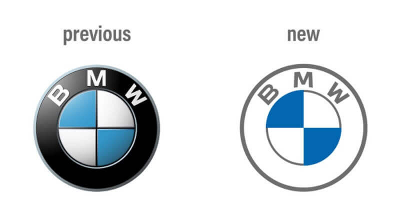
3. BMW
BMW decided to go completely minimal and flat with their new logo. Companies like KIA, Ford, and General Motors have done something similar with their logos. Their recent redesigns go well because most of these companies shift towards electric vehicles and a carbon-neutral future.
4. Tripadvisor
Tripadvisor decided to flatten its logo's look by going monochromatic and making the owl a bit simpler. This redesign makes the entire logo look more streamlined and modern, making it easily applicable and recognizable.

5. Mountain Woods
This minimal logo incorporates a multilayer design in an exquisite and straightforward form. Even without the lettering below the logo, it is pretty clear what it represents.

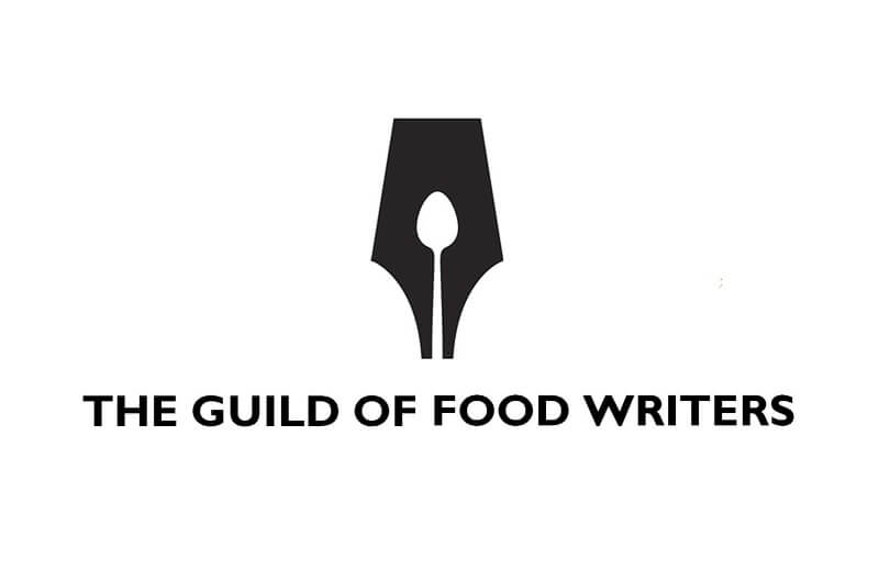
6. The Guild of Food Writers
Perfect use of negative space makes this logo one of my favorites on this list. I couldn’t imagine a better logo for this organization.
Simplification
Simplification for a moment may look similar to minimalism. But unlike minimalism, where design can go back from scratch, simplification plays only with available elements.
So if you want to create a simple modern logo, sometimes all you have to do is strip unnecessary elements from your existing logo. Here are a few brands that have simplified their logos successfully.
7. Dunkin Donuts
Dunkin went through a few simplifications of their logo. Initial reactions to the latest one were not very kind, but there's not much to be criticized from a design perspective. They kept the bold colors, and they kept the font. Dunkin’ is one of those iconic brands that don’t need to remind us what they are selling.

8. Burger King
The king of Twitter roasts tried something new by redesigning something old. They revamped the old logo from the 70s and made it work. They may never simplify their menu, but they sure did simplify their logo nicely.

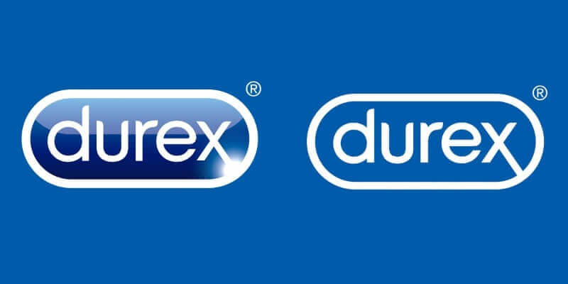
9. Durex
Durex always had the best team of creatives that produced some of the best ads on the subject. They decided to simplify their logo and make it more sex-positive by introducing special new font called “One Night Sans.”
10. Google Maps
Google decided to update the visual identity of most of its popular apps. Some of the new designs were well received, and some didn’t. Google Maps is one of the exceptionally well-made simplifications of the previous logo. They simplified the previously busy logo with a well-executed minimalist design.

Gradients
Gradients used to be a thing back in the 2010s when Apple used many of them for their app icons. They quickly fell out of style when Apple decided to go for a flat look in later iterations of the iOS. It seems that the gradients are slowly coming back and will stick around for a while.
11. Microsoft Edge
Microsoft has a decades-old struggle with its internet browser. However, they finally managed to produce a decent browser with Microsoft Edge's launch. They decided to go with a logo that would look quite good, only if there wasn’t already a competitor with a similar logo.

12. Cadbury
On one side, you can see the logo of a beloved confectionery brand, and on the other, a million-dollar gradient redesign. Cadbury famously paid that sum of money for the redesign that didn’t go well with the public.

13. TechnCorp
This logo fits well in the definition of modern. It uses clear shapes, intense colors in the form of a gradient that is done just right.

Typography logos
Typography logos are never going out of style. Mainly because they quickly convey the message, and if done right, they are also easily memorable and help the brand name be heard too. One essential rule when it comes to this type of logo is to make it legible.
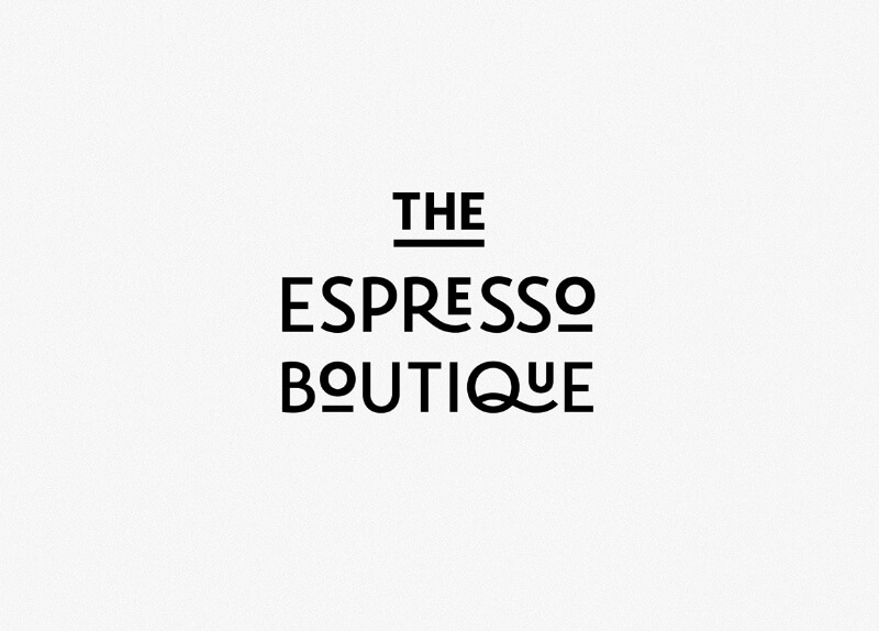
14. The Espresso Boutique
This logo doesn’t need any additional graphic elements. The font used gives us an association of coffee. The name of the brand is simple enough, so it doesn’t give us an option to think of anything else but a good cup of coffee.
15. Handpicked
The funny-looking font in different sizes and colors makes this logo pop and draws attention.

16. Kyra
The uninterrupted line makes this typographic logo look designer and elegant.

Optical illusion logos
The best way to make people give a second look to your logo and your brand is by using some sort of an optical illusion in your design. Golden rules here are:
- not to be visually overwhelming
- and all the other elements in the design should be as simple as possible
17. Edge Board
This design plays well with the brand's name and the optical illusion associated with the brand. The design is simple yet effective enough.

18. Unreal.Place
Cyberpunk movies and games inspire this logo for VR park. Neon pink and teal give this logo the right visual appeal and make it feel like it came straight out of Blade Runner.

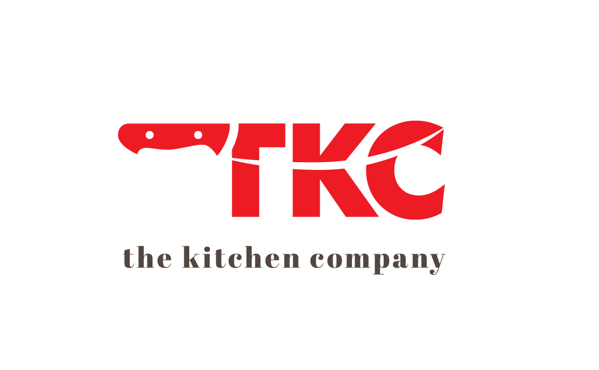
19. The Kitchen Company
I love logos that have hidden details or use negative space to hide some extra detail or meaning. This logo is one of my favorites on this list. The color, the knife hidden in the logo, the whole composition works well for me.
Muted colors
Muted, earthy colors are a long-standing favorite for beauty and wholefood brands. However, these elegant, understated shades can be a great idea when deciding how to make a logo look more modern.
20. Airbnb
Airbnb did a whole 180, with its logo redesign in 2014. Although that is now 9 years ago (how is it possible, I know), this is still a modern business logo, which appeals to younger audiences today. Part of its appeal is the beautiful coral tone, which has become the company’s signature.

21. Memorial Baptist Church
A modern church logo? It’s possible! Muted tones generally evoke a sense of calm and serenity, so they actually make a lot of sense in this case. Since they’re not overbearing, muted colors also pair really well with fun, retro designs, as you can see from this funky modern logo design.

22. Oaties Oatmeal logo concept
You can see tons of similar modern logo ideas, and probably have been seeing them for years now. This muted color combo is ideal for wellness and organic brands. Just make sure to pair it with custom typography or illustration to ensure your logo is unique.

Viva magenta
If, however, muted is not your style, there’s another major color trend we’ll see in 2023. Pantone’s color of the year is Viva Magenta, a gorgeous shade that can look both youthful and elegant, if used cleverly. Here are just a few modern logo ideas to get your creative juices flowing.
23. T-mobile
With the right color choice, you don’t need much more to create a stunning modern logo. T-Mobile’s iconic wordmark makes a perfect pairing between the stunning magenta and a classic serif typeface.

24. Marcha FM
Want to know how to design a modern logo? Look no further than this stunning example.Simple, yet incredibly striking, this logo is perfect for a variety of uses. It also has an awesome logomark (simplified version of a logo ideal for using on applications, stationary and more).

Glitch effect
Authenticity is something modern consumers really value. So, adding a visual effect that makes a logo look “imperfect” can be a smart choice. Glitch effect also has a distinct, techy look that’s perfect for a modern logo design.
25. Personal branding logo
Glitch effect works best with simple logos, such as wordmarks or lettermarks. This modern logo alone shows just how much edge it adds to simple letters against a plain background. I could see this being a perfect addition to a cool black business card!

26. Glitch boy
Of course, you can also use this effect with simple illustrations. It’s a great way to add different colors to your logo, without it looking tacky or overwhelming. A modern logo like this one would work best in a digital environment, although it’s simple enough to be used for a variety of other purposes.

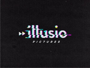
27. Illusion Pictures
The designer of this logo decided to play with a VHS glitch, which is quite suitable for a movie studio.
Hyperrealism
Design technology has progressed a lot in the last few years. So, while minimalist designs are still a wonderful choice, you can also up your game with an awe-inspiring photorealistic logo. Here are just a few cool logo ideas in this style.
28. Charles Laveso personal branding
Creating texture in graphic design is the make of a great designer. But this modern logotype really takes it to the next level! The photorealistic wooden texture gives it an amazing 3D effect. Paired with a slick design and clever layout (if you look closer you’ll notice the initials), it also can work perfectly in a variety of contexts.

29. Blue White Leaves
This is definitely one of my favorite modern logo ideas on this list! It’s the perfect blend of simplicity and intricacy.

30. Surecoin
Why opt for a gold logo color, when you can design it to look like actual gold? This trendy logo would work great as a cryptocurrency brand mark.

It’s not always about the trends
Just blindly following the trends won't bring you to a good logo design. Good logo design, the one that can withstand the test of time, requires a skillful designer. Someone that can sum up the brand's core message and values visually and use the correct designing elements to create a modern style logo that will communicate with the target audience.

Diplomat by education, marketer by profession. Currently living between Berlin and Skopje, still deciding where to settle permanently. Ghostwriter that is slowly crossing back into the land of the living writers. Always reading two books at the same time and follows at least 15 TV series. Used to dream about changing the world, now just patiently waits for the next Marvel movie.

A design solution you will love
Fast & Reliable
Fixed Monthly Rate
Flexible & Scalable
Pro Designers