%201.svg)


Presentation Design: Ultimate Guide for Beginners
Great presentation design is as important as presenting. Are you creating your own slide decks? Here are some must-follow rules for awesome presentations!

.svg)
Table of Contents

Whether you are pitching a business idea, telling about your new research, or sharing important data with your audience, presentations are a visual aid essential for your success. You could have awesome presenter skills, and a fantastic idea for the content. But without stunning presentation design, the whole thing will fall flat. Learn how to make a good PowerPoint presentation design with these 10 tips.
Presentations: you’ve seen many of them, and you've probably made several yourself. An ultimate visual communication tool to get your point across, presentations are deeply integrated into the academic and business world.
However, many individuals and businesses still make the mistake of thinking that PowerPoint presentation design always comes down to dark text on a white background, with a few images and charts sprinkled in. Nothing could be further from the truth!
Presentation design shouldn’t be walls of text or extensive bullet point lists, but rather a way to tell a story and inspire the audience with a beautiful and balanced design. And it’s not just about communicating with your audience. Visme found that 91% of presenters feel more confident when using a professionally designed slide deck.
Want to learn how to make a good PowerPoint presentation design? We can help. In this article, we’ll cover the basics, such as:
- What is presentation design?
- What types of presentations are there?
- 7 Tips to design presentation slides yourself.
What is presentation design?
Presentation design focuses on the visual look of your presentation as a tool to engage your audience. It is the way you present your information on the slide: the color scheme, combination of fonts, the way design elements are used as part of your slide. All of this comes together to present your message in a certain way.
Presentation design is about finding the perfect combination of design elements to create slides that will not bore or tire your audience, but rather engage them and glue them to the slides while attentively listening. Whether you are looking to inform your audience, entertain them, establish credibility, or something else, well-thought-out and executed presentation slides can help you achieve this.
Types of presentations
What is the first step in designing an effective presentation? Knowing what the presentation is for, of course.
Presentations have different purposes. A quarterly presentation you are making for the investors of your dropshipping business will not be the same as an employee training slide. In the first case, your aim will be to inform and report, in the second case, the goal of the presentation is to educate. Depending on what you are trying to achieve, there are 5 types of presentations. Let’s take a look at each.
- Informative - One of the most common presentation types, informative presentations aim to communicate important information with the audience and show new findings. Think of presenting company updates or planning a new project: informative presentations should be clear and straight to the point.
- Persuasive - As the name suggests, the aim of this presentation type is to use important data to not simply inform the viewers, but to persuade them to take a specific action. Persuasive presentations are what you should show to potential investors when telling them about the user acquisition growth speed of your company.
- Educational - Often confused with informative presentations, educational presentations are different because they aim to not simply inform, but to teach the viewers new skills and educate them about a new topic. Staff training slides or academic presentations are a great example of this slide type. You can go as far as making a tutorial video and including it in the slides, adding notes and key points next to it.
- Inspirational - Often used by managers and team leaders, inspirational presentations aim to cause a spark and motivate employees to work harder. Presentations of this type usually have a highly emotional message the aim of which is to inspire viewers to take a particular action.
- Problem-solving - This presentation type does a particularly good job at hooking the audience, as the key part of this presentation is the problem they are facing. Then, during the presentation, you are showing them how you are going to solve that problem. An example of this would be discussing how hard it is for large companies to hire qualified people by sharing statistics, then presenting your new HR automation tool and showing its benefits.
7 presentation design tips for beginners
Are you ready to jump into it? Here are 7 golden tips that will help you design presentation slides you can be proud of.
1. Outline your content and refine the key message
What is the first step in designing an effective presentation? You need to prepare your content and refine the key message. Try to understand what your audience wants to know, what they may already know, and what is more likely to keep them engaged. Then, keep this information in mind as you prepare your content for your presentation. What is the main takeaway from each slide?
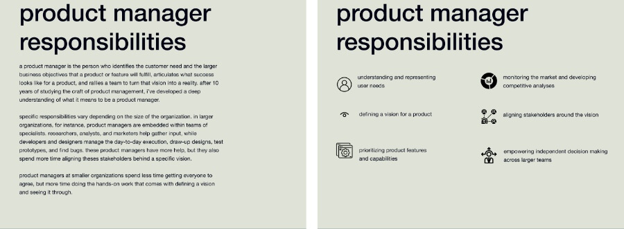
Choose a working title and have a clear point for each of the slides. Understand what you want your slide to tell people. For example, instead of “Using hashtags for Instagram” go with “Using hashtags for Instagram increases engagement by 12.5%.”
Keep your content specific and informative, but as concise as possible. Simplify your sentences, keep only the main point without writing an excessive amount of information on the slide. Below are two examples of a slide with the same information. Which one do you think is more readable?
2. Pick a framework
Now it’s time to pick the framework you are going to use to make your professional presentation design. Do you want to create a presentation from scratch, or go with something pre-built?
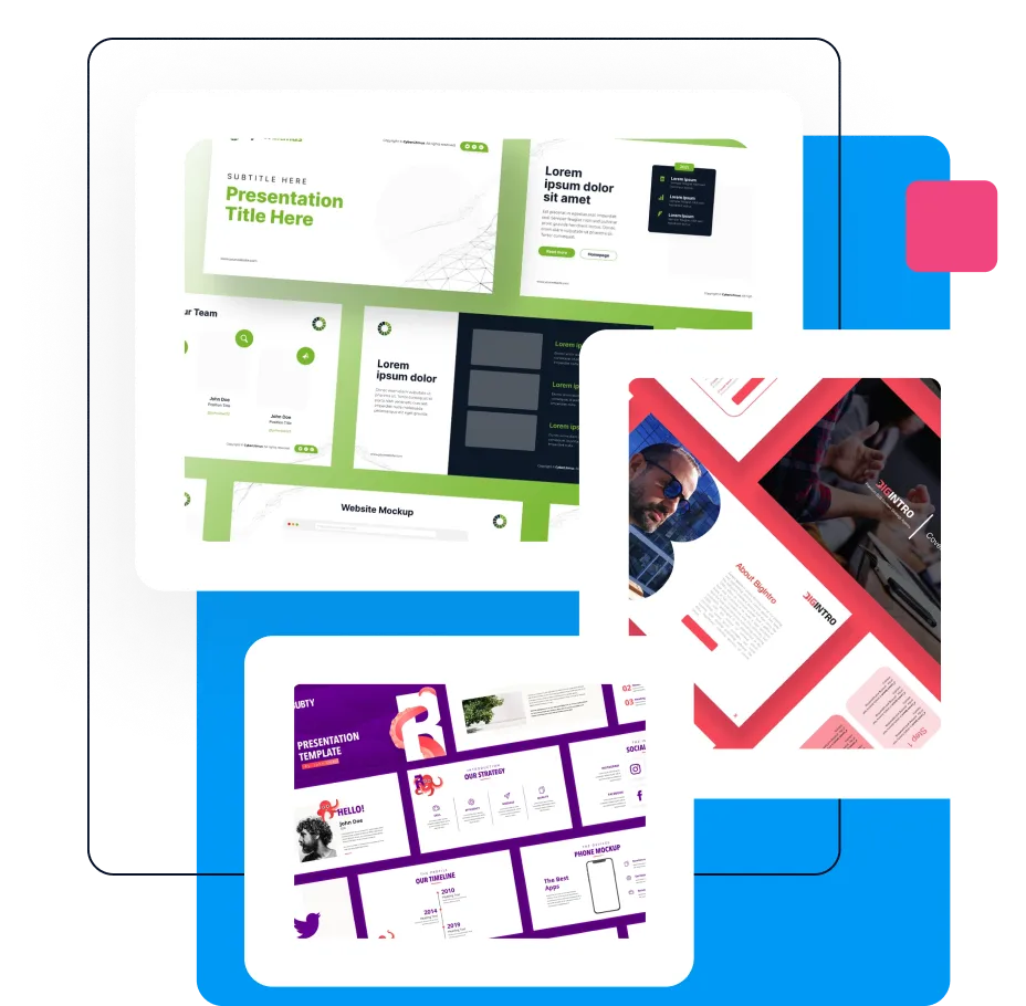
There are many terrific presentation design templates available online, on platforms like Canva, Visme, and Venngage. Still, you should never use a presentation template without editing it.
Changing the color scheme or fonts to match your brand may seem like a small detail, but it will greatly improve the overall impression of your presentation. It also helps to strengthen your brand identity (whether for a personal or business brand marketing), and demonstrates professionalism and care.
Another important thing is not to limit your creativity to pre-built presentations. That’s why it’s also advisable to explore presentation designs on platforms, such as Behance, Dribble, and 99Designs.
Sure, most of these will have been done by professional designers, and may be a little challenging for beginners to recreate. However, understanding just how creative PowerPoint presentation design can be will help you shed your preconceptions and explore new creative routes.
3. Choose a color scheme and fonts
The best presentation design will be limited to a handful of options as too many colors will create chaos on your slide and make it harder for the readers to understand.
If you have a brand guide in place, it’s best to stick to colors and fonts used in your branding. However, remember that a PowerPoint presentation design is supposed to keep viewers engaged. So, even if your brand colors are soothing muted tones, a bright element here and there can work well to draw attention to the key messages.
4. Make it visual
Sharing your information only as texts and bullet points is a lazy way out. When you design presentation slides, consider how you can present information visually. This will help your audience understand and take in key messages faster.
A simple example of this is adding relevant icons instead of simple bullet points. Colored or outlined texts next to realistic and relevant photos make the presentation a lot more enjoyable and keep the viewers entertained.
Graphs and charts are a business presentation design staple. However, you can also think about different design elements that can be both surprising and effective. For example, a simple illustration instead of a dull stock photo will delight your audience and keep them engaged.

5. Pay attention to the layout
Your slide layout is the area where all of your presentation elements (photos, texts, icons, logo) are contained. Most presentation tools come with pre-built layouts you can use.
You can also create your own layout from scratch. In both cases, the main aim is to design a beautiful slide that doesn’t overwhelm the viewer. Include plenty of white space in your layout, don’t crowd it with too many text boxes and elements. If the elements are different, as they often will be, keep similar one close to each other. Keep your layout as clean and simple as you can.
6. Align and position
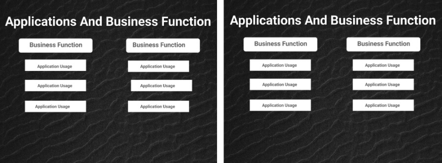
Nothing screams amateur more than jumping texts and layouts from slide to slide. Mismatching logos and design elements jumping here and there showcase a lack of professionalism and give an impression that you’ve put your presentation in a hurry. Not to mention that they are sometimes extremely annoying and distractive!
So, whenever you are working on your slides, always align and position them properly. No matter the presentation tool used, chances are, it will have an alignment tool.
Presentation software such as Keynote and Figma even offer an option to create background grids to help with the alignment. Below is an example of a slide, before and after aligning the texts and icons. Notice the difference?
7. Stay consistent
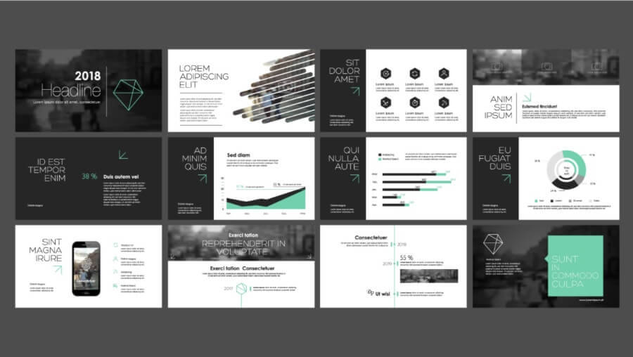
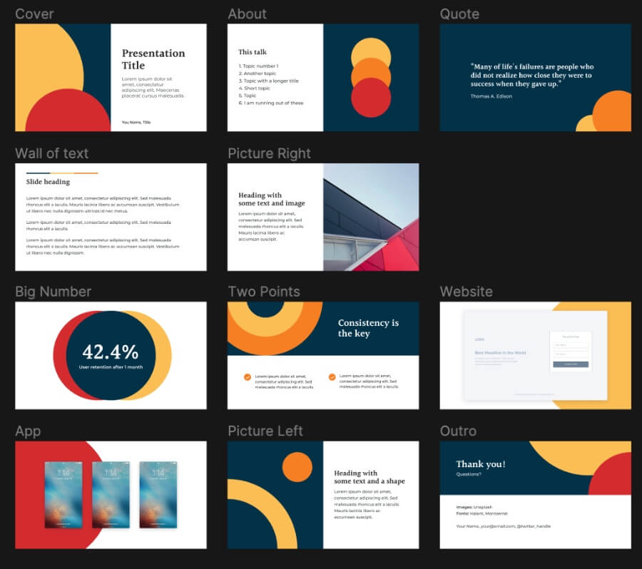
As you progress through the design of your presentation, it is essential that you stay consistent. No matter how many slides your presentation has, they are still part of one presentation. And you don’t always have to keep the same background color, or slide themes for this. Consistency in design can be achieved through design elements, color schemes, and similar illustrations.
Take a moment to look at these three slides. Although some of the slides seem to be styled differently from the rest, the color scheme of design elements holds the presentation together. It’s crucial to make sure that each one of your slides is visually connected to the previous one, to make sure your viewers don’t lose track of what you were saying.
Key takeaways
Now that you know the basics of professional presentation design, it's time to try them in practice! As with every other design type, there is no end to presentation design. Try to experiment with different tools, elements, and styles to find the one that works best for your audience. Research trends and best practices, and dedicate time to plan each slide thoughtfully. Don't be afraid to try new things, and you'll see the benefits a good presentation can have for your project in no time.
Great presentation design is as important as presenting. Are you creating your own slide decks? Here are some must-follow rules for awesome presentations!
A design solution you will love
Fast & Reliable
Fixed Monthly Rate
Flexible & Scalable
Pro Designers