
How to improve your storytelling using graphic design

TABLE OF CONTENTS


Have you ever noticed Google’s Doodles? Google often changes its logo to commemorate holidays, events, and significant figures. Each Doodle tells a unique story, celebrating diversity, culture, and historical moments.
This is called design storytelling - communicating a strong story through visual elements.
Storytelling in design is not a new trend in graphic design. It has been one of the foundation stones of modern graphic design. However, many brands still make the mistake of focusing too much on written content.
If you are one of them, you need to use the power of a visual narrative in good storytelling. You can use graphics and visual storytelling techniques, as well as other photos and videos, to improve your content and, as a result, boost your profits.
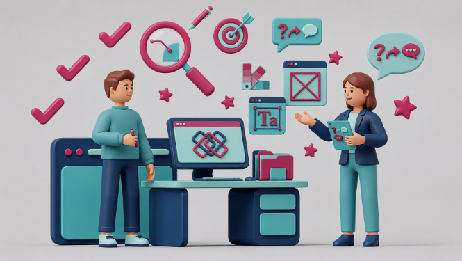
{{GRAPHIC_BANNER="/dev/components"}}
What is storytelling in design?
Storytelling in design uses narrative elements to communicate ideas and create a more engaging user experience. It's about going beyond just functionality and aesthetics and infusing your design with a human touch and a good story.
There are many ways to incorporate storytelling in design, including:
- User personas: Creating characters representing your target audience and using their stories to guide the design process.
- Visual elements: Using images, illustrations, and videos to tell a story alongside the design.
- User interface (UI): design involves structuring the user journey with a clear beginning, middle, and end, with built-in challenges and resolutions.
Famous graphic designers have always combined design and storytelling in their design projects. When you understand how to use them effectively, you can create functional designs that resonate with users on a deeper level.
Why use storytelling in design?
Effective storytelling is a combination of good graphic design and content writing. So how does storytelling enhance branding and marketing efforts?
Here are a few key reasons.
- Creates emotional connection: Stories tap into our emotions, making designs more relatable and memorable. Apple's "Think Different" campaign used storytelling to connect with users' aspirations and creativity rather than just focusing on product features.
- Improves user understanding: A narrative structure can explain complex concepts more clearly. IKEA makes assembly easy with step-by-step instructions that are like following a recipe, not confusing technical language. Visuals help tell the story.
- Boosts user engagement: Stories can make using a product or service more enjoyable and interactive. For example, Duolingo features a friendly green owl named Duo as its mascot. Duo appears throughout the app, offering encouragement, celebrating wins, and reminding users to practice. This creates a sense of companionship and makes the learning process more personal.
- Strengthens brand identity: Storytelling can help communicate a brand's values and personality in a way that resonates with its target audience. Dove's "Real Beauty" campaign challenged traditional beauty standards by celebrating women's diversity through storytelling, creating a brand focused on empowerment.
- Enhances user empathy: Designers can better understand user needs and frustrations by crafting stories around user journeys. For example, P&G’s “Thank you, mom” campaign for the 2012 London Olympics.
This campaign didn't focus on the athletes themselves, but rather on the unwavering support system behind them – their mothers. Through a series of short films, P&G showcased the sacrifices, encouragement, and unwavering belief that mothers provide throughout their children's journeys, culminating in the Olympic Games.
Now you know what is storytelling in design and why you should use it. So, let’s see some examples of how to use design and storytelling to build an emotional connection with your audience.
How to use storytelling in design?
Show your research with infographics
Infographics are valuable tools when dealing with complex research data. They make data more accessible by transforming it into visual stories.
Lots of numbers in a design can be overwhelming, but infographics help convey information in a clear and easy way.
Here are some of the most popular infographic types that you can use to present your data.
Statistical infographics
Display research analysis or survey results via statistical infographics. You can even instruct your design team to add icons and illustrations to make the design user-friendly and easy to understand.

Informational infographics
Break up long text, share an overview of a topic, or provide a quick list of items.

Timeline infographics
A timeline infographic can be extremely useful in showing the course of development for a certain event or process.

Geographic infographics
Geographic infographics excel at location-based data visualization by employing map charts as a central focus, occasionally serving as heat maps.

Hierarchical infographics
A hierarchical infographic is shaped like a pyramid and helps organize data from greatest to least. A good example of this infographic is the food pyramid.

These were some of the most popular infographics that blend design and storytelling. Still, there are many more types of infographics that you can explore and choose according to your brand identity.
Use illustrations for visual communications
Illustrations are widely used in web design and enhance content by adding character, color, and context. While infographics visualize data, illustrations are ideal for conveying abstract concepts or improving visual appeal.
You can hire a freelance illustrator or use free illustrations by ManyPixels to beautify your page with stylish illustrations.

Create a mascot/character to personalize your brand
A mascot, like Microsoft Word's Clippy, enhances brand recall and personalizes the user experience.
Clippy was the best example of storytelling for user experience. It was an animated paper clip that aided users in quickly learning the software and provided entertaining and actionable tips, making the learning process more engaging for new users.
A process infographic is similar to a timeline one, but instead of depicting time spatially, it is a step-by-step visual representation of the course of action. It usually has a left to right or a zig-zag direction of the steps.

In fact, many brands use a character to make their brand story more relatable and easy to remember. Colonel Sanders, Tony the Tiger, and, in more contemporary times, the endless virtual assistants and chatbots you see daily are visual and imaginary characters that help people learn easily and quickly.
Tell a story with comics and cartoons
One method to enhance user engagement through design is incorporating storytelling elements, such as characters and narratives that resonate with the audience.
You can also use an AI story generator to create engaging stories to elevate the appeal of not just written content but also supporting visuals, making them part of a larger narrative that users find captivating and immersive.
Comics, though challenging to produce, offer a unique and valuable means of conveying brand stories, explaining products, or entertaining audiences.
For instance, Netcetera's comic heroine, Neta, working in software development, not only promotes women in tech but also adds humor and relatability, making it popular on social media.

Here is another example of a company that reshares creators’ comics that suit their narrative. The Muse, a hiring and coaching company that often shares tips about professional growth and learning, shares cartoons like the ones below to help nurture their Instagram audience.
.png)
Use GIFs and interactive images to boost engagement
Dynamic images and GIFs enhance storytelling by offering context, contrasting elements, or quickly showcasing multiple images.
For instance, The Guardian effectively used a dynamic image with a drag toggle to illustrate the before-and-after impact of the Beirut explosion in June 2020, providing a powerful visual representation that words alone couldn't convey.

Use logos that represent your brand identity
Logos are vital in design storytelling as they strengthen the brand image, encapsulate brand identity and values.
Many famous logos use subtle symbolism to communicate the brand’s values. For example, the Amazon logo uses a subtle curve on the arrow underneath the company name. This curved arrow can be seen as a smile, which portrays a customer-centric and friendly approach.

Marketers also understand that the arrow goes from A to Z, insinuating that you can find any (A to Z) item on the biggest eCommerce marketplace in the world.
Create with empathy to build an emotional connection
Any UX designer, when doing design storytelling, intends to communicate the brand’s story but also address the pain point of customers.
Empathetic stories help build emotional connections. By putting the audience in the shoes of others, storytelling cultivates empathy, guiding the design process with purpose.
This iterative approach ensures that the final design resonates emotionally, connecting the audience with the brand, product, or artwork. Design work infused with emotion and empathy invites the audience to join the narrative, strengthening the bond between the viewer and the visual communication.
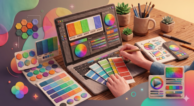
Choose a color palette to stay consistent
Coca-Cola's vibrant red color is one of the most recognizable elements of the brand identity The consistent use of red fosters immediate recognition evokes emotional connections of joy and celebration, and aligns with cultural significance.

In essence, the strategic use of the red color palette goes beyond aesthetics, becoming a powerful storytelling tool.
Captivate users with images and videos
Patagonia effectively utilizes high-quality imagery to tell a captivating story of unique travel experiences, local immersion, and a sense of belonging. The carefully curated visuals inspire exploration and make you get out of your house!

The consistent use of imagery across platforms creates a unified user experience (UX) design, fostering recognition and trust.
Use storytelling to improve user expeirence
Duolingo, this language learning app incorporates storytelling elements throughout the user experience, making it engaging and motivating to learn on the platform.
Duolingo uses a green owl named Duo to make learning fun. It's like going on an adventure with levels and rewards. The lessons have stories and dialogues that feel real. Seeing your progress with points and leaderboards makes learning like a game. This makes Duolingo fun and keeps you motivated to learn languages.

This instance of design storytelling has been so successful it made Duo an instagram celebrity. The “threatening” tone of voice might not be what the creators intended. Still, they recognized the power of a good story and character.


Conclusion
It is true that graphic design and copywriting must go hand in hand for an effective marketing strategy, but as the world’s content consumption habits are changing, you need to adapt to the growing demand for visual storytelling.
Do your user research before you design your marketing campaigns, and make sure that you establish and maintain your brand story across your marketing channels - blog, social media, website, and more.
If necessary, create a graphic design workflow checklist to ensure your design storytelling is coherent, consistent, and impactful.

Journalist turned content writer. Based in North Macedonia, aiming to be a digital nomad. Always loved to write, and found my perfect job writing about graphic design, art and creativity. A self-proclaimed film connoisseur, cook and nerd in disguise.

Top-quality designers
A complete creative team at your fingertips: graphic and web designers, illustrators, and more.

Lightning-fast turnaround
Get start today and receive your first update on the next business day.

All-inclusive pricing
Unlimited requests and revisions. One flat monthly fee. No surprises.

Flexible & scalable model
No contract. Scale up and down as needed. Pause or cancel at anytime.
Continue reading

Explore some of our best designs
Get inspired by a curated selection of ManyPixels work. Download the portfolio to see what our team can create.


