%201.svg)


.jpg)
Typography Design: How to Create an Impact with Fonts
Learn everything you need to know about typography design: types, terminology, and more!

.svg)
Table of Contents

The art of typography is the technique of arranging type to make written language legible, readable, and appealing when displayed. From ancient inscriptions to modern digital screens, typography has played a vital role in human communication.
When you read a book, scroll through a website, or glance at a billboard, typography guides you through the content. The importance of typography in graphic design lies in its ability to convey words, emotions, attitudes, and personalities.
Consider how a playful, bubbly font might convey a sense of whimsy and fun while a bold, elegant typeface can exude sophistication and professionalism.
Typography design isn't just about choosing pretty letters; it's about creating an experience for the reader.
Types of typography
Letters come in multiple styles and shapes. They are categorized into serif, sans serif, script, display, and handwritten fonts.
Serif fonts
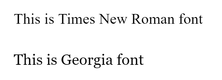
Serif fonts have small decorative flourishes, or "serifs," at the ends of letter strokes. They often convey a sense of tradition, elegance, and authority.
Take, for example, Times New Roman, one of the most popular fonts in graphic design used in many newspapers and academic papers, or Georgia, with distinctive serifs that add a touch of sophistication to online content.
Sans serif fonts
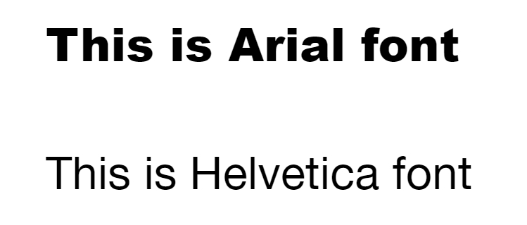
Unlike serif fonts, sans serif fonts are clean, straightforward, and devoid of decorative elements. Their simplicity makes them versatile and modern. So, they’re a popular choice for digital interfaces and branding.
With its clean lines and balanced proportions, Arial is a widely used sans serif typeface in web design for its clarity and readability. Helvetica is one of the most popular fonts for logo design and a classic example of a sans-serif font.
🔔 We have a complete guide on Serif vs. Sans Serif fonts to help you understand when and how to use them!
Script fonts
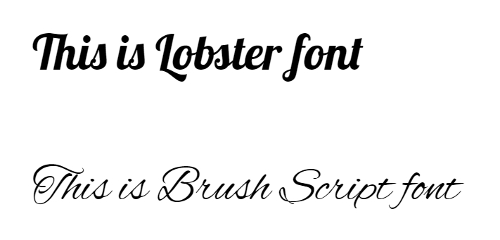
Script fonts mimic the fluidity and elegance of handwriting, adding a touch of personality and warmth to designs. Brush Script embodies casual charm, while Lobster exudes retro vibes with bold, flowing strokes.
Display fonts
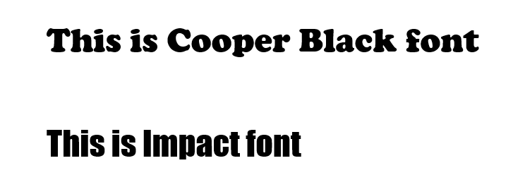
Display fonts are designed to grab attention and make a statement. They come in various styles, from bold and brash to intricate and ornate. They can help text stand out, so they’re often used for CTA buttons, email banners, and YouTube thumbnails.
Impact demands attention with its heavy strokes and condensed letterforms, while Cooper Black exudes retro charm with its rounded shapes and generous proportions.
Handwritten fonts
Handwritten fonts add a personal touch to designs, conveying authenticity and warmth.
Pacifico's flowing curves evoke the carefree spirit of handwritten notes, while Dancing Script exudes a playful energy perfect for casual designs.
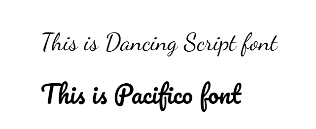
Note: There is only a slight difference between Script and Handwritten fonts. While Script fonts are more elegant and calligraphic, Handwritten fonts look like they were written by hand, often with a pen or marker, and reflect the variations of actual handwriting.
Typography design terms
If you are wondering how to learn typography design and the impact of design typography, let's clarify some key terms to help you master the basics of typographic design.
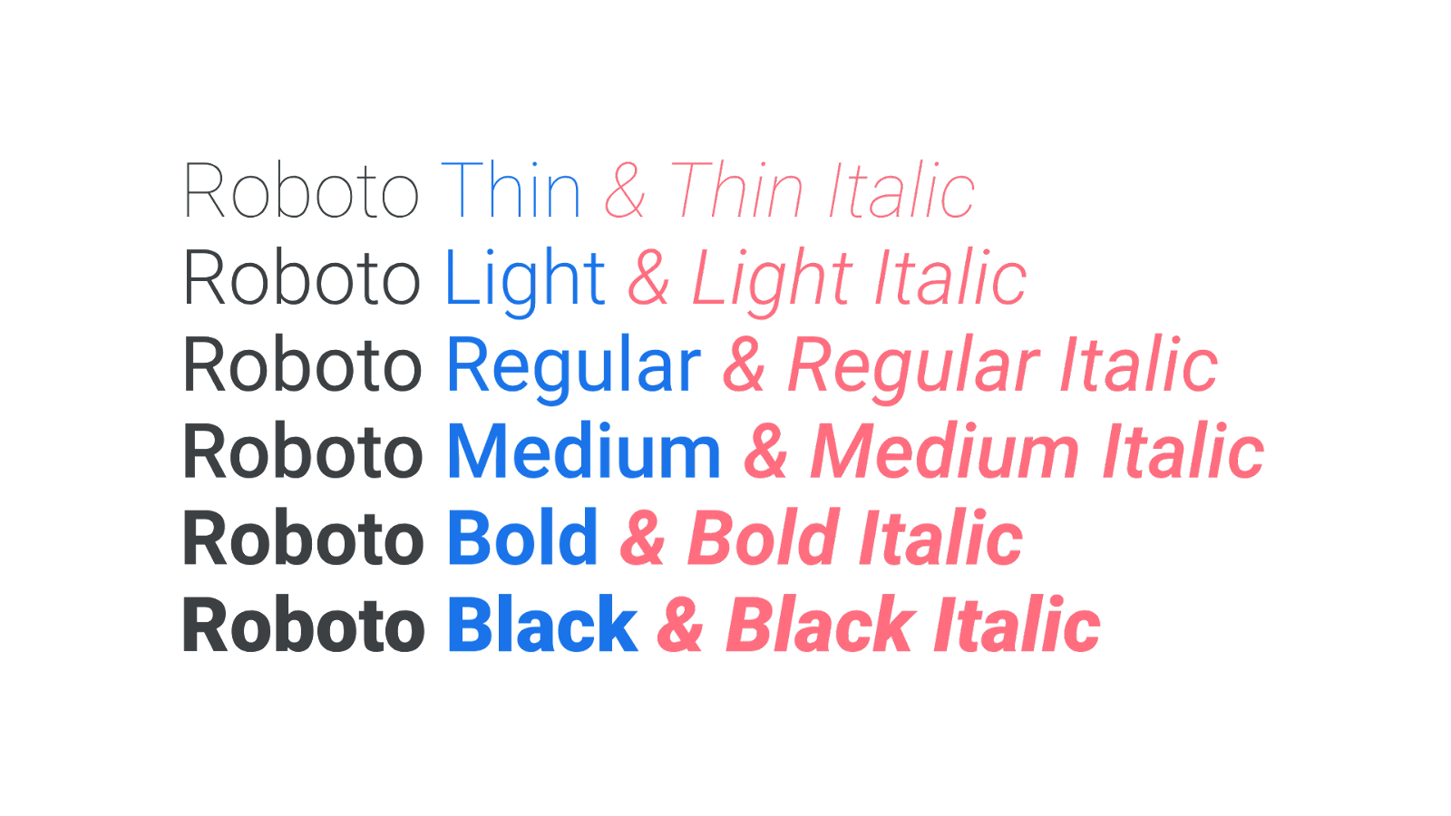
Typeface vs. font
It's easy to confuse between typeface and font, but they actually refer to different things. A typeface is the design of a set of characters (font family), while a font refers to a specific size, weight, and style within that typeface family.
Think of a typeface as a family name, like "Roboto," and a font as a particular member of that family, like "Roboto Bold."
Alignment
Alignment gives your text a sense of direction. You know how sometimes things just feel right when they're lined up perfectly? That's what alignment does for your text. It helps guide your readers' eyes smoothly from one line to the next.
Four types of typography alignments are mainly used in any design: left, right, center, and justify.
Left
Left alignment is the most common choice for most texts as it is the natural flow humans read in. Left-aligned text is familiar and easy to read for the human eye. In typography design, just avoid any singular words at the end of the lines, known as “widows.”
Right
Right alignment is quite uncommon as it goes against the flow of most languages. However, it adds a touch of uniqueness to your designs. When using the right alignment, avoid long paragraphs and minimize punctuation at the end of lines to keep it clean.
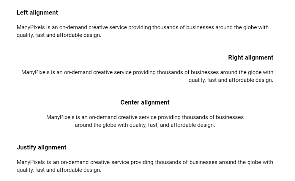
Center
Center alignment adds elegance and dynamism to your designs. It's like the centerpiece of a beautifully set table. To nail it, play with line lengths while maintaining overall balance.
Justify
Justified alignment gives a modern, clean look but can turn messy quickly. Watch out for awkward spaces between words, like unexpected potholes in a smooth road. Keep everything neat by adjusting text size, box lengths, and spacing.
Kerning and tracking
Kerning refers to adjusting space between individual letters to achieve visually pleasing spacing. Tracking, however, refers to the overall spacing between groups of letters or words. Proper kerning and tracking can greatly enhance readability and aesthetic appeal.
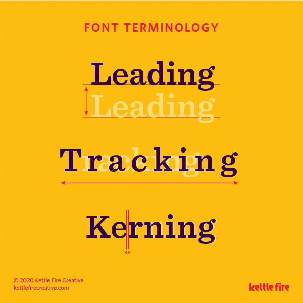
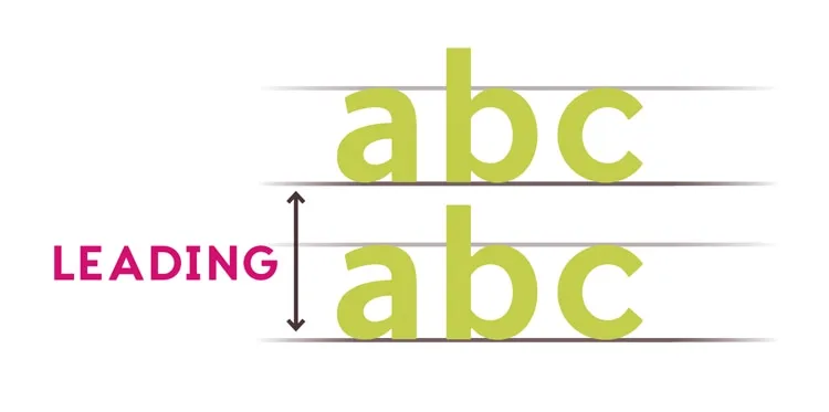
Leading
Leading (pronounced "ledding") refers to the vertical spacing between lines of text. Proper leading ensures that lines of text are spaced optimally for readability. Too much leading can cause text to appear disjointed, while too little can make it difficult to read.
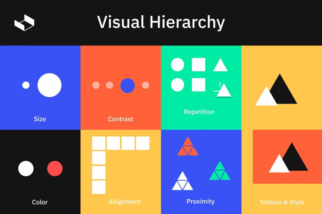
Hierarchy and contrast
Typography is not just about choosing the right fonts; it's also about creating contrast and visual hierarchy to guide the reader's eye. By varying font size, weight, and color, designers can emphasize important information and create a sense of structure within a design.
Grid
Think of the grid as your blueprint for laying out text on a page. Whether simple or complex, the grid helps you organize elements neatly, making it easier for readers to follow along.
For example, when building a house, you wouldn't randomly place bricks and beams. You'd use a blueprint to ensure everything fits together perfectly. Similarly, the grid gives you control over arranging elements on your page.
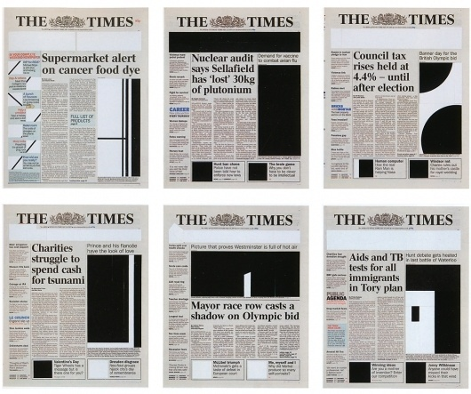
For instance, consider a newspaper layout. The grid makes articles and images neatly organized in columns and rows. This organization helps readers quickly find what they're looking for without feeling overwhelmed.
White space
White space is like breathing room for your text. Just like you need space to think clearly, your text needs it too. It's like a crowded room versus one with plenty of space between people – the latter feels much better, right?
That's what white space does for your text. It gives it room to breathe, making the composition light and airy.
For example, white space is crucial in any website layout. Notice the space around text and images? It's not just for looks; it helps you focus on the important stuff by giving your eyes a break.
Anatomy of typography
There are various components of letters and text, and as a graphic designer, knowing what these components are called can help you a lot. Here are some of the most important ones that you should know.
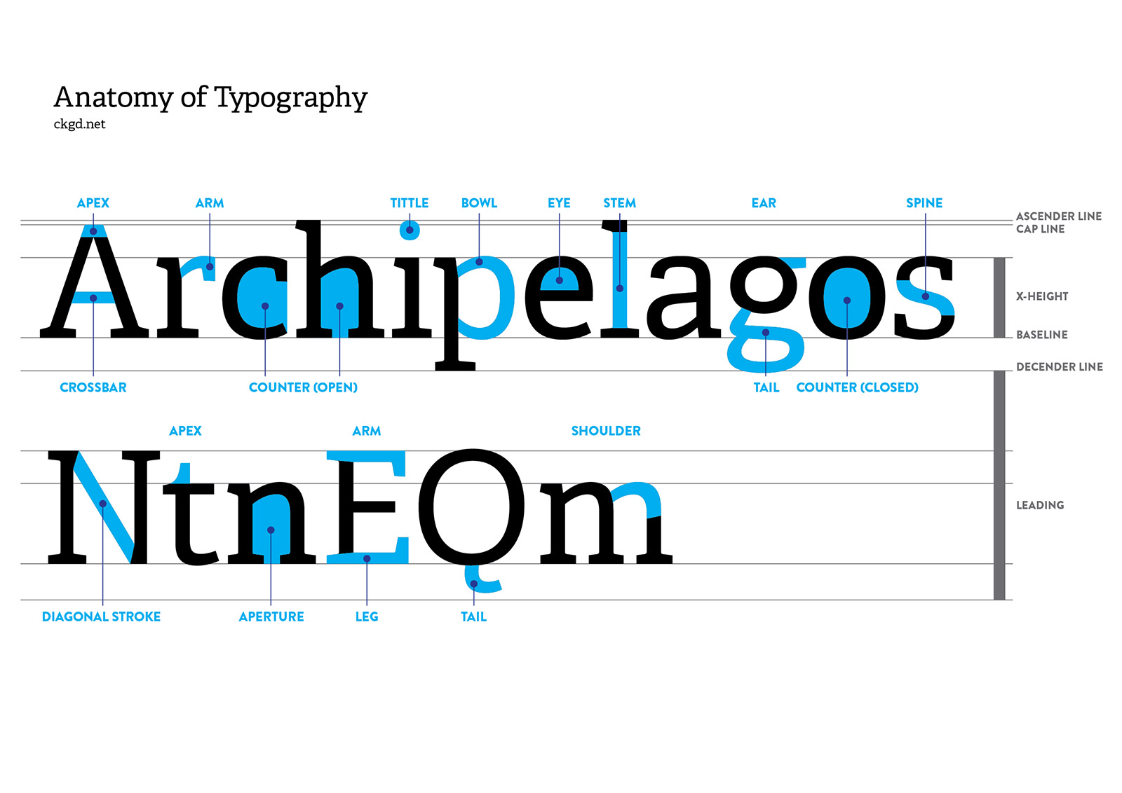
- Stem: The vertical stroke that forms the main body of a letter (e.g., in the letter “H,” the two vertical lines are stems).
- Arm: The horizontal or diagonal stroke extending from the stem (e.g., the top horizontal line in the letter “T”).
- Bowl: The curved part of a letter (e.g., the rounded part in the letter “O”).
- Baseline: The imaginary line on which most letters rest.
- Descender: The part of a letter that extends below the baseline (e.g., the tail in the letter “g”).
- Ascender: The part of a letter that extends above the x-height (e.g., the top part of the letter “b”).
Typography in graphic design
Now that we have a solid understanding of the fundamentals let's explore how typography is used in various forms of graphic design to communicate messages effectively and evoke emotional responses.
Logos
Logos are often the first point of contact between a brand and its audience, and typography plays a crucial role in creating a memorable and recognizable identity.
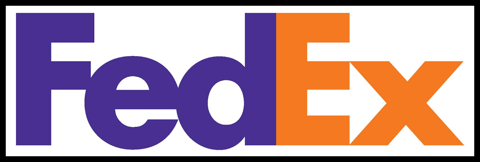
Take the FedEx logo, for example. The clever use of negative space forms an arrow between the "E" and the "x," symbolizing speed and precision.
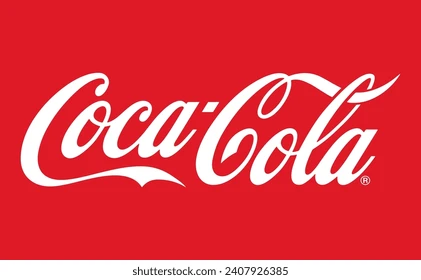
Similarly, the Coca-Cola logo is instantly recognizable worldwide, thanks partly to its iconic script font and distinctive red color.
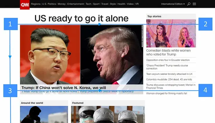
Websites
In the digital age, typography is more important than ever for creating engaging and user-friendly websites.
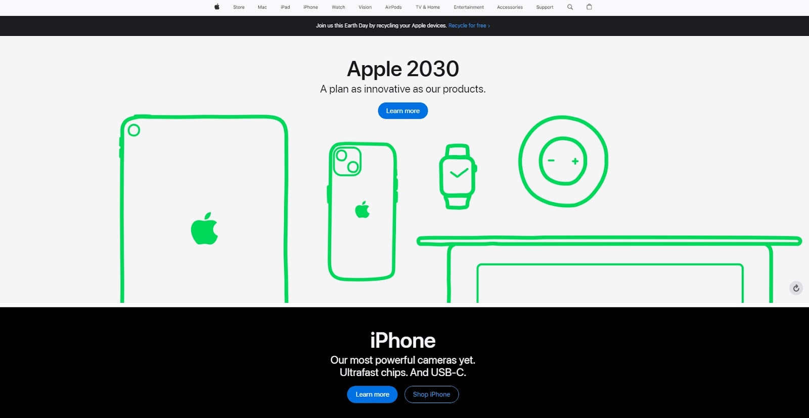
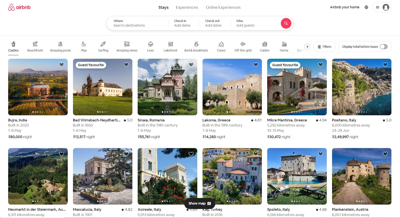
Companies like Apple and Airbnb understand the power of typography in shaping the online experience. Apple's website is a masterclass in minimalist design, with clean, spacious typography that lets the products speak for themselves.
Airbnb, on the other hand, uses a friendly sans serif font and playful illustrations to create a welcoming atmosphere for users.
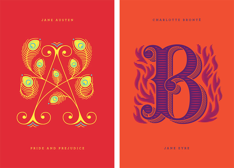
Illustrations and artwork
Typography isn't confined to words on a page; it can also be used as a visual element in illustrations and artwork to enhance storytelling and evoke emotions.
Artists like Jessica Hische and Seb Lester are renowned for their typographic illustrations, which blend lettering and imagery seamlessly to create stunning visual narratives.
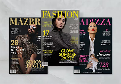
Print designs
From magazine layouts to brochures and posters, print designers rely on typography to convey information and captivate audiences.
Magazine covers often feature bold, eye-catching headlines set in display fonts to grab readers' attention, while body text is typically set in legible serif or sans serif fonts for easy reading.
How does typography impact design?
Now that we've explored how typographical designs are used in various design contexts let's delve into their broader impact on design typography as a whole.
Readability and accessibility
Good typography isn't just about aesthetics; it's also about ensuring that content is readable and accessible to all users. Proper font choice, size, and spacing can greatly improve readability, especially for visually impaired users.
Branding and consistency
Designing with typography helps you build a strong, consistent, and recognizable brand identity. By using consistent fonts across all brand touchpoints, from logos to marketing materials, companies can reinforce their brand values and create a cohesive brand experience for customers.
Emotional tone
Typography can evoke specific emotions and attitudes through font choice and styling. For example, a sleek, modern font might convey professionalism and efficiency, while a handwritten font might evoke a sense of warmth and authenticity.
Visual hierarchy
Effective use of typography can guide users' attention and create a clear visual hierarchy within a design. By varying font size, weight, and color, designers can emphasize important information and lead users through the content logically and intuitively.
Conclusion
In this article, we learned about typography's different types, terms, and anatomy. We also learned how does typography impact design and various applications of typography in graphic design.
Typography is the art that shapes how we perceive and interact with the world around us. By understanding the principles of design typography and experimenting with different fonts and styles, designers can create visually appealing and engaging experiences that resonate with audiences on a deep and emotional level.
However, if you still need help with typography design, you can book a free demo call with ManyPixels and let our expert graphic designers help you out.
.jpg)
Rohit is a novelist (not a NY Times Bestseller!), an avid reader, a passionate content writer, and does YouTube on the side as a hobby! When he is not researching and writing content, he loves to read books and watch movies, TV shows, and anime.
A design solution you will love
Fast & Reliable
Fixed Monthly Rate
Flexible & Scalable
Pro Designers


.jpg)