Best Website Fonts
TABLE OF CONTENTS

A font can make or break a website design. Not just website design, fonts are essential pieces of design that, when done poorly can throw off the entire thing. It seems paradoxical, but the best website fonts will often fly under the radar. They are an organic part of the design, so much so that they go unnoticed.
Web design is a complex process. There are many visual elements designers should take into account, from color schemes, icons, and branding, to fonts. None of these are choices that should be taken lightly.
However, with fonts, there are a few pointers that will help you discern what are the best fonts for a website.
- Think about the purpose of the website. Good website fonts should always follow the general style of the design. If you’re going for traditional, serif fonts should be the first choice, for example.
- Colors are important. Too much contrast or clashing colors can be jarring, even if the font’s shape is right. Combining fonts can be great for creating a dynamic design. But be careful not to go overboard. Two to three fonts should be the maximum amount. Consider combining heavier and lighter fonts. Heavier, more intricate fonts should be used sparingly, only for headlines and such. The body text should be as simple and easy to read as possible.
{{WEB_BANNER="/dev/components"}}
What is the best font size for a website?
Font size is also crucial in web design. It’s tricky to get right because the website must be usable on various devices that all have different sizes. When choosing a font style for website design you should always take into account the device the font will show up on.
Desktop site font sizes
It’s widely advised that body text font size for a desktop site should be 16-18px. This will help the site be neater and easier to navigate.
Headings for desktop sites should be around 1.96 times bigger than the body text. So if your body text is about 16px, the headings need to be about 31.36, or even 32px.
Subheadings should be bigger than the body text, but slightly smaller than the headings. If you use 32px for the headings, subheadings should be around 27-29px.
Input fields should match the body text as closely as possible.
Mobile site font sizes
Mobile sites are typically more difficult to design because of the limited space. That’s why it’s so important to think about what’s the best font size for a website used on a mobile device.
As with desktop sites, you should aim to have your body text and input fields at about 16px. You can go as low as 14px if you use all caps, or the font you choose is bigger by default.
Headings are where mobile and desktop sites differ. Headings on mobile sites are usually smaller, around 1.3 times larger than the body text. This means if your body text is 16ox, the headings would be around 20 or 21px.
Subheadings look very similar to headings on mobile sites because the difference in sizes tends to be smaller. If the heading is 20px, it’s very easy to confuse it with a subheading that’s 18px.
To avoid this, it’s smarter to have subheadings be italicized or otherwise distinct from the headings.
What are the best fonts for a website?
Below you’ll find a list of 17 cool fonts for websites, from no-nonsense serifs to wacky script fonts. Let’s take a look!
Garamond (Free)
We’ll start with a classic. Garamond is an elegant serif font, with rounded bowls and graceful lines. It’s versatile and can be used both for headings and body text.

Garamond could be a great choice when designing a website for law firms or banks. It projects stability and powerful elegance. Even better for my fellow Brooklyn 99 fans, it has Victor Santiago’s stamp of approval.
Montserrat (Free)
Montserrat is another popular and big family of fonts. It’s a sans-serif typeface font, and it’s very neat and easy to read. This makes it a great choice for body texts.

A lot of websites use it for their body texts, as well as subheadings. Montserrat works wonderfully with different fonts, and it could be a great companion to more flamboyant cursive or typeface fonts. Many designers believe it’s the best font for web design because it’s easy to navigate and scale.
Playfair Display (Free)
Playfair Display is another great serif font that can work for both headings and body text. Its sharp serif points give it a little bit of an edge, but it’s not too aggressive.
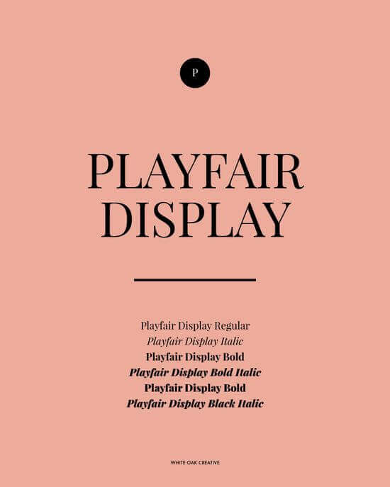
The font features several different weights, making it extremely versatile. It could work well paired with a heavy sans-serif or even another serif font. Playfair Display is a great choice if you’re looking for a font that you can use for various elements of your website design.
Tisa ($65.99 per font)
Tisa is a nice font family, designed by Slovenian designer Mitja Miklavcic in the late 2000s. It is a well-balanced font, which means the stems and bowls of the letters are similar in size and weight.
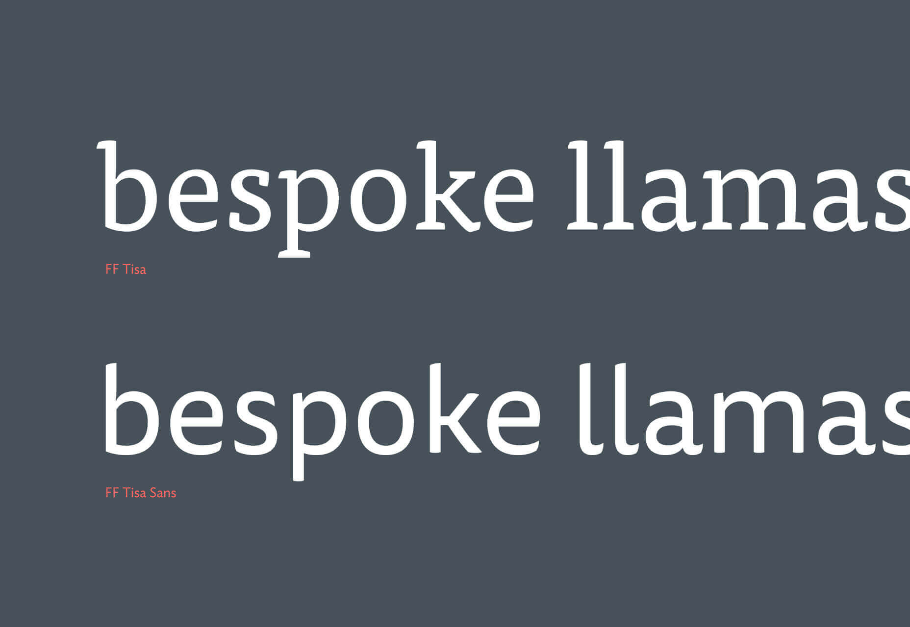
This makes the font look similar to typewriter fonts, so it can be the best font for websites going for a vintage-inspired look.
Alegreya (Free)
Alegreya is a beautiful serif font that evokes the graceful elegance of Greco-roman architecture.

It’s mostly used in publications, and as such it’s not common on the internet. This might be a great thing for web designers, however, as it can give an edge to a website. It’s legible and can be a great option for body text.
Roboto (Free)
Roboto is another popular sans-serif font. It’s common on all sorts of websites because of its legibility and clean lines. It has rounded bowls and thick stems, which make it look sturdy and dependable.
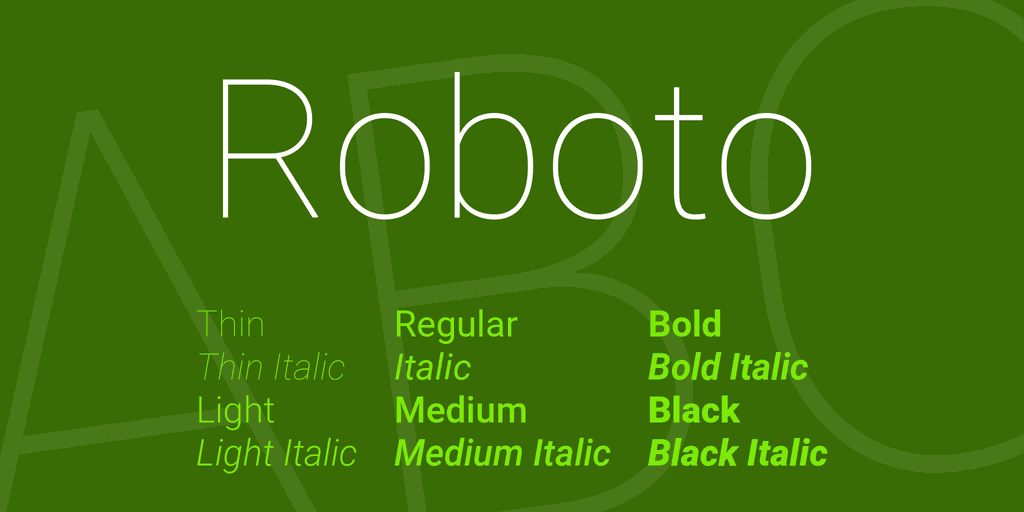
Roboto has a variety of different weights that will suit any design. It pairs well with other sans-serifs and especially well with serifs. It’s one of the best website fonts which will let other design elements shine to their fullest potential.
Begum ($39.00 per font)
Begum is one of my all-time favorite fonts. It’s a wonderful serif font that just oozes sophistication. Its triangular serifs and interchanging thin and thick lines lend it a dynamic look that’s bound to attract attention.
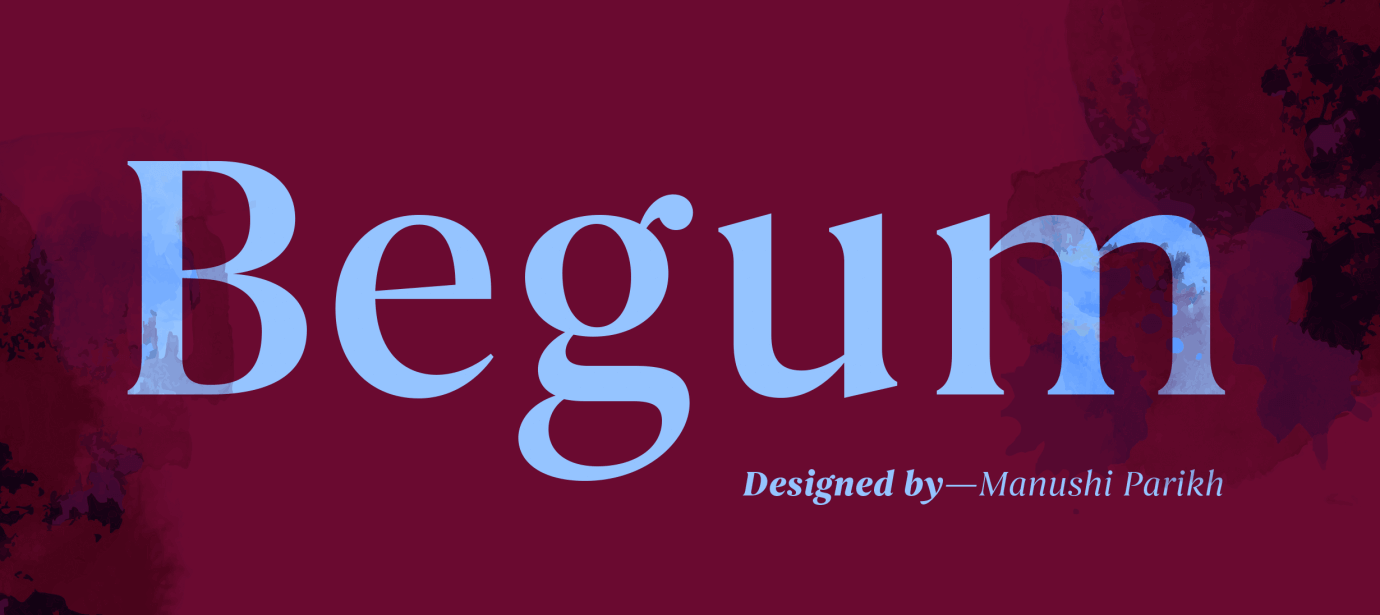
Begum is best used for headings and subheadings, as it tends to be the star of the show. It pairs well with lovely floral and patterned visuals, and it can lend a sense of elegance as well as intrigue to a design.
Palmer Lake ($17.00 for a family of two fonts)
Palmer Lake is a small, but lovely font family. It has a print font and a cursive font that work beautifully together. The fonts are vibrant and have amazing energy.

They can be perfect for headings, as well as website logos and other pieces of online branding. It’s the best font for websites that have a more relaxed vibe. Since it only has two fonts within the family, it’s fairly affordable as well, which is great for smaller companies and startups.
Lato (Free)
Lato is a sans-serif font that you can use for all kinds of web design. It’s an amazing font style for a website because it is legible, yet dynamic with slightly elongated bowls and stems that shift gradually from thick to thin.

Lato is a big font family with many different weights and styles. This means you can find a Lato font for almost any task. It’s one of the most versatile and best website fonts you can find.
Tangerine (Free)
Tangerine is a lovely free script font that can lend a softer look to a design. Script fonts in general are the best fonts for websites for wellness or lifestyle brands (as such it’s also a firm favorite youtuber font).

Tangerine has curved, yet neat lines that can look wonderful in logos or headings. However, with most script fonts, it’s best when used sparingly, so you should opt for a typeface for the body text.
Oregon ($19.00 for a family of two fonts)
This is another small, yet wonderful font family. With its elongated bowls, this typeface font is vintage-inspired and can work beautifully with many types of web design.

It can be the best font for websites that have something to do with crafts or outdoors. It’s a simple, yet eye-catching font that will give your design character and depth.
Didot (Free)
Didot is a great traditional font. It has very thin slab serifs that ground the letters, but they still look light and sophisticated.

Didot can look wonderful on various kinds of websites, it’s timeless and projects traditional elegance. The thin strokes provide a nice transition between the serifs and the thicker strokes.
Baskerville (Free)
This is another free serif font that is considered to be one of the best website fonts. It’s great for both body text and headings. Serif fonts often work best for desktop sites, because of the space desktop sites provide.

But, they can also work for mobile sites, provided web designers take into account the proper spacing for the letters.
Century Gothic (Free)
Century Gothic is a beautiful sans-serif font that has all the elegance of serif fonts with the upsides of sans-serifs.

It’s amazing for body text and subheadings, and it can pair wonderfully well with serif fonts like Didot or Alegreya. Century Gothic has large, rounded bowls and thin stems which make it dynamic, yet easy to read.
Athelas (Free)
This is another beautiful font style for a website that is perfect for body text. The triangular serifs with wide angles provide enough space for each letter to breathe. This helps the users because they have enough time to process what they’ve read.

Athelas, or kingsfoil if you ask Samwise, has an understated beauty that combines well with all kinds of different fonts. For a more modern look, you can opt for a heavy sans-serif, or if you want a softer vibe, consider script fonts for headings.
Battlefin ($140 for a family of 6 fonts)
This beautiful serif font was designed by father and son duo Zoran and Nikola Kostić. It’s an eye-catching serif that is just perfect for headings and subheadings.

Battlefin has playful lines that would look perfect in more vintage-inspired designs. The lighter weights evoke a little bit of art-nouveau and can be a lovely choice for delicate visuals.
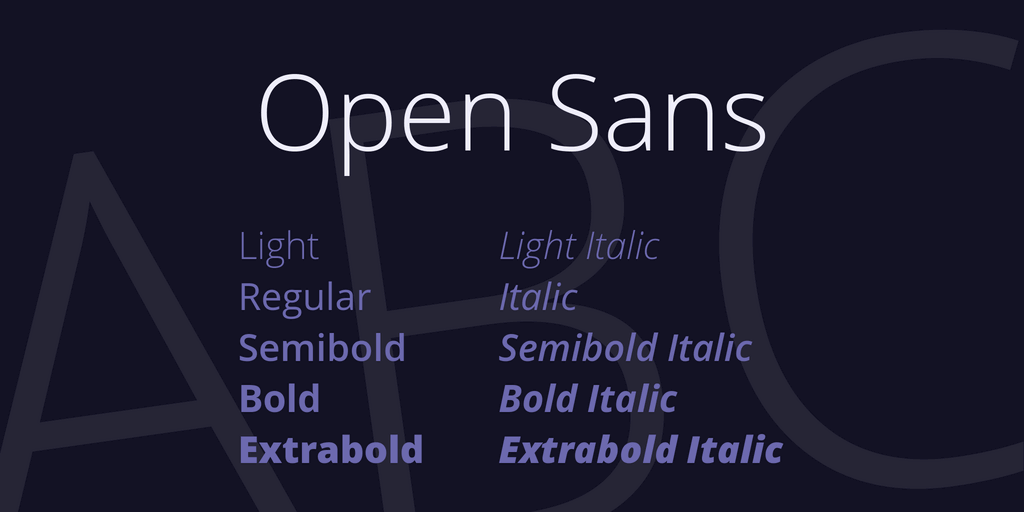
Open Sans (Free)
Open sans is a versatile free font, so it’s no surprise it’s considered to be one of the best fonts for websites.
Conclusion
We hope this list helps you find the best font for your website. But, remember that these are just guidelines. There are thousands of great fonts out there and selecting the right one can be fun.
For more great font ideas, feel free to check out our articles on the best free commercial fonts, as well as our selection of modern serifs and sans serifs.

Top-quality designers
A complete creative team at your fingertips: graphic and web designers, illustrators, and more.

Lightning-fast turnaround
Get start today and receive your first update on the next business day.

All-inclusive pricing
Unlimited requests and revisions. One flat monthly fee. No surprises.

Flexible & scalable model
No contract. Scale up and down as needed. Pause or cancel at anytime.

Continue reading
Explore some of our best designs
Get inspired by a curated selection of ManyPixels work. Download the portfolio to see what our team can create.
