
How to Create Catchy and Engaging CTA Button Design

TABLE OF CONTENTS


Imagine spending hours creating a marketing plan, only to have customers leave your site without clicking your CTA button.
You've done everything you can to make your CTA copy action-oriented and personalized, but still, it's not enough.
That begs the question: could your CTA button design be the problem?
In this article, we’ll explore some best practices to help you create compelling CTA buttons that inspire action from your audience along with some of the best call-to-action examples to help spark ideas as you create your own.
- What is a CTA Button?
- Why are CTA buttons important?
- Best CTA practices to follow
- Designing effective call-to-action buttons
What is a CTA button?
A call-to-action (CTA) button is a visual element that entices visitors to take the desired action, such as signing up for a webinar, joining an email list, proceeding to checkout for a limited time offer, or following a social media page.
CTA buttons are important for marketing success as they help prospects complete a section of the buyer's journey.
While every buyer's journey is unique, CTA buttons are the signposts that guide your audience toward their interests as potential customers.
Why are CTA buttons important?
CTA buttons play a critical role in marketing campaigns for two reasons:
- They act as signposts guiding users through the site.
- They compel visitors to take action.
In other words, the importance of a CTA button is to create a good user experience and help you achieve your business goals (e.g. acquiring leads, increasing sales, improving website traffic, etc.)
{{WEBSITES_PORTFOLIO="/dev/components"}}
If you want me to be even more blunt, let me put it this way. Without a great CTA button design, your business won’t succeed online.
So, without further ado, let’s learn how to create a CTA button that does its job.
Best CTA practices to follow
When designing a CTA button, there are certain guidelines to follow to be as eye-catching and engaging as possible. Here are some best practices to keep in mind.
1. Emphasize contrast
Emphasizing contrast is important because it helps your buttons stand out from the rest of your website design and content. Your readers won’t click a button they don’t notice.
Use contrasting colors, shapes, sizes, and fonts that are different from your background and other elements on your page. That naturally draws your users’ attention to your buttons and prompts them to take the desired action.
Check out this CTA button from Huemor.
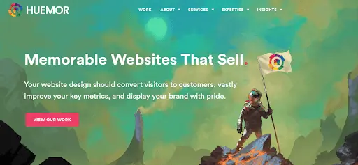
As you’ll notice, the webpage uses bold colors, text, and art. However, the button still stands out because its pink color creates a stark contrast with the light green background.
2. Use negative space
Creating negative space (also called white space) around your CTA buttons is important because it helps you:
- Make your buttons more visible and attractive. Negative space creates a contrast between your CTA button design and the rest of your page elements, making the buttons stand out and catch your visitors’ eyes.
- Reduce clutter and distraction. Negative space helps you avoid overcrowding your page with too many elements, which would confuse and overwhelm your visitors. By creating some breathing room, you make your CTA button UI design more focused and user-friendly.
- Improve readability and usability. Negative space improves the legibility of your button text and the “clickability” of your button’s shape. In other words, by providing ample space around the letters and the button, you make sure your visitors can easily read and click on your buttons.
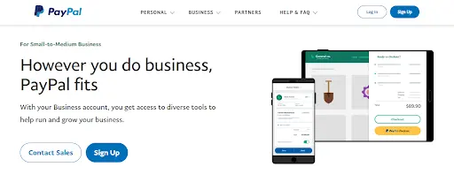
PayPal, for example, does an excellent job of using negative space on its signup page; its CTA button stands out.
3. Make your CTA text easy to read
Users are more likely to skim over text instead of reading every word. If your CTA copy isn’t eye-catching and legible, visitors are likely to miss it and go somewhere else.
Make sure your CTA copy conveys a clear and compelling message. A good call to action shouldn’t be too small, fancy, or too complex. Create visual hierarchy to help your CTA copy sink in (knowing how to choose the best website fonts can help).
Canva uses this approach well on its homepage.
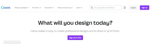
Notice how this button uses a font that’s easy to read. Canva also uses a visual hierarchy through varying colors and sizes with other text elements on the page.
4. Use vibrant colors
Everyone has their favorite color, but it’s best to use vibrant colors for your CTA buttons. Why? Because they’re more noticeable and appealing than dull or pale colors. Vibrant colors also help create the necessary contrast needed in effective CTA button UI design
Choosing a more vibrant color can also help the copy on your CTA button helps with creating a sense of urgency that draws in users.
A button color A/B test using the same landing page by HubSpot showed just as much, where a red CTA received 21% more clicks than a green one.
That’s not to say green can’t be a vibrant color. But as shown below, there were more green-colored elements throughout the page, making the red stand out more.

Another example of bright colors and contrast are the CTA buttons on Wix’s website.
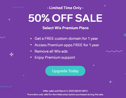
As you can see, the CTA button's turquoise color and white text help it stick out against the page’s purple backdrop.
5. Use size differences to create more contrast
Using size is an effective way to create a visual hierarchy on the webpage.
Make your call to action button design more prominent than other elements on your page. The trick is to use a bigger (or smaller for softer CTAs) button to convey a stark contrast to the rest of the page’s visual elements. That breaks any monotony, which draws attention.
That said, be careful not to make your button too big that it becomes obnoxious. Too small, on the other hand, and it becomes hard to see or click. Always remember that the goal is making the CTA button design the page's focal point.
On Readwise's homepage, the CTA button differs in size from the header and subheader, so it stands out.

6. Use fewer words
The best CTA button design usually involves as few words as possible. The words “Just Do It” are iconic, not just because they aren't just simple, powerful, and memorable. The short text also has a visual impact that conveys confidence and authority.
Besides, making users read a lot of text only adds to their cognitive load as they interact with your webpage. Remember, you have your website visitors’ attention only for a limited time. Don’t ramble, but use action phrases like “buy now,” “book now,” or “add to cart.”
Lyft has a couple of great CTA button examples. The start contast in color helps to distinguish the two actions, but they also made the copy work really well in both cases with two distinct actions "apply" and "sign up".

7. Mind your CTA button placement
Placement affects how visible and accessible your CTA button is. If the Brafton case study is any indication, placing your CTA button in a prominent and logical position can increase your blog post’s revenue by 83%.
Putting your CTA button above the fold (immediately visible without scrolling down the web page) is generally considered the best practice.
Placement also affects how appealing and persuasive your CTA button is. For example, you’ll never see newsletter sign-up buttons at the top of a blog post. Instead, they’ll be placed at the bottom, so that readers get an idea of what kind of content they’ll be signing up for.
On the other hand, CTA buttons on most landing pages should come sooner rather than later. Since the point of an effective landing page is for visitors to take action, you don’t want them to waste time searching for the button.
Here’s a great example of CTA button placement and visual hierarchy in website design. By using a much bigger font for the value proposition, Eyebuydirect grabs attention immediately. The CTA button is conveniently placed below, and doesn’t need to be too big or overwhelming, since the placement already enhances its effectiveness.

8. Stay consistent with your brand
Consistent brand design creates a coherent and recognizable identity for your business.
The best CTA button design involves using consistent colors, shapes, fonts, and copy, to reinforce the brand message and values across significant touchpoints in the customer journey. Honestly, what better time to do this than when a user is taking the next step in your relationship?
Sometimes it’s perfectly fine to deviate from your branding elements when designing CTA buttons; it depends on your goals and context. The best way to learn is to test different variations and measure their performance.
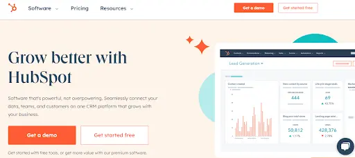
Notice how HubSpot’s orange CTA button design matches the company’s orange logo and secondary CTA strikes a fine balance between consistency and deviation.
Further reading
Your website’s click-through rates (CTR) and conversion rates will dramatically improve once you have the best CTA button design, placed strategically on your web page. If you're at a loss on how to craft effective CTA buttons, use this practical guide as a starting point — and the CTA examples as a source of inspiration.
However, keep in mind that these CTA button best practices are not independent of each other. Each principle is dependent on the other principles, so consider how they interact and work together.
Most importantly, you need to consider the purpose of your CTA button; how does it align with your goals and with your target audience's needs? Spend some time analyzing who your users are and what they expect, then you can ensure your CTA button UI design can help you get results.
Do you need further guidance on creating effective websites? Be sure to check out this article on where to find web design inspiration and this handy list of essential web design rules everyone should know about.
Discover an array of captivating voices and expert insights as our guest writers grace the pages of the Manypixels blog. From seasoned industry veterans to emerging talents, their thought-provoking articles will inspire and inform, enriching your reading experience.

Top-quality designers
A complete creative team at your fingertips: graphic and web designers, illustrators, and more.

Lightning-fast turnaround
Get start today and receive your first update on the next business day.

All-inclusive pricing
Unlimited requests and revisions. One flat monthly fee. No surprises.

Flexible & scalable model
No contract. Scale up and down as needed. Pause or cancel at anytime.
Continue reading
.jpg)
.jpg)
.jpg)
Explore some of our best designs
Get inspired by a curated selection of ManyPixels work. Download the portfolio to see what our team can create.


