

30 Most popular fonts in graphic design (and when to use each one)
TABLE OF CONTENTS


TL;DR
The most popular fonts in graphic design fall into three categories: serif fonts like Garamond, Bodoni, and Times New Roman for editorial and luxury branding; sans serif fonts like Helvetica, Futura, and Gotham for logos, UI, and modern identity work; and script fonts like Lobster and Pacifico for casual, expressive designs. If you only need three for your toolkit, start with Helvetica, Garamond, and Futura. The full 30-font reference below includes designer, origin, and exactly where to use each one.
Introduction
Whether it’s fonts for logos, advertisement design, books, or even web design and digital ads as of late, some popular fonts always make the final picks.
You’d think the reason for that is that they are free or cheap, but the truth is that they are so well-designed, that they tick all the boxes: legibility, versatility, style, class, flexibility for other alphabets, and glyphs. Here are the best of the best fonts.
{{BRAND_BANNER="/dev/components"}}
Popular serif fonts
Serif fonts have an extra decorative stroke at the ends of each letterform, known as the serif or "foot." These strokes create a visual rhythm that guides the eye across a line of text, which is why serif fonts have dominated print for centuries. They're the default choice for editorial design, book publishing, and luxury brand identities, signaling refinement, heritage, and authority.
1. Didot
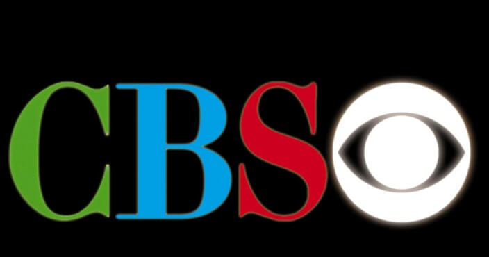
The Didot type family was developed by the Didot printing dynasty in France in the late 18th century, with the most influential version refined by Firmin Didot between 1784 and 1811. Now digitized by Linotype and other foundries, it's defined by extreme contrast between thick and thin strokes, hairline serifs, and vertical axis. Although originally created for print, Didot found its place on a vast number of logos and mastheads, including Harper's Bazaar, Vogue Italia, and the long-running CBS eye typeface. Use it for luxury brand logos, high-fashion editorial, and display headings where elegance is the main objective.
2. Bodoni
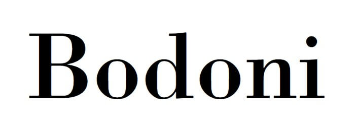
Giambattista Bodoni, a printer and typographer working in Parma, Italy, created this typeface in the 1790s. Often called "The King of Printers," Bodoni produced many typefaces, but none as successful or long-lived as this one. Bodoni is characterized by unbracketed serifs, even geometric styling, and is recognized as one of the first Didone fonts, with a dramatic contrast between wide and narrow strokes. The modern digital version was created by Morris Fuller Benton for American Typefounders between 1907 and 1911. Famous users include Vogue, ZARA, Nirvana, and Burberry (before the 2018 sans-serif rebrand).
3. Baskerville
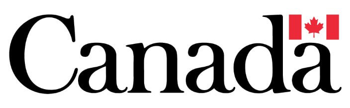
Baskerville was created by John Baskerville in Birmingham, England, in 1754, making it the first major Didone typeface in British typography. Its moderate contrast, generous proportions, and refined letterforms make it more legible than stricter Didone designs. The most widely recognized wordmark using Baskerville is the official Canadian Government logo. Today it is reworked for Adobe Fonts and used primarily as a display typeface and for formal editorial settings. Use it for book typesetting, academic publishing, and government or institutional documents.
4. Garamond
With its first typeface designed by Parisian engraver Claude Garamond in the 1530s, Garamond is one of the oldest typefaces still in regular use. The family grew steadily over five centuries: Apple Garamond modified the original for Mac in 1984, and Monotype Garamond was widely used in Microsoft products throughout the 1990s and 2000s. Its low contrast, open apertures, and elegant proportions make it supremely readable at body sizes. Use it for book printing, long-form editorial, and luxury brand identities. Famous users include Dior, Abercrombie and Fitch, and Google (before their 2015 sans-serif rebrand).

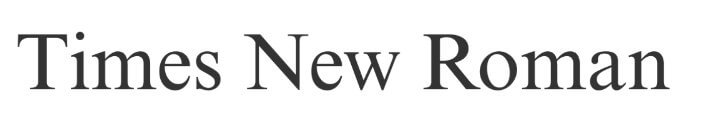
5. Times New Roman
The original Times font was designed for The Times of London by Stanley Morison and Victor Lardent, commissioned in 1931. Its key design goals were a high x-height, short descenders, and tight line spacing, so that newspaper columns could fit more text in less space. Microsoft adopted it as a default system font, acquainting it with the rest of the world. It is an OpenType font (OTF), freely licensed and open for redesigning. Use it for formal documents, legal and academic papers, and any context requiring authoritative, well-established serif type.
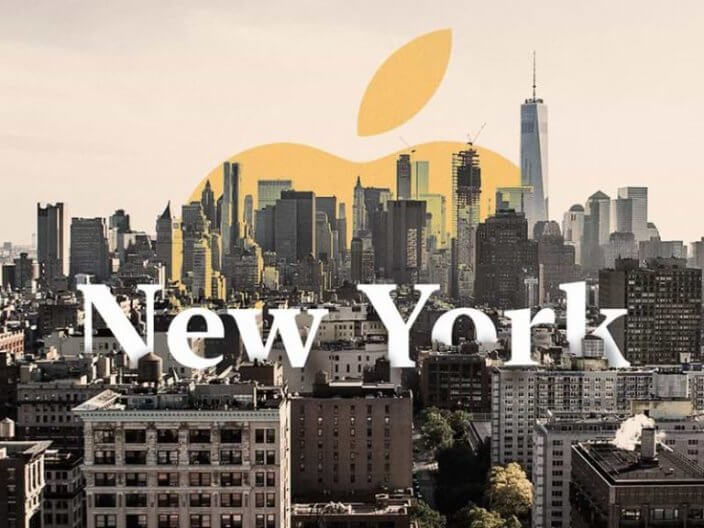
6. New York
New York was originally designed by Susan Kare for the 1984 Apple Macintosh release. Apple revived and substantially reworked it in 2019 as a modern serif companion to their San Francisco sans-serif typeface, and made the updated version free to download. It retains a retro and nostalgic feel while performing cleanly on Retina displays. Use it for Apple-platform publishing, editorial design with a nostalgic tone, and UI contexts where a serif needs to pair with San Francisco.
7. ITC Lubalin Graph
This slab serif font is designed by one of the most famous graphic designers of all time, especially when it comes to type design, Herb Lubalin. A slab serif font has big “shoes” at the ends of letters. This precise font’s underlying forms are those of Lubalin's previously released ITC Avant Garde Gothic, but its shapes were modified to accommodate large slab serifs.

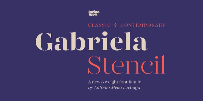
8. Gabriela Stencil
Published by Latinotype, the Chilean type foundry, Gabriela Stencil is one of the newer entries on this list. It is available through MyFonts and merges retro aesthetics with vibrant, urban energy in a way that's unusual in the serif category. The stencil construction adds a tactile, industrial quality to an otherwise classical letterform structure. Use it for branding that needs a distinctive visual edge, poster design, and display headings where generic choices would blend in.
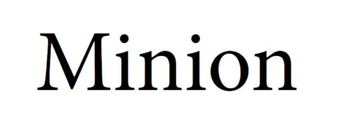
9. Minion
Minion was published as an Adobe Original in 1990, designed by Robert Slimbach. Slimbach drew inspiration from late-Renaissance typography, aiming to create a typeface suited to body text and extended reading. Available through Adobe Fonts, Minion is slightly condensed with large apertures and open counters to increase readability at small sizes. It remains one of the publishing industry's most-used typefaces for books and academic texts. Use it for body copy, long-form editorial, and any project where the text needs to carry readers across hundreds of pages without fatigue.
10. Georgia
Georgia was designed by Matthew Carter for Microsoft in 1993 and released in 1996. It was inspired by Scotch Roman typefaces of the 19th century and engineered specifically for legibility on low-resolution screens, with a high x-height, open apertures, and strong stroke contrast. The name was chosen somewhat informally, referencing a tabloid headline ("Alien heads found in Georgia"). Now available on Google Fonts. Use it for web body copy, digital editorial, and any context where a serif font needs to hold up on screen at small sizes. Famous digital users include The New York Times and The Guardian.

Popular sans serif fonts
Sans serif fonts remove the decorative strokes entirely, which makes them cleaner, more legible at small sizes, and more consistent on screens. That's why they've become the dominant choice in logo design, UI and UX, and digital branding. The most popular sans serifs, from Helvetica to Gotham, are versatile enough to use across nearly every type of project without becoming a liability.
11. Helvetica
Helvetica is, by most measures, the most popular and widely used font in the world. Designed in 1957 by Max Miedinger and Eduard Hoffmann for the Haas Type Foundry in Switzerland, it was originally called Neue Haas Grotesk before being renamed Helvetica in 1960, an adaptation of Helvetia (the Latin name for Switzerland). The family contains 22 different fonts across weights and widths. Its clean shapes, neutral character, and crisp legibility make it work in almost any context. Famous users: BMW, 3M, American Apparel, Jeep, Panasonic, Target, Fendi, Nestle, and American Airlines, among hundreds of others.

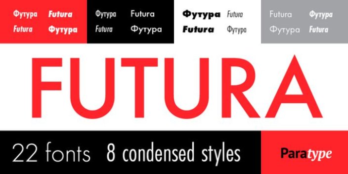
12. Futura
Futura was designed by Paul Renner and released in 1927 by the Bauer type foundry in Germany. It is a typeface built directly from the Bauhaus movement, based on stark geometric forms: the circle, triangle, and square. Its vast collection of symbols supports multiple languages including Cyrillic, which made it a widely adopted typeface in Slavic-speaking countries. Use it for modern and geometric branding, fashion campaigns, film titles, and advertising. Famous users: IKEA (historically), Nike campaign type, Absolut Vodka, Louis Vuitton, Red Bull, Calvin Klein, and Supreme. Wes Anderson uses Futura in nearly every film he makes.
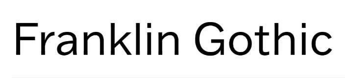
13. Franklin Gothic
Franklin Gothic is a sans serif typeface published by American Type Founders (ATF) in 1902 under head designer Morris Fuller Benton. At the time, "Gothic" was an American term meaning sans-serif. Franklin Gothic is most known for its use in industrial design, and became one of the most widely used ATF typefaces of the 20th century, appearing in newspapers, magazines, and advertising as a headline typeface. An open-source version, Libre Franklin, is available free on Google Fonts. Use it for newspaper headlines, advertising layouts, and industrial or editorial branding with a bold, no-nonsense character.
14. Avenir
Adrian Frutiger designed Avenir for Linotype, releasing it in 1988. "Avenir" is French for "future," and the typeface takes direct inspiration from the geometric sans serifs of the early 20th century while adding humanist warmth. Frutiger described it as his finest work: "My personality is stamped upon it." It merges the precision of Futura with a more approachable character, and it's available through Adobe Fonts. Famous users: LG Electronics, Japan Airlines, the City of Amsterdam, and Scottish Water. Use it for branding that needs to feel modern and rigorous without being cold.

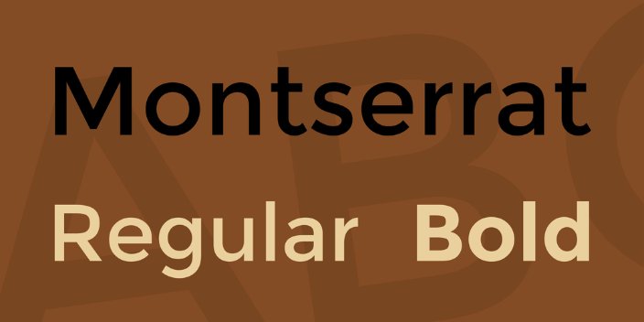
15. Montserrat
Montserrat's backstory is deeply rooted in architecture. constructure and urban design. It was created by Julieta Ulanovsky in 2011, inspired by the typographic signage and building lettering of the Buenos Aires neighborhood of the same name. Free on Google Fonts. The font has two sister families: Montserrat Alternates (with distinctive alternative letterforms) and Subrayada (underlined). It is consistently one of the most downloaded typefaces on Google Fonts. Use it for web design, app UI, modern brand identities, and social media graphics.
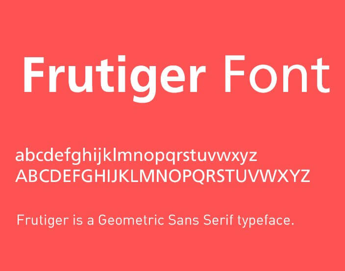
16. Frutiger
Frutiger was designed by Adrian Frutiger between 1975 and 1977, originally commissioned for the wayfinding system at Charles de Gaulle Airport in Paris. It is a humanist sans serif, meaning the letterforms are rooted in calligraphic tradition rather than pure geometry. Type designer Steve Matteson described it as "the greatest preference for legibility in quite considerably any situation." It also has a companion serif version. Use it for signage, wayfinding systems, pharmaceutical labeling, public institutions, and any context where text must be read accurately at distance or at small sizes.
17. News Gothic
News Gothic is similar to Franklin Gothic but lighter in weight, and is a separate design by the same ATF designer, Morris Fuller Benton, released in 1908. During a significant portion of the 20th century, News Gothic was used primarily in newspapers and magazines and on Intertype hot-metal typesetting machines. Its slightly condensed proportions allowed for efficient column typesetting without sacrificing legibility. Use it for newspaper and magazine design, journalistic publications, and editorial headers where you want a classic 20th-century print feel.
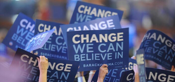
18. Gotham
Gotham is a geometric sans serif designed by Tobias Frere-Jones for Hoefler and Co. in 2000. The letterforms were drawn from the architecture and vernacular signage of mid-20th-century New York City: building directories, awning lettering, and transit graphics. The typeface became globally recognizable through the 2008 Obama presidential campaign, which used it across all campaign materials. Famous users: Discovery channel, Taco Bell, Saturday Night Live, and New York City institutional design. Use it for corporate branding, political and civic campaigns, and American institutional identity.
19. Gilroy
Gilroy was designed by Radomir Tinkov and released in 2016. It is a modern geometric sans serif with strong OpenType features: each weight supports a wide range of languages including Cyrillic, plus fractions, tabular figures, arrows, and ligatures. Available in weights from thin to extra-bold. Gilroy gained wide adoption quickly as a webfont, particularly for headers and display text in digital products, SaaS brands, and editorial sites. Use it for web design headers, digital product UI, and corporate communications where you need a clean geometric sans with serious multilingual support.
20. Univers
Univers is a neo-grotesque sans serif designed by Adrian Frutiger and released by Deberny and Peignot in 1957. It was one of the first typeface families to use a systematic numbering scheme for all weights and widths, which allowed documents to be set entirely in one consistent typeface family. Later licensed by Monotype, Linotype, IBM, and American Type Founders. Famous users: eBay, UNICEF, Walt Disney World road system, and Audi instrument panels. Use it for corporate identity, industrial design, signage, and publishing where you need a versatile, highly controlled sans-serif system.
Popular script fonts
Script and handwriting fonts bring warmth and personality that serif and sans serif fonts rarely match. The trade-off is legibility: most script fonts work best at larger display sizes, not in body text. Use them for headings, logos, packaging, and social media graphics where you want to stand out with a human, handcrafted feel. The ten fonts below are among the most widely used scripts in digital design today.
21. Lobster
Lobster was designed by Pablo Impallari and released on Google Fonts in 2010, where it has been downloaded hundreds of millions of times, making it one of the most popular fonts on the platform. It's known for its contextual alternates, which automatically switch letterforms to avoid awkward connections between certain letter combinations. The result is a flowing, legible script with more polish than most free options. Use it for food and beverage branding, casual website headers, and lifestyle brands. Note: Lobster's popularity means it can feel overexposed in some markets; treat it as a benchmark for script legibility rather than a unique choice.

22. Grape Nuts
Grape Nuts is a casual, flowing script available free on Google Fonts. The letterforms sit between connected cursive and loose print script, giving it a handwritten feel that's relaxed without feeling childish. It handles informal use cases well without the overexposure of more popular scripts. Use it for casual social media headings, lifestyle and wellness brands that want approachability, and any project where a handwritten tone is the goal but Lobster feels like the wrong register.

23. Allura
Allura is an elegant connected script by Rob Leuschke of TypeSETit, available free on Google Fonts. Its consistent stroke weight and clean letterforms make it more refined than most free script options: it reads more like calligraphy than casual handwriting. It is best suited to display sizes rather than body text. Use it in beauty and wellness brand logos, wedding stationery, flyers, and spa or hospitality design where elegance is the primary signal.

24. Serendipity
Serendipity is a monoline script typeface available through Befonts. Unlike the Google Fonts entries in this list, it requires a commercial license for brand or commercial use. The monoline construction, where strokes are consistent in weight rather than varying between thick and thin, gives it a more modern, controlled feel than traditional calligraphic scripts. Use it for premium brand logos, luxury product packaging, and boutique brand identities where the investment in a less common typeface pays off in differentiation.

25. Pacifico
Pacifico was designed by Vernon Adams and released in 2011. It draws from 1950s American surf culture lettering, with rounded forms and generous curves. It's a strong alternative to Lobster, which has earned a reputation for being overused. Pacifico is slightly less legible at small sizes, so it works best at display scale. Free on Google Fonts. Use it for casual lifestyle branding, beach and outdoor brands, retro-themed designs, and social media headers where you want something warmer and more distinctive than Lobster.

26. Alex Brush
Brush fonts make excellent display and heading fonts, and Alex Brush is one of the better-designed free options. It was created by Rob Leuschke of TypeSETit in 2011 and is available free on Google Fonts. The slight taper in the strokes gives it a calligraphic quality that holds up well in print. Connected letterforms keep it flowing and legible at heading sizes. Use it for product packaging, business cards, signage, and any application in feminine or artisan branding where you need a brush script that won't look cheap.

27. Rock Salt
Rock Salt was designed by Font Diner and released on Google Fonts in 2010. It does bear a superficial resemblance to Papyrus, whose reputation was memorably ended by a hilarious SNL sketch. But used in the right context, Rock Salt's rough, textured letterforms, which simulate marker or chalk-on-blackboard writing, bring a raw, handmade quality that cleaner scripts can't replicate. Use it sparingly: best for grungy or craft branding, chalkboard-style menus, and independent brand aesthetics where polish would feel false. Not suitable for body text at any size.

28. Croissant
Designed by Eduardo Tunni and free on Google Fonts, Croissant is a display script inspired by Parisian hand-painted signage. Its ornate letterforms and decorative flourishes give it an unmistakably French character that's well-suited to hospitality, food, and lifestyle branding. Best used at large display sizes where the detail in the letterforms is visible. Use it for French-themed restaurants and cafes, boutique hospitality branding, creative YouTube thumbnails, and playful headings where you want European flair.

29. Amita
Amita, also designed by Eduardo Tunni, draws from both Devanagari calligraphic tradition and Latin letterforms, resulting in a script with an unusual structure compared to purely Latin scripts. It's available free on Google Fonts. The letterforms are legible enough for short headings but too stylized for extended body text. Use it for cultural brand identities, editorial display type, and decorative headings where you want a sophisticated handwritten quality with a distinctly non-Western influence.

30. Cookie
This popular script by Ania Kruk is as sweet as it sounds. Cookie is free on Google Fonts and features retro brush script letterforms with calligraphic touches. The warm, personal quality of the letterforms works well across brand touchpoints that need a handmade feel without looking rough. It has a slight retro vibe that pairs naturally with vintage-style design. Use it for bakery and food branding, lifestyle and wellness headings, greeting card typography, and any design where a personal handwritten quality is the goal.

FAQ: Popular fonts

Journalist turned content writer. Based in North Macedonia, aiming to be a digital nomad. Always loved to write, and found my perfect job writing about graphic design, art and creativity. A self-proclaimed film connoisseur, cook and nerd in disguise.

Top-quality designers
A complete creative team at your fingertips: graphic and web designers, illustrators, and more.

Lightning-fast turnaround
Get start today and receive your first update on the next business day.

All-inclusive pricing
Unlimited requests and revisions. One flat monthly fee. No surprises.

Flexible & scalable model
No contract. Scale up and down as needed. Pause or cancel at anytime.
Continue reading

Explore some of our best designs
Get inspired by a curated selection of ManyPixels work. Download the portfolio to see what our team can create.


