
40 best logo fonts for 2026, sorted by brand style
TABLE OF CONTENTS
TL;DR
The best logo fonts in 2026 are the ones that hold their character at 16 pixels and come with a licence you can keep. Futura PT, Didot, Satoshi and Bodoni Moda cover most brand styles, and 26 of the 40 fonts below are free for commercial use, including in a logo.
- ✅ Safest all-rounder: Futura PT (paid) or its free cousin League Spartan. Geometric, readable at any size, already proven by FedEx and Supreme.
- 🎨 Fonts that look like logos on their own: Bungee, Shrikhand, Clash Display, Recoleta, Cooper Black and Futura PT. One word set in any of them already reads as a wordmark.
- 💰 Best free picks: Satoshi and Clash Display (Fontshare), Bodoni Moda, Montserrat and Alfa Slab One (Google Fonts). All 26 free fonts here allow commercial logo use.
- ⚠️ Check before you commit: Helvetica, Proxima Nova, Futura and Circular are paid fonts, even though plenty of download sites list them as free.
- ❌ Skip: Lobster and Great Vibes for anything that has to look premium. They're good fonts, but so many small brands use them that your logo will look like someone else's.
Most lists of logo fonts are built from what looks good in a preview window. That's the wrong test. A logo font has to survive a favicon, a one-colour stamp, an embroidered polo and a black-and-white invoice, and it has to come with a licence that lets you keep using it after the brand grows.
So every font on this list was checked against two things: how it holds up when the logo gets small, and what its licence actually says. We confirmed each free font's licence at its source (Google's own font repository or the foundry page) rather than trusting download sites, which is how the old version of this article ended up calling Helvetica free. It isn't.
The 40 logo fonts below are grouped into six brand styles. If you already know your style, jump to it. If you don't, start with the style table.
{{BRAND_BANNER="/dev/components"}}
What makes a font look like a logo?
A font looks like a logo when one word set in it already feels finished, with no icon or effects added. That usually comes from one signature move (an unusual letter shape, extreme weight, tight spacing or a strong slant) that stays visible when the word shrinks to 16 pixels.
Here's what the fonts in this group have in common:
- One recognisable detail. Cooper Black's soft, swollen serifs. Recoleta's bouncy curves. You notice it in a single letter.
- Personality at heavy weights. Logo-like fonts get more distinctive as they get bolder. Most body fonts just get darker.
- Tight default spacing. Letters sit close enough to read as one shape rather than a row of characters.
- Distinctive capitals. Wordmarks are often set in all caps, so the uppercase has to carry the brand on its own.
- Short-word confidence. They look best with 4 to 10 letters, which is what most brand names are.
Six fonts on this list pass all five tests: Bungee, Shrikhand, Clash Display, Recoleta, Cooper Black and Futura PT. Type your brand name in each of them before you do anything else. If one of them already looks right, you've just saved yourself a lot of custom lettering.
The catch: fonts this distinctive are easy to spot. If you sell in a crowded category, adjust the letter spacing or redraw one letter so the wordmark is yours and not just the font's.
Not sure which side of the serif line you're on? Our guide to serif vs. sans serif fonts explains what each family signals and where it works best.
Vintage and retro logo fonts
Retro fonts borrow from sign painting, packaging and early advertising. They work when your brand has a real reason to feel established. If you launched last month, a "since 1922" look can feel like a costume.
1. Alfa Slab One
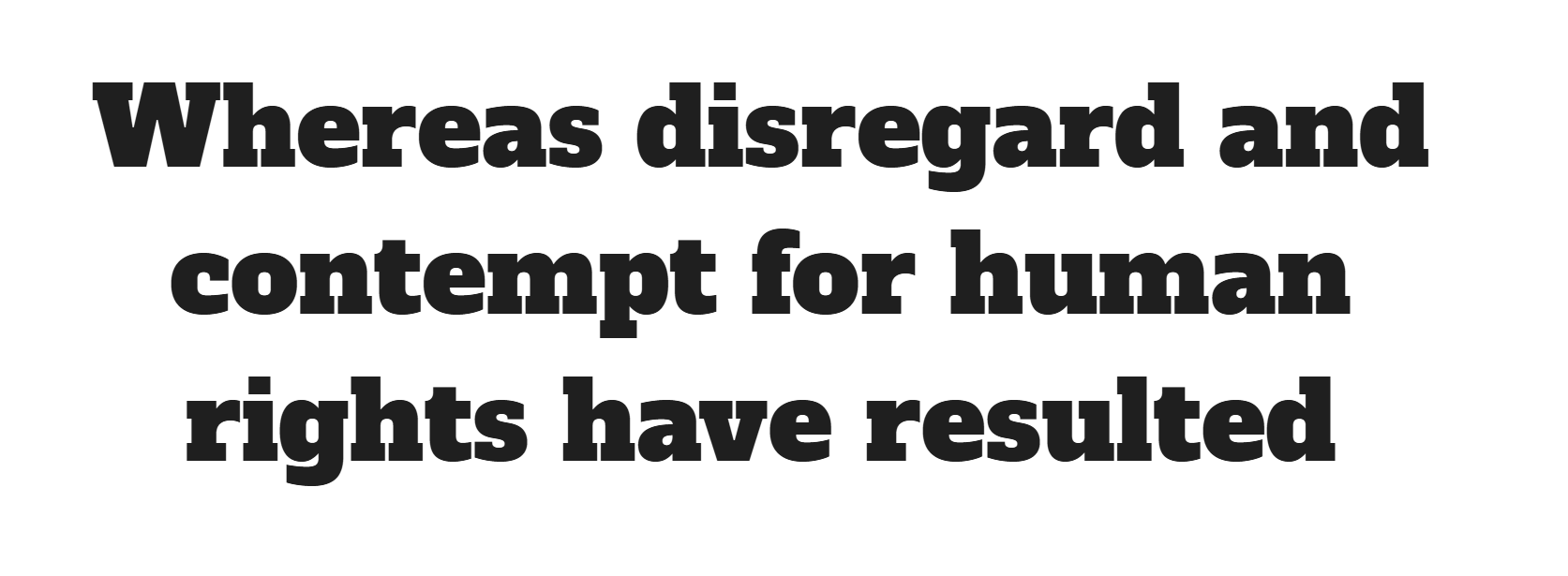
A heavy slab serif by JM Solé with chunky, rectangular serifs that look painted onto a shop window. It's one of the few free slabs that stays legible when set tight. Alfa Slab One is on Google Fonts.
Licence: Free, SIL Open Font License (OFL). Best for: burger joints, breweries, hardware stores.
2. Bungee

David Jonathan Ross designed Bungee for vertical street signs, so it's built to be read from across the road. The square, all-caps letters already look like a sign, which makes it one of the strongest "looks like a logo" fonts on this list.
Licence: Free, OFL. Best for: street food, gaming, event brands.
3. Rye
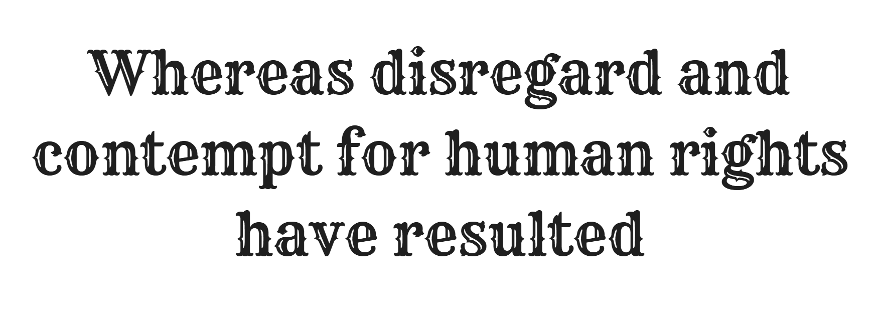
A Wild West poster face by Nicole Fally, with spurs on almost every letter. Rye is loud and narrow in what it suits, but nothing free does saloon-style better.
Licence: Free, OFL. Best for: BBQ, whiskey, western-themed venues.
4. Modesto
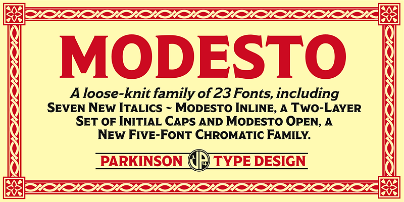
Jim Parkinson drew Modesto from hand-painted circus and sideshow lettering, then cleaned it up so it reads well. It comes in multiple widths, so you can set a tall, condensed wordmark and a wide tagline from one family.
Licence: Paid. Included with Adobe Creative Cloud through Adobe Fonts. Best for: craft drinks, festivals, vintage stores.
5. Sackers Gothic
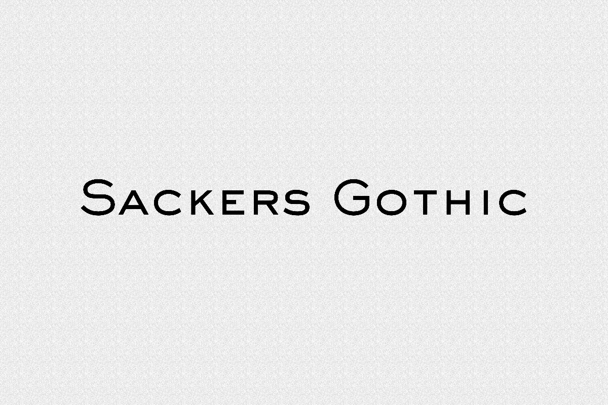
Sackers Gothic is a wide, engraved-looking sans serif from the world of letterpress stationery. Set in small caps with generous letter spacing, it makes a two-word name look like a fine stationer.
Licence: Paid, from Monotype. Best for: stationery, menswear, private clubs.
6. Cooper Black
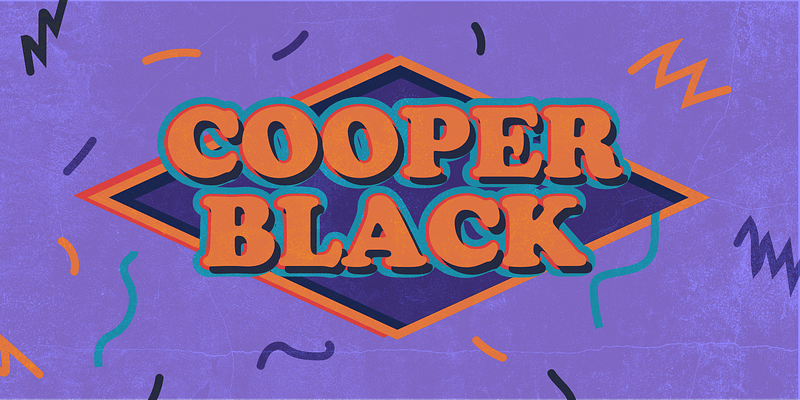
Oswald Cooper released Cooper Black in 1922, and the soft, rounded serifs still read as instantly warm and slightly cheeky. It's a font that looks like a logo straight out of the box. That's also its risk: it's so recognisable that it can read as "1970s album cover" if the rest of the brand doesn't back it up.
Licence: Paid. Included with Adobe Creative Cloud through Adobe Fonts, which clears it for commercial use, logos included.
7. Recoleta
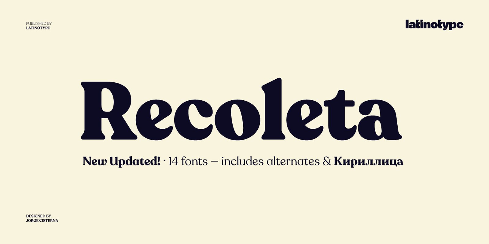
Latinotype's Recoleta takes the 1970s soft-serif mood and makes it current. The curves are bouncy without looking dated, which is why you'll see it on a lot of direct-to-consumer packaging.
Licence: Paid, from Latinotype. Best for: skincare, coffee, lifestyle brands.
For more options in this style, see our list of construction fonts, which covers heavier slab and industrial styles.
Classic serif logo fonts
High-contrast serifs are the default language of luxury and heritage. The thin strokes are the problem: at favicon size, a Didot-style wordmark loses its hairlines first, so always test the smallest version before you choose.
8. Didot
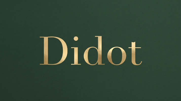
The Didot family of printers developed this style in late-18th-century Paris, and fashion magazines have used it ever since. Linotype Didot, drawn by Adrian Frutiger in 1991, is the version most designers license today.
Licence: Paid, from Linotype. Best for: fashion, jewellery, high-end retail.
9. Bodoni Moda
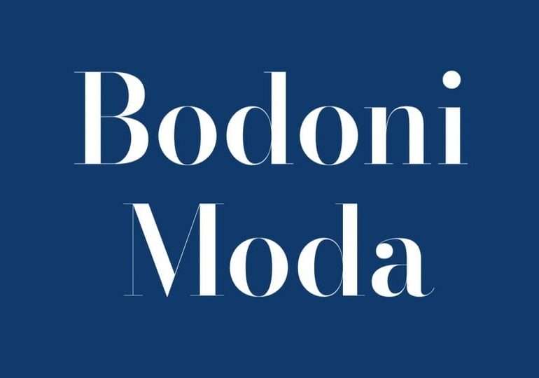
Owen Earl's Bodoni Moda is a free Bodoni with an optical size axis. That means the thin strokes thicken automatically at small sizes, which solves the favicon problem above better than most paid Didones.
Licence: Free, OFL. Best for: boutiques, editorial brands, salons.
10. Playfair Display
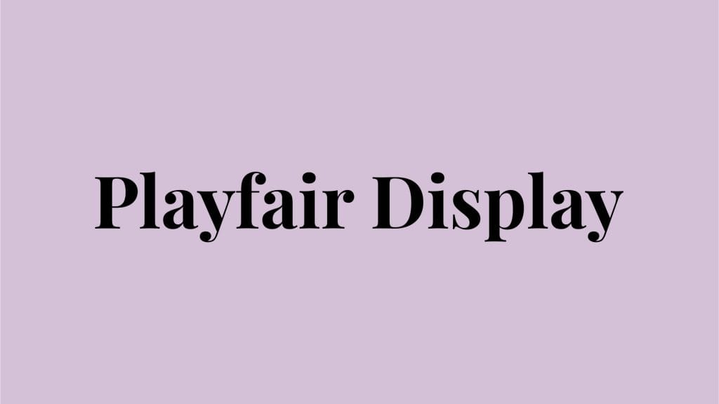
Claus Eggers Sørensen designed Playfair Display for headlines, with sharp contrast and big, round letterforms. It's extremely popular, so use the italic or adjust the spacing to stand apart.
Licence: Free, OFL. Best for: restaurants, wedding planners, interior designers.
11. EB Garamond
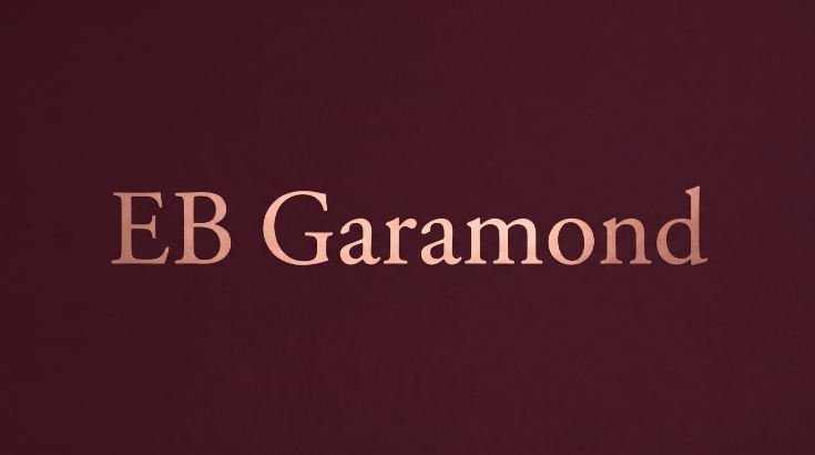
EB Garamond is a free revival of Claude Garamond's 16th-century type. It's calmer than a Didone and reads as literate rather than glamorous. Apple used its own custom Garamond for years, which shows how far a classic serif can stretch.
Licence: Free, OFL. Best for: publishers, universities, consultancies.
12. Libre Baskerville
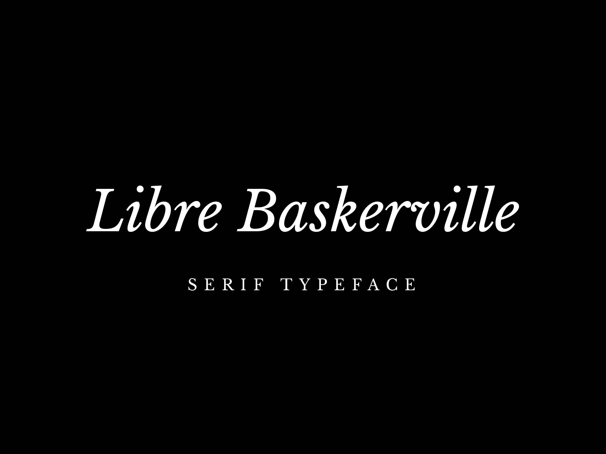
Impallari Type built Libre Baskerville for reading on screen, so it has a taller x-height and sturdier serifs than the original Baskerville. That makes it one of the few classic serifs that still works at small sizes.
Licence: Free, OFL. Best for: law firms, accountants, nonprofits.
13. Abril Fatface
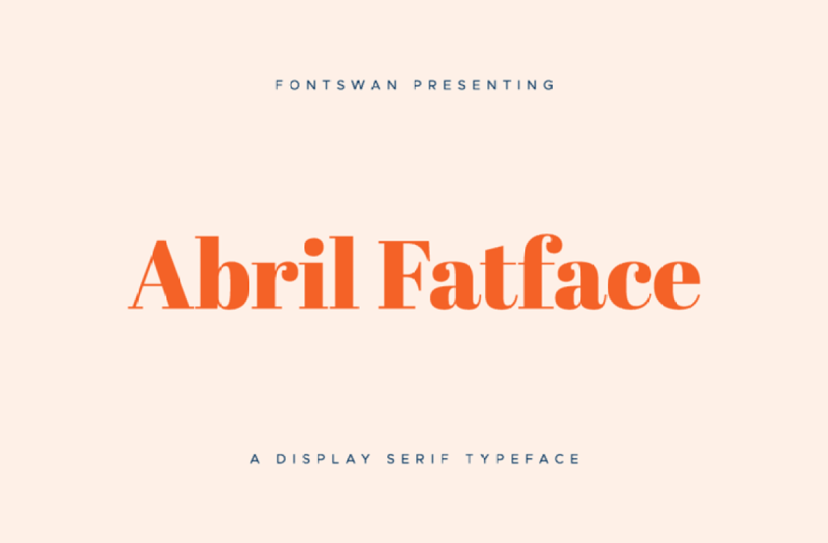
TypeTogether's Abril Fatface is a bold, poster-weight Didone. It has the luxury contrast of Didot with enough weight to survive on a shopping bag.
Licence: Free, OFL. Best for: magazines, beauty brands, event branding.
14. Trajan
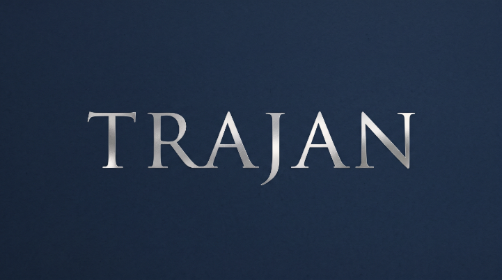
Carol Twombly drew Trajan for Adobe in 1989, based on the inscription on Trajan's Column in Rome. It's all capitals, and it says "permanent" more strongly than almost any other font. Film posters used it so heavily that it can feel generic, so keep it to brands that really need gravitas.
Licence: Paid. Included with Adobe Creative Cloud through Adobe Fonts. Best for: wineries, real estate, institutions.
For more serif options built in the last few years, see our list of modern serif fonts.
Modern sans serif logo fonts
Clean sans serifs are the most common logo style for a reason: they're legible, flexible and easy to pair. The trade-off is that a plain sans serif wordmark gives you very little that's ownable. If you choose this style, plan to customise at least one letter.
15. Helvetica Now
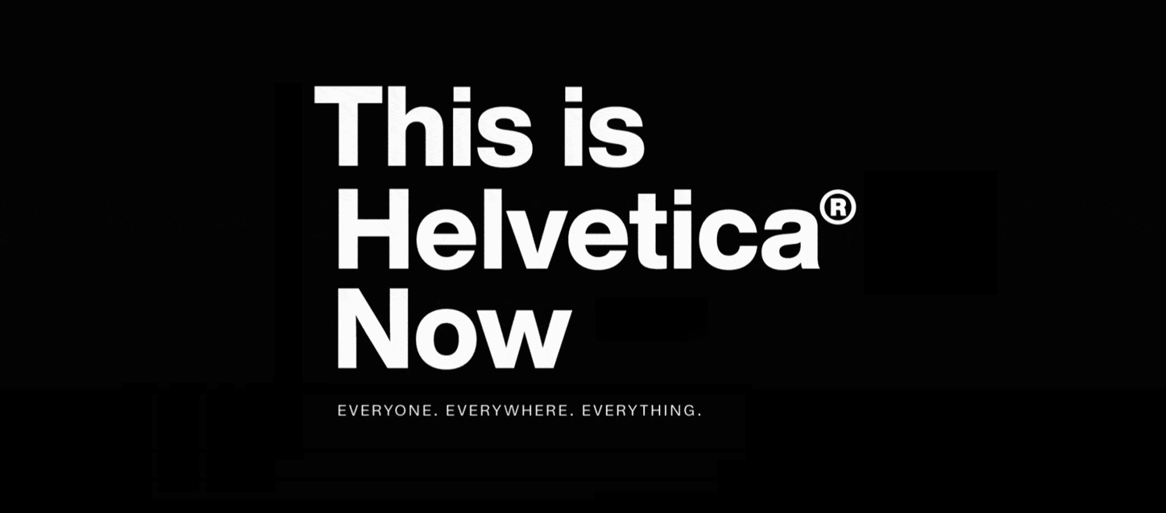
Monotype's 2019 redesign of Helvetica comes in three optical sizes (Micro, Text and Display), so the logo, the website and the small print can all use one family.
Licence: Paid, from Monotype. Helvetica is not free for personal use, whatever download sites say. Best for: corporate, healthcare, finance.
16. Proxima Nova
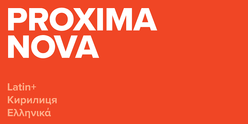
Mark Simonson released Proxima Nova in 2005, blending a geometric skeleton with humanist proportions. It's friendly without being cute, which is why so many websites use it.
Licence: Paid. Also included with Adobe Creative Cloud through Adobe Fonts. Best for: SaaS, media, agencies.
17. Avenir Next
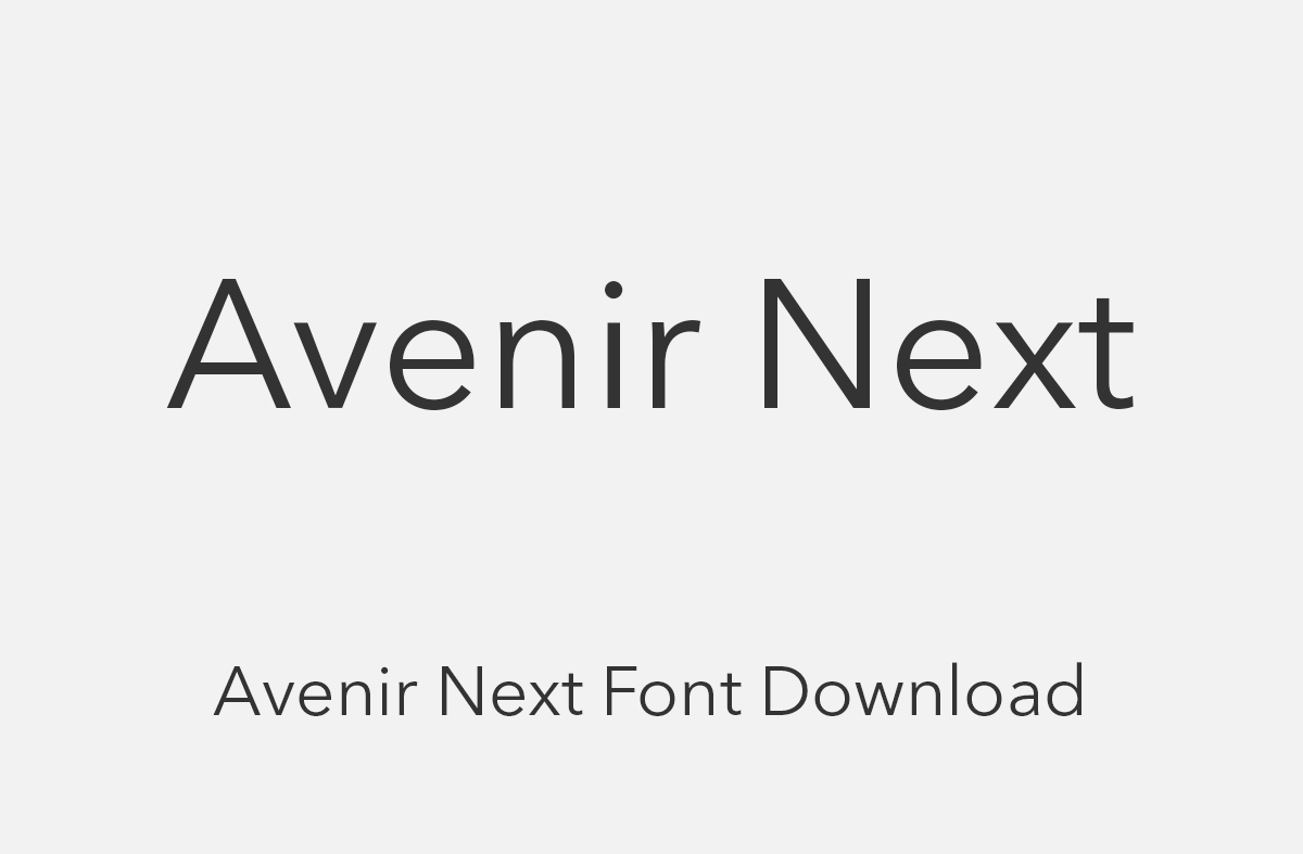
Adrian Frutiger designed the original Avenir in 1988. Avenir Next, a 2004 update with Akira Kobayashi, added the weights and widths a full brand system needs. It's softer than Futura and more refined than most free alternatives.
Licence: Paid, from Linotype. Best for: premium tech, travel, wellness.
18. Montserrat
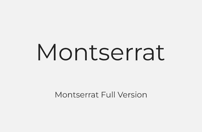
Julieta Ulanovsky drew Montserrat from the old signs of Buenos Aires' Montserrat neighbourhood. Its wide capitals hold up well in all-caps wordmarks, and the family has enough weights to cover the whole brand.
Licence: Free, OFL. Best for: startups, real estate, local services.
19. Satoshi
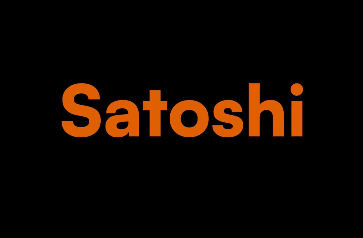
Satoshi, designed by Deni Anggara for Indian Type Foundry, mixes grotesk letterforms with a few geometric ones. It looks like a paid font, and it's free for commercial use. That combination is hard to find.
Licence: Free, ITF Free Font License, which explicitly allows commercial use, logos included. Best for: tech startups, studios, personal brands.
20. Mont
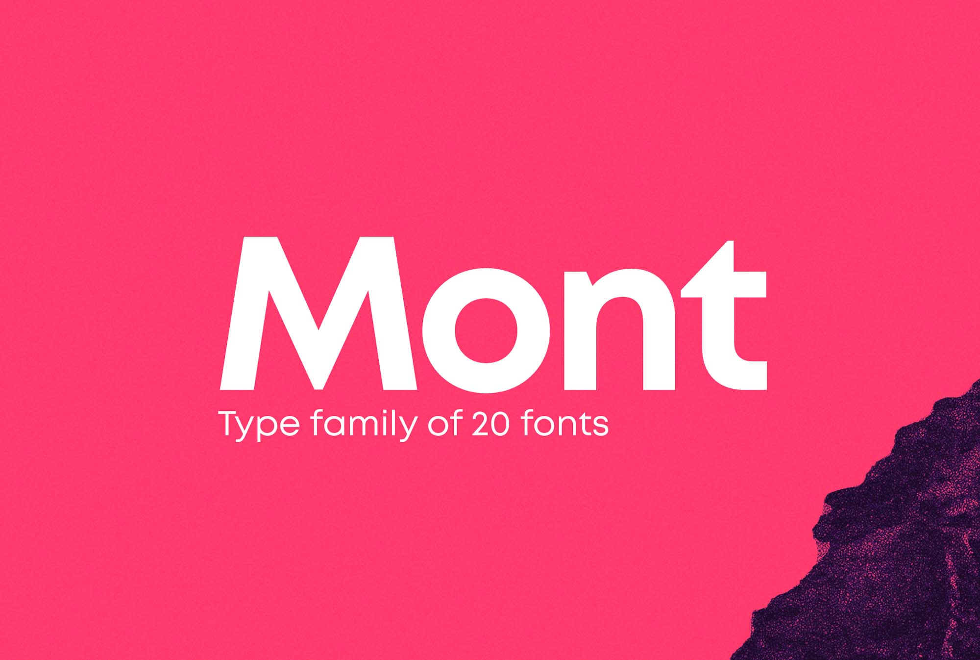
Fontfabric's Mont is a geometric sans with 10 weights and generous spacing, so even the heaviest weight doesn't feel cramped. It's a good choice when the logo needs to sit next to a detailed icon.
Licence: Paid. Fontfabric offers demo weights, but check the demo licence before using one in a logo. Best for: apps, fintech, sports brands.
21. Bebas Neue
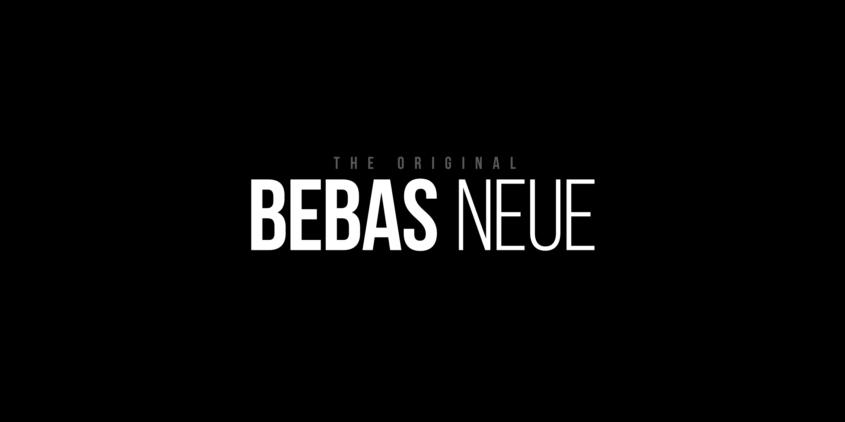
Ryoichi Tsunekawa's Bebas Neue is a tall, all-caps display sans. It's often said to be the Netflix font, but it isn't. It's still one of the most useful free fonts for a condensed, confident wordmark.
Licence: Free, OFL. Best for: YouTube channels, gyms, film and media.
For more options, our list of modern sans serif fonts goes deeper on this style.
Geometric logo fonts
Geometric fonts are built from circles, triangles and straight lines. They look engineered, and they scale well, because simple shapes survive at small sizes better than detailed ones.
22. Futura PT
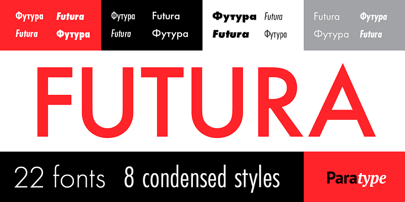
Paul Renner's Futura dates from 1927, and ParaType's Futura PT is the version most designers use today. FedEx combines Futura Bold with Univers, and Supreme's box logo is Futura Heavy Oblique. Few fonts have a longer track record in logos.
Licence: Paid. Included with Adobe Creative Cloud through Adobe Fonts. Best for: fashion, logistics, any brand that wants to look built to last.
23. Circular
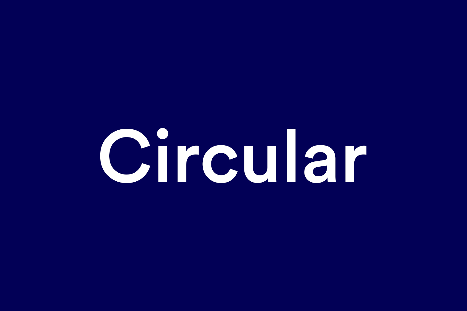
Laurenz Brunner's Circular, published by Lineto, is a geometric sans with a warmer, slightly quirky edge. It became a tech favourite in the 2010s, so in some categories it now reads as a familiar startup look.
Licence: Paid, from Lineto. Not free for personal use. Best for: consumer apps, marketplaces.
24. Poppins
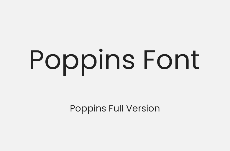
Indian Type Foundry's Poppins is a free geometric sans with near-perfect circular bowls and support for Devanagari as well as Latin script. It's a strong free alternative to Futura for rounder, friendlier wordmarks.
Licence: Free, OFL. Best for: education, apps, ecommerce.
25. League Spartan
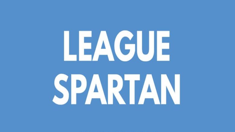
League Spartan, by Matt Bailey and Tyler Finck, is the closest free match to Futura's bold weights. If your budget is zero and you want the FedEx-and-Supreme feel, start here.
Licence: Free, OFL. Best for: sports, construction, bold consumer brands.
26. Josefin Sans
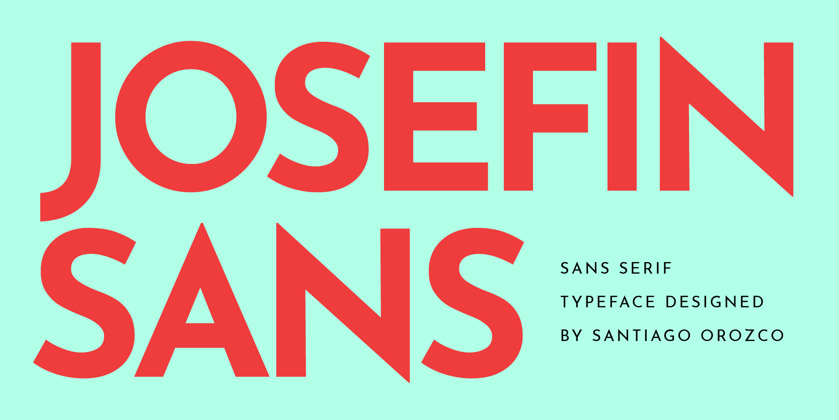
Santiago Orozco's Josefin Sans has a vintage, Art Deco geometry and a low x-height that makes all-caps settings look elegant. It works best light and widely spaced.
Licence: Free, OFL. Best for: hotels, florists, design studios.
27. Outfit
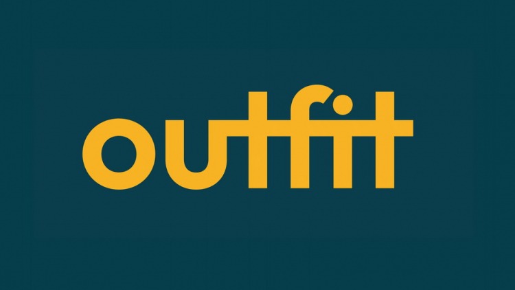
Outfit, designed by Rodrigo Fuenzalida and released by Smartsheet, is a clean geometric sans with a full set of weights. It's a safe modern choice that won't date quickly.
Licence: Free, OFL. Best for: SaaS, agencies, B2B brands.
Playful display logo fonts
Playful fonts win attention fast. The question to ask is whether your brand will still want to look this cheerful in five years, because rounded, bouncy wordmarks are hard to grow out of.
28. Fredoka
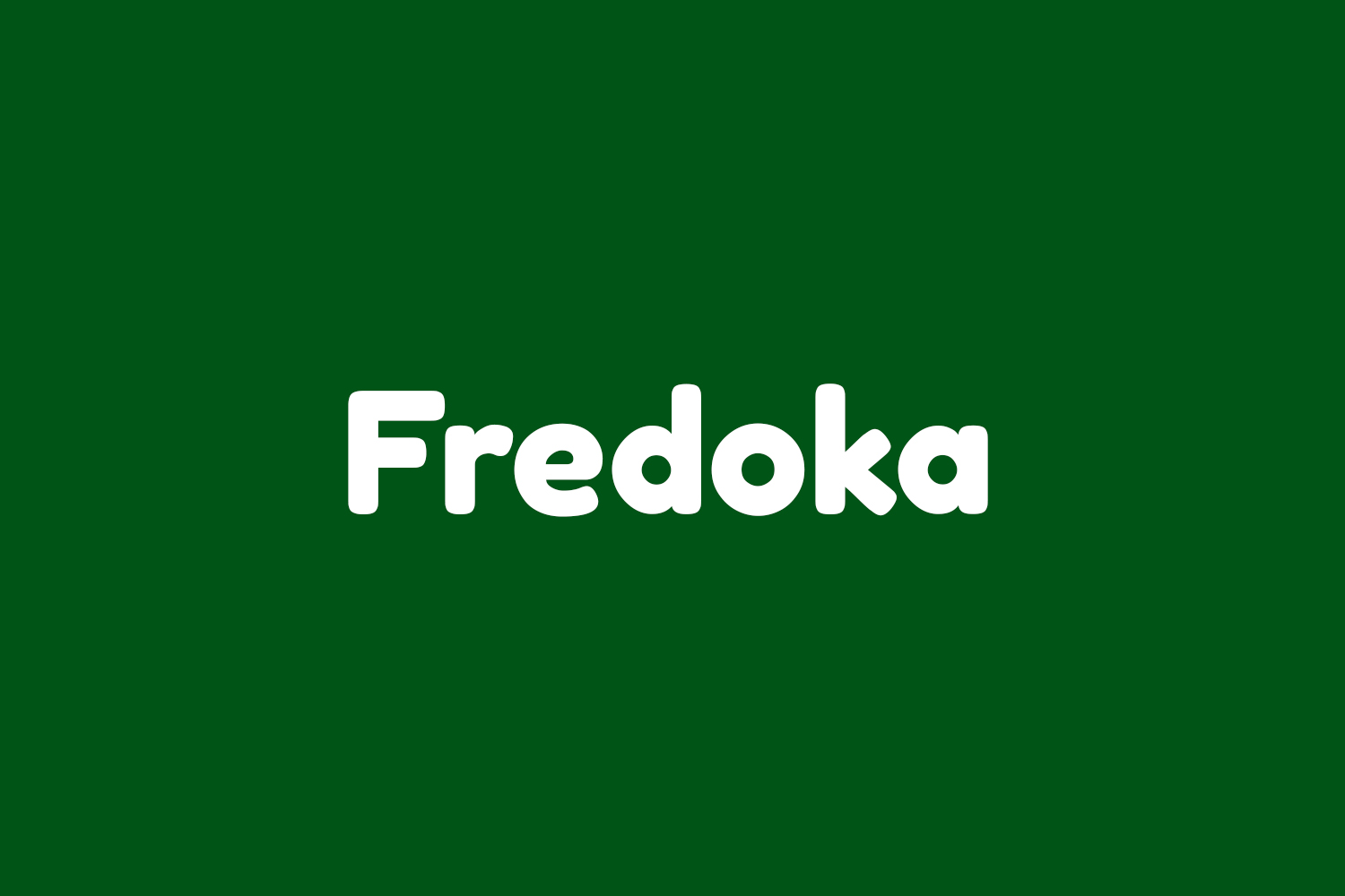
Fredoka is a rounded sans with soft terminals and a variable weight axis. It's friendly without looking childish, which makes it useful well beyond toy brands.
Licence: Free, OFL. Best for: kids' products, pet brands, apps.
29. Righteous
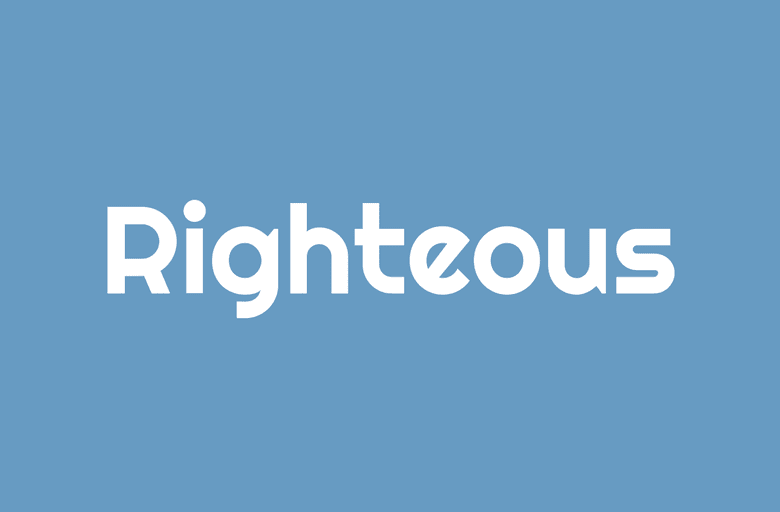
Astigmatic's Righteous has rounded, Art Deco-flavoured letterforms. It already looks like signage, so it needs very little added to work as a logo.
Licence: Free, OFL. Best for: bars, arcades, music brands.
30. Shrikhand
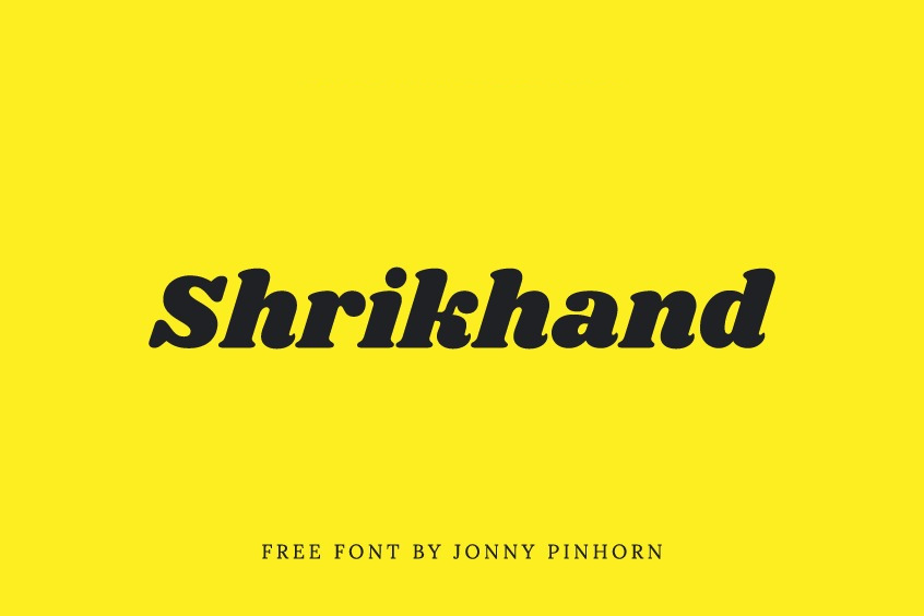
Jonny Pinhorn's Shrikhand is a heavy, slanted display face inspired by Gujarati street lettering. One word in Shrikhand already looks like a candy wrapper, in a good way.
Licence: Free, OFL. Best for: snacks, ice cream, restaurants.
31. Lobster
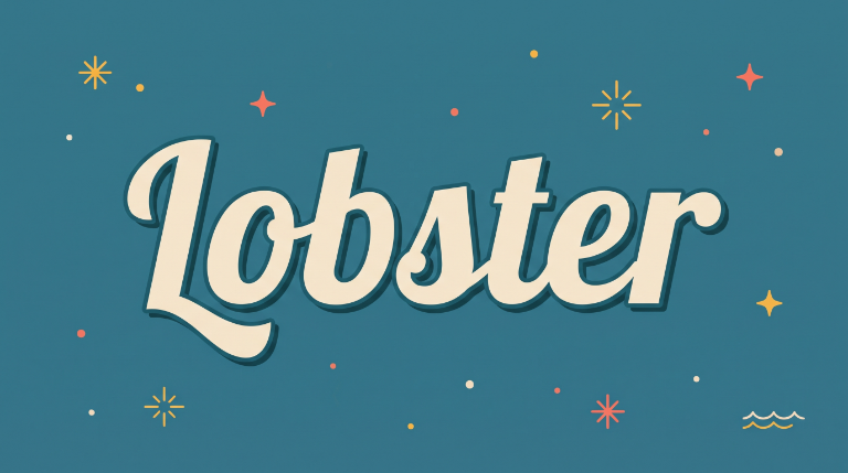
Impallari Type's Lobster is a bold connected script that was everywhere in the early 2010s. It's well made, but it's now so common that small businesses using it tend to look alike. Use it only if you're adding custom touches.
Licence: Free, OFL. Best for: diners and food trucks that embrace the retro feel.
32. Cherry Bomb One
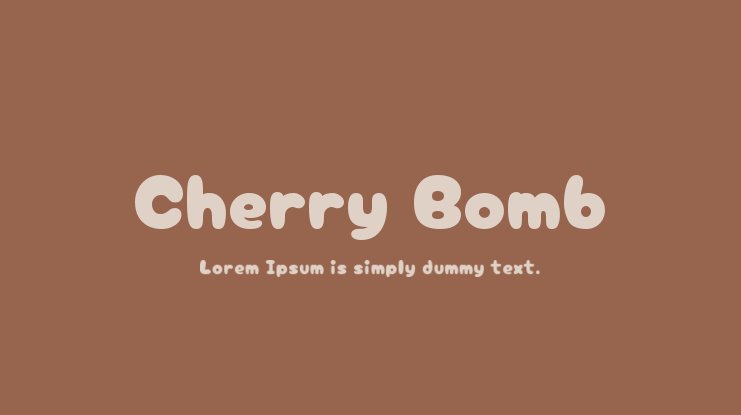
Cherry Bomb One by Satsuyako is a chubby, rounded Japanese-and-Latin display font. It's about as cute as a font gets, and it covers Japanese kana as well as Latin letters.
Licence: Free, OFL. Best for: sweets, stationery, anime and creator merch.
33. Bricolage Grotesque
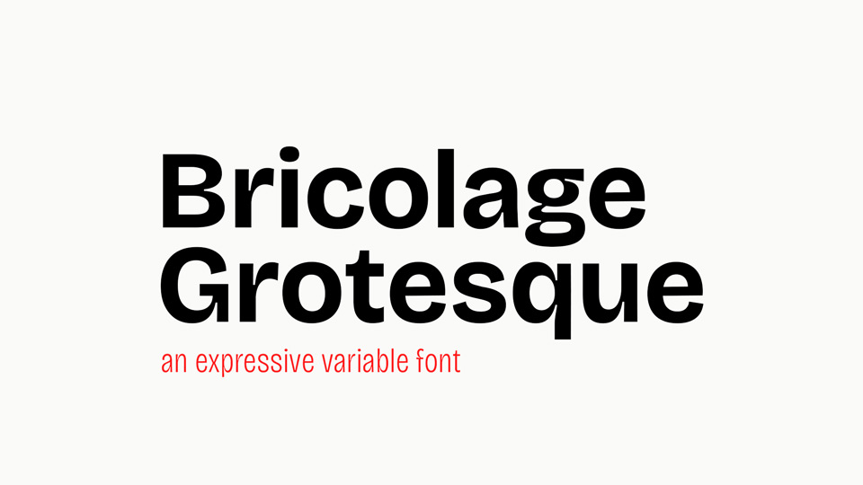
Mathieu Triay's Bricolage Grotesque (2023) is a grotesk with ink traps and quirky details that get more pronounced at large sizes. It's playful in a design-literate way rather than a cartoonish one.
Licence: Free, OFL. Best for: creative studios, newsletters, indie brands.
34. Clash Display
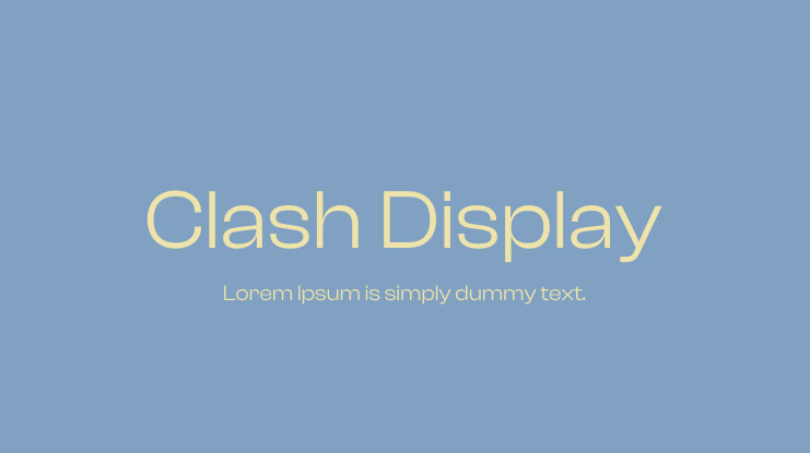
Clash Display from Fontshare is a compact, high-impact display sans. Set heavy and tight, it reads as a finished wordmark, which is why it's on our "looks like a logo" shortlist.
Licence: Free, ITF Free Font License (commercial use allowed). Best for: fashion drops, music, tech launches.
Elegant script logo fonts
Script fonts feel personal, but they're the hardest style to read at small sizes. A script wordmark nearly always needs a simpler secondary logo (an initial or a short sans serif version) for social avatars and favicons.
35. Great Vibes

Robert Leuschke's Great Vibes is a flowing formal script with confident capitals. It's popular, so make the capital letter your own, or pair it with an uncommon sans serif.
Licence: Free, OFL. Best for: wedding photographers, event planners.
36. Allura
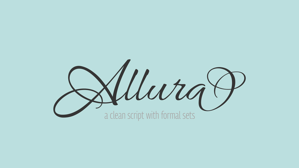
Allura, also by Robert Leuschke, is lighter and more legible than Great Vibes, with less dramatic swashes. It works when the name is long and you still want a handwritten feel.
Licence: Free, OFL. Best for: beauty salons, gift shops.
37. Pinyon Script
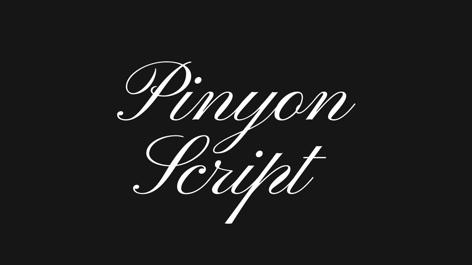
Nicole Fally's Pinyon Script is a copperplate-style script based on 19th-century engraving. It looks formal and traditional rather than casual.
Licence: Free, OFL. Best for: wineries, invitations, heritage brands.
38. Rochester
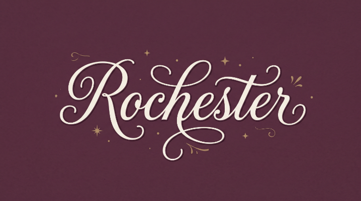
Rochester by Sideshow draws on Victorian and Art Deco penmanship. It's more upright than most scripts, so it stays readable at smaller sizes.
Licence: Free, Apache License 2.0 (commercial use allowed). Best for: consultants, barbers, vintage shops.
39. Snell Roundhand
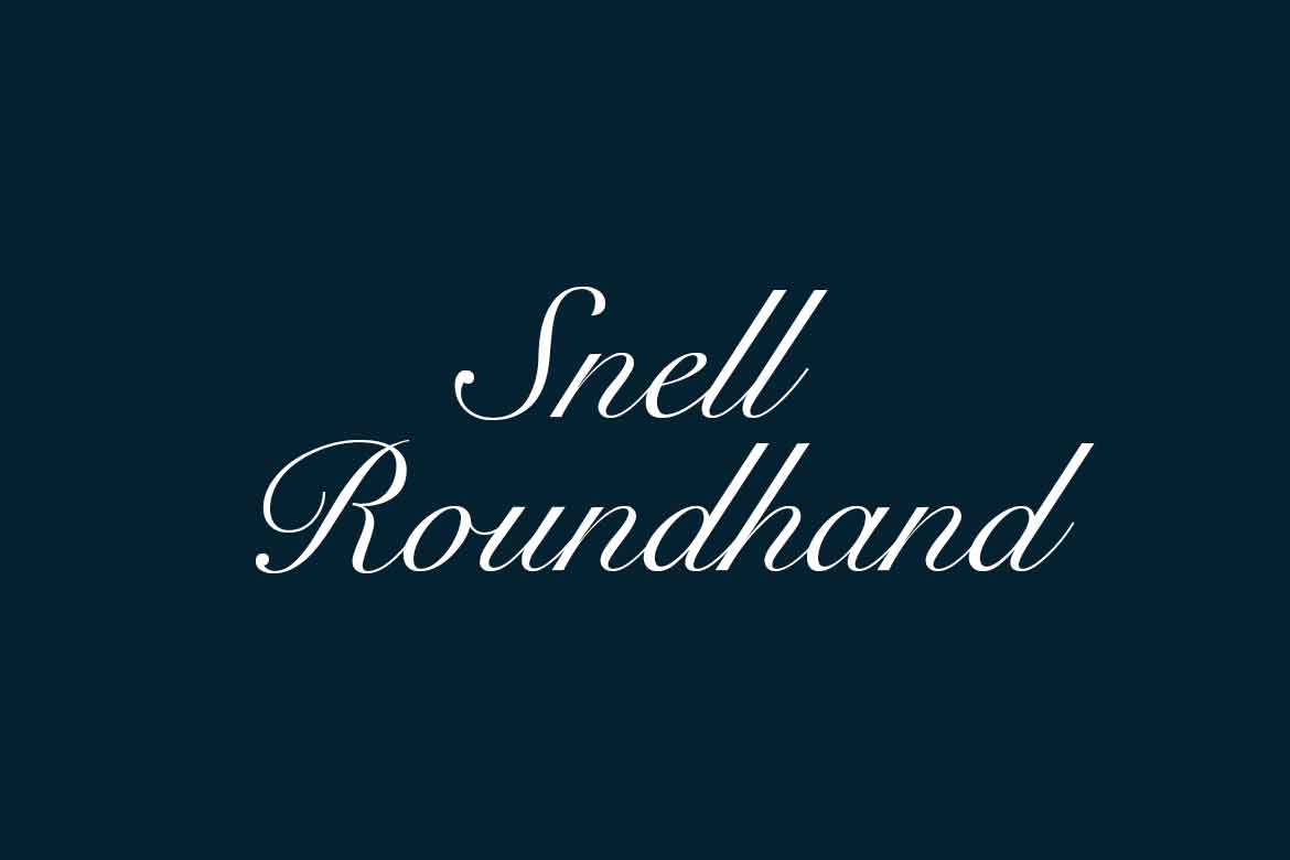
Matthew Carter designed Snell Roundhand in 1965, based on the 18th-century writing of Charles Snell. It's a true formal script with consistent, even strokes, and it looks expensive in a way most free scripts don't.
Licence: Paid, from Linotype. Best for: luxury hospitality, formal events.
40. Bickham Script Pro
Richard Lipton's Bickham Script for Adobe is based on 18th-century English penmanship, with hundreds of alternate letters and swashes. It's the go-to when a script logo needs to look properly calligraphic.
Licence: Paid. Included with Adobe Creative Cloud through Adobe Fonts. Best for: perfume, fine dining, bridal.
Free logo fonts you can use commercially
26 of the 40 fonts on this list are free for commercial use, including in a logo. The 24 Google fonts use the SIL Open Font License or the Apache License, and the two Fontshare fonts use the ITF Free Font License. All three allow you to use the font in a logo you sell or trademark. What they don't allow is selling the font file itself.
All of these are standard TTF or OTF files, so you can install them on a desktop or import them into mobile design apps such as PixelLab that accept custom fonts. Download them from Google Fonts or Fontshare directly rather than from mirror sites, which sometimes bundle old versions or the wrong licence file. For more free options outside logo design, see our list of free commercial fonts.
💡 Worth knowing: "free for personal use" is not free for a logo. A logo is commercial use the moment it appears on anything you sell, so a personal-use font in a logo is an unlicensed font.
Which fonts do famous logos use?
Most famous logos either use a well-known commercial font (FedEx uses Futura and Univers, Supreme uses Futura Heavy Oblique) or a custom typeface you can't buy at all, like Netflix Sans and Disney's script. When a big brand's logo looks like a font, it's usually a licensed font that has been modified.
Sources: Creative Bloq for FedEx, eBay, Amazon, Microsoft, Facebook and Disney. Entrepreneur for Netflix Sans, which Netflix built with Dalton Maag to cut licensing costs. For the most-used fonts outside logo design, see our list of popular fonts.
The pattern is useful. The brands with the most recognisable wordmarks started from an existing font and changed one or two things. That's a realistic approach for a small business too: license a good font, then customise it.
How do you choose the right logo font?
Choose a logo font by testing it, not by browsing. Type your exact brand name in three or four candidates, then put each one through five checks: small size, one colour, licence, character set and pairing. The font that passes all five is usually not the one you liked best in the preview.
- The 16-pixel test. Shrink the wordmark to favicon size. Thin serifs, tight script joins and hairline weights disappear first.
- The one-colour test. Print it in pure black on white, then reverse it to white on black. If it only works in a gradient, it's not a logo font.
- The licence test. Read the licence for the exact file you downloaded. Confirm it allows commercial use, and check whether it has any clause about logos or trademarks. OFL, Apache and the ITF Free Font License all allow logo use.
- The character test. Check every letter in your name, plus the characters you'll need later: numbers, ampersands, accented letters for other markets.
- The pairing test. Set your tagline and a paragraph of website copy next to the logo. If nothing pairs well, the font will make the rest of your brand harder.
One thing that surprises people: accessibility rules don't protect you here. The WCAG contrast requirement explicitly exempts logotypes, so nothing stops a hard-to-read logo from going live. You have to test it yourself. Our guide to common logo design mistakes has a two-minute version of this test.
At ManyPixels, we deliver logo files with the font information included, and the client is responsible for holding the font licence. So the licence question comes up on every logo project. Ask it before you fall for a font, not after.
What should you pair with your logo font?
Your logo font rarely works for body text, so you'll need a second font for your website, documents and social posts. The usual rule is contrast: a decorative logo font with a plain text font, or a plain logo font with a text font that has a bit more character.
For 20 ready-made combinations, see our guide to font pairings. Once you've chosen your fonts, write them into your brand guidelines so everyone uses the same versions, including in presentations, where a missing brand font is the most common reason decks go off-brand.
FAQs about logo fonts
Bottom line
✅ Start with the style table, shortlist three fonts, and run the five tests before you fall for any of them. If you want a font that already looks like a logo, try Bungee, Shrikhand, Clash Display, Recoleta, Cooper Black or Futura PT. If budget matters, the 26 free fonts above are all licensed for commercial logo use.
The font is only the starting point, though. The logos people remember take a good font and change one thing about it. If you'd rather have that done by a designer, ManyPixels covers logo design on every plan: a typical daily output is one logo draft, with unlimited revisions. Plans start at about $699 a month (check manypixels.co for current pricing), and you can pause for $10 a month when you don't need design. Explore ManyPixels plans, or read our logo design cost guide to compare your options.
{{BRAND_BANNER="/dev/components"}}

Having lived and studied in London and Berlin, I'm back in native Serbia, working remotely and writing short stories and plays in my free time. With previous experience in the nonprofit sector, I'm currently writing about the universal language of good graphic design. I make mix CDs and my playlists are almost exclusively 1960s.

Top-quality designers
A complete creative team at your fingertips: graphic and web designers, illustrators, and more.
Lightning-fast turnaround
Get start today and receive your first update on the next business day.
All-inclusive pricing
Unlimited requests and revisions. One flat monthly fee. No surprises.
Flexible & scalable model
No contract. Scale up and down as needed. Pause or cancel at anytime.
Continue reading
Explore some of our best designs
Get inspired by a curated selection of ManyPixels work. Download the portfolio to see what our team can create.