18 Amazing Retro Logo Designs to Make You Nostalgic

TABLE OF CONTENTS

Retro logo design is a trend that’s not going away anytime soon. If you have a customer base that’s keen to reflect on “simpler times” or hipster millennials in love with all things vintage, then one of these logo ideas can help you create a stunning brand identity.
I’m one of those annoying people known to use the phrase “I was born in the wrong decade”. What I’ve come to learn as such a person is that retro style means a lot of different things. For me, it’s always been the 1950s and 60s. For a lot of my friends, it’s the neon colors of the 1980s.
Finally, for those well versed in design, the best vintage-style logos are those that evoke a sense of nostalgia but fulfill the aesthetic expectations of the 21st century.
{{LOGOS_PORTFOLIO="/dev/components"}}
Cool vintage typography
I like to start these lists with simple wordmarks, as it’s amazing how much of an impact a custom typeface can deliver. The best thing about this type of vintage logos is that they resonate well with pretty much anyone—if you know next to nothing about logo design, you’ll still likely notice an especially groovy retro font.
1. Whistler Bottling Co.
If you thought this soda looks like something the Scooby-Doo Gang would drink - you’re not alone! This kind of typeface was a huge favorite with 1960s movie posters, and the asterisk on the letter "I" gives this logo a further, playful note.

2. PawnShop Kings
This awesome logo was created for a country band’s rebranding before a big tour. Hoodzpah, the design agency behind this logo design came up with a terrific custom typeface that makes a great fit for any country or blues album. The circle frame is another awesome choice as it resembles old vinyl.

3. Lancaster Sweet Shoppe
Ok, but how about something a little more timeless than the 1950s and 1960s? I hear ya! Take a look at this graphic designer’s exquisite logo design that’s just the perfect company logo for a vintage candy shop (pardon, shoppe!). The elegant, cursive lettering and subtle aesthetic details give this logotype a retro look that still ticks all the boxes of contemporary logo design.

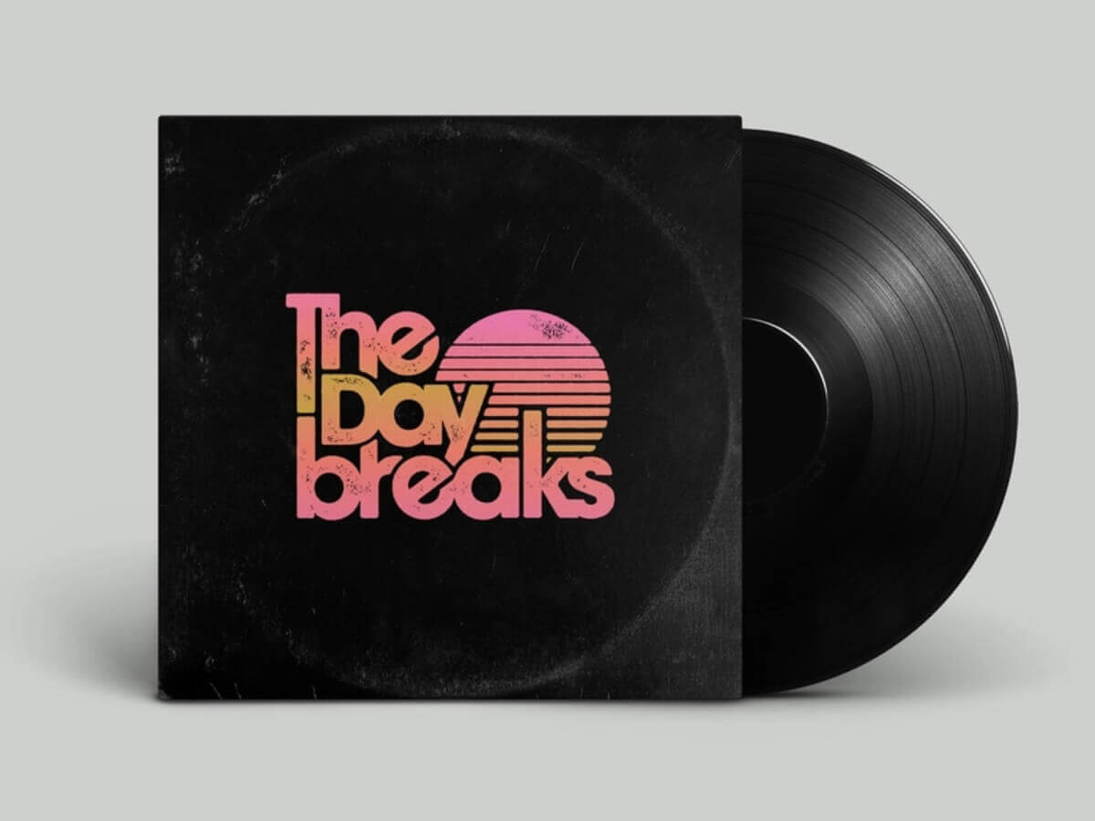
4. The Daybreaks
Here’s another fun band logo (no surprise that the music industry is particularly partial to vintage logos). The 1980s are definitely the era behind this logo design inspiration. You may have expected loud neons, but this graphic designer brilliantly achieved a retro look with a more elegant color palette. This retro badge is definitely something you can imagine on hand-me-down retro t-shirts!
5. Phaëton
I am not one for loud neon colors (sorry Stranger Things fans), but you can certainly color me impressed with this powerful 80s logo! There are several design elements (including complex shading) which wouldn’t make this logo a great choice for print designs. However, for a vintage arcade game, this bold futuristic design makes a lot of sense.

Emblems and retro logo badges
A badge or emblem-style logo is a wonderful option to achieve that vintage design style. Think of old uniform patches or classic university crests, and you get the idea of how this style makes a great addition to any business card or branded merch (like t-shirts and hoodies).
6. Heisa
This one is a bit of a cheat, as it’s not exactly the company logo, but rather an emblem created for their clothing line. Nevertheless, it makes for perfect retro logo design inspiration! It marries a retro look (color palette) with sleek modern design (simplicity and cohesiveness of design elements).

7. Dreadphile Cinema Club
This business name promises a very interesting logo concept, and sure enough this graphic designer’s logotype delivers. The old school style lettering and skull drawing make the logo a little less scary, but still delivers that delightfully weird and slightly ominous effect you’d want for a horror movie club!

8. Kohii coffee shop logo concept
Although this awesome retro badge isn’t actually used in this company’s branding, it’s a wonderful example to look up to. The great thing about retro emblems like this one is the toned-down colors that are a lot easier to get right in print (back in the days before graphic design went digital everything had to be print-friendly).

9. Sirilo’s cafe
This very simple little monogram still manages to evoke a sense of nostalgia. This dark shade of mustard yellow can be a dangerous choice - without the right graphic designer, it can look outdated. However, paired with the simplicity of the typeface and the elegant grey it’s a great choice for his cute, little diner.

Vintage logos with illustrations
This type of vintage logo design often holds a stark difference to a more contemporary style. While simplicity is often insisted on in modern logo design, illustrations that have a retro style are often a little more intricate. If you enjoy colorful designs, then some of the examples from this logo collection will certainly put a smile on your face!
10. Alpha Floral
As I said—sometimes it’s ok to leave the hipster minimalism to someone else, and instead opt for a design that’s luxurious and truly fabulous. This gorgeous art deco-style logo boldly pairs golden letters with prominent, red flowers. Like this style? Make sure to check out our comprehensive article on luxurious art deco logos.

11. Columbus Metro Park
This logo is actually for a sticker the graphic designer created by incorporating the company’s monochromatic emblem logo. The style of this vintage logo resembles a child’s drawing and the typeface gives a positive 60s vibe.

12. Olives Organics logo concept
This food logo for a fictional organic company includes a cool, modern illustration that takes inspiration from the past. The earthy tones are a good match for a company like this and the typeface gives this retro logo design a more luxurious feel.

13. Bird and Jim
This cool logo is definitely not “over-the-top” old school, but the imagery and style remind me of old Lucky Luke comics. Use this example as a retro logo template if you’re interested in finding a way to give retro designs a simpler, more modern twist.

14. Moonbuggy blend
This logo for a particular blend produced by Jubilee Roasting Co. features a retro RV and a very cool typeface. The coherence of the whole logo is achieved with bold yellow lettering paired with the RV’s subtle grey and white tones.

Turn of the century retro design logos
When we think of retro the first thing that usually comes to mind our styles dating back to the 1950s and onwards. However, if you want to stand out from the crowd, you may consider traveling further back in time and take inspiration from these traditional logotypes that resemble styles prominent at the turn of the 19th/20th century.
15. Lambay Irish Whiskey
Of course, it’s also possible to create a gorgeous illustration in black and white. The bird you see here is called a puffin and is native to Ireland. The custom typeface is simply wonderful with the swooshes giving it a very nice flow.

16. Commissiary Barber & Barista
As if a 2 in 1 barbershop and artisanal coffee bar wasn’t enough to draw hipster audiences in, this vintage logo design really sticks the landing with its target audience. The tiger illustration that resembles old circus posters is a great asset to use on social media, while the simple wordmark portion of the logo makes a great little addition to their web design (there’s a lot going on with photos and videos so the simplicity of the typeface works well).

17. Clementine
This eclectic gift shop now uses a new logo that’s a little more modern, however their old one is definitely a terrific example for those seeking retro logo design inspiration. The gorgeous handwritten custom font along with this elegant frame would make this logo a beautiful addition to any business card, packaging, or label.

18. Grove’s Style logo concepts
If you google Victorian-style logo, you’ll be amazed at how many great vintage logos are out there that take inspiration from old sign painted typography. This example is a particularly successful one as it, again, transforms this distinctly retro style into a cleaner, more modern layout.

Be retro, not outdated
Whether you go for classic elegance or something that’s nostalgic and quirky, make sure to keep your retro designs up-to-date. This means taking inspiration from retro styles, but adhering to all the principles of good logo design that will keep your logo on par with those of your competitors!

Top-quality designers
A complete creative team at your fingertips: graphic and web designers, illustrators, and more.

Lightning-fast turnaround
Get start today and receive your first update on the next business day.

All-inclusive pricing
Unlimited requests and revisions. One flat monthly fee. No surprises.

Flexible & scalable model
No contract. Scale up and down as needed. Pause or cancel at anytime.

Continue reading
Explore some of our best designs
Get inspired by a curated selection of ManyPixels work. Download the portfolio to see what our team can create.
