The Different Types of Logos Explained
TABLE OF CONTENTS

What is a lettermark? Emblems? Combination marks? These terms might be too complicated for a logo design rookie. Keep reading to find an explanation and visual example for popular types of logos.
Although it might seem simple, logo design is a discipline based on the study of forms, shapes, colors, composition, geometry, and many other deciding factors. When you see a logo, you probably judge it subjectively and base your opinion on something that makes you remember it for either good or bad reasons.
But in terms of types, logos can be more than good or bad, text or illustrated… There are certain categories defined by different design elements. It’s hard to define all the types of logos, but we’ll do our best to explain the most popular and oft-used categories.
{{BRAND_BANNER="/dev/components"}}
1. Wordmark logos or logotypes
Wordmarks, also known as logotypes, are simple typographic logos that consist of the brand name in full. Think of Coca Cola, Google, Canon, Sony, Disney, FedEx, and many other companies that decided that their brand identity will probably improve if the audience sees the company’s name.
Even though it seems like a simple idea, choosing the correct typography, colors and custom lettering is a job for an experienced designer.

2. Lettermarks or monogram logos
Whereas in wordmarks you see the full name, in lettermarks or monogram logos the designers use initial forms of a company name. Some of the most famous lettermarks are IBM, HBO, NASA, CNN, HP, and others.
This type of logo is at the same time minimalist and more practical than a wordmark if the name of the company is very long (this is also a common issue with government agencies). Imagine International Business Machines or National Aeronautics and Space Administration in full as a logo. Not exactly tight, and long names definitely don’t improve brand recognition.

3. Abstract logos
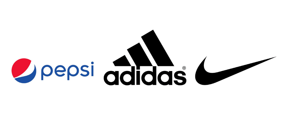
Abstract logos use shapes and forms in a non-literal way. For example, the Adidas logo has three stripes, but they abstractly look like a mountain—a height yet to conquer, suitable for a sportswear brand. Their rival company, Nike, also has the Nike Swoosh, a checkmark accompanying their iconic slogan, “Just do It”.
Another example is the Pepsi logo, that’s reminiscent of a bubble (it’s a fizzy drink after all), but in the colors of the US flag, which helps them relay the message that part of their brand identity is the patriotic value.
Abstract logos are great to form your own visual language and meaning, instead of using what’s culturally relevant as a base. It takes more than just aesthetics, but research and ingenuity too to create a good abstract logo.
4. Pictorial marks
Pictorial marks (sometimes wrongly named brand marks, which are a different thing) are icons or graphic symbols that signify the brand image or story in a visual way. Like Twitter’s blue bird, or Apple’s iconic biblical fruit with a single bite. A recent example of a logo symbol is AirBnB’s ‘belo’, a combination of icons that signify people, places, love and "A" for AirBnB.
Unlike abstract logos, pictorial marks are more straightforward and simple to understand, and often represent common objects.

5. Letterforms
Letterforms are even more toned-down, geometrical and minimalist versions of monograms. They are usually the first letter of the brand name, designed in a specific way according to the brand image. Famous examples of a letterform include McDonald’s, Netflix, WordPress, and other logos.
Letterform brand marks are commonly mistaken to be logos. For example, the “Y” with an exclamation mark, that is Yahoo’s brand mark. The original logo, however, is the business name as a wordmark. Similarly, the other brands we mentioned above also have a wordmark, or combination mark as the official logo too.

6. Combination marks
When a logo uses both a typographic wordmark and graphic symbol, icon, or image, that is a combination mark. By putting together typography and imagery, companies often experiment and have more than one version of their logo for official use. Famous combination logos include the Mastercard, Lacoste, Burger King, Doritos, Chanel, and many other logos.
It’s not uncommon to see different design elements of these logos separately, but the official logos are usually the combination marks themselves.

7. Mascots
Mascots aren’t a thing only with sports teams! In fact, some of the most recognizable brands around the world use (or have used at some point) a mascot, a character that’s a face to their brand.
Even though it’s not the most modern type of logo, mascot logos are still often used in the food industry, like KFC’s Colonel Sanders, Planter’s Mister Peanut, or Tony the Tiger for Kellogg’s Frosted Flakes. Apart from that industry, the Michelin Man also stands strong in the tire business.

8. Emblem logos
As far as logo design goes, emblem logos might be the oldest type of logos. They are characterized by the brand name put inside a frame or shape. They do seem a little retro and not exactly versatile, but some brands still use them, and to great success. The Starbucks mermaid, Harley Davidson rock n’ roll typography inside an army-badge shaped frame, and Warner Brothers’ monogram inside a custom shape are famous examples.

Hopefully, this guide helped you understand the characteristics of different types of logo designs. Since the logo is the first step towards building strong branding and no marketing materials go without it, we suggest you invest time in research and the best design possible. From your business card to your social media graphics, it’s going to be everywhere, so opting for a free logo design isn't advisable.
Luckily, our designers at ManyPixels can help you. For a flat rate, you get unlimited revisions and great-quality graphic design. You can learn more here. Good luck with your logo!

Top-quality designers
A complete creative team at your fingertips: graphic and web designers, illustrators, and more.
Lightning-fast turnaround
Get start today and receive your first update on the next business day.
All-inclusive pricing
Unlimited requests and revisions. One flat monthly fee. No surprises.

Flexible & scalable model
No contract. Scale up and down as needed. Pause or cancel at anytime.

Continue reading
Explore some of our best designs
Get inspired by a curated selection of ManyPixels work. Download the portfolio to see what our team can create.
