

What is visual identity? (and how it differs from brand identity)
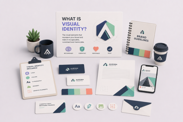
TABLE OF CONTENTS

TL;DR:
Visual identity is the set of design elements that make a brand recognizable: logo, color palette, typography, imagery, and supporting graphics. It's the visible part of a larger system. Brand identity is the whole thing, including the parts you can't see, like values, voice, and personality. In short, brand identity is who you are; visual identity is how you look. You need the first to get the second right.
Introduction
Most people use "visual identity" and "brand identity" as if they mean the same thing. They don't, and the difference matters the moment you brief a designer or sign off on a logo. Get the order wrong and you end up with a nice-looking brand that says nothing. This guide covers what visual identity actually includes, how it fits inside brand identity, and why building them in the right sequence saves you from an expensive rebrand later.
💡A quick note on why this is worth getting right: people judge the visual appeal of a website in about 50 milliseconds, according to a widely cited study published in Behaviour & Information Technology. Your visual identity is doing work before anyone reads a single word.
What is visual identity?
Visual identity is the collection of visual design elements that represent a brand and make it instantly recognizable. It includes the logo, color palette, typography, imagery style, and supporting graphics like icons and patterns. Together these form a consistent visual language that works across a website, a business card, a social post, and a billboard.
Think of it as the face of the brand. It's the first thing anyone notices and the fastest way to trigger recognition. When you spot the Tiffany blue box before you read the name, that's visual identity doing its job.
The core elements are:
- Logo. The primary mark, plus secondary versions, a simplified icon or favicon, and variations for light and dark backgrounds.
- Color palette. Primary, secondary, and accent colors with defined hex, RGB, and CMYK values so they stay consistent in print and on screen.
- Typography. A primary and secondary typeface with rules for headings, body copy, and digital versus print use.
- Imagery. The style of photography, illustration, and iconography that carries the brand's tone.
- Supporting graphics. Patterns, textures, and layout systems that tie everything together.
Here's the part people miss: a logo on its own is not a visual identity. A logo without a color system, type rules, and imagery direction is just a file. The identity is the system that makes all of those pieces feel like they came from the same place.
{{BRAND_PORTFOLIO="/dev/components"}}
What is brand identity?
Brand identity is the complete set of elements a company uses to shape how it's perceived, both the visible and the invisible. It includes visual identity, but it also covers mission, values, personality, tone of voice, positioning, and the brand story. Visual identity is one layer inside it.
If visual identity is the face, brand identity is the character behind it. It answers "who is this brand and why should I care?" rather than "what does it look like?" A polished logo means little if the business has no clear purpose or voice. What people actually remember is the meaning.
The elements that sit outside visual identity include your reason for existing, the principles that guide decisions, how the brand speaks, how it stands apart from competitors, and the narrative that ties it all together. These are strategic, not visual. And they should be decided first, because they're what your visual choices are meant to express. If you want a step-by-step on the strategic side, our guide on how to create a brand identity walks through it.
Visual identity vs. brand identity: the key difference
The difference in one line: brand identity is what a brand is; visual identity is how it looks. Visual identity is tangible and made to be seen. Brand identity is strategic and made to be felt. Visual identity lives inside brand identity, not beside it.
Here's the breakdown:
One more distinction worth clearing up: corporate identity is a related but broader term that also folds in internal behavior and company culture. For most small businesses and marketing teams, the visual-versus-brand distinction is the one that affects day-to-day design decisions.
Why the order matters: identity first, visuals second
Brand identity comes first, always. You need to know what your brand stands for before you can decide how it should look. Skip that step and every visual choice becomes a guess: you pick colors because you like them, not because they mean anything.
This is the mistake behind most weak visual identities. A founder rushes to a logo before defining the brand, then wonders why nothing feels cohesive six months in. The logo, the colors, and the imagery all pull in different directions because there was no shared idea holding them together.
Do it in the right order and the visual choices almost make themselves. If your brand is warm, accessible, and playful, that rules out cold corporate blues and rigid serif fonts before you've drawn anything. The strategy narrows the visual options, which is exactly what you want. Visual identity isn't decoration you add at the end; it's the translation of decisions you've already made.
What makes a visual identity actually work?
A visual identity works when its elements are distinctive, coherent, and used the same way everywhere. Distinctive so people can tell you apart from competitors. Coherent so the logo, colors, and type feel like one system. Consistent so repeated exposure builds recognition over time.
Distinctiveness is why color carries so much weight. Color can improve brand recognition by up to 80%, according to research from the University of Loyola, Maryland. It's also a fast-track to the buying decision: studies from the CCICOLOR Institute for Color Research suggest people make a subconscious judgment about a product within 90 seconds, and up to 85% of that assessment can come down to color alone. Pick your palette with intent, not by mood.
Coherence is where the individual pieces earn their keep. Coca-Cola has used broadly the same red and script lettering for over a century, and that refusal to drift is a big part of why the brand reads as trustworthy and established. You don't need a hundred-year head start to apply the same principle: choose a system and hold the line.
The consistency problem (and how brands lose it)
Most visual identities don't fail at the design stage. They fail after launch, when the same logo shows up in three slightly different colors, the deck uses a font nobody approved, and the social graphics look like a different company made them. Consistency is the hardest part, and it's where the return on a strong identity is either won or lost.
It's also where the money is. Companies with consistent branding across channels can see up to a 33% increase in revenue, according to a Lucidpress study. The identity only pays off if it's applied the same way every time, everywhere.
Two things keep an identity consistent. The first is a solid brand guidelines document that spells out logo usage, color values, type rules, and do/don't examples, so anyone touching the brand has a reference. The second is having a steady hand on the actual design work, rather than a rotating cast of freelancers who each interpret the brand a little differently.
If you’ve considered using a design subscription as an alternative to freelancers, ManyPixels might be the right choice for you. With the Assigned Designer and Dedicated Team plans you don’t just get predictable monthly costs - you also get to work with 1 or 2 part-time designers who can get to know your brand inside and out.
Frequently asked questions
Bottom line
Visual identity is how your brand looks; brand identity is who your brand is. The visual part sits inside the bigger one, and it only works when it's built on a clear strategy and applied consistently. Sort out what your brand stands for first, then design the system that shows it, and hold that system steady everywhere it appears.
If you're putting together a visual identity from scratch or trying to keep an existing one consistent, it helps to understand what brand identity design services include and what they cost before you decide how to build it.
If you need help with creating your visual identity, check out ManyPixels or book a free consultation to learn how we can help.

Having lived and studied in London and Berlin, I'm back in native Serbia, working remotely and writing short stories and plays in my free time. With previous experience in the nonprofit sector, I'm currently writing about the universal language of good graphic design. I make mix CDs and my playlists are almost exclusively 1960s.

Top-quality designers
A complete creative team at your fingertips: graphic and web designers, illustrators, and more.

Lightning-fast turnaround
Get start today and receive your first update on the next business day.

All-inclusive pricing
Unlimited requests and revisions. One flat monthly fee. No surprises.

Flexible & scalable model
No contract. Scale up and down as needed. Pause or cancel at anytime.
Continue reading

Explore some of our best designs
Get inspired by a curated selection of ManyPixels work. Download the portfolio to see what our team can create.







