
10 Email Banner Designs to Inspire Your Next Campaign
TABLE OF CONTENTS


Wondering what kind of email headers work best and interest people to check out the product or services? Keep reading to find out what banner design is best for you.
Email marketing is still king. With the rise of social media marketing and other inbound strategies, people feared that emails might no longer be an important marketing channel. However, they are personalized, direct, targeted, and great for target recognition. So you shouldn’t dismiss this strategy in any case.
In promotion emails, a banner image or header is possibly the most important element. It is the first thing receivers of the email see when clicking to open the email, and it’s ultimately what will make them continue reading.
When it is eye-catching, well-designed and close to the branding, a banner certainly helps with the read-through rate, and in the long run, it is a way to promote your company.
From special offers to onboarding emails, we’re a long way from barebones and simple emails, and if you don’t want your emails to be buried in the Promotions inbox, you better think through their design and call to action.
In this article, we’ve compiled a list of well-designed email banners and explained why they work. At the same time, you’ll see different types of banner designs and find something you can produce that fits your brand image.
{{AD_BANNER="/dev/components"}}
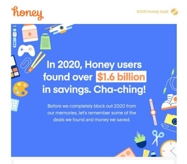
1. Honey: Straight to the point and catchy
Not only is this email banner beautifully designed with illustrations in vivid colors, but the call to action is attention-grabbing and direct.
It is a promotional email but also awakens a sense of giving and community. In the header, Honey directly tells subscribers how much their peers saved by using its services, and the true value of being a part of that community.
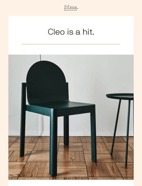
2. Dims: Eye-grabbing product shot
Selling unique and high-quality products? They are the star of your show, so why not place them on the hero image? In this email by Dims, which is promoting the Cleo chair, the company simply shows the product in the header, with the caption “Cleo is a hit”. The rest of the email is body text with reviews from satisfied customers.
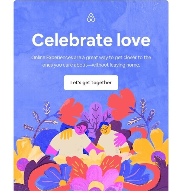
3. Airbnb: Quirky and artistic
There is nothing too promotional in this marketing banner, but what makes it captivating is a unique style and design. A detailed illustration, beautiful colors, and caption that will turn even the toughest hearts into mush, (Feel the love, even from afar), this email is a recipe for a good click-through rate.
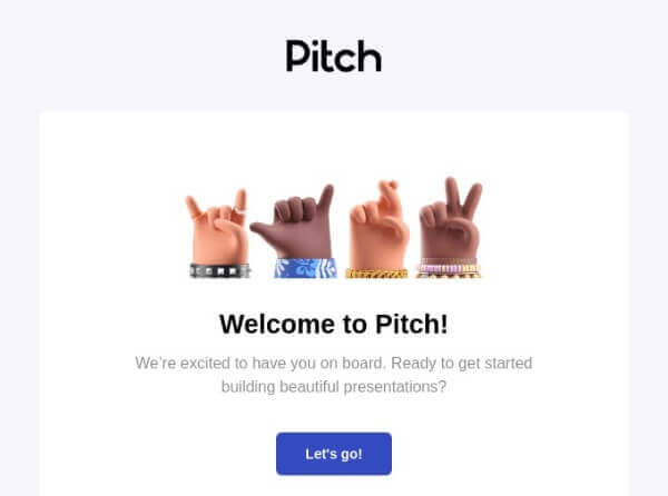
4. Pitch: High-quality design, high value
For a company that sells presentation designs, a good presentation is very important. For their onboarding email, Pitch created a 3D realistic design for the hero image that is cute and immediately sells one of their key values: they stand for good design.
5. Stocksy: The power of humor
To remind their mid-funnel customers to finish their application, Stocksy used a funny photo of a rather lazy monkey and the subject line “Application Atrophying” to remind them to finish the job. Since Stocksy is a library of stock photos, it’s pretty clear that they used one of their products as a hero image, at the same time promoting the quality pics they have in their ranks.

6. Allset: Typography
Instead of illustrations, stock photos, or videos, Allset used a unique typographic art as the banner. It might be my personal preference since I love typo art, but it’s captivating and definitely something I’d read through.

7. Vimeo: Limited offer for FOMO
A product shot of the limited-time offer, accompanied with an enticing value proposition (All you need to go live), is enough to make people that actually need that camera to be able to stream videos give some thought into this email campaign offer.

8. Picmonkey: Freebies always work
This is perhaps the simplest header of all the emails in this list, but there is one “show-stopper” that it has: an offer for freebies. By scrolling a bit lower, you’ll see some of the free videos offered, but the banner alone is enough to catch attention.

9. YNAB: Cartoons to put a smile on your face
A personal budgeting software that helps with financing and monitoring your expenses sounds like it has a rather corporate, dare to say, boring marketing. But with this cartoon-style header, they show what using their software can do to stress and guilt in the months to come, due to your better saving abilities.

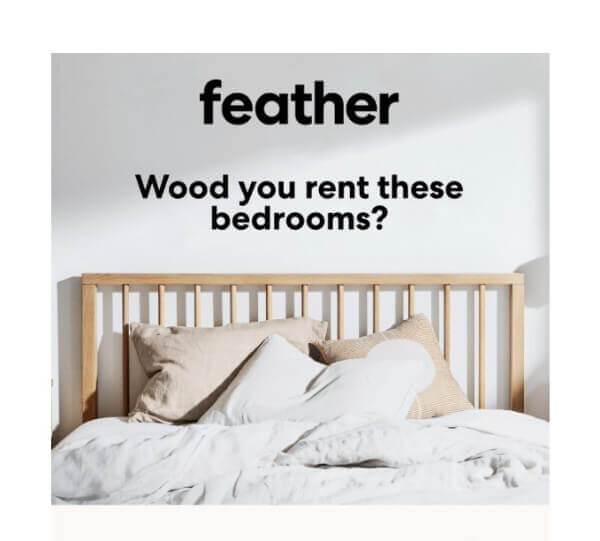
10. Feather: Clever subject line
Finally, we have this email in which Feather did a play on words to focus on the “wood” part of their furniture that can be rented out. Punny, but effective!

Journalist turned content writer. Based in North Macedonia, aiming to be a digital nomad. Always loved to write, and found my perfect job writing about graphic design, art and creativity. A self-proclaimed film connoisseur, cook and nerd in disguise.

Top-quality designers
A complete creative team at your fingertips: graphic and web designers, illustrators, and more.

Lightning-fast turnaround
Get start today and receive your first update on the next business day.

All-inclusive pricing
Unlimited requests and revisions. One flat monthly fee. No surprises.

Flexible & scalable model
No contract. Scale up and down as needed. Pause or cancel at anytime.
Continue reading
Explore some of our best designs
Get inspired by a curated selection of ManyPixels work. Download the portfolio to see what our team can create.


