


Designing Cool Email Banners: Some of the Best in 2021
Find inspiration in 10 amazingly-designed and creative email banners from famous companies.

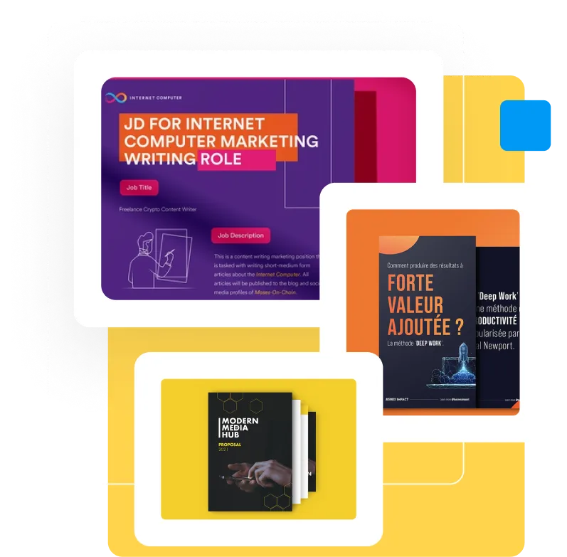
.svg)


Looking for inspiration for your email marketing? Here are some of the best email banners we’ve seen so far in 2021.
No matter what social media and advertising gurus predict, email campaigns are still one of the best marketing tools for companies. In fact, email marketing can have as high as 4400% return on investment. The email banner design is only one of the many elements that you need to do right in order to design a high-performing email campaign, and it has to be eye-catching, compelling and supplementary to the rest of the email.
So, before you start designing your next promotional email, check out some of these amazing examples of good design and successful branding in email marketing.
{{AD_BANNER="/dev/components"}}
Outer: Simplicity is always in fashion
This brand decided to celebrate its recent milestone—being featured in Vogue magazine—by offering a special limited deal. Instead of adding a super complicated and detailed email banner, they simply decided to go for a big typographic banner that scratches out one of their bucket list items. The subject line added is direct and clear too: ‘A Very Special Offer’.

Niice: Modern realism
In one of the best-designed banners, we see a three-dimensional realistic illustration, as well as a fully branded email header and email signature banner.
Of course, this kind of banner requires more attention and design work, and can hardly be achieved with some stock photos and DIY power. Still, it’s safe to assume that it is opened and read by many subscribers.

Rosendahl: Awakening the need for a fancy brunch
E-commerce brands are usually very uncreative and pushy with their email marketing. The banners tend to include a product shot and flashy text reminding you to make a purchase. These marketing banners are usually easily forgotten and don’t evoke emotion in recipients.
Rosendahl, on the other hand, shows its products in action: beautiful ceramic dishes used in an Instagrammable setup that makes you want to have them as soon as possible.

Binned Art: Artistic banner for an art brand
Everything about this email tells the reader that they sell art: the elegant font, the basic background colors, the focus put on the art piece. If you can somehow add an email marketing art direction that will immediately let the reader know what kind of business you are, that might greatly improve your brand awareness and recognition.

Lisa Congdon: Art and creativity infused in every small detail
It makes a lot of sense for this artist and illustrator to have a well-designed email banner, doesn’t it? From the custom typography and hand-drawn logo added in the header, all the way to the engaging and playful color scheme, this email banner is one of the best-branded ones we could find.

Ando: Jovial and simple
Although there is nothing extremely detailed or delicate in the illustration used by Ando, the friendly and joyful pastel colors, as well as the beautiful font included in the header, make this a well-balanced and cute banner. The brand also uses the font and colors in the call to action buttons.

Jeni’s: Party in your mailbox!
The first thing that would make you open this email, most importantly, is that the subject line says “You’re invited! 🎂🍦”. If it were me, I would probably completely forget to check the sender and look forward to this birthday party.
And what awaits is a cute banner of a birthday invitation, set up to invite customers to try a new flavor of ice cream. It is a cool idea that promotes the “birth” of a new product.

DIYODE: Techy, sci-fi fun
It is very hard to promote parts for LED lights and make your email look funky. That wasn’t a problem that DIYODE encountered, since they created a cool animated banner that shows a PMW maker as a spaceship cruising through space.

Judy: A sense of urgency
If your business has a limited-time deal that you want to sell out as soon as possible, creating urgency with the subject and email banner can help you achieve that effect.
Judy, a company that sells outdoor equipment, used this simple and effective banner that resembles a countdown clock to let people know that they can have this offer only in the course of 48 hours.

A Kids Book About: Sneak peek of a new selection
The final entry in this list is no more than a collection of books, but with the inclusion of good photography and a clear view of some of the new titles this publishing company is adding to its offer, it is more than enough to catch a reader’s interest.


Journalist turned content writer. Based in North Macedonia, aiming to be a digital nomad. Always loved to write, and found my perfect job writing about graphic design, art and creativity. A self-proclaimed film connoisseur, cook and nerd in disguise.
A design solution you will love
Fast & Reliable
Fixed Monthly Rate
Flexible & Scalable
Pro Designers
.jpg)
