
21 Famous graphic designers and their most iconic works

TABLE OF CONTENTS


TL;DR
This list covers 21 graphic designers who shaped the visual language of the 20th and 21st centuries, from corporate logos to movie posters to album art. Three standouts: Paul Rand (IBM, ABC, UPS logos), Saul Bass (Hitchcock film posters and title sequences), and Milton Glaser (the I Love New York logo). Best for design students, marketers, and anyone curious about the people behind the world's most recognizable visuals.
Introduction
Since graphic design is an applied art, many of us can't connect famous graphic designers and their work. Here's your quick design history lesson about the most famous graphic designers of all time.
Pop culture, marketing, fine art, music and other disciplines influenced graphic design, but nothing influenced it more than some of the biggest graphic designers in history.
The 20th century reshaped the way we perceived visual arts and used them for marketing, advertising or promoting any idea, and the design industry took flight very quickly. Many famous graphic designers worked in the Mad Men era of graphic design, pre-Photoshop and Illustrator, experimenting with what they had as physical objects.
So who are some famous graphic designers, and what are they best known for? Here are 21 names you need to know.
{{GRAPHIC_BANNER="/dev/components"}}
Paul Rand
Paul Rand (1914-1996) is the American graphic designer widely credited with defining what a corporate logo looks like. He created the identities for IBM, ABC, UPS, and NeXT, and introduced the Swiss Modernist style to American commercial design. His ideas about the relationship between design and business still underpin most corporate branding today.
Paul Rand didn't only have a stellar career as a graphic designer and art director, but shaped the way a corporate logo looks today. This creative genius was behind the IBM, ABC, Enron, Morningstar, UPS and many other logo designs, as well as the corporate identities that they use to this day. Rand famously developed the Next Computers brand identity for $100,000 for Steve Jobs, who was then fired from Apple Computers, without even letting the client adjust or brainstorm on the idea.
Rand taught graphic design at Yale University, where he was professor emeritus, and his 1985 book "A Designer's Art" is still standard reading in design programs.
He is also known for being one of the early adopters of the Swiss style of design in the United States, especially in commercially successful industries and businesses' corporate designs. He was dedicated to the modernist school of thought, looking up to artists such as Paul Cezanne, Pablo Picasso and Jan Tschichold, famously saying that "the problem of the artist is to defamiliarize the ordinary".
In his 1999 biography of Paul Rand, the author Steven Heller wrote that "he was the channel through which European modern art and design, Russian Constructivism, Dutch De Stijl and the German Bauhaus was introduced to American commercial art."

Peter Saville
Peter Saville is the British graphic designer who brought fine art into popular culture through record sleeve design. Co-founder of Factory Records, he created the artwork for Joy Division's "Unknown Pleasures" (1979) and dozens of album covers that made music packaging a collector's art form. He later redesigned the Burberry logo.
From the Burberry logo to one of the most beautiful album cover designs, Joy Division's "Unknown Pleasures", Peter Saville is a famous graphic designer known for his role in spreading graphic design across mediums and closer to pop culture.
He co-founded Factory Records in 1978 with Alan Erasmus and Tony Wilson, and they went on to create hundreds of album covers. Apart from designing for cult bands like Joy Division and New Order, he has created album covers for David Byrne, Pulp, Brian Eno, King Crimson, Peter Gabriel and many others.
He is also famous for re-contextualizing and adapting other visual arts examples into his works, like using "Roses", a painting by Henri Fantin-Latour combined with a color-coded alphabet to create New Order's "Power, Corruption and Lies" album cover.


Milton Glaser
Milton Glaser (1929-2020) is the American graphic designer who created the I Love New York logo in 1977, replacing "love" with a red heart and establishing a visual shorthand now used worldwide. He co-founded New York magazine in 1968 and designed the psychedelic Bob Dylan poster that became a symbol of 1960s counterculture.
Ever wondered what famous graphic designer created the I love NY logo?
We are all used to using the heart symbol instead of writing "love", but before Milton Glaser's "I Love New York" design, that was inconceivable. This famous graphic designer made his name designing popular logos, such as the DC Comics and Brooklyn Brewery, as well as creating eye-catching, psychedelic inspired poster designs like the famous ones with Bob Dylan and Aretha Franklin.
He co-founded and wrote for New York magazine in 1968, which still exists and comes out biweekly to this day.
Glaser has made some of his typography elements available for free by publishing the Glaser Stencil typeface in 1970..


Like many others on this list, he was a member of the Art Directors Club. Founded in 1920, this organization has brought together art directors from New York, and highlighted their work through exhibitions and awards. Other notable members include Paul Rand, Saul Bass, Herb Lubalin, Ivan Chermayeff, Massimo Vignelli, Walt Disney, Andy Warholl, and many more.
Stefan Sagmeister
Stefan Sagmeister is an Austrian graphic designer known for provocative, concept-driven work that treats almost any surface as a canvas. He designed album covers for the Rolling Stones, Lou Reed, and Talking Heads, and built his reputation on experiments like a wall made of 10,000 bananas spelling out a philosophical statement.
Many artists are known for being an odd egg, but Stefan Sagmeister takes peculiarity and experimentation to another level.
This Austrian graphic designer has designed many famous album covers for Lou Reed, The Rolling Stones, and Talking Heads' "Once in a Lifetime" box set. But apart from commercially known designs of his, he has a knack for innovative media.
One such example is his Banana Wall, which was literally a wall of 10,000 bananas. Green bananas created a pattern against a background of yellow bananas spelling out "Self-confidence produces fine results". After a while, the green bananas turned yellow and the text disappeared, but then the yellow bananas turned brown it reappeared together with the artist's self-confidence, he often jokes.
He co-founded the Sagmeister & Walsh studio with Jessica Walsh (more about her later).


Massimo Vignelli
Massimo Vignelli (1931-2014) was an Italian designer and architect whose motto, "If you can design one thing, you can design everything," defined his career. He created the New York City Subway map in 1972, the American Airlines identity, and worked with IBM and Bloomingdale's, applying a strict Modernist grid across every discipline he touched.
Massimo Vignelli was originally an architect who graduated from Politecnico di Milano, one of Europe's most respected engineering schools, who went on to become a famous designer of all sorts of things. He was famously governed by the motto "If you can design one thing, you can design everything". He was a follower of the Modernist school of design and used geometrical forms in all his creations.
From packaging to interior design, he worked in many fields of graphic design, with high-profile clients like IBM, American Airlines, Bloomingdale's and the City of New York, for which he designed the New York City Subway Map. He considered this simplified visual for navigation to be one of his greatest creations. And he was right, since this map is thought to be a landmark in Modernist information design.
Vignelli also worked on several typefaces, improving and simplifying very notable fonts like Bodoni and Helvetica.


Aries Moross
Aries Moross is a British designer and art director known for bold typographic illustration, vivid color, and work rooted in pop culture. Through Studio Moross, they have created visual identities for Cadbury and Nickelodeon, art directed for MTV, and designed the touring visuals for the Spice Girls' 2019 reunion.
Aries Moross is a designer mostly known for their typographic illustrations, blasts of color and taking inspiration from tribal art. From Cadbury's milky logotype to the Spice Girls' tour visuals, they have a huge presence in everyday things and pop culture. Working for their own Studio Moross, they've lent their colorful vision and artistry to the entertainment business, as designer and art director to various MTV and Nickelodeon projects, many music festivals and record artists' album covers.
They've also written the book Make Your Own Luck: A DIY Attitude to Graphic Design & Illustration, as well as sailed the waters of vinyl publishing with Isomorph Records.


April Greiman
April Greiman is the American designer widely credited as one of the first to embrace digital tools as a primary creative medium, in the early 1980s. She served as head of design at the California Institute of Arts and designed the official poster for the 1984 Los Angeles Olympics, helping establish what New Wave graphic design could look like on screen.
April Greiman was one of the handful of famous graphic artists to first embrace technology in their craft. Although at the beginning of her career she worked with traditional techniques, Greiman quickly adopted the new medium and started working exclusively digitally. The creativity of her designs helped others to see the potential in the novelty approach, which later paved the way for design becoming more accessible. This later opened up a range of approaches, skills and techniques modern designers use today.


Chip Kidd
Chip Kidd is an American art director and designer who transformed book jacket design into a recognized art form. Working at Knopf since 1986, he has created covers for Haruki Murakami, Cormac McCarthy, and Frank Miller, and developed a visual language for book covers that many publishers still study and imitate today.
If you ever stared at a beautiful book cover for minutes and wondered how designers can be so ingenious, chances are it might have been either designed or influenced by Chip Kidd. This famous designer, who's currently working as an art director for Knopf, has worked or freelanced for all the major book publishers like Amazon, Penguin, Columbia University Press, HarperCollins, and many others.
He has designed for writers and artists like Haruki Murakami, Frank Miller, Charles Schulz, Cormac McCarthy and many others. Apart from illustrating and editing amazing book jackets and covers, Kidd has two of his own book series, some graphic novels and a history of drawing for the Batman comic series. For contemporary publishers looking to carry this passion for literary presentation into the digital space, compiling layouts into an interactive flipbook preserves the traditional, page-turning experience readers love.


David Carson
David Carson is the American designer credited with inventing "grunge typography" in the early 1990s through his work at Ray Gun magazine. He rejected readability conventions in favor of expressive, layered layouts, becoming one of the most imitated designers of his generation and a frequent TED speaker on design and communication.
David Carson is considered to be the rule-breaker of graphic design and the father of so-called "grunge typography". Widely respected for his works in magazine cover and typography poster design, he could be described as an anarchist in his style since he's trying to break and re-establish the rules of design.
He is also famous for his work ethos: he doesn't start working on a project until he has experienced the art, product, or service it represents first.


Alan Fletcher
Alan Fletcher (1931-2006) was the British graphic designer widely called the godfather of British modern design. Co-founder of Pentagram, one of the world's most influential design studios, he created the Victoria and Albert Museum logo and the Reuters logo, and spent 18 years writing "The Art of Looking Sideways," his definitive book on visual thinking.
Deemed "the godfather of British modern design", Alan Fletcher had a stellar career and ground-breaking typography and poster designs. Throughout his career, he worked for highly esteemed design studios like Pentagram, as well as his co-owned graphic design agency Fletcher/Forbes/Gill. He worked on his book on graphic design, "The Art of Looking Sideways", for 18 years. He has also published a book of his designs called "Beware of Wet Paint".
Some of his most famous works include the Victoria & Albert Museum logo, a now-retired logo for Reuters, as well as the logo for the Institute of Directors.


Paula Scher
Paula Scher is one of the most influential American graphic designers working today and the first woman to become a principal at Pentagram. She has created brand identities for the Museum of Modern Art, the Public Theater, and Microsoft (Windows 8), and is known for her bold, typographically driven approach to identity design.
From designing children's book covers at Random House to being the art director of Atlantic Records in charge of album covers, Paula Scher has had a respectable career. She is also known as the first woman who became the principal of the iconic design studio Pentagram.
While working there, Scher has created notable brand identities, such as the Museum of Modern Arts, The Public Theater, The Metropolitan Opera, NYC Ballet, and others. One of her most famous logos is the Windows 8 logo. Up until that point, Microsoft used the 4-color flag as a logo, but Scher redesigned it to a more obvious object: a window.
She has also worked in environmental graphic design, bettering the designs of buildings to the best conditions set by the environment.
In her typography works, she relies heavily on Art Deco and Russian Constructivism.



Herb Lubalin
Herb Lubalin (1918-1981) was an American graphic designer who turned typography into editorial art, calling his approach "word pictures." Colorblind from birth, he worked almost entirely in black, white, and grey, and spent his career at the intersection of design and provocation, pushing boundaries in mid-century advertising and publishing.
If there is a designer who toyed with censorship and pushed forward the boundaries of what is accepted in the design industry, it's Herb Lubalin. Working for three infamous magazines that were blamed for obscenity in the 1960s and 1970s, to publicly criticizing bad leadership, discrimination and the state of politics in a time where it wasn't generally accepted to do that, Lubalin infused his designs with ingenuity, sarcasm and intelligent humor.
He is most famous for inventive typography he himself called "word pictures": creating shapes with lettering. He rejected the Swiss style of design to adopt a more humanistic approach and used avant-garde typography and minimalist color palettes. He was colorblind, which would be considered a great obstacle for a graphic designer, but his use of white, black and grey defined his work.
Lubalin is one of the most inventive designers in the mid-20th-century American advertising revolution and has worked for many big-time clients, from pharmaceutical companies to Cadillac.


Otl Aicher
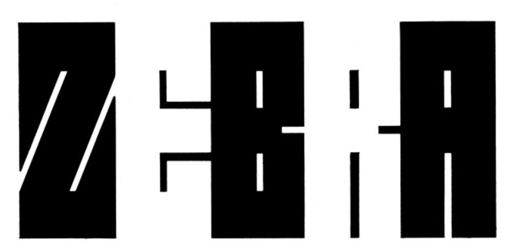
Otl Aicher (1922-1991) was a German designer best known for creating the first modern stick-figure pictogram system for the 1972 Munich Olympics, a visual language now found in airports, hospitals, and public spaces worldwide. He also developed the corporate identities for Lufthansa and Braun, and designed the Rotis typeface family.
It's hard to imagine the world without stick figure signage in public spaces and traffic, and the heavy use of pictograms that explain everything better. But before Otl Aicher, stick figure signs were nowhere to be found. This German designer created the first stick figure pictograms for the 1972 Munich Olympics. Since then, they were adopted everywhere: from traffic signs to airport signage.
He is also considered to be one of the forefathers of corporate design, having worked for Lufthansa and Braun, among others.
He has also created book cover designs, typography, and even furniture. Apart from his design work, Aicher is known for strongly opposing the Nazi regime in Germany.


Ivan Chermayeff
Ivan Chermayeff (1932-2017) was an American graphic designer and illustrator who pioneered the abstract corporate logo at a time when wordmarks dominated. He created the identities for National Geographic, Pan Am, and NBC, producing marks that are still among the most culturally recognized logos ever designed.
Ivan Chermayeff may as well be one of the best graphic designers of all time, if you consider the amount of iconic work he's created. Some of his most famous logos, including National Geographic, Pan Am, and NBC, are still used today.
Chermayeff is one of the pioneers of abstract logos, as opposed to wordmarks which had been the norm previously. This is now a pretty common practice with corporate logos, but few designers are as successful at creating something quite as unique and memorable.

Saul Bass
Saul Bass (1920-1996) is the American designer who invented the modern movie title sequence and created some of Hollywood's most recognizable film posters. He worked with Hitchcock, Scorsese, and Kubrick, designed the Kleenex and AT&T logos, and won an Academy Award for his short film in 1968.
Saul Bass is a prominent graphic designer who created some of the most iconic movie posters and went on to become an Academy Award winner for his directorial work as well.
He has created posters for Hollywood legends of the likes of Alfred Hitchcock, Martin Scorsese, Billy Wilder, Otto Preminger and Stanley Kubrick, most notably "Vertigo", "North by Northwest" and "Anatomy of a Murder".
He was also a visual consultant to Hitchcock, producing title sequences and graphic transitions for "Psycho".
However, famous graphic designers and their work usually get most recognition for logos and branding. Along with incredibly creative movie posters, Bass also designed one of the most recognizable logos today: the Kleenex logo.


Michael Bierut
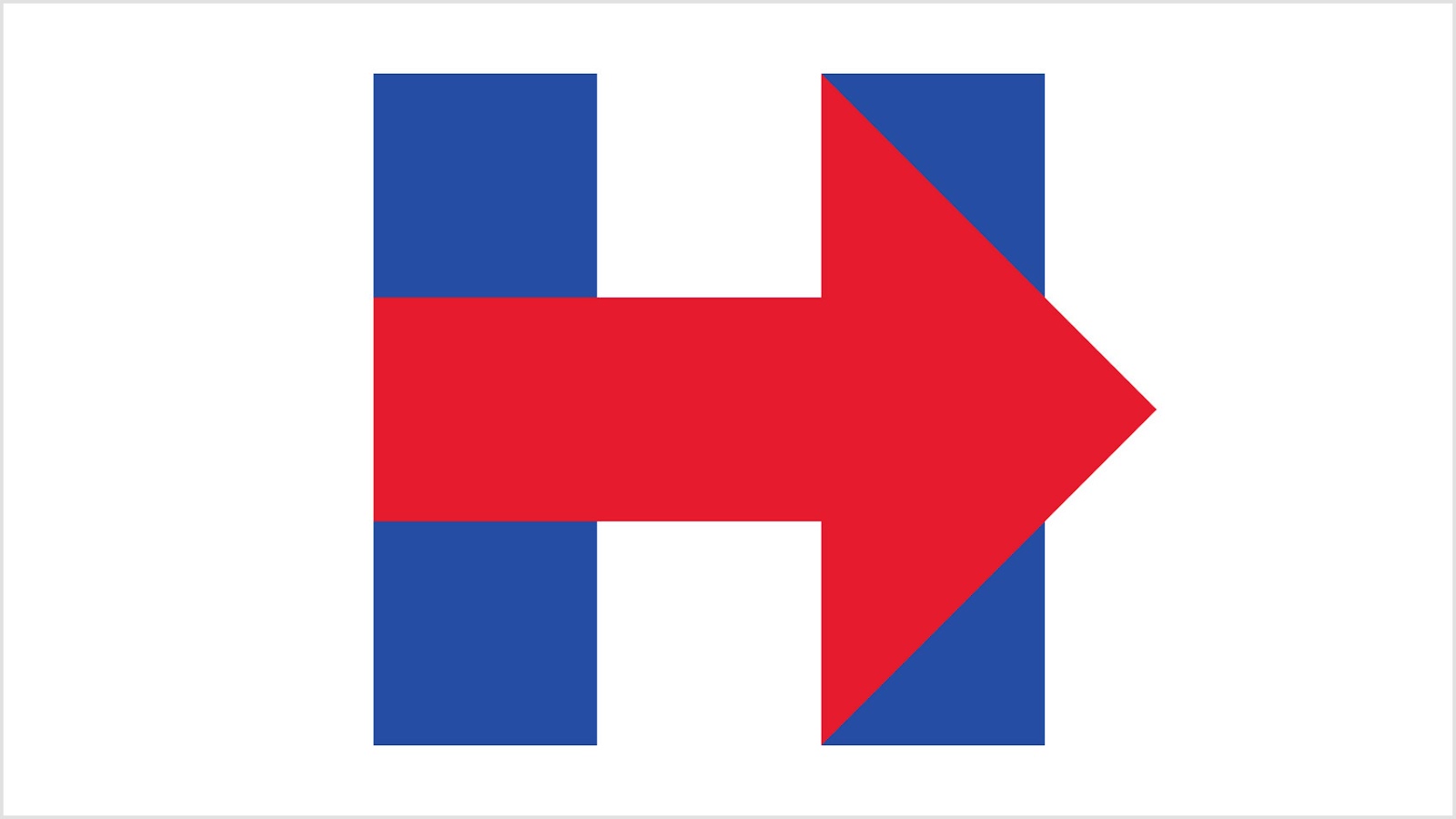
Michael Bierut is a senior partner at Pentagram and one of the most prominent graphic designers of the past 30 years. He trained under Massimo Vignelli and has since designed for Hillary Clinton's 2016 presidential campaign, The Atlantic, Mastercard, the New York Times building, and Saks Fifth Avenue.
Michael Bierut is a graphic design contemporary, who worked for Vignelli Associates, learning directly from Massimo Vignelli, as well as for Pentagram. He is a professor at Yale and worked on the syllabus for the design thinking program. Bierut is also a well-known design critic.
Some of his notable designs and clients include Hillary Clinton's 2016 campaign logo, the redesign of The Atlantic, Mastercard, Benetton, The Museum of Sex, Motorola, The Walt Disney Company, United Airlines, and many others. He has also developed environmental signs for The New York Times building.
He regularly writes for Fast Company and The New York Times about corporate branding and design and has written four books on design.


Rob Janoff
Rob Janoff is the American designer who created the Apple logo in 1977, one of the most recognized marks in the world. The bite was added to make the shape clearly identifiable as an apple rather than a cherry or other round fruit. The original rainbow version signaled that Apple computers could display color; the company switched to the monochrome version in 1998.
Many famous graphic designers became well-known thanks to a single project. That's certainly the case with Rob Janoff who designed one of the most famous, and long-lasting logos in history: the Apple logo.
What is it about this logo that much more intricate design can never compete with? Its simplicity. When a company is called "Apple" it only makes sense the logo should be this symbol.
Janoff explained that the famous bite was added to ensure the simple design was still recognizable as an apple, rather than similar round fruit with stems. On a deeper level, this imagery is connected to man's biblical desire for knowledge, and the way Apple computers can fulfill that desire. Finally, this small yet powerful detail has another dimension, since "byte" is a computer term.
The initial choice of colors was also intentional, as Apple were the first computers that could show images in color. As this ceased to be a distinguishing factor, the brand switched to a more timeless, minimalist look that is sure to stay relevant for decades to come.

Lindon Leader
Lindon Leader is the American designer who created the FedEx logo in 1994 while a senior design director at Landor Associates. The arrow hidden in the negative space between the E and the x made it the most cited example of negative-space logo design, and the identity has collected over 40 design awards since.
The FedEx mark still has that universal, corporate look the company was after, with a trick inside it.
It's one of the most iconic and creative brand logos, that still has that universal, corporate look the company was after. The designer started by combining two fonts to ensure the arrow "hidden" in the whitespace would fit seamlessly into the design. Almost 30 years later, this logo still feels as fresh and relevant as ever.

Jessica Walsh
Jessica Walsh is the American designer and creative director who became a partner at Sagmeister & Walsh at age 25, one of the youngest in the studio's history. She later founded Ladies, Wine & Design and opened her own agency, &Walsh, known for bold, surrealist branding and campaigns for global clients.
The youngest person on this list who defines graphic design styles and trends today is Jessica Walsh, who became a partner at Sagmeister & Walsh at only 25 years old. Prior to that, she had already done magazine covers for the New York Times, books and magazines, and was interning for Paula Scher and Pentagram.
Walsh is thought to have a bold, colorful and often surrealist style, that she infuses in all her products, from magazine covers to branding projects.
Some of her most notable projects include the Adobe logo "remix competition" with business partner Stefan Sagmeister, branding efforts for the Jewish Museum of New York, as well as creating ads and editorials for Aizone and Levi's.
She has also written a blog and book about her experiment with fellow designer Tim Goodman, called "40 Days of Dating", which is about to become a feature film.


Helmut Krone
Helmut Krone (1925-1996) was an American art director at Doyle Dane Bernbach, the advertising agency that invented modern advertising. He is best known for the Volkswagen "Think Small" campaign (1959), widely considered the most influential advertisement ever made, and for the Avis "We Try Harder" campaign that redefined competitive positioning.
As you can see, these celebrated designers created some of the most famous logos and ads in history. One name to add to that list is Helmut Krone, a famous designer and art director.
Although he's worked on many ad campaigns, the most famous are his iconic Volkswagen ads. To this day, these ads are considered the perfect marriage of design and copy, which many modern marketers struggle to achieve. The "Think Small" ad broke every rule of American advertising in 1959: no aspirational imagery, no bold color, a tiny product shot against a white background. It worked because Krone trusted the idea over the convention.
He spent almost his entire professional career at the celebrated advertising and design firm Doyle Dane Bernbach.

Adrian Frutiger
Adrian Frutiger (1928-2015) was a Swiss typeface designer whose fonts became global infrastructure. He designed Univers (1957), a 21-weight type family that systematized typeface naming; Frutiger (1977), created for Charles de Gaulle Airport and now used in wayfinding systems worldwide; and Avenir (1988), still one of the most popular humanist sans-serif typefaces in use today.
Let's finish off this list of famous graphic designers with a designer whose contribution became a staple in everyday graphic design.
Swiss designer Adrian Frutiger created some of the most widely used typefaces in the world, including Avenir, Univers, and the eponymous Frutiger. He approached type design as a systematic problem: Univers was the first typeface to be designed as a complete family from the start, with a numbering system to describe weight and width that other foundries later adopted as a standard. The Frutiger typeface was originally commissioned for the signage system at Charles de Gaulle Airport in Paris, and its legibility at a distance made it one of the most replicated wayfinding typefaces of the 20th century.

Iconic graphic design examples by category
The clearest way to understand what makes these designers famous is through the work itself. These six graphic design examples each defined what their category could be, and all of them come from designers on this list.
Logo design: the FedEx logo (Lindon Leader, 1994). The arrow hidden in the negative space between the E and the x turned a plain wordmark into design's favorite party trick, and the most cited example of negative space in a logo. Rand's IBM eight-bar mark and Janoff's Apple are the other two logos every design course teaches.
Poster design: Bob Dylan (Milton Glaser, 1966). Glaser's silhouette with psychedelic rainbow hair shipped inside a greatest-hits album and became the visual shorthand for 1960s counterculture. Saul Bass's "Vertigo" spiral poster (1958) plays the same role for film.
Album cover: "Unknown Pleasures" (Peter Saville, 1979). A white-on-black plot of radio pulses from a collapsed star, with no band name or title on the front. It broke every packaging rule and is still reprinted on t-shirts almost 50 years later.
Wayfinding: the NYC Subway map (Massimo Vignelli, 1972) and Munich Olympic pictograms (Otl Aicher, 1972). The same year produced both landmarks of information design: Vignelli's geometric map treated the city as a diagram, and Aicher's stick-figure pictograms became the template for public signage worldwide.
Advertising: Volkswagen "Think Small" (Helmut Krone, 1959). A tiny car photo on a sea of white space, in an era of chrome-heavy, full-color car ads. Regularly ranked the most influential print advertisement ever made.
Typeface design: Univers (Adrian Frutiger, 1957). The first typeface planned as a complete 21-weight family with a systematic numbering scheme. If you've read an airport sign, you've read Frutiger's work.
FAQ: Famous graphic designers
Bottom line
The designers on this list built careers across different eras, tools, and disciplines. What connects them is a commitment to solving visual problems with clarity and intention, whether that meant designing a pictogram system for the world's airports or a three-letter logo for a tech startup. Good design, it turns out, is always the same problem in a different context.
If you're curious about how that tradition continues today, the ManyPixels graphic design service gives you access to a professional design team on a flat monthly subscription.

Journalist turned content writer. Based in North Macedonia, aiming to be a digital nomad. Always loved to write, and found my perfect job writing about graphic design, art and creativity. A self-proclaimed film connoisseur, cook and nerd in disguise.

Top-quality designers
A complete creative team at your fingertips: graphic and web designers, illustrators, and more.

Lightning-fast turnaround
Get start today and receive your first update on the next business day.

All-inclusive pricing
Unlimited requests and revisions. One flat monthly fee. No surprises.

Flexible & scalable model
No contract. Scale up and down as needed. Pause or cancel at anytime.
Continue reading



Explore some of our best designs
Get inspired by a curated selection of ManyPixels work. Download the portfolio to see what our team can create.








