

A Short Guide to Brand Logo Colors and Their Meaning

TABLE OF CONTENTS


A colorful logo can make a big impact on target audiences, but choosing the right color can be difficult. Check out some popular logo colors and find one that best fits your brand.
Facebook’s navy blue, Coca-Cola’s timeless red logo… there’s probably a memorable logo for every color, yet when it comes to making a decision on the best color for your brand, things may not always seem so straightforward.
Just because a color is beautiful, or even popular in logo design, doesn’t mean it will make the right brand color for you. Remember that the color you choose for your logo will be the foundation of your brand identity—the color scheme of design elements like business cards, website or social media graphics should correspond to your logo color.
We’re looking at some popular logo colors used by big brands and highlighting some of the key meanings color psychology associates with these colors.
{{BRAND_BANNER="/dev/components"}}
Black and white logos
Think of a white shirt or a small black dress; black and white designs are likely to stand the test of time much better than any single color. And yet, most people tend to get excited about their brand and story, and somehow these simple color options seem too bland or boring.
In color psychology, black is often associated with seriousness and sophistication so it makes a great color choice for anyone looking to create a timeless logo people will love.
Chanel, Adidas, Nike: these companies have achieved tremendous brand recognition with simple black logos. The reason why black made such a good choice is that the logo design itself was very simple and clever: Nike’s swoosh symbolizes movement; Adidas' steps challenge to be conquered; Chanel’s initials of the most famous fashion designer in history.

Warm colors
If your vision of a perfect logo is something bright and colorful that draws the eye, than a warm color might be the right choice for you.
Red logos
Red is one of the most popular color choices in logo design and for good reason. Some studies find that we are naturally drawn to red, since this is how people used to tell ripe produce from unripe.
The psychology of colors suggests that red is the color of passion and love, but also anxiety and conflict. Either way, it’s clear that red is a color people notice. Because of that, it might not be the best color for small, exclusive brands.
On the other hand, if you want to radiate confidence and importance, it can be the right logo color for you. Red is also super popular in the food industry since it increases our blood flow, which can make us feel hungry.

Orange logos
As a secondary color, orange has been neglected in the world of logo design for a relatively long time. In more recent years this color, which is said to be associated with innovation, creativity and originality is the staple of many famous brands.
Apart from big players like Harley Davidson, Nickelodeon and Firefox orange logos are also popular with nonprofits, startups and innovative tech companies. Orange is also a fantastic accent color (Amazon and FedEx being a good examples), since it’s bright and easily noticeable without the risk of looking “threatening” like red.

Yellow logos
Orange’s older brother, color psychology finds yellow to be a color of optimism, energy and happiness. To be fair these are qualities that most brands would want to be associated with, however, a yellow logo might not be for everyone.
Yellow logos are definitely not ideal for very exclusive or high-end brands. McDonald’s, Subway, Shell, Ikea and Snapchat are all examples that show that as a brand color yellow is awesome for products and services of everyday use.

Pink logos
While pink is technically a shade of red, culturally it does have a status of a color in its own right. For a long time, pink logos have been almost exclusively used by brands that were traditionally meant for women and girls. But as society is (slowly) moving towards a more complex understanding of gender roles and marketing, pink is working its way up as a logo color to be reckoned with.
Modern companies like Lyft and LG opted for cool pink and magenta logos that look techy and cool.

Cold colors
Cold colors are better suited to very serious professions like banking, medical, or accounting. On the other hand, combining them with a different color like red or orange can create a very strong visual effect and a more modern look.
Blue logos
Blue is definitely one of the most favorite colors in logo design and branding in general. Color psychology findings suggest this primary color to signal stability, trust and wisdom, so it’s no surprise that banking and medical professionals overwhelmingly opt for blue color palettes.
Whether you decide on a more elegant look with a navy blue logo, or a youthful and fresh light blue brand identity, a blue logo is a good choice for those that are looking for something very professional and timeless.

Green logos
The first green logo that pops to mind is definitely the famous Starbucks mermaid. One of the reasons why this logo design is so successful is because it utilized a logo color that wasn’t overused in the industry (before the third wave coffee shops started throwing around the word “organic”).
Speaking of, green logos are often used by companies that have a strong connection to the natural world. Still, if you’re in a different industry, green can be a great color choice to help you stand out. Green is said to symbolize growth, so it can be a cool choice for a tech company (in the sea of blue and orange, everyone remembers Spotify’s cool green logo).

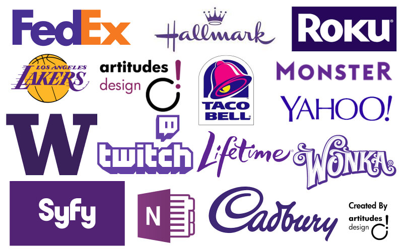
Purple logos
This secondary color is said to have a range of different meanings and associations, from luxury to mystery and spirituality.
When it comes to brand identity, purple or violet can certainly give your company logo a very modern and cool vibe. And if you’re looking for interesting logo color combinations, purple is a very strong contender, since it works equally well with complementary colors like pink and teal, or contrasting like yellow and orange (again, take notes from FedEx).
Color theory and color combinations: what you need to know
Whereas color psychology still doesn’t have enough scientific data to back up all of its findings, color theory is the scientific foundation of graphic design. The study of colors revolves around the color wheel which helps us determine how colors stand in relation to one another: are they complementary colors, contrasting, triadic.
While some basic understanding of color theory and the color wheel can help you make better design decisions, creating a brand identity is by no means a task for a non-designer. Whether you go for one specific color or a fun logo color combination, you ought to consider hiring a professional designer to help you out.
If you need help creating the perfect logo, our inexpensive and simple service might be for you. Schedule a demo to find out more or check out some of our work.

Having lived and studied in London and Berlin, I'm back in native Serbia, working remotely and writing short stories and plays in my free time. With previous experience in the nonprofit sector, I'm currently writing about the universal language of good graphic design. I make mix CDs and my playlists are almost exclusively 1960s.

Top-quality designers
A complete creative team at your fingertips: graphic and web designers, illustrators, and more.

Lightning-fast turnaround
Get start today and receive your first update on the next business day.

All-inclusive pricing
Unlimited requests and revisions. One flat monthly fee. No surprises.

Flexible & scalable model
No contract. Scale up and down as needed. Pause or cancel at anytime.
Continue reading


Explore some of our best designs
Get inspired by a curated selection of ManyPixels work. Download the portfolio to see what our team can create.


