13 Sleek and Professional Business Coach Logo Ideas to Attract Clients

TABLE OF CONTENTS

Let’s be honest: with heaps of information available online, there aren’t many people who will readily pay for business coaching services. Your branding needs to target the right audience, and your logo can help you do that in one glance.
Many business coaches are their own brand. Still, this doesn’t mean that people will automatically be drawn to you just because you’re a magnificent human being in real life. Business coach branding follows pretty much all the rules of small business branding.
What is your purpose as a business coach? Are you a coach for small businesses and entrepreneurs, or do you provide an exclusive service for the big players?
If you’re clear on this, it’s time to start thinking about your logo. When it comes to business coaching (or consultancy), there is a certain level of professionalism that you should uphold in your visual identity. After all, people look up to you for advice, and you want to seem trustworthy. This is why a simpler design for your logo is usually preferable.
Finally, as a business coach, you can certainly appreciate the importance of professional design. Practice what you preach and don’t end up with a sloppy, DIY logo. Simplicity does not equal simple design.
To help you decide what it is that you’re looking for, we’re sharing 13 trendy examples of real-life business coach logos. Browse through and find one that fits your coaching style best!
{{BRAND_BANNER="/dev/components"}}
1. Luxurious and elite
You understand that business coaching isn’t necessarily a luxury. It can be a sound investment for any business to get tailor-made guidance and resources that make sense for them. That said, there will be people out there who are on the lookout for a more exclusive service - something, not just any small business owner or entrepreneur has access to.
If this mindset matches your clients, then we recommend you take inspiration from Goldleaf Partners. Gold is always a safe choice if you want to communicate a sense of exclusivity. Paired with this stylish font it also makes a very elegant combination to impress even the most demanding of clients.

Of course, don’t forget to ask for some graphic design help should you need it!
We hope you found our examples helpful! Be clear on what kind of business coach you are and for whom and tell that story through your logo.
Again, think of nature-inspired elements that relate to your work. This is another excellent example from Tonny Loorbach. How slick is this stylized bird that excites a sense of movement and direction?
Remember that initials can also be stylized! This one is from coach Andrew Moreno.
Do be careful with initials, though, as some of them might turn into pretty unfortunate choices. If your name is Bob Smith, an initials logo might not exactly inspire trust with most clients!
2. Script fonts
If you’re thinking that the only route to go is bold, clear fonts: think again! Script fonts can give your logo a unique, approachable look.
EMyth is a brilliant example. The letters are readable, and the sleek black and white layout adds a more professional note. On the other hand, it’s the cursive that gives a more “human” feel. And since their mission is to provide a personal approach in business coaching, this style choice makes a lot of sense.

3. Stairs or bar charts
If you’ve already started brainstorming business coach branding and looked up some logos, you will definitely have come across this one!
It’s easy to see why this is such a favorite in the industry. Business coaches deal with a lot of data (hence charts). Still, it’s really the symbol of steps that perfectly depicts what business coaches do: guide people towards greater professional heights.
Club Capital’s logo also includes a little cloud icon. And this is pretty smart! It suggests that with these guys, sky is the limit!

4. Your initials
As a business coach, you might be building your brand around your own persona. This is why many people opt for giving their brand their own name.
In terms of the logo, an organic choice for you could be your initials. This one from Marani Consulting is our own work and a great example of a professional initials logo. Blue and white is a timeless combination which means you can easily adapt your logo to a different background or purpose.


Or this one from Eva-Britt Rodermann. The scribble makes a playful contrast to the professional-looking typeface used for her name, but also represents her initials EB.

5. Characters
Your work revolves around people. That’s why it’s very smart to make a human character the focus of your logo. Many coaches combine this with the steps imagery (chart element) to hone down the message of people going up.
If you want a more exciting twist, take a look at this logo from Wayne Herring. It’s definitely people-centric, while blue and orange make a pleasant contrast.

6. Communication
Just like the above example, it’s likely that you want your logo to tell a story of how well you communicate and work with other people.
In that respect, this example from Robin Volk is pretty cool. Sure, speech bubbles are a universal symbol for representing communication. But merging them together like this strengthens the idea of synergy and working together with businesses and individuals.

7. Nature-inspired
While you may think boho style logos are a better fit for health and life coaches, you really shouldn’t discard nature-inspired elements altogether. Remember that nature is closely associated with growth, and if used well, these elements can deliver a significant impact.
Take a look at this example from the Startup Coach. The leaf is elegant, unassuming, and very well incorporated with the name of the brand. Moreover, it’s a great idea to use this style if you work with startups. These businesses are often run by young innovators who will love to see a more casual logo. It sends the message that you’re there to help them grow, but also freely explore their potential: like a leaf carried by the wind.


8. 3D elements
Even though they have been around for a while, 3D effects can still deliver a powerful futuristic impact.
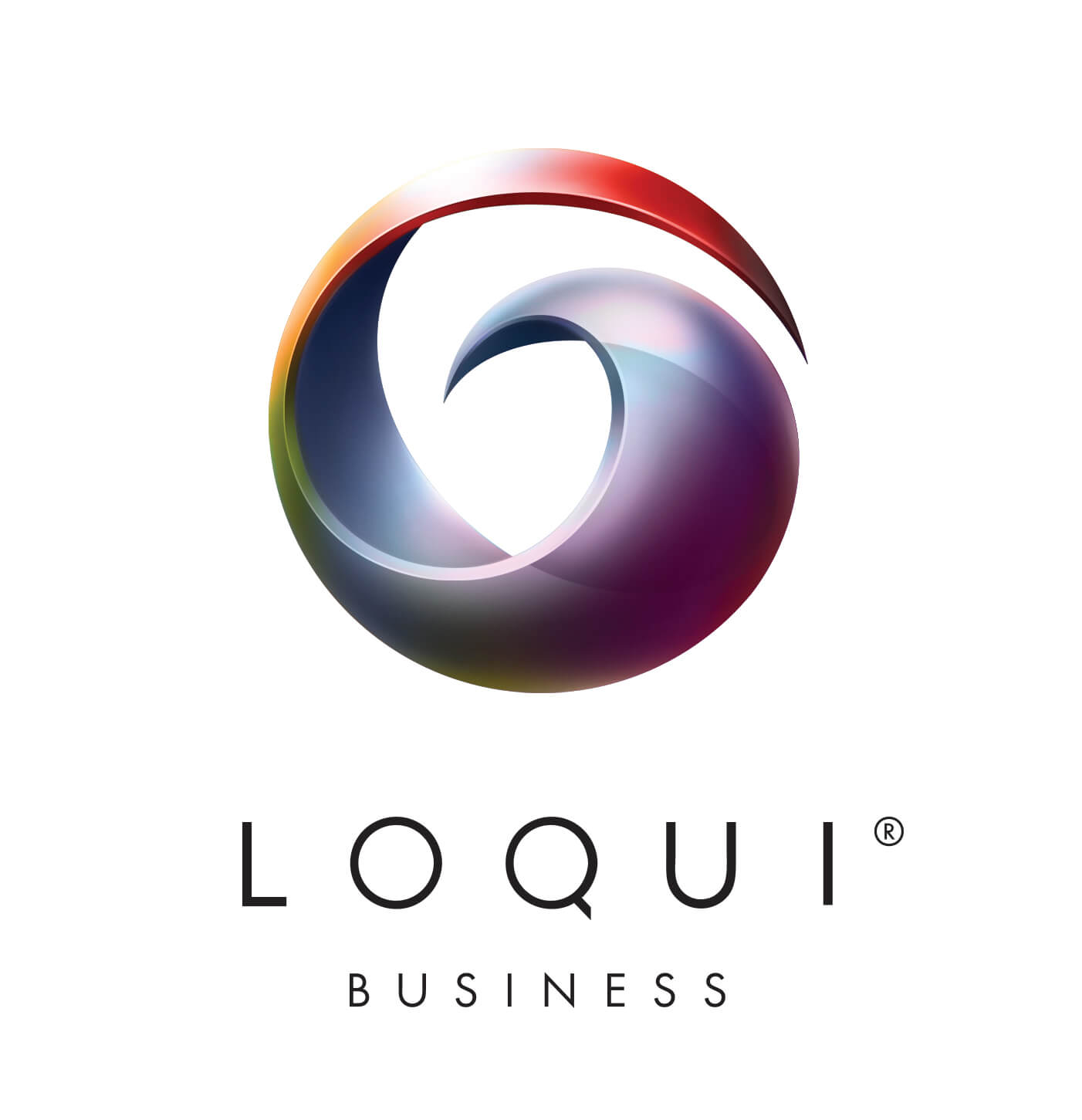
Let’s look at this example from Loqui, an app for improving internal communication in a corporate setting. It's cool and mysterious, but still very professional.
And just look at that mysterious orb! If you told me that it contains all the secrets of effective business networking I would have happily believed it.
9. Elegant
In this profession, you’re aiming to come across competent, knowledgeable, but also stylish. After all, design is a critical element of branding. If you want to establish yourself as an authority on style, going for black and white is always a safe option.
That’s not enough, though! Take a look at this snazzy example from Ollivier. Everything is well balanced, and the prominent, perfectly round ‘O’ really captures attention.

10. Geometric elements
Few professions fit this type of logo as well, but business coaching is definitely one of them. Because the nature of the job is so diverse, it might be hard to represent everything you do in one simple, unique symbol.
This is where interesting geometric elements can really step up your game! This logo from Oliver Wyman looks like a play on the infinity symbol, with two distinct parts that create a whole (just like a client and their business coach). A great motive to represent in business coach branding is synergy, and this one really conveys the message quite well.

11. Representing your niche
If you’re bold enough to work in just one industry, then definitely think about incorporating a key element into your logo.
Check out Vape Mentors’ logo. There’s a fire symbol that relates to vaping. However, the color choices still aren’t red, orange, yellow (even black), which probably would have made anything fire-related a little tacky. Instead, blue and orange (do I sense a pattern here?) make a strong professional statement.

12. Targeting a specific audience
One of the golden rules of branding is that you don’t have to be everything to everyone. A great logo will speak loudest to your most valuable customers.
Melinda Emerson is a terrific example. Her business is called SmallBiz Lady, and her logo checks all the right boxes. It’s unapologetically “feminine” and very bold at the same time. Since she works with women in business, this boss lady logo is the perfect way to reach out to her clients!

13. Icons
Like we said: professional doesn’t mean boring! If you think you’ve got an outstanding service, make sure your logo stands out.
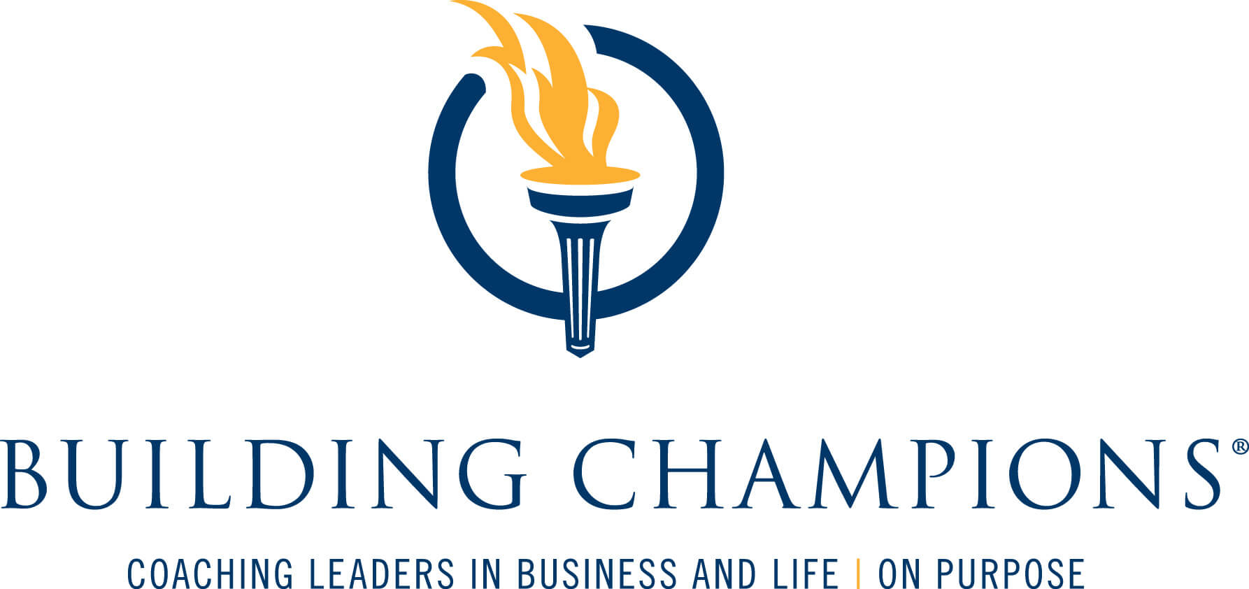
There’s nothing subtle about Building Champions’ Olympic flame icon. However, it still looks professional. The classy serif font and dark blue help the yellow flame deliver just enough of a kick without being overwhelming.
{{LOGOS_PORTFOLIO="/dev/components"}}

Top-quality designers
A complete creative team at your fingertips: graphic and web designers, illustrators, and more.

Lightning-fast turnaround
Get start today and receive your first update on the next business day.

All-inclusive pricing
Unlimited requests and revisions. One flat monthly fee. No surprises.

Flexible & scalable model
No contract. Scale up and down as needed. Pause or cancel at anytime.

Continue reading
Explore some of our best designs
Get inspired by a curated selection of ManyPixels work. Download the portfolio to see what our team can create.
