
15 Best Fonts for Packaging Design, by Product Type
TABLE OF CONTENTS

TL;DR
- ✅ Small print and ingredients: Inter. By our measurements it meets the EU's legibility rule from 6.2 pt.
- ✅ Food and drink: Fraunces (free) or Recoleta (paid) for warm, appetising product names.
- ✅ Luxury and beauty: Playfair Display for product names, Didot for display lines only.
- ❌ Skip for mandatory text: scripts and delicate display faces. The ones we measured need 8.2 to 9.5 pt just to meet the EU minimum.
- 💡 The rule: pay for personality on the front of the pack. Use a free, high x-height workhorse on the back.
A packaging font has two jobs, and most fonts can only do one of them. It has to give the product a personality at shelf distance, and it has to stay readable when a shopper squints at the allergen list. Food labels add a third job: in the EU and the US, the law sets a minimum size for mandatory text.
So we did something the other lists don't. We measured the x-height of every openly licensed font below from its font file, then worked out the smallest point size that still meets EU and US labelling rules. The fifteen fonts are grouped by product type, with a licence note and that size for each one.
For the size figures, we set each variable font to its Regular weight (and its smallest text optical size where it has one), measured the height of the lowercase x, and worked out the point size at which that x reaches the EU's 1.2 mm x-height minimum for mandatory food information. For the US column we used the FDA's 1/16 inch minimum for information panel text, which is measured on the lowercase o. We could only measure fonts whose files are openly licensed, so the paid fonts are marked as front-panel fonts instead.
What are the best fonts for packaging design?
The best fonts for packaging design are Inter, Fraunces and Playfair Display. Inter handles ingredients and legal copy at small sizes, Fraunces gives food and drink a warm voice, and Playfair Display brings luxury contrast. All three are free for commercial packaging.
The rest of this list adds range: paid display faces for brands that want something less familiar, condensed fonts for narrow labels, and a few fonts that look great on the front panel but should never touch the back one. No single font does everything on a pack, so plan on a pair: one display font for the name, one text font for everything else.
Sizes are the smallest point size that meets each rule at Regular weight, rounded to one decimal. EU packs whose largest surface is under 80 cm² may use a 0.9 mm x-height instead, which brings Inter down to 4.7 pt. Treat these as floors, not targets.
Before the fonts: custom packaging type
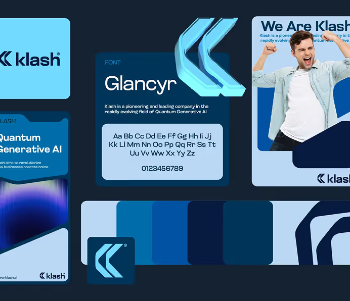
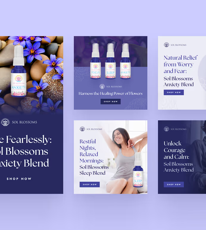
ManyPixels: when an off-the-shelf font isn't enough
Every font below is available to every competitor on the shelf next to you. That's the honest limitation of any font list. If your product name is set in the same Fraunces as the granola beside it, the font stops doing branding work.
ManyPixels is a design subscription, not a font download. A designer builds the type system for your pack: a custom-lettered product name where you need one, a licensed or free text face for the back panel, and the sizes and weights for each line, delivered as print-ready files with labels and boxes in scope. Plans start at about $699/month for the Advanced plan, you can pause for $10/month between launches, and you own 100% of the files (check manypixels.co for current pricing).
Best for: brands launching a product line that needs a consistent type system across several packs ✅
Not ideal for: a single one-off label you'll print once ❌
{{BRAND_BANNER="/dev/components"}}
Best fonts for food and drink packaging
Food and drink packaging fonts need to look appetising and read instantly. Soft serifs and rounded display faces suggest warmth and craft, which is why the 1970s "soft serif" style keeps coming back on snacks, coffee and chocolate. Pair any of these with a text face from the household section for the nutrition panel.
1. Fraunces: the free soft serif for food
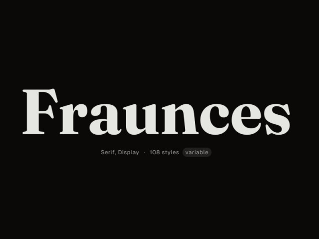
Fraunces is a free soft-serif family from Undercase Type with an optical size axis, so it gets sturdier when you set it small. It looks baked rather than drawn, which suits granola, bakery and coffee packs. A "softness" axis lets you round the corners off for a friendlier brand.
It's the rare display serif that also works on the back panel, reaching the EU minimum at 7.2 pt. The variable font file opens at its Black weight, so check you've set Regular before you size the small print.
Best for: bakery, cereal, coffee and snack brands on a budget ✅
Not ideal for: clinical or premium-minimal products ❌
2. Recoleta: the paid version of the same mood
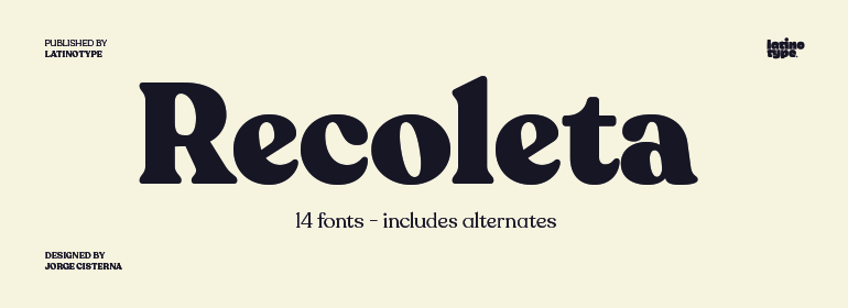
Recoleta is a retro serif designed by Jorge Cisterna for the Chilean foundry Latinotype. Its curves borrow from 1970s faces like Cooper and Windsor, and its alternate characters make a product name feel custom without paying for custom lettering.
If Fraunces feels too common in your category, Recoleta is the step up. You're paying for distinctiveness at headline size, not better small print.
Best for: chocolate, confectionery and specialty drinks ✅
Not ideal for: brands that need a free font for every supplier ❌
3. Milk and Honey: thick, retro and sweet
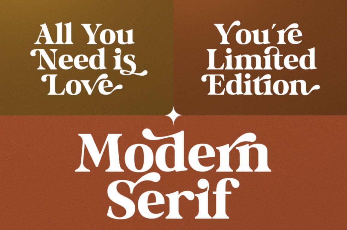
Milk and Honey is a thick, curvy display serif from the independent foundry Gatype, kept from the original version of this list. The swashes and alternate glyphs give a product name a hand-finished look. Just imagine it on an artisanal bar of chocolate.
Use it for one or two words only. The heavy curves that make it charming at 60 pt fill in at small sizes.
Best for: artisan chocolate, honey and jam labels ✅
Not ideal for: anything longer than a product name ❌
4. Bondie Slab: condensed vintage for drinks
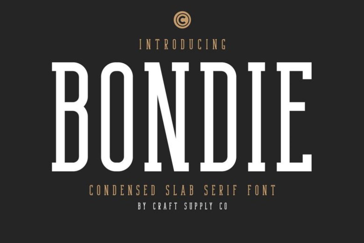
Bondie Slab is a condensed slab serif from Craft Supply Co, also kept from the original list. Condensed letters fit long names onto narrow cans and bottle necks, and the vintage slab feel suits craft beer, cider and grooming products.
It's a display font. Set the ABV, allergens and brewer address in something from the household section.
Best for: craft beer, cider and barber products ✅
Not ideal for: mandatory text or wide, short labels ❌
Best fonts for beauty and personal care packaging
Beauty and personal care packaging leans on two looks: clean geometric sans for skincare and "clinical" brands, and refined serifs or scripts for fragrance and gifting. Both styles tend to have small x-heights, which is exactly why ingredient lists on cosmetics are so hard to read. Check the size column before you commit.
5. Jost: a free Futura-style sans
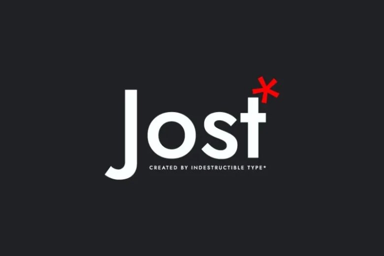
Jost is a free geometric sans from indestructible type*, inspired by the German geometric sans fonts of the 1920s such as Futura. It gives skincare and haircare packs that clean, confident look without a Futura licence.
Geometric fonts have small x-heights by design, and Jost needs 7.4 pt to meet the EU rule. That's workable, but tight on a 30 ml tube.
Best for: skincare, haircare and minimalist personal care ✅
Not ideal for: dense INCI ingredient lists on tiny packs ❌
6. Cormorant Garamond: elegant, but only for names
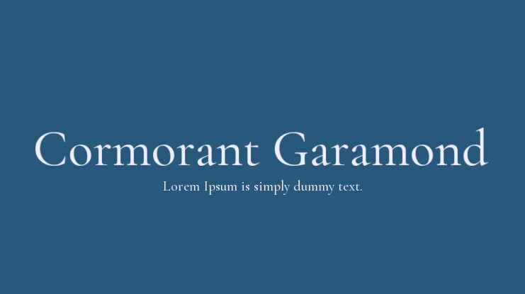
Cormorant Garamond is a free display Garamond by Christian Thalmann of Catharsis Fonts. It has long, graceful ascenders and sharp details that read as expensive on fragrance and candle packaging.
Its x-height is under 40% of the font size, so it needs 8.8 pt to meet the EU minimum. Use it for the name and the scent notes, not the safety warnings.
Best for: fragrance, candles and bath products ✅
Not ideal for: small print of any kind ❌
7. Josefin Sans: vintage geometric for headlines

Josefin Sans is a free geometric sans by Santiago Orozco of Typemade, with a deliberately vintage, elegant feel. It's lovely in spaced-out capitals on a lid or a sleeve.
Orozco designed it for larger sizes, and the numbers agree: 8.2 pt to reach the EU minimum. Pair it with a high x-height text face on the back.
Best for: spaced capitals on beauty boxes and gift sets ✅
Not ideal for: body copy or instructions ❌
8. Great Vibes: a script that stays readable

Great Vibes is a free formal script by Robert Leuschke of TypeSETit. Script fonts imitate handwriting, either formal like this one or casual like a marker pen, and they signal care and a personal touch. The Coca-Cola wordmark is the classic packaging example: Frank Robinson wrote it in an adaptation of Spencerian script, the business penmanship of the 1880s.
Great Vibes is clearer than most free scripts, but connected letters still blur at small sizes. Keep it to names and short messages.
Best for: gift packaging, wedding favours and fragrance names ✅
Not ideal for: anything a shopper has to read quickly ❌
Best fonts for luxury packaging
Luxury packaging fonts are almost always high-contrast serifs: very thick strokes beside hairline-thin ones. That contrast reads as fashion and jewellery at large sizes. The catch is printing: hairlines that look perfect on screen can break up on textured board or foil, so test on the real material.
9. Linotype Didot: the fashion classic, for display only
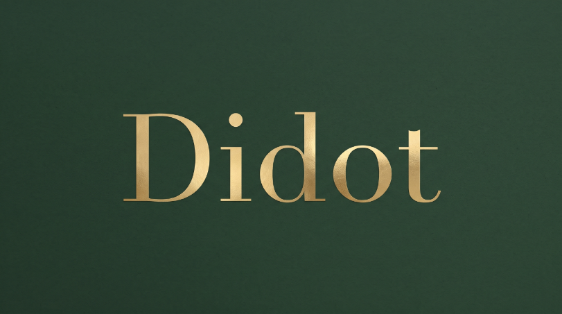
Linotype Didot was drawn by Adrian Frutiger in 1991, based on the types Firmin Didot cut between 1799 and 1811. It's the reference point for the "fashion magazine" look on perfume, watch and jewellery boxes.
Use it big. Its hairlines are the whole point, and they're the first thing to disappear when the type shrinks or the press runs slightly heavy.
Best for: jewellery, watches and fragrance at headline size ✅
Not ideal for: embossing, foil or any text set small ❌
11. Bodoni Moda: a free Didone with optical sizes
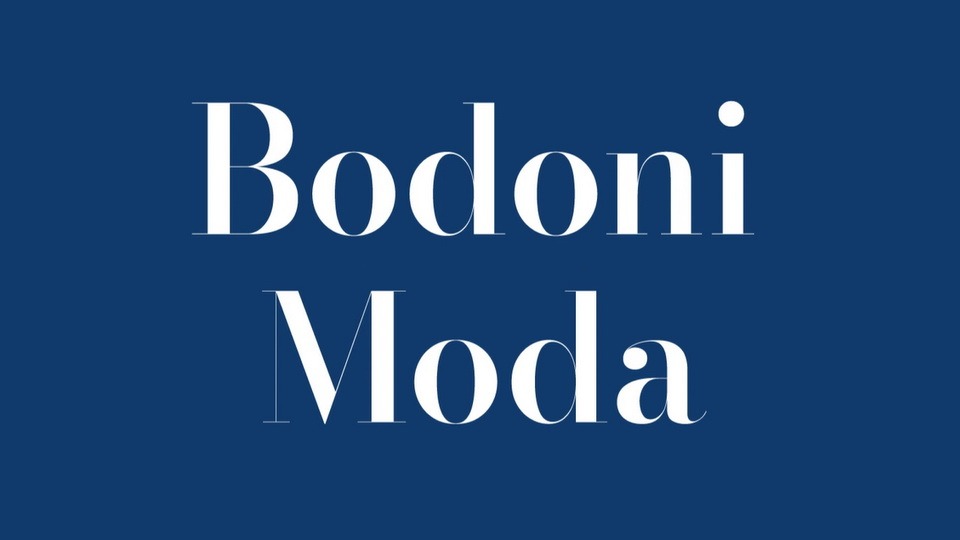
Bodoni Moda is a free Bodoni revival by Owen Earl of indestructible type*. Its optical size axis thickens the hairlines at small sizes, which solves the main printing problem with Didone fonts.
That optical size axis is why a luxury serif can reach the EU minimum at 7.4 pt here, when most can't be used small at all. It's the best free alternative to Didot on this list.
Best for: premium spirits, cosmetics and fashion accessories ✅
Not ideal for: rough or uncoated stock without a print test ❌
12. Playfair Display: the most versatile luxury serif

Playfair Display is a free high-contrast serif by Claus Eggers Sørensen. It has a much taller x-height than Didot or Bodoni, so it keeps the luxury look while staying readable.
At 6.6 pt for the EU minimum, it's the only luxury serif here you could reasonably use for short product descriptions as well as the name.
Best for: premium food, wine labels and boutique cosmetics ✅
Not ideal for: brands that want a rare, ownable look ❌
Best fonts for household and industrial packaging
Household and industrial packs carry the most mandatory text: instructions, hazard warnings, dosage and multilingual copy. These four fonts have the tallest x-heights on the list, and they double as the back-panel partner for every display font above.
12. Inter: the safest small-print font

Inter is a free sans by Rasmus Andersson, built for small text on screens. That same tall x-height makes it the strongest small-print font we measured.
Inter meets the EU's 1.2 mm rule at 6.2 pt and the US 1/16 inch rule at 8 pt, the lowest of any font here. Use it for ingredients, nutrition panels and instructions on any pack.
Best for: back panels, nutrition tables and multilingual copy ✅
Not ideal for: a product name that needs personality ❌
13. Roboto Slab: sturdy slab for tough materials

Roboto Slab is Google's slab-serif companion to Roboto, released under the Apache License. Slab serifs hold up well on rough printing like flexo on corrugated card, where thin details fill in.
It reaches the EU minimum at 6.4 pt, so it can carry both the name and the small print on a tool, garden or pet-care pack.
Best for: DIY, garden and pet products on corrugated or kraft board ✅
Not ideal for: premium or beauty positioning ❌
14. Barlow Condensed: fits narrow labels
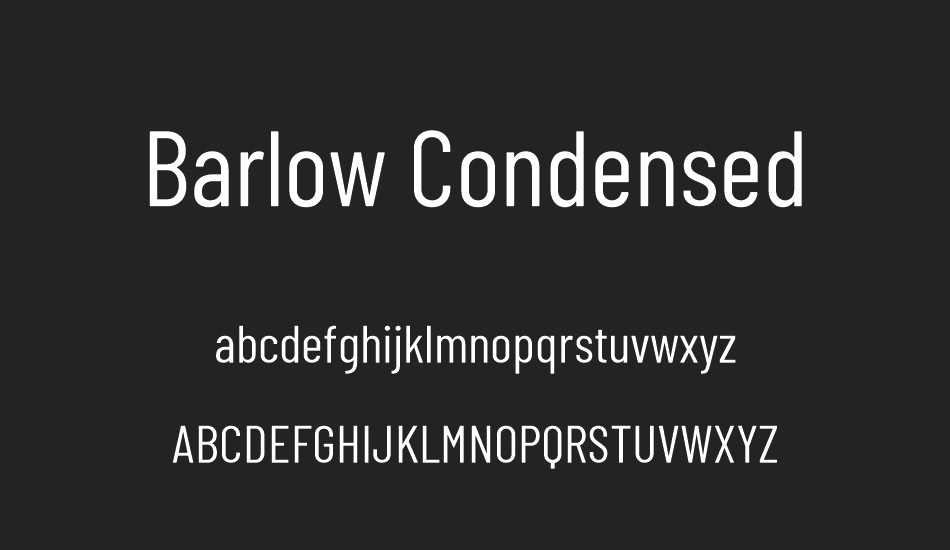
Barlow Condensed is a free, slightly rounded grotesk by Jeremy Tribby. Condensed widths fit more words onto bottle sides, spray cans and tube crimps without dropping the point size.
At 6.7 pt for the EU minimum, it's the best choice when your problem is width rather than height.
Best for: cleaning products, aerosols and narrow labels ✅
Not ideal for: large panels where a wider font reads faster ❌
15. Atkinson Hyperlegible: built for readers with low vision
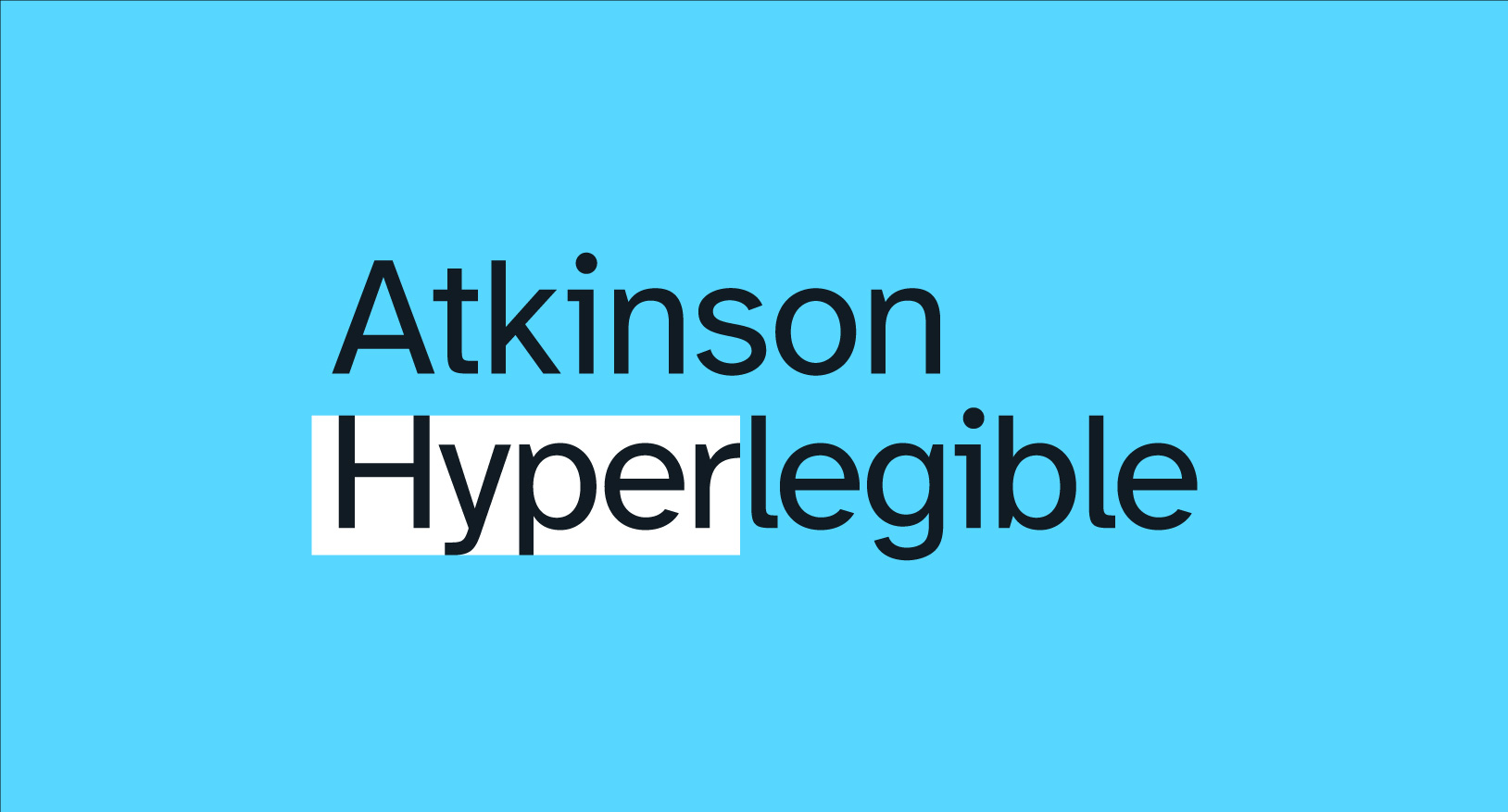
Atkinson Hyperlegible was made by the Braille Institute to help readers with low vision tell similar characters apart, like a capital I, a lowercase l and the number 1. It's free under the SIL Open Font License.
On dosage and safety text, misreading a character is a real risk, and this font is designed to reduce it. It meets the EU minimum at 6.9 pt.
Best for: medicine, supplements and products for older shoppers ✅
Not ideal for: fashion or luxury packaging ❌
How small can text on packaging be?
On EU food packaging, mandatory text needs an x-height of at least 1.2 mm, or 0.9 mm if the largest surface is under 80 cm². In the US, information panel text must be at least 1/16 inch tall, measured on the lowercase o. The point size that meets these rules depends on the font.
That last sentence is the one most designers miss. Both rules measure the height of the letters, not the point size in your design software. A font with a small x-height, like Cormorant Garamond, needs 8.8 pt to reach 1.2 mm. Inter gets there at 6.2 pt. Same rule, very different label.
A few habits keep small print legible in practice:
- Use Regular or Medium for small text. Light and Thin weights lose strokes on press.
- Keep contrast high. Dark text on a light, uncoated background is safest; reversed white text on a dark colour needs a heavier weight.
- Avoid scripts, italics and condensed display faces for mandatory information.
- Print a proof on the real material. Foil, kraft and textured stock all eat fine detail.
The same discipline applies to any small print piece. Our guide to business card sizes covers the safe zones and trims that cause the same headaches on cards. Bottomline: pick your small-print font by its x-height, then size it with the numbers in the table above.
These figures cover EU and US food rules. Cosmetics, medicines and chemicals have their own labelling regulations, so confirm requirements for your category and market before you print.
Do you need a commercial licence for packaging fonts?
Yes, you need a licence that covers commercial print use, but free fonts usually already include it. Fonts under the SIL Open Font License or the Apache License can be used on packaging you sell. Paid fonts need a desktop licence, and some foundries charge extra for logo use or high volumes.
The SIL Open Font License lets you use a font in any printed product, including packaging, without paying or crediting the designer. The main restriction is that you can't sell the font files themselves. Ten of the fifteen fonts on this list ship under it, and Roboto Slab uses the similarly permissive Apache License 2.0.
Paid fonts are where buyers get caught. Before you commit a paid font to packaging, check three things in the licence:
- Number of users or computers. Your designer, your printer and your packaging supplier may all need to open the file.
- Logo and trademark use. Some licences restrict using the font as a registered logo or product name.
- Print runs or products for sale. A few licences cap the number of units or exclude products made for resale.
Outlined text in the final artwork doesn't remove the need for a licence. You still needed one to set the type in the first place. For more on choosing type with brand use in mind, see our guide to choosing a logo font.
How to choose a packaging font
Start with the back panel, not the front. The text face is the font that has to pass a legal test, so pick it first and choose a display font that pairs with it. If you're unsure which family suits your brand, our explainer on serif vs sans serif fonts is a good starting point.
If your pack carries a lot of mandatory text, then 👉 set it in Inter or Atkinson Hyperlegible and keep your display font to the name.
If you sell food or drink and want warmth, then 👉 use Fraunces, or Recoleta if Fraunces is already common in your aisle.
If you're positioning as luxury, then 👉 use Playfair Display for flexibility, or Didot and Bodoni Moda for headline-only drama.
If your labels are narrow or your board is rough, then 👉 use Barlow Condensed or Roboto Slab.
If your product sits next to competitors using the same free fonts, then 👉 invest in custom lettering for the name and keep a free font for the rest.
For the wider principles behind pairing and hierarchy, our guide to typography in graphic design goes deeper, and our walkthrough of product packaging design covers the rest of the pack.
FAQs
Bottom line
✅ For most packaging, pair a display font for the name with Inter or Atkinson Hyperlegible for the small print. Fraunces is the best free choice for food and drink, and Playfair Display is the most practical luxury serif. Pay for personality on the front of the pack, never for legibility on the back.

Privileged to be raised in the most beautiful city in the world, Novi Sad. Studied biology and ecology at the University of Novi Sad. A creative soul, travel enthusiast, passionate writer, and crazy dog lover. Proud mama of (for now :) ) one stubborn English Bulldog.

Top-quality designers
A complete creative team at your fingertips: graphic designers, illustrators, motion designers and more.

Lightning-fast turnaround
Get started today and receive your first update on the next business day.

All-inclusive pricing
Unlimited requests and revisions. One flat monthly fee. No surprises.

Flexible & scalable model
No contract. Scale up and down as needed. Pause or cancel anytime.
Continue reading


Explore some of our best designs
Get inspired by a curated selection of ManyPixels work. Download the portfolio to see what our team can create.