

15 College Logos For An Impressive Academic Brand
.jpg)
TABLE OF CONTENTS


It’s the quality of teaching that really counts, but these awesome examples of college logos will definitely show you that your university’s logo can make all the difference in creating a memorable and unique brand image.
{{BRAND_BANNER="/dev/components"}}
Traditional emblems and seals
A classic emblem logoe vokes a sense of tradition and respect. But you don’t need to have been around for hundreds of years to go for this type of logo! Look to the future and create a timeless logo design that will speak to students and proud parents for generations to come.
1. Harvard University
Let’s start with the most famous college logo in the world. Harvard logo consists of a shield with three open books spelling out the word veritas, meaning truth, and its name at the bottom. It’s very traditional with its red color and wreaths, however it’s still relatively simple and easy to adapt. Each faculty at the university has its own version of the Harvard shield.

2. Johns Hopkins
Many emblems have very intricate designs, which may not always look great across all uses. Although it’s one of the most famous universities in the world, Johns Hopkins has a logo that’s still surprisingly simple and modern.
The elegant serif typography found in the wordmark portion of the logo, complements the minimalist emblem well to create a memorable and effective primary logo, while the emblem on its own is great for use on things like business cards, varsity jackets and even yearbooks.

3. Universities of Canada in Egypt
If you’ve decided that your new logo is going to be an emblem, you should also think about which graphic elements you want to include in the framed section. You might want to go with the university mascot, motto, or an architectural feature of your location. The most important thing to remember is that the overall design shouldn’t look cluttered. This is a wonderful contemporary example of an academic emblem that manages to include several design elements: the Canadian symbol of a maple leaf, the Egyptian eagle, pillars and an ancient building, representing civilization and a strong foundation. Even with this many elements, the emblem’s design looks crisp and would work well in smaller sizes as well.

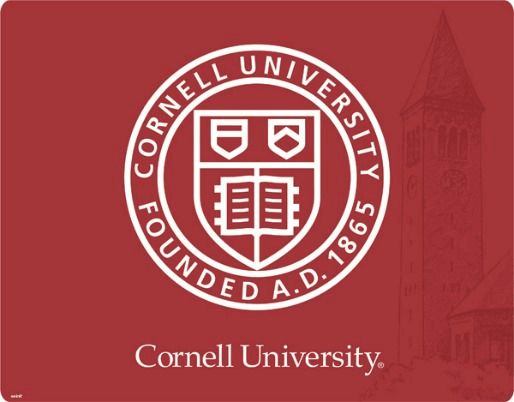
4. Cornell University
Here’s another Ivy League name on our list, with a surprisingly current and memorable logo. Books and studying are synonymous with the university experience (what parties, mom?), so it always makes sense to include this image in your logo. What’s great about Cornell’s logo is that it includes the year of foundation, showing the college’s long-standing history and tradition, but with a more modern, minimalistic design that can be easily reproduced as sticker design or merch like hats, mugs, etc.
5. Pennsylvania State University
Who says that all emblems have to be Latin scripts and scriptures? Here’s an example of a wonderful emblem that's equal parts traditional and cool. Penn State University pays homage to the Nittany Lion, a sculpture gifted to the university in 1942. With the subtle use of gradients, the logo is perfect for both print and digital use, and thanks to an iconic mascot, it’s pretty ideal for things like social media profile pictures and athletic programs.

Simple wordmarks
Using your university name on your logo is a great way to create a buzz around your brand and ultimately develop a lasting brand identity. There are so many techniques you can use to make a simple wordmark pop: from an interesting color scheme to gradients and drop shadows. However, remember that the most important part of any logotype is typography.
6. Universidad Villanueva
Let’s start with a very simple and effective example. The crisp sans serif typography creates a modern brand image for Universidad Villanueva, while the cool monogram is perfect for use on small printed materials like business cards and letterheads.
Although monochrome, this college logo uses contrast in an interesting way, since the typography in the wordmark is more curved with softer edges, while the U and V have very sharp and bold finishes.

7. Warsaw University of Technology
Another great thing about logotypes is that you can easily create different versions to match the international nature of your institution. Warsaw University logo demonstrates how this idea can work really well, created with an exciting modern font Adagio Slab.
Even though this university dates back to 1826, as a technology university it's important that their visual identity suggests an appreciation of trends, innovation and change.

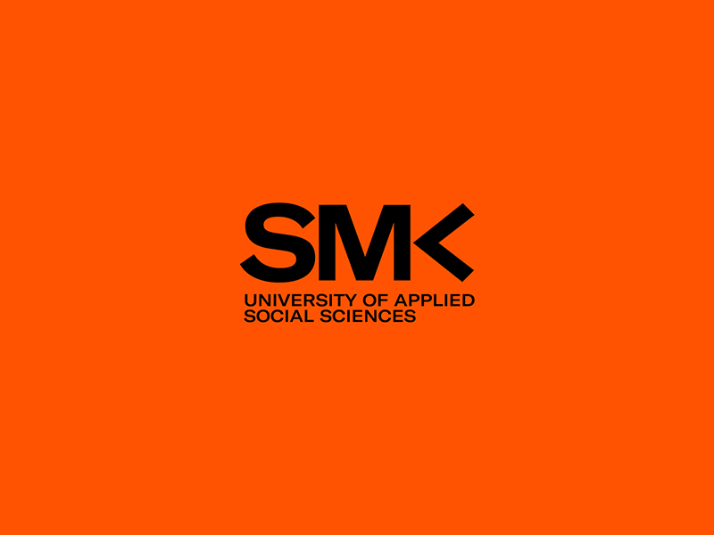
8. University of Applied Social Sciences
If your university specializes or is well-known in a particular academic field, it makes sense that the logo should reflect this. A traditional serif monogram or wordmark would probably be more appropriate for a classical studies or literature department. But this sleek and dynamic design is perfect for a “trendy” field like applied social sciences.
9. London School of Economics and Political Science
Many people download free logo templates with the idea that they will simply edit an EPS file and create a totally custom logo, by simply changing the color and font. But, in professional logo design, every element can make an impact.
LSE is a perfect example of this. Thanks to its signature red color (and not just any red, but specifically PMS 485) and the dainty yet professional typography, this logo looks tailor-made exactly for the innovative school that many contemporary thinkers, business people and leaders have attended.

10. Vanderbilt University
Adding a simple visual element to a wordmark or monogram can be a great way to add visual interest, but retain a more classic and stylish look. Vanderbilt’s simple “V” monogram with an oak leaf and acorn is perfectly fitting for both business cards and letterheads, but also campus athletics merchandise and signage.

Creative combination marks
Combination marks usually consist of a wordmark portion and a graphic element. It’s a great option for a college logo, because it’s memorable and versatile (e.g. you can use the visual element as a brand mark).
11. University of Paris
If your first association with Paris is a sense of style, then the latest rebrand of the University of Paris will not disappoint you. This gorgeous monogram was created in 2019, and uses an elegant custom font called together with the most iconic Parisian landmark.
This is a great way to attract students from all over the world, and the design choice doesn’t feel forced.

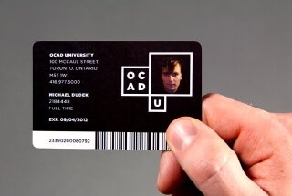
12. Ontario College of Art and Design
What better way to find logo design inspiration than looking at the examples of art schools, like Ontario College of Art & Design? Now, you may not think much of this modern, albeit very minimalistic academic logo at first. However, its ingenuity lies in its versatility.
The clear space in the largest rectangle allows you to place different images and icons to create an interesting twist on this logo.


13. University of Surrey
How about a more traditional-looking combination mark? I hear you! Many historic universities have a crest, which can be a good starting point for a modern and new logo design. University of Surrey’s elegant deer and key help create a lasting and memorable brand image. And if you need a university athletics mascot, well then a design like this will naturally guide you to the best possible choice!e!

14. Stanford University
You should be cautious about using colors for your logo since this can sometimes get tricky (e.g. many non-designers forget that before printing colors on any design need to be done in the CMYK mode).
Still, that doesn’t mean you need to stick to monochrome.Stanford University’s logo sports a classic color combination that is definitely not going out of style anytime soon. The redwood tree in the logo represents the university’s home state.

16. Universidad EIA
The last example on this list is a very cool modern logo that could even be used as an innovative tech logo. The owl is often used as the symbol of wisdom, so it makes perfect sense this would be a good choice for a higher institution logo.
However, as a school that specializes in innovative fields such as health science and engineering, a very traditional-looking logo would certainly miss the mark for Universidad EIA.

Get your university logo & branding for less!
We hope this gives you plenty of ideas to share with your branding design agency of choice.
However, if you’re looking for a much more affordable and faster way to get a college logo, going with a professional design service is the only choice! Our monthly graphic design packages include all the design assets you could possibly need (logo, brand guide, website, social media, ads, and more), all at a fixed monthly rate.
You get unlimited revisions, access to a team of designers with diverse skills and styles, as well as professional project managers to oversee the design process.
Need to talk it over? Book a personalized 1:1 consultation for a chance to ask us any questions.

Having lived and studied in London and Berlin, I'm back in native Serbia, working remotely and writing short stories and plays in my free time. With previous experience in the nonprofit sector, I'm currently writing about the universal language of good graphic design. I make mix CDs and my playlists are almost exclusively 1960s.

Top-quality designers
A complete creative team at your fingertips: graphic and web designers, illustrators, and more.

Lightning-fast turnaround
Get start today and receive your first update on the next business day.

All-inclusive pricing
Unlimited requests and revisions. One flat monthly fee. No surprises.

Flexible & scalable model
No contract. Scale up and down as needed. Pause or cancel at anytime.
Continue reading


Explore some of our best designs
Get inspired by a curated selection of ManyPixels work. Download the portfolio to see what our team can create.


