
7 Types of infographics (with examples)

TABLE OF CONTENTS


TL;DR
✅ There are seven main infographic types: statistical, timeline, comparison, process, geographic, hierarchical, and how-to. Pick the type based on the shape of your data, not the other way round.
- 📊 Statistical and comparison types work best for research, benchmarks, and head-to-head decisions.
- 🔄 Process and how-to types work best for sequences someone needs to follow, not just look at.
- 🗺️ Geographic and hierarchical types work best for spatial data and organizational structure. Both fail fast when overloaded.
- ⚠️ The most common mistake across all seven types is cramming in more data points than the format can hold. Most break down past 6 to 8.
Introduction
Search "infographic examples" and you will find plenty of galleries. Most of them skip the part that actually matters: which type fits the data you are starting with. A timeline cannot rescue a comparison you are trying to make, and a process infographic will flatten a set of statistics into something that reads like a report cover.
Here is the more useful version. There are seven main infographic types, and each one is built to carry a different shape of information. Below are real, published examples of each, not stock templates, along with the brief-level details you need before you commission or design one yourself: what data suits the type, roughly how many data points is too many, and the mistake that shows up most often.
{{INFOGRAPHICS_PORTFOLIO="/dev/components"}}
1. Statistical infographics
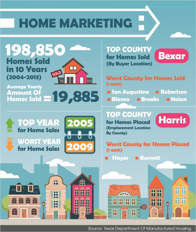
A statistical infographic turns raw numbers into something a reader can absorb in seconds, without pretending the numbers say more than they do. San Antonio Mobile Homes built one around mobile home sales trends: pricing shifts, regional demand, and financing patterns, each pulled from its own labeled source and presented as one chart type per data set rather than mixing bar charts, pie charts, and icons on the same panel.
This type suits survey results, benchmark studies, and internal performance data, anything where the point is "here is what the numbers show." The data point ceiling is lower than people expect: past 6 to 8 headline figures, a single infographic starts to read like a spreadsheet screenshot. If you have more than that, split it into a series or move to a full report with our tips for presenting data.
The most common mistake is precision that implies certainty the data does not have, showing "47.3%" from a sample of 40 respondents, or comparing two metrics that use different denominators without saying so. A close second is picking a chart type because it looks interesting rather than because it is the right shape for that specific number.
2. Timeline infographics
A timeline infographic works when the point you are making is that something changed over time, not just that a list of things happened. Spotify's A Visual History is a strong published example: an interactive scroll through company milestones from its 2006 founding to recent product launches, with imagery attached to each entry instead of a flat list of dates.
This type suits company histories, project milestones, and product roadmaps, anything where sequence itself carries meaning. A useful ceiling is 8 to 12 milestones before the format becomes unreadable. For a longer history, group entries by era or year rather than listing every event at the same scale, which is exactly what keeps Spotify's version legible despite covering two decades.
The common mistake is giving every event the same visual weight. If 15 things happened but only 3 of them actually mattered, the timeline should show that difference through size, color, or spacing, not force the reader to guess which milestones the article considers most important.
You can also use a colorful timeline infographic to present the milestones you or your business achieved in a particular year. In any infographic guide, contrasting colors are always suggested rather than a monochromatic theme when designing a timeline infographic.

3. Comparison infographic
A comparison infographic sets options side by side so a reader can decide between them without reading four separate articles. Mayo Clinic's caffeine content tables are a clean published example, comparing coffee, tea, soda, and energy drinks on the same two criteria (serving size and caffeine content) across every entry, rather than switching what is measured from one drink to the next.
This type suits product comparisons, before-and-after results, and decision guides. It works best with 2 to 5 options. Past that, the format stops being scannable and becomes a table pretending to be an infographic, at which point a real table is the more honest choice.
The mistake to watch for is comparing on criteria that do not actually drive the decision, or listing so many criteria that the one that matters gets buried. Mayo Clinic's version works because it holds the criteria constant across every drink type. A weaker version would compare coffee on taste, tea on caffeine, and soda on sugar, three different arguments dressed up as one comparison.

4. Process infographics
A process infographic breaks a workflow into steps a reader can follow in order, which only works if the steps are genuinely sequential. The USGS water cycle diagram is one of the most widely reused process infographics anywhere, walking through evaporation, condensation, precipitation, and collection as a closed loop rather than a flat list.
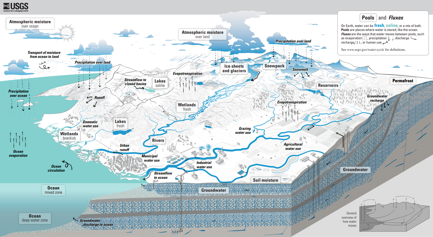
This type suits manufacturing steps, onboarding flows, and any procedure with a clear order of operations. Keep it to 4 to 7 steps. Past that, group the steps into phases (like the water cycle's four stages) instead of numbering fifteen individual actions in a single row.
The common mistake is numbering steps that are not actually sequential. If two steps happen in parallel or in either order, forcing them into a numbered line tells the reader something false about how the process works, and it is the fastest way to get a "wait, is this right?" comment back on a design draft.
5. Geographical infographics
A geographic infographic ties data to location, and it only works when the reader can tell what the color or shading means without a second look. The CDC's weekly FluView map shows regional flu activity across every US state using a single shaded scale, updated weekly, with no competing metrics layered on top.
This type suits sales by region, distribution patterns, or any data where "where" is the story. Stick to one metric per map. Layering a second metric, like adding population density on top of activity level, usually makes both harder to read rather than adding insight.
The common mistake is using too many shade gradations. Past 5 or 6 steps on a color scale, most readers cannot reliably tell one shade from the next, which defeats the purpose of a map in the first place. Less really is more here.

6. Hierarchical infographics
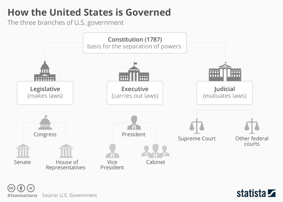
A hierarchical infographic shows structure: who reports to whom, what ranks above what, or how a system branches. Statista's "How the United States Is Governed" chart is a clean published example, laying out the legislative, executive, and judicial branches and how they check each other, without collapsing the relationships into a single flat list.
This type suits org charts, decision trees, and category systems. Three tiers deep is the practical limit for a static image. Beyond that, the boxes get too small to read or the chart needs to become an interactive tool instead of a picture.
The mistake that breaks these most often is uneven branching, one box with two children sitting next to another box with twelve. It is not just a visual problem. It usually means the underlying structure needs to be reorganized before it is drawn, not redesigned around.
 You will find more infographics at Statista
7. How-to or instructional infographics
A how-to infographic tells the reader what to do, which is a different job from a process infographic explaining how something works. The CDC's Project Firstline devices infographic is a real published example: a single-page guide for healthcare workers on recognizing infection risks from medical equipment, built around actions to take rather than background explanation.
This type suits safety guidance, setup instructions, and tutorials, anywhere the reader needs to act, not just understand. Keep it to 5 to 8 steps. A longer procedure should split into a two-part series rather than shrinking the type size to fit everything on one page.
The most common mistake is assuming the reader has more context than they do, skipping a step because it seems obvious to whoever wrote the brief. The CDC's version avoids this by stating the risk and the action together at every step, so no step depends on the reader already knowing something.

Which infographic type should you use?
The type should follow the shape of the data you already have, not a template you liked. If you are not sure which of the seven fits, work through these in order.
If your data is a set of numbers or survey results, use a statistical infographic. If your point is that something changed over time, use a timeline. If you are weighing two or more options against each other, use a comparison. If you are explaining a sequence someone needs to follow, use a process or how-to infographic: a process infographic explains how something works, while a how-to infographic tells the reader what to do. If your data is tied to location, use a geographic infographic. If you are showing rank, structure, or reporting lines, use a hierarchical infographic.
Most infographics that read as generic tried to do two of these jobs at once. Pick one job per infographic. If you are still at the idea stage rather than ready to brief one, our infographic ideas guide is the better starting point. For the fundamentals of infographic design beyond type selection, see our complete guide to infographic design, and once you know where it will live, our guide to infographic design on websites covers the distribution side.
Getting infographics produced
Building any of these seven types well takes more than picking a template. It takes someone who can turn a spreadsheet or a checklist into something a reader understands in the first three seconds, without losing the data underneath.
ManyPixels' infographic design service covers all seven types above, from a single statistical graphic for a blog post to a full hierarchical chart for an internal deck. Requests go into a queue and come back as a daily output, so a straightforward infographic usually gets a first draft within one to two business days, with unlimited revisions included until it is right.
If you are weighing whether to build it yourself from a template or brief a designer, that decision usually comes down to how polished it needs to look versus how fast you need it done. Explore ManyPixels plans to see what fits.
Bottom line
Pick the infographic type based on what your data actually looks like, not the template that caught your eye. Statistical, timeline, comparison, process, geographic, hierarchical, and how-to each solve a different problem, and mixing two of them into one image is the fastest way to end up with something nobody reads past the headline.
.avif)
Rohit is a novelist (not a NY Times Bestseller!), an avid reader, a passionate content writer, and does YouTube on the side as a hobby! When he is not researching and writing content, he loves to read books and watch movies, TV shows, and anime.

Top-quality designers
A complete creative team at your fingertips: graphic and web designers, illustrators, and more.

Lightning-fast turnaround
Get start today and receive your first update on the next business day.

All-inclusive pricing
Unlimited requests and revisions. One flat monthly fee. No surprises.

Flexible & scalable model
No contract. Scale up and down as needed. Pause or cancel at anytime.
Continue reading
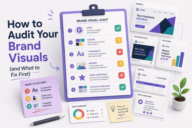


Explore some of our best designs
Get inspired by a curated selection of ManyPixels work. Download the portfolio to see what our team can create.








