
12 Design Mistakes That Could Lead Your Small Business Down a Path of Bad Design

TABLE OF CONTENTS


One mistake in your design could lead to another. Before you know it, you’re on a slippery slope sliding straight towards bad design. We’ve listed the most common design mistakes small business owners make so that you can avoid them.
Design is thrown at us all the time, both good and bad. As small business owners, your to-do list grows by the minute and squeezing in a design session dangles at the bottom. But the harsh reality is that this is costing you customers.
No matter how hard you try to avoid this cliché, everyone judges a book by its cover, which means that looks matter, whether you’re a big corporation or a small business. Learn more about the 12 common design mistakes so that you can avoid them.
What is bad design?
We'll lay down some ground rules before guiding you on your quest for good design. Because, let’s face it, to avoid a design fail, we first need to know; what is bad design?
“Bad design is smoke, while good design is a mirror.”
- Juan Carlos Fernandez
Just like smoke, bad design can cloud your vision and mislead you. Good design is like a mirror, reflecting the clear truth.
If you ask us, bad design is a missed opportunity. Carelessness, even. But that’s coming from people who take their design pretty seriously. Bad design is complicated, not thought-through, and defeats its purpose.
It screams out inadequacies, making bad design easy to spot. Don’t believe us? After going through the 12 most common design mistakes, we’ll show you some examples of poor design.
12 Design mistakes small business owners often make
Forewarned is forearmed: here are the 12 most common design mistakes for you to avoid:
Not knowing your audience
When it comes to reaching your audience through design, it is vital to know exactly who your audience is. A pro-tip, especially aimed at small businesses, is to go for a small but loyal customer base rather than a big one.
You don’t have to appeal to everyone. If your audience is middle-aged accountants, your flashy, fun design is probably not going to work. And vice versa. If your customers are flashy twenty-somethings, you most likely don’t want to come across as a middle-aged accountant.
When you don’t know who exactly you’re designing for, a design fail is bound to happen. Specify your audience by asking yourself as many questions as possible about who you want your customer to be. Ideally, gather up a focus group consisting of customers and ask them for feedback.
Confusing or non-existent brand identity
Newsflash: a brand identity does not equal a logo. Instead, creating a brand identity is a long and detailed process. It consists of the overarching strategy of what you try to achieve as a business. What message do you want to convey, and to whom? And how do you want them to feel about it?
If your brand identity is unclear or non-existent, a visual identity is far out of reach. Your visual identity comprises all of your brand assets and affects how customers perceive your brand. And this is crucial. Remember how books are judged by their cover?
This article is jam-packed with tips on creating a strong brand identity.
Plagiarism
Finding inspiration is one thing - copying is something totally different. Messing about with images that are copyrighted could get you in serious legal trouble.
Apart from getting into copyright infringement claims, it also doesn’t look great on your part. Copying blindly shows your customers a sense of carelessness. And those with a good eye will probably not take you seriously.
Being unoriginal and taking stuff from others also means that you’ll always be a step behind your competitors. We probably don’t have to tell small business owners how crucial it is to be unique and stand out from the crowd.
Bad typography and color choices
Yes, the aesthetics of design are subjective. But let’s not beat around the bush; there actually is such a thing as poor design. Making bad design choices for fonts and colors can have a major effect on your brand.
Even though it seems like one of the more straightforward tasks in design, picking out colors and typography is a precise process. Too much contrast in your colors or too little spacing can make your design illegible, but it can also cause confusion. A bright red and deep black for a dentist’s office, for example, would throw anyone off.
Overly complex designs
Small business owners are excited about what they do, and rightfully so. But sometimes, this could mean they want to show off every single aspect of their business. The result? An overly complex and crowded design.
The next time you get a little carried away, remember that less is more. Consider what your clients need to know and declutter to go from bad to good design.
Too little going on
There is a fine line between good design and bad design. Because while having too much going on equates to bad design, too little can have the same repercussions. With a seemingly incomplete and very minimalistic design, you’re going to attract a tiny audience.
Minimalism is all the rage, and when done correctly, it can work very well. But especially when it comes to small businesses, people want to know who you are and what your business can do for them. Being overly cryptic or leaving too much to the imagination will leave your audience guessing.
The key to producing a design is balance. Your design should contain enough information without being oversaturated.
Misleading or too many CTAs
A great call to action (CTA) is two things: clear and well-timed. If it’s unclear what exactly you want from your audience, people are less likely to act. This also goes for an ill-timed CTA. Place one in your design too soon, and you come across as pushy. Place one somewhere at the bottom, and you may have lost the majority of your audience already.
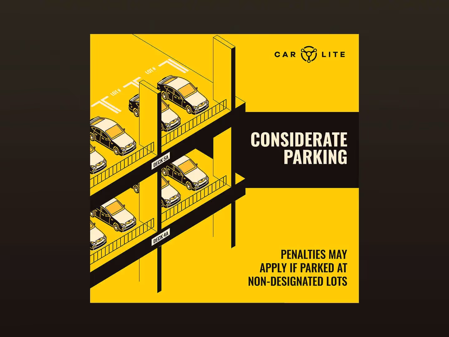
Your CTA is successful when it’s both subtle and powerful. For example, this design by one of our designers below. It focuses on what the product or service can do for you (discovering the world), telling you why you should act now (discount). Instead of the regular ‘buy now’ or ‘click here’, the designer went with the more unique approach of ‘let’s go’.

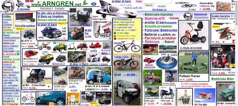
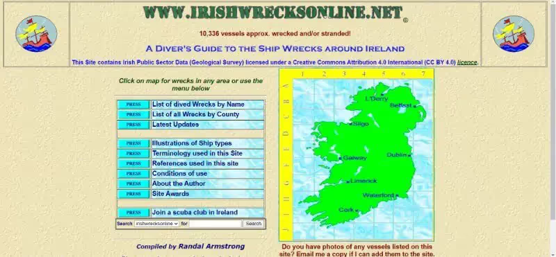
Irishwrecksonline is an example of outdated design. At first glance, you would assume this website’s information hasn’t been updated in a long time. Most visitors probably wouldn’t bother clicking further because of the badly designed page.
Now for the total opposite. Take a look at the below example of a design with too little going on. Do you really want to “touch start” without having a clue about what is going to happen next? Because I sure don’t.
Boring visuals
Yes, stock photos can do the trick, especially if you don’t have any visuals available yet. But have you ever considered that your audience may have seen the stock photo floating around the internet already?
With nowadays’ saturated markets, standing out from the crowd is a must. Having unique visuals will do the trick and put you one step ahead of businesses that use stock photos or overused designs from platforms like Canva.
Outdated design
Not everyone is an early adopter, and honestly, not everyone needs to be. Selling agricultural products? Then don’t worry about learning the newest TikTok dance to promote your brand.
However, with the digital world ever-evolving, you need to keep up at least somewhat. Outdated design can make you seem untrustworthy. For example, would you order from a webshop that has not updated its website since 2010?
Inconsistent design
Being inconsistent with your design will negatively affect on the recognizability of your brand. If you want your audience to recognize you when you pop up in their feed, you need to be consistent.
A few simple tactics will help you do this:
- Use the same colors
- Maintain a single tone-of-voice
- Use your logo as a watermark
- Reuse the same elements for different platforms
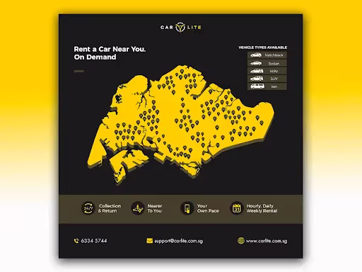
Below is an example by one of our designers who nailed consistency by conscious use of colors and illustrations.

Web design mistakes
For small business owners, their website is one of their biggest assets. People discover businesses online more and more, so it’s crucial that your website is easy to find and easy to navigate.
An overcomplicated website that doesn’t show what your brand is all about is a design fail as clear as day. Make sure your website is mobile-friendly, contains enough information, and is optimized for search engines. Otherwise, you may be losing potential customers.
Here are 7 tips for designing a website that Google will love.
What are some examples of bad design?
If you’re a visual learner, you may be wondering: What are some examples of bad design? Let’s have a look.
We’ll kick off our list with a prime example of too much going on. This complex page is a sign of an owner that got a little carried away, trying to showcase everything at once.

Conclusion
As a small business, great graphic design could make or break you. Therefore, design should be an integral part of your business strategy.
New to the game? Make sure you know your audience and feel confident about your brand identity.
If you spotted a mistake that slipped into your design, try using one of our tips to get your design back on track!
{{GENERAL_PORTFOLIO="/dev/components"}}

Simone is a writer, dividing her time between native Netherlands and 'home away from home' Malawi. Whenever not stringing words together, she's either on her yoga mat or exploring any off the beaten track she can find.

Top-quality designers
A complete creative team at your fingertips: graphic and web designers, illustrators, and more.

Lightning-fast turnaround
Get start today and receive your first update on the next business day.

All-inclusive pricing
Unlimited requests and revisions. One flat monthly fee. No surprises.

Flexible & scalable model
No contract. Scale up and down as needed. Pause or cancel at anytime.
Continue reading
.jpg)
.jpg)
.jpg)
Explore some of our best designs
Get inspired by a curated selection of ManyPixels work. Download the portfolio to see what our team can create.


