The Ultimate SaaS Design Trends of 2020

TABLE OF CONTENTS

Being competitive in the SaaS industry means creating the best user experience and building a brand image that inspires trust in your customers. That’s why we’re looking at top SaaS design trends in 2020 that you should consider when designing for your business.
Knowing what your competitors are doing is critical, as it allows you to keep your design relevant (and good design is an essential part of your SaaS business). However, this doesn’t just go for your direct competitors: there are a number of cool design trends in the SaaS market that you should be aware of.
Of course, not all of them will make sense to your SaaS business, but if you’re stuck on design inspiration, this ultimate 2020 SaaS trends list can be a helpful resource to get your ideas flowing.
We’ll be looking at the following design aspects:
- Logo design
- Website design
- Illustrations
{{BRAND_BANNER="/dev/components"}}
SaaS Logo Design
Starting with your logo, remember that current trends can be a helpful source of inspiration, but never do something just because it’s cool.
Being “cool” in SaaS may seem like a must-have, but remember that overcomplicating with too many elements can lead to the opposite result. The truth is that SaaS products are intrinsically cool anyway! A catchy name and two carefully selected colors can probably do a lot more for your brand image than you may think.
Of course, make sure you’re paying attention to some more general logo design rules like if your logo looks good in print and black and white.
The good news in that respect is that in 2020, the prevalent trends for SaaS logos are minimal or font-based design.
Minimal, Simple, Elegant, and Sharp Logos
Now, you’ve probably heard of the term minimal design. But, if you’re not well versed in the world of graphics, you might not recognize some indicators of SaaS logo design. The two basic concepts of minimalism are using a two-color palette and combining it with an accent color.
Another thing that must be mentioned is the font type and placement. Your typeface must be congruent with the rest of your design, which means no over-the-top pretentious fonts and font colors.
In the following examples, purple and dark blue are dominant colors. Some might say that these colors represent trust and something that is of high-quality or luxurious. Although there have been psychological studies that have confirmed this, the true beauty of art is in its subjectivity. What we can say for certain is that these companies utilized their color usage brilliantly.
Here are some examples we particularly liked:
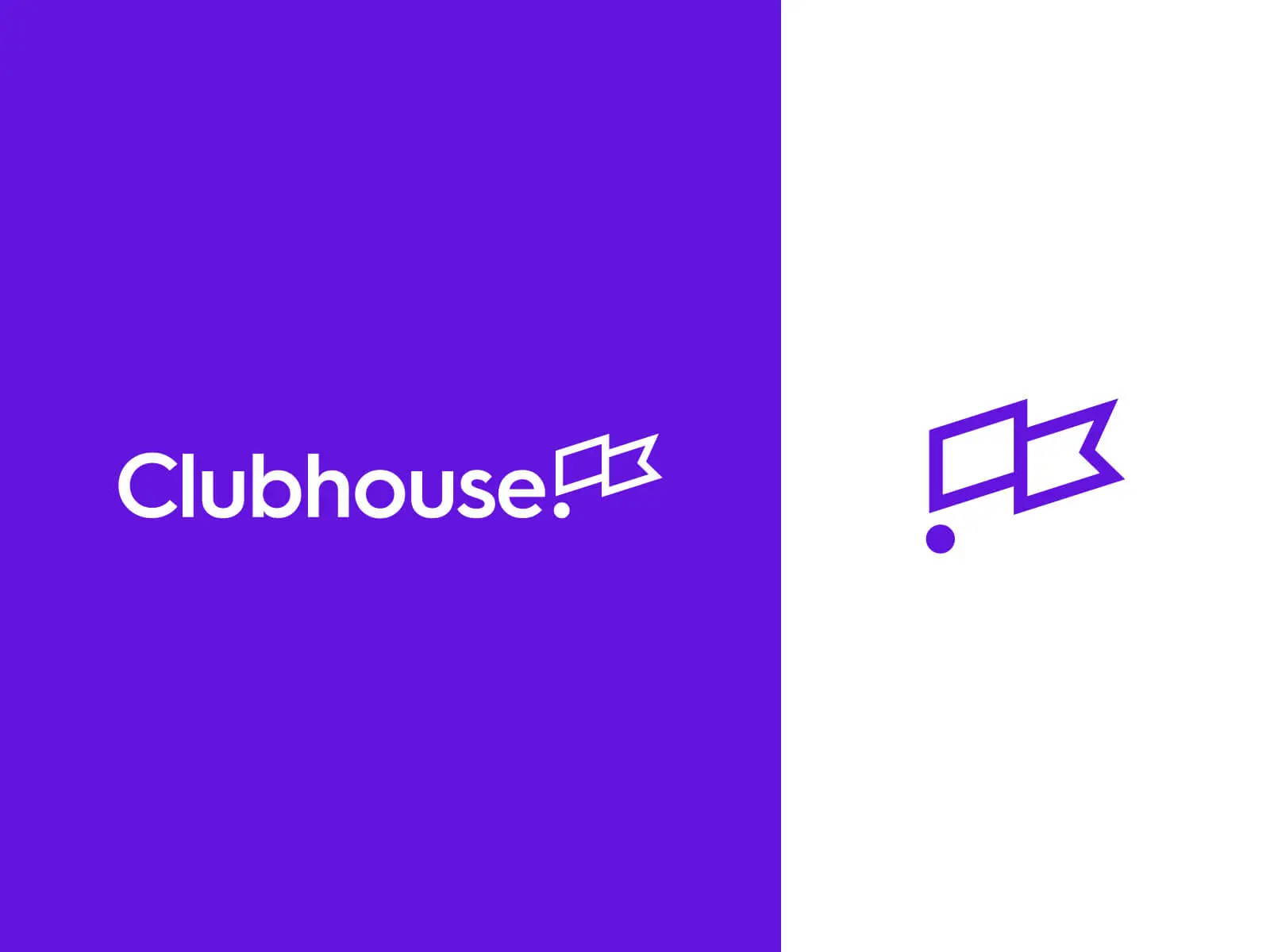
Clubhouse, for example, used a simple two-color purple and white palette. The designer used a sans serif font (something prevalent in minimal designs) and inserted the logo as part of the graphics as well.
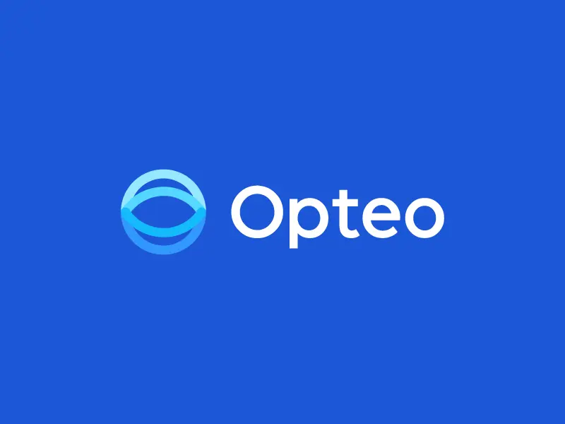
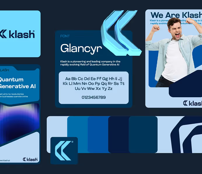
In this particular case, the artist played with shades of blue to create a really cold 3D effect. Unlike the previous design, this one has the logo before the company name rather than after it.
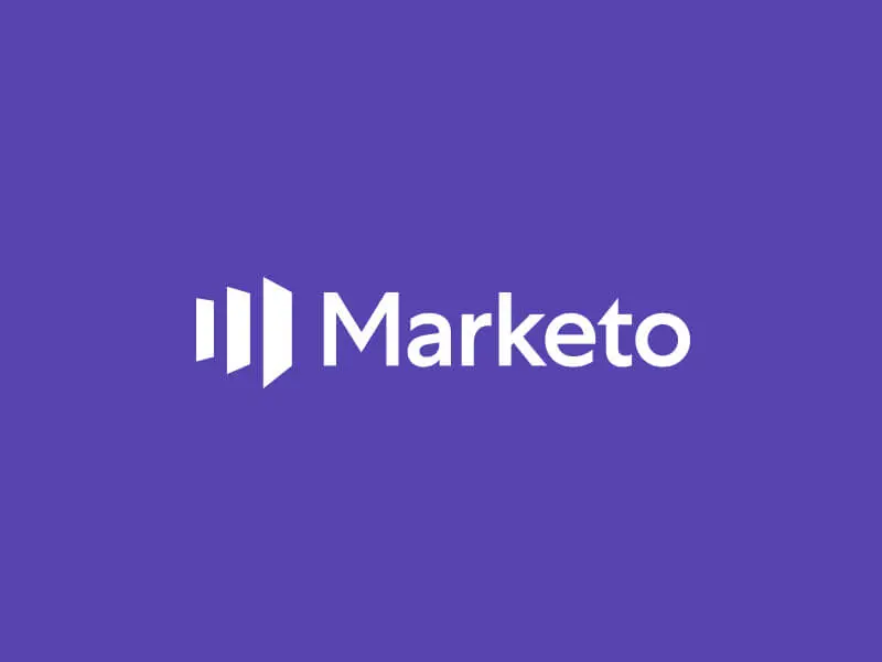
In this particular case, the artist went with a three-color design, having a dark blue background together with a custom-made white font. Unlike the previous design, this one has the logo before the company name rather than after it.

This is the epitome of what we call minimal design. The colors, the font, and most importantly, the minimal bread logo makes this one of the best SaaS logos we’ve seen in a long time.
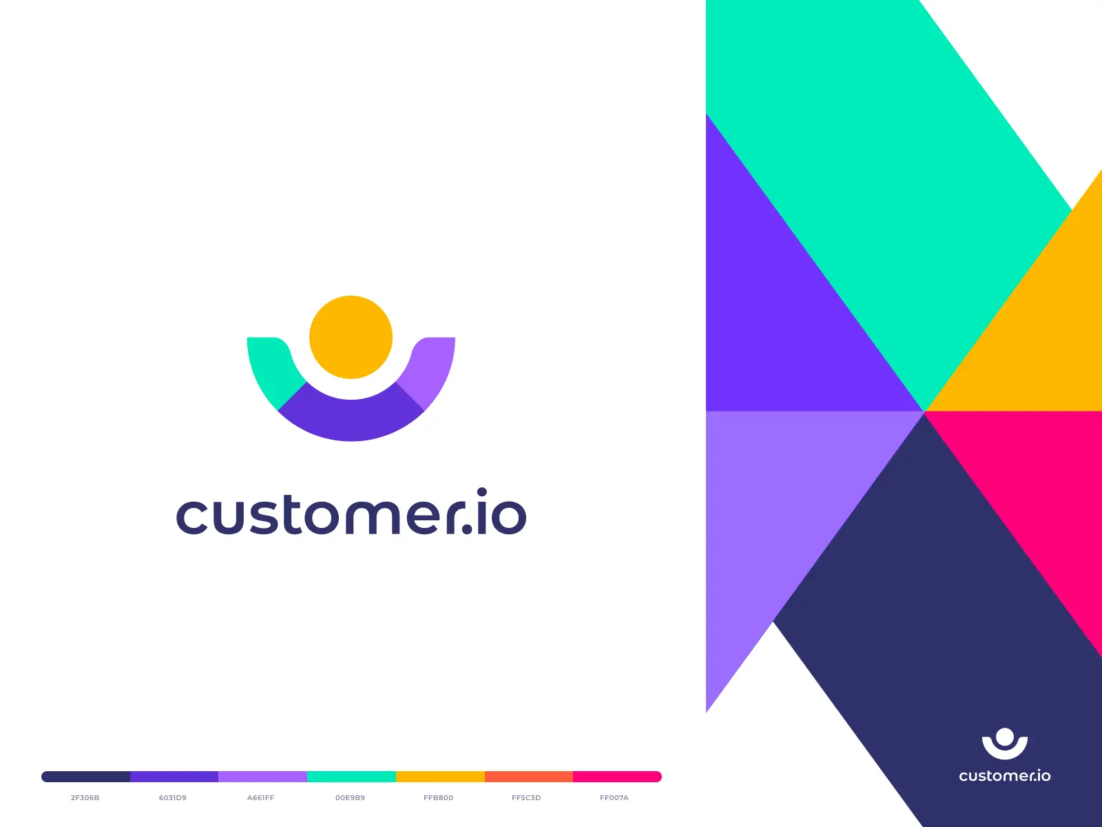
We could go on explaining all the details of the design, but simply put - Customer.io’s design is wonderful. Minimal design is combined with a range of gorgeous colors which delivers quite the visual impact.
Font-Based Logos
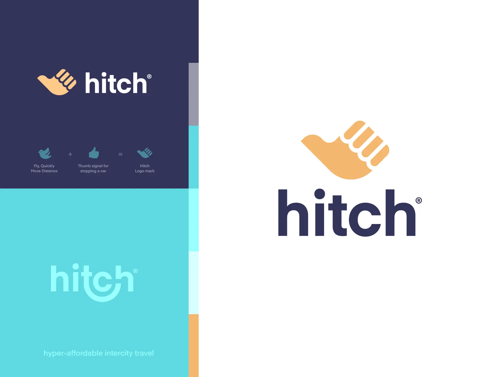
Font-based logos, also known as wordmarks or logotypes, are logos that focus on a business’ name. Creating the perfect font-based logo can be tricky. It needs to be clean and memorable, which is challenging to do when the nature of its design limits you.
Since the main focus of these types of SaaS logos are the company names themselves, choosing the right fonts is essential. The most iconic SaaS logotype is certainly Google. But let’s examine some less known and more contemporary examples that you can look up to
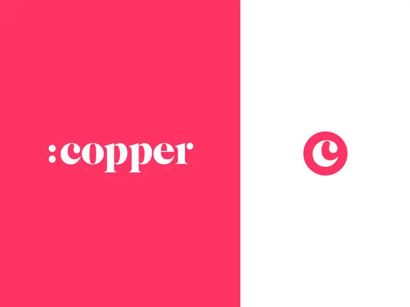
You want your CRM to be simple and easy to use, and Copper’s logo conveys this message perfectly. And the simplified version with the letter “C” makes a terrific alternative: it resembles a button and features the first letter of their actual service (customer/client relationship management).
SaaS website design
The two cornerstones of a user-friendly UI are a clear value proposition and an actionable CtA. Your web page should also help your customers know what they are supposed to do (and usually, graphics and videos are preferable as a quick and easy way of communicating this).
A few other interesting SaaS web design trends to note are: light backgrounds (it’s not really a trend, but perhaps even a standard as 94% of SaaS websites use a light background) and positioning the logo in the top left corner (same survey shows this is a very convincing 98% of SaaS websites).
Of course, making your web page optimized for mobile devices is another big must - customer retention rates are 4 times higher with people who use SaaS applications on their smartphones.
Big bold value proposition
Long gone are the days when technology was a privilege of the few. In our digitalized world you have one job: convince people that your software solution is effective and simple.
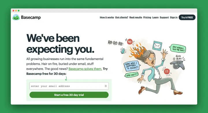
That’s why in SaaS web design the value proposition should be the first thing you see. You’ll notice that aligning your value proposition to the left is a major SaaS design trend (so if you’re feeling brave, I’d suggest moving it right or centre).
Let’s look at a couple of examples.
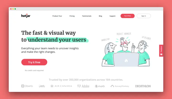
HotJar is a superb one. They combine the bold text with a playful illustration, but to make it even clearer what it is they do, they also highlighted the most important part of the text. In theory, it might sound excessive, but the end result here is slick and highly effective!
Clean UI with crisp and clean Fonts
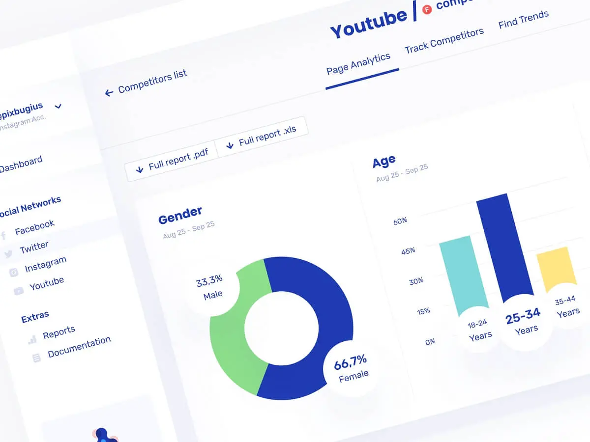
Apart from the value proposition, CtA, and some sort of visual, you won’t see that much on most SaaS landing pages. Obviously, the trend is geared towards immaculate pages with crisp SaaS fonts that are easy to read.
An excellent example of a clean landing page is Blackbird.

When you visit the page, two things are immediately noticeable. Firstly, the font (Textbook New Bold), and secondly the crystal clear picture of one of Blackbird’s dispensaries.
Sometimes having only a couple of focal pieces of content can significantly improve the user experience. And not only this, but it also helps to navigate the visitor towards the website sections of your choice.
The same goes for SaaS dashboards:
Artificial intelligence (AI)
Although the SaaS industry is big right now, there are some indications that this incredibly rapid growth rate will start to decline: TechCrunch sees the decline in venture capital (VC) funding in recent years, as an indication of SaaS market saturation.
With that in mind, in the coming years, it will likely become even more important to follow SaaS trends which can help you stay ahead of the curve. One such trend is the use of artificial intelligence (AI).
The most common use of course are chatbots, which provide a simple and effective customer service solution. And they’re only likely to become bigger: Gartner predicts that by 2021 an astonishing 85% of customer interactions will be managed without humans (increased personalization of chatbots also helps here).
Artificial intelligence is progressing rapidly and will likely take on a much more dominant role in several different areas. For example, it’s proven to be a great solution for detecting potential security threats in cloud computing.
In terms of design, remember that personalization is key. Use images or illustrations to give your customers the experience of human interaction.

Video tutorials
Would you rather get to know a SaaS product by 5,000 words? Or scrolling through an infographic? Or watching a 2 minute video?
Funnily enough, each of these options takes around the same amount of time. However, videos help you process information much quicker than is the case with text or images.
Videos are still a kind of an emerging trend; only about half of SaaS websites use videos. However, if you’re looking to step up your game, trends like these are the ones to look out for!
Check out Canny’s brilliant explainer video. All it takes is a crisp, white background, a value proposition front and center and a 1-minute video to explain exactly how this customer feedback tool works. And some clever animated graphics can help you seriously save up on video production costs!
Illustrations
You might think us partial, but illustrations are kind of the ultimate design trend in the SaaS industry right now. And for good reason! Illustrations aren’t just beautiful. More importantly, they can really improve customer experience, since they make a simple and memorable way of explaining how SaaS solutions work.
Illustrations are also a great thing to incorporate into your SaaS marketing strategy: whether you’re looking to create a more fun user experience or creating cool graphics to share on social media.
SaaS companies have gone a bit overboard with the use of illustrations in recent years. However, there’s a very wide range of illustration types to use and help you stand out from the crowd and build a beautiful, memorable brand image.
Soft Illustrations
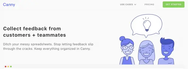
The first type is soft illustrations (or soft line illustrations). What’s notable about these designs is that they usually use very soft or pastel colors. This has resulted in some magnificent designs, some of which we’ll share below.
For example, Canny, the popular feedback tool we've already mentioned, used soft illustrations in their header. Notice how all of the colors and drawings are very soft and subtle. As is usually the case with these illustrations, the beauty is in their simplicity.

Illustrations With People
An example of a type of illustration that’s very much one of the SaaS design trends of 2020 is that of Prospa. Notice how, in certain aspects, the art style is similar to that of Softline. The difference being that this illustration type is a lot more detailed, comprised of different colors, shades, and small interesting details.

In this particular graphic, we can see an illustration of a man painting a wall. The predominant color is green, and the artist wasn’t afraid of utilizing warmer and colder shades of the color as well. The brown staircase ladder provides a nice contrast, together with the subtle hints of white throughout the whole illustration.
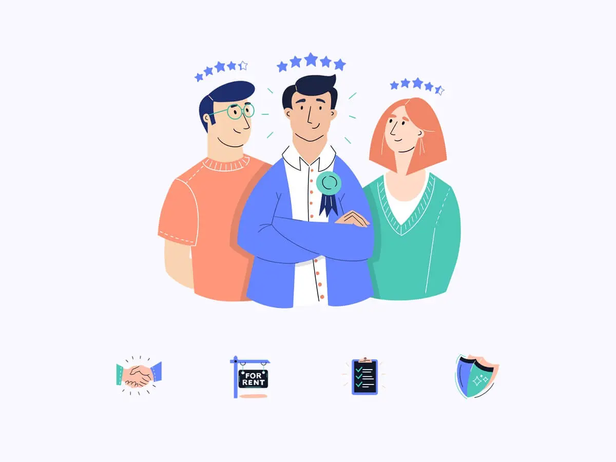
Another example is the ones done by Will Beeching for FlatFair, a tenant/landlord relationship app. In 2018, the company wanted to revolutionize its brand identity and create a dynamic new visual system. The result of all this was a complete redesign of their website with some fantastic SaaS illustrations.
Minimalist Animated Icons
Icons are an awesome design prop to think about, since they’re easy to create and very versatile: they work equally well in UX design and for example, social media marketing.
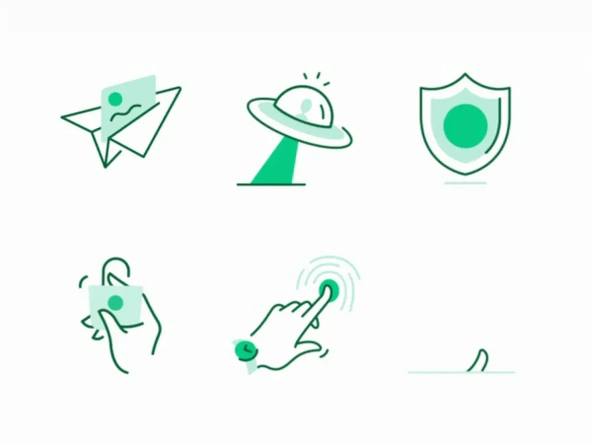
If you want to take it up a notch and make it more SaaS-appropriate, try creating animated icons. This is another great way to improve customer experience as it’s yet another way to tell customers exactly what they’re supposed to do.
As part of the project for Prospa, the artist created these animated green state icons. These animations were designed for scenarios around Prospa’s customer dashboard.
Pencil illustrations
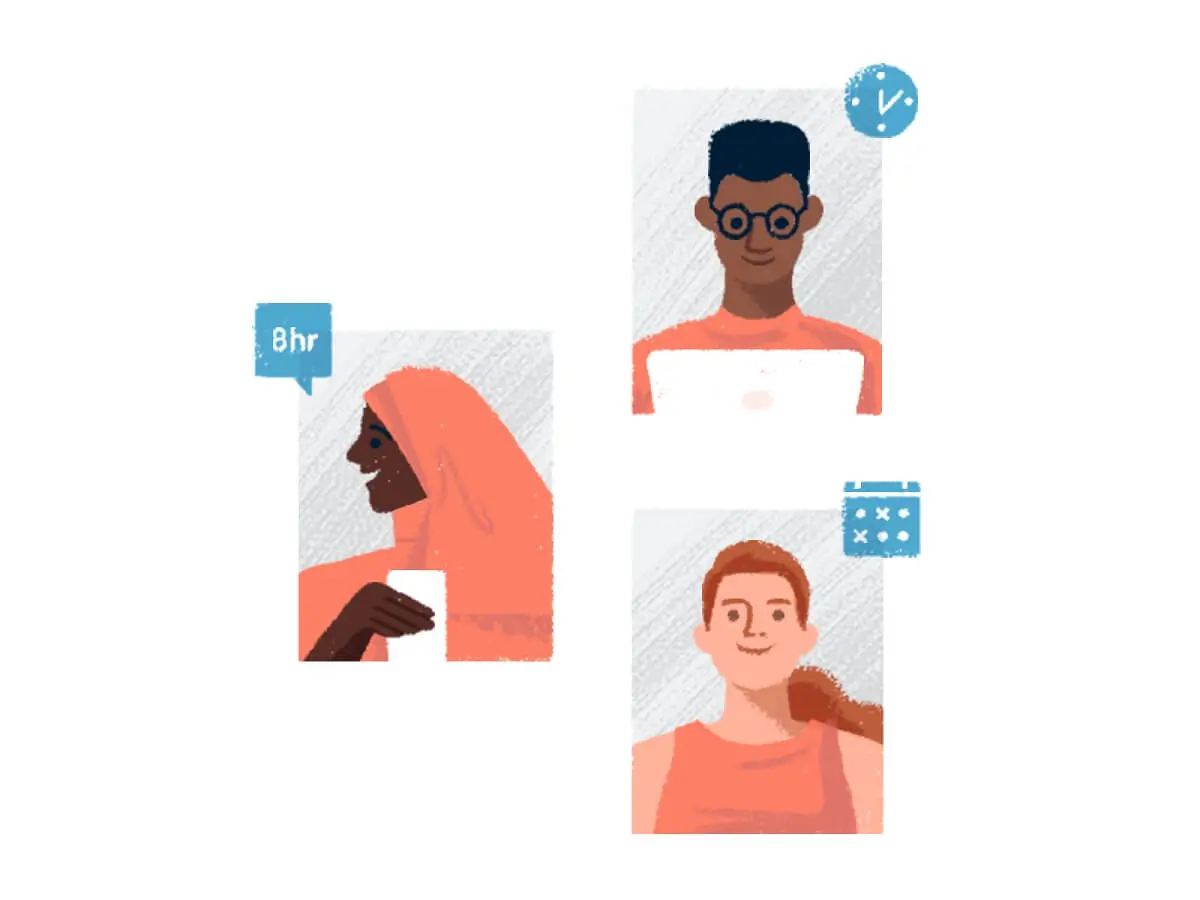
Unlike all of the SaaS illustrations we’ve seen so far, this one has an entirely different drawing style. Pencil illustrations bring us back to our beginnings when we drew things on paper as kids.
This type of illustration is created using colored pencils and is a nice change from what we’ve looked at so far. The great thing about pencil illustrations is that they are timeless and don’t appear to be out of date. This makes them an excellent choice for any artist who wants to change up their usual style.
Animated illustrations
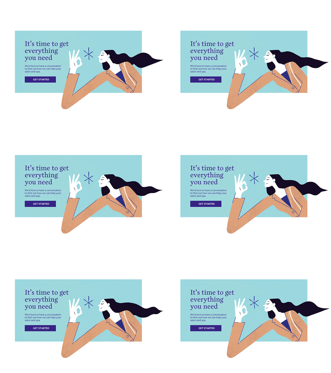
Simple animations seem to be the trend again, and there’s a good reason why. Animations help grasp your visitors’ attention more effectively while also delivering an excellent user experience—a win-win situation for both the website and the visitor.

This particular example is of a Cannabis retail SaaS company called WebJoint. The designer team was hired to completely redesign their website with animations and make it informative and easy to understand. They went for a non-corporate design, to resemble what the company is itself—a cannabis startup. They attempted to show the connection between the brand and the retailer, and they did a fantastic job.
Large Hero Illustrations
Another popular trend, specifically for landing pages (not only for SaaS ones), is having large hero illustrations. While we could go on about the psychology behind these illustrations and how it helps create trust between the company and customer. However, sometimes it’s just enough to look at the illustration.
Take a look at this gorgeous illustration by Tubik Studio:
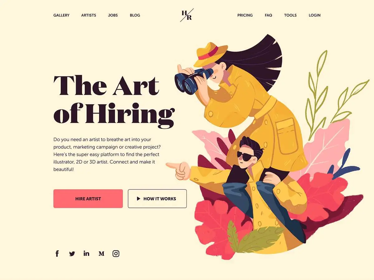
To quote the design studio: “It’s a page that helps artists and their clients easily find each other and together make the world even more beautiful.” And we couldn’t agree more, the hero illustrations, autumn vibe & colors and overall design all look amazing.
{{ILLUSTRATION_BANNER="/dev/components"}}
Further SaaS design resources
Ready to tackle your next SaaS redesign or simply want to start from scratch? Check out some of the exciting resources below:
- For your UI projects, we recommend using design systems. For example, Shopify released Polaris, which is widely used by SaaS companies. It can save your designer (and developer) a ton of time to design your MVP or your fully-fledged SaaS landing page/app.
- Icons8 recently created a gallery of free illustrations made by top Dribbble designers, with different styles. Alternatively, you can also use our free illustrations gallery (we're constantly updating it and are open to suggestions!)
- Land Book is our go-to resource for SaaS Landing Pages. The collection is well-curated and features landing pages that follow (or create) the trends.
Conclusion
Whether you’re a micro-SaaS or a more established business owner looking to freshen up your company’s look, we hope these trends get your thinking on the right track! Also, be sure to check out our free illustration gallery for some technology-inspired illustrations.

Top-quality designers
A complete creative team at your fingertips: graphic and web designers, illustrators, and more.
Lightning-fast turnaround
Get start today and receive your first update on the next business day.

All-inclusive pricing
Unlimited requests and revisions. One flat monthly fee. No surprises.

Flexible & scalable model
No contract. Scale up and down as needed. Pause or cancel at anytime.
Continue reading
Explore some of our best designs
Get inspired by a curated selection of ManyPixels work. Download the portfolio to see what our team can create.






.jpg)
.jpg)
.jpg)