Black Friday ad design: 20 examples and what makes them convert
TABLE OF CONTENTS

TL;DR
A Black Friday ad converts when a shopper can read the offer, the product and the deadline in about two seconds. The phrase "Black Friday" does the least work, because every ad in the feed says it. The 20 examples below win on a big, specific number, a product that is clearly visible, or a reason to buy that has nothing to do with a discount.
- ✅ Best format to copy: the offer-first static. Dyson's 2025 ad shrank "Black Friday" to a small label and let "save up to €300" and the products do the work.
- 💰 Under $100, show a percentage (Huel's "15% less"). Over $100, show the cash amount (Boots's "Save up to £150" on smartwatches).
- 🎨 Build every concept in 4:5 and 9:16. Mobile drove 55.2% of the $11.8B spent online on Black Friday 2025.
- ⚠️ One sale needs 40 to 60 files across five phases, from teaser to last chance. Start the design work 4 to 5 weeks before your first teaser.
- ❌ Skip the anti-Black Friday play unless your brand already stands for something. It only worked for Patagonia and REI because they had years of credibility behind it.
Black Friday 2026 falls on 27 November, and your ads are about to land in the most crowded feed of the year. According to Adobe's 2025 holiday recap, US shoppers spent $11.8 billion online on Black Friday 2025, 55.2% of it on phones, at an average discount of 23.7%. Nearly every brand will be discounting by roughly the same amount, in the same black and red, on the same day.
So the discount alone rarely wins. Design does. That means how fast the offer reads, what the product looks like next to it, and whether the ad still makes sense in a nine-by-sixteen frame with a caption over the bottom third.
Here's what we did: we went through Meta's Ad Library for Black Friday ads that ran in November 2025, and picked 13 that solve that problem in different ways. We added seven well-documented campaigns and formats (Amazon's Lightning Deals, Apple, Tentree, Patagonia, REI, The Ordinary and IKEA) that changed how brands approach the weekend. Every Meta ad below links to its Ad Library record, so you can see the full creative and its run dates. Several are EU versions of the ad, since that's where Meta keeps inactive ads public, and we've translated the copy.
We grouped the examples by the conversion mechanic they use, not by brand, so you can take the idea rather than the look. If you want the basics first, here's what ad creative actually is.
What makes a Black Friday ad convert?
A Black Friday ad converts when it passes a two-second test. The shopper should see what the offer is, what product it's on, when it ends and whose brand it is, in that order. Ads that lead with the words "Black Friday" fail the test, because those words tell a shopper nothing that every other ad isn't already saying.
Here's the bad version. A black square with "BLACK FRIDAY SALE" in huge white type, a small product photo underneath and "Shop now". It looks like a Black Friday ad, but so does everything else in the feed that week, so nobody can tell it apart.
The better version swaps the hierarchy around. The number gets the biggest type ("40% off", "$170 off"), and the product sits right next to it. The deadline lives in a small line ("Ends Monday") and the brand mark stays where it always is. "Black Friday" becomes a small label, if it appears at all.
The event name is the context. The offer is the headline.
Every example below gets at least one of those four elements unusually right. A few of them leave out the discount completely and still sell.
What size should Black Friday ads be?
Black Friday ads should be built vertical first: 4:5 at 1440 x 1800 pixels for Meta feeds and 9:16 at 1080 x 1920 for Stories, Reels and TikTok. Add the core Google display sizes and an email header, then keep all text clear of the bottom 35% of vertical frames, where captions and buttons sit.
Mobile is where Black Friday happens. Adobe measured 55.2% of Black Friday 2025 spend on phones, and Meta's own 2025 festive planning guide found that 9:16 video with audio delivered 7% more conversions per dollar in Advantage+ sales campaigns.
The safe-zone percentages follow Meta's current placement guidance. For every display format, see our list of all 20 Google display ad sizes.
Offer-first ads: the number is the headline
These five ads say "here's the deal" so clearly that the event barely matters. This is the safest format on the list and the one we'd test first.
1. Dyson: "Black Friday" as a small label
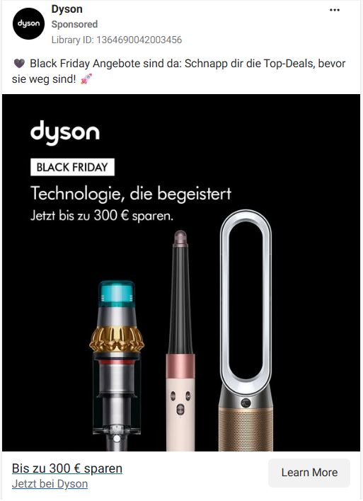
Dyson's German ad puts "Black Friday" in a small black label under the logo. The headline is "Technologie, die begeistert" ("technology that inspires"), and the offer reads save up to €300 now above a vacuum, an Airwrap and an air purifier.
Why it converts: this is the hierarchy we argue for, used by one of the most premium brands in the feed. The event is a label, the products carry the ad, and the offer is in euros rather than a percentage, because €300 sounds bigger than "15%" on a product that costs several hundred euros.
👉 Steal this: shrink "Black Friday" to a tag and let your product lineup take the space.
2. Charlotte Tilbury: the offer is the biggest type on the ad
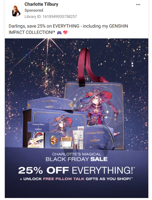
Charlotte Tilbury's ad shows its Genshin Impact collaboration gift set on a dark purple background. "Black Friday Sale" sits in small type, and "25% OFF EVERYTHING!" is the largest line on the creative.
Why it converts: "everything" removes the shopper's first doubt (does the deal cover what I want?), and the collaboration product gives fans of the game a reason to stop scrolling. The caption is written in Charlotte's voice ("Darlings, save 25% on EVERYTHING"), so the ad still sounds like the brand while it discounts.
👉 Steal this: if the discount is sitewide, say "everything". It answers the question that stops people from clicking.
3. Boots: the saving as a bauble
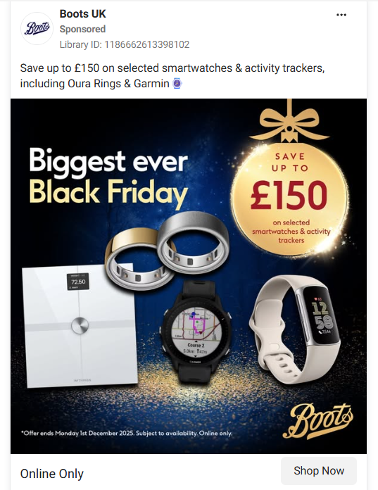
Boots UK advertised "save up to £150 on selected smartwatches & activity trackers". The £150 sits inside a gold Christmas bauble, with "Biggest ever Black Friday" in small type and the watches and Oura rings below.
Why it converts: the bauble makes the number the brightest object in the frame and quietly tells gift buyers what this sale is for. It's also the rule of 100 in action. Below $100 or £100, percentages look larger. Above it, the cash figure does, and smartwatches sit well above it.
👉 Steal this: put the number inside a shape that belongs to the season, so the offer and the gifting message land together.
4. John Lewis: the offer plus a promise
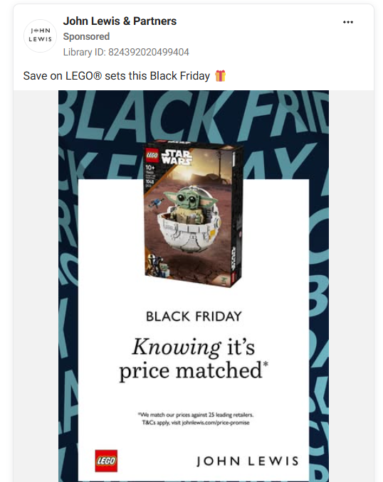
John Lewis advertised "30% off selected LEGO sets". The creative shows a single LEGO box on a white card with one line underneath: "Knowing it's price matched".
Why it converts: the biggest reason people don't buy on Black Friday is the fear that it'll be cheaper somewhere else, or next week. John Lewis answers that worry in four words, so the shopper doesn't need to open another tab to compare.
👉 Steal this: if you have a price match, free returns or a price guarantee, put it on the creative. It isn't small print, it's a conversion lever.
5. Huel: making 15% feel like more
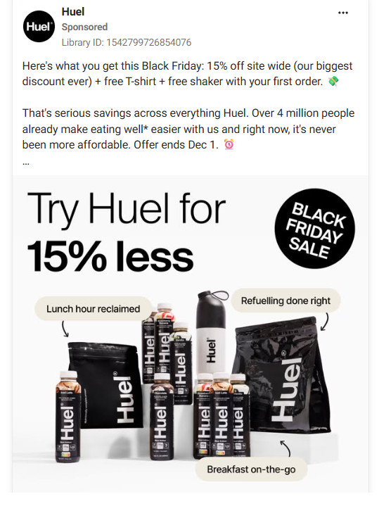
Huel's Black Friday offer was only 15% off, so the ads stack it. The static reads "Try Huel for 15% less", shows the product range, and adds a free T-shirt and shaker on the first order. The caption calls it "our biggest discount ever" and mentions 4 million customers.
Why it converts: "Try Huel for 15% less" frames the deal around trying the product, not around the discount size. The free gifts add value, which you can see in the picture, and "biggest discount ever" is believable because Huel rarely discounts.
👉 Steal this: if your discount is modest, add a free item you can photograph, and say how rare the sale is.
Bottom line: if you only make one kind of Black Friday ad, make an offer-first static with the number as the biggest element. For more layouts in the same spirit, see these banner ad examples.
Brand-led ads that skip the black and red
When every ad in the feed is black and red, colour and typography become ways to stand out. These two ads lead with the brand.
6. LEGO: "Bring colour to your Black Friday"
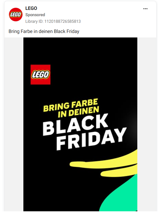
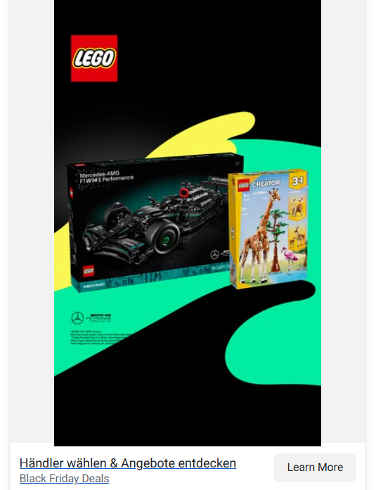
LEGO's German ad translates to "bring colour to your Black Friday". It's yellow type on black with bright yellow and green shapes cutting across the frame. The call to action sends shoppers to choose a retailer, not to a LEGO discount.
Why it converts: LEGO turns the event's own colour scheme into the joke. Black Friday is black, LEGO is colour. It also shows a smart choice for brands sold through retailers: LEGO doesn't cut prices in its own ad, it points people to the stores that do.
👉 Steal this: if your brand owns a colour, use Black Friday's black as the background that makes it look brighter.
7. SKIMS: typography and nothing else
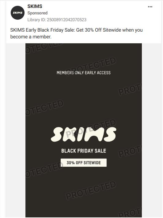
SKIMS ran its early access sale on a plain card. It has the SKIMS wordmark, "Black Friday Sale" and "30% off sitewide" in small type, with no product or model. SKIMS ran the same layout on a dark background and on a light, cream-coloured one.
Why it converts: it only works because SKIMS is famous enough for the wordmark to sell. The caption ties the offer to membership ("Get 30% off sitewide when you become a member"), so the ad builds SKIMS's own customer list before the main sale starts.
👉 Steal this: run your early access ad in two background colours and let Meta show you which one stops more people.
Urgency that people actually believe
Fake urgency ("only a few left!") stopped working years ago. These four examples create urgency the shopper can check, or change what urgency means.
8. Amazon Lightning Deals: urgency you can watch
Amazon's Lightning Deals pair a countdown timer with a bar showing how much of the deal has been claimed.
Why it converts: both numbers move while you watch. A static "ends soon" can be faked, but a progress bar at 78% and a timer at 1:42:10 are hard to argue with. Shopify saw its peak of $5.1 million in sales per minute at 12:01 p.m. EST on Black Friday 2025, which shows how strongly shoppers react to a clock.
👉 Steal this: in video and Stories, animate a real countdown to your actual end time, and refresh the creative every day.
9. MotoGP: the teaser is the one place "Black Friday" earns the headline
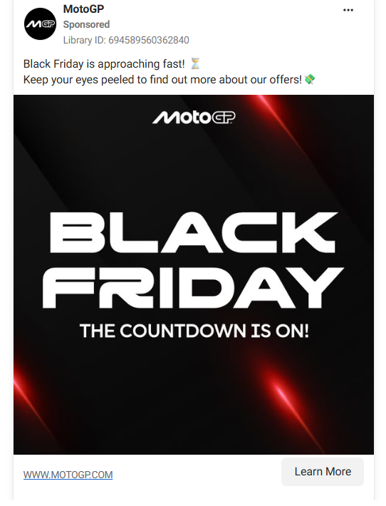
MotoGP ran a teaser from 20 to 25 November 2025. It has "BLACK FRIDAY" in big white type, "The countdown is on!" underneath and red light streaks on black. There's no offer at all. The caption says the offers are coming soon.
Why it converts: before the sale starts, there's no offer to lead with, so the event is the news. This is the one phase where a big "BLACK FRIDAY" headline does work. The red streaks borrow the speed of the sport, so it still looks like MotoGP rather than a generic template.
👉 Steal this: in teaser ads, lead with the event and the date. Once the sale is live, swap in the offer as the headline. For more on the early window, see these ideas for early holiday shoppers.
10. Vinh Giang: "Price up in days", then "in hours"
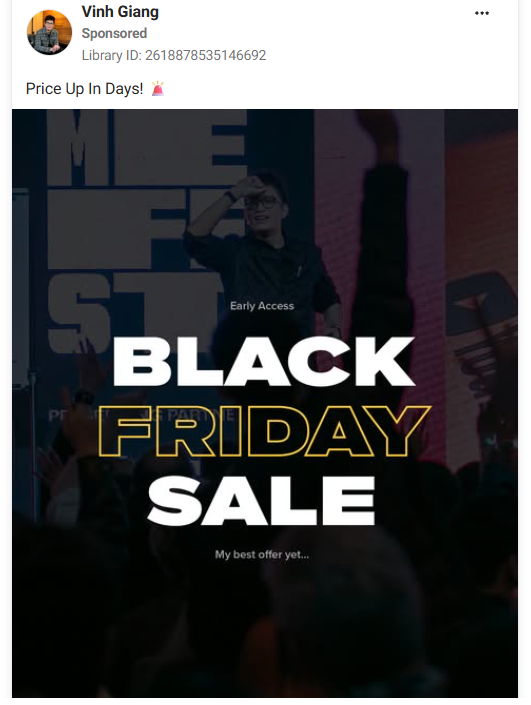
Communication coach Vinh Giang's ads didn't say the sale was ending. They said the price was going up. The caption read "Price Up In Days!" and from the next day, a second version read "Price Up In Hours!"
Why it converts: "the price goes up" frames waiting as a loss, which feels stronger than missing a sale. Swapping "days" for "hours" a day later is cheap to make, and it tells shoppers who've seen the first ad that the clock really is moving.
👉 Steal this: write the deadline line for each phase in advance and swap it on schedule. It's the cheapest variant you'll make all week.
11. Ridge: "The Cost of Waiting"
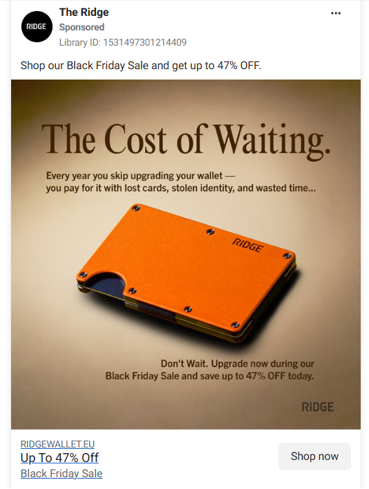
Ridge's static ad looks like a print magazine ad. A serif headline reads "The Cost of Waiting.", over an orange wallet on beige. The body copy lists what an old wallet costs you: lost cards, stolen identity and wasted time. Black Friday and "up to 47% off" appear only in the closing line.
Why it converts: it makes the case for buying the product before it makes the case for buying now. By the time the reader reaches the discount, they already agree they need a new wallet. The editorial look also stands out against the sea of red sale graphics.
👉 Steal this: turn your urgency into a cost of not buying, and keep the discount as the final line.
Ads that look native to the feed
Polished brand ads can blur together on Black Friday. These three look like content first. Billo's analysis of 80,069 Meta video ads from the second half of 2025 put the average hook rate at 24.42%, so roughly three in four viewers scroll past in the first seconds. Looking native is one way to make the first second count.
12. Oura: one offer, many creators
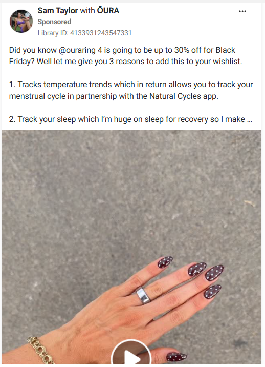
Oura's Black Friday 2025 campaign ran brand statics alongside a batch of partnership ads from creators. Each creator explained in their own words why they wear the ring, with the up to 30% offer added in.
Why it converts: a ring tracker is hard to explain in a static image, while a person wearing it every day explains it in seconds. Running the offer as both a percentage and a cash amount lets the algorithm learn which version works for which audience.
👉 Steal this: brief creators in October so their footage is ready by the sale, and run your discount as a percentage and a cash figure side by side. More formats are in our roundup of Instagram ad examples by format.
13. Clinique: a get-ready-with-me video
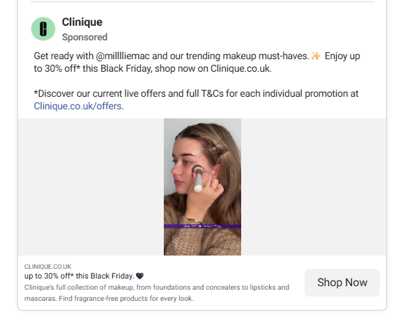
Clinique UK used a creator's get-ready-with-me video for its Black Friday push (Ad Library, 18 November to 3 December 2025). The headline under the video reads "up to 30% off* this Black Friday". Before the sale, the same creator footage ran with a gifting message instead (Ad Library, 3 to 18 November).
Why it converts: the video is something people already watch on purpose, so it earns attention before it asks for the sale. Reusing the same footage for two phases, gifting first and discount second, is also an efficient way to produce Black Friday creative.
👉 Steal this: shoot creator content once and plan two captions, one for pre-sale gifting and one for the sale itself.
14. Lingopie: "Like Duolingo... but it actually works"
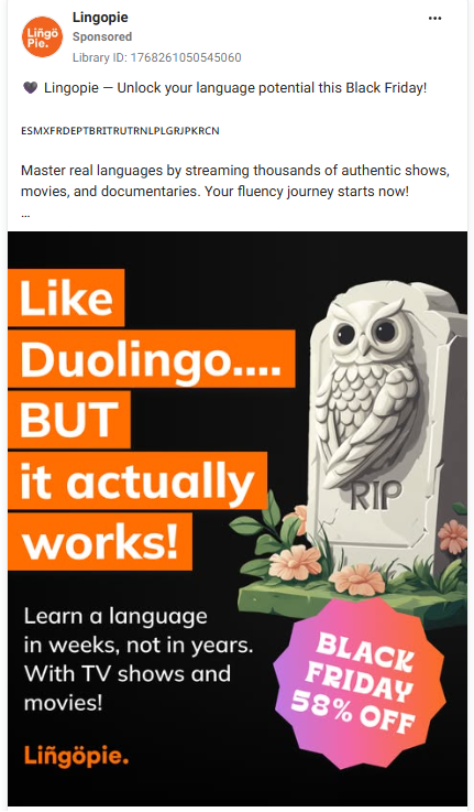
Language app Lingopie ran a meme-style static that reads "Like Duolingo... BUT it actually works!" in orange type on black, beside a white owl figure, with a pink "Black Friday 58% off" sticker in the corner.
Why it converts: it borrows the audience's best-known reference point, a rival people already use, and makes a cheeky claim against it. The offer is a sticker, the way someone would mark up a screenshot, so it reads like a post rather than a banner.
👉 Steal this: a comparison hook works when your audience already knows the bigger brand. Check the legal side before you name a competitor.
Value without a discount
Not every brand can or should cut prices. These two give shoppers a different reason to buy that week.
15. Apple: the gift card instead of the price cut
Apple doesn't call it a sale. Its 2025 "Shopping Event" ran from 28 November to 1 December and offered an Apple Gift Card of up to $250 with eligible products, according to Cult of Mac. The newest models were left out.
Why it converts: list prices stay intact, so the product never looks cheap, and the gift card brings the buyer back to Apple. The design follows the same logic: clean product shots, an "event" name and no red slashes.
👉 Steal this: if discounting would hurt your brand, offer credit, a gift with purchase or a bundle, and design it like a launch rather than a clearance.
16. Tentree: Green Friday with a live meter
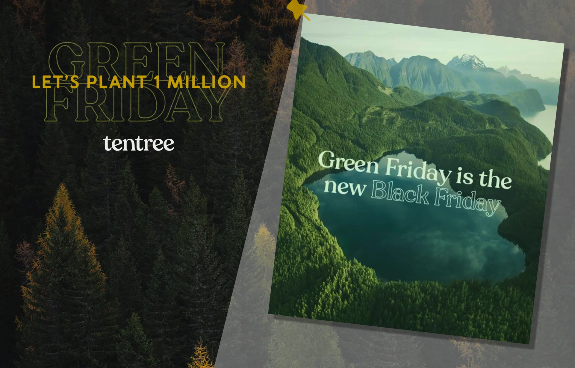
Tentree renamed its sale Green Friday for BFCM 2024, kept planting ten trees per purchase and set a goal of one million trees. A live goal meter in emails and on site tracked the progress, and it reached the goal.
Why it converts: every purchase moves a public number. That's a countdown in reverse, and it gives buyers who feel uneasy about Black Friday a reason to feel good about the cart.
👉 Steal this: if you have a mission metric, put a progress bar on the creative and update it daily.
Anti-Black Friday campaigns, and why they still sell
The famous campaigns in this group all told people not to shop. Be real: they still helped sell. But they worked because each brand had years of credibility behind the message, and a brand without that would just look like it was copying.
17. Patagonia: "Don't Buy This Jacket"
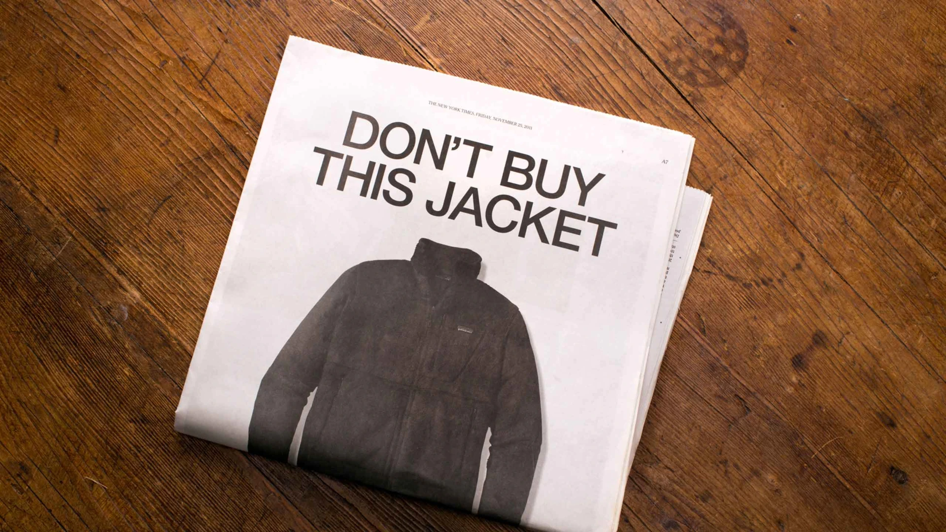
On Black Friday, 25 November 2011, Patagonia ran a full-page ad in The New York Times with a jacket photo and the headline "Don't Buy This Jacket". The body copy asked readers to reduce, repair, reuse and recycle.
Why it converts: the headline breaks the one rule every other ad that day followed, which made it impossible to ignore. The long copy then backs up the claim, and that's what makes it more than a stunt. Fifteen years later, it's still one of the most-cited Black Friday ads.
👉 Steal this: a contrarian headline only works if the body copy proves you mean it.
18. REI: #OptOutside
https://www.youtube.com/watch?v=MAAvQvaeGTE
In 2015 REI closed its stores on Black Friday and asked people to go outside instead. According to REI, more than 1.4 million people and 170 organisations joined in that first year, and the closure became permanent in 2022.
Why it converts: it trades one day of sales for a year of brand preference. The creative is photography of the outdoors and a hashtag, with no products in it, which is exactly the point.
👉 Steal this: if you can't close, you can still own a ritual. Give customers something to do, not just something to buy.
19. The Ordinary: Slowvember
The Ordinary's parent DECIEM runs Slowvember instead of a Black Friday sale. In 2025 it offered 23% off everything from 1 November to 7 December, and its terms page shows that its sites and stores were closed to transactions on Black Friday itself.
Why it converts: it's still a discount, just spread out. Shoppers get more than a month to buy without panic, The Ordinary gets the media attention, and the odd number (23%, not 20% or 25%) makes the offer memorable.
👉 Steal this: a specific, unusual number reads as deliberate. Round numbers read as standard.
20. IKEA: Buy Back Friday
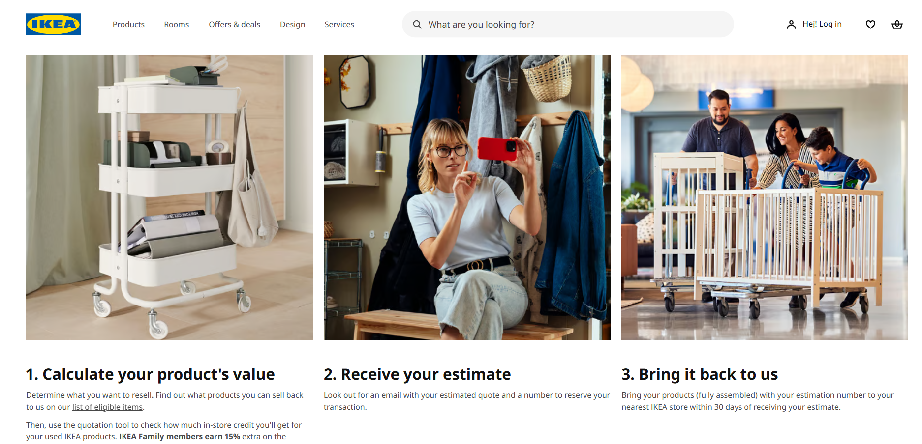
In 2020 IKEA launched Buy Back Friday across 27 countries, starting 24 November. Customers could sell back used IKEA furniture for store credit worth up to 50% of the original price if it was as new, 40% with minor scratches and 30% if well used.
Why it converts: it's a sustainability message with a cash value. Every returned bookcase becomes credit you can only spend at IKEA, so the "anti-shopping" campaign brings people into stores.
👉 Steal this: if you run a trade-in, resale or repair programme, Black Friday is the week to give it a campaign of its own.
How many ad variants does a Black Friday sale need?
A typical Black Friday sale needs 40 to 60 ad files. One offer runs through five phases (teaser, early access, Black Friday, the weekend and Cyber Monday or last chance), and each phase needs around three social sizes, five display sizes and an email header. Plan the set as a system, not as 50 separate designs.
Here's the 2026 calendar we'd plan around:
Five phases times about ten formats is roughly 50 files, before any A/B variants. Meta's festive guide recommends running at least three asset types (static, carousel and Reels) in each campaign, which pushes the number up again. That's why we keep a master concept per phase and change only the phase line, the number and the end date.
This is the part most teams underestimate. At ManyPixels, the Advanced plan delivers a daily output of 2 to 3 display ads per business day. A 50-file Black Friday set is therefore 17 to 25 working days of design time, or roughly half that on the Business plan's double output. Count back 4 to 5 weeks from your first teaser, and that's when the brief needs to be in. For a comparison of providers who can take this on, see our guide to ad design services.
Getting your Black Friday creative made
If your designer is already full with Q4 work, the variant set above is the part to hand off. ManyPixels designers work from your brand guidelines and your master concept, and they produce the sizes and phase versions as a daily output, so your team can focus on the offer and the media plan.
Fast, affordable designs. ManyPixels has been a big help across our illustrations, web graphics, and ad materials. The platform is straightforward, communication is smooth, and turnaround times are fast. - Thomas Partoune, Owner, Bikehero
Plans start at about $699 a month for the Advanced plan. Check manypixels.co for current pricing. Explore ManyPixels plans.
{{GRAPHIC_BANNER="/dev/components"}}
FAQs about Black Friday ads
Bottom line
The Black Friday ads that convert make the offer, the product and the deadline readable in two seconds, and they leave the event name as a small label. Start with an offer-first static built in 4:5 and 9:16, then plan the full five-phase variant set early. The brands that win Black Friday usually finished their creative before November started.
Planning more holiday creative? Send us the offer and the master concept, and we'll handle the sizes and phase versions.

Having lived and studied in London and Berlin, I'm back in native Serbia, working remotely and writing short stories and plays in my free time. With previous experience in the nonprofit sector, I'm currently writing about the universal language of good graphic design. I make mix CDs and my playlists are almost exclusively 1960s.

Top-quality designers
A complete creative team at your fingertips: graphic and web designers, illustrators, and more.
Lightning-fast turnaround
Get start today and receive your first update on the next business day.

All-inclusive pricing
Unlimited requests and revisions. One flat monthly fee. No surprises.

Flexible & scalable model
No contract. Scale up and down as needed. Pause or cancel at anytime.
Continue reading


Explore some of our best designs
Get inspired by a curated selection of ManyPixels work. Download the portfolio to see what our team can create.