
8 Best email newsletter design examples to steal in 2026
TABLE OF CONTENTS


TL;DR
The best email newsletter designs in 2026 share three things: a recognizable visual identity, strong hierarchy, ..and one link or button that tells the reader exactly what to do. Morning Brew built a media empire on personality-driven layout. Apple proves white space is a design choice, not empty space. Duolingo turned a mascot into a click driver. Below are eight newsletters worth reverse-engineering, and exactly what to steal from each one.
Most newsletters get deleted in under three seconds. Not because the content is bad. Because nothing in the design gives the eye a reason to stay.
Over 55% of emails are now opened on mobile, and 50% of people delete an email that isn't optimized for their screen. A wall of unbroken text doesn't fare much better on a desktop. Design isn't decoration here. It's the first thing your reader judges, usually before they've read a single word.
The newsletters that consistently get opened, read, and clicked all have something in common: their design is doing actual work. A deliberate visual system that reflects the brand, creates hierarchy, and makes the next action obvious.
The eight examples below are worth studying if you're building or refreshing a newsletter. Each one does something specific well, and I've pulled out exactly what that is so you can apply it. If you need custom email graphics, branded templates, or a recurring design system for your newsletter, ManyPixels' design team handles all of it on a flat monthly subscription.
What makes a great email newsletter design?
A great email newsletter design creates instant visual hierarchy, stays recognizable across every send, and guides the reader toward one clear action. It works in dark mode, loads fast on mobile, and looks like it was built for the brand sending it, not pulled from a generic template library.
That's a higher bar than most teams think. Most newsletter designs fail not because they're ugly, but because they're forgettable. The reader opens, sees something that looks like every other marketing email, and moves on.
How we chose these examples
The eight newsletters below were chosen for one reason each: they do something specific better than almost anyone else. Not overall quality, not production budget. One clear design lesson per example that you can apply directly.
Each entry covers the design choice worth stealing, why it works, and where you can see it yourself. Screenshots aren't embedded here since newsletter designs update frequently. Each entry links to a live gallery where you can browse current and archived examples directly.
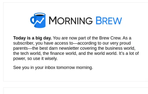
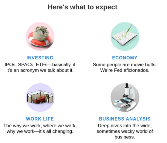
1. Morning Brew: personality built into the layout
📸 See examples: Morning Brew on Really Good Emails
Morning Brew has over 4.4 million subscribers and maintains open rates around 42 to 50%, well above the industry average. That's not purely a content achievement. The layout earns a significant share of the credit.
Every Morning Brew email follows the same structure: a brief intro, a series of tightly written story blocks separated by thin dividers, and a sign-off section with light humor. The visual rhythm is completely consistent. Readers know exactly where they are in the email at any given moment.
What to steal: section dividers and a predictable layout grid. Most newsletters try to look different every send. Morning Brew does the opposite. Consistency becomes the brand. When a reader opens it and immediately recognizes the layout, that familiarity builds trust over time, and trust drives clicks.
The typography is plain. Nothing fancy. The differentiation is purely structural. That's a lesson worth sitting with if you're tempted to redesign your newsletter every quarter.
✅ Best for: Content-heavy newsletters that need to feel readable without a large production budget.
❌ Not ideal if: Your brand depends on heavy visual assets or product photography.
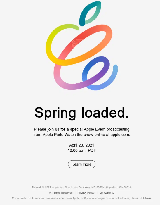
2. Apple: white space as a design system
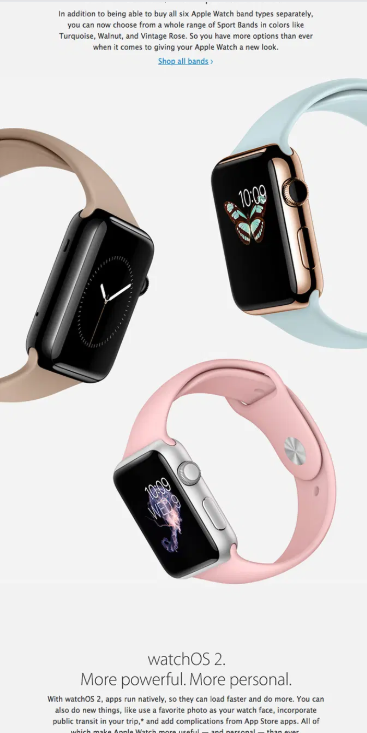
📸 See examples: Apple on Really Good Emails
Apple product launch emails are some of the most studied in the industry, and for good reason. They do almost nothing. One hero image. One headline. One CTA. A lot of white space. And somehow, it works every time.
The trick is restraint. Apple doesn't try to communicate everything about a product in a single email. They communicate one thing, at maximum fidelity. The product image is large, centrally placed, and shot against a clean background. The copy is minimal. The CTA is a single link.
What to steal: the single-message rule. Most newsletters fail because they're trying to do too much in one send. Apple treats every email like a billboard: one message, one visual, one action. If you find yourself adding a fourth section to your newsletter and wondering why your CTR keeps dropping, this is probably why.
White space is also doing real work here. It signals quality. It gives the eye somewhere to rest. And it makes the one thing you want the reader to look at genuinely stand out.
✅ Best for: Product-first brands, e-commerce, and any newsletter where a single campaign is the focus.
❌ Not ideal if: You have multiple stories or items to cover in one send.
3. Airbnb: photography as the entire design system
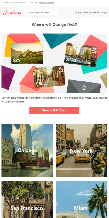
📸 See examples: Airbnb on Really Good Emails
Airbnb newsletters are image-first by design. Not in the way that every brand says it's "visual first." Actually image-first: the photo takes up most of the email, the text is minimal, and the entire layout is built to make you want to be somewhere.
One of their most referenced campaigns featured community Instagram photos under the subject line "We woke up like this." The layout was essentially a photo grid with a short headline and a CTA. The design itself was the selling point. No feature list, no pricing, no bullet points. Just places people had been, and a button to book.
What to steal: let your imagery carry the hierarchy. If you have great photography or illustration assets, don't bury them between paragraphs of copy. Build the layout around them. Airbnb understands that its product is an emotion, not a transaction, and the email design reflects that. If your product or service has a strong visual component, your newsletter layout should lead with that, not treat images as decoration between text blocks.
The secondary lesson is restraint with copy. When the image is strong, text gets in the way.
✅ Best for: Travel, hospitality, lifestyle brands, or any service with aspirational visual assets.
❌ Not ideal if: You're working with limited photography or your content is primarily data-driven.
4. Duolingo: brand character in every element
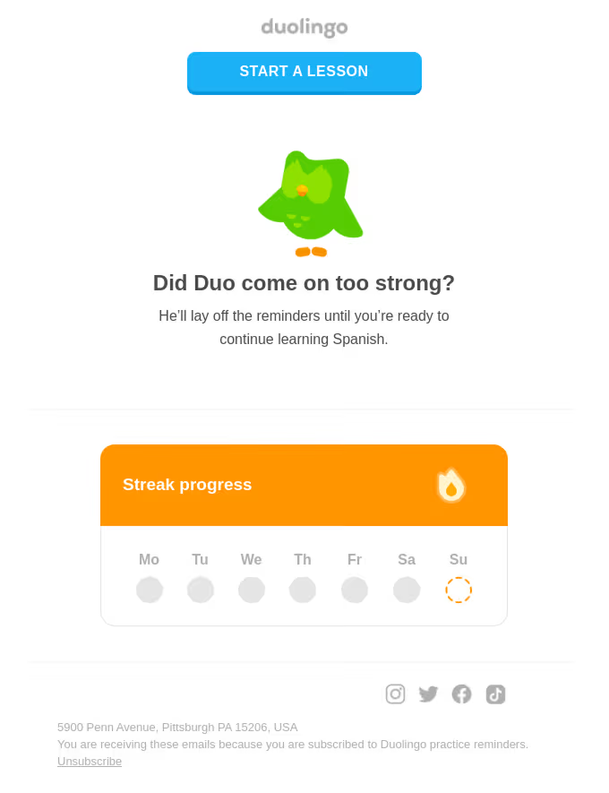
Duolingo's email newsletters are immediately recognizable. Not because of a logo. Because of Duo the owl, the brand's color palette of bright greens, and a tone so consistent that you'd know it was a Duolingo email if the brand name was removed entirely.
Their weekly update emails are gamified: progress trackers, personalized stats, streak reminders, mini-challenges. The design reinforces the product experience instead of breaking from it. When you open a Duolingo email, it feels like an extension of the app.
What to steal: design that mirrors the product experience. Most brands treat their newsletters as separate from their product. Duolingo treats them as part of the same experience. The same colors, the same character, the same tone of voice. When your email looks and feels like your product, it reinforces brand memory every time it lands in an inbox.
The other lesson is personalization at a visual level. Duolingo's emails include individual stats and progress, which means the design needs to flex around dynamic content. They've built a template system that accommodates this without losing the brand identity. That's harder to pull off than it looks.
✅ Best for: Apps and SaaS products with strong brand identities and user data to personalize.
❌ Not ideal if: You're a B2B brand where playfulness might undercut credibility.
5. Headspace: calm as a design principle
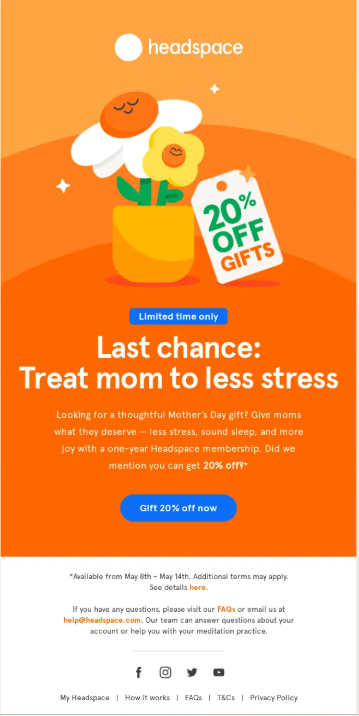
📸 See examples: Headspace on Really Good Emails
Headspace uses color psychology as its primary design tool. Soft gradients, muted purples and oranges, plenty of breathing room between elements. The email feels like the product: calming, low-pressure, easy to engage with.
Their illustrations are consistently warm and humanized. Characters are round and friendly. The overall effect is an email that doesn't feel like a marketing message. It feels like a check-in from a product you trust.
What to steal: let your design tone match your brand promise. Headspace isn't selling meditation software in its emails. It's demonstrating what meditation feels like. The design is the proof point. If your brand promise is simplicity, ease, or calm, your newsletter design should embody that, not just describe it.
The practical application here is whitespace and a limited color palette. Headspace uses two or three colors per email, consistently. No competing gradients, no cluttered layouts. The restraint is intentional and the effect is immediate. You feel the brand before you read a word.
✅ Best for: Wellness, health, and lifestyle brands where the emotional tone of the product matters.
❌ Not ideal if: Your audience expects dense, information-rich content.
6. The Hustle: bold type as the hook
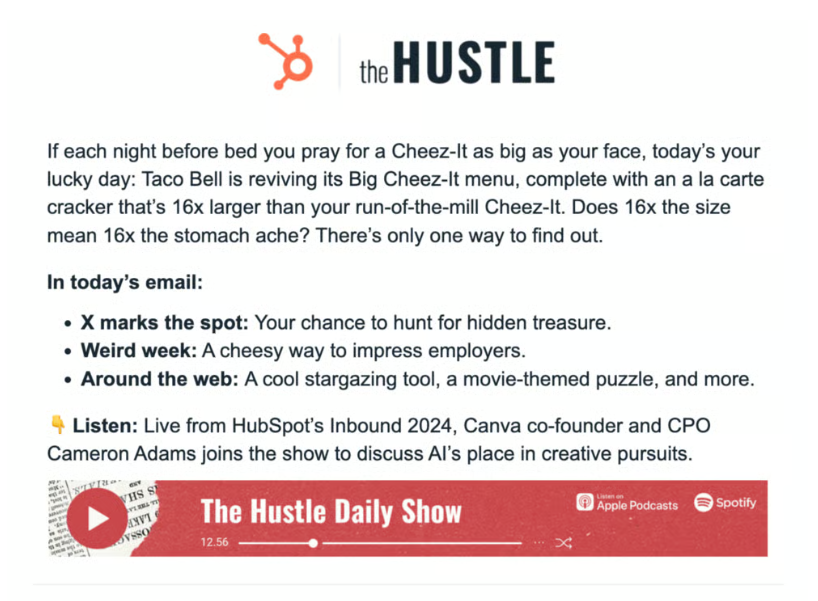
📸 See examples: Inside The Hustle's redesign
The Hustle was acquired by HubSpot in 2021 for a reported $27 million, which gives you a sense of how well a text-heavy newsletter can perform when the design is right. Their emails are not visually elaborate. There are no large hero images, no product photography, no animations. The design is almost entirely typographic.
What makes it work is hierarchy through type. The headline is large and bold. The subhead is slightly smaller. The body copy is compact and easy to scan. Bullet points and bolded phrases pull out key details for readers who skim. The result is an email that feels dense with information but never hard to read.
What to steal: typographic hierarchy as a substitute for visual complexity. Not every newsletter has a strong image library or design budget. The Hustle proves that you don't need either. What you need is a clear system for how information is ranked visually. If your H1 is bold and large, your key points are called out in bold mid-paragraph, and your copy is short and snappy, the reader's eye will follow.
The tone helps, too. The Hustle reads like a smart friend caught you up on business news, which is exactly what it's designed to feel like. The design is in service of that voice, not competing with it.
✅ Best for: B2B and media newsletters where written content is the primary product.
❌ Not ideal if: Your brand needs strong visual assets to communicate what you do.
7. Mailchimp: editorial design that teaches hierarchy
📸 See examples: Mailchimp on Really Good Emails
Mailchimp's brand emails are some of the most studied in the email marketing world, partly because Mailchimp is itself an email tool and its own design has to be impeccable. Their newsletters use bold, custom illustration as a centerpiece, a typeface that's entirely their own, and an editorial layout borrowed from magazine design.
The hierarchy is always clear: one big visual at the top, a headline that tells you exactly what you're getting, and body content that unfolds logically beneath it. There's no ambiguity about where to start reading or what to do next.
What to steal: treat your newsletter like a magazine page, not a web page. Web design has trained most marketers to put everything above the fold and repeat CTAs every 200 pixels. Editorial design works differently. It trusts the reader to scroll, uses visual rhythm to pull them down the page, and saves the CTA for when the reader is actually ready to act. Mailchimp's emails feel like something worth reading, not something trying to sell you. The paradox is that they convert better for it.
Custom illustration is also worth noting here. Mailchimp invests in original artwork for their emails rather than stock images. It's a significant differentiator in an inbox full of generic photography.
✅ Best for: Brands with a distinctive visual identity and content worth reading for its own sake.
❌ Not ideal if: You don't have access to custom illustration or a strong visual brand system.
8. Notion: ultra-minimal, text-first by design
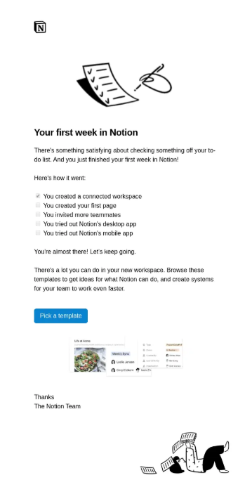
📸 See examples: Notion on Really Good Emails
Notion takes the opposite approach from almost every other brand on this list. No hero images. No bold color palettes. Just clean, well-spaced text on a white background with a simple logo at the top.
It sounds like a limitation. In practice, it's a statement. The design signals: we trust our content to do the work. Every design choice says "we don't need tricks." For a product built around thinking and writing, that's exactly the right message to send.
What to steal: intentional minimalism beats accidental plainness. The difference between Notion's emails and a bare-bones newsletter with no design thought is intentionality. Every element in a Notion email is exactly the right size, spaced correctly, and clearly prioritized. The padding is generous. The type is clean and consistent. Nothing is small or hard to read. It's not "we didn't design this." It's "we designed this to look undesigned."
If your brand is built on clarity, simplicity, or productivity, this is the approach to study. Trying to compete with Headspace on color or Apple on photography is a losing game for most brands. Going the other direction and owning minimalism fully is a legitimate, high-performing strategy.
✅ Best for: Productivity tools, B2B SaaS, and brands where simplicity and clarity are the core value proposition.
❌ Not ideal if: Your brand is visually expressive or your audience expects rich, content-heavy emails.
What do all great newsletter designs have in common?
Every high-performing newsletter design does three things: it creates a recognizable visual identity across every send, it uses hierarchy to guide the reader's eye in the right order, and it delivers one clear action per email. Every newsletter on this list does all three, in completely different ways.
The details vary. Apple uses white space and a single image. The Hustle uses typographic hierarchy. Duolingo uses brand characters. But the underlying structure is the same: a reader should know who sent it within two seconds, understand what the email is about within five, and know what to do next without hunting for a button.
The most common newsletter design mistake is treating each issue as a blank canvas. The brands that build loyal audiences design once and then maintain. Consistency is the brand. Readers who open your newsletter and immediately recognize it are readers who've built a habit around it. That habit is far more valuable than any individual send.
A few practical principles that show up across every example above:
- Limit your color palette to two or three brand colors per email. Competing colors break hierarchy and signal low production quality.
- One primary CTA per email, two at most. Every additional button dilutes the one you care most about.
- Mobile-first layout, always. Over 55% of emails are opened on mobile. If it doesn't work on a phone, it doesn't work.
- Visual rhythm matters more than visual complexity. Readers follow rhythm. They fight complexity.
How to apply these ideas without starting from scratch
You don't need to rebuild your newsletter design from the ground up. Pick one lesson from this list and apply it to your next send. If your emails currently have five different CTAs, cut to one and see what happens to your click rate. If your layout changes every issue, lock it down and run the same structure for three months.
The harder problem for most teams is capacity. Designing a newsletter that looks like Mailchimp or Headspace requires real design work, recurring production, and someone who owns the visual system consistently. That's where a lot of good intentions fall apart: the first three issues look great, and then the designer is pulled onto something else and the newsletter reverts to a template.
👉 Check out our list of fantastic email design services that can help you with designing the newsletter that fits your brand and goals.
FAQs
Bottom line
The best email newsletter designs in 2026 aren't the most complex or the most expensive. They're the most consistent. Morning Brew, Apple, Duolingo, and the others on this list all built recognizable visual identities and then maintained them send after send. That's the lesson worth stealing more than any specific color palette or layout trick.
Pick one example from this list that fits your brand, extract the one design principle behind it, and apply it to your next send. Then keep it. That's how the best newsletters get built.
If you need help getting there, ManyPixels designs email newsletters, custom templates, and recurring email graphics as part of a flat monthly subscription. Explore ManyPixels plans to see which tier fits your team's output needs.
{{GRAPHIC_BANNER="/dev/components"}}

Having lived and studied in London and Berlin, I'm back in native Serbia, working remotely and writing short stories and plays in my free time. With previous experience in the nonprofit sector, I'm currently writing about the universal language of good graphic design. I make mix CDs and my playlists are almost exclusively 1960s.

Top-quality designers
A complete creative team at your fingertips: graphic and web designers, illustrators, and more.

Lightning-fast turnaround
Get start today and receive your first update on the next business day.

All-inclusive pricing
Unlimited requests and revisions. One flat monthly fee. No surprises.

Flexible & scalable model
No contract. Scale up and down as needed. Pause or cancel at anytime.
Continue reading
.jpg)
Explore some of our best designs
Get inspired by a curated selection of ManyPixels work. Download the portfolio to see what our team can create.


