
5 Rules for Choosing the Right CTA Words on Button Labels
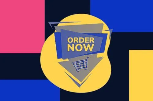
TABLE OF CONTENTS


A website or marketing campaign is like a puzzle. Every piece emphasizes a purpose and contributes to its success. Strong CTA words and buttons are the pieces that encourage your potential customers to take action and these actions are proven beneficial to your business.
Creating attractive CTA buttons is relatively simple because of the graphic design software available today. The real challenge is writing compelling and positive CTA wording. No need to worry because we will discuss 5 critical rules to help you execute them effectively. We also include best practices and real-life examples to help you visualize the outcome.
You can select and write the best CTA words at the end of this article. Not only can they grab your potential customer’s attention, but they also increase your click-through rates (CTRs) and revenue. But before anything else, let's answer the most popular questions: what is a CTA button, and why does it matter?
{{AD_BANNER="/dev/components"}}
What Is A CTA Button?
CTA, or call to action, is a marketing term used to lead any prospective customer to perform a specific action. It consists of 3 crucial parts: copy, color, and placement. The copy must have an actionable, simple phrase that clearly communicates its purpose or offer.
It is often shown as a clickable button with a high-contrast background color to make it stand out. The blue background color is the popular choice because it is mentally calming. It is a plus that it also represents the power of authority which helps build credibility and trust.
But if you want to build excitement and spontaneity, go with yellow and orange (or a combination). Shop Solar Kits, solar generators and kit provider, makes this color combination work. The screenshot below shows how they use it to highlight its training program.

Make sure the link placements seem natural, nothing too promotional otherwise visitors bounce right off. Here’s VPNoverview’s blog on using Netflix with a VPN where you can get some ideas on how to smoothly link to other sites and to your offers. You'll see how they naturally incorporated the links throughout their piece on the topic.
You can also offer other tempting and huge deals such as:
They placed this simple CTA button on the homepage and all relevant web pages for instant access. Marketing campaigns are unique for different target audiences. Therefore, the placement will depend on the type of calls to action the marketers use. Here are 3 types of CTAs, including their purpose and proper placement:
A. Banner
A banner is most effective to use when fulfilling your brand's goals. It shows excellent results for brand awareness and lead/traffic generation. It can also easily grab your target audience's attention because you can place it anywhere on the website. Top, bottom, and side parts are the 3 favorite choices. Regarding its sizes, the 5 standard formats are listed as follows:
- Mobile = 320 X 50 px
- General = 468 x 60 px
- Square = 250 x 250 px
- Skyscraper = 120 X 600 px
- Leaderboard = 728 X 90 px
Blogging remains a valuable tool for businesses this 2023. Therefore, it is one of the best platforms to add the banner. Medical Alert Buyers Guide, a review site for in-home life alert devices and services, is a great example to cite.

They place the banner on the side of the blog page. It gives visitors options to read an individual blog post or their comprehensive report on the best medical alert systems.
B. Pop-Ups
There is nothing more reliable and effective to promote your brand than pop-up display banners. Running the pop-ups at the right time and audience will result in an 11% increase in conversions (average).
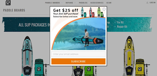
Some might think it is intrusive. That is one reason most business owners show this banner with a generous offer. Take Gili Sports, stand-up paddle boards and SUP accessories store, for example. The company offers a special promo for first-time buyers. Visitors can enjoy a $25 discount when they register their email addresses to their mailing list.
- VIP deals
- Flash sales
- Limited-time discounts
The company also uses an exit-intent pop-up. So it will only show up when the website detects the user is about to leave. It is also the ideal option to reduce the cart abandonment rate, offer free upgrades, and provide engaging reminders.
C. Slide-In
Slide-in CTAs are the go-to option for increasing engagement on your website. It works similarly to pop-ups but with more placement options. The size of the banner will depend on your message. It is usually a small banner appearing on the bottom left, middle, or right corner of the website or blog. It is collapsible, too, so visitors can hide it while browsing.
If you only wish to show this CTA once, you can add an X icon for the exit. Look at Dress Form USA CTA, a dress form and sewing mannequin provider.

They boost engagement on their website by offering a discount coupon for first-time customers. To make it more entertaining, they gamify the banner with a roulette wheel.
5 Rules For Choosing The Best CTA Words
Attracting new customers and improving the brand's conversion rate optimization efforts are just the tip of the iceberg. If you analyze it further, the call to action is the prospects' guide through the sales funnels and customer journey. Follow the rules and best practices below to ensure you can clearly communicate the information you want to share.
1. Pick An Action Verb
Call-to-action button labels must be short and on-point. At a glance, the visitors must understand what to do next. So select an action verb. There are tons of possible action verbs to choose from. Here are a couple of call-to-action examples to help you decide:
1.1 Learn More
Curiosity is natural for all people. So, if you put yourself in an expert position, people will come to you for knowledge and guidance. ‘Learn more’ is one of the best action phrases to hook your visitors. It may sound generic, but it calls for direct action. GoAura takes it to the next level by providing two options with different CTA wording.

One option allows visitors to learn more about how their automated Amazon repricer and revenue analytics can maximize sales. While the other option can help them take a closer look at the tool for free. This combination makes it a more compelling call to action.
A bright color for the CTA buttons will capture the visitors' attention. But you can still use a clean white background. The white space makes the CTA words easier to read and look more professional.
1.2 See It In Action
If you want a more interactive call to action for button labels, use these CTA words instead. It encourages your prospects to look closely at your product/service. Here's how Ampliz uses this CTA phrase for their Dermatologist email list.
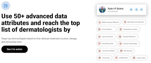
Ampliz is known as a one-stop shop for business development and intelligence needs. For this particular CTA button, the visitors will experience how easy it is to target the right dermatologists. All they need to do is select the right data attributes, which include individual email addresses and license information.
1.3 Get A Quote
'Get' is a commonly used action verb for converting prospects into customers. You can often see these CTA words for SaaS products and services. It is a formal request where companies provide an accurate estimate of how much their products/services cost. They should also include their terms and inclusions (if there are any).
Some eCommerce businesses also use it for wholesale products. Vivion is one good example to cite. You can see its pricing rates when you register an account. They also offer a bulk quote for all their quality food and beverage ingredients.

The entire page contains all information you should know about the product. But if you want to know more about its specification, there is a separate submission form to request expert advice.
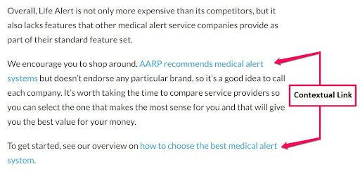
2. Contextual Link
A contextual link is another fantastic CTA type to add to your blog post. It is a clickable text that is strategically placed within the post's body. It includes a hyperlink that redirects to a related landing page.
Remember that the phrase you will include must naturally fit into your blog's post and hyperlink's content. It will improve your site's SEO ranking and conversion rate. Here's an example to give you an idea.
Do you have an SEO keyword list? If so, you can pick the most relevant and add it to your content. If none, you create one with the help of keyword research tools like Google and Wordtracker. It has a simple process: input the primary term you want to use and the location you serve.
The result page will give you an in-depth look at the competitive keywords (related) for your target market, which include:
- Competition
- IAAT (in anchor and title)
- Volume of monthly searches
Other keyword research tools also show the customer demographics and other keyword suggestions that you may find helpful.
3. CTA Words Should Explain The Result
What is a good call to action? Call-to-action phrases can explain the result to the visitors before pressing the button. You can do this by writing the main content topic instead of using action verbs alone. This is exactly what Bluleads implement on their website.

Blueleads is an inbound marketing agency that introduces an effective method to drive more sustainable revenue. The method is called a flywheel, and when visitors press the CTA button, they will learn what a flywheel is and how it works.
Of course, they did not stop there. They also add more informative CTA wording like this for each web page. Here are a few that can inspire you:
- Let's talk (contact sales)
- See detailed website pricing
- Let's drive revenue together (book a meeting)
- Subscribe to our blog (email marketing campaign)
- Submit a project request (request for a custom solution)
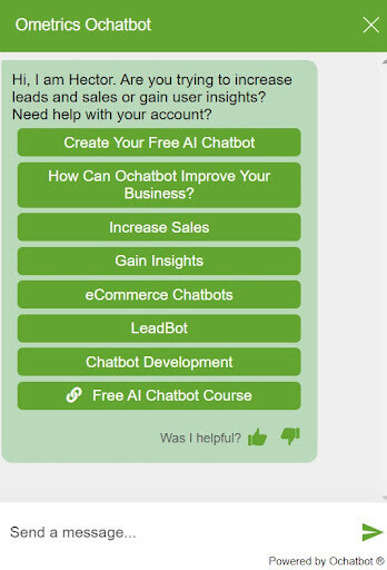
Did you know you can also add CTAs to your customer service chatbot? It can help your visitors to accomplish a specific goal more quickly. Not to mention getting an instant answer to their concerns. It certainly opens up their sense of exploration, which leads them to more knowledge and understanding.
What is a good call to action for a chatbot? Genuine and straightforward CTA phrases that simulate real conversations are the ones to choose. The screenshot below can give you more ideas.
4. Find What Motivates The Consumers
Consumers react to CTAs differently. Some base it on their interests, while others rely on their emotions. Understand the things that motivate them. It will help you determine the correct type of action to provide.
4.1 Urgency
Are you dealing with risk-averse customers? They are the type of consumers that prefer to accept a deal only if it has a guaranteed benefit. If so, creating a strong sense of urgency can help you motivate them to act immediately and smartly. You can deliver the latter by clearly communicating the benefit of your offer.
1 Body, a health supplement provider, sets a good example. They include a countdown clock in their pop-up for everyone to know it is only available for a limited time. You will receive free shipping when you complete the purchase within the 15-minute timeline.

4.2 Scarcity
The scarcity mindset is somewhat similar to urgency because it both creates the fear of missing out (FOMO). Their only difference is that consumers must act quickly because of the short supply. Travel booking sites and eCommerce stores are the typical businesses that use the sense of scarcity on their CTAs. Here are some of the clever scarcity CTA examples:
- Kohl's: Clearance sale
- Amazon: Only 2 left in stock
- Booking: Our availability in [country] is low on your dates - lock in a great price before it is too late
4.3 Achievement
Some consumers feel a sense of achievement when discovering a huge deal. You can motivate these consumers by writing clear and direct CTA words like "Get up to 70% off!".

The bigger the offer is, the more people will participate. But be mindful when offering great deals. People will start to doubt its credibility if it sounds too good. So include a trust factor in your promotional banner. Star ratings and the total number of reviews are some of the most reliable.
Using reward-based language can also strengthen the consumers' desire to take action. The reward does not always have to be in the form of discounts or money saving. You need to identify what they perceive as a reward.
- Referrals: Encourages loyal customers to recommend your business to their network
- Tiered loyalty programs: Offer different rewards based on the milestones they unlock
- Trial of new tech products: Invite trusted customers to give your new products feedback before launching them
- Knowledge: Provide solutions to every customer concern or expert advice on how to speed up the learning process and achieve success
Implement it well, and it will have a significant impact on conversion rates and CTRs.
- Add ValueWriting compelling calls to action requires much more than just saying "Download" or "Sign up." You should also give them an accurate answer on why they should click on your CTA. Also, list all the value they can get out of it.
Remember that people do not click CTA buttons just for fun. They engage with them because they believe you have something valuable to offer. So, focus on its value whether you are writing a creative or emotion-focused call to action.
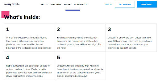
You can take the approach ManyPixels uses to promote their informative guides. There's a separate landing page for each guide to give ample space for its highlights. Take this social media guide, for example. Scroll down a little, and it will show the 5 important highlights of the guide. This is on top of the tips and insights promised on the submission form.
Perform A/B Test
Creating a beautiful website is essential. But without a clear CTA, users will struggle to see its purpose and end up leaving your site. Do you have one but failed to perform well? The best solution is performing A/B testing.
It is an effective method that compares two CTA buttons and analyzes which performs best. The testing does not only focus on the text but every single detail of it. When comparing two buttons, ensure they have one slight difference. It will help you determine which details are worth keeping and removing.
Do you need help making your CTA buttons and website visually appealing and user-friendly? You can seek assistance from an unlimited design company. Just give them the goals you want to meet and the audiences' expectations and they will produce a highly-optimized website.
Conclusion
Finding the best CTA words to make it irresistible is a challenging feat. One small word can make or break your CTA's goals. Not to mention, it will greatly impact your target audience's mind. All the rules above can help you achieve success. Also, you should always remember 4 vital points:
- Increase the value proposition
- Evoke a genuine emotional response
- Make it simple, readable, and easy to convert
- Lastly, ensure to place it where the reader can see it fast
How long should a CTA copy be? Ideally, it should have at least 2 words and a maximum of 5 words. We hope that the rules discussed here will help you get started. If you need help polishing your web design, check out this comprehensive guide.
Discover an array of captivating voices and expert insights as our guest writers grace the pages of the Manypixels blog. From seasoned industry veterans to emerging talents, their thought-provoking articles will inspire and inform, enriching your reading experience.

Top-quality designers
A complete creative team at your fingertips: graphic and web designers, illustrators, and more.

Lightning-fast turnaround
Get start today and receive your first update on the next business day.

All-inclusive pricing
Unlimited requests and revisions. One flat monthly fee. No surprises.

Flexible & scalable model
No contract. Scale up and down as needed. Pause or cancel at anytime.
Continue reading


Explore some of our best designs
Get inspired by a curated selection of ManyPixels work. Download the portfolio to see what our team can create.


