
18 Examples of Modern Accounting Websites You’ll Want to See
.avif)
TABLE OF CONTENTS


Cool accountants? Yup, we said it! And this list of 25 professional accounting websites can prove it. Whether you're looking for more conventional or daring web design, use this list as inspiration to create the best website for your accounting service.
Simple and timeless accountant websites
If ever there was a place to be a little conventional, then it's probably the accounting industry. As an accounting professional, you want to convey a sense of professionalism and trustworthiness. Sometimes, the best websites for accounts are the simple ones.
{{WEB_BANNER="/dev/components"}}
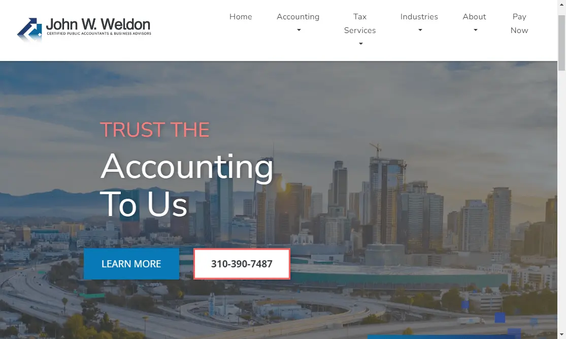
1. John W. Weldon CPA
This website is a terrific example of industry-related simplicity. You've got a professional blue, gray and white color palette, basic stock images, and all the information is clear (location, what kind of clients it is for and contact info).
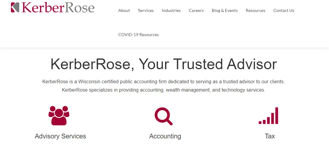
2. Kerber Rose
The dark red and gray color combination is a much bolder choice than blue and gray, and it gives this website a more distinct look.
If your website is text-heavy, consider pairing different fonts to achieve a more dynamic look. In this case the company used a legible sans serif font for longer blocks of text and a traditional serif for the headings. Of course, remember that fonts shouldn't be completely different, as this might harm your professional branding.
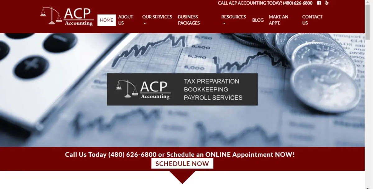
3. ACP Accounting
Accounting means a lot of different things to different people, so it makes sense that accountants websites should fit the expectations of their primary target audience.
ACP focuses their message on 'tax preparation, bookkeeping and payroll services’ (which is perhaps particularly important for small business owners).
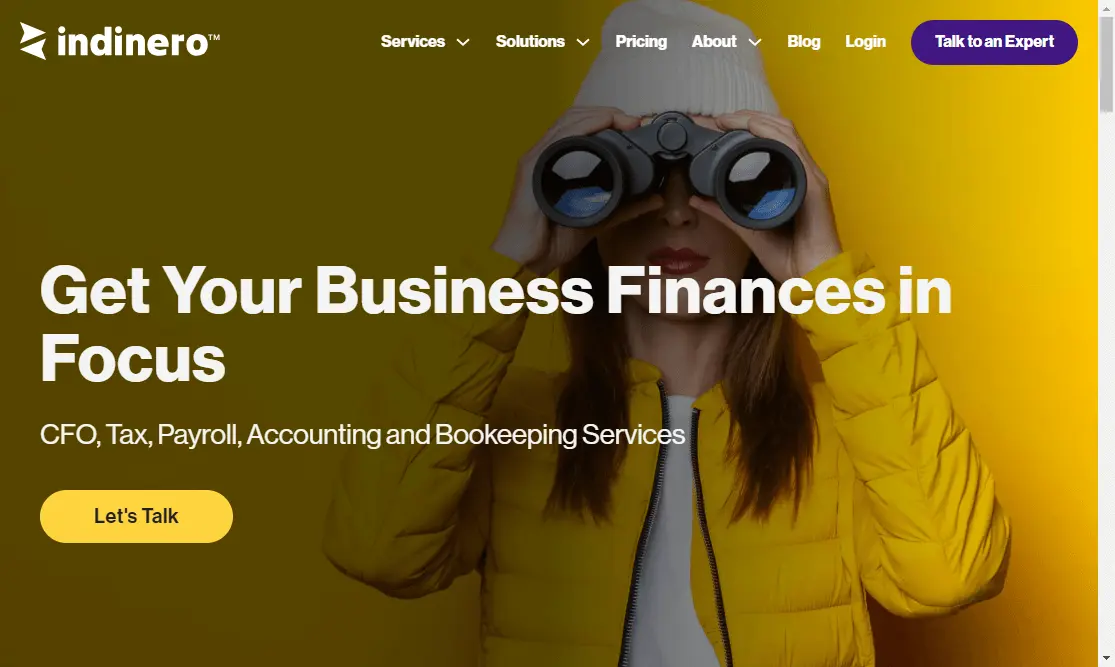
4. Indinero
The right choice of color can make or break any website, which goes for websites for accountants.
This business uses a vibrant yellow, with cool purple contrasts for a youthful and professional look. I also recommend you check out their blog section to see how a little bit of graphic design can go a long way to make a website look coherent and on-brand.
Websites for Modern Accounting Professionals
Bookkeepers and tax professionals may not have the most glamorous jobs in the world. But, this doesn't mean your accountant website design should be boring or outdated.The service these professionals provide remains super important, so you need to keep your website relevant and up-to-date.
Here are some fantastic examples of websites for accountants that definitely belong in the 21st century!
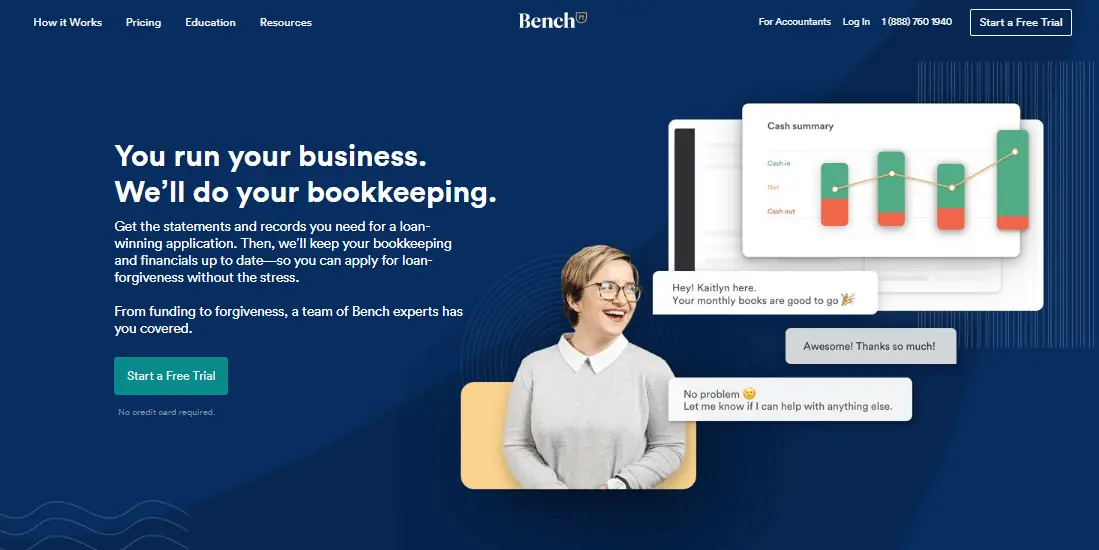
5. Bench
It’s no surprise that some of the best accountant websites belong to companies that offer modern accounting software solutions (like Quickbooks).
Bench is one such company, with a gorgeous website.The dark blue background and crisp fonts still give this web page a slick, professional look, but the graphics and modern layout (take a good look at all the white space!) makes it seem like a great resource for anyone wanting to easily tackle tax preparation to loan forgiveness..
6. Bean Ninjas
The name itself suggests an unconventional service; indeed these awesome accountants specialize in working with digital entrepreneurs, influencers and online businesses. They provide webinars and online training in Xero accounting software, which is a perfect service for these digital natives.
Their wonderful website combines a fresh color palette, original high-quality photos and playful copy (for example, instead of the conventional “Our Team” you can”Meet the Ninjas”).
.webp)
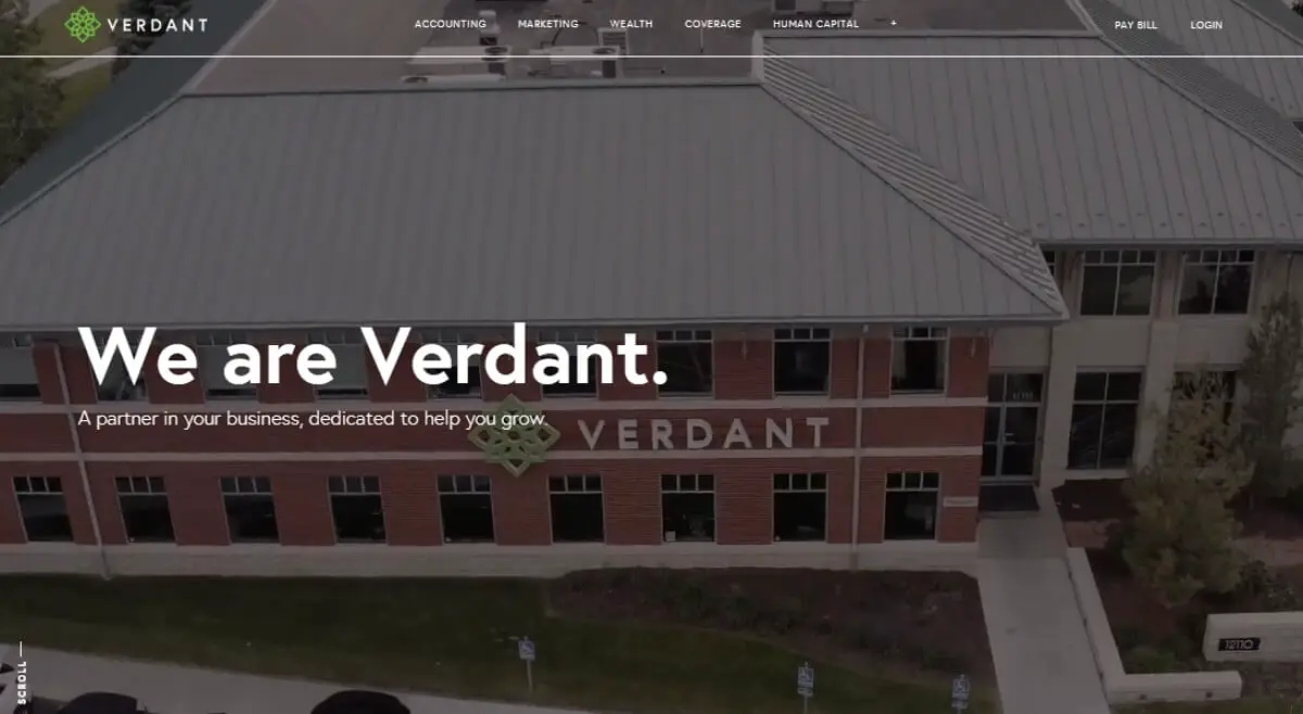
7. MyVerdant
Website videos are such an impactful tool even without any words or sound in the background.
MyVerdant's landing page makes a strong case for this with the video tour of their impressive offices and smiley staff. The website is certainly modern (their playful ornamental logo is another unique feature), but it does give out a sense of an established accounting firm
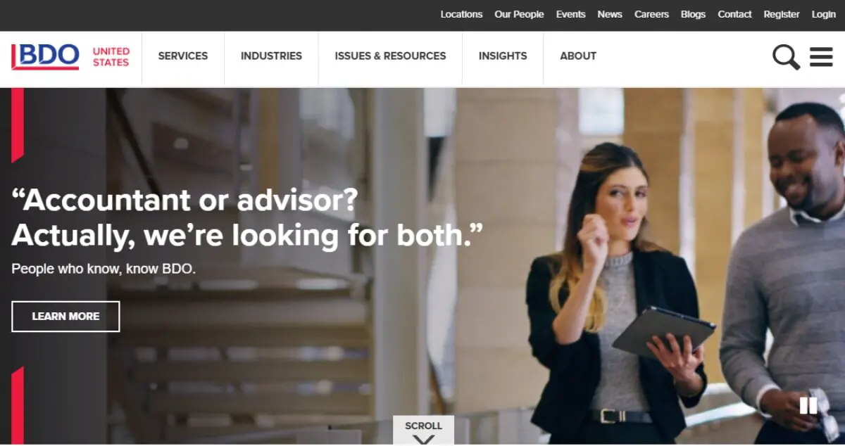
8. BDO
Another company that uses a simple video on their landing page is the industry leader BDO. Their associate Mark Goodfield is the man behind the Blunt Bean Counter, which is a great resource should you ever need content ideas.
Other than the video, BDO's website is very much "industry standard". Their value proposition suggests a tailored service, which is especially important for high net worth clients this firm works with.
9. Counting Up
Many people want to learn how to understand accounting to avoid paying for professional accounting services. So, when they ultimately end up at your doorstep, it’s a great idea to try and make accounting a little more accessible to the average Joe.
Some of the best accounting websites include useful resources that help people understand how accounting works.
And one such example is this terrific video. Sure, it’s more appropriate for an app such as this one, but you could just as easily have a team member explain some of the main features and benefits of your service.
Accounting websites centered around people
Although many people are going digital and switching to tax accounting software, the nature of accountants and bookkeepers is still largely interpersonal.
Let's have a look at some examples of CPA websites that put people at the forefront.
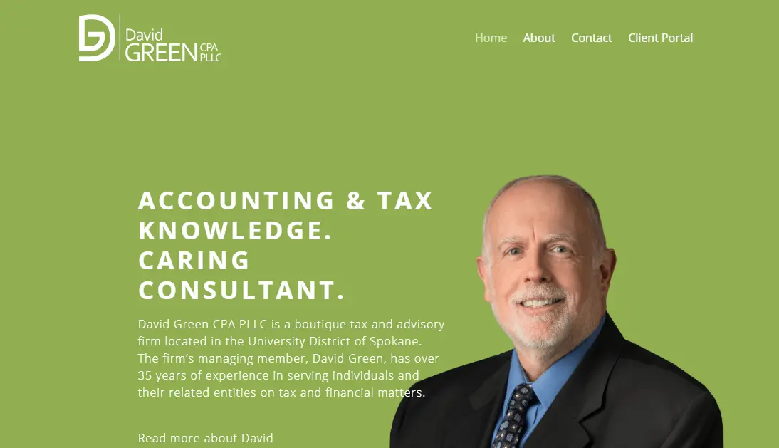
10. David Green CPA
This website is a terrific example of how a little can go a long way. The words 'caring consultant' pair very well with the featured image as well as the fresh, green color, which isn't overused in the industry.
The simple layout makes for great user experience: the key Home, About, Contact, and Client Portal sections are clearly visible.
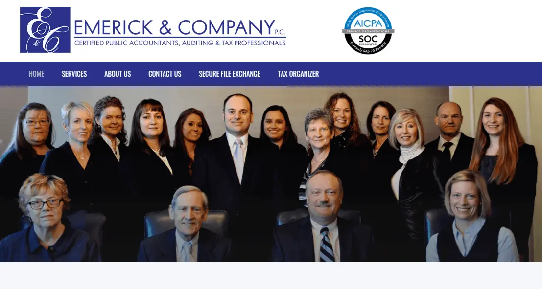
11. Emerick and Co
Using photos over stock images can often go terribly wrong (poor quality, unprofessional look, and setting). However, if done right, it can help add personality to your business.
Take a look at this example. It's by no means a "flawless" stock photo. Still, there is a visual consistency and a level of professionalism that you'd expect in a CPA firm.
Websites that push accounting industry standards
Ready to really stand out from the crowd? The following websites are terrific examples of how a different approach can be effective and still fit your business's professional nature.
12. Zoho
Zoho is an invoicing software with a hip, modern website complete with a slick explainer video and nice mockups.
Something to take away from this example is the modern, scrollable layout, as well as the excellent use of white space (or in this case blue) to draw attention to the most important points.
13. iFirma
Another accounting software solution with a crisp UI design with a playful mix of photos and illustrations This kind of design is very versatile. For example, it can be a fantastic choice for your social media.

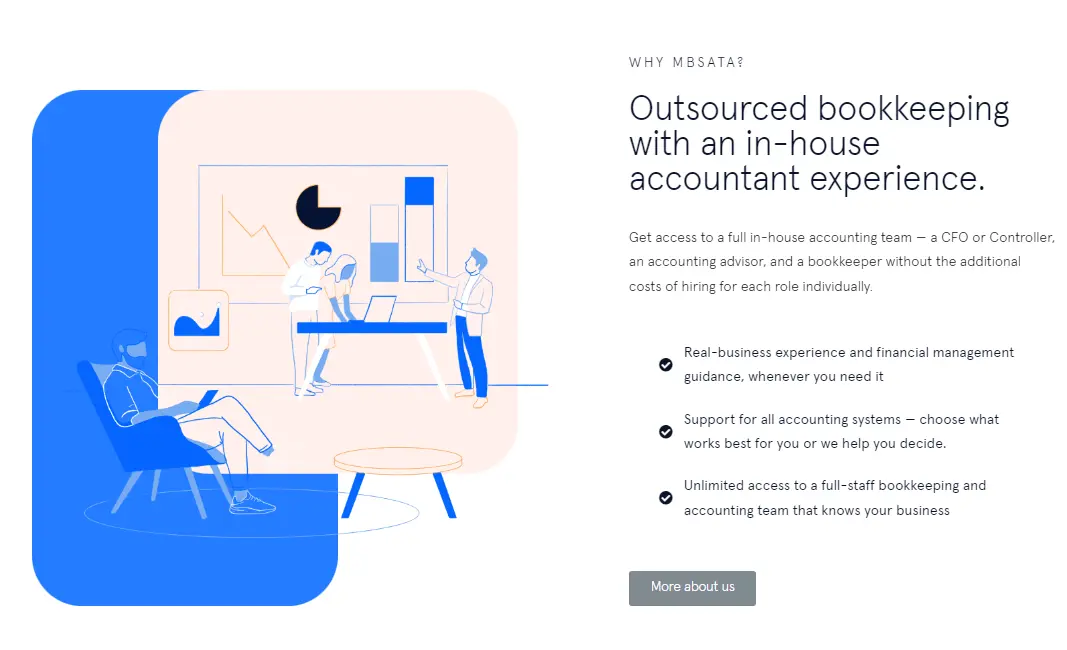
14. mbsata
Like the company itself, this website does a great job at combining technology with the human accounting skills (accounting advisors at your disposal). The illustrations against a crisp white background look both interesting and very professional.
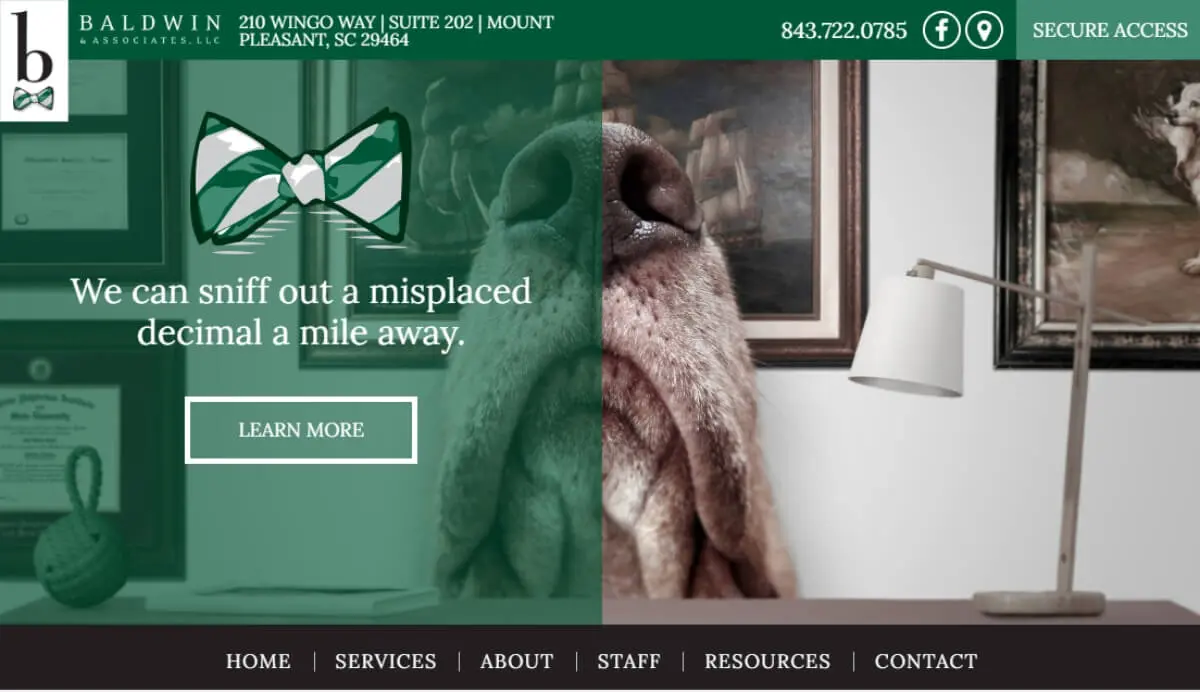
15. Baldwin and Associates
This one is definitely one of the most creative accounting websites out there! Instead of the conventional messages and imagery, they developed a playful copy and featured adorable dogs all over their website.
This probably wouldn’t be the safest choice for a company that works with high net worth businesses. However, as personal tax specialists, conveys a sense of personality and friendliness.
Elegant CPA websites
If you're not convinced about making your business seem too "light-hearted" but still want to stand out from the crowd, these examples can be a terrific source of inspiration.
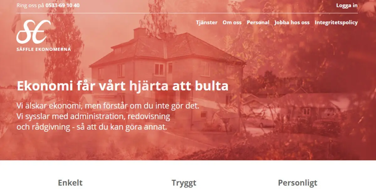
16. Saffle Ekonomerna
You can always rely on the Swedes to offer some elegant design solutions, and this website is yet another one!
We love how elegant the red looks, but their homepage also has a great layout.. Black and white photos of the team to give the business a bit more personality with the same level of elegance.
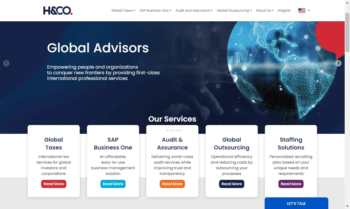
17. H&CO
A website like this one is a great way to go if you're looking to impress those high net worth clients. Convey a sense of international distinction, and they might let you handle their complex income tax issues.
If you offer an array of services, it’s also a good idea to make sure prospective clients can easily find what they need on your homepage. A case studies section also help connect you with the right clientele.
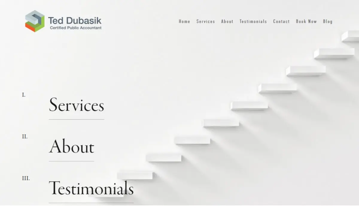
18. Ted Dubasik CPA
Simplicity is usually the right choice if you're unsure what direction to take with your website.
This certified public accountant website makes it extremely easy for users to find all the critical information. It pairs it with an elegant background (steps as a motif are great for any kind of professional assistance).
We hope our examples have given you plenty of food for thought to design your professional website! Make sure you pick a style that best fits your accounting firm and clients, and don't be afraid to be different. Need help with your new website? Check out this list of the best graphic design services for accountants. Or get started our affordable website design services for just $699 per month!
{{WEBSITES_PORTFOLIO="/dev/components"}}

Having lived and studied in London and Berlin, I'm back in native Serbia, working remotely and writing short stories and plays in my free time. With previous experience in the nonprofit sector, I'm currently writing about the universal language of good graphic design. I make mix CDs and my playlists are almost exclusively 1960s.

Top-quality designers
A complete creative team at your fingertips: graphic and web designers, illustrators, and more.

Lightning-fast turnaround
Get start today and receive your first update on the next business day.

All-inclusive pricing
Unlimited requests and revisions. One flat monthly fee. No surprises.

Flexible & scalable model
No contract. Scale up and down as needed. Pause or cancel at anytime.
Continue reading
.jpg)
.jpg)
.jpg)
Explore some of our best designs
Get inspired by a curated selection of ManyPixels work. Download the portfolio to see what our team can create.


