26 Elegant and Luxurious Art Deco Logos
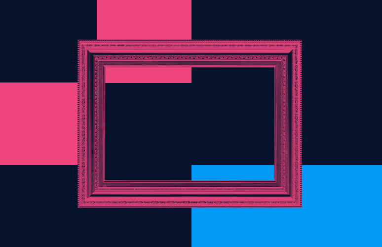
TABLE OF CONTENTS

Thinking about an elegant, rich, and retro Art Deco logo? Check out these wonderful examples that combine the lusciousness of gold and bright colors, with sharp and geometric shapes.
There is no style as elegant, glamorous, and beautifully contradictory as Art Deco. Flappers, the Roaring 20s, golden arches, Parisian cafes, and the Great Gatsby… There are many remnants even today about the incredible influence of Art Deco on architecture, design, and fashion.
Naturally, graphic design isn’t untouched by it, and we can see a comeback of this movement in modern logo design.
{{BRAND_BANNER="/dev/components"}}
Wordmarks
A simple wordmark goes a long way. Even though it’s just the brand name, when designed well, this kind of logo is memorable and versatile (think of Coca Cola, Google, FedEx, etc.). Companies in the real estate, entertainment, hospitality, and beauty industry often decide to use a retro Art Deco font to infuse elegance and timeless glamour into their logos. Here are a few examples.
1.Snob Hotel
This simple golden hotel logo with an architectural, sans serif font, is very effective in reflecting the character and brand story of this business. Set in the home of Art Deco, Paris, The Snob Hotel pays homage to the Parisienne ladies. With its chic design, geometrical patterns on the walls, and Art Deco-inspired furniture, the complete branding and interior design of the hotel makes for a worthy souvenir of the golden days of Paris.

2.DecoDance
This logo for a dance bar in San Francisco is inspired by The Great Gatsby and the Roaring Twenties vibe. The dark green and golden color pattern offers a rich and luxurious quality to the logo, while the typical geometrical Art Deco pattern of the circular and semi-circular letters brings in authenticity and playfulness, richness, and excess, all often tied to decadence.

3.Cin Cin
This bar in Singapore offers a rich boutique selection of the world’s best gins. They opted for a more minimalist solution of an Art Deco-inspired wordmark, erasing the thin lines of letters and giving more strength and essence to the wider elements. They too decided to go with gold—a color that describes wealth, rarity, power, and grandeur.

4.The Wilkins Co
This husband and wife photographer duo from Atlanta decided to go for a simple and elegant Art Deco logo with a font with some super subtle serifs. We see a golden and dark-green color combo once again, proving that these two colors paired together exude refinement and taste. Imagine how good it looks on a business card!

5.La Luce
This custom logo created by Unifikat was made for a wedding photography studio called La Luce (the light). It takes the name as an inspiration, bringing a light and sophisticated wordmark for this company working to preserve people’s fondest memories through its craft.

6.Paraiso
Another amazing branding and packaging design by Unifikat, that bursts with the stylishness and distinction that is the essence of Art Deco. It is a branding for a special project for a real estate marketing company, that hired the design studio to create branding for special gifts for his clients. The final project was Paraiso, a limited number of fine wines, with a logo and packaging that belongs in the 1920s. Just look at that sharp and elegant letter A.

7.Luux
Here we see another example of simple and smooth typography that gives an art deco style essence to the logo. Luux is a Swiss brand for luxury perfumes and the femininity and grace are well relayed through the pale rose and gold color combination.

Geometric and pattern logos
Art deco design is also known for its symmetrical patterns, sharp Cubist shapes and steel rods adorning windows, doors, arches, and walls. Art Deco frames are still a design inspiration for many people, using them to create unique logos.
8.Lebu Copi
This amazing branding and packaging for a tea company heavily rely on the use of Art Deco frames. The product is a fusion between classic Deco and modern, through combining fresh and pastel colors, three-dimensional letters, and a golden geometric pattern.

9.Thirdeye Airships
We stumbled upon this Deco-inspired design on Behance. Creator Martin David made this unused design for an imaginary company called Thirdeye Airships, including the eye and airship as design elements put inside an intricate frame with many details.

10.CW Monogram
This heart-shaped design with a monogram and Art Deco frame is a unique and cute solution. According to the designer, it’s commissioned by a company that produces gift cookies.

11.Green Haus
This logo takes inspiration from Art Deco but adds some simplicity and minimalism that is more contemporary. Using both semi-circular and straight-line patterns, combined with a simple uppercase sans serif font, it results in a cool frame design.

12.Dynastea
This will probably be considered cheating, but this example isn’t of an Art Deco logo design, but a brilliant and modern art example of packaging. The Dynastea tea brand packaging takes huge influence from the Art Deco movement but combines it with colors that are very atypical: coral pink, green, and yellow. Flat icons of the fruits used in the tea blend are put inside an intricate and detailed Art Deco frame, and the result is a cool and unique look of a product we’re usually used to have a much simpler and conventional look.

Modern
As beautiful as it might be, Art Deco isn’t exactly a simple and contemporary style. Some designs try to marry the old and extravagant, with a modern and minimal twist. The results are borderline Art Deco with an impressive and effective solution.
13.30 Park Place
This luxurious residential building in New York is owned by one of the real estate moguls that are responsible for the look of the modern NY skyline and designed by architect Robert A.M. Stern, who is a legend himself. The logo or this residential complex is vaguely inspired by the glitz and glam of Art Deco, with a modern take that results in an amazingly simple, yet rich design.

14.La Bleu
La Bleu is a French restaurant in Vietnam, that took inspiration from Art Deco and one of the most iconic symbols of France: the Eiffel Tower. The logo is a combination of the letters L and B, as well as a sketch of the tower. The blue and gold color combination is an homage to the name of the restaurant, and the most notable element of the art movement that influenced the design.

15.Sweet Stars
This creative and gorgeous logo combines the word “sweet” with the pattern of a grain strand. It is all well combined and the final result is an Art Deco-style logo that is both retro and modern at the same time.

16.Hive Interiors
A logo that is simple, yet packed with design elements connected to the backstory and effectively designed, can only belong to an interior designer. The Hive Interiors logo design consists of an outer shape of a beehive, a right-pointing arrow signifying progress and moving forward, a diamond shape for the modern and resourceful mindset, and a cube symbolizing architecture. Everything tied up nicely in an Art Deco design.

17.Lorella
This logo is essentially a logotype, put inside a frame that is an extension of the letter R. It takes the golden frame concept and creates a minimalist and simple solution, better suited for the modern era.

18.Felipe Rangel
The logo for this architecture company is an elegant monogram of the initials of the architect, along with another layer in the frame, that is actually based on an architectural sketch of an apartment.

Emblem logos
By combining an icon, sketch, or character and an Art Deco-style typeface, some designers created cool emblem logos.
19.Rasayana
What happens when you combine the colors and sharp forms of Art Deco, with an Art Nouveau design of a portrait? This emblem logo for an imaginary IPA beer is the answer. It is rich in design elements but still manages to look compact and tasteful.

20.Le Pan Decó
This logo for a bakery takes a dough roller for the base and a simple Art Deco typeface for the brand name. It is not an extravagant or intricate design but the result is a cute logo connected to the business story.

21.Casa de Nora
Casa de Nora, or House of Corn, is a Mexican cuisine restaurant that pays homage to corn, the most important ingredient in pre-Hispanic times in Mexico. Its logo is an elegant logotype with a sketch of three corn cobs.

22.El Rayo Tequila
This tequila brand used a sleek, elegantly serif typeface, and a golden frame with a lighting striking (the name translates to lightning).

Extravagant
Lastly, we have a selection of logos that took a step up in incorporating the gold and black color combinations, rich arches and elegant patterns, to achieve an extravagant look.
23.El Piacere
This restaurant logo has some extra golden hour aesthetics added into the whole rich and luxurious vibe, with rays of light piercing through the letters.

24.Delux
This manufacturer of electronic cigarettes and E-liquid opted for a black and gold combo, with a typeface created with the iconic gold rods often used in Art Deco frames. The packaging also has classic Art Deco patterns, taken from the ceilings of theaters and window frames.

25.Sabio Mentor
This grappamiel manufacturer has a simple golden frame and fancy lettering that form the logo. It is well combined with a packaging that shows the ingredients this Uruguayan beverage consists of grappa, honey, and various grains.

26.Sala Soirée
The final logo on our list is especially refined, due to the beautiful ligatures paired with an intricate circular frame. As we’ve already established, you can’t go wrong with a dark blue and gold combination of colors.


Top-quality designers
A complete creative team at your fingertips: graphic and web designers, illustrators, and more.

Lightning-fast turnaround
Get start today and receive your first update on the next business day.
All-inclusive pricing
Unlimited requests and revisions. One flat monthly fee. No surprises.

Flexible & scalable model
No contract. Scale up and down as needed. Pause or cancel at anytime.

Continue reading
Explore some of our best designs
Get inspired by a curated selection of ManyPixels work. Download the portfolio to see what our team can create.
