
21 Awesome Banner Ad Example To Learn From

TABLE OF CONTENTS


What makes a good ad? There’s more than one answer. Here are 20 brilliant banner ad examples with key takeaways to help you devise your own advertising strategy.
Banner advertising, also known as display advertising, refers to the placement of promotional graphics online that lead people to a particular website or landing page. This type of paid media marketing has a vast use, from building brand awareness to more narrowly targeting a particular campaign.
Google Display Network reaches 90% of online users, which means that this is one of the ways in which most businesses can reach their target audience. Of course, the problem with display ads is that they often get ignored. An Infolink study suggests that 86% of people experience banner blindness, meaning ignore or avoid banner ads.
So, if you want to improve your click-through rates and make the most out of your advertising budget, here are some helpful tips from the most effective banner ad examples.
{{AD_BANNER="/dev/components"}}
Apple: Keep it on-brand
Bright colors and big lettering aren’t the only options when it comes to ad design. Of course, you want to get people’s attention. But ultimately, you want them to remember your brand past noticing a well-designed ad.
These examples from Apple use emojis to symbolize recognizable features and products (iCloud, MacBook) which immediately helps their target audience identify which brand the ads belong to.

Instapage: Simple copy can be effective
I personally love a good pun or even a simple rhyme but, truthfully, effective copywriting is often surprisingly simple.
Display ads are meant to get people interested in your product or service enough that they want to find out more about it. So, instead of tapping into the latest trend or convoluted, cryptic copy, you can simply state your value proposition and invite people to find out more about it. If you’re targeting the right audience (in this case people who know what a landing page builder is), a simple ad will certainly catch their attention.

Nike: Feature a single product
Product shots are a great way to get people clicking on your ads because they’re so straightforward: if you see a product you like, it’s only logical you’ll want to find more details about it.
It’s also a great technique to use with retargeting ads (ads that show up for people who’ve already visited your website). Similar to an abandoned cart email, these ads can help remind people of a purchase they had considered but haven’t completed yet.

Ridge: Show what makes you different
This great display ad does more than just show off a single product. The comparison with a similar product demonstrates how this one is different (and superior). It’s a great technique to use with, especially physical products, but even for SaaS companies a simple comparison table of possibilities or features can do the trick.
As far as design goes, the neutral color palette makes for a very elegant choice and one that’s not imposing.

Zara: Use bright colors
It’s well known that bright colors grab people’s attention. Of course, the color choice should be in line with your brand and marketing strategy. Hip neon colors might be very noticeable, but not exactly appropriate for a business looking to inspire a sense of trust, like a bank or hospital.
Here’s a good example of good use of colors. Although red isn’t Zara’s “signature color” (it’s not found in their logo and regular branding), the combination of different red products makes a logical choice for a display ad promoting a specific store

Lexus: The power of human expression
Beautiful, custom illustrations can do wonders for your digital marketing strategy and can be used on your website, social media posts and display ads. However, if used well, even a stock photo can deliver a powerful impact.
The ad manages to “make eye contact” with the viewer, getting them to pause, while the intriguing ad copy is what would encourage them to click on the ad. Interestingly, although Lexus is a car manufacturer, this ad campaign is focused on one of the features in one of their cars: a new speaker system.

Hermes: Create a sense of mystery
Continuing in a similar mode, here’s another great example of a banner ad from Hermes. A luxury company like this shouldn’t need to “spell things out”. Rather a sense of mystery and exclusivity works much better in this case.
Of course, it’s not an approach that would work across all industries. However, if you’re launching a teaser campaign for a new product, or want to promote a product that’s already well known in a certain niche (like the Hermes Birkin bag although of course, this is a product everyone knows), then this type of ad design is definitely worth looking into.

Google: Make it personal
A stock photo model smiling on your ad might look polished and professional, but it usually won’t help you connect with the right audience, and will fail to create a connection between your customers and your brand.
By adding a personal touch like a name, or perhaps giving your brand a “face”, you instantly make the ads more relatable. This way you avoid the overly salesy tone that makes most people turn away from annoying pop up or display ads.

Samsung: Minimalism works
A slick and minimalist approach to ad design is also a useful route to consider. First, it will make your ads distinguishable from the majority of very bright and colorful ads out there. And secondly, an ad like this will blend easily into surrounding content.
Why is this important? Well, ads that match the surrounding content are called native ads and are shown to perform much better than regular online advertising: a study from Sharethrough showed that native ads have up to 53% more views and increase purchase intent by 18% compared to regular display ads.

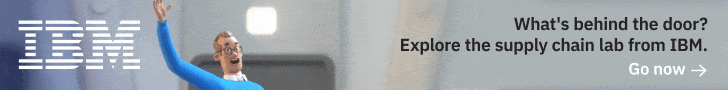
IBM: Simple animation
In 2021, a convincing 53% of display ads were animated, proving that this is a trend that’s here to stay. Of course, it might seem like a tall order at first, but the truth is that many online design DIY solutions these days allow you to create simple animation in just a few clicks.
It’s pretty obvious why this approach works. Movement draws attention to a static page. However, make sure your ad is optimized for web use so that the animation isn’t lagging. Here’s a nice example from IBM. The custom 3D illustration is playful yet still on brand and the movement itself is recognizable: when we see someone waving, chances are we will instinctively look their way.
Brita: Create visual balance
So, you want people to click on your ads. And you want people that click on your ads to be genuinely interested in your offer and have a high potential for turning into paying customers. So, it’s only natural that you’d want your ad design to be as eye-catching as possible, whilst also containing as much information as possible, so as to avoid paying for clicks of non SQLs (sales qualified leads). Right?
Well, cramming a small banner ad with tons of information will discourage even the most interested of people from going through all the text. And, it will hurt the design of the ad and make it look ugly.
This awesome example from Brita uses short, snappy copy, a clear call to action and a small product shot, all perfectly aligned to create a pleasing, visual balance. The good design will certainly attract attention and there is just enough information on there to prompt potential buyers to click on the ad.

Volkswagen: Amazing interactivity
As was already mentioned, Google ads are a great way to raise brand awareness and reach new audiences, since they’re reach is so vast. But creating brand or product awareness is a much longer process than a single ad click.
That’s where a great interactive ad can create long-term memories of a business or product. Here’s an amazing example from Volkswagen. By allowing viewers to engage with the ad for a longer period of time, the brand manages to keep them interested for long enough to actually click on the link (plus the CTA is also playful and in line with the rest of the ad). This is probably the most complicated type of ad you could create, but it can be a great choice for a bigger campaign such as rebranding or launching an important, new product.
VW Blank like a Rabbit Web Banner from Justin Luchter on Vimeo.
Microsoft: Speak to your niche
It’s an old marketing mantra that you can’t be everything to everybody. Although the potential reach of display ads is vast, sometimes it makes much more sense to limit yourself to people who have a real interest in your product. Ad design and copywriting can help you make sure you’re reaching the right audience.
The use of specific terminology and the design mimicking recognizable coding symbols will certainly catch the attention of the right audience, while those who have no need for such software will probably ignore this ad, which means your marketing budget is also optimized.

Mailchimp: Test different copies and sizes
When creating a Google ads campaign, you can create different ad groups each containing at least 3 different ads. This way Google ensures that your ads are displayed for the most relevant audiences, whether it’s a case of content marketing or advertising on specific platforms, or showcasing specific products.
Here’s a good example of how Mailchimp does it well. The first ad showcases their product and would be suitable for audiences already familiar with the service. The second ad is suited to marketing beginners and features a clear value proposition that might get people interested. Both of course are done in the style of the brand and help to build brand awareness and recognition.


Georg Jensen: Try video ads
The final entry on this list is a successful example of video display advertising. This type of ad might not fit every marketing budget, but it can be really impactful and infuse your marketing efforts with powerful storytelling.
This Danish jewelery manufacturer created a beautiful seasonal ad that makes you want to watch and see it through to the end. Most importantly, it works equally well without sound, which is pretty important seeing that on most devices/sites videos show up muted.
The New Yorker: Focus on the CTA button
This great ad example shows that the point of a banner ad is to drive clicks. With a clear value proposition and great design (stark contrast between the CTA button and the background), this ad is all about putting focus on that call to action button.

Gillette: Pop culture references
This ad might go over the heads of slightly younger audiences nowadays. Still, back in the day everyone knew about the movie Cast Away, and could immediately get this whimsical reference. Even though the man is stranded on a desert island, you can still see he’s perfectly clean shaven, thanks to Gillette’s long-lasting razors.

Manhattan Mini Storage: Humor is always a good idea
There are tons of examples of banner ads that use humor to get the message across. Sometimes, the humor comes from the visual elements (e.g. the example above). However, in this case it's the hilarious banner ad copy that helps to create a memorable ad.
This ad example also shows how important it is to connect with your target audience. In suburban areas lack of space might not be a big issue, but for New Yorkers it’s definitely one of the most recognizable pain points.

Amnesty International: Send a powerful message
Some of the best examples of banner ads aren’t those that sell a product or service. Instead, if you want to promote your brand recognition, or find people interested in your company or organization, a great banner ad can help.
In this case the organization was looking to hire writers, but the actual CTA to apply showed up once you solved the Hangman game with the message “Words save lives”. The simple black and white design works well for this kind of message and organization.


Ikea: Show your product in action
Even the best banner ads leave very little space to actually show what your product can do (unless you opt for video ads). Still, here’s a great banner ad design example that manages to show the products in action, even in a very limited space (pun intended).
Ikea’s ad isn’t just smart, it’s also interactive, which helps to boost the ad performance.

Dreamworks: have some fun
Banner ads have pretty low click-rates, so being a quirky and fun usually pays off. This great example from Dreamworks works perfectly for the film in question. The design is fun and suited to their target audience.

Final word: how to design banner ads?
We hope these high-quality examples of banner ads helps you understand why ads work and how to improve your own.
A great idea can help, but remember that creating banner ads usually requires the work of a professional. Whether it’s a custom graphic, video editing, or motion design - this is hardly something a layperson can do easily.
Many businesses opt to hire freelance marketing designers for these tasks, as a fast and inexpensive solution. However, remember that most businesses often run banner ad campaigns. So, paying on a one-off basis can rack up the costs quickly.
For a faster, and much more cost-effective solution, check out on-demand design services. One flat monthly rate covers all your banner ads, and every other marketing asset you could possibly need: landing pages, custom illustrations, business presentations, logos, video editing, and much, much more!
Our vast design team has ultra-fast turnaround times of just 1-2 business days. So place your first design request today, and get ads back tomorrow.
Alternatively, get in touch with us to discuss your design needs.

Having lived and studied in London and Berlin, I'm back in native Serbia, working remotely and writing short stories and plays in my free time. With previous experience in the nonprofit sector, I'm currently writing about the universal language of good graphic design. I make mix CDs and my playlists are almost exclusively 1960s.

Top-quality designers
A complete creative team at your fingertips: graphic and web designers, illustrators, and more.

Lightning-fast turnaround
Get start today and receive your first update on the next business day.

All-inclusive pricing
Unlimited requests and revisions. One flat monthly fee. No surprises.

Flexible & scalable model
No contract. Scale up and down as needed. Pause or cancel at anytime.
Continue reading

.jpg)
Explore some of our best designs
Get inspired by a curated selection of ManyPixels work. Download the portfolio to see what our team can create.


