

What Are the Benefits of Good Logo Design?

TABLE OF CONTENTS


You’ve gone into business fully aware that a logo is a must. But is your logo really doing its job? Have you ever wondered what makes a good logo? Are you aware of the benefits a good logo can bring to your business? We’ll answer your questions!
Before “brand” ever became the buzzword it is today, there were logos. Coca-Cola’s iconic wordmark came into existence over one hundred years ago, and it still persists in its almost original format.
Every business needs a logo to distinguish itself from its competitors and create a kind of ID for its products - from a bakery to a SaaS company. But did you know a logo is much more than that?
Here are 6 reasons why good logo designs are significant prerequisites for business success.
{{BRAND_BANNER="/dev/components"}}
It’s the most recognizable part of your brand
Let’s start with the most obvious benefit of a great logo. When you think about famous brands such as Coca-Cola, Apple, or Nike, their logo usually comes to mind. Although their actual products are widely used and, arguably, designed to perfection, the first association is usually a simple piece of graphic design.
That should be enough to show you how impactful a good brand logo design is. But there’s also some data to confirm this.
A jaw-dropping 94% of the world population (that’s over 7 billion people) recognizes the Coca-Cola logo. Wowzers.

At 75%, logos are the most recognizable brand identifiers. Interestingly, a vast majority of people (78%) consider logos works of art. So, if you think your target audience can’t tell a good logo apart from a bad one, think again!
It builds customer loyalty
Ok, so people recognize your logo. What’s in it for you?
Brand recognition grows into brand loyalty. And your logo is a powerful driver of this process.
People are much more aware of branding efforts than you might think. A 2021 study from Stackla shows that an impressive 88% of people value authenticity in deciding which brands to support. Another study shows that 46% are prepared to pay more for purchases from brands they trust.
A great logo and consistency in your branding show potential customers that you are trustworthy and stand behind your values (since a logo design also needs to reflect that). In fact, consistently presented brands are 3.5 times more likely to have excellent brand visibility.
A good logo improves sales
Creating a powerful brand is almost as important as devising a quality product these days.
We’ve already established that a quality logo builds brand loyalty. But what does this mean exactly? How do people liking your brand translate into monetary terms?
A study by Kasper & Bloomer from 1995 defined brand loyalty as these behavioral patterns in a customer:
- Bias or preference toward one brand over another
- A unique behavior response (purchasing)
- A commitment to a brand over time
Brand loyalty is the key to a successful brand. Not only does it mean you stay relevant in a competitive market (thanks to a loyal customer base), but it also significantly impacts your revenue.
- Brand loyalty is worth 10 times more than a single purchase (Office of Consumer Affairs)
- 73% of CEOs claim their brands rely on returning rather than new customers. (Gartner)
- When brand loyalty is increased by 7%, the lifetime value of a customer can increase by as much as 85% (Microsoft)
It’s the foundation of a solid brand
Earning money is fantastic, but building a lasting brand is the next level. Take a look at this list of 20 wealthiest companies. You’ll notice that along with a few “faceless” conglomerates, most of the companies there are well-loved brands: Apple, Tesla, Samsung, Microsoft, Meta (I still call it Facebook, though), and Walmart.
If you’re unsure how to design a good logo, starting with your brand identity is always advisable. What are your mission, vision, and values, who is your target audience, and what makes you distinct? All of these should go into your logo design, which will subsequently dictate the look of your brand image.
It shows professionalism
As a small business owner or a startup, you have much to do to prove yourself. One way to do that is to have a custom logo.
These days anyone can whip up a logo with the help of online logo makers in minutes. Although these look professional enough in the first instance, customers usually forget them very quickly (it’s likely a logo design they’ve seen many times before).
A custom logo perfectly aligned with your brand identity shows that you take yourself and your business seriously. Well, the way to start thinking about forming those long-lasting connections is with a professionally designed logo and visual identity. If people discard you from the get-go because you don’t look like a viable option, you won’t have a chance to get them to understand your brand on a deeper level.
Good logo designs are a powerful communication tool
It’s an often-quoted statistic that our brains process visual information 60,000 times faster than text. I know what you’re thinking. How much information can you pack in a simple logo?
The answer is a lot. Each element of the logo design should be chosen carefully to strengthen the message you want to send. If you aren’t sure what makes a good logo, here are just a few things to consider:
- Color: Most professional logos use the color blue, but that doesn’t necessarily mean you should use it. Get acquainted with color theory and psychology to assess what color combinations go well together and what impact a color may have on the viewers.
- Typography: Sans, serif, or script fonts? There are hundreds of thousands of fonts, so choosing the perfect one is both simple and incredibly challenging. Each font will bring a different quality to the table. For example, sans serif fonts are usually more modern and professional. In contrast, serif fonts exude a sense of tradition and trust. Dainty script fonts usually communicate a sense of elegance. However, remember that fonts also work together with other design elements to tell your story.
- Graphics: You should choose your imagery carefully, whether you opt for a pictorial mark (graphics-based logo like Apple) or a combination mark (logos that include graphics and text). There’s no single way to do it right. Some famous companies, such as Apple and Twitter, went with a straightforward approach. On the other hand, one of the most famous pictorial marks today has nothing to do with the brand name: Nike’s swoosh is so famous in its own right that it even has a name of its own!
- Mascots: These types of design elements and logos deserve a separate mention as they’re particularly interesting in terms of communicating with your audience.
Still don’t believe that a little can mean a lot for good logo designs? Let’s take a look at a couple of failed rebranding examples.
The first one is Gap’s infamous 2010 attempt to change their iconic serif wordmark. Yes, sans serifs are much more prevalent in logo design. But is it the right choice for Gap, a well-loved family brand known for tradition and durability?
The new logo design looks like it belongs to a trendy SaaS company and doesn’t “speak” to the intended target audience. So, after they’ve probably spent considerable money on the new logo, Gap decided to scrap it after just 6 days.

Another great bad example is MasterCard. Remember, the point of a good logo design is that you don’t need to rebrand just to stay trendy. A really good logo, like Coca-Cola or Google, is timeless.
Moreover, the change in logo design is usually a step towards a stripped-down, more straightforward look. In 2006, MasterCard went with a new look that was a lot more complex and detailed than their original and pretty iconic logo. Not only are gradients tricky to get right across the board, but in this case, the design choice also jeopardized one of the logo’s signature traits: the color combination.
Luckily, this brand also got wiser, and with the rebrand in 2019, they did precisely what a good rebranding project should do. Made the original logo even simpler, keeping as much as possible intact.

What makes a good logo?
So, now that you know the benefits of having a good brand logo design let’s quickly share some tips on how to design a good logo for your business.

Simplicity
There is nothing more important for a good brand logo design than simplicity. If there is an element that could be taken away without disrupting the design, you don’t need it.
Good logo designs tell complicated stories: as we’ve explained, they represent your entire brand identity. Making the message as concise and straightforward as possible through effective and minimal elements of a good logo shows a genuinely skilled logo designer.
Memorability
A memorable logo is usually defined by 2 things: simplicity and one focal point. Since people usually need 5-7 interactions with your logo to remember it, you should strive for simplicity that allows quicker memorization.
On the other hand, your logo should include one powerful element that people will start remembering almost instantly. For example, the movement of the Nike swoosh or the MasterCard color combination).
Relevance
Effective logos always exist in the context of a particular industry. Suppose you come up with a stunning and memorable logo that simply doesn’t fit your business or appeal to your audience. Surely, that’s hardly any success.
Make sure your logo is trendy, but only if being trendy is a part of your brand identity. Respond to the changes in your industry promptly, or keep your ground if that’s something your audience expects.
Versatility
Remember, your logo has numerous uses. From business cards to your website, a logo should work equally well in different formats, off- and online spaces.
Ideally, you’ll have several versions of your logo, such as monochrome or a brand mark. This way, wherever it’s placed, your logo represents your brand adequately
Distinctiveness
Some of the best logo designs may seem very basic today, but that’s just because we’re used to seeing many logo designs that mimic them. A great logo should also be unique, in addition to all the aforementioned best practices for logo design.
Where can I get a good logo?
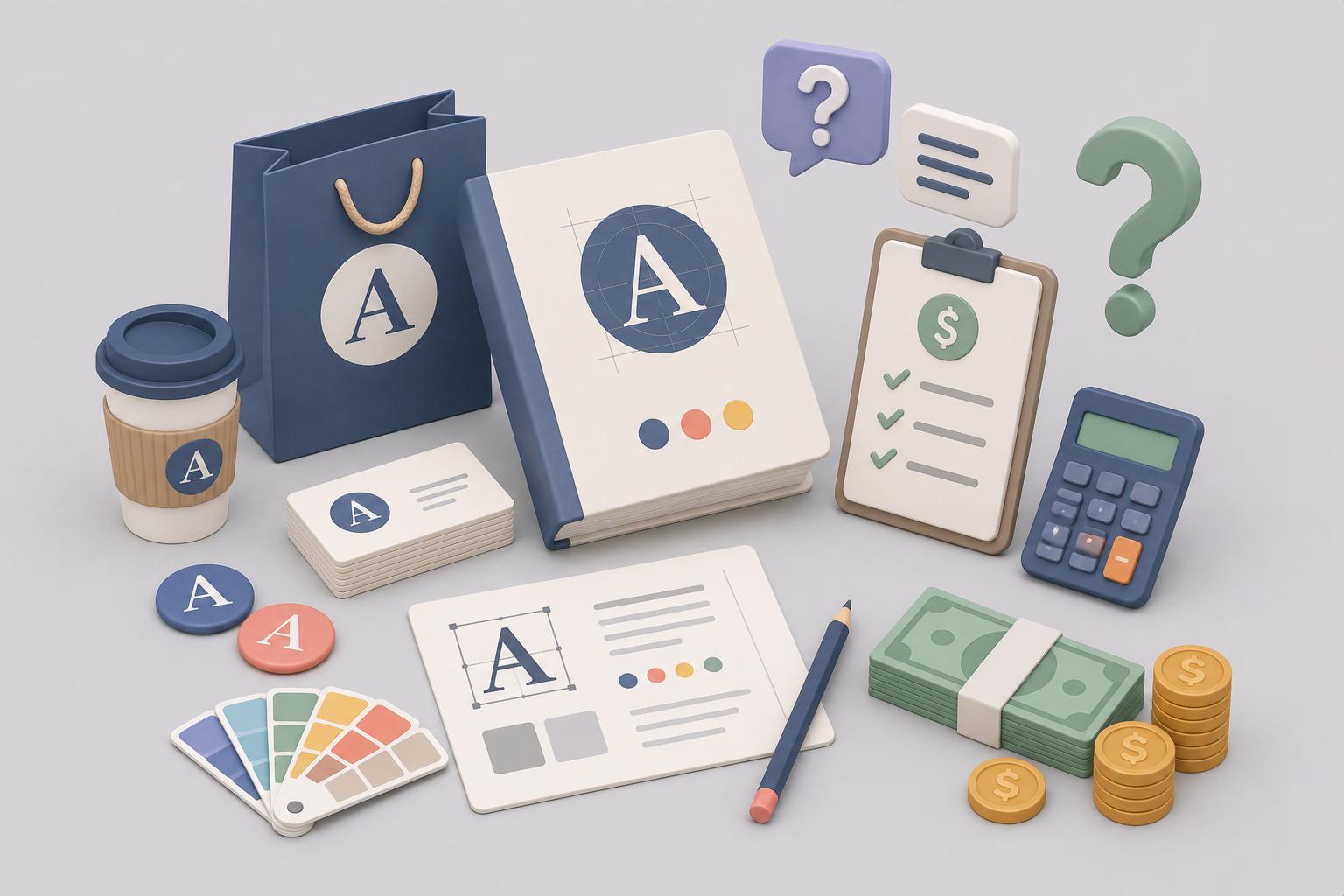
The price of a good logo for business purposes ranges from $20 to several thousand dollars. As a ballpark figure, we’d say you can get a good brand logo design between $300 and $1,000.
However, this can mean a significant dent in the budget for a small business or startup. But now that you know how important a logo is, you probably know that getting low-quality, cheap designs isn’t the way to go either.
Luckily, there is a third alternative! ManyPixels unlimited design service allows you to get a professional design for as little as $549. But that’s not all. This same price covers all your graphic design needs within a month. That means you could get a logo, complete brand guide, and marketing materials for the price of a single logo design elsewhere.
Learn more about how our unlimited design service works, or book a 1:1 demo consultation to discover how we can create a great logo for your business.

Having lived and studied in London and Berlin, I'm back in native Serbia, working remotely and writing short stories and plays in my free time. With previous experience in the nonprofit sector, I'm currently writing about the universal language of good graphic design. I make mix CDs and my playlists are almost exclusively 1960s.

Top-quality designers
A complete creative team at your fingertips: graphic and web designers, illustrators, and more.

Lightning-fast turnaround
Get start today and receive your first update on the next business day.

All-inclusive pricing
Unlimited requests and revisions. One flat monthly fee. No surprises.

Flexible & scalable model
No contract. Scale up and down as needed. Pause or cancel at anytime.
Continue reading

Explore some of our best designs
Get inspired by a curated selection of ManyPixels work. Download the portfolio to see what our team can create.


