

25 Brand guidelines examples to inspire your brand book
TABLE OF CONTENTS

TL;DR
The best brand guidelines examples are the ones you can actually open. We checked all 25 brand books on this list in September 2026 and found that 19 are fully public, one is partly gated, and five were never published at all.
✅ Best for studying voice: Mailchimp.
✅ Best single downloadable PDF: Asana.
✅ Best public-sector system: City of Helsinki.
⚠️ Every brand book we could not find in public belonged to a consumer brand, which tells you something about who these documents are really written for.
All 25 brand books checked September 2026.
Why most "brand guidelines examples" lists send you to dead ends
Search for brand guidelines examples and you get the same 20 companies described in glowing prose, with no way to tell which documents you can actually read. Some of those brand books are open to anyone. Some live behind a partner login. Several have never been published in any form, and the PDFs floating around Scribd and Pinterest are student recreations, not the real thing.
That gap matters if you are building a brand guide and looking for a benchmark. You do not need a description of Glossier's typography. You need to open a real brand book, see how a section is structured, and steal the structure.
So we checked. Every link below was verified in September 2026, and the summary table tells you before you click whether the document is public, what format it is in, and what the brand does unusually well.
{{BRAND_PORTFOLIO="/dev/components"}}
What is a brand book?
A brand book is a document that defines how a brand looks, sounds, and presents itself across every touchpoint. It covers logo usage, color palette, typography, photography style, voice and tone, and how all of these elements work together. Anyone creating brand materials, from an in-house designer to an external agency to a freelance contractor, should be able to open the brand book and know exactly what's allowed and what isn't.
The terms "brand book," "brand guidelines," and "brand style guide" are used interchangeably by most companies. There are loose distinctions worth knowing:
In practice, a brand book is a more complete version of a style guide. Both exist to answer the same question: when someone picks up your brand assets, do they know exactly how to use them?
Why consistency matters: Research from Marq found that consistent brand presentation across all channels can increase revenue by up to 23%.
What should a brand guide include?
complete brand guide covers seven things: logo standards, colour palette, typography, imagery guidelines, voice and tone, mission and values, and usage examples. Smaller brands can cover all seven in 10 to 15 pages. The reason most brand guides fail is not missing sections, it is missing examples of the rules being applied.
Use this as a checklist:
- Logo standards. Primary logo, secondary marks, clear space, minimum sizes, approved placements, and what not to do. If you are still deciding on a mark, our breakdown of the different types of logos covers which format suits which kind of business.
- Colour palette. Primary and secondary colours with HEX, RGB, CMYK and Pantone values, plus the rules for pairing them and the accessibility minimums. Our guide to logo colour palettes covers how to build one that survives contact with real layouts.
- Typography. Typefaces, weights, the type scale, line height, and the fallbacks for when the licensed font is not available. If you are choosing now, start with font pairings that work and the best fonts for logos.
- Imagery guidelines. Photography direction, illustration style, iconography, and the treatment rules that keep a stock photo looking like it belongs to you.
- Voice and tone. How the brand sounds, how that shifts by context, and side-by-side examples of on-brand and off-brand copy. This is the section most brand guides skip and most teams need.
- Mission and values. The reasoning behind the identity. Skip this and you get a rulebook people follow without understanding, which breaks the moment they hit a case the rules did not anticipate. The connection between values and how a brand actually feels in use is the subject of brand experience design.
- Usage examples. Real applications: a social post, an ad, a deck, a packaging mock, a landing page. Rules in the abstract get misread. Rules with examples do not.
💡 If you only have time to do one section properly, do usage examples. They resolve more questions than the other six combined.
All 25 brand books at a glance
Availability was checked in September 2026. "Public" means no login and no partner credentials. "Not published" means the company has never released a brand book publicly and the versions circulating online are third-party recreations.
Tech and SaaS brand books
1. Mailchimp
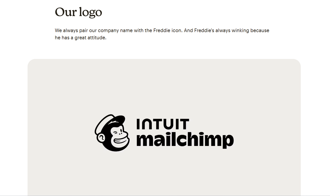
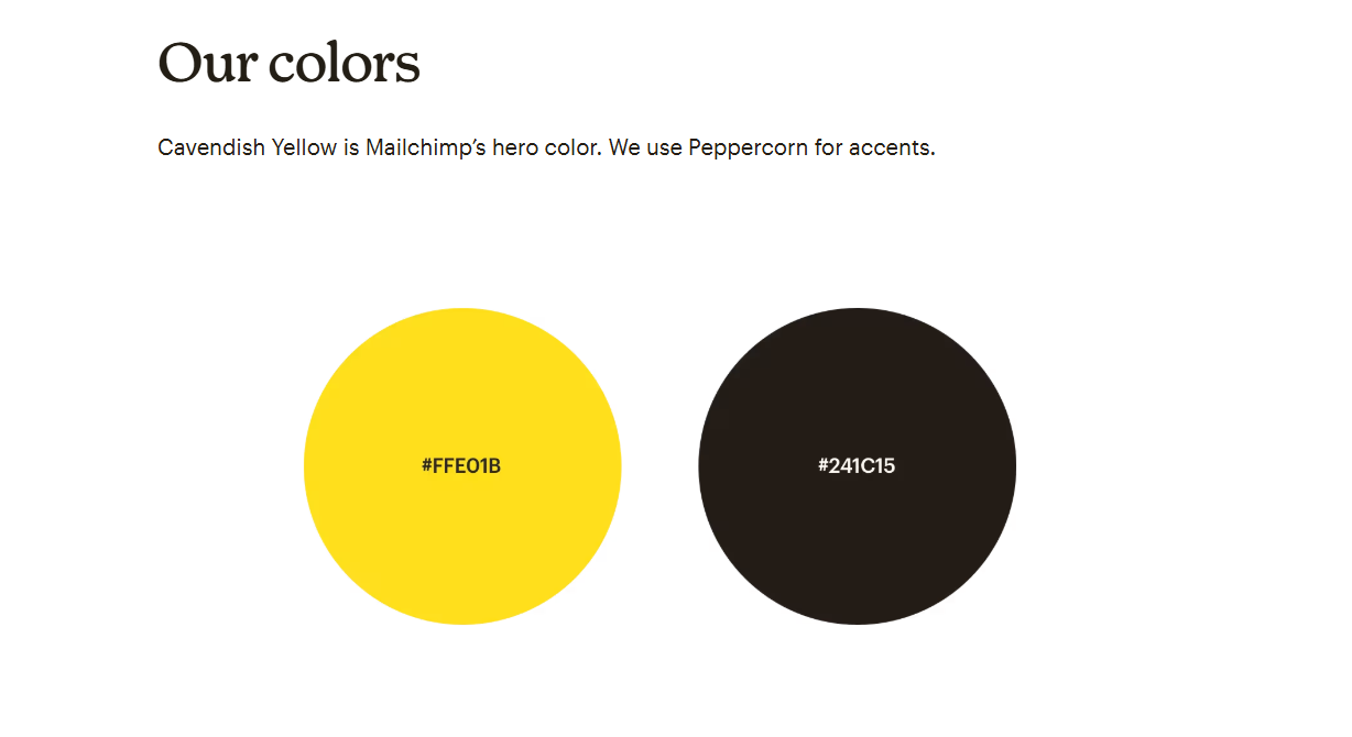
Mailchimp's brand assets page is public and includes EPS and PNG downloads, but the part worth studying is the writing. Mailchimp's content style guide documents voice by emotional context: how to write when a user has just succeeded, when something has broken, when the message is legal boilerplate.
Almost no brand guide does this. Most treat voice as a fixed list of adjectives, which is useless the moment a writer has to deliver bad news. Mailchimp treats voice as constant and tone as variable, and gives examples of both.
Steal this: write your voice section around situations, not adjectives.
2. Spotify
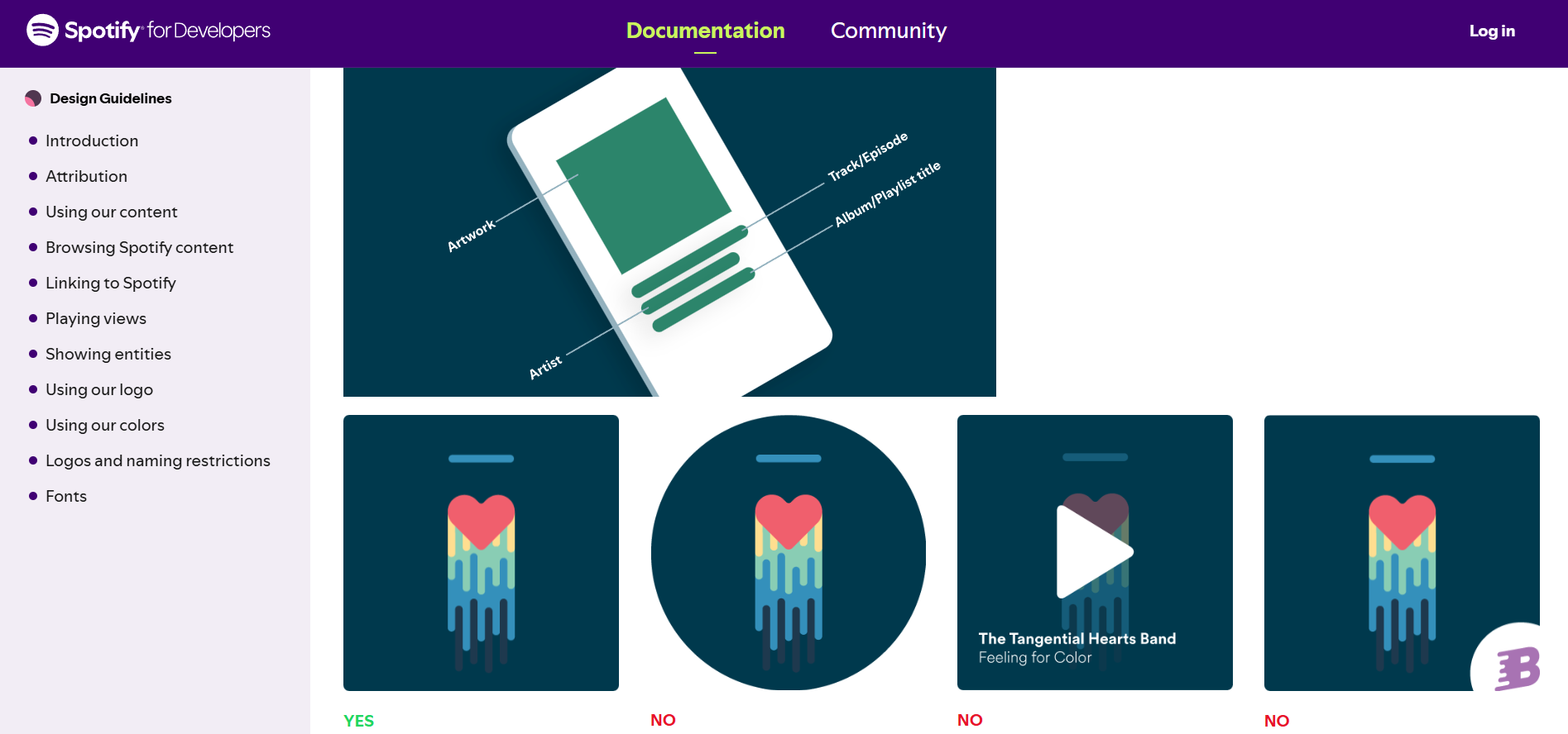
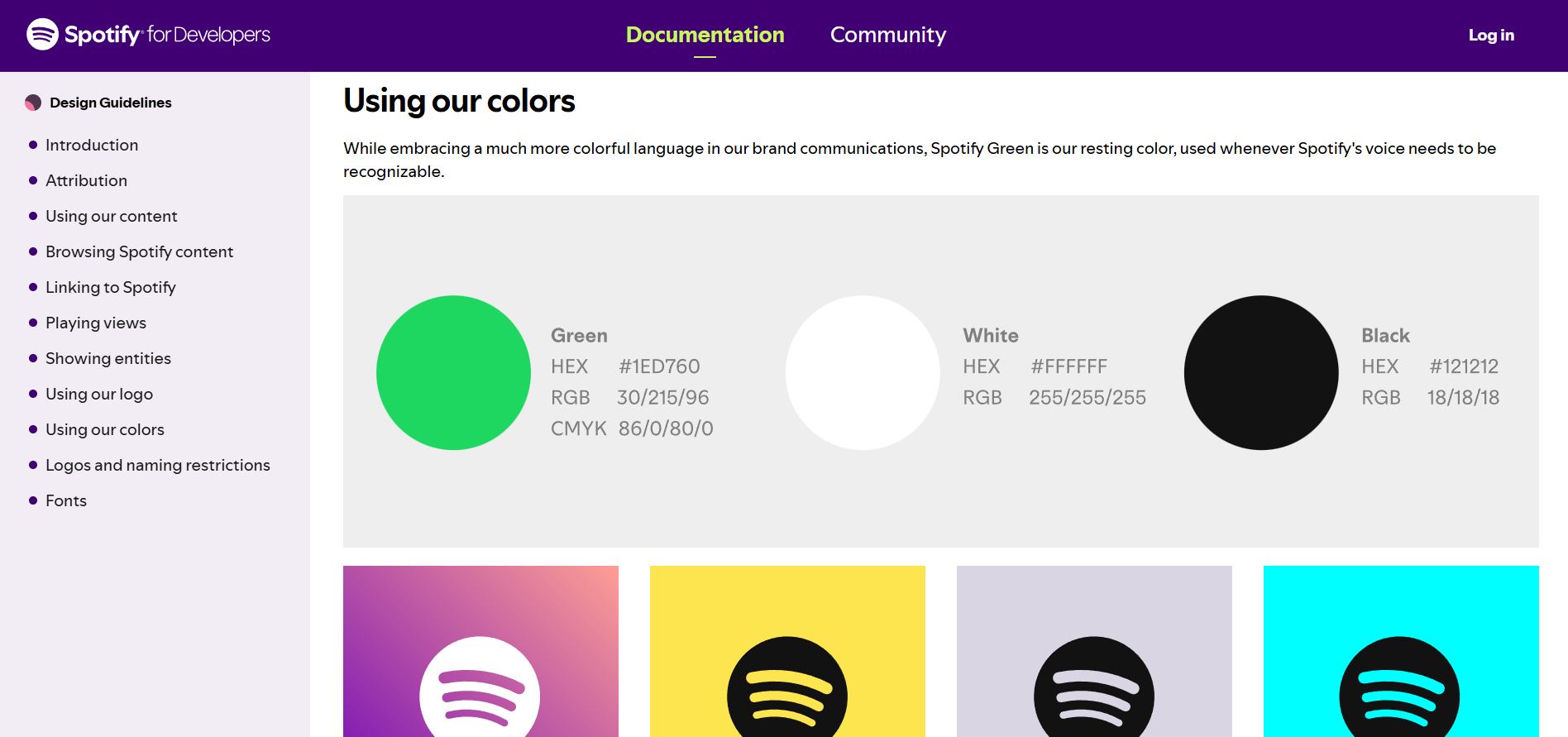
Spotify's design guidelines sit inside the developer documentation, which tells you who they are for. Anyone embedding Spotify content has to get the green right, keep the logo intact, and follow attribution rules. The guidelines exist to make that possible without a support ticket.
Worth knowing: this is narrower than a full brand book. It is logo, colour and attribution, not strategy or voice. As a study in protecting one colour across thousands of third-party surfaces, it is excellent. As a template for your own brand book, it is partial.
Steal this: define the one element you cannot afford to have misused, then over-document it.
3. Slack
Slack publishes a downloadable PDF through its media kit. The logo is a genuinely hard mark to reproduce: a multi-coloured octothorpe with precise colour relationships and no forgiving simplification. The guidelines respond with unusually blunt instructions about what breaks it.
The tone is the lesson. Slack's don't-do-this examples are specific and slightly funny, which makes people read them. Most brand guides bury the same rules in a grid of crossed-out logos nobody studies.
Steal this: make the misuse section entertaining enough that people finish it.
4. Dropbox
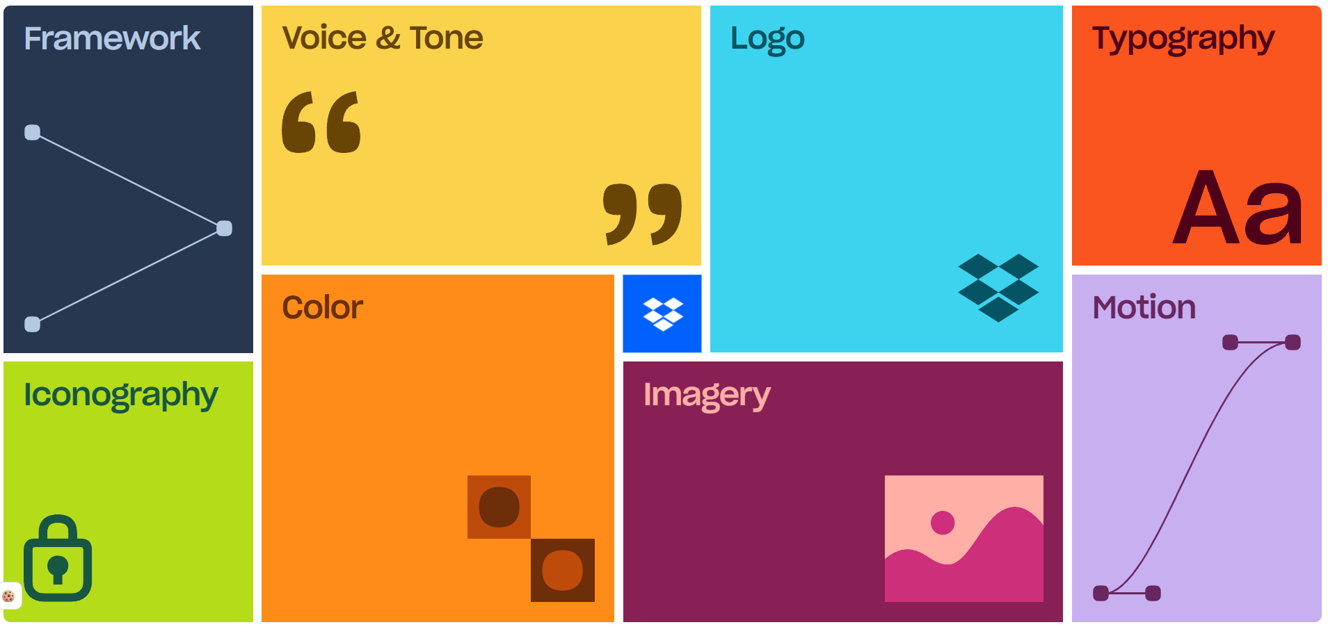
Dropbox's brand site covers framework, voice and tone, logo, typography, iconography, colour, imagery and motion. Motion as a first-class section is still rare, and it matters more every year as brand surfaces become animated by default.
Note that the older dropbox.design address now redirects here, so any bookmark or citation pointing at the old URL is stale.
Steal this: if your brand appears in anything that moves, document how it moves.
5. IBM
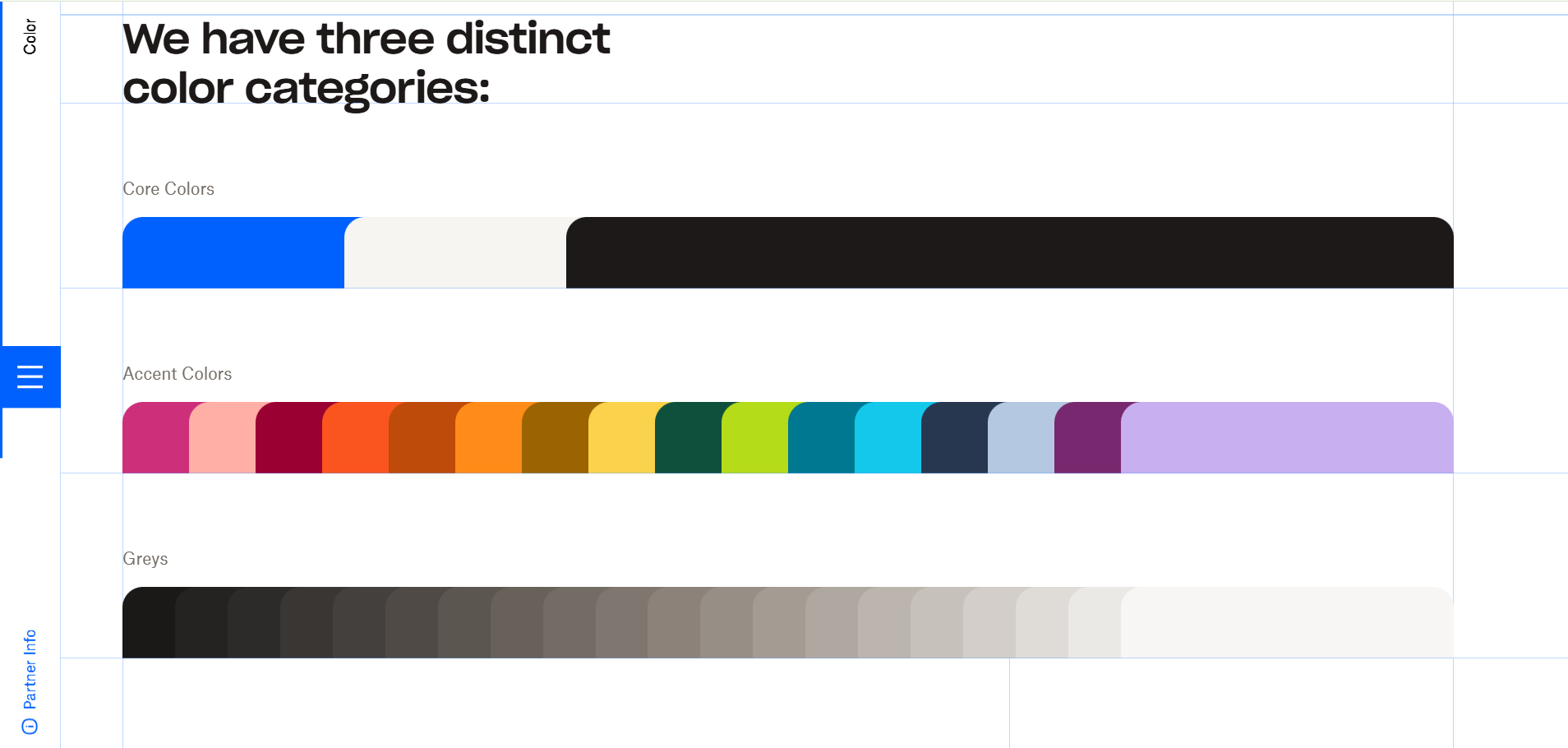
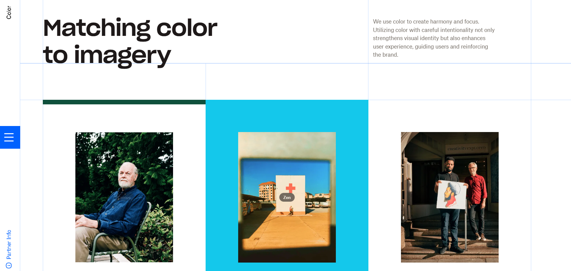
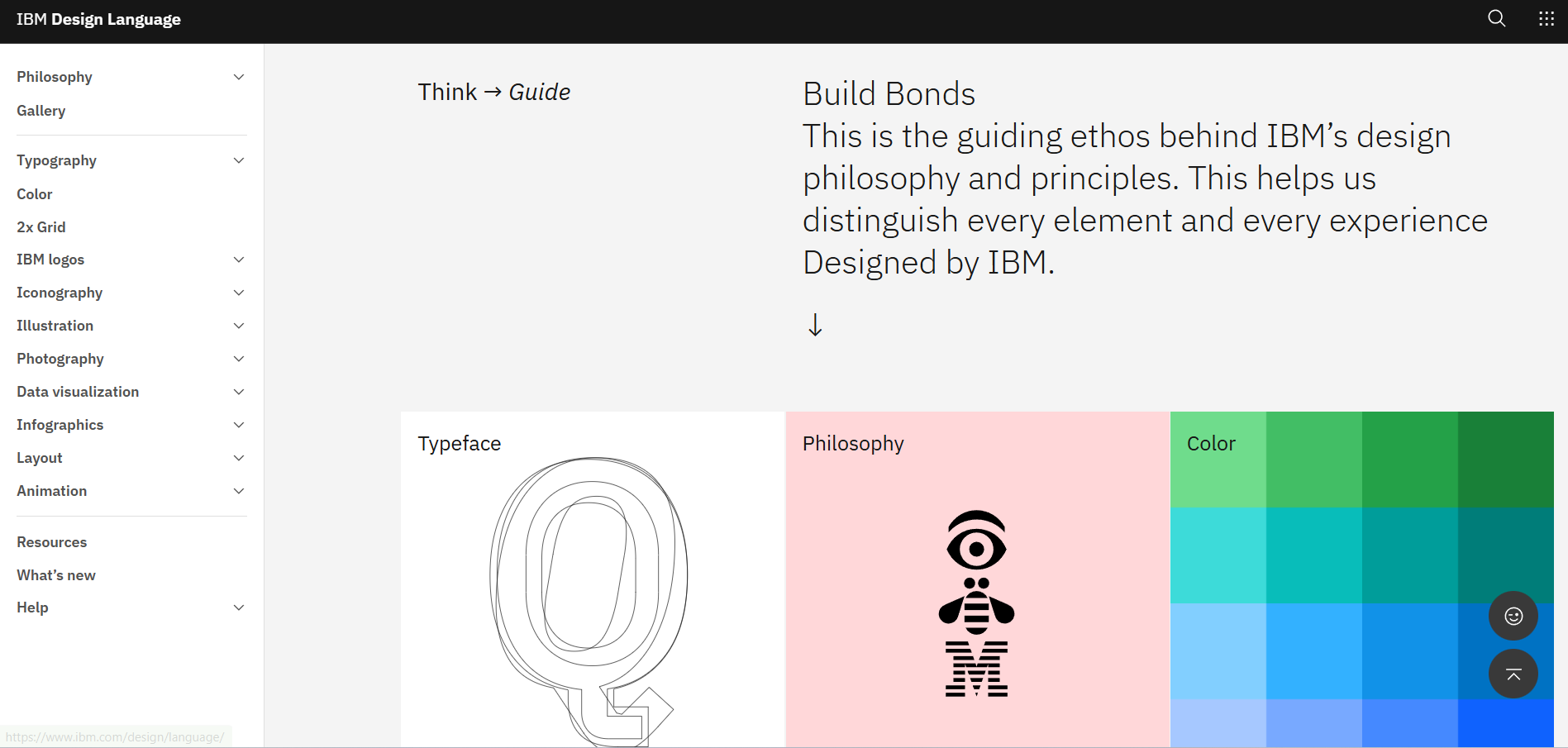
The IBM Design Language is the most institutionally serious document on this list, and IBM did something unusual with it: released IBM Plex as an open-source typeface and Carbon as an open-source design system. The brand guide is not just published, parts of it are given away.
To be fair, not all of it is open. Some sections are flagged for IBM employees only, so the public version is the majority of the system rather than all of it.
Steal this: the more of your system you give away, the more correctly it gets used.

6. Salesforce
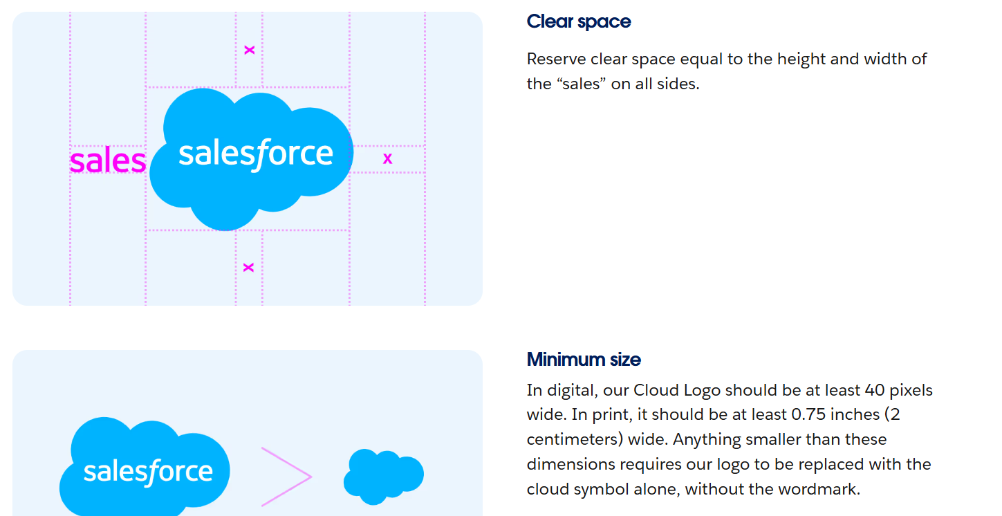
Salesforce Brand Central is the clearest example of tiered access in this set. The public tier gives everyone core logo artwork and basic usage principles. Detailed guidelines, training and the full asset library require credentials from a Salesforce marketing contact.
Be real: this is the model most large B2B companies actually use, and it is a reasonable answer to a real problem. The public tier handles press and casual use. The gated tier handles partners who need depth. It is worth including precisely because it is the honest middle ground between publishing everything and publishing nothing.
Steal this: if you cannot publish it all, publish the layer that stops the most common mistakes.
7. Asana
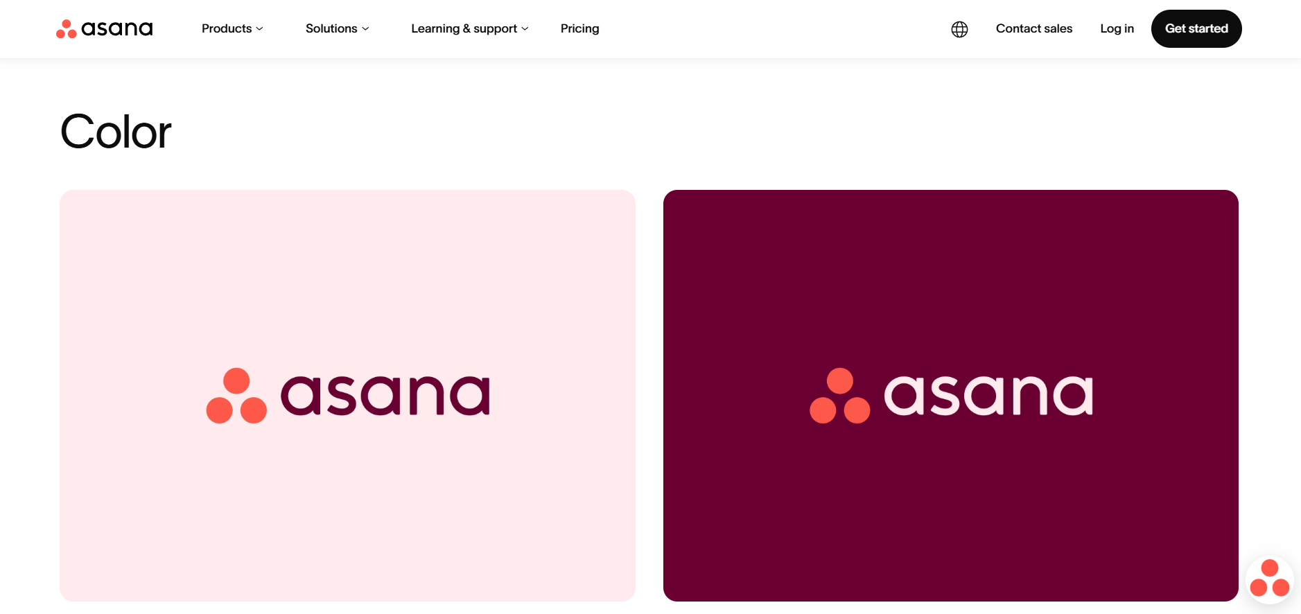
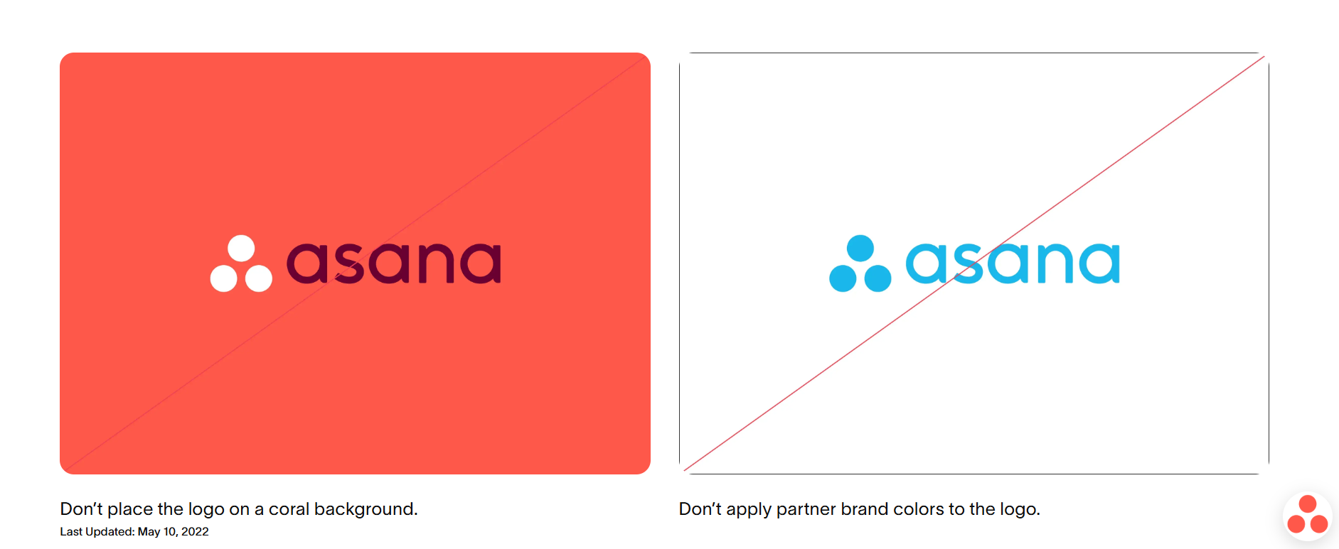
Asana's brand page does the simplest thing on this list and does it well: one downloadable PDF, versioned by fiscal year, alongside a web summary of the essentials. The current file is dated FY27.
The versioning is the detail to copy. A dated file tells a reader immediately whether they are looking at current rules, which is the single most common failure mode of internal brand documents.
Steal this: put a version and a date on the file itself, not just on the page that hosts it.
8. Atlassian
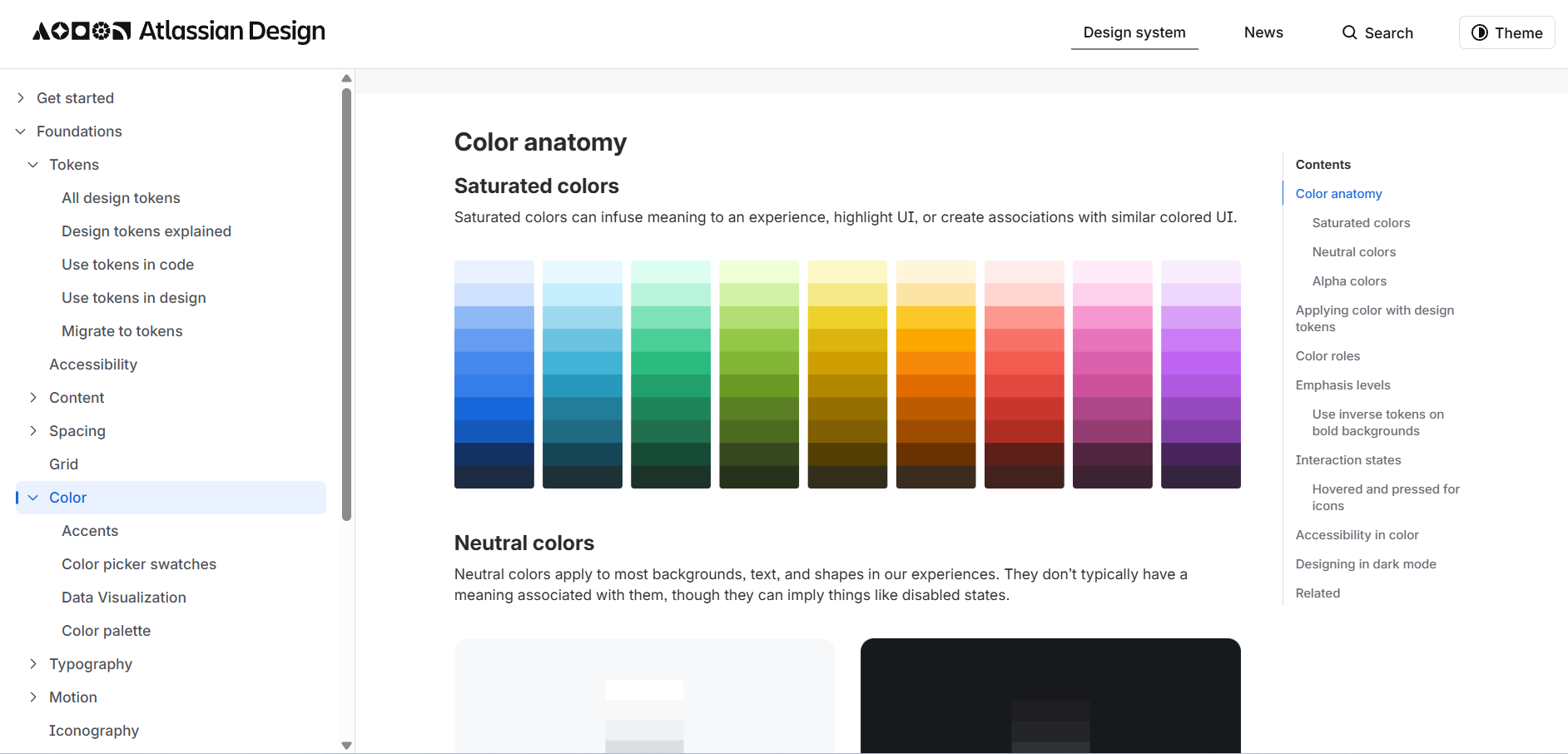
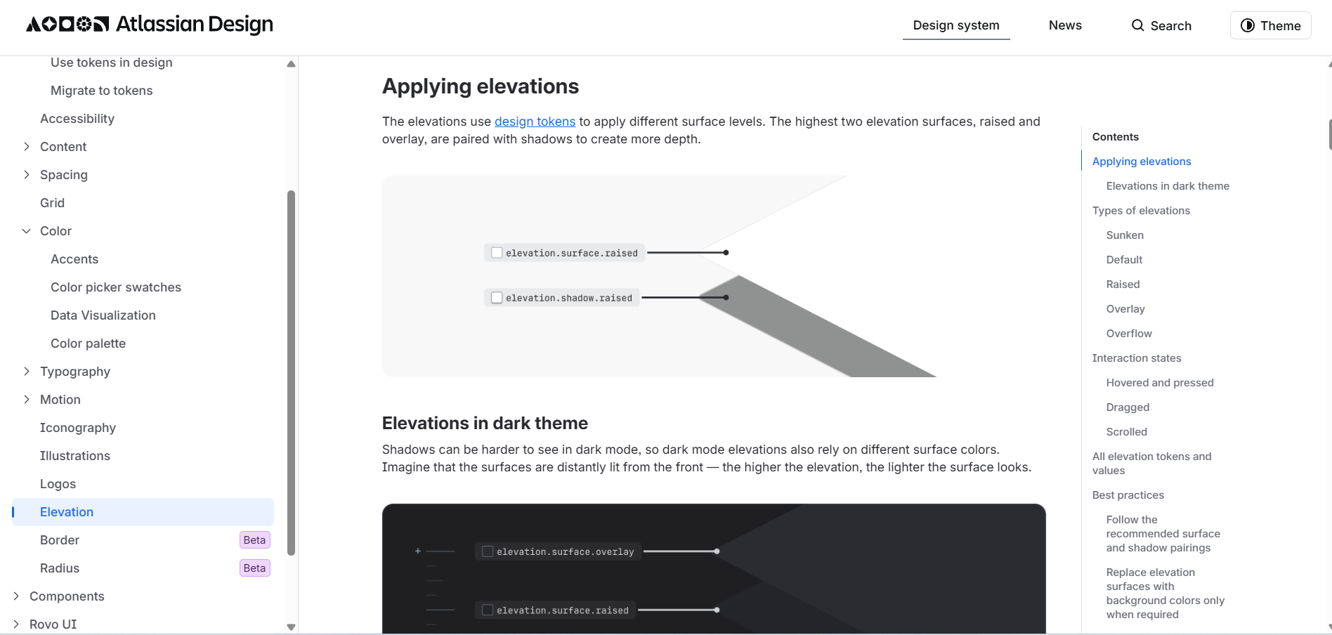
The Atlassian Design System treats design tokens as the source of brand truth. Colour, typography, spacing and elevation are all defined as named tokens rather than fixed values, which means the brand can be re-themed without rewriting the guidelines.
This is the direction brand documentation is heading for any company whose brand lives mostly in software. It also sidesteps the oldest problem in brand guides: the PDF that says one thing and the product that does another.
Steal this: if your brand mostly appears on screens, define values as tokens and let the document reference them.
Consumer and lifestyle brand books
9. Starbucks
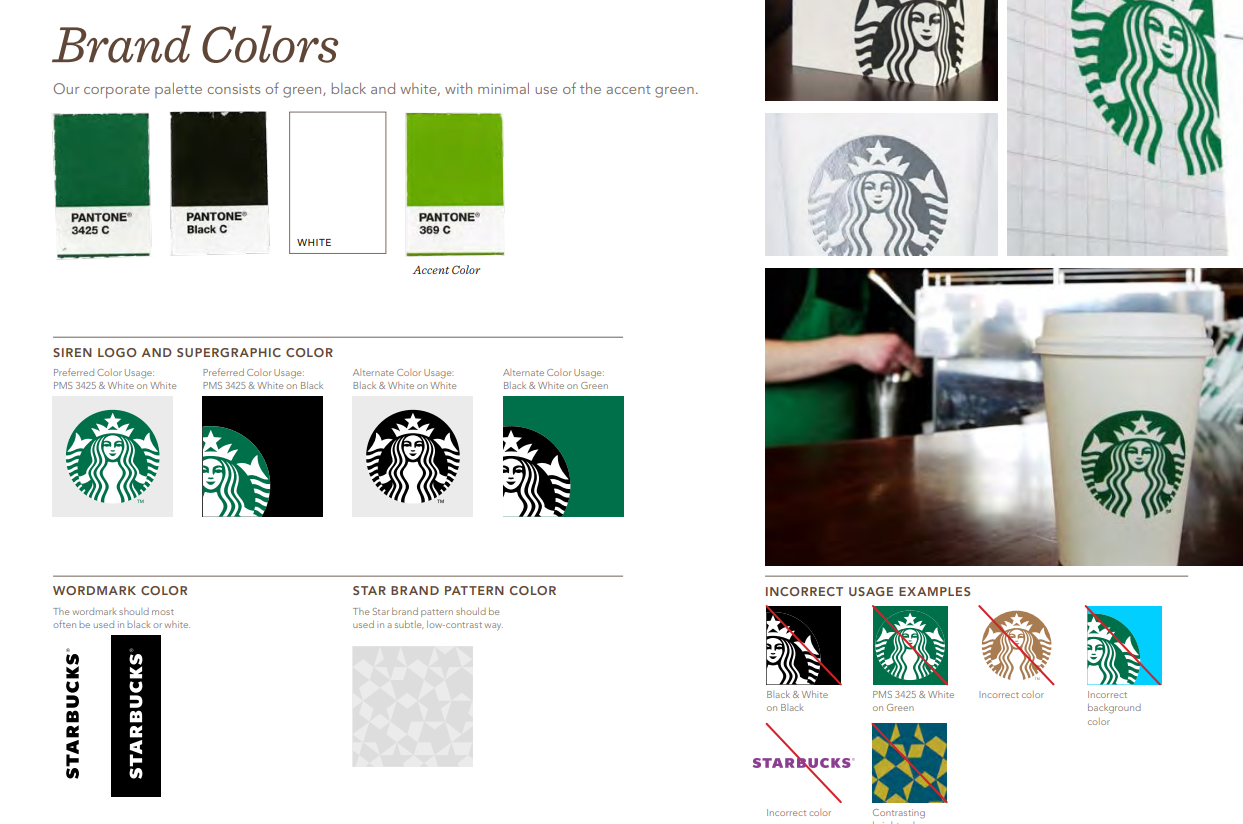
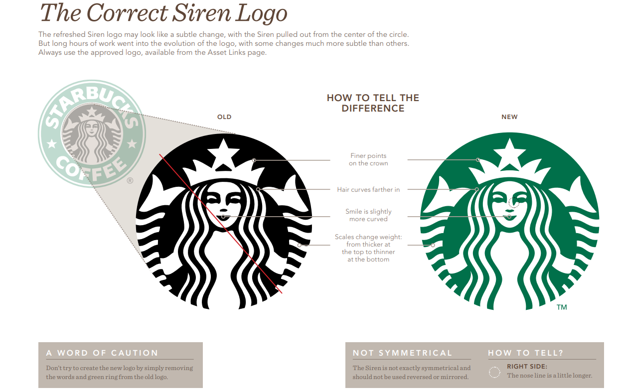
Starbucks Creative Expression is public and frames the identity as storytelling rather than specification. The siren, the green, the typography and the photography are all presented through what they are meant to communicate, with the technical rules following.
For a brand with tens of thousands of physical locations and an enormous partner ecosystem, that ordering makes sense. People executing Starbucks work need to understand the intent, because no rulebook can cover every store, campaign and market.
Steal this: lead each section with the intent, then give the specification.
10. Duolingo
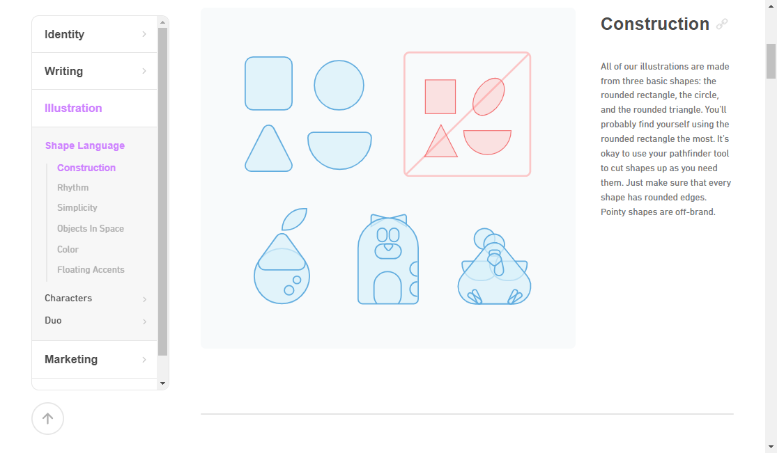
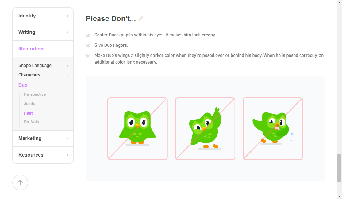
Duolingo's brand guidelines are public and unusually complete for a consumer app, covering identity, colour, typography and, crucially, Duo. The owl has documented personality rules, not just artwork specifications.
Mascot governance is a genuinely hard problem and almost nobody documents it well. Duolingo defines what Duo would and would not do, which is what actually keeps a character consistent across a social team, an in-app animation and a billboard.
Steal this: if you have a character, write its personality rules, not just its pose sheet.
11. Allbirds
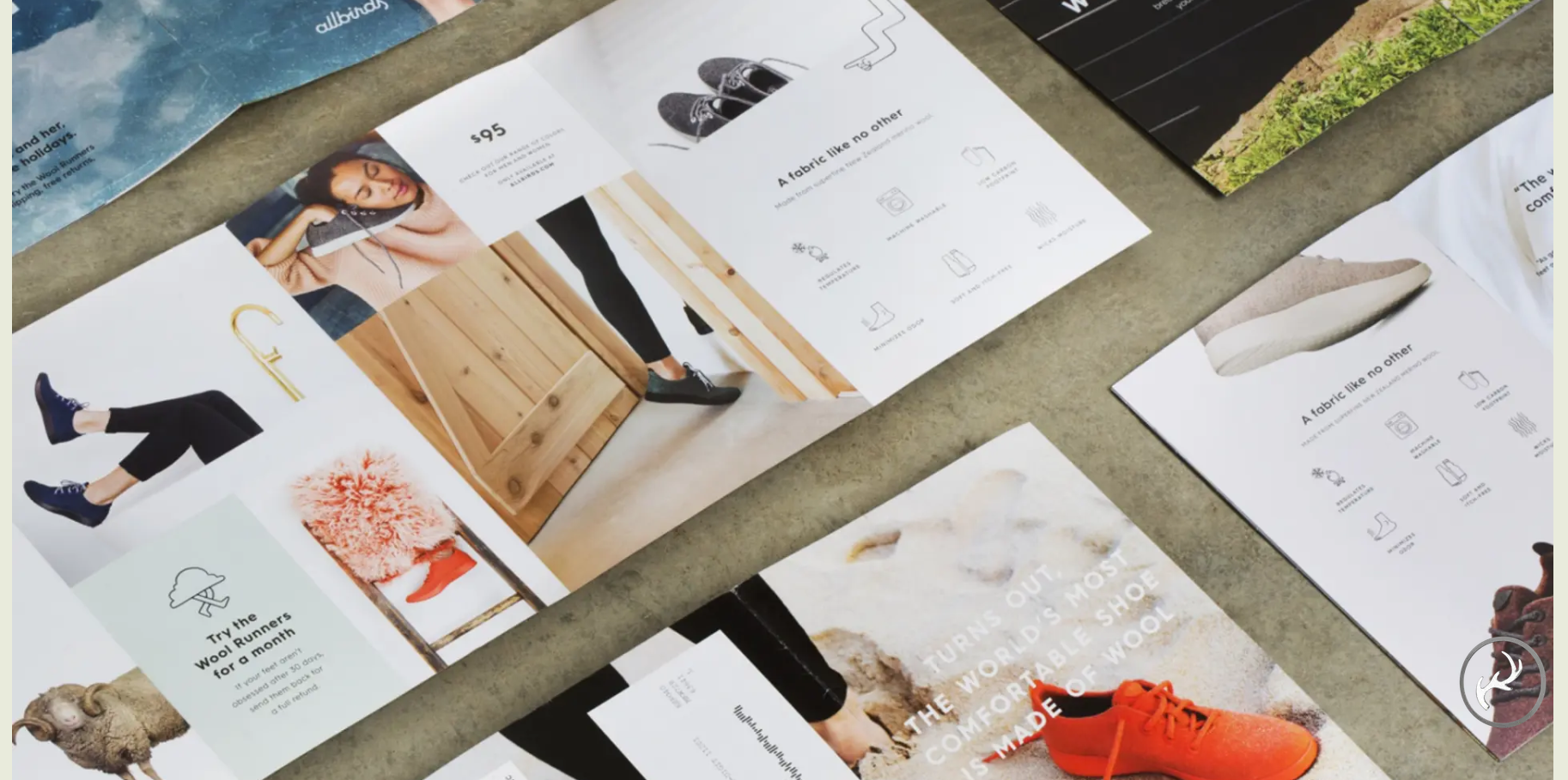
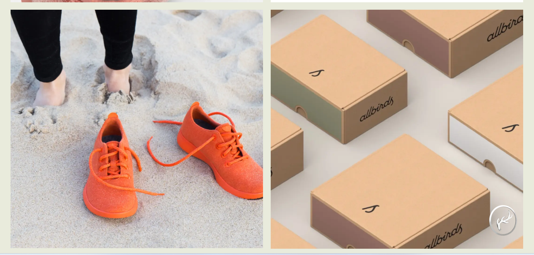
Allbirds has never published a brand book, and the "Allbirds brand guidelines" PDFs circulating online are design-school recreations. What does exist is better than most recreations: Red Antler's case study on building the brand, published by the agency that made it.
The scope tells you how the brand was actually built: research and naming, brand strategy and messaging, identity system, UX and visual design, art direction, packaging. Naming came before the visual identity, which is the reverse of how most brand projects run and most brand guides read. Red Antler describes the result as an evocative name, a flowing logotype and dynamic packaging, all pointed at the same job of making sustainable materials feel like a movement rather than a specification.
Allbirds co-founder Tim Brown put the outcome in terms worth borrowing, saying the agency "didn't just create a logo mark for the brand" but helped the company communicate what it stands for. That distinction is exactly the one a thin brand guide misses.
Steal this: settle naming and positioning before you document a single visual rule. A logotype designed after the story is fixed will carry it. One designed first will need explaining forever.
Availability: no brand book, but a public agency case study.
12. Glossier
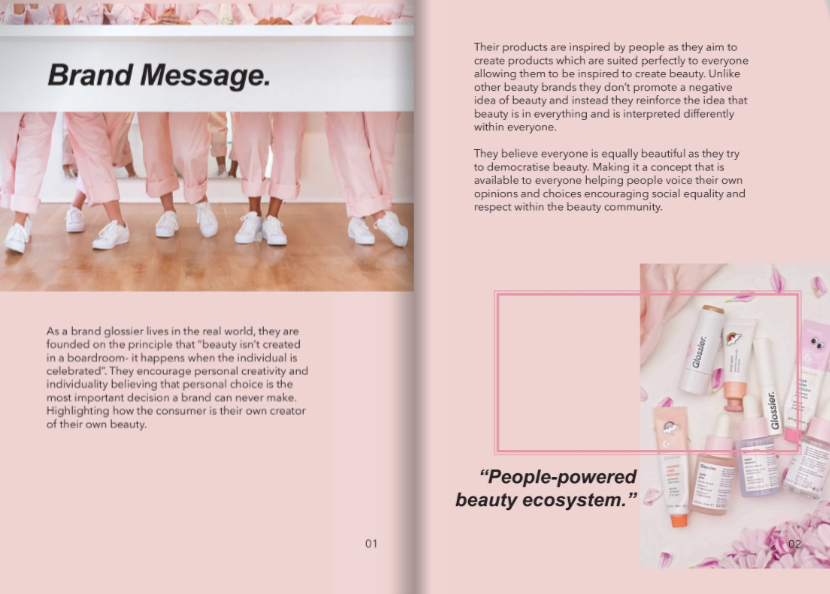
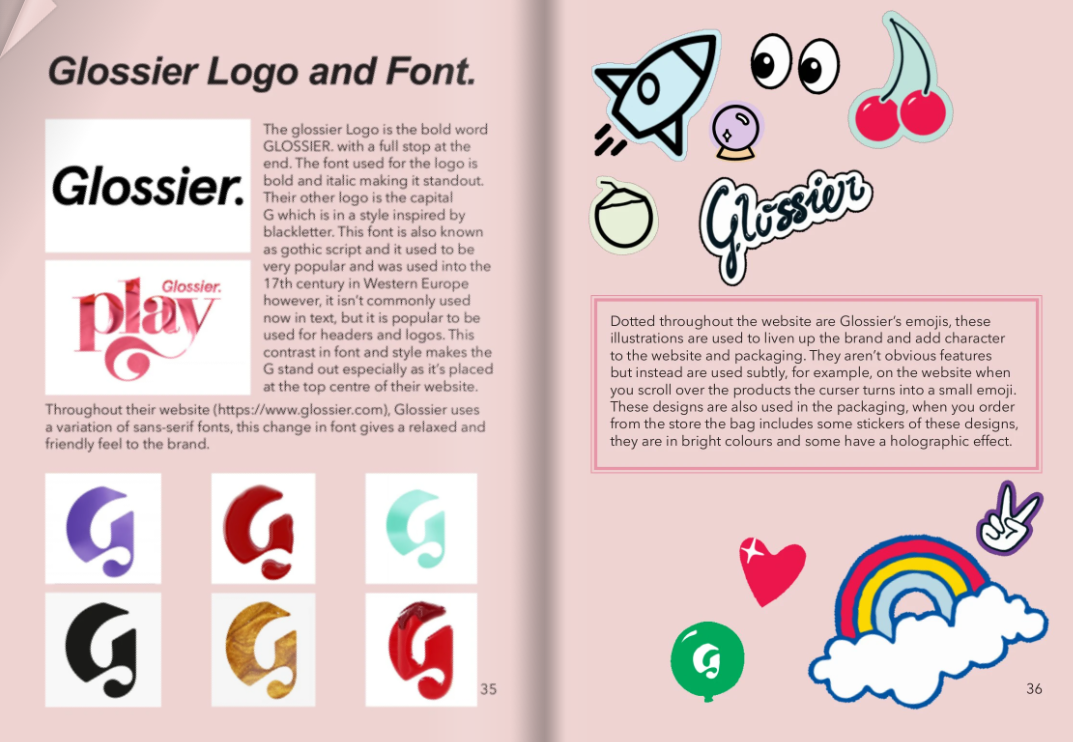
Glossier has not published a brand book either. The widely shared "Glossier brand book" files on FlipHTML5 and Pinterest are student projects, and several of them contradict each other, which is a useful tell.
What Glossier did that is genuinely instructive is treat customer content as brand asset rather than brand risk. The visual identity was deliberately simple enough that user photography sat inside it without clashing. That is a strategic choice a brand guide can encode, and most do the opposite.
Availability: not published. ❌
13. Oatly
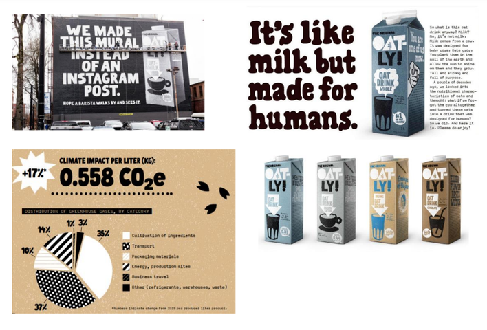
No official Oatly brand guidelines exist in public. The "Oatly Guiding Principles" document that appears on document-sharing sites is an unofficial upload of uncertain provenance.
Oatly is on this list because its brand lives almost entirely in copy. The packaging carries long, self-aware, faintly argumentative text where other brands put a tagline. It is the clearest proof that voice can be the primary identity element, with the visual system in a supporting role.
Availability: not published. ❌
14. Headspace
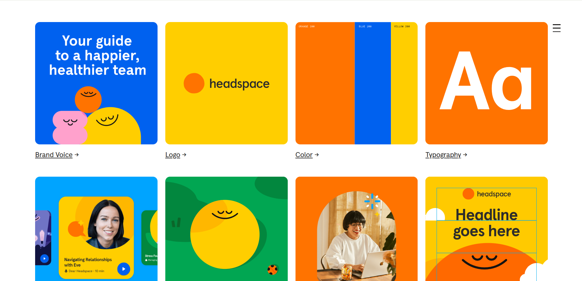
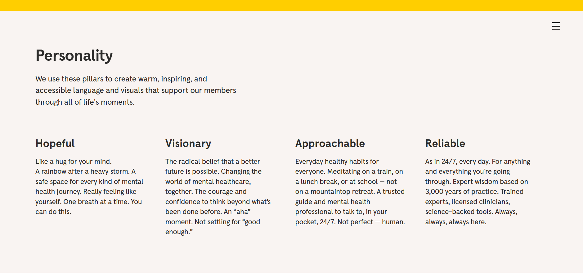
Headspace's brand guidelines are fully public and cover brand voice, logo, colour, typography, UI, illustration, photography, layouts, motion, accessibility and applications. The site was last updated in September 2024.
The illustration system is the part worth studying. Headspace ties illustration style to emotional state, which is a brave thing to document and an unusually functional one for a mental wellness product. Accessibility gets its own section too, which is still not standard.
Steal this: give accessibility a section rather than a footnote.
15. Ben and Jerry's
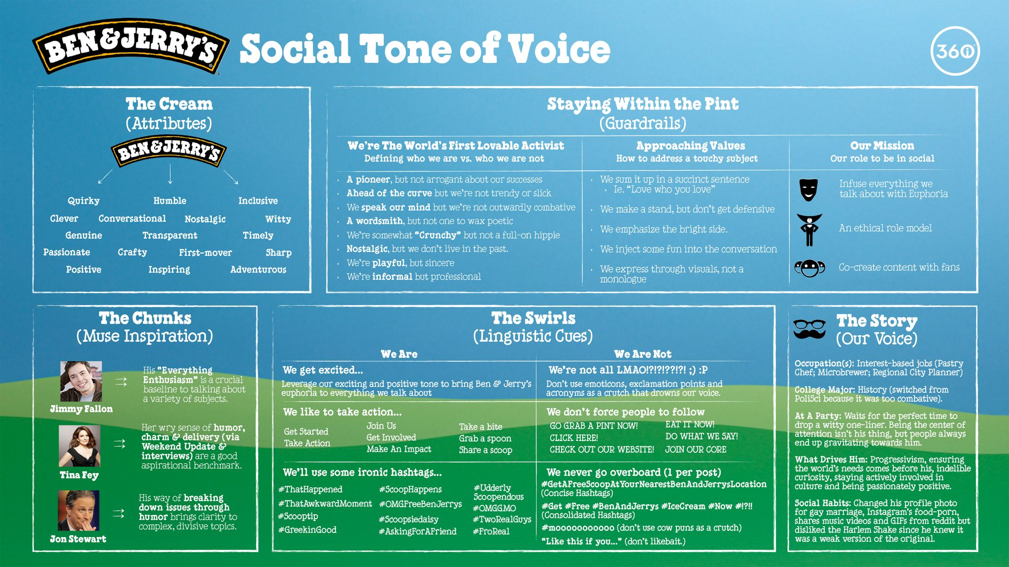
Ben and Jerry's does not publish a brand book. The PDFs on Scribd and similar sites are third-party analyses and student work.
The brand is included because it solves a problem most guides never address: how to integrate activism into an identity without it reading as decoration. The hand-drawn warmth and the political positions are the same brand, expressed consistently, over decades. That coherence is the lesson.
Availability: not published. ❌
Iconic and institutional brand books
16. Netflix
Netflix's brand site is public. Worth knowing before you visit: it renders entirely through JavaScript, so it is close to invisible to anything that does not execute scripts, including some archiving and citation tools.
The content is a lesson in single-asset discipline. Netflix has essentially one mark and a wordmark, and the guidelines spend their energy on protecting them rather than on a broad system. For a brand that appears on every device manufacturer's hardware and in every partner's marketing, that focus is the correct allocation.
Steal this: spend your documentation budget where misuse is most likely.


17. NASA
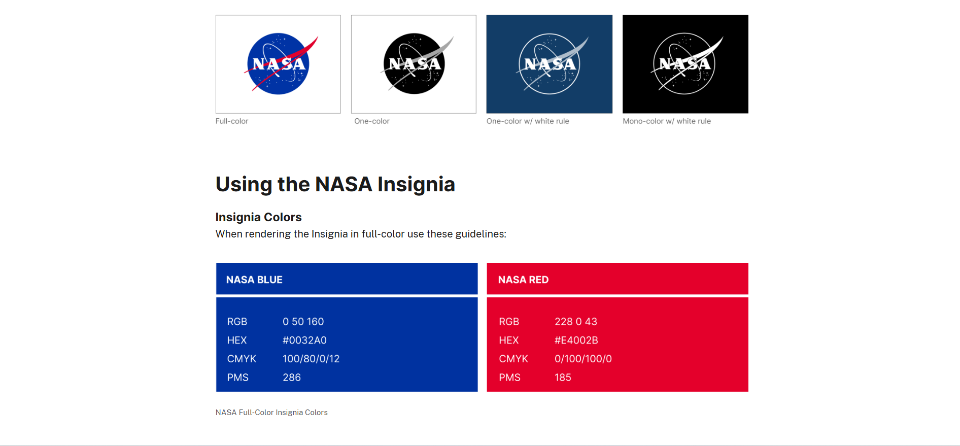
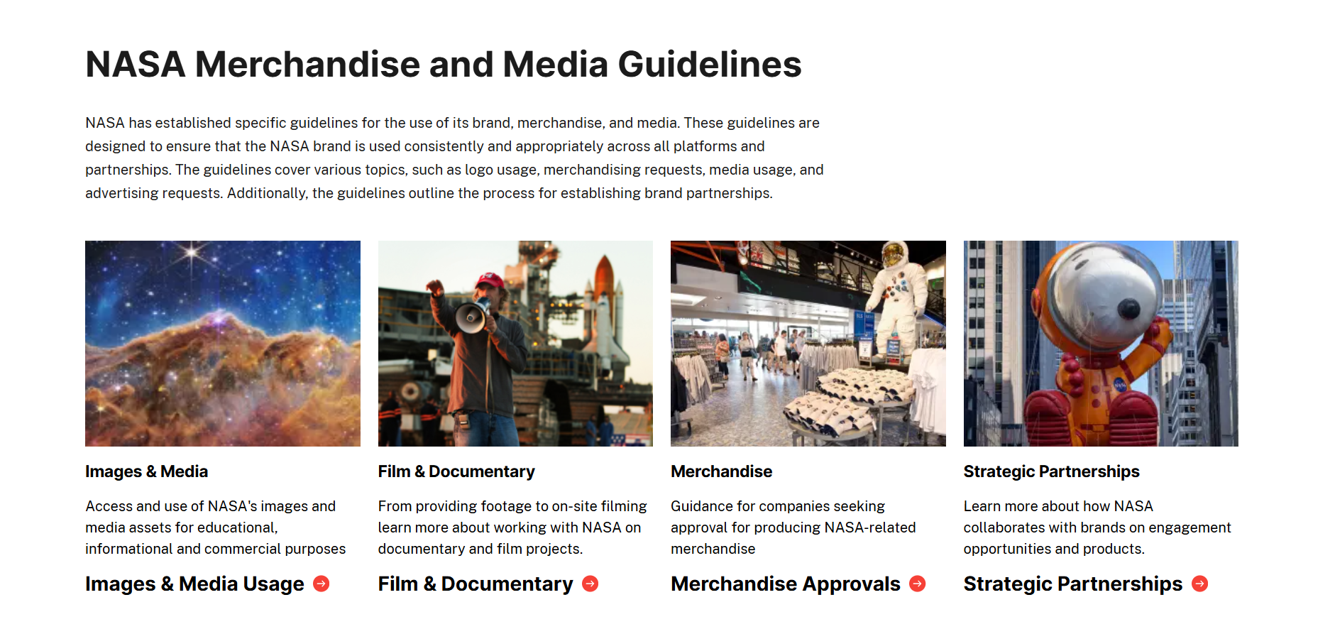
The NASA Brand Center is public and was last updated in February 2026. It governs both the "meatball" insignia and the "worm" logotype, two marks with a complicated shared history, and sets out when each applies.
One thing to flag, because it trips people up: the famous 1975 NASA Graphics Standards Manual is referenced but is not downloadable from the brand center. If that is what you came for, you will need to source it separately.
Steal this: if you carry more than one legitimate mark, write the rule for choosing between them.
18. Uber
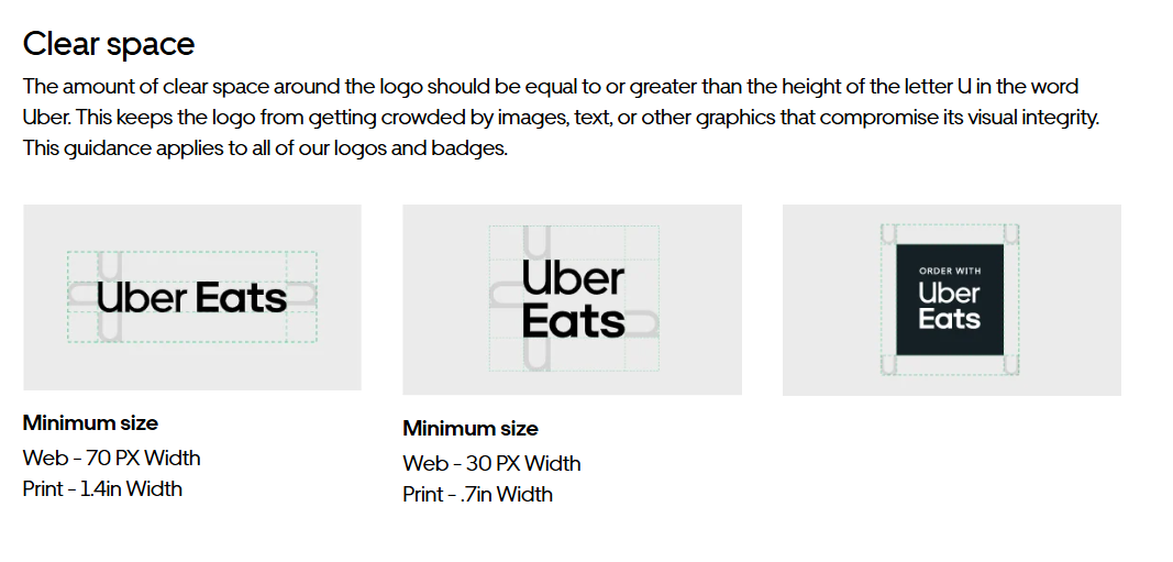
Uber's brand site is public and structures the identity around nine defined elements, with a most-requested-assets shortcut for people who only need a logo and want to leave.
That shortcut is a small thing that matters. Most people arriving at a brand site want one file. Making them navigate a philosophy first is how you end up with the wrong logo on a partner's website.
Steal this: put the most-requested files on the first screen.
19. City of Helsinki
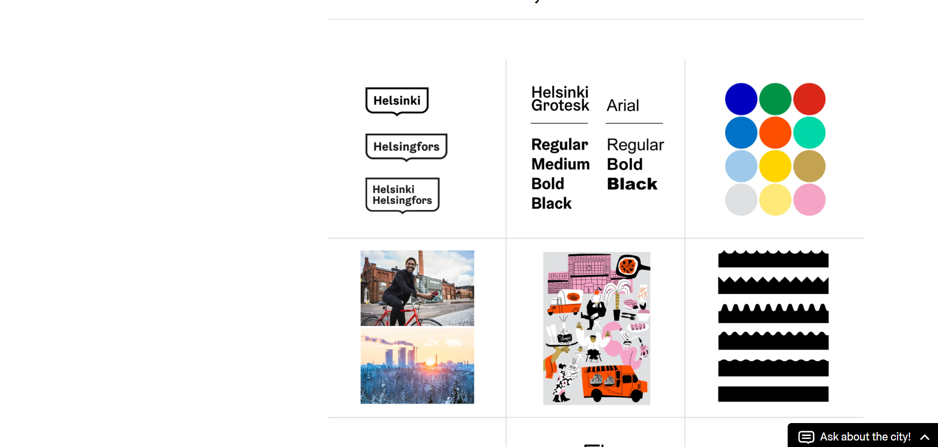
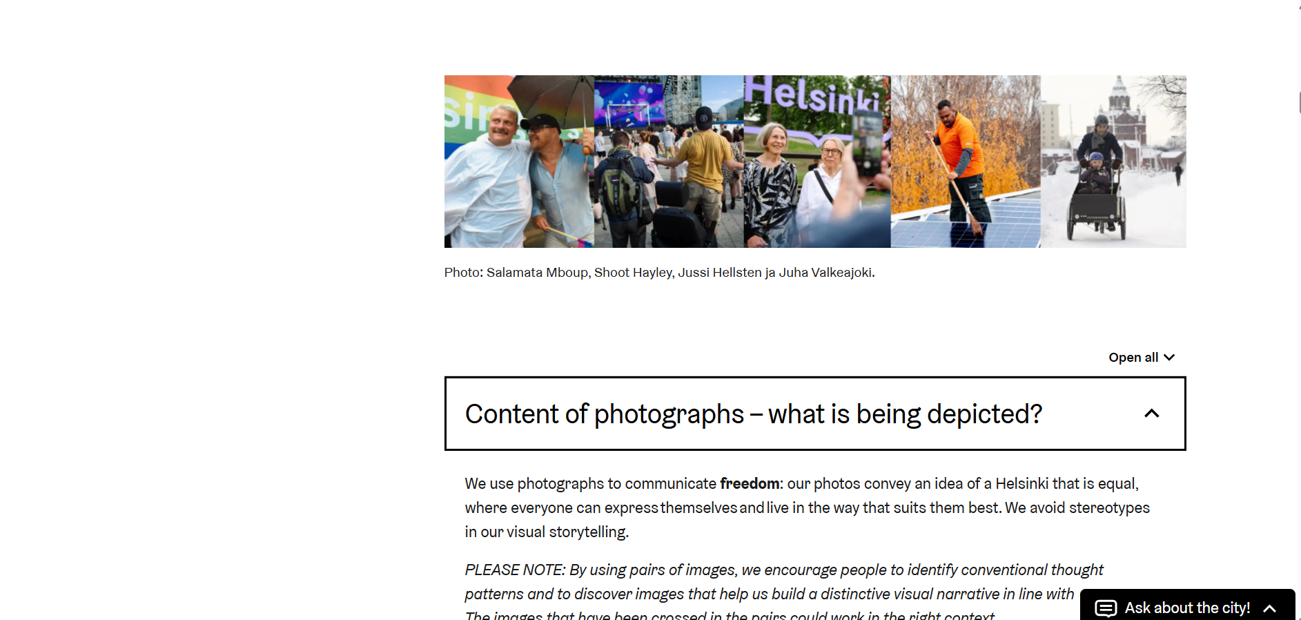
The City of Helsinki visual identity guidelines are fully public and cover the framed logo, typography, colour, photography, illustration, the wave motif, layout, data visualisation and wayfinding icons, with a download section for all of it.
A city has the hardest possible brand governance problem: hundreds of departments, thousands of staff, external contractors, and no way to route everything through one design team. Helsinki's answer is to make self-service genuinely work. It is the best argument on this list that the quality of a brand guide is measured by how few questions it generates.
Steal this: design the guide for the person who will never be able to ask you anything.
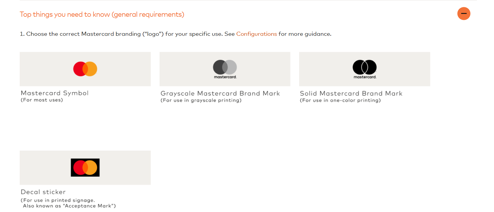
20. Mastercard
The Mastercard Brand Center is public with downloadable logo artwork and usage guidance for card programmes and partners.
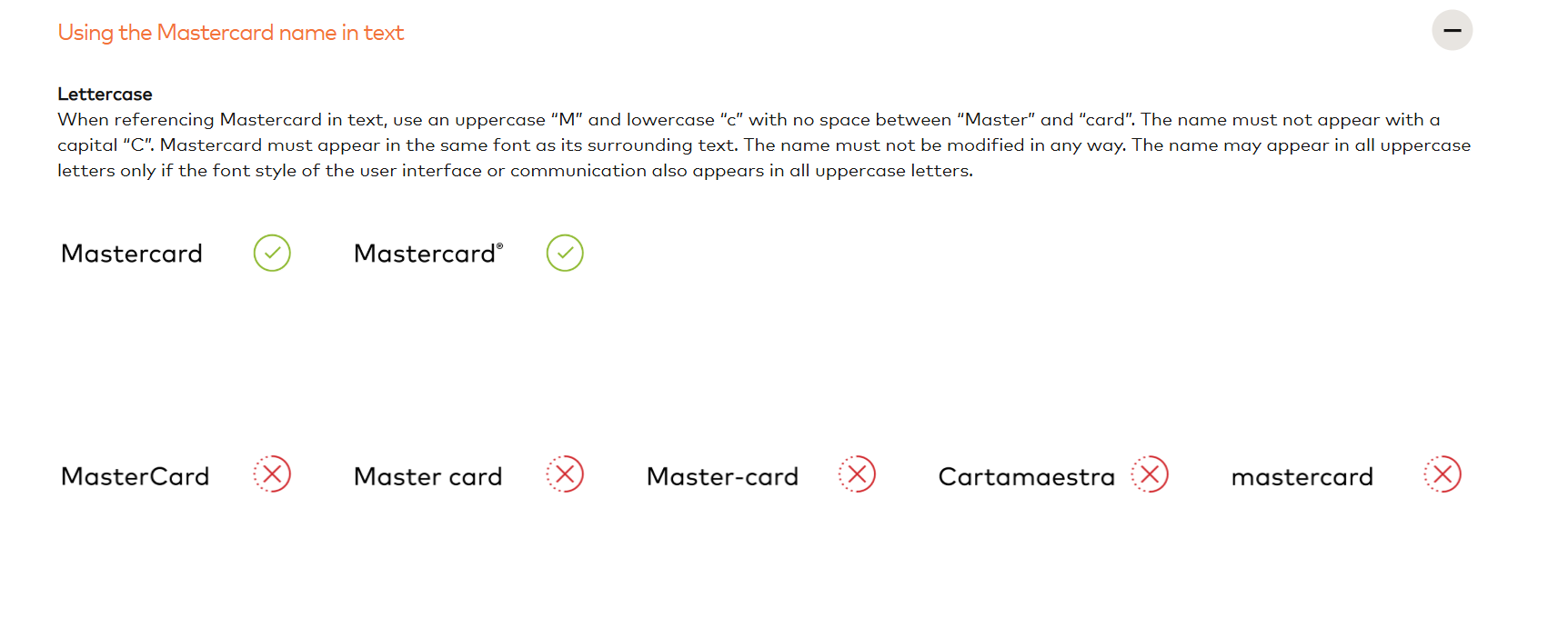
Mastercard dropped the wordmark from its primary mark in 2019, keeping only the interlocking circles. The brand center documents the result, including where the name still has to appear. Very few brands reach the point where the symbol alone is enough, and the guidelines are honest about the conditions where it is not.
Steal this: document the cases where your simplified mark is not sufficient.
Challenger and fresh brand books
21. Instagram
Instagram's guidelines live in the Meta brand resource centre, which is public and includes downloadable assets.
The gradient is the interesting constraint. A multi-stop gradient is fragile: it degrades in print, breaks at small sizes, and is easy to approximate badly. The guidelines respond with tight reproduction rules and approved flat alternatives for the cases where the gradient cannot survive.
Steal this: for any fragile brand element, supply the approved fallback rather than hoping nobody needs one.
22. Klarna
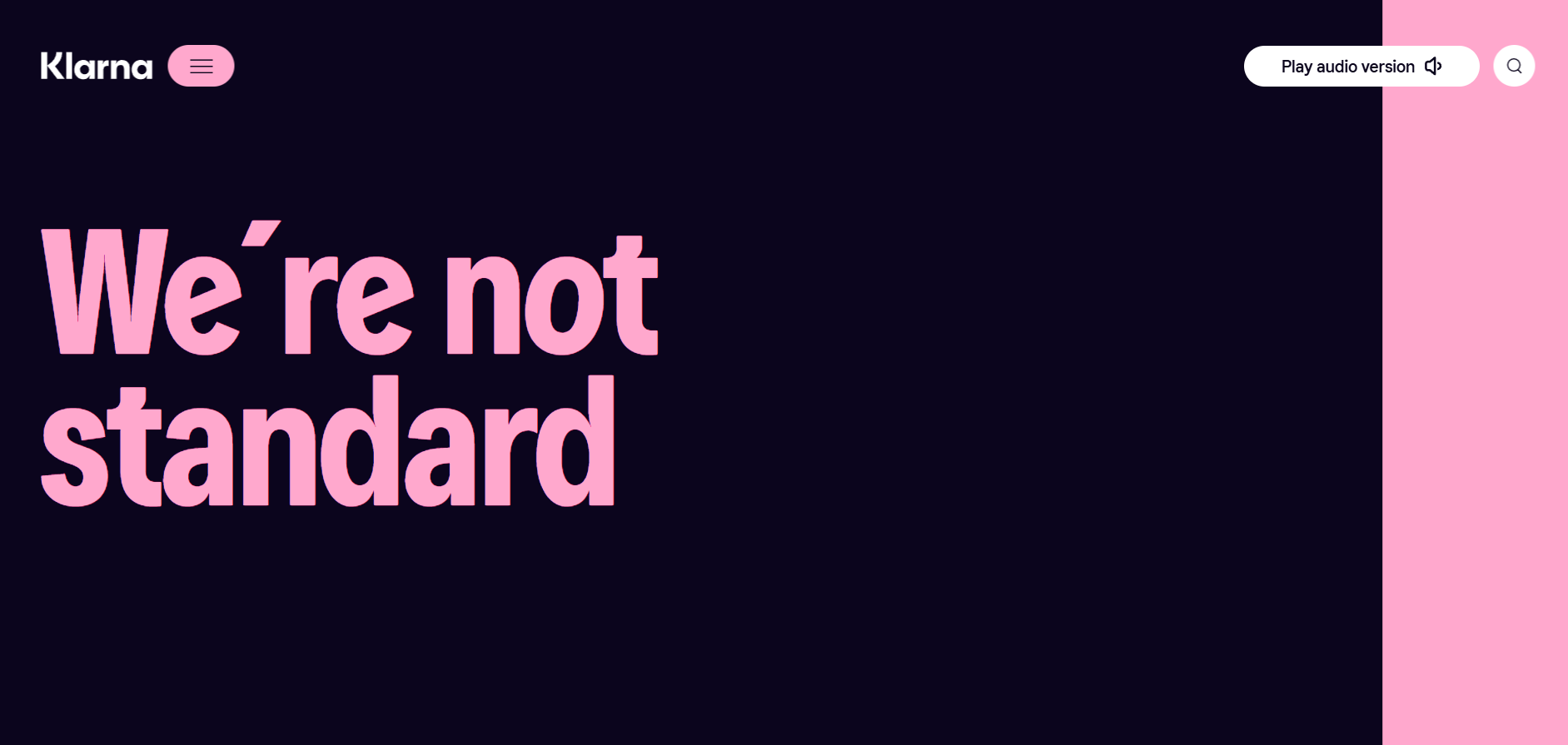
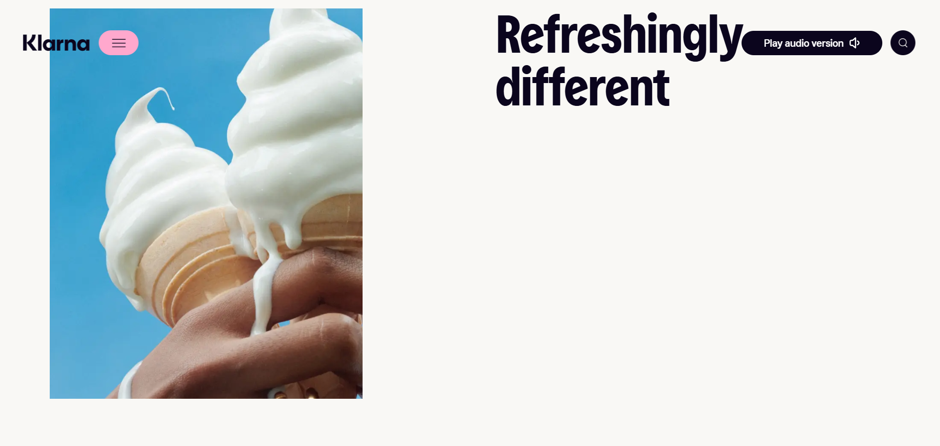
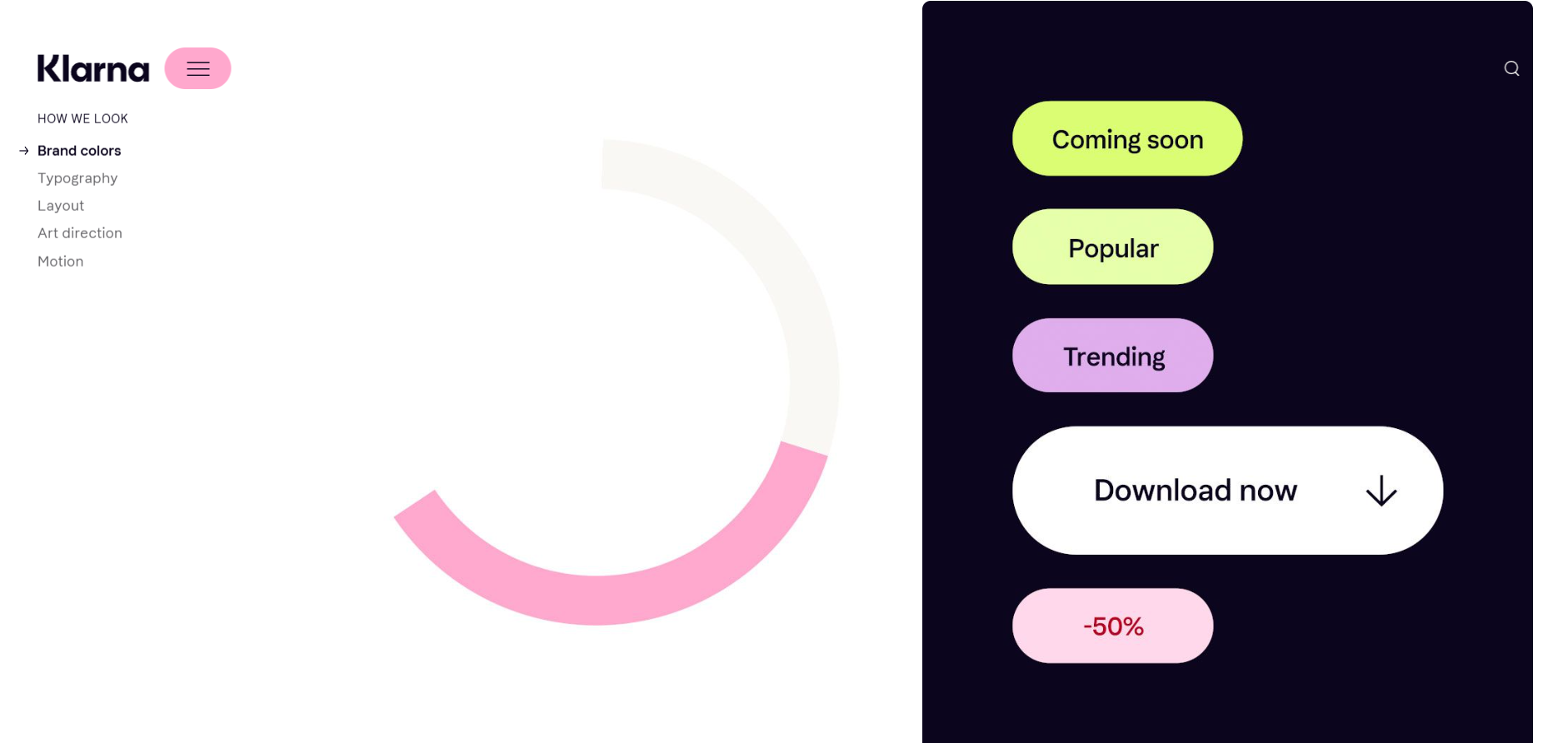
Klarna's brand site is public, web-only, and organised around "proudly pink". The colour is the brand, and the guidelines carry it through voice, imagery and layout rather than confining it to a swatch table.
For a fintech operating in a category of blues and greys, committing that hard to one unusual colour is the entire positioning. The guidelines read as an argument for the choice, not just a specification of it.
Steal this: if your colour is your differentiator, make the guide argue for it
23. Casper
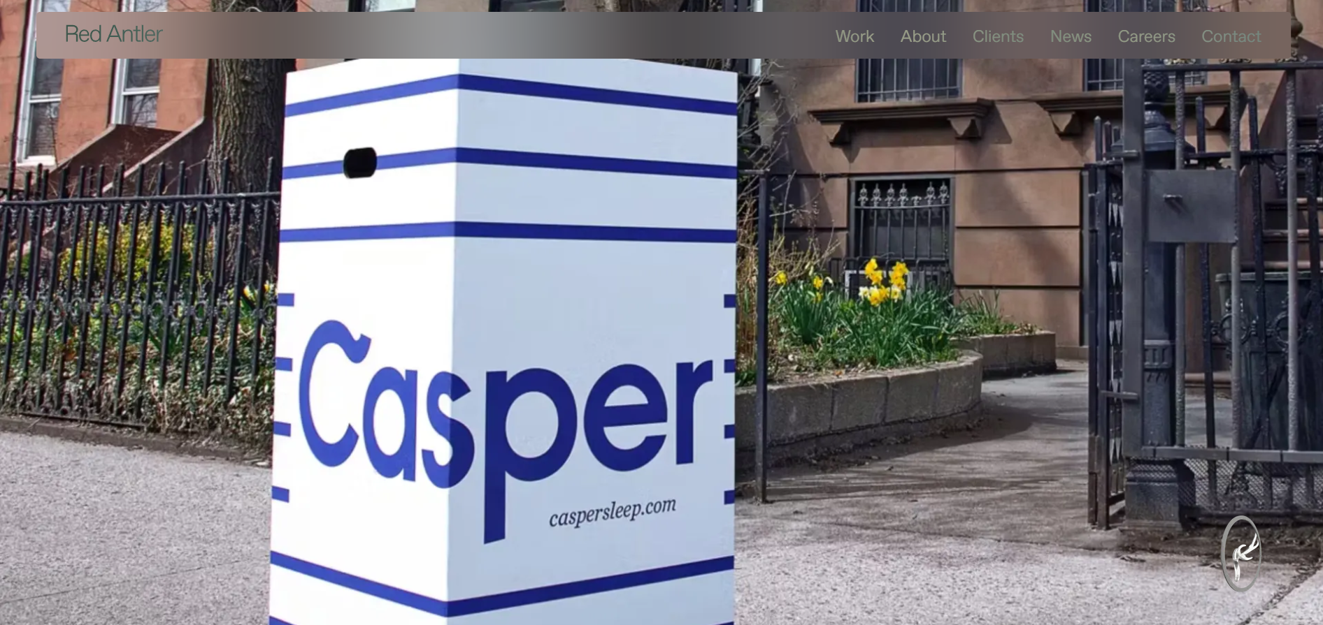
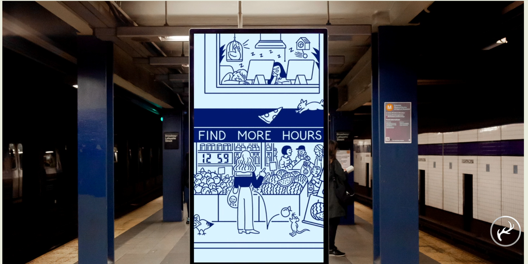
Casper has not published a brand book, and searching for one mostly surfaces Casper College and Visit Casper, which are unrelated organisations. The real documentation is Red Antler's case study, covering brand strategy, identity, digital experience, photography and video, packaging, and the out-of-home campaigns.
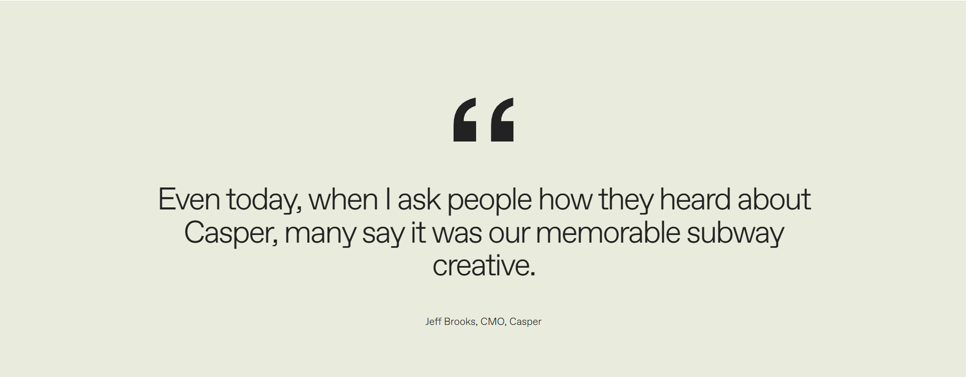
The strategic decision is the part worth studying. Mattresses were sold on coil counts, foam densities and showroom discounting. Red Antler moved the brand off technical specification entirely and onto the benefits of good sleep, then went further and built the advertising around people's waking lives rather than the product at all. The subway campaign used characters drawn by illustrator Tomi Um, and Casper's own CMO has credited that creative as what many people remember the brand for.
That is a harder choice than it sounds. Refusing to compete on the specifications your category is sold on means giving up the comparison your competitors are winning, and trusting that a different conversation is worth more.
Steal this: write down what your brand will not talk about. A brand guide that only lists what you say leaves the category's default language available to anyone drafting copy.
Availability: no brand book, but a public agency case study.
24. Firefox
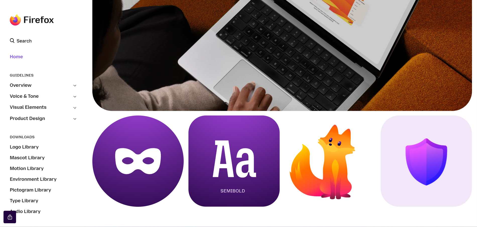
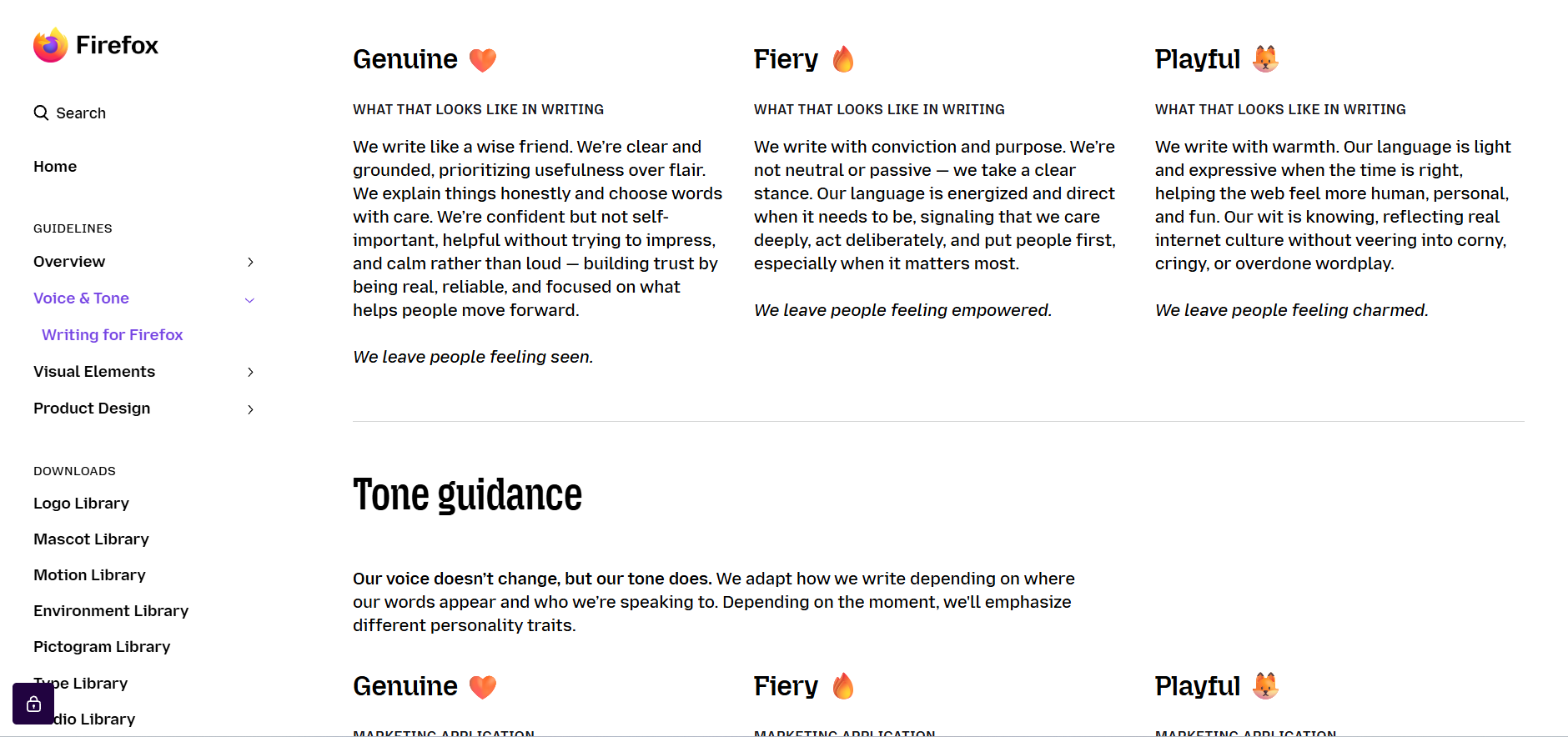
Mozilla's Firefox brand page is public and sits inside a broader design site that documents Mozilla's process openly, including positioning, purpose and audience.
Mozilla has a long habit of designing in public and publishing the reasoning alongside the result. For an open-source organisation dependent on contributors, that is not generosity, it is operational necessity. The brand guide has to work for people who will never attend a meeting.
Steal this: publish the reasoning, not only the rules.
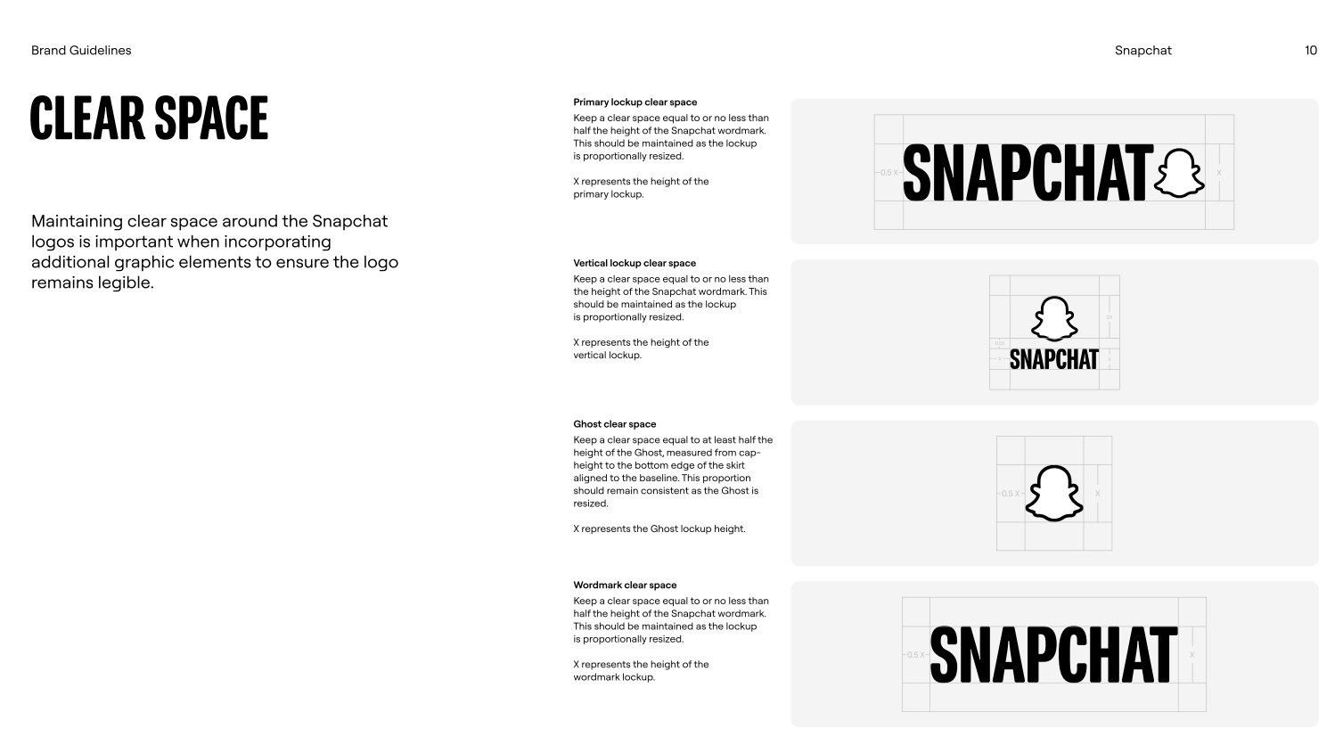
25. Snapchat
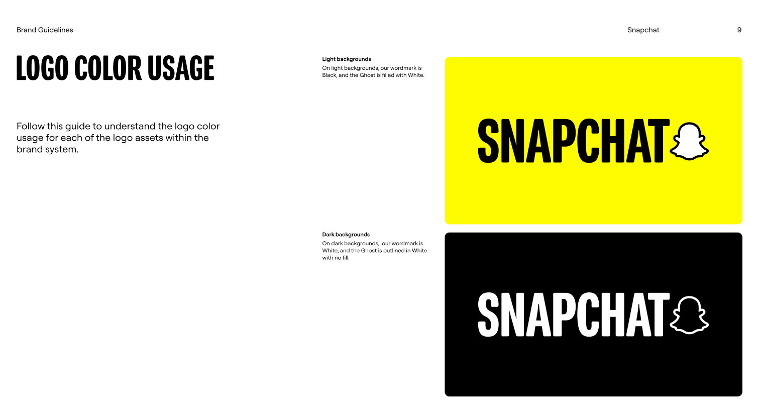
Snap's brand guidelines are public with a downloadable PDF dated September 2025.
Snapchat is the purest logo case on this list: a ghost, no wordmark, no name in the mark at all. That only works with sustained recognition, and the guidelines are correspondingly strict about the ghost's proportions, colour and clear space. There is very little flexibility on offer, which is the right call.
Steal this: the less your mark says, the tighter its rules need to be.
Why most consumer brands keep their brand books private
Of the 25 brand books checked in September 2026, five were never published: Allbirds, Glossier, Oatly, Ben and Jerry's and Casper. Every one of them is a consumer brand. Every brand book that was fully public belonged to a technology company, a platform, a financial institution or a public body. That split is not coincidence.
Here's the thing: a brand book gets published when strangers have to use the brand correctly without asking permission first. Spotify needs thousands of developers to embed its logo properly. Helsinki needs hundreds of departments to produce their own materials. NASA needs every school, publisher and contractor in the country to get the insignia right. For those organisations the brand book is operational infrastructure, and publishing it is cheaper than answering the questions.
Consumer brands have the opposite shape. Allbirds controls its own packaging, its own retail, its own campaigns. The work runs through a small internal team and a fixed agency roster, all of whom can simply be sent the file. There is no distributed audience to serve, and the document doubles as a competitive asset describing exactly how the brand works. Publishing it costs something and returns nothing.
The practical consequence is that the standard advice to study great brand books quietly points you at one kind of company. If you are building a consumer brand, most of the publicly available examples come from organisations with a governance problem you do not have, and their solutions are shaped by that problem rather than yours.
There is a workaround, and it is underused. When a consumer brand has not published its guidelines, the agency that built the identity often has. Red Antler's case studies on Allbirds and Casper both set out the strategy, the scope of work and the reasoning, which is the part of a brand book that actually teaches you something. Look up the agency before you settle for a student recreation on Scribd.
To be fair, the craft still transfers. Mailchimp's approach to voice works for a skincare brand as well as for software. But the structure does not always transfer. A 200-page self-service system is the right answer for a city government and the wrong answer for a nine-person company that can resolve most questions in a Slack thread.
How long should a brand guide be?
It depends on how many people need to use it without asking you. A startup with one designer and a small team can cover everything essential in 10 to 15 pages. Enterprise brand books run to 50 pages or more because they are serving departments, regions and partners who have no other route to an answer. Length is not the metric. Usability is.
The useful test is question volume. If the same question keeps arriving, the guide is too short or badly organised. If nobody opens it at all, it is too long. Most brand guides fail in the second direction, which is why the examples above that lead with usage rather than theory tend to be the ones people actually use.
💡 Start at the length your team will read, then add sections when a recurring question tells you one is missing.
How to build your own brand guide
Work in this order: settle the visual identity first, document the rules second, and add usage examples third. Most teams reverse the first two and end up writing rules for a logo that is still changing.
A realistic first version covers the seven elements in the checklist above, runs to somewhere between 10 and 20 pages, and includes at least one real application per section. Build it as something you expect to revise, because you will: every one of the public brand books on this list is on at least its second major version, and several are dated by year for exactly that reason.
Budget honestly. A freelance designer will typically handle a visual identity system including written guidelines for around $1,000 to $3,000, while agencies generally start at $3,000 per project and a full rebrand runs $2,000 to $8,000 or more depending on scope. Our full breakdown of graphic design prices covers where those ranges come from and what changes them.
If you would rather not manage the process piece by piece, brand guidelines are part of what our brand identity design service covers, and the Assigned Designer plan gives you one designer who owns the document from first draft through revisions. You can see what that costs on our pricing page.
Once the core guide exists, the next document most teams need is a channel-specific extension. Our guides to writing brand guidelines and social media brand guidelines cover the two most common follow-ups.
Frequently asked questions about brand books
Bottom line
If you want one brand book to model yours on, use Asana for structure (a single dated PDF that a person can finish) and Mailchimp for voice. If you are documenting a brand that lives mostly on screens, Atlassian's token-based approach will age better than a PDF. ✅
If the example you want is from a consumer brand, expect to work from the outside in. Those companies almost never publish, so you will be learning from the packaging, the site and the campaigns rather than from a document.

I hold two degrees in history, and am currently working on a project of creating a digital library of Medieval manuscripts. I still like to have a foot in the 21st century though, so I write freelance about my other big passion, art and design. All Lord of the Rings references and puns I make are intentional.

Top-quality designers
A complete creative team at your fingertips: graphic and web designers, illustrators, and more.

Lightning-fast turnaround
Get start today and receive your first update on the next business day.

All-inclusive pricing
Unlimited requests and revisions. One flat monthly fee. No surprises.

Flexible & scalable model
No contract. Scale up and down as needed. Pause or cancel at anytime.
Continue reading
Explore some of our best designs
Get inspired by a curated selection of ManyPixels work. Download the portfolio to see what our team can create.







