
Create the Best Email Design: Tips & Best Practices

TABLE OF CONTENTS


Want to design an effective email campaign and improve your click-through rates? Here are some email design tips to improve your email content and looks.
If you’re trying hard to produce good email campaigns, but your recipients don’t seem to open and click on your CTAs, perhaps you need to think over some of the steps in your email marketing strategy.
Keep reading to discover some simple tips that will help you optimize your email marketing design and help you reach your prospects effectively.
Write catchy email subject lines
A clever, humorous, or simply informative subject line will dramatically increase your open rates. You can analyze the scenario and adopt a tone of voice that matches it well depending on the type of email.
Using a snappy subject line, or one that quickly tells the reader of the email's subject matter will encourage them to open the email, and therefore increase the campaign's success.

{{AD_BANNER="/dev/components"}}
Use a familiar sender name
Although it is courteous to put at least the sender's first name in an email, including your company's name in the "From" name is a better formula for success. That way, you can ensure that the people on your email list don't dismiss the email as spam or a random individual attempting to contact them.
Design your emails for accessibility
If you want to design emails that your entire audience can enjoy and read, you must consider issues of accessibility.
For example, you optimize the email better by adding a meta content type and alt text for images that aren’t just placeholders. Your email will most likely reach sight-impaired people too, so why not help them know what’s on it? You can also add a text to voice recording to further better their experience.
As for hearing impaired people, a transcript of voice recordings and subtitles for embedded videos would do the trick.
You should also add a language attribute, so that screen readers know in which language the email is.
Finally, don’t ignore simple, yet effective email layout ideas that can improve the readability and accessibility of your emails. For example, breaking up long paragraphs and structuring headings better, you will help recipients with reading comprehension.
Pick a good email frequency
If you send your subscribers an email every day or two, they will most likely be annoyed by how often they are approached by you. You don’t want them to hit that unsubscribe button, right?
At the same time, sending them emails too rarely will cause them to forget about your brand, and you would risk losing their interest that way.
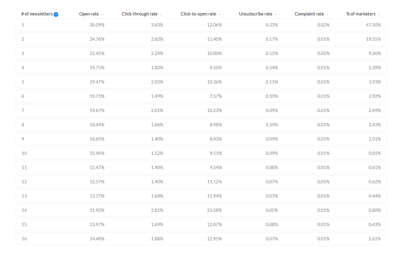
According to research, marketers that send only one newsletter a week achieve the highest opening and click-through rates.
Follow the best practices for email deliverability
Email deliverability is critical to the success of your campaign. It makes no difference how beautifully you can design emails. Subscribers will not convert if they never see them.
Find a good email template (or design one from scratch)
Emails are likely to remain a part of your marketing strategy, so it pays to consider good email design as a long-term investment. Of course, we’re not all email designers, and that’s okay. Luckily, there are dozens upon dozens of good email templates in email automation software and other DIY design platforms.
You can start by finding one good template that fits your purpose, customize it in your branding colors and add unique graphics and images, and voila—you have a draft that can be copied and reused for future needs. Ideally, you’ll create several templates to cover your entire email marketing design strategy, such as welcome/onboarding emails, abandoned cart, sale/promotion emails, newsletters, etc.
If you are willing to let your creativity go, you can also design an email from scratch, but you would probably need some help with the graphic design.
Make the call to action button visible
A good email must be legible so the question “should color and design be used in emails” is a legitimate one. Of course, bold and bright colors help with grabbing people’s attention. Still, the design of the email should never make reading difficult.
While you can opt to make emails as colorful or simple as you like (and both options have their place and use), there is one email design element that requires special attention: the CTA button.
Designing email CTA buttons requires much careful thought. Make sure it's the correct size and color, and that the typeface stands out from the body content but doesn't detract too much from the overall aesthetic of the email. Take some time to consider the best location as well. Is it better to make it flat, rounded, or three-dimensional?
Based on your brand image, art direction, and fundamental psychology, make these judgments (it should be noticeable, first and foremost).
Finally, spend some time deciding on the most effective call to action. After a time, phrases like "Buy now" and "Learn more" become monotonous and uninteresting, and your content could definitely use some more innovation.
Design cool email banners
Although an email banner may not help with open rates, it does help with read-through rates.
A well-designed banner that complements the email text and provides a sneak peek at the product you're promoting will be a useful and decorative addition. As a result, the entire email will appear more professional and attractive.
Should color and design be used in emails? Well, not every type of email or industry suits a colorful and playful design. Sometimes, a simple email layout against a plain, white background is what your audience expects and wants to see. However, when it comes to banners, a good rule of thumb is to make them as eye-catching as possible, while still sticking to your brand image.
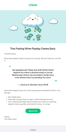
How about a helpful example?
Chime is a banking app, meaning it has to hit that sweet spot between a casual, friendly brand image, and a sense of trustworthiness you want with anyone handling your finances.

Pick a focal point
You probably know that people’s online attention span is shockingly short. So, it’s advisable to focus your email marketing design on a single point.
Don’t use your monthly newsletter to promote the launch of a new product. Similarly, avoid sharing company updates in flash sale email campaigns. All the email design elements should tell a cohesive story.
How to design emails with a strong focal point? Here’s a stellar example to learn from. Onsen is a company known for a single product and this email design example focuses on the product itself, rather than pushing an overly salesy message onto the reader. Instead the large hero image, customer review and powerful CTA really make you want to discover why these are “the Internet’s favorite towels”.

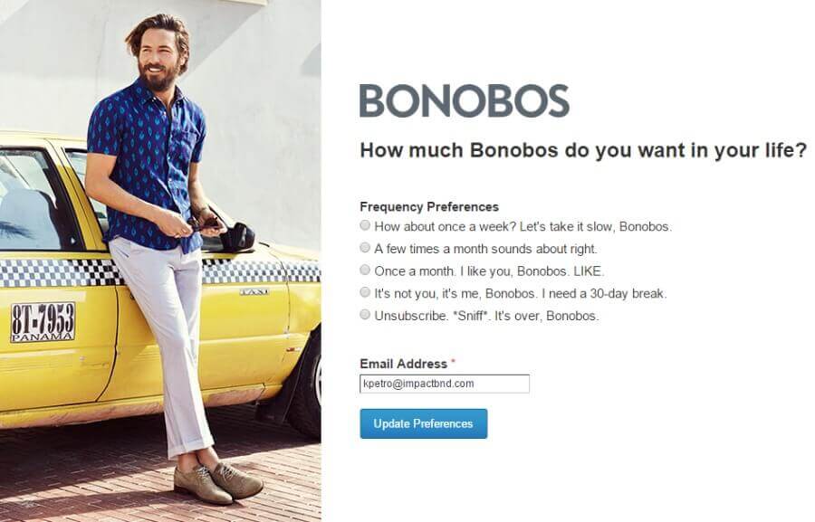
Make the unsubscribe links obvious
Many marketers think that hiding away the unsubscribe link will stop subscribers from ditching them. But, if someone wants to stop receiving emails, they’ll find a way, whether by finding the unassuming button or by reporting your emails as spam. And both options will badly affect your deliverability.
So, instead of trying to trick your recipients into staying stuck in your maze of emails, help them decide. Create an unsubscribe page that helps them personalize their email preferences, or simply give you their reasons for unsubscribing. That will help you realize what you’re doing wrong as well.
Don’t make them as long as landing pages
An email should be neither as long nor as detailed as a landing page. Instead, it should be a shorter version that leads to one, if you’re sending an email to promote an event, sale, or product.
You can reuse copy and elements from a landing page, but never fully copy one and send an email that looks the same to promote it.
Always send yourself a test email
No matter how long you’ve been doing this and you are confident in your email marketing skills, always, I mean always send yourself a test email. Plenty of things could go wrong on the receiving end that you sometimes cannot foresee.
Maybe you used a font that looks buggy if the recipient doesn't have it installed, or the emojis you added look like plain squares when copied and pasted. Or maybe your hero image goes out of its place and it looks bad. Or it goes to the Spam box and you miss out on thousands of email opens.
Whether it is something visual or technical, it doesn’t hurt to double-check.
Find a suitable automation email service
A good email automation service that fits your budget and number of subscribers will do wonders for your email marketing success. No matter how hard you try, sending emails with free trial versions or forever-free plans such as the one Mailchimp has is useful, but limiting too.
There are many different platforms that you can use, that offer great templates, automation tools, data insights and plenty of integrations. Some of the best known are Hubspot, Active, Constant Contact, Sendloop, GetResponse, Drop, Mailchimp, ConvertKit, and plenty of others.
Optimize for mobile devices
According to 99Firms, mobile devices were used to view 42% of all emails in 2019. This research suggests that your email marketing desig should be optimized for mobile as well: email banners, headers, and buttons should appear just as well on a smartphone as they do on a PC.
Make sure you optimize them if you don't want more than 40% of your readers to miss the point because they have to zoom out or spin their phone to read your email.
Conclusion
We hope this answers your questions about how to design emails that people will open and read through.
A beautiful email design can boost your click-through rate and increase conversions. However, you also shouldn’t ignore some of the technical considerations that can help ensure your emails end in people’s inboxes, instead of the spam folder.
For more tips on how to create email design and optimize your campaigns, check out our articles on choosing the best email colors and our guide on how to create effective email newsletter graphics. If you want to skip the hassle and work with the pros, check out this list of the best email design services.

Journalist turned content writer. Based in North Macedonia, aiming to be a digital nomad. Always loved to write, and found my perfect job writing about graphic design, art and creativity. A self-proclaimed film connoisseur, cook and nerd in disguise.

Top-quality designers
A complete creative team at your fingertips: graphic and web designers, illustrators, and more.

Lightning-fast turnaround
Get start today and receive your first update on the next business day.

All-inclusive pricing
Unlimited requests and revisions. One flat monthly fee. No surprises.

Flexible & scalable model
No contract. Scale up and down as needed. Pause or cancel at anytime.
Continue reading


Explore some of our best designs
Get inspired by a curated selection of ManyPixels work. Download the portfolio to see what our team can create.


