
17 Best YouTube thumbnail examples (and why they work)
TABLE OF CONTENTS

TL;DR
A YouTube thumbnail is the custom 1280 by 720 pixel image that represents your video in search, suggestions and the home feed. The best ones use one clear focal point, high contrast, and three to four words of text that create curiosity without repeating the title.
- ✅ One focal point wins. Every thumbnail below does one thing loudly instead of three things quietly.
- 📊 There are six thumbnail types that reliably work, and the right one depends on your niche, not your taste. The table below maps them.
- ⚠️ Three to four words maximum. At 200 pixels wide on a phone, a fifth word is decoration nobody reads.
- 🎨 Consistency beats cleverness. Viewers should recognise your thumbnail before they read your title.
- 👉 Publishing weekly? Thumbnails are the single highest-leverage recurring design job on a channel.
The YouTuber thumbnail: the power of human expression
Faces are the default for a reason. A human face with direct eye contact is processed faster than text, and it tells a browsing viewer there is a person behind the video rather than a brand channel. The catch is that a face alone is not a design. It needs a reason to be there.
1. Mr Beast

As the biggest youtuber in the world, it makes sense Mr Best would use his own face in YouTube thumbnails.
His face makes the content instantly recognisable, but the different (often exaggerated) expressions and layouts keep the visuals interesting and make the viewers want to click.
Another visual lesson is hierarchy. Face, number and background are ranked so unambiguously that the thumbnail survives being shrunk to the size of a postage stamp. Most channels cannot spend what he spends, but any channel can decide which single element is allowed to be the biggest.
Best for: challenge, finance and experiment content with a countable hook ✅
Not ideal for: content where the interesting part is not quantifiable ❌
Best for: B2B, marketing and advice channels building trust over time ✅
Not ideal for: entertainment channels that need variety to stay interesting ❌
2. Neil Patel

Neil Patel runs the same photo treatment on almost every video: one clean headshot, a solid or lightly textured background, and a short line of text. Nothing else.
The repetition is the strategy. When every thumbnail looks like the last one, a viewer who liked one video recognises the next one instantly, before reading anything. For knowledge and B2B channels, that visual consistency reads as professionalism, which is exactly the impression you want when the topic is advice.
Best for: B2B, marketing and advice channels building trust over time ✅
Not ideal for: entertainment channels that need variety to stay interesting ❌
3. Katie Steckly

Katie Steckly pairs a simple self-portrait with a specific, concrete promise. Not "grow your channel," but the actual thing the video delivers.
This is the most copyable example on the list, because the design is genuinely simple and the work is in the sentence. The photography is unremarkable on purpose. What earns the click is that the text says something precise enough to be worth eight minutes.
Best for: solo creators without a design budget ✅
Not ideal for: topics where the payoff is hard to state in four words ❌
Curiosity and how-to thumbnails
Curiosity thumbnails work by opening a loop. You state enough to make the viewer want the rest, and not one word more. The failure mode is stating so little that the thumbnail is vague rather than intriguing.
4. The School of Life

The School of Life puts an intriguing question on a minimal background and lets the question do everything. No face, no photography, often barely any colour.
It works because the questions are ones people have privately asked themselves and rarely see asked out loud. Content-heavy channels can lean on text like this, but only if the writing is genuinely good. A weak question on a minimal background is just a blank thumbnail.
Best for: essay, philosophy and psychology channels with strong writing ✅
Not ideal for: practical how-to content where viewers want to see the result ❌
Quote thumbnails
A quote thumbnail is the highest-leverage format in existence for anyone who talks for a living, because the asset already exists. You are not designing an image, you are choosing a sentence.
5. Alpha Leaders

Alpha Leaders pulls surprising lines from well-known speakers and sets them over a still of the person saying them.
The selection is the craft. A generic motivational line is invisible. A specific, slightly uncomfortable statement stops the scroll, because it sounds like something a real person said rather than something a brand wrote.
Best for: interview clips, podcast cuts and speaker highlight reels ✅
Not ideal for: channels whose value is demonstration rather than talking ❌
6. Tony Robbins

Tony Robbins locks the format completely: face, quote overlay, solid background, same typography every time.
For a personal brand in coaching or speaking, that rigidity is an asset. The channel becomes recognisable as a unit rather than a collection of videos, which matters more than any individual thumbnail performing well.
Facts and stats thumbnails
Numbers are the most under-used element on YouTube. A feed is mostly faces and sentences, so a large numeral is a genuine visual interruption rather than another variation on the same thing.
7. Graham Stephan
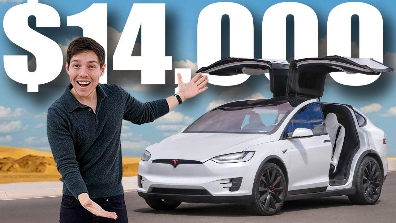
Graham Stephan makes the dollar figure the subject. The thumbnail is typically a specific amount, a reacting face, and a background doing nothing at all.
Finance is the ideal category for this because the number carries built-in stakes. A viewer does not need context to know whether a figure is large. Worth noting: the specific amount outperforms the round one, because $47,000 reads as a real thing that happened and $50,000 reads as an estimate.
Best for: finance, salary and business channels with concrete figures ✅
Not ideal for: topics where the meaningful result is not a number ❌
Before and after transformation thumbnails
Before and after thumbnails sell the payoff before anyone reads a word. They are close to unbeatable for tutorial content, and they fail almost exclusively through cluttered composition rather than weak concept.
8. Full Time Filmmaker

Full Time Filmmaker uses before/after thumbnails to compare filmmaking gear and DIY setups. Each thumbnail is high-resolution and communicates the comparison instantly - you can see both states at a glance without reading anything. The images are chosen specifically because the difference is dramatic and obvious, which is the foundation of a great transformation thumbnail.
9. DIY Wife

DIY Wife has some of the most thoughtfully laid-out before/after thumbnails on the platform. Rather than defaulting to a left-right split, she uses different layouts (including a smaller inset "after" image over the main "before") to create visual interest and avoid the cluttered look that plagues this format. If you're working with before/after content, her channel is worth studying for layout ideas alone.
Versus and comparison thumbnails
A comparison thumbnail is a before and after with the emotional charge removed and an argument added. Two things, one divider, and the contrast carries the whole idea.
10. Vox

Vox built one of the most recognisable examples of the format: rollercoasters of the 1800s set against modern ones, where the gap between the two images is the entire story.
No text is doing the work. The two images are chosen so precisely that the contrast is self-explanatory, which is exactly why it travels well as a screenshot. If your comparison needs a caption to make sense, you have chosen the wrong two images.
Best for: explainer and journalism channels with strong archive material ✅
Not ideal for: comparisons that are conceptual rather than visual ❌
11. Epicurious
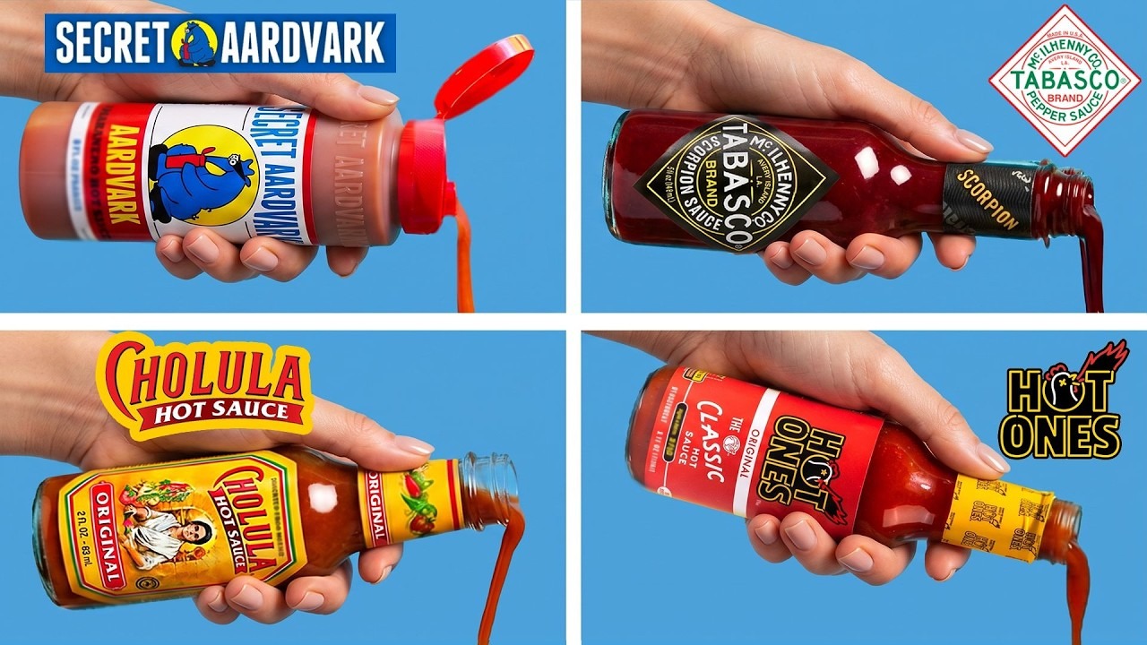
Epicurious built the tiered comparison into a format with its "4 Levels" series, where the same dish appears at several skill levels in one gridded frame.
The grid does something a two-image split cannot: it implies a scale rather than a binary. A viewer reads it as a progression and immediately wants to know where the top of the range lands. The layout is also unusually durable, since the composition stays identical while the subject changes every episode, which is how a series becomes recognisable without becoming repetitive.
Best for: tutorial and review series comparing three or more tiers ✅
Not ideal for: one-off videos with no series format behind them ❌
Illustrated thumbnails that set you apart
Illustration is the right answer when your subject has no photogenic physical form. Software, abstract ideas and processes all photograph badly and draw well.
12. Canva

Canva uses illustration across a wide range, from restrained and professional to bright and playful, depending on the video.
What makes it hold together is not the style but the intentionality: each video's treatment matches its audience. If you are building your own system, the features inside Canva cover most of what a thumbnail needs without opening Illustrator.
Best for: software and product channels covering varied topics ✅
Not ideal for: channels that need one instantly recognisable look ❌
13. TED-Ed

TED-Ed runs wildly different illustration styles, anatomical one week and flat vector the next, held together by a single consistent quality bar.
This is the strongest argument on the list that consistency does not have to mean sameness. The unifying element is craft level, not palette or style, which gives an education channel room to match the illustration to the subject.
Best for: education channels covering unrelated topics ✅
Not ideal for: anyone who cannot maintain a high illustration standard every week ❌
Real-life photography thumbnails
Photography thumbnails live or die on whether the moment looks real. Staged enthusiasm reads as stock imagery, and stock imagery reads as skippable.
14. The Bucket List Family

The Bucket List Family uses striking photography shot from unusual angles, often mid-action rather than posed.
The authenticity is the click. A genuine moment, even a slightly imperfect one, outperforms a polished setup because viewers can tell the difference immediately even if they could not explain how.
Best for: travel, family and lifestyle channels with real footage to pull from ✅
Not ideal for: channels shooting entirely indoors against a single background ❌
15. XO, MaCenna

XO, MaCenna keeps lighting and colour grading consistent across every thumbnail, so individual photos add up to a channel that looks designed.
No single image here is doing anything technically remarkable. The effect comes from the set, which is a useful reminder that thumbnail work is a system problem, not fifteen separate design problems.
Best for: home, decor and lifestyle channels with a settled aesthetic ✅
Not ideal for: channels still experimenting with their visual direction ❌
Product thumbnails
When the product is genuinely nice to look at, the design job is mostly restraint. Most product thumbnails fail by adding.
16. Apple

Apple uses one accent colour, one product shot, and nothing else. No face, usually no text.
That only works if the product carries the frame and the audience already recognises it. Read as a rule rather than a template: whatever your strongest visual asset is, give it the space to be the only thing in the picture.
Best for: channels with a recognisable, photogenic physical product ✅
Not ideal for: unknown products that need context to make sense ❌
17. Webflow
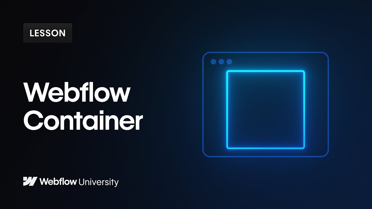
Webflow commits to a dark blue palette with gradients and one contrasting accent, applied across every video.
Software has no physical form to photograph, so the colour system becomes the brand asset. Committing to one palette hard enough that viewers recognise it is more valuable than any individual thumbnail being beautiful.
Best for: SaaS and digital product channels ✅
Not ideal for: channels whose audience expects a human presence ❌
Typography carries more of this than most creators expect, and thumbnail text has different requirements from body text. We covered the specifics in the best fonts for YouTube.
The pre-upload thumbnail checklist
Run this before every upload. It takes about ninety seconds and catches almost everything.
- 1280 by 720 pixels, 16:9 aspect ratio
- Under 2MB in file size
- Saved as JPG or PNG
- Still readable when shrunk to 200 pixels wide (actually shrink it and look)
- One focal point, not two
- Three to four words of text at most
- Checked against both light mode and dark mode
- A second version ready to test against it
The full specification, including minimum widths and what happens when you go over the file size limit, is in our guide to the right YouTube thumbnail size. While you are checking dimensions, the YouTube banner size has its own set of safe zones that catch people out more often than thumbnails do.
Frequently asked questions
Bottom line
Pick the thumbnail type that matches what you actually make, then execute it consistently enough that people recognise you before they read you. ✅ If you are publishing weekly, thumbnails stop being a design task and become a production line, which is the point where doing them yourself starts costing more time than it saves.
If you're producing video content regularly and want to stop making thumbnails from scratch each time, a graphic design subscription covers custom thumbnails as part of its scope. You can also work with a graphic design service for YouTube creators to build a reusable template system that keeps your channel looking consistent without starting over every upload.
ManyPixels covers thumbnails, channel art and everything else on one unlimited design subscription, with unlimited revisions and full ownership of the files. Plans start at $699 a month for the Advanced plan, and you can pause for $10 a month when you are between pushes.
ManyPixels has been a game-changer for our marketing team. They've quickly understood our brand and hit the ground running, producing everything from brand and website graphics to social media assets and video editing. Their turnaround time is impressive, and they're incredibly responsive. - Beth Shepherd, Marketing Manager, Virtual Service Operations
Explore ManyPixels plans to see what a daily output includes.

Having lived and studied in London and Berlin, I'm back in native Serbia, working remotely and writing short stories and plays in my free time. With previous experience in the nonprofit sector, I'm currently writing about the universal language of good graphic design. I make mix CDs and my playlists are almost exclusively 1960s.

Top-quality designers
A complete creative team at your fingertips: graphic and web designers, illustrators, and more.

Lightning-fast turnaround
Get start today and receive your first update on the next business day.

All-inclusive pricing
Unlimited requests and revisions. One flat monthly fee. No surprises.

Flexible & scalable model
No contract. Scale up and down as needed. Pause or cancel at anytime.
Continue reading


Explore some of our best designs
Get inspired by a curated selection of ManyPixels work. Download the portfolio to see what our team can create.








