

15 Best fonts for YouTube thumbnails (free + paid) in 2026
TABLE OF CONTENTS


TL;DR
The best YouTube thumbnail fonts are bold, readable at small sizes, and matched to your channel's tone.
✅ Best free options: Bebas Neue (gaming/action), Impact (vlogs/reaction), Montserrat (lifestyle/beauty).
✅ Best free for personal use: Obelix Pro (used by Mr Beast), Badaboom BB (entertainment).
✅ Best paid: Config Rounded (business/professional), Indigo (versatile dual-style). All 15 picks below include a font type, niche recommendation, and licensing note so you can choose without guessing.
According to YouTube, 90% of top-performing videos use custom thumbnails. Your font choice is a big reason why some thumbnails stop the scroll and others don't. A thumbnail has to work at 1280×720 pixels on a desktop and still read clearly at 168×94 pixels on a phone. That's a small canvas. Bold, distinctive typefaces that hold their weight at that scale are what separate a click from a pass.
This list covers the 15 best fonts for YouTube thumbnails across every niche, with free and paid options, a clear "Best for" label per font, and notes on which real creators use them. We've also included tips on choosing by niche, sizing your text correctly, and pairing fonts.
{{SOCIAL_BANNER="/dev/components"}}
15 Best Fonts for YouTube Thumbnails and Banners
1. Bebas Neue (free)
Font type: Display sans-serif | Best for: Gaming, sports, tech, action content
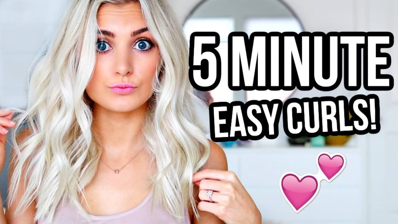
Bebas Neue is the most versatile thumbnail font you can use without spending anything. Its all-caps, tall letterforms hold up at small sizes, the tight spacing packs a lot of text into limited space, and the clean geometry works against almost any background color. Aspyn Ovard, a lifestyle creator with millions of subscribers, built much of her thumbnail style around it.
The one real limitation is the all-caps format. If your thumbnail text needs mixed case (longer phrases, proper nouns), Bebas Neue can feel restrictive. For punchy three-to-five word callouts, though, nothing beats it at this price point. It's fully free for commercial use on Google Fonts, which puts it ahead of several other popular picks on this list.
2. Impact (free)
Font type: Display sans-serif (condensed) | Best for: Reaction videos, vlogs, emphatic callouts
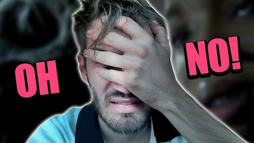
Impact is the font that built YouTube's thumbnail culture. PewDiePie used it throughout his rise to over 100 million subscribers, and its thick strokes and condensed width make text nearly impossible to miss on a crowded feed. It comes pre-installed on most computers, so the barrier to getting started is zero.
Be real: Impact has become so associated with meme-format thumbnails that it now carries tonal baggage. For a comedy, reaction, or entertainment channel, that association works in your favor. For a professional or educational channel, it can undercut credibility. Choose it deliberately, not because it's the easiest option to reach for.
3. Montserrat (free)
Font type: Geometric sans-serif | Best for: Lifestyle, travel, beauty, fashion content
Montserrat is the go-to for creators who want a modern, polished thumbnail without defaulting to a display face. Its geometric letterforms stay clean across sizes, and unlike Impact or Bebas Neue it works in mixed case, making it better suited to longer thumbnail phrases. Available in 18 weights on Google Fonts, from Light to Black, so you have full control over how heavy your text lands.
Lifestyle, travel, and beauty channels consistently choose Montserrat because it reads as contemporary without looking designed-by-committee. It pairs well with a thinner secondary font for a two-layer thumbnail treatment. If you're building a YouTube channel that needs to look like a brand from the first video, Montserrat is the low-risk, high-return pick. Fully free for commercial use.
4. Anton (free)
Font type: Display sans-serif (condensed) | Best for: Fitness, motivation, sports, high-energy content
Anton is a condensed, bold display font that reads as athletic and urgent. Where Bebas Neue is sleek, Anton is blocky and heavy, giving thumbnail text a sense of physical weight. It's free on Google Fonts and works in mixed case, which gives it flexibility Bebas Neue doesn't have.
Fitness and motivational channels have adopted Anton as a near-standard. If your thumbnails feature challenge completions, before/after transformations, or high-energy callouts like "I tried this for 30 days," Anton reinforces that tone without needing much design work around it. Keep the contrast high, the text short, and the weight at Bold or above.
5. Roboto (free)
Font type: Sans-serif | Best for: Educational, tech, tutorial, and informational channels
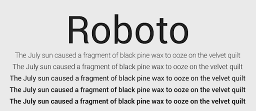
Roboto is YouTube's own platform font. The platform switched from Arial to Roboto in 2015 and has used it for the interface, video titles, and closed captions ever since. Using Roboto in your thumbnails creates a visual alignment with the platform itself, which works particularly well for educational and informational content where credibility is part of what you're selling.
Roboto's neutrality is an asset, not a compromise, in the right context. When the thumbnail image carries the visual weight and the text just needs to be clear, its clean design stays out of the way. Use Roboto Bold or Black when the regular weight is too thin to compete in a thumbnail environment. Fully free on Google Fonts.
6. Poppins (free)
Font type: Geometric sans-serif | Best for: Food, family, lifestyle, and educational channels
Poppins is a balanced geometric sans-serif with a friendly, approachable quality that suits channels where warmth matters alongside visual impact. Its circular letter construction gives it a softer feel than Impact or Bebas Neue, and its range of weights (Thin through Black) makes it adaptable across thumbnail styles.
Food, family, and lifestyle channels benefit from Poppins because it avoids the aggressive energy of condensed display fonts without reading as bland. Use Poppins Bold or ExtraBold for thumbnail headlines, as the lighter weights disappear at small display sizes. Fully free for commercial use on Google Fonts.
7. Obelix Pro (free for personal use)
Font type: Display sans-serif (chunky) | Best for: Challenge videos, viral content, high-energy channels
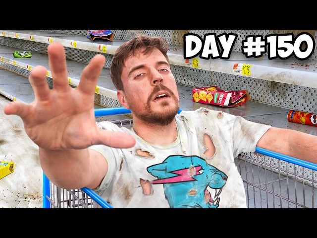
Obelix Pro is Mr Beast's thumbnail font. That alone is worth noting: Mr Beast's thumbnails are among the most studied in the creator space, and Obelix Pro's chunky, legible sans-serif style is central to what makes them read clearly against his typically busy, high-contrast imagery.
The font is free for personal use. For commercial channels, a license is required. Any YouTube channel earning revenue through ads, sponsorships, or merchandise technically qualifies as commercial use, so check the licensing terms before building a full thumbnail library around it.
8. Badaboom BB (free for personal use)
Font type: Display (bold comic brush) | Best for: Entertainment, gaming, fun lifestyle channels
Badaboom BB is loud, attention-grabbing, and unapologetically fun. Wengie uses it consistently in her thumbnails, and its bold comic-style weight demands attention even at small preview sizes. Use it in bright colors with strong outlines and it becomes nearly impossible to scroll past.
The catch is specificity. Badaboom BB has a strong personality that works only for entertainment, gaming, and playful lifestyle content. Anything requiring professional authority will feel undermined by it. Free for personal use; a commercial license is required for monetized channels.
9. Bangers (free)
Font type: Display (comic-inspired) | Best for: Pop culture, entertainment, comedy
Bangers is the free, commercially-licensed alternative for creators who want comic-book energy without the licensing concerns of Badaboom BB. Rclbeauty101 built a significant part of her thumbnail identity around it, and it works across most entertainment and pop culture video types.
What distinguishes Bangers is adaptability - it can play serious or playful depending on how it's styled and what it's placed over. Fully free for commercial use on Google Fonts, which makes it the safest choice in this style category for monetized channels.
10. Lato (free)
Font type: Humanist sans-serif | Best for: Business, finance, professional and educational channels
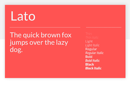
Lato is where you go when your thumbnails need to look credible and approachable at the same time. It's a professional, sleek sans-serif that avoids the aggressive energy of display fonts, making it suited to business, personal finance, career, and educational channels where authority matters.
Lato handles text-heavy thumbnails better than most fonts on this list. If your thumbnail needs to display a full phrase rather than a punchy two-word callout, Lato reads cleanly where a display font would feel crowded. Also the most reliable option for in-video subtitles alongside Roboto. Fully free on Google Fonts.
11. Roadster (free)
Font type: Display (condensed uppercase) | Best for: Travel vlogs, lifestyle, minimalist channel aesthetics
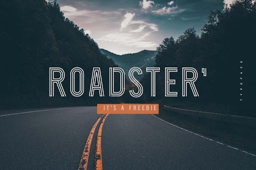
Roadster is a stylish uppercase display font with parallel lines that join at the letter corners, giving it a distinctive elongated graphic feel. It's free and works particularly well on travel vlogs and lifestyle content where the thumbnail image is scenic and the text needs to feel editorial rather than emphatic.
Roadster comes only in uppercase and in a single weight, which limits how widely you can use it across a varied content library. Use it when you want thumbnails that look intentionally designed without much effort, especially on clean or minimal backgrounds where the letterform itself can be a visual element.
12. Nanotech (free)
Font type: Display sans-serif (futuristic) | Best for: Tech, science, AI, and gaming channels
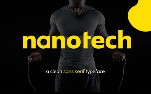
Nanotech has a geometric, forward-looking design that suits technology, science, and AI channels without resorting to tired sci-fi clichés. It's one of the few fonts that communicates "future" through its letterforms alone. Free for personal and commercial use.
The tradeoff is niche specificity: Nanotech reads clearly in a tech context and feels out of place almost everywhere else. If your content is consistently in the tech or gaming space and you want a distinct typographic identity, it's worth building your entire thumbnail style around it.
13. Frisky Puppy (free for personal use)
Font type: Display (cartoonish) | Best for: Kids' content, family channels, toy reviews
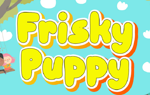
Frisky Puppy is a jolly, cartoonish font designed to pop for younger audiences. Its bold, rounded style signals "for kids" before anyone reads a single word, which is exactly what you need in that niche. Its weight also keeps text legible even at small thumbnail sizes.
Keep Frisky Puppy in its lane: kids' content, family channels, and toy or game reviews. Using it outside that context will undercut credibility with most adult audiences. Free for personal use; a commercial license is required for monetized channels.
14. Config Rounded (purchase only)
Font type: Rounded sans-serif | Best for: Business, finance, SaaS, professional informational channels
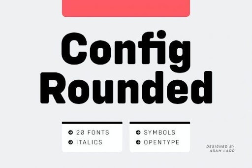
Config Rounded is the premium pick for professional channels that want a polished, modern look without the cold edge of a standard geometric sans-serif. The rounded terminals give it a friendliness that works in business, SaaS, and finance content where you want authority without intimidation.
It comes in multiple weights, giving you flexibility for both headline and supporting text. If you're building a YouTube channel alongside a professional brand and want thumbnails that feel deliberately designed rather than templated, Config Rounded earns the purchase price. Verify current pricing at Best Fonts.
15. Indigo (purchase only)
Font type: Display (chunky dual-style) | Best for: Brand-driven channels, versatile thumbnail and banner use
Indigo stands out because the font pack includes both Regular and Outline versions, which you can layer to create a distinctive two-tone text effect on thumbnails. That layered look is hard to achieve cleanly with free fonts and adds a visual quality that's immediately noticeable in a feed full of flat text overlays.
Available on Envato Elements (subscription) or individual purchase. Best suited to channels where thumbnail consistency across dozens of videos is a core part of the identity strategy. If you're creating content at volume and want thumbnails that look recognizably yours, Indigo's dual-style format makes that easier to sustain.
How to choose a font for your YouTube niche
The best font for your YouTube thumbnails matches your content's emotional tone and stays legible at mobile preview size (168×94 pixels). Bold, condensed display fonts work for high-energy niches. Clean geometric or humanist sans-serifs suit professional and educational content. Decorative or cartoonish fonts work only in tightly defined niches like kids' content.
Use these as a starting framework:
👉 If your channel is gaming, fitness, or sports: Bebas Neue, Anton, or Obelix Pro. All three have the weight and urgency those niches need.
👉 If your channel is lifestyle, travel, or beauty: Montserrat or Poppins. Both are modern and flexible enough to work across the range of video types within those niches.
👉 If your channel is educational, finance, or professional: Roboto or Lato. Credibility is part of what you're offering. A display font associated with meme culture will undercut it before anyone watches a second of your video.
👉 If your channel is entertainment or comedy: Impact, Bangers, or Badaboom BB. The cultural familiarity of these fonts does part of the work for you.
👉 If your channel targets kids: Frisky Puppy. It's specifically built for that context.
On the technical side, use a minimum font size of 75px on a 1280×720 thumbnail canvas. Check your design at actual preview size before publishing. Limit thumbnail text to three to five words. More than that, and you're competing with the image rather than complementing it. For creating professional YouTube thumbnails at scale, it helps to establish a consistent template so the font choice compounds into channel recognition over time.
What font do YouTubers use for subtitles?
Most YouTubers use Roboto for subtitles because it's YouTube's default closed-caption font and viewers are already conditioned to reading it. For creators who want more control, Lato and Open Sans are the most common alternatives, since both are clean, highly legible sans-serifs that hold up at smaller subtitle text sizes without drawing attention to themselves.
The distinction between thumbnail fonts and subtitle fonts is worth drawing clearly. Thumbnail fonts need to be bold and attention-grabbing at a glance. Subtitle fonts need to be readable at smaller sizes, sustained over time, and unobtrusive enough that they don't compete with the video. Impact and Bebas Neue are excellent thumbnail fonts and genuinely poor subtitle choices for exactly the same reasons they're good at grabbing attention.
For burned-in subtitles, Roboto Bold is the safest default. It's what viewers already expect from the platform, it reads clearly at any size, and it avoids any typographic personality that might pull attention away from the content itself.
How to pair fonts on YouTube thumbnails
Font pairing on YouTube thumbnails works best with two typefaces that contrast in weight and personality: one bold display font for the main callout and one clean supporting font for any secondary text. The display font grabs attention; the supporting font clarifies it. Two similarly weighted or stylistically similar fonts create visual noise without establishing hierarchy.
Three combinations that work consistently:
- Bebas Neue + Montserrat: Bebas Neue handles the headline callout in all caps; Montserrat fills in secondary text (episode numbers, names, context) in a lighter weight. Clean, modern, and widely used because it reliably works across content types.
- Impact + Roboto: Impact for the primary word or phrase; Roboto Bold for any supporting text. The contrast between Impact's aggressive condensed style and Roboto's neutral legibility creates natural hierarchy without any additional design work.
- Bangers + Poppins: Bangers brings the energy; Poppins keeps secondary text friendly and readable. Works well for entertainment channels that want a playful thumbnail aesthetic with slightly more structure than an all-comic-font approach.
For font pairing beyond thumbnails, our font pairing guide covers combinations across use cases with more detail on the principles that make each pairing work.
FAQs
Bottom Line
For most channels, Bebas Neue, Impact, and Montserrat cover the range. They're free, proven, and readable at any size. If you want something fewer creators use, Obelix Pro (Mr Beast's pick) or Indigo's dual-style format are worth the investment. Pick one font, use it consistently across your thumbnails, and let the repetition build channel recognition. The specific font matters less than the commitment to using it.
.avif)
Rohit is a novelist (not a NY Times Bestseller!), an avid reader, a passionate content writer, and does YouTube on the side as a hobby! When he is not researching and writing content, he loves to read books and watch movies, TV shows, and anime.

Top-quality designers
A complete creative team at your fingertips: graphic and web designers, illustrators, and more.

Lightning-fast turnaround
Get start today and receive your first update on the next business day.

All-inclusive pricing
Unlimited requests and revisions. One flat monthly fee. No surprises.

Flexible & scalable model
No contract. Scale up and down as needed. Pause or cancel at anytime.
Continue reading

Explore some of our best designs
Get inspired by a curated selection of ManyPixels work. Download the portfolio to see what our team can create.


