
40 Epic Design Fails That Made Bad Design History
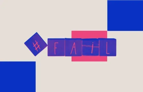
TABLE OF CONTENTS


A good picture is worth a thousand words, but some of these hilarious design fails are so hard to believe they might leave you speechless!
There’s a reason people spend years studying design: there’s really a lot more to it than meets the eye.
It might be the poor placement of text, lack of consideration for the end-user, or simply a severe lack of aesthetic quality. In any case, bad design can prevent you from sending the right message and even seriously harm your business.
Of course, you can find plenty of amusing examples down the rabbit hole that is the Reddit crappy design thread. But around here, we also like to be educational as well as entertaining. So here are some hilarious examples, split into categories that correspond to some of the most common reasons why design systems fail.
Let’s dive in!
{{GRAPHIC_BANNER="/dev/components"}}
Typography design fails
Perhaps most graphic design fails happen because of text. Whether it’s the placement, poor choice of typography, or simply a lack of aesthetic considerations, a text can make or break a piece of design.
1. This scary wedding menu
I appreciate some folks don’t like kids but the food options for this wedding are a bit too drastic, don’t you think?
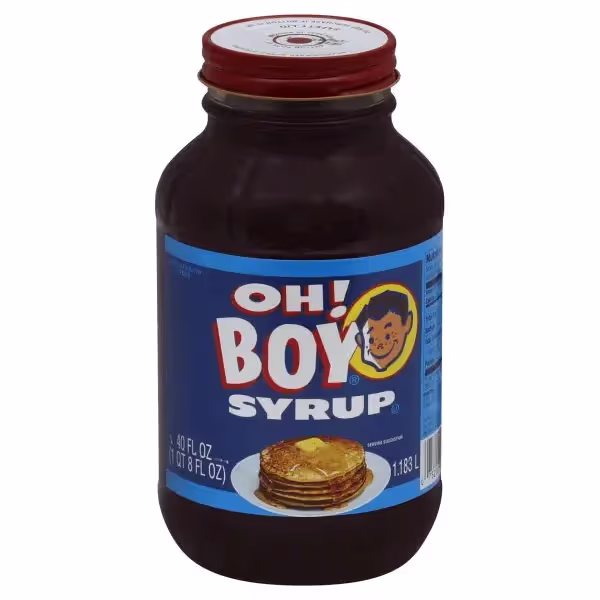
2. Boy syrup
What helped this example make bad design history is bad punctuation. The poorly placed exclamation mark turns what should have been an expression of delight into “boy syrup”, something you probably wouldn’t want on your pancakes.
3. This crappy design
Sorry kids, but no one’s betting on this little league team.

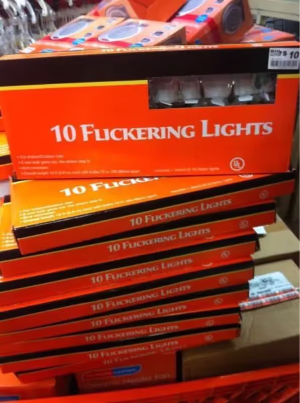
4. Christmas lights designed by the Grinch
For those who are fed up with traditional holiday cheer but still want to embrace the festivity in their own way. This famous design fail shows the importance of correctly choosing the right font and spacing letters.
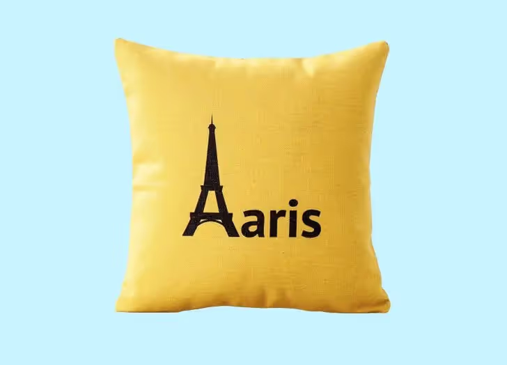
5. The city of… light?
This design fail is a little hard to believe, but I hope their trip to Aaris was nothing short of magical.
6. Fashion fart
To be frank, fashion fart would be a good term for when you just throw on whatever you can find. Although, laundry day couture might sound a bit more sophisticated.

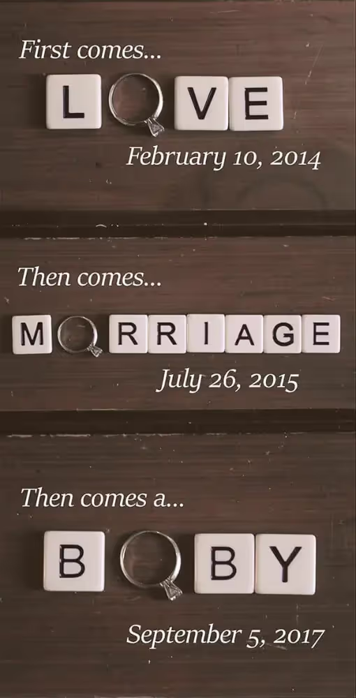
7. Happy birthday Boby!
Modern families have their own ways of doing things and come in all shapes and sizes. But when it comes to love, morriage and boby, they must always come in that order.
8. No thanks to this cruise
Personally, I too would appreciate a cigarette before pending doom.

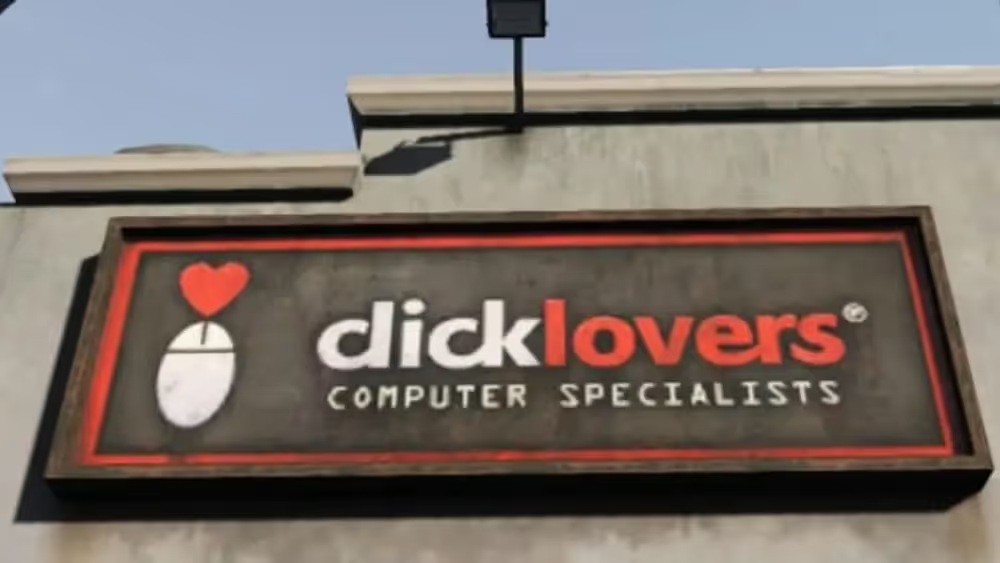
9. The word click is problematic
This is just one of the many failed designs that involve the word click. You might get away with it on a small label, but as a massive sign outside your shop, it makes for a pretty poor design choice.
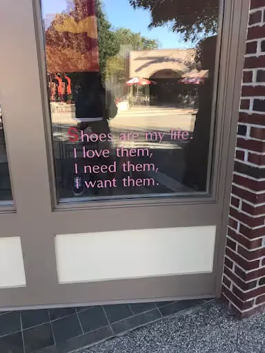
10. Bros before…
It’s hard to tell what’s funnier about this sign: the completely unnecessary choice of making the letter S different or the additional text that makes that first line all the more striking.
Design fails that are not user friendly
The goal of good design isn’t simply to be aesthetically pleasing—it’s also to serve a specific purpose. We can all have a good laugh at funny design fails, but coping with poor design in real life can be extremely frustrating.
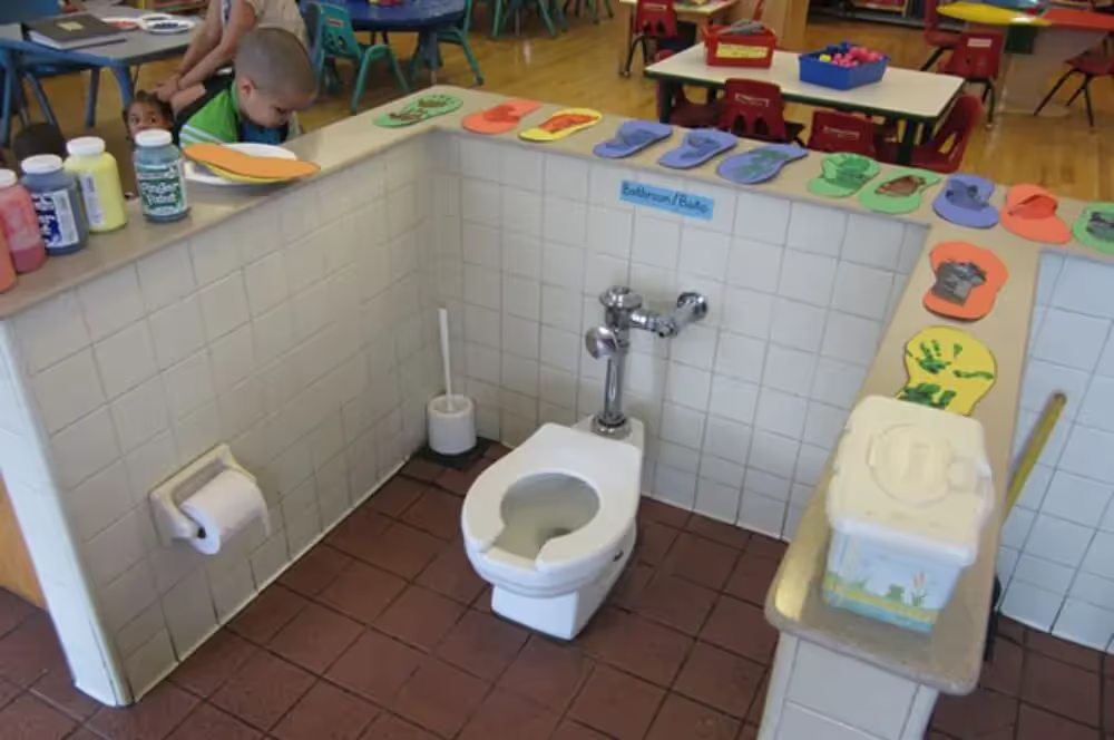
11. Kids live in tight-knit communities
Put down your sandwich for a second and cheer on your pal doing a number two right next to you. Don’t worry, it’s sectioned off so they have some privacy.
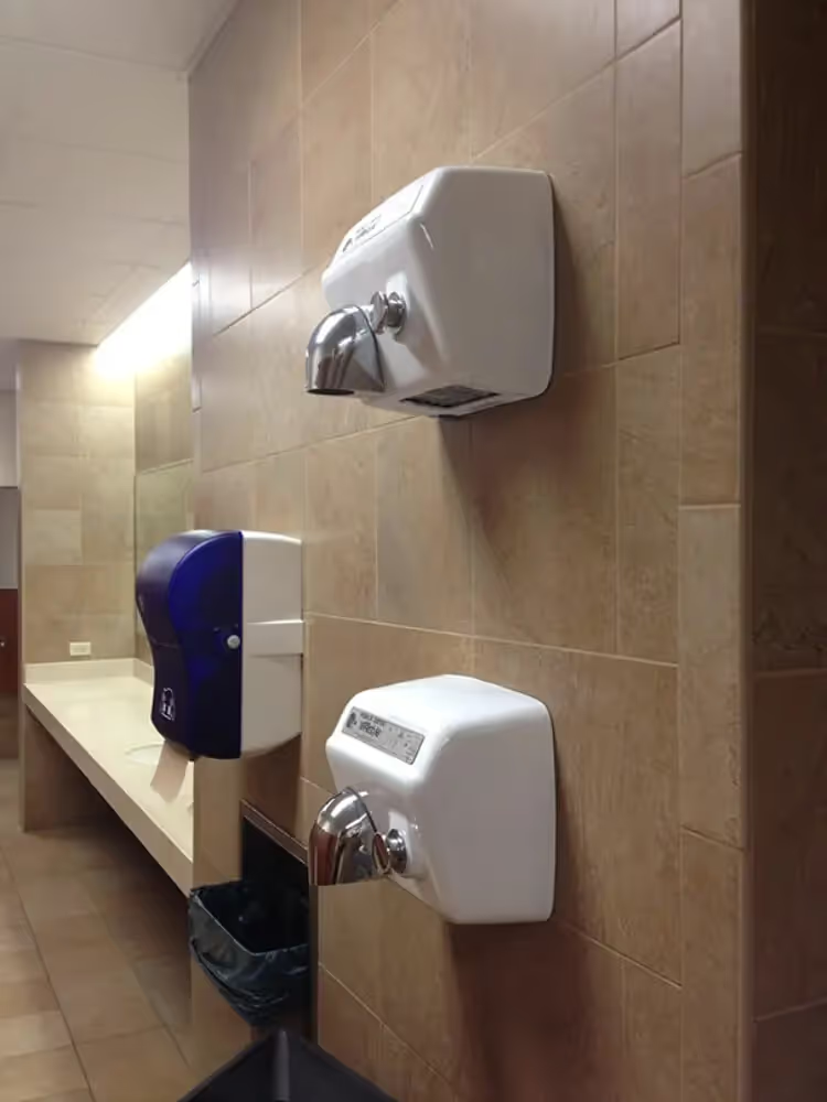
12. Hand dryers for mother and child
Try it out with a friend who’s shorter or taller than you! Jokes aside, with this one, you may be able to see the good intention (designing for children or shorter people). Still, the execution simply doesn’t make sense.
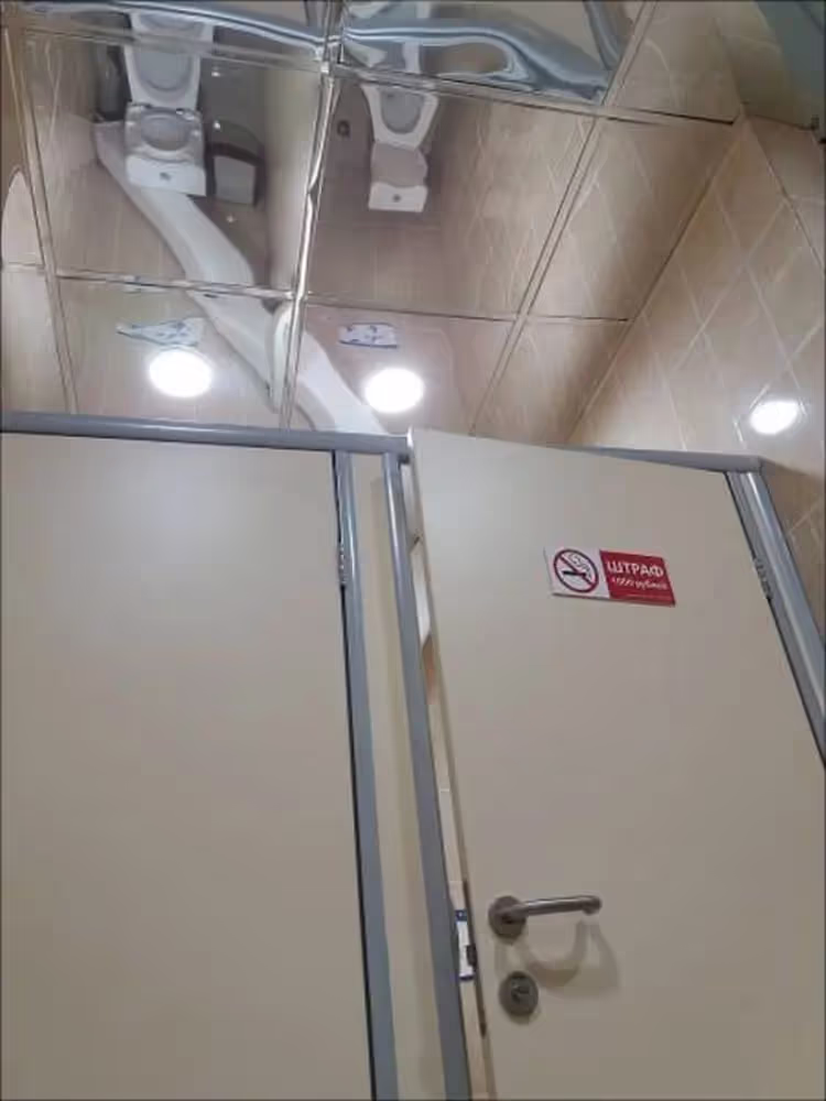
13. Mirror ceilings you really don’t need
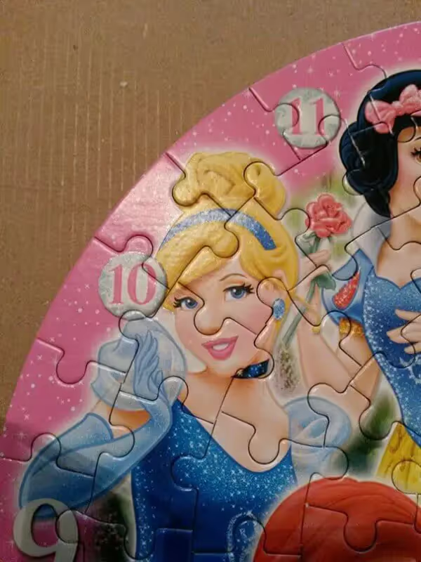
I don’t think mirror ceilings are ever a good idea, but this one is next level. It’s one of the funniest fails for sure, but imagine the horror of walking into that bathroom stall and seeing people on the other end.
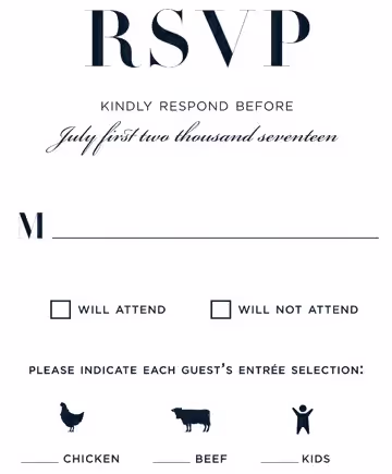
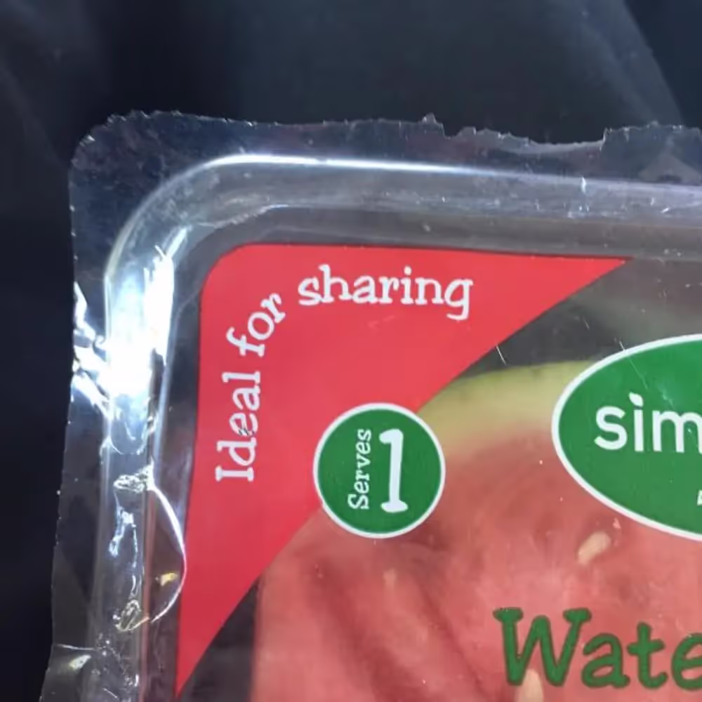
14. Mixed messages
If you’re looking to plan your meals and calorie intake, don’t bother. Also, this brings back memories of my mom making me share everything with my sisters. No thanks, mom.
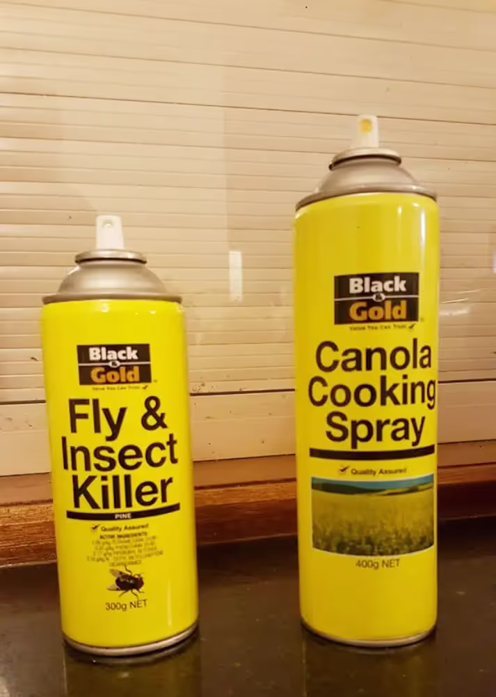
15. A secret ingredient?
In the following example, the designer wanted to keep the brand design consistent, which is undoubtedly very important. However, imagine your grandma having both of these cans in her pantry. Creating fail-safe design means you also predict for human error and ensure people will be able to use products as intended.
16. Get me out of here!
I’m not even sure how a simple display can end up looking this complicated, but I sure wouldn’t like to get stuck in this nightmare of an elevator.

17. You can’t be everything at once
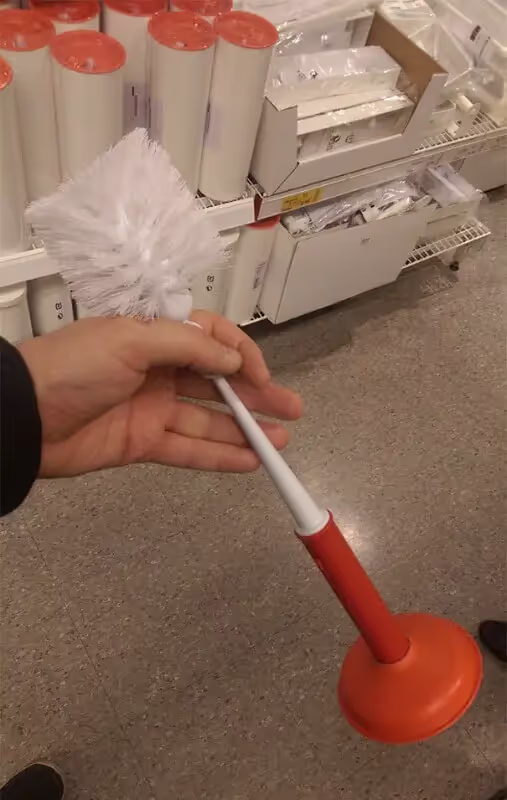
Would you rather hold a used toilet brush or a plunger? Yeah, me neither. The road to hell indeed is paved with good intentions, and this unfortunate bathroom utensil proves it.
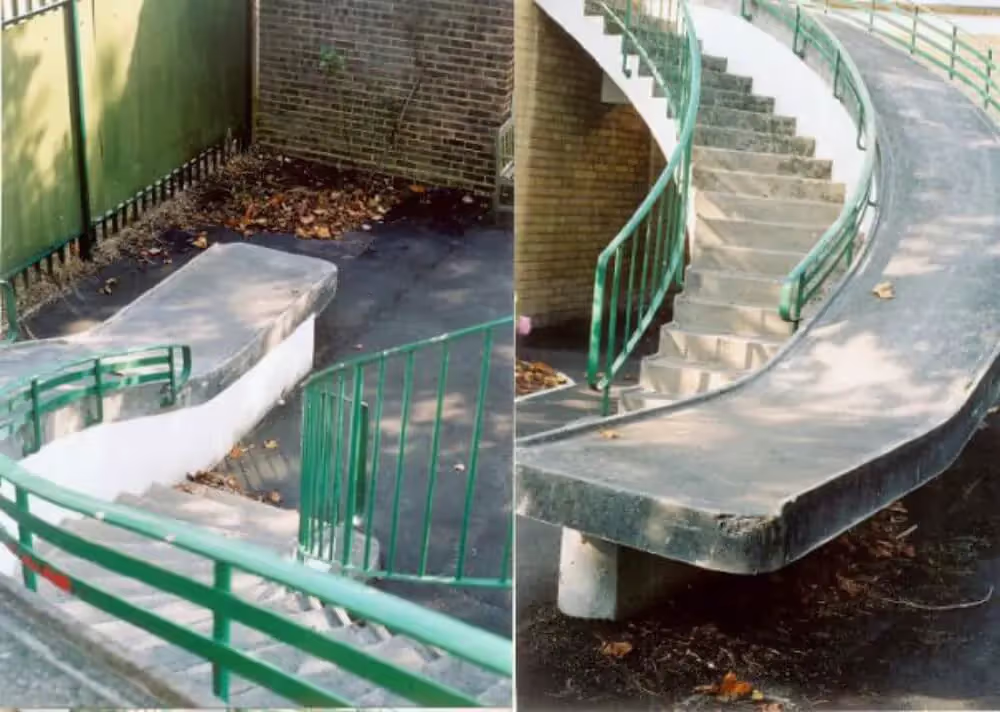
18. Impossible wheelchair escape route
This design envisioned getting people out of the building in case of an emergency, but not exactly how the eventual escape would end.
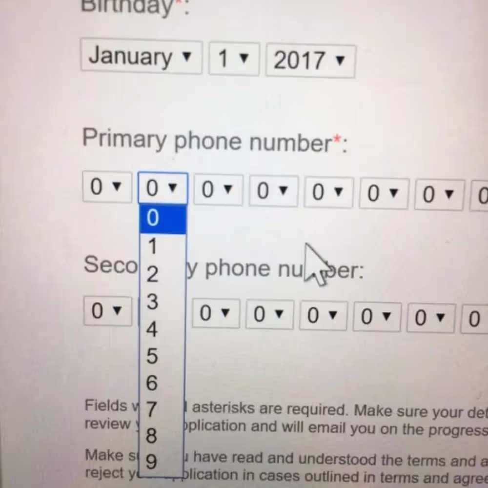
19. Nonsense UX design
This is definitely one of the worst design fails in UX design. It’s hard to believe that anyone could think this was the best way to add phone numbers.
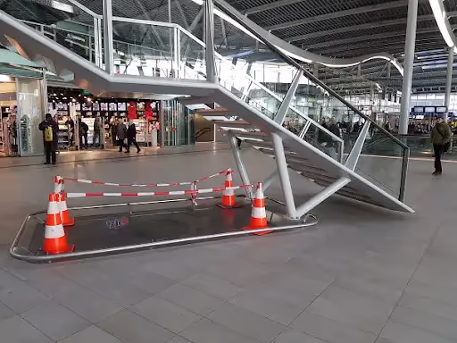
20. If at first, you don’t succeed
The rails were presumably installed to prevent people from hitting their heads on the stairs. However, it's much likelier for someone to trip over them. Design mistakes can be pretty costly, so make sure you consider all angles before implementing.
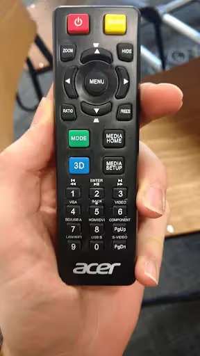
21. You’ve been counting all wrong
One of the cardinal rules of good UX design is to use familiar design elements and layouts. A “page up” button in place of a 9 is bound to make any user frustrated.
22. The notice you don’t want to miss
Remember when we answered the question: what is fail-safe design? Here’s an example of what it’s NOT. Imagine dealing with an elevator failing every time someone misses this sign!

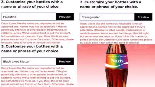
23. Double-check everything
This bad graphic design example went viral last year. A user discovered that Coca-Cola’s bottle customization platform prevented people from using certain words (including LGBTQ and Black Lives Matter) but failed to recognize a big red flag like this.
Funny design fails
Sometimes a design fulfills the intended purpose and delivers the right message (in writing at least). However, context is everything, so even the most well-meaning of ideas can turn into epic design fails.
24. The “I didn’t know I was pregnant” test
Honey, I thought it was just the holiday weight, but it turns out I have some great news! If you were hoping to become a parent, you’d probably find this, admittedly funny design fail horribly unprofessional and turn to a different product.

25. Gay lions
This Noah’s ark illustration is one of the most famous bad graphic design examples. Although I like the idea of these two out and proud on Noah’s ark, it really shows you need to choose your graphic designer carefully.

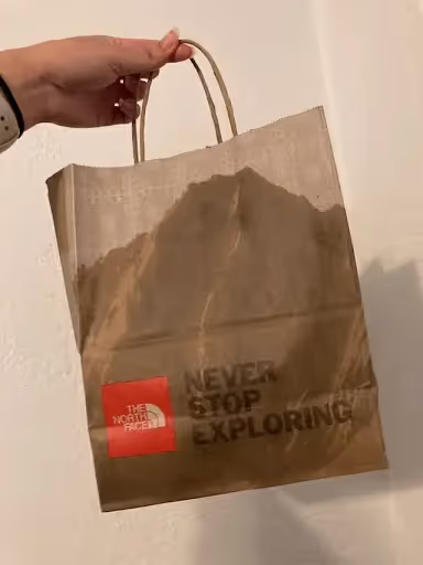
26. The greasy shopping bad
Nothing says brand shopping like an environmentally conscious shopping bag that looks like it was used for greasy takeout too.
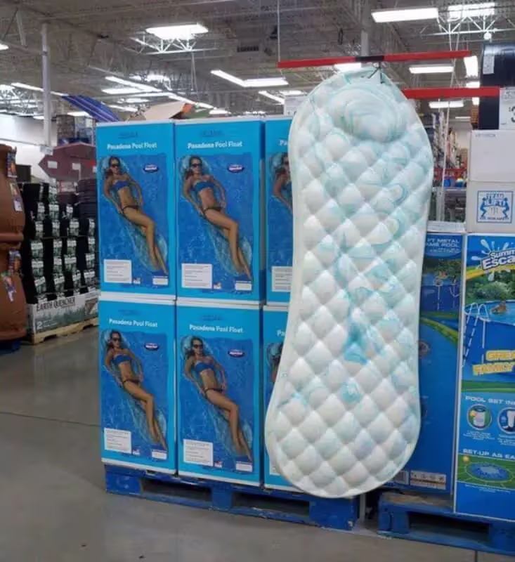
27. A man designed this pool float
I’m all about normalizing the topic of menstruation, but this design fail takes it a bit too far.
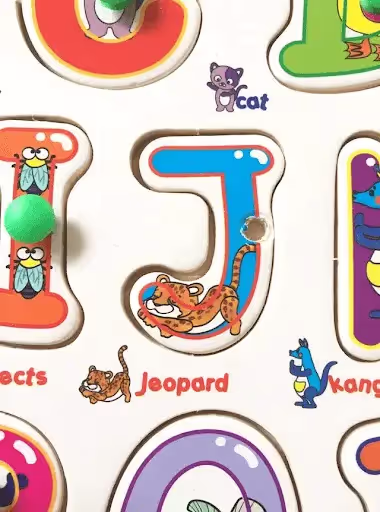
28. What a cute jeopard
Proofreading shouldn’t be a graphic designer’s job, but surely this could be avoided with just a bit of common sense. Or, you know, the basic alphabet.
29. No diabetes bummer
Recognizable design symbols are part of good UX, but context is just as important. Although a frowning emoji would usually be a good match for the “no” option, in this case, it will make you feel like a sociopath.

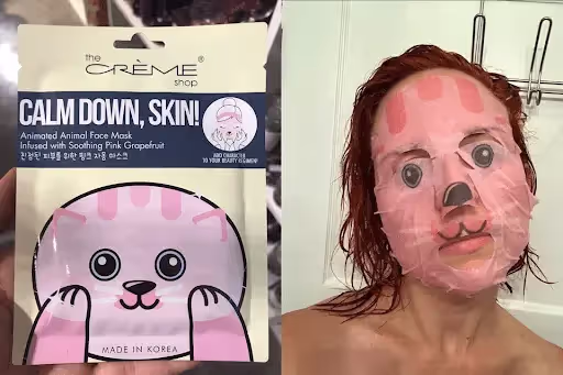
30. Silence of the Lambs face mask
Just me here doing hot girl stuff. This funny example is another reminder that there can always be some horrific product design behind decent packaging.
Good design, wrong context
Even the best piece of design (user-friendly, aesthetically pleasing, on-brand, etc.) will fail if you don’t consider the environment it's used in.
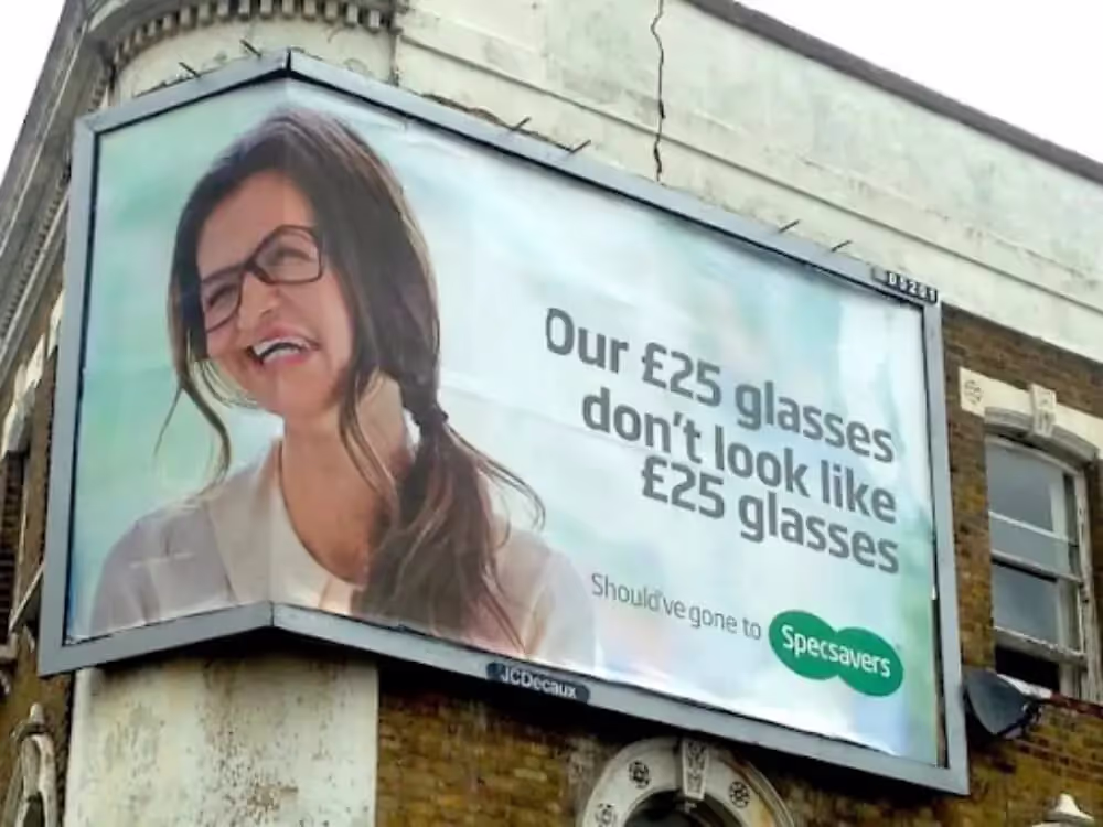
31. Poorly placed advert
You can plan everything and come up with great design and copy, but the harsh reality is that even then you might end up with an epic design fail. That’s why you need a graphic designer who will take into consideration how your designs will be used across the board.
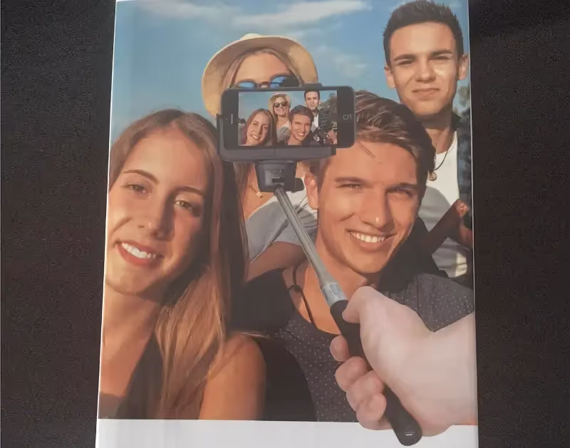
32. That’s not how you use a selfie stick
A word of advice: anyone designing your marketing materials should understand your service or product and how it works. The reason why design systems fail is often the absence of collaboration from different stakeholders: in this case, marketers, product developers, and designers.
33. In it goes, I guess?
This triggers some severe PTSD, watching my parents try to insert a USB stick the wrong way - 8 times consecutively.

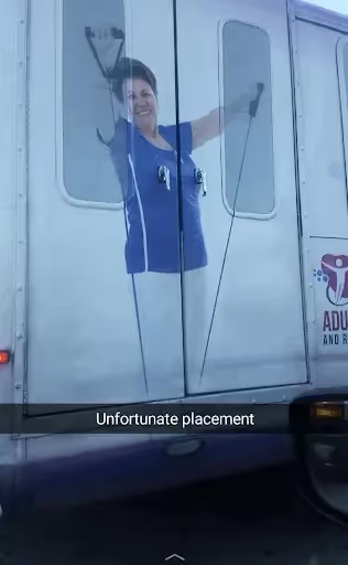
34. Honker handles
This one is so bad it almost seems intentional. Perhaps whoever was in charge of placing the photo on the vehicle simply decided to make a joke. Still, designers should be reminded of how even the slightest detail can disrupt the final result completely.
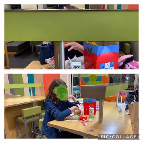
35. This conversation piece at McDonald’s
Even industry leaders aren’t immune to design fails. Seeing as kids are perhaps the primary target demographic of McDonald’s, this kind of oversight is pretty huge.
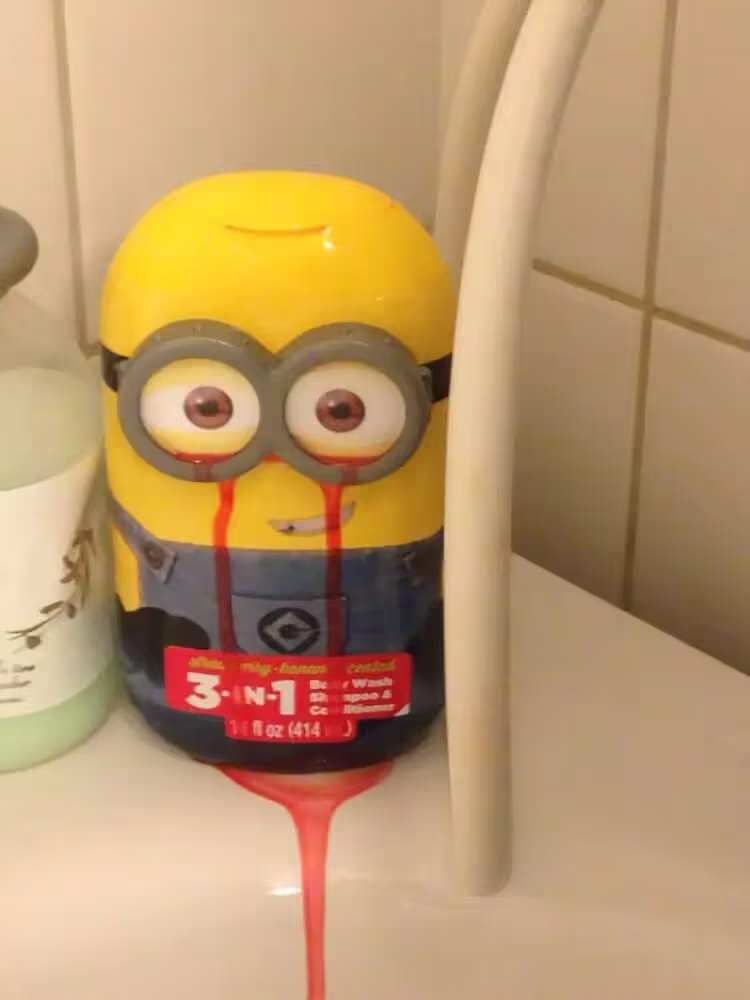
36. The Minion from hell
Oh, look, a cute minion shampoo that’s strawberry-scented! Except that after you use it, a red liquid starts to ooze out of the character’s eyes, and your cute Minion becomes a maniac on a killing spree.
37. Disney in distress
We’ve all seen bad Disney ripoffs, but although the design itself is pretty decent, the end result suffered due to some unfortunate cutting. Bibbidy, bobbidy, botched!
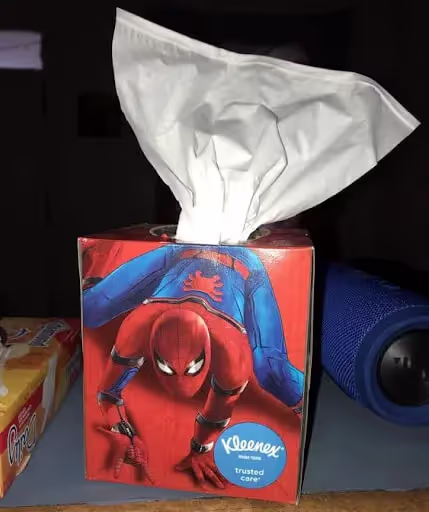
38. My spider-sense tells me this is wrong
Surely there were many ways to make a very cool Kleenex box for Spiderman fans. Oh well, instead, we’ve got a pretty entertaining graphic design fail.
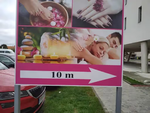
39. A transformative massage experience
Breathe. Relax. You are about to enter a state of the perfect fish roll.
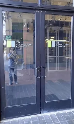
40. False advertising
I’d like to speak to the manager.
It pays to hire a professional
We hope this list of bad design examples gave you a few good laughs and shed some light on just how important design can be!
Most people opt to hire interior designers and architects, but graphic design is a whole different story. With so many DIY design software, many people decide to design their own business graphics. Unsurprisingly, this is why graphic design fails are a lot more common.
Don’t be the butt of the joke - professional graphic design is a lot easier and more affordable than you think. Design as a service companies like ManyPixels offer unlimited design services at a flat monthly rate.
Work with a team of designers who can create anything you need: from a business logo and website, to ads, presentations, social media graphics, motion designs, and more!
Get started today for as little as $549 a month. Or book a call with us for a chance to ask any questions.

Having lived and studied in London and Berlin, I'm back in native Serbia, working remotely and writing short stories and plays in my free time. With previous experience in the nonprofit sector, I'm currently writing about the universal language of good graphic design. I make mix CDs and my playlists are almost exclusively 1960s.

Top-quality designers
A complete creative team at your fingertips: graphic and web designers, illustrators, and more.

Lightning-fast turnaround
Get start today and receive your first update on the next business day.

All-inclusive pricing
Unlimited requests and revisions. One flat monthly fee. No surprises.

Flexible & scalable model
No contract. Scale up and down as needed. Pause or cancel at anytime.
Continue reading
.jpg)
.jpg)
.jpg)
Explore some of our best designs
Get inspired by a curated selection of ManyPixels work. Download the portfolio to see what our team can create.


