
Google Display Ad Examples: Proven Designs that Drive Clicks

TABLE OF CONTENTS


Display ads help consumers to get familiar with different kinds of brands. They are focused on targeted audiences, and that is why they are a great investment for your business.
Display ads have a high ROI, yet their CTRs (click-through rates) are not so high since you can't target all the exact words your potential customers will type in the search box when browsing the product or service they are in need of.
That is why you need to draw their attention and make them click on your banner ad; you will achieve this if your ad has an incredible visual appearance and compelling copy. Using te right display ad size is also paramount.
This might sound easy to you, but creating a responsive display ad from zero is not so simple. But how can you create an ad that looks so good no one can resist clicking on it?
In this article, I will talk about some of the most effective examples, and hopefully, they will inspire you to do your best.
{{AD_BANNER="/dev/components"}}
Outstanding Google display ad design examples
Google banner ads are a bit challenging to create but they are an excellent marketing strategy. When properly done, they enhance brand awareness and are an integral part of your paid media marketing strategy.
The following examples will be used as an inspiration to you so you don’t have to start from the blank page.
PayPal: Using icons as a universal language
PayPal is a big and reliable name in the world of payments and allows their customers options like paying invoices or checking out when purchasing products.
This ad explains how users can easily link the credit card with their PayPal account for easier and faster checkouts. PayPal used simple visual elements to present its company policy to a broader audience. No matter which language they speak, everyone will understand this ad since the icons that are used here speak an international language.

The ad is easily recognizable thanks to familiar PayPal branding and eye-catching colors that will draw attention. Why does this ad work? The simple design shows the apparent purpose of this ad that is easily understandable globally. Highlighted CTA button leads the users directly towards their next step.
MailChimp: catchy and colorful
MailChimp is a well-known marketing platform that has now expanded its offers above email campaigns. This ad example shows us two things. First, it informs the customers about their upgraded offer. The second explains to the customer how this innovation will help them in growing their business.
They used eye-catching colors, and they added some playfulness by incorporating duck floatie to enhance the ad visual effect. But what stands out in this design is the highlighted blue call to action button that clearly demonstrates what's your next step.
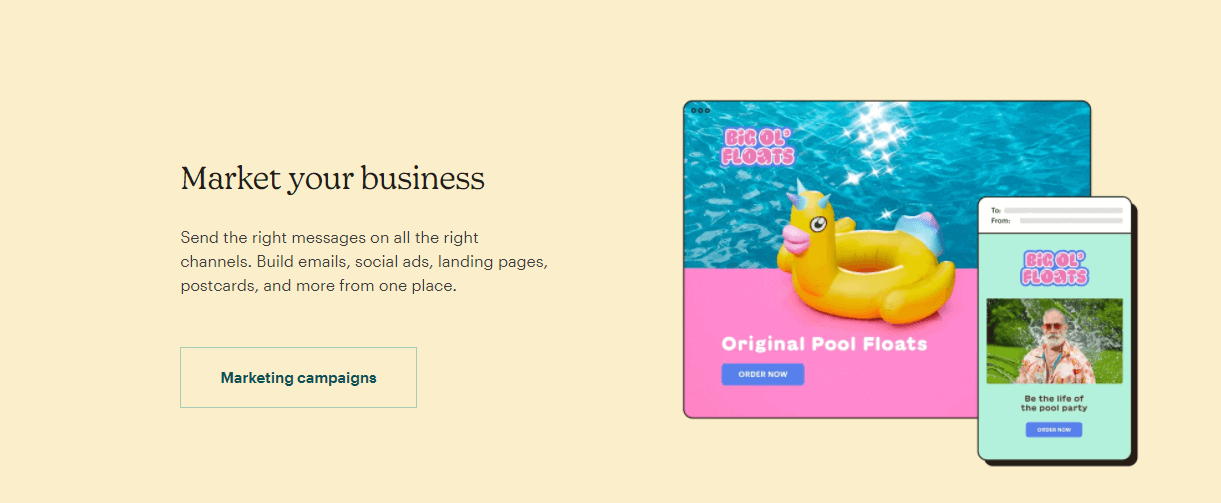
They are confident enough to know you are well aware of who they are and how you only need a bit of encouragement to sign up.
Amazon: Straight to the point
There is nothing spectacular about when a giant e-retail company like Amazon has amazing ads for its products; that's their main goal. The true surprise is when they advertise a job opening.
They are often labeled as a hard, demanding company that does not offer perfect working conditions, and this is a bit of an issue when they try to hire a new workforce. So, they needed to step up their game, and did they do it well? You bet they did!
The biggest problem for workers in the infrastructure industry is their pay, and what Amazon did is that they offer to pay well above the national average and compensate for all the hard work they expect from their workers.

They used Amazon's signature design and colors combined with a promising copy and a subtle orange CTA button that invites you to apply and join their team.
Adobe: Freebies get attention
Adobe is a set of apps and services that give you access to a wide variety of software for graphics, design, photography, video editing, web development, and cloud services. This amazing tool can be used in both business and creative projects, and that is exactly what this ad represents.
This ad sends a similar message to two different types of users, explaining how exactly this product can contribute to their work, and save their money at the same time. The main difference is in pricing.
Since Adobe was a premium tool, most of the potential users couldn't afford to use it, or they thought so. With this set of ads, Adobe addressed this problem, informing everyone that they do have affordable options in their subscription offers. Also, they played smart and sneaked in some free goodies, and we all know how freebies encourage people to interact with your business more.

The design on its own is eye-catching, demonstrating to the viewer what it can expect from Adobe and encouraging them to purchase their software products.
Samsung: Elegant and simple
Samsung is an industry leader when we talk about mobile devices, but the story is a bit different when we talk about computers. The Microsoft Surface and iPad Pro are a big competition to them, so they need to do all it takes to stand out.
This beautiful and simple ad does just that. It speaks to creatives, and it plays on the typically competitive loyal customer base cards.

The ad is brand-specific since it clearly displays their product in an elegant and simple way, demonstrating how easy it is to use their product anywhere and anytime, making this ad click-worthy.
Microsoft Surface: Consistent branding
Talking about the competition, it was a must to include them in this article and show you how they created their storyline. So, Microsoft Surface is a direct competition to Samsung, and since this brand has been in the hype 9ver the past decade, Microsoft needed to step up its game and win some customers over.
How to win a battle among the same two products that offer similar performances in two different design packaging? By offering a generous deal, like one year of extra warranty.

Behold the ad that simply won in this duel. The design is a simple and subtle blending of the background with the product. This implies how easily this product will be integrated into your life. Consistent branding, pretty design, and a discount are all Microsoft needs to earn the clicks and win the battle.
Shopify: Barebones but effective
Shopify is a reliable name in the e-commerce world. One of the reasons why is because of the simplicity of their system. However, now they have to offer more than just an online sale platform. These days, the platform also includes several tools that are crucial for your business expansion, and with this ad, they are informing their users about that.
The design is simple, branded, and click-worthy since it includes the offer of a free trial. Shopify is a verified brand, so they do not need a lot of work to make their users engage with their ads, but they need innovations like this to make their users stay loyal to them.
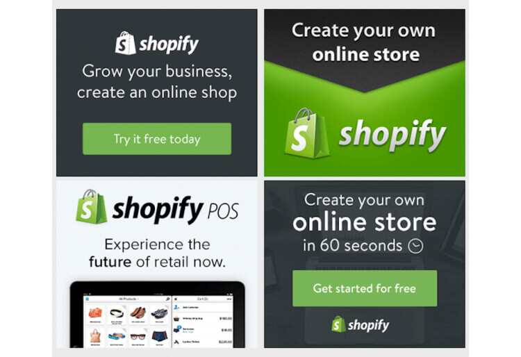
This value proposition encourages users' curiosity to find out more, sign up for a free trial and the rest is history.
Let's summarize
When we talk about Google Display Ads, there are a lot of elements you need to include in your design to make your ads really speak to your audience. Design, copy, format, targeting options such as demographic, interest, gender all those must be taken into consideration.
The best way to create a clickable ad is to play with all those parameters from the above and test to see what combination is working out for you the best.

Privileged to be raised in the most beautiful city in the world, Novi Sad. Studied biology and ecology at the University of Novi Sad. A creative soul, travel enthusiast, passionate writer, and crazy dog lover. Proud mama of (for now :) ) one stubborn English Bulldog.

Top-quality designers
A complete creative team at your fingertips: graphic and web designers, illustrators, and more.

Lightning-fast turnaround
Get start today and receive your first update on the next business day.

All-inclusive pricing
Unlimited requests and revisions. One flat monthly fee. No surprises.

Flexible & scalable model
No contract. Scale up and down as needed. Pause or cancel at anytime.
Continue reading

Explore some of our best designs
Get inspired by a curated selection of ManyPixels work. Download the portfolio to see what our team can create.


