

13 Hair Salon Logo Ideas that Will be a Perfect Cut
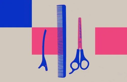
TABLE OF CONTENTS


The most important thing about a hair salon is the quality of the service. But how do you convince the client your service is the best before they get their first chop? One answer—a great salon logo.
Whether you are creating a logo for a barber shop, a beauty salon, an upscale celebrity hairstylist, or a new local hipster hair salon, the possibilities are endless. What can help to narrow down the search for the perfect logo is being aware of the brand identity.
The salon is not just a place where customers come and go. A good hairdo is just half the job—a good rapport with the hairstylist and good customer service makes up the other. You want the client to feel comfortable at your establishment so that they will keep coming back. To achieve this, knowing the kind of customer you wish to attract will help you understand what they look for by honing in on their interests, likes and dislikes.
Whether you are targeting out-of-the-box trendsetters or soon-to-be-wed brides, this article should give you plenty of food for thought for your hair logo designing process.
{{LOGOS_PORTFOLIO="/dev/components"}}
Importance of transferability
A hair salon logo ought to be not only beautiful but also simple enough that it can be replicated in a variety of sizes and on multiple surfaces. To successfully brand your salon, having the logo just on the shopfront won’t do.
Business cards, social media platforms, hair product packaging, aprons, interior design—all these marketing vessels deserve to be stamped with your salon logo. Having a logo vector or an icon vector as part of the logo is a great idea, as it ensures changing the size of the logo will not compromise its quality. Keep it in mind, therefore, when creating your salon logo design, to keep it as versatile as possible.

Design by Anastasia Kurilenko
Design by Lucian Radu
Design by Muhammad Yousaf
Design by Mindz Map and Rajesh Kanna
Design by Dario Petrilli
Design by Yoga Perdana
Design by Symbold Studio
Design by Victor Hermansky
Design by Olga
Design by Anastasia Lila
Design by Ilya Gorchaniuk
Design by Helena Olson
Design by Jessie Maisonneuve
Now that we covered the most important aspect of logo design, let’s take a look at some great examples of hair salon logo designs.


Scissors
What is the first thing that comes to mind when you think of getting a haircut? The absolute necessity for any hairdresser, scissors are the tool that creates the magic—the magic wand to the hairstylist, so to speak. The quintessential nature of the connection between the grooming industry and scissors makes it a great item to use in logo design, as it creates associations and connotations in the minds of customers before even reading the salon name.
The sharp blades of the scissors as well as their symmetry also work great from a graphic design perspective and can make a great stylistic addition to any salon logo.
1. Before & After
This logo design creatively incorporates the scissors into the ampersand between the words “before” and “after”. It is also crafted in a way that the direction of the blades forms the “less than” mathematical symbol, subconsciously signaling that the customer’s appearance, confidence and hair volume will be bigger after receiving service at the salon. As a color that is used recurrently in design, light grey is used for the background to give the logo a professional and modern feel, making the black typography come to the forefront.

2. Smooth Hair Studio
This hair salon takes the smooth aspect of their name seriously, incorporating it into multiple aspects of the logo. The font used is a simple and elegant sans serif font. The monogram in the middle resembling hair locks has a smooth appearance and is pleasant to the eye, further corresponding with the salon name. The scissor symbol is cleverly incorporated into the design, with the finger rings making up the two o’s in the word “smooth”, as well as interacting with the monogram to make it look as if it’s about to cut the hair strand.
The color choices of this custom logo add a modern touch, as the muted orange creates a contrast against the black background. This makes the design a nice contrast to the typical blue & red colors so often used in barber shop logos.

3. Legend
Playing with textures when creating logo designs can go a long way to create extra dimension and add little something, even more so when making logos for businesses dealing with one of the most textured things ever—hair. The neutral tones of this logo as well as the dark brown color used to spell out the name of the barber shop combined with the fuzzy texture give the appearance of hair—a great touch to signify the purpose of the brand. The font style is also very consistent, as the shape of the scissor blade is repeated in every single letter in the form of serifs—a sharp logo for a sharp trim.

4. Beauty Studio
Vaguely reminiscent of the Beauty and the Beast logo, this scissors logo makes for an elegant and mystical-looking design. The scissor outline in the center of the logo also carries a resemblance to the Aries zodiac symbol—further incorporating esoteric elements into the design. The metallic gold used for the text is a common tactic in the cosmetics and beauty industry that is used to elevate quality perception, comparing it to precious metals. The black background adds to the appearance of elegance, making this a highly professional logo, convincing potential customers their hair will be worked on by the most high-quality tools out there, giving them the cut of their life.

Minimalistic
Many of the most successful and known brands have some of the simplest logo designs. The reason? It is more memorable and makes more of an impact. An overly complicated or detailed design can oftentimes be redundant. Keeping things simple, on the other hand, shows you don’t have the need to make up for anything and have confidence in your brand that it can do well without any overly embellished design. Given the fact that many beauty and spa salons cater to a wide and diverse pool of clientele, having a more simple logo ensures that everyone can relate to it and feel welcomed.
5. Nevelin
A wonderful representation of minimalistic design, this next logo uses star symbols together with the white negative space to create the letter “N”. While the letter is not technically there, the clever play with the stars forms an illusion, making the eye identify it as one. The serif font with kerning makes the letters more spaced out, making it more readable even from a distance. This beauty salon logo design is simple yet interesting, making it a highly versatile design that is perfect for hairdressing.

6. Jacob Hair Atelier
Just having the word “atelier” in this hairstylist logo design is enough to say that this place means business when it comes to giving the best hairdo. Translated as a workshop or studio from French, it refers to a place where professional and recognized artists create their own original pieces of work, as well as train apprentices. For customers looking for a high-end, expert-level of service, this salon logo goes a long way to signal that it can provide just that.
The simplicity of the logo, with a black background and a muted orange-pink bold font conveys elegance and delicacy. The name of the salon being the name of the hairstylist is a great choice for a logo, particularly if they are already known and renowned in the industry for their skill, as this will be enough to boost salon business. The slanted cut spanning from the letters “C” to “O” gives an interesting touch to the font, and although we visibly don’t see any scissors, the insinuation of a haircut is quite clear.

7. Hairgonomy
This salon has a great brand identity which is reflected (pun intended) in the logo design. The theme of reflection is consistent through the font—which has a mirror effect—as well as the subtitle “reflecting aesthetics”.
Overall the logo has an uncommon and interesting look, with the bright yellow background being enough to attract plenty of attention. While the effect of the font is certainly impressive, it does slightly compromise the readability—but that’s not necessarily a bad thing.
Alternative brands often choose to amp up the visual and creative effect of the text, which negatively impacts comprehension. Such places often attract equally alternative target groups or those more knowledgeable about the field, as it might be a challenge to recognize this hair salon as one without doing prior research.

8. Hair
This next logo is the perfect representation of a design that creates beauty through attention to detail. While the overall design and color scheme is fairly simple, the real charm of this logo is created through the white space, which creates the silhouette of a woman’s head within the letter “A”. What takes it even a step further is the strand of hair sticking out of the letter—a tiny detail for a great impact.
The font is also customized, as the top corners of the letter “H” and “A” are slanted, making it look as if someone “shaved off” the corners. All these small details result in an extremely professional, soothing and delicate-looking logo—bringing to life the silky feel of a freshly cut and washed long woman hair.

9. Petrilli Parrucchieri
Mentioned at the beginning of this article, this minimalistic hair salon logo intelligently incorporates the scissors into the design, which serves as an icon vector that can be easily applied to products produced by the salon without having to write out its full name. The two parts of the scissors make up 2 “P” letters—fusing the initials of the hair salon.

10. Blades
As all great barber logos should do, just looking at this logo design makes you feel as if you could smell the musty cologne and pomade permeating from the salon. A blade is incorporated into the font by replacing the letter “D”, which makes the purpose of the business easily recognizable to anyone, making it a widely versatile option for any barbershop. The sharp and aggressive angles of the font add to the razor-sharp, masculine and elegant appearance of the logo.

Illustrations
Incorporating illustrations into your hair salon logo design can be a great way to boost visual appeal as well as to better capture what your business is about and the services it offers, as the font has its limitations to how much you can convey through it. While it can add dimension and color, it is also a good idea to keep it simple enough that it can be transferred to multiple surfaces and mediums.
11. Warsa Beauty Salon
This feminine logo illustration portrays the silhouette of a woman as a flower, emphasizing the delicacy and gentleness of a woman. The gentleness is further emphasized through the use of pastel colors resembling the leaves and petals of a flower, as well as soft curves resembling voluminous hair locks. The curves within the design also fit well with the curves of the script font, making the design look consistent.

12. Woman logo
This next design perfectly combines femininity and boldness, capturing lots of character in the simple illustration. The red dot acting as a blush on the cheek of the woman gives the design a native Indian vibe. The strong outlines of the female’s features add character and the seamless outline of the hair creates the illusion of an upside-down water droplet when seeing it from far away. All these design elements foreshadow how empowered the customer will feel after getting a haircut at the salon.

13. Garden
Both beauty and nail salon logo, this design perfectly incorporates the two elements into the illustration, putting a crown (which is put on the head) on top of a nail. The crown gives an elegant and regal feel to the image, which is accompanied by the use of emerald, gold and red-brown colors, not only mirroring the tones found in a garden but giving the design an elegant look. If one wishes for their hair and nails to be treated like a queen’s, this is the destination to go!


Found my calling in the online world writing articles about design. Russian by passport, Korean at heart. Dreaming of traveling the world and spreading love.

Top-quality designers
A complete creative team at your fingertips: graphic and web designers, illustrators, and more.

Lightning-fast turnaround
Get start today and receive your first update on the next business day.

All-inclusive pricing
Unlimited requests and revisions. One flat monthly fee. No surprises.

Flexible & scalable model
No contract. Scale up and down as needed. Pause or cancel at anytime.
Continue reading

Explore some of our best designs
Get inspired by a curated selection of ManyPixels work. Download the portfolio to see what our team can create.


