

9 Eye-Catching Logo Color Combinations to Get Inspired By
TABLE OF CONTENTS


Your logo is a big part of your branding design. But before getting caught up in shapes, monograms, and sizing, one crucial step should be put first: picking the right logo color. Let’s go over brands that nailed the brief for some much-needed inspiration.
Whether a combination or a single color, the choice could make or break your logo. Color holds a lot of meaning and should be considered carefully. Especially when it comes to something as important as a logo.
{{BRAND_BANNER="/dev/components"}}
The importance of a good logo
Before delving into the world of color, let’s have a look at some statistics proving the undeniable importance of a good logo:
- It builds recognizability – Did you know a jaw-dropping 94% of the world population recognizes the Coca-Cola logo? If that doesn’t prove a logo can help you build brand recognizability, we don’t know what will!
- It builds customer loyalty – Recognizability helps people build trust in your brand, and trust is a prophecy for customer loyalty.
- It improves sales – Your audience recognizing your branding design from the crowd and trusting your brand boosts conversions. Think about it, do you pick brands that you know and trust over others? You probably do.
- It shows professionalism – Lastly, having custom-made branding design, including a logo that perfectly aligns with your brand values and vision, will show your audience that you take your branding seriously.
What makes a good logo?
A logo can boost your brand identity tremendously. However, that’s only the case when it’s a good logo. Remember GAP’s infamous shift to a new logo, only to scrap it after six days, tail between their legs, because it just didn’t work? They returned to their iconic and recognizable logo, spending all that money on a new logo in vain.

There are multiple aspects to a logo that make it a good or a bad one, such as typography, as shown by the example of GAP. But one of the most important aspects is color, as it’s arguably the most recognizable element of a visual. No wonder color can improve brand recognition by up to 80%.
A brief lesson on color
While on your quest for striking logo color combinations, a good starting point is knowing color 101. What do logo colors mean, and how many colors should a logo have? Let’s scratch the surface on color psychology and theory, and the different types of color combinations to get you started on the right foot.
Color Psychology
Color impacts viewers. Knowing how to evoke the right emotion for your brand is a good starting point. Is your brand minimalistic, a little cheeky, or completely zen?
Each color has a meaning almost automatically associated with it, which we’ll get into in a little while. But there is also something called color psychology. Did you know that the color green produces a calming effect? And that the color yellow stimulates mental activity?
Bear in mind that different cultures perceive colors in various ways as well. It’s a good idea to do some color research based on the geographic location of your target audience and the market you operate in.
The website ColorPsychology.org provides a nifty overview you can fall back on while choosing the right colors for your brand identity.
Color theory
Once you have an idea of what colors represent, it’s time to decide how many you want to use and which ones. Understanding the different logo color combinations can help you strategically decide on a palette.

- Monochromatic – One color scheme that consists of one color or various tones of one color.
- Complementary – Two colors located opposite each other on the color wheel. The contrast between the two helps make each color appear brighter.
- Triadic – Three colors evenly situated around the color wheel.
- Analogous – A color combination consisting of two or more colors that sit next to each other on the color wheel.
- Tetradic – Two sets of two complementary colors, adding up to four different colors combined.
Pick the right color scheme for your logo
Knowing basic color psychology and which classic combinations to choose from is a great start in selecting a suitable color scheme for your logo. Before going over famous logos with inspiring color combinations, let’s answer some frequently asked questions surrounding logo colors.
How many colors should a logo have?
There is no one-size-fits-all answer to this. Most companies use either one or two colors in logos. However, you can see that multiple colors can work just as well, in a little while.
It’s important to realize what colors mean and how they can portray your brand in a way that fits your branding strategy before making your logo color choice.
As with all other design aspects, it’s wise to think about your brand and how you want it to be perceived by your audience rather than picking the first color that you like.
What do logo colors mean?
Good logo colors aren’t chosen randomly but are handpicked by a designer because they convey a certain meaning that fits the brand. Here’s a little cheat sheet showing the meaning of colors:
- Red – Associated with love, danger, power, passion, and desire.
- Pink – Associated with tenderness, vulnerability, youth, innocence, hope, and optimism.
- Yellow – Associated with happiness, warmth, and joy.
- Orange – Associated with energy, joy, enthusiasm, creativity, and stimulation.
- Blue – Associated with authenticity, sympathy, sincerity, peacefulness, and flexibility.
- Green – Associated with growth, freshness, sincerity, calmness, and nature.
- Purple – Associated with power, luxury, extravagance, and femininity.
- Brown – Associated with honesty, stability, and reliability.
- White – Associated with innocence, purity, and cleanliness.
- Black – Associated with power, elegance, evil, and mystery.

9 Eye-catching logo color combinations
On to the fun part: admiring stunning logos with colors that perfectly fit the brand. These successful brands nailed their color combinations. As you can tell, you don’t necessarily have to pick a monochromatic logo color. You can go all out and choose various matching colors to express your brand.
1. Reese’s
Who isn’t familiar with the mouth-watering peanut butter cups from Reese’s? You can find them in stores worldwide, wrapped in the iconic orange, yellow, and brown packaging. No matter how many colorful wrappers try to grab your attention, Reese’s is instantly recognizable to many people.

The bright color scheme is an excellent insight into the brand identity of Reese’s, even though the yellow and brown were initially intended to remind people of the yellow of peanut butter and the brown of chocolate.
Brown is by no means a popular logo choice as it’s rarely seen as exciting, but for a chocolate product like Reese’s, it works. The yellow and orange show excitement and fun, which is perfect for a candy brand.
2. TikTok
TikTok is rapidly earning its place as one of the world's most popular social media platforms. The app hosts short-form videos, acting as a platform for millions of content creators. Which is exactly what inspired their logo.

TikTok’s logo consists of three colors representing the darkness you experience while standing in a crowd. The bright blue and red represent an electronic wave effect that stands out against the black background.
The designer wanted the logo to feel cool and exciting, which they definitely succeeded in!
3. Firefox
Firefox is an internet browser that recently changed its logo, giving it a warmer appearance. They created the logo according to user input, which is a fantastic way to ensure your audience will love your logo.

Firefox's newest logo is an excellent example of using an analogous color combination for your logo colors. The internet browser kept its recognizable red fox but changed the globe from blue to purple, giving the logo a more harmonious look.
4. Tinder
We now know colors evoke emotions. So what better way to put them to use when creating a logo for a dating app? Tinder used color psychology and the meaning behind colors to their advantage by using colors that match their brand to a T.

Hues of red and orange create an overall sense of warmth, happiness, and passion. Those looking for love will surely resonate with these colors much sooner than, say, a cold color combination like blue and gray.
5. Slack
Slack is an online communication tool used and loved by many companies. It’s an easy tool to communicate with your team. Originally, Slack’s logo consisted of a whopping 11 colors, which suffered against any background color other than white.
The rebrand of Slack shifted to using four primary colors, which are much easier to combine and display in various ways. They kept the recognizable aubergine purple hue as a background color.

Using a multi-colored palette like Slack’s instantly gives off a sense of playfulness. It shows Slack is a young, modern company that doesn’t take itself too seriously.
6. Tommy Hilfiger
Talk about an all-American brand, and there’s no denying Tommy Hilfiger fits the bill. The logo shows an international maritime flag, meaning ‘I have a pilot on board,’ but in Hilfiger’s case, it stands for the letter H.
The colors used by Tommy Hilfiger perfectly represent the all-American brand. Similar to the colors of the American flag, as well as a classic and sporty combination that matches the clothing style of the brand.
7. Patagonia
Much like Tommy Hilfiger, Patagonia, an outdoor clothing brand, chose to represent a geographical location in its logo. However, instead of doing this with just colors, they decided on a stylistic outline of the mountain Monte Fitzroy, located in Patagonia on the border of Chile and Argentina.
On top of that, the brand went for a stunning color palette. It’s a complex logo, but it’s instantly recognizable and a gorgeous visual proudly worn by many.
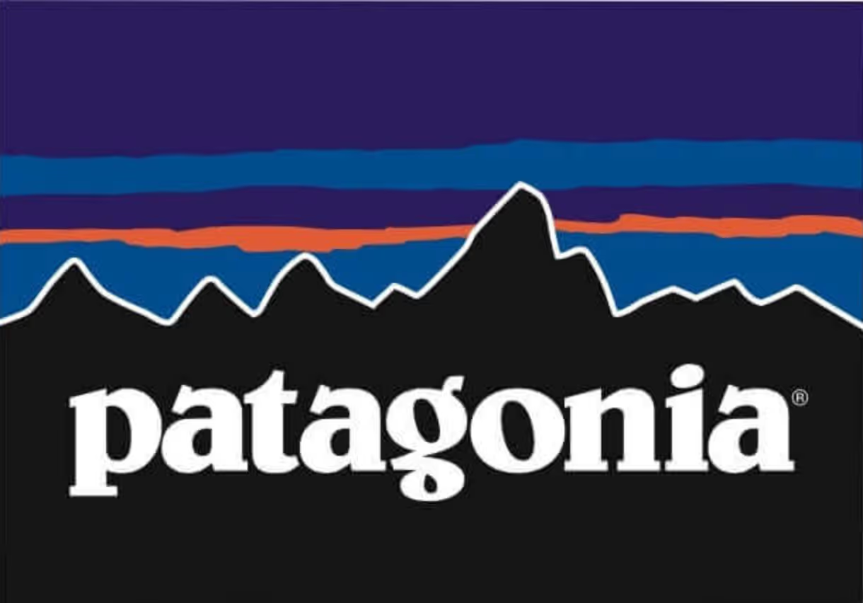
The colors that depict the sky above the mountain outline show off a beautiful sunset or rise, speaking to many adventurers and nature lovers.
8. Google
Possibly the most recognizable multi-colored logo out there is Google. And it has a lot more meaning than you might think!
Google uses primary colors in a specific order but then uses a secondary color for the green l, seemingly coming out of nowhere. This is a nod to Google not following the rules.
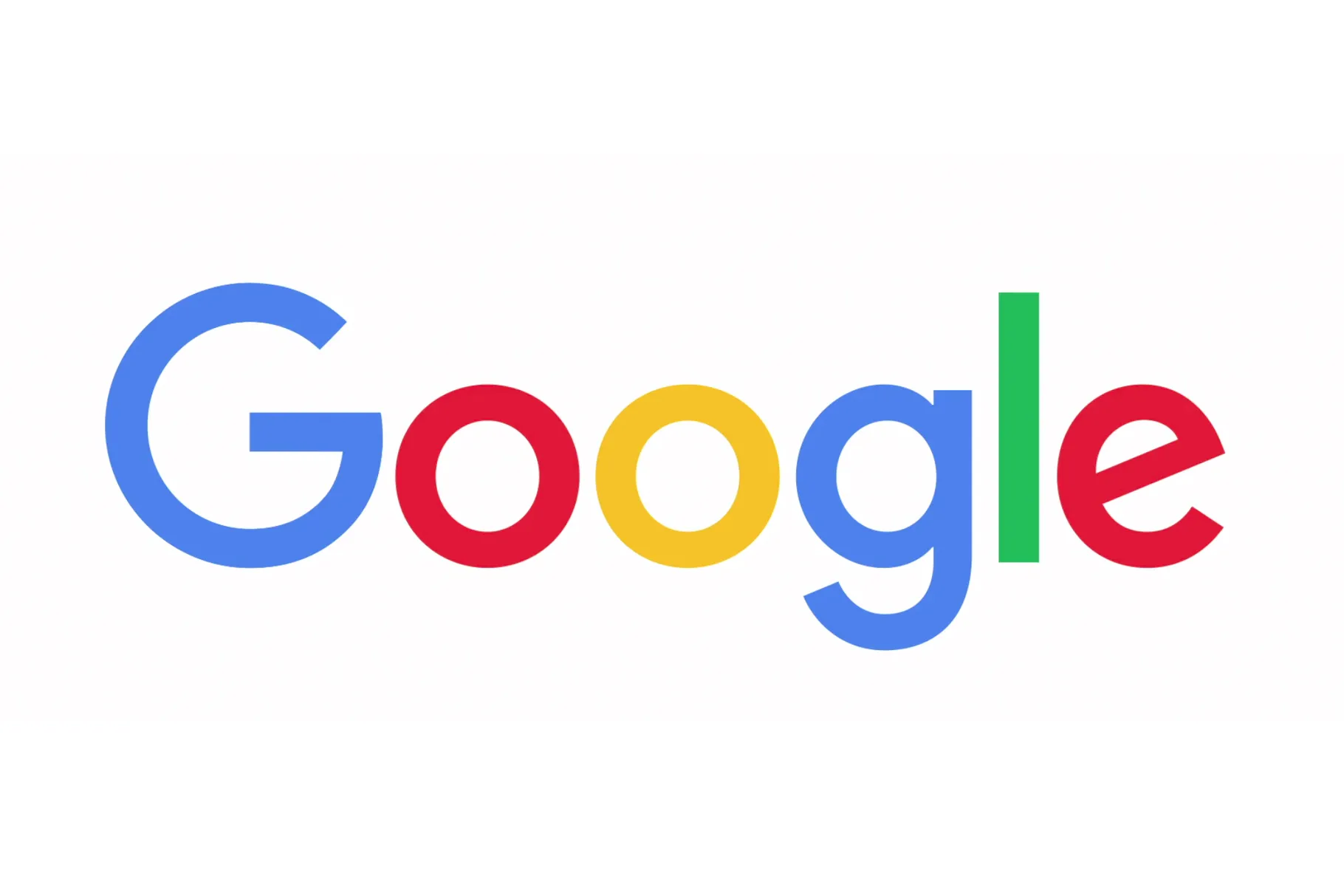
As we mentioned with Slack, colorful logos instantly give off a playful vibe. But another way to interpret multi-colored logos is by looking at the differences in various colors. A logo with many colors shows a brand is all about inclusivity and embracing diversity.
Google is a global brand with a massive audience and does well keeping things multi-colored; we don’t expect them to shift to a monochromatic logo anytime soon!
9. Wikipedia
Here’s an example of a logo that uses different hues of only three colors, giving it a more coherent look. Wikipedia uses various tones but sticks to the colors gray, black, and white. This goes to show you don’t necessarily have to pick a plethora of bold colors for your logo to make a striking color palette.

The color palette of gray, black, and white tones shows a sense of simplicity and elegance without distracting the viewer from the logo's meaning.
It shows a well-balanced palette, which indicates that Wikipedia is a neutral party, presenting information and facts as they are without picking a side.
Logo inspiration
Can’t get enough of striking logo design? We’re right there with you, which is why we’ve written about it often.
After picking a color palette, it’s time to choose typography. Get inspired with some of the best logo fonts. There are also plenty more logo design ideas on our blog. Check it out!
We hope these examples inspired you to pick a striking color palette for your logo!

Simone is a writer, dividing her time between native Netherlands and 'home away from home' Malawi. Whenever not stringing words together, she's either on her yoga mat or exploring any off the beaten track she can find.

Top-quality designers
A complete creative team at your fingertips: graphic and web designers, illustrators, and more.

Lightning-fast turnaround
Get start today and receive your first update on the next business day.

All-inclusive pricing
Unlimited requests and revisions. One flat monthly fee. No surprises.

Flexible & scalable model
No contract. Scale up and down as needed. Pause or cancel at anytime.
Continue reading

Explore some of our best designs
Get inspired by a curated selection of ManyPixels work. Download the portfolio to see what our team can create.


