
Let’s Choose the Right Email Font for Your Business

TABLE OF CONTENTS


Which is the best font for emails? It’s not a simple question to answer. However, we can offer 7 great tips to help you choose the right email font for your business!
Have you ever confused one letter for another when reading something? So that you had to do a double-take for a moment to figure out what's being said? Take a look at the following image:

Get this banner and emil font here
Get this banner and emil font here
Get this banner and emil font here
Get this banner and emil font here
Get this banner and emil font here
Get this banner and emil font here
Get this banner and emil font here
Get this banner and emil font here
Get this banner and emil font here
Get this banner and email font here
Image Credit: The Logo Company
Image Credit: stripo.email
Image Credit: font.com
Image Credit: neurosciencemarketing.com
Dr. Brown’s choice of fonts seems to acknowledge the poet’s verses!
Ogden Nash’s poem, “This is Going to Hurt Just a Little Bit”, has these lines: “Because some tortures are physical and some are mental, but the one that is both is dental.”
Image Credit: bonfx.com
Image credit: imgur.com
Does the caption, in red, within the image read “I love Cow” or “I love Coco”, or something else altogether?This is nothing but just another typical example of a bad font choice. And organizations from small businesses and startups to big enterprises can make this mistake.
The font you choose in your designs and marketing collaterals matters a lot, especially when it comes to digital and email marketing. Consumers' perceptions of your brand are influenced by font style and font size. Your typeface can help reinforce a specific theme, add to the overall feel and personality of work, and make or break your message, thus significantly impacting your business.
Our discourse is limited to choosing the perfect fonts for emails only in this post. It would, however, definitely give you a general idea of the factors you must consider before choosing your fonts for other platforms as well.
7 Tips to pick the best font for email
Which is the best font for emails? There are several factors to answering that question. Still, we won’t leave you in the dark. Here are 7 tips to help you find the best font for email campaigns for your brand.
1. Choose fonts that line up with your brand image
Fonts exist in a variety of styles and sizes, and the way letters are displayed in email clients, including their shape and spacing, can have an influence on your audience. The typeface you select has its own personality and offers a distinct message. So if anything doesn't seem quite right, or doesn't match your messaging or overall brand image, potential prospects will notice and be repelled.
Take the following example:

Therefore, fonts that match your message and brand image attract your prospects and help maintain recipients' attention and increase click-through rates.
2. Legibility is more important than beauty
Sometimes you can become so obsessed with designing visually appealing emails that you compromise on clarity. And the result is an unclear, unreadable email that a recipient closes at once.
In 2010, Norbert Schwarz and Hyunjin Song conducted an experiment on font readability. They concluded that reading a fancy typeface takes roughly twice as long as reading a standard, easy-to-read font:

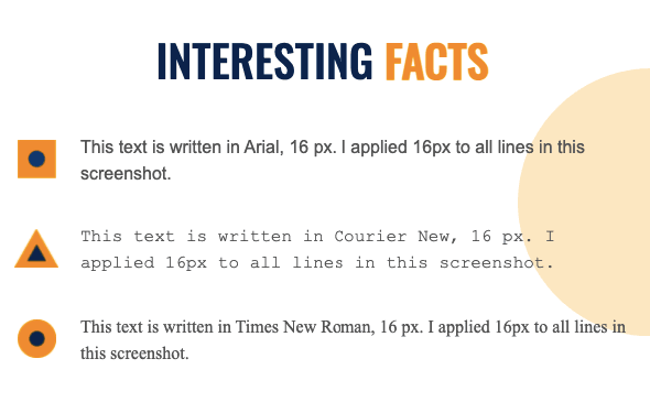
When it comes to legibility, fonts are divided into two categories: serif and sans serif. Fonts with a tiny line at the end of each character are known as serif fonts. Times New Roman and Georgia are the most common serif fonts.

Those fonts without a decorative line at the end of each symbol are known as sans serif fonts. Arial, Trebuchet MS, and Helvetica are the most popular sans-serif fonts safe for emails.
Various sources claim that serif fonts are best for emails. But the fact that emails are exclusively seen online on desktop or mobile displays, sans serif fonts are the best. On the screen, sans-serif characters are easier to read.
3. Choose fonts that align with the type of message
Which is the best font for emails? It greatly depends on the type of message you want to send. Although your brand style guide should provide a general direction, you can experiment a bit depending on the type of email campaign.
Do you have a flash sale? The best email font might be something big and bold. Are you making a big company announcement? Stick to something more traditional to ensure you don’t come across as unprofessional.
4. Choose an optimal email font size
Choosing the right email font size is almost equally as important as picking the right font. One powerful reason for that? Most people read emails on their mobile devices nowadays - a whopping 85%!
So, what is the best email font size? Stick to at least 14 pixels, or go for 16x if you want to play it safe. Of course, the font size will also depend on the amount of text in your emails - sometimes it’s okay to scale up or down a bit if it means your emails will look
Mobile clients account for 41.6% of email opens, followed by 40.6% for webmail and 16.2% for desktop. Isn't that a compelling argument to pay attention to this detail? Even if you have high-quality content, an unreadable email is likely to be deleted in under 3 seconds in more than 70% of cases. Instead of deleting, up to 15% of users will even go as far as opting to unsubscribe. Overall, that's an 85% reduction in potential mobile clients.
Too large fonts are also unappealing and sometimes even seem offensive. They give the feeling of someone shouting at you and, thus, are a big turn-off. If your audience consists of septuagenarians and octogenarians, you can increase the font size so they can read it without their glasses.
5. Use the rule of two for fonts and font styles
If you use too many fonts in your email, it will be difficult to read, and unpleasant to the eye. For one email, use only one or two fonts. Ideally, you'd only need to use one font in two sizes: one to highlight the heading and another for the body of your content.
Also, do not mix regular, bold, and italic font types in your emails. If you use more than two, your emails will appear cluttered. In most cases, one font style suffices. If you want to draw attention to something, use the bold font type, or simply go with a larger email font size.
Another question you might be wondering about is how to use custom font in email templates? This is usually possible, and fairly easy - all you need to do is upload/install the font to whichever program you’re using. Custom is always better. So, don’t miss out on creating a unique brand image, simply because you want to experiment with a creative email font.
6. Use contrast colors and keep the number of colors to minimum
Only employ the colors that are already part of your brand identity. If you want to use more than three colors in your email -don't. It will make the text illegible and the email messy. Use a bold font to highlight a single line or phrase instead of using a different color, which will make your email unclear.
If you're going to utilize bright colors, which many of us do around the holidays, make sure you choose contrasting colors. Red lettering should not be used over green buttons, and white should not be used over grey. For those with good eyesight, it may appear festive enough. Colorblind folks, however, may not be able to read it.
Good designers frequently choose black or dark grey for email content. It improves readability. The only exception is when the background is black. Then a white font should be used.
7. Perform A/B test with different fonts
Testing plays a vital role in email marketing. To choose the best font for email campaigns, it’s a good idea to preview your email in multiple environments. Also, if you're unsure which font to use, create an email with the identical content written in two different fonts. Send the first email to half of your list, and the second email to the other half. Then choose the email, and the respective font, with the highest open and click-through rates.
The top 10 fonts for emails (+ email banner templates)
There’s a world of amazing fonts out there. With our tips, you’ll certainly be able to find good email fonts for all your campaigns.
However, as a parting gift, here are 10 of the most popular email fonts that you might consider using. We're also sharing some cute email banner templates that pair perfectly with these fonts.
1. Arial
Arial is a popular sans serif font found in both print and digital media. The font is well-known for being adaptable, modest, and straightforward. Arial is frequently used, so it should be avoided if you want to stand out.

2. Helvetica
Helvetica is ideal for headlines and logos but not for the body of an email. Longer texts are difficult to read since the letters are close together.

3. Georgia
Georgia is a serif font created by Microsoft and is extensively used in newspapers and periodicals. Because of its widespread use, the font has gained a reputation for being authoritative and formal. Because of the well-defined serifs and wide-spaced letters, Georgia is an excellent choice for longer email content.

4. Trebuchet MS
Released in 1996, Trebuchet MS has become one of the most well-known web-safe fonts. It has neat tiny flicks at the beginnings and ends of letters that serve as readability guidelines without detracting too much from the letter's major features, as complete serifs do.

5. Times New Roman
This serif font was created by the Times newspaper and is one of the most popular font types of all time. It’s a font known for being authoritative, traditional, and classic. We recommend using it only for headlines because the narrow letters make reading hefty sentences difficult.

6. Oswald
This elegant, condensed font should be used in larger sizes to ensure readability. However, it can be one of the best font for email headings, as it allows you to fit more text in within a single line.

7. Lato
A crisp, geometric font like Lato will provide great readability and a clean and polished look for your emails. It can be one of the best font for emails with a very colorful design, as simple lettering won’t make the email overwhelming.

8. Merriweather
If you want something classy and timeless, Merriweather is a great font for emails. It comes in many different variations, so it’s truly versatile. It can also be one of the best email signature fonts, since the relatively wide letters will look good in smaller sizes as well. And thanks to its classic look, your name is sure to make an impact!

9. Verdana
This is one of the most popular web fonts, as it was designed with a screen display in mind. It’s a crisp sans serif, with generous spacing between the letters. So it’s definitely one of the best fonts on the list to use for text-heavy emails.

10. Courier New
If you’re looking for a retro font that still looks great in email design, this one is a strong contender. It looks a bit like typewriter lettering, so it’s a great idea to use it for longer email newsletters - some nostalgic folks (or hipsters!) could feel like they’re reading a personal typewritten letter.

A wrap up:
When sending email communications to prospects and consumers, using just any font will not suffice. In fact, choosing the wrong font might have a detrimental impact on your conversion rate. As a result, the fonts you choose should be email-safe, provide an excellent first impression, and be easy to read. With the 7 tips we’ve provided, you will now make informed decisions and pick the perfect fonts for your upcoming email campaign. If you’re seeking solutions or services in graphic design, ManyPixels can be your one-stop design solution partner for emails, marketing collaterals, web design, social media graphics, and illustrations.
{{GENERAL_PORTFOLIO="/dev/components"}}
Discover an array of captivating voices and expert insights as our guest writers grace the pages of the Manypixels blog. From seasoned industry veterans to emerging talents, their thought-provoking articles will inspire and inform, enriching your reading experience.

Top-quality designers
A complete creative team at your fingertips: graphic and web designers, illustrators, and more.

Lightning-fast turnaround
Get start today and receive your first update on the next business day.

All-inclusive pricing
Unlimited requests and revisions. One flat monthly fee. No surprises.

Flexible & scalable model
No contract. Scale up and down as needed. Pause or cancel at anytime.
Continue reading


Explore some of our best designs
Get inspired by a curated selection of ManyPixels work. Download the portfolio to see what our team can create.


