

Logo Design Trends 2026: What Comes Next?
.jpg)
TABLE OF CONTENTS


Logos are no longer static symbols that sit quietly in a header or footer. They now live inside apps, dashboards, packaging, motion systems, and social feeds. As brands plan for the next few years, interest in logo design continues to rise, with logo design trends 2025 often serving as shorthand for a bigger question: what will actually define brand identity in 2026?
So, what are the latest trends in logo design as we move forward? The answer is not a single style or visual trick. The next generation of branding is shaped by flexibility, personality, and intent. Logo design trends 2025 were a signal. What follows is a clearer picture of where brand identity is actually heading.
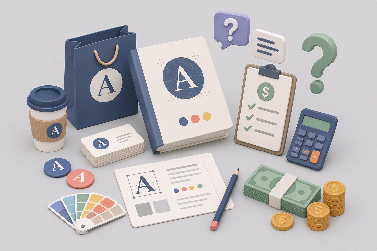
{{LOGOS_PORTFOLIO="/dev/components"}}
Logos Are Becoming Systems, Not Symbols
One of the most important trends in logo design has little to do with aesthetics. Logos are no longer designed as single, fixed marks. They are built as systems that adapt across platforms, formats, and environments.
Google remains the clearest example of this approach. Its core “G” mark flexes across products, motion states, and screen sizes while remaining instantly recognizable. The logo behaves differently in Search, Android, Chrome, and Workspace, yet the underlying visual identity stays consistent. This is not accidental. It is system thinking applied to branding.
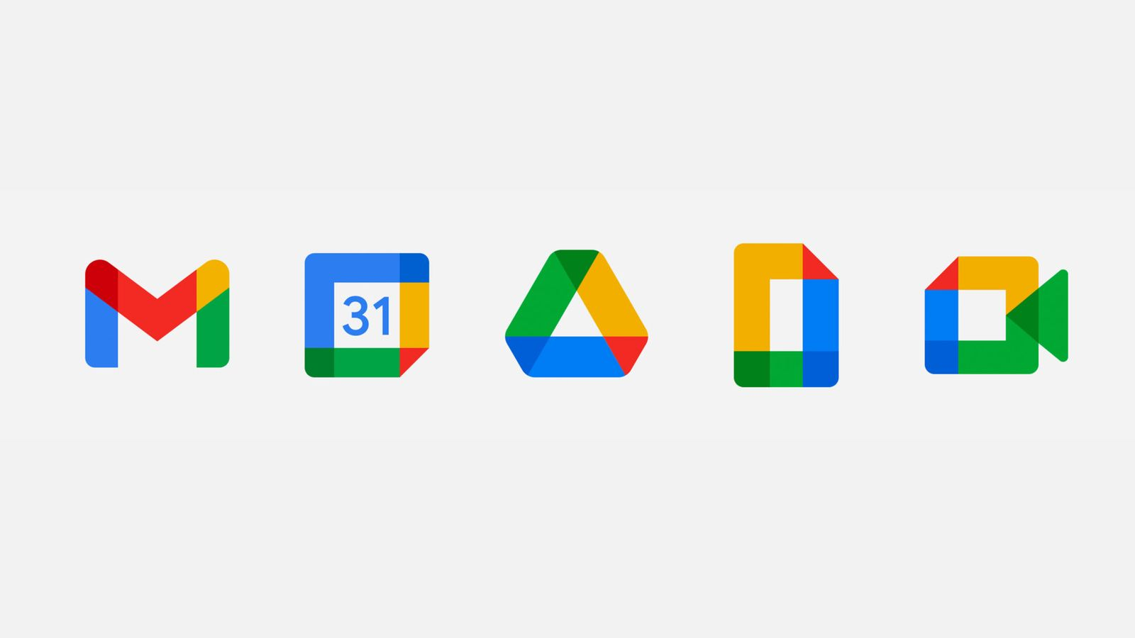
In 2026, this approach will be the baseline for all logo design trends. They must work inside interfaces, animations, icons, and micro-interactions. Designers are defining behavior, not just shapes. This shift is deeply tied to digital design, where consistency matters more than repetition. Brands that fail to think system-first risk creating logos that collapse outside of ideal conditions.
Minimalist Logos, Refined and Humanized
Minimalism is not disappearing, but it is changing. The hyper-sterile look that dominated the late 2010s is being replaced by something warmer and more expressive. Minimalist logos are still built on clean lines, but they now include subtle decisions that add personality.
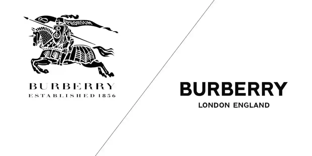
Burberry’s recent direction illustrates this shift clearly. After embracing extreme minimalism in 2018, the brand has gradually reintroduced heritage typography and expressive detailing. The result feels confident rather than clinical. It shows how brands are learning that simplicity does not have to mean neutrality.
These refinements are often subtle. Slightly rounded corners, optical spacing adjustments, or warmer background tones can transform how a logo feels. In 2026, minimalism will remain dominant, but it will feel more human. Brands are no longer trying to disappear. They are trying to connect.
Typography Is Doing the Heavy Lifting
Another defining logo trend for 2026 is the rise of typography as the primary brand signal. Icons are becoming secondary, while wordmarks take center stage.
Dropbox is a strong example. Its identity relies heavily on custom typography rather than a dominant symbol. The logo works because the typeface itself carries personality and flexibility. It scales across products, marketing, and interface design without losing clarity.
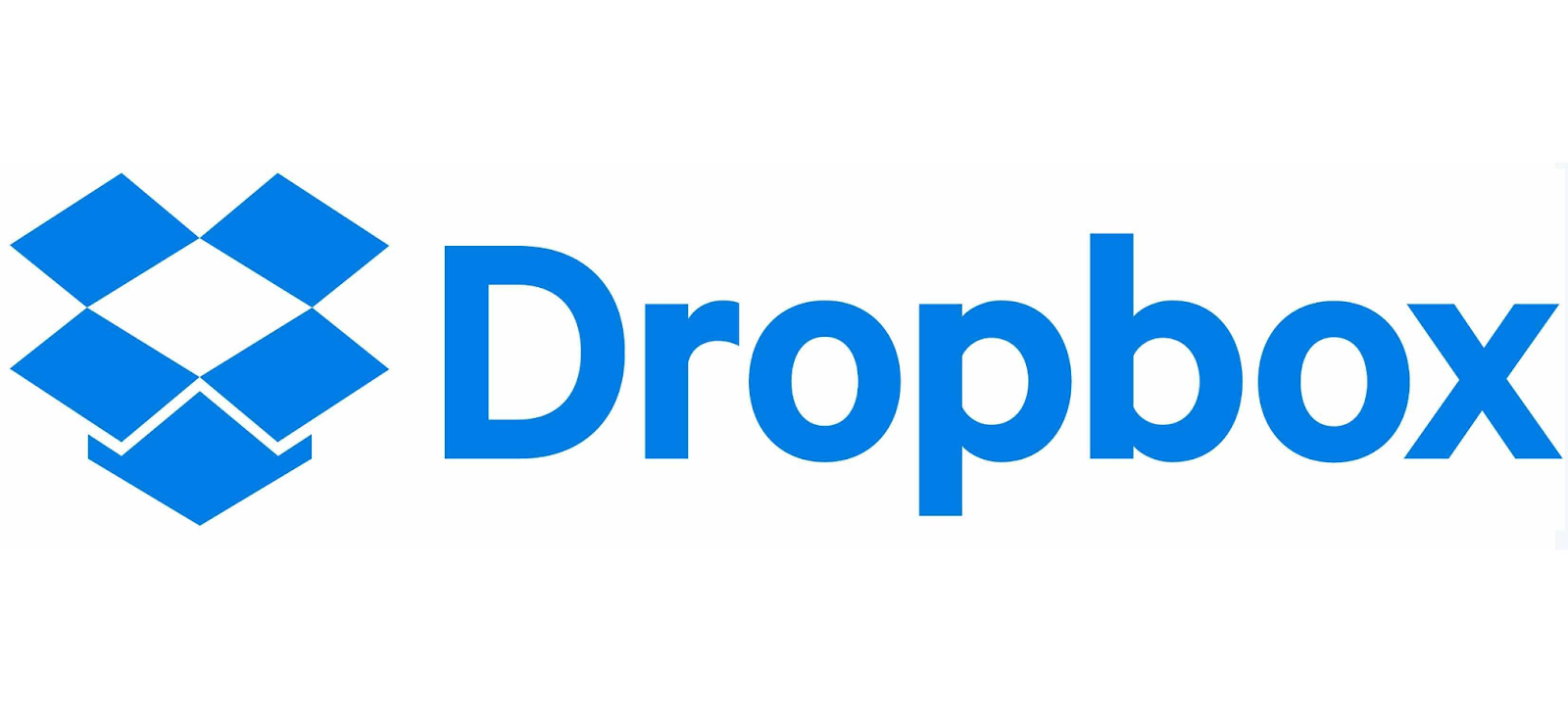
Most of these systems are built on sans serif foundations, but they are far from generic. Letters stretch, compress, and adapt across layouts. This is where variable fonts play a critical role. A single type system can behave differently across contexts while maintaining cohesion.
Typography-led branding is becoming central to graphic design, brand identity, and a lot more. In 2026, more brands will invest in custom type as a strategic asset, not a decorative choice.
Color Palettes That Do Real Work
Color is no longer an afterthought. In 2026, strong color palettes are doing more than decorating logos. They are carrying recognition and emotional weight.
Spotify demonstrates this better than almost any brand. Its logo is structurally simple, but the consistent use of green across products and campaigns makes it instantly recognizable. The color system does the heavy lifting, allowing the logo itself to remain restrained.
This approach reflects a broader shift. Brands are choosing fewer colors and using them more deliberately. High contrast, accessibility, and adaptability across light and dark environments matter more than novelty. Color helps logos capture attention without relying on complexity.
Gradients and depth are returning, but with control. The goal is richness, not noise. In 2026, color will be used with confidence and intention, helping brands create a visually strong presence across digital and physical spaces.
Restraint as a Competitive Advantage
As more brands adopt bold visuals, another shift is happening quietly in parallel. Some of the strongest identities heading into 2026 are doing less, not more. In crowded markets, restraint is becoming a strategic choice rather than a limitation.
This shows up in logos that rely on proportion, spacing, and balance instead of decoration. The mark itself may appear simple at first glance, but it is supported by a disciplined system that knows when not to speak. This kind of confidence is difficult to fake and easy to recognize.
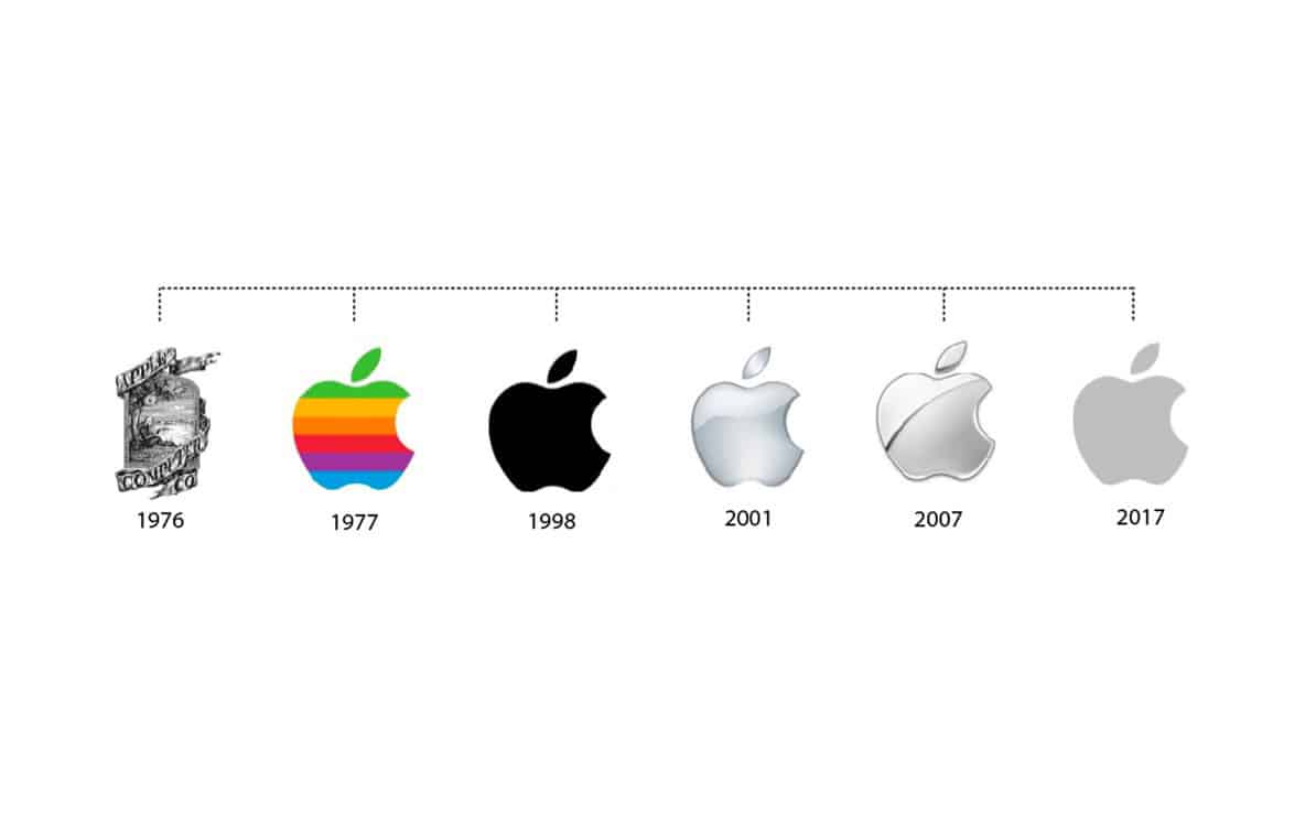
Brands like Apple demonstrate this well. Their logo has not changed dramatically because it doesn’t need to. The surrounding visual identity carries nuance through layout, photography, and tone, allowing the logo to remain calm and consistent. In an environment where many brands fight to capture attention through visual noise, restraint becomes memorable.
Hand-Drawn Elements and Imperfection
As automation becomes more visible, including an increasing amount of AI generated design work, imperfection becomes more valuable.
Mailchimp’s identity is a strong example. While the wordmark itself is clean, the surrounding brand system incorporates illustration, uneven lines, and playful visual elements. These hand drawn elements introduce warmth and approachability without sacrificing clarity.
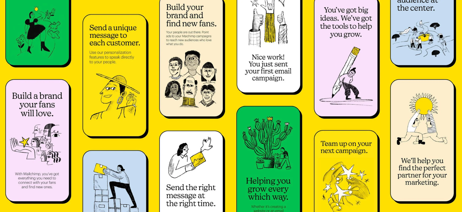
This approach is spreading beyond creative industries. Brands are intentionally adding small imperfections to signal authenticity. Rough edges, organic shapes, or illustrative sub-marks create contrast against polished digital environments.
In 2026, brands that feel overly perfect will struggle to earn trust. Controlled imperfection adds character and reinforces a human touch that audiences respond to.
Eco-Conscious Design Without Visual Clichés
Sustainability is no longer a differentiator. It is an expectation. As a result, eco conscious logo design is becoming quieter and more disciplined.
Patagonia is a long-standing example of this mindset. Its logo has remained largely unchanged for decades, and that consistency is part of the message. The brand communicates responsibility through restraint, durability, and long-term thinking rather than trend-driven visuals.
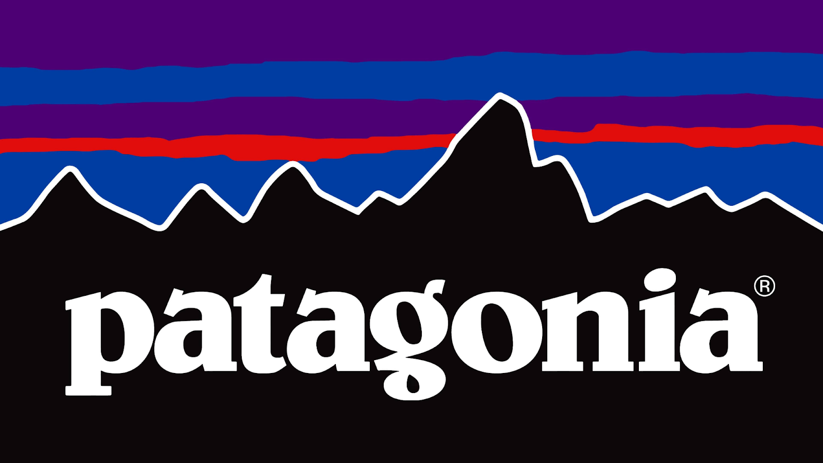
In 2026, sustainable branding will rely on timeless construction and clarity. Earth-toned palettes, simple forms, and durable typography will signal values without leaning on obvious symbols. This approach supports longevity and reduces the pressure for constant redesign.
Eco-conscious logos will feel confident and calm, designed to last rather than impress in the short term.
Motion as a Built-In Expectation
Logos are no longer static by default. Motion is becoming a core component of brand expression.
Airbnb’s identity shows how this works in practice. The “Bélo” symbol is designed to animate smoothly across digital touchpoints, from app loading states to marketing content. Motion reinforces recognition rather than distracting from it.

In 2026, logos will be designed with motion rules from the start. Subtle animation helps logos feel alive and relevant in interface-driven environments. It also helps brands capture attention without relying on visual excess.
Motion is not about spectacle. It is about reinforcing identity through behavior.
Logos That Prioritize Distinctive Micro-Details
As branding becomes more system-driven, another counter-trend is emerging: logos that hinge on a single, distinctive micro-decision. Instead of relying on complexity, these marks use one intentional twist to create memorability.
This might be an unexpected cut in a letterform, a subtle asymmetry, or a custom detail that only reveals itself over time. The logo remains simple, but it is no longer generic. That small deviation becomes the brand’s signature.
Pepsi’s most recent logo update is a strong example. On the surface, the mark looks familiar. But the proportions, spacing, and type treatment have been carefully adjusted to feel bolder, more confident, and more contemporary. The logo does not shout. It signals clarity through refinement.
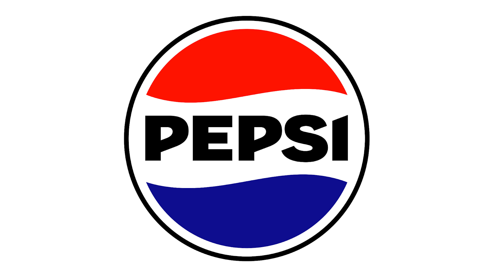
In 2026, this approach will become more common. As more brands adopt clean systems and flexible identities, distinctiveness will come from restraint plus one defining choice. The logos that stand out will not be the loudest, but the most considered.
Turning Trends Into Actual Logos
Talking about 2026 logo design trends is useful. Making them work in practice is harder.
That’s where ManyPixels comes in. Their logo design work focuses on getting the fundamentals right: proportion, typography, scalability, and consistency. Instead of treating a logo as a one-off deliverable, they design in a way that can live across websites, products, social media, and future brand extensions.
ManyPixels works with startups, growing teams, and established brands, whether they’re creating a logo from scratch or refreshing an existing one. That can mean refining proportions, adjusting typography, or updating how a logo behaves across digital environments.
Best of all? The flat-fee service offers unlimited requests and revisions, so you don't only get the logo of your dreams, but a complete brand guide, together with marketing materials, web design, and more!
If you’re planning a logo with 2026 in mind, that kind of practical thinking matters more than chasing trends.

Zach is a content and SEO strategist with an affinity for cars, tech, and animals. He runs a SaaS content agency, and when he's not typing, he runs his small-scale farm at home.

Top-quality designers
A complete creative team at your fingertips: graphic and web designers, illustrators, and more.

Lightning-fast turnaround
Get start today and receive your first update on the next business day.

All-inclusive pricing
Unlimited requests and revisions. One flat monthly fee. No surprises.

Flexible & scalable model
No contract. Scale up and down as needed. Pause or cancel at anytime.
Continue reading

Explore some of our best designs
Get inspired by a curated selection of ManyPixels work. Download the portfolio to see what our team can create.


