
How to audit your brand visuals (and what to fix first)
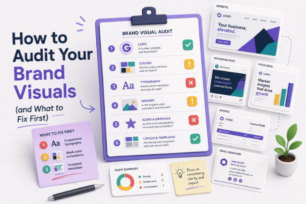
TABLE OF CONTENTS

TL;DR
A brand visual audit is a channel-by-channel check of every place your logo, colors, fonts, and imagery show up, scored against one source of truth. Run it in a single sitting by screenshotting every touchpoint into one board. Then fix in order: logo and color first (they carry most of your recognition), typography and imagery second, templates last. Most audits stall because teams try to fix everything at once. Don't. Consistency beats polish.
Introduction
Your logo looks slightly different on your website than it does on LinkedIn. Your invoices use a font nobody chose. Three people have made "on-brand" social graphics this quarter and no two of them match. None of this is a crisis on its own. Together, it quietly makes your brand look smaller and less trustworthy than it is.
Companies with consistent brand presentation see revenue lifts of roughly 10 to 20%, and some studies put the ceiling near 33%, according to Marq's (formerly Lucidpress) brand consistency research. That gap is not about better design. It's about the same design showing up the same way everywhere.
This guide walks through how to audit your brand visuals without hiring a consultant or booking a three-week project. You'll learn what to look at, how to run the whole thing in an afternoon, and, most importantly, what to fix first so the work actually moves the needle.
What is a brand visual audit?
A brand visual audit is a structured review of how your brand looks across every channel, comparing what's actually published against your brand guidelines. It covers your logo, color palette, typography, imagery, icons, and templates, and flags every place they drift, break, or contradict each other.
Think of it as a brand checkup rather than a rebrand. You're not redesigning anything. You're finding out where reality has quietly wandered off from the plan. A good audit spans everything from your website and pitch decks down to your email signatures, invoices, and the odd one-off flyer someone made in a hurry, as Frontify's brand audit guide lays out.
The output isn't an opinion piece about whether your brand "feels right." It's a list: here's what's inconsistent, here's how bad it is, here's what to do about it. That list is the whole point.
Worth knowing: a visual audit is different from a full brand audit. A full brand audit also looks at positioning, messaging, and market perception. This guide stays in the visual lane, because that's where most of the quick, high-impact fixes actually live.
Why your brand visuals drift out of sync
Brand visuals drift because more people touch them over time, and most of those people don't have the source files or the rules. Growth, not carelessness, is usually the cause. The more channels and contributors you add, the more copies of "your logo" and "your blue" end up floating around.
Here's the thing: this is normal, and it's worth naming the real culprits so the audit tells you something useful.
- The Canva free-for-all. Anyone can make a graphic now with Canva and similar tools, which is great for speed and terrible for consistency. Free templates come with their own fonts and colors, and those sneak in fast.
- No single source of truth. If your brand colors live in someone's head or a two-year-old PDF, people guess. Guessed HEX codes are how you end up with four slightly different blues.
- Freelancer and vendor handoffs. Every contractor rebuilds your look from whatever assets they were handed, which is rarely the complete set.
- Platform defaults. Social tools, email builders, and slide software all impose their own fonts and crops unless you actively override them.
At ManyPixels, the single most common cleanup we see in incoming requests isn't bad design. It's brand fragmentation: a company sends us "the logo" and it turns out they have five versions, and no one is sure which is current. If that sounds familiar, the audit below is for you.
{{LOGOS_PORTFOLIO="/dev/components"}}
What to actually look at: the 6 visual elements
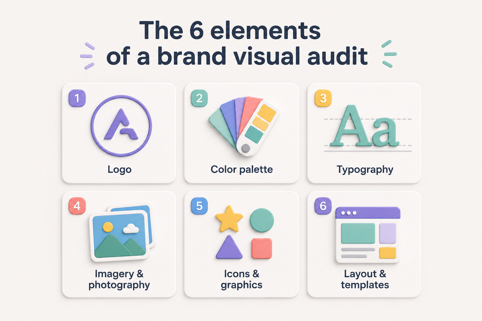
A complete brand visual audit checks six elements everywhere they appear: logo, color, typography, imagery, icons and graphics, and layout templates. Score each one as consistent, drifting, or broken across your top channels. Everything else is a subset of these six.
Go through them in this order. It's roughly the order of how much each one drives recognition.
1. Logo
Check that the correct, high-resolution logo is used everywhere, with no stretched, pixelated, recolored, or outdated versions. Confirm you have the right file for each context: a full-color version, a one-color version, and a version that survives being shrunk to a 16px favicon. If you're unsure which logo colors and file formats you should even have, that's finding number one.
See a list of 10 common logo design mistakes here.
2. Color palette
Pull the exact HEX (and where relevant, RGB, CMYK, and Pantone) codes from your guidelines, then check them against what's live. Sampling colors from your own website and social graphics with a color picker is the fastest way to catch drift. While you're there, check that your text and background combinations meet WCAG 2.2 contrast requirements, because an on-brand color that no one can read is still a problem.
3. Typography
You should be using a defined set of two or three fonts across all headings, subheads, and body copy. Count how many typefaces actually appear across your website, decks, and social. If it's more than three, you've found a fix. Watch especially for platform default fonts creeping into emails and slides.
4. Imagery and photography
Look at whether your photos, illustrations, and graphics share a cohesive look: same treatment, same mood, same level of polish. A brand that mixes stock photos, hand-drawn illustrations, and iPhone snapshots with no through-line reads as inconsistent even when every individual asset is fine.
5. Icons and graphics
Check that icons share one style (all outline or all filled, same weight, same corner radius) rather than being pulled from five different icon packs. Same goes for recurring graphic elements like patterns, shapes, and dividers.
6. Layout and templates
Finally, look at how elements are arranged: spacing, alignment, where the logo sits, how much room things get to breathe. This is the element to fix last, but it's what ties a set of consistent parts into a consistent system.
How to run the audit in one sitting
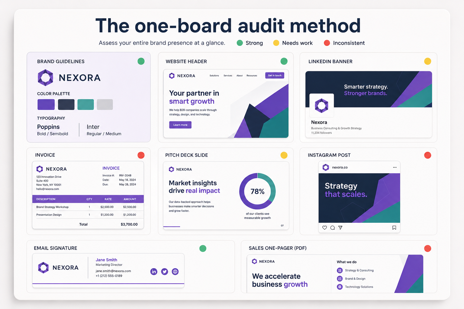
The fastest way to audit your brand visuals is to screenshot every touchpoint into a single board, then compare them side by side against your guidelines. Seeing everything in one view is what makes inconsistencies obvious. Reviewing channels one at a time hides them.
Here's what we'd do, start to finish, in about two hours:
- List every touchpoint first. Website, each social profile, email signature, newsletter template, pitch deck, one-pager, invoice, ad creative, business cards. If a customer can see it, it counts. A channel inventory like the ones in Smartsheet's brand audit templates keeps you from missing the boring-but-visible stuff like forms and receipts.
- Screenshot everything into one place. One slide deck, one Figma board, or one folder. Don't judge yet, just capture.
- Put your guidelines on the first slide. Logo files, HEX codes, fonts. This is your answer key.
- Score each element red, yellow, or green. Green is on-brand, yellow is drifting, red is broken or off-brand. Now the picture is undeniable.
- Tally the reds by element. The element with the most reds is usually where you start, unless a single broken logo outranks it.
One honest flag: if you don't have brand guidelines to audit against, the audit becomes a slightly different job. You're documenting what your brand should be as you go, then applying it. That's still worth doing, and often it's the real deliverable. Our guide to creating brand guidelines covers what that document needs to include.
What to fix first: the priority order
Fix your brand visuals in this order: logo and color first, typography and imagery second, templates last. Logo and color carry the majority of brand recognition, so correcting them delivers the most visible consistency for the least effort. Save layout systems for after the individual elements are settled.
This is the part most guides skip, and it's the whole reason audits succeed or die. You will find more problems than you can fix this month. The order you tackle them in decides whether anyone notices the improvement.
If you fix one thing, fix the logo. A wrong, stretched, or low-res logo is the single most damaging inconsistency because it's the element people recognize first. Get one clean set of logo files (full color, single color, favicon-sized) into everyone's hands and replace every bad instance. This alone makes a brand look more put-together.
If the logo is already clean, fix color. Lock the exact HEX codes into one shared place and correct the biggest offenders: your website, your primary social channels, your most-used template. Color drift is subtle per instance but adds up fast across a feed.
If logo and color are handled, fix typography and imagery. Standardize to your two or three fonts and bring your imagery under one visual treatment. These matter, but they're less immediately recognizable than a wrong logo or an off blue.
Fix templates last. Once the individual elements are correct, build them into locked templates for your recurring formats: social posts, decks, one-pagers. Templates are how you stop the drift from coming back, which is why they come after, not before, the elements are right.
Bottomline: sequence by visibility, not by how easy each fix is. The most-seen, most-recognized elements come first.
Common problems and what they signal
The specific inconsistencies you find usually point to a specific root cause, which tells you how to stop them recurring. Fixing the instance is cleanup. Fixing the cause is the actual win.
- Blurry or stretched logos signal that people don't have the vector or high-res files. Fix: distribute a proper logo pack, not a PNG someone lifted off the website.
- Four slightly different blues signal that your HEX codes aren't written down anywhere central. Fix: one shared palette card everyone can copy from.
- Five or more fonts in the wild signal platform defaults winning by inattention. Fix: set brand fonts as defaults in your email, social, and slide tools.
- Imagery that doesn't match signals no agreed photo or illustration style. Fix: a short visual reference of "yes this, not that."
- Every graphic looks handmade and different signals no templates. Fix: locked templates for your top three recurring formats.
How often should you audit your brand visuals?
Run a full brand visual audit once a year, plus a quick 10-minute check after any major change: a rebrand, a website redesign, a new campaign, or onboarding a new agency or freelancer. Brands drift gradually, so an annual cadence catches slow slippage before it becomes embarrassing.
Between full audits, the cheapest insurance is a shared, current source of truth. If everyone making visuals is pulling from the same guidelines and templates, drift slows to a trickle and your yearly audit turns up green far more often than red.
Turning audit findings into fixes
An audit produces a to-do list, and that list is only useful if someone actually works through it. For a lot of teams, the problem was never spotting the inconsistencies. It's having the design capacity to fix a backlog of them without pausing everything else.
This is where an on-demand design partner fits neatly. If your audit surfaced a logo pack that needs rebuilding, thirty social templates that are off-palette, and a pitch deck that needs realigning, that's a steady stream of well-defined design work. A service like ManyPixels gives you a dedicated designer who can churn through audit fixes and then stay on to keep new work consistent, so the drift doesn't just creep back in six months later. It handles both halves of the job: clearing the backlog and maintaining the standard afterward.
ManyPixels has truly been a huge help for us. Managing a wide range of creative tasks can get overwhelming, but they’ve handled everything we’ve thrown at them without missing a beat. The team maintains our brand standards consistently and delivers strong support across the board. - Ava Stavridis, Manager @Sleep Solutions
Explore ManyPixels pricing plans or book a free consultation to learn more about how we work.
Frequently asked questions
Bottom line
Auditing your brand visuals isn't complicated, but it does reward discipline: capture every touchpoint in one view, score it honestly against your guidelines, and resist the urge to fix everything at once. Start with the logo, then color, and let templates come last. That order is what turns a long list of small inconsistencies into a brand that finally looks like one brand.
If the audit leaves you with a backlog and no one to work through it, that's a solvable problem. Explore ManyPixels plans to see how a dedicated designer can clear the fixes and keep things consistent afterward.
{{BRAND_BANNER="/dev/components"}}

Having lived and studied in London and Berlin, I'm back in native Serbia, working remotely and writing short stories and plays in my free time. With previous experience in the nonprofit sector, I'm currently writing about the universal language of good graphic design. I make mix CDs and my playlists are almost exclusively 1960s.

Top-quality designers
A complete creative team at your fingertips: graphic and web designers, illustrators, and more.

Lightning-fast turnaround
Get start today and receive your first update on the next business day.

All-inclusive pricing
Unlimited requests and revisions. One flat monthly fee. No surprises.

Flexible & scalable model
No contract. Scale up and down as needed. Pause or cancel at anytime.
Continue reading

Explore some of our best designs
Get inspired by a curated selection of ManyPixels work. Download the portfolio to see what our team can create.








