
10 Basic Principles of Design Everyone Should Know
.avif)
TABLE OF CONTENTS


Graphic design is pretty much everywhere. Whether you are a small business owner, working in a startup, or a member of a marketing team, you probably need design every day. Learning about these basic principles of design will help you give better briefings and feedback, and even vet designers more easily!
On the other hand, if you’re a self-taught graphic designer, you probably have some basic knowledge. But what are the principles of design that you absolutely must follow to deliver high-quality results?
We’ll explain each of them in more detail.
{{GRAPHIC_BANNER="/dev/components"}}
Balance
There are two types of visual balance in graphic design: asymmetrical balance and symmetrical balance.
The principle of balance in design exists to create a sense of stability and structure. Every design element has its weight, so the designer has to create a sense of balance between them. It's important to know that weight doesn't equal size. For example, a small red circle can have more weight than a big white circle. Balance depends on several factors, such as the design elements, the layout, and the purpose of the design.
Balance can be either symmetrical or asymmetrical. Symmetrical balance is when the weight of all the elements is evenly divided into both sides of the design (left and right, up and down, diagonally), whereas asymmetrical uses scale, color, and contrast.

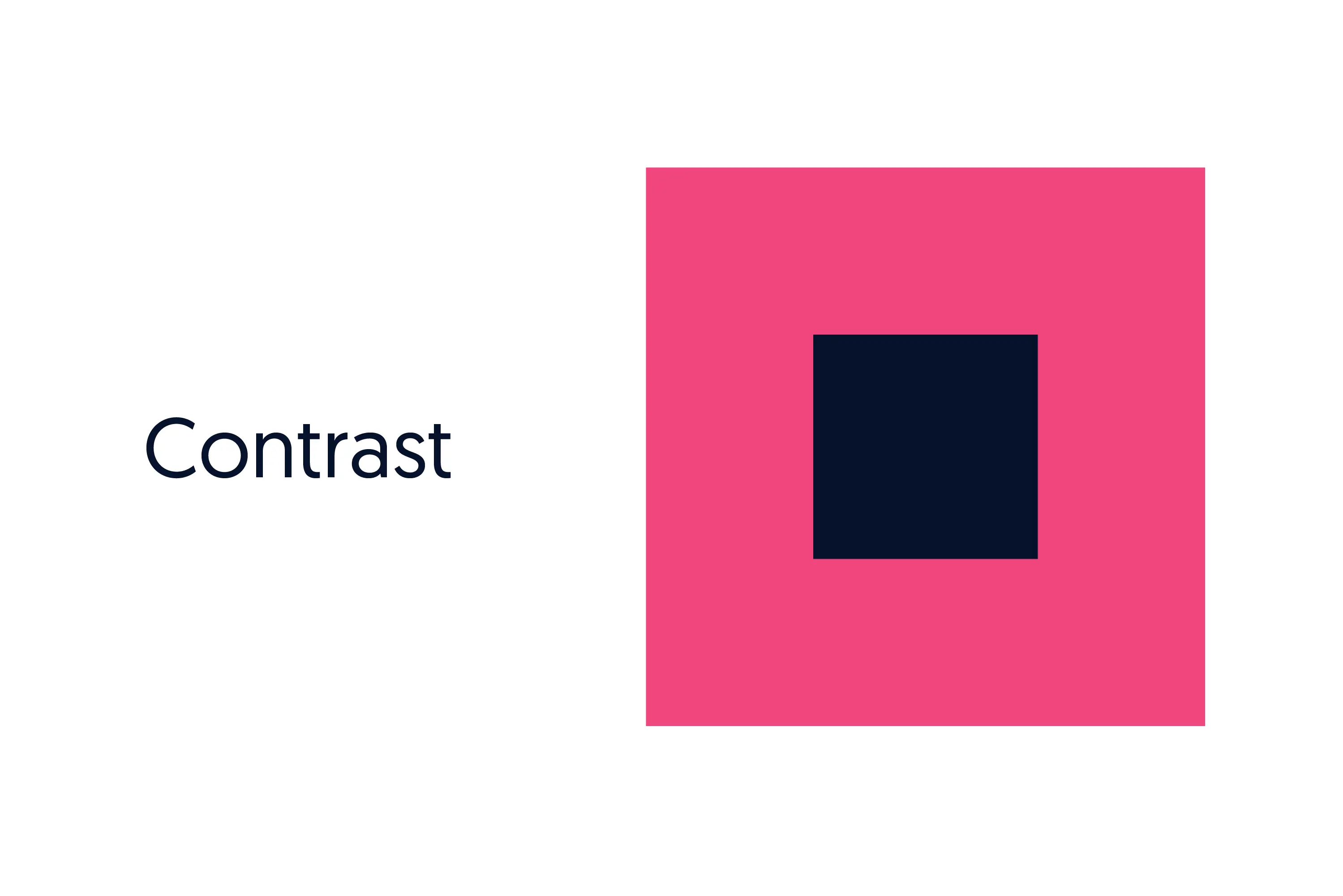
Contrast
The contrast principle in design creates a drastic difference between the two opposing design elements. It can be achieved with color: opposing elements in dark or cold colors versus strong, warm, and light elements.
Although some other principles (balance, hierarchy) are also fundamental principles in art, contrast is perhaps the most critical one in graphic design.
Unlike art, graphic design always needs to fulfill a specific purpose, and contrast is often the tool by which this is achieved.
Contrast also helps guide the eye of the viewer to the most important elements. For example, CTA buttons on websites are usually created in a different color so viewers can spot them easily.
As of late, designers often create high contrasts by playing with different styles, like contemporary versus old-fashioned, smooth versus rippled texture, etc. It's another clever hack to help your brand identity become distinctive.
Visual hierarchy
Hierarchy is a design principle that means arranging elements in a certain structure so that the viewer can absorb the information in a simple and comprehensive manner.
A graphic designer knows how to accentuate one element over another and dictate the visual focus and natural movement, leading the viewer's eye to the centerpiece.
They can achieve this either by putting extra visual weight on the critical elements with a different color, texture or putting them closer. Perhaps even by using completely different typography to help viewers focus on what they need to read or see.
This is an especially vital principle of design when creating landing pages. Using different types of visual elements, such as shapes, typography and color, designers are able to guide users through the page and get them to take action.

Negative space
The space that is left blank is called negative or white space. It is the area between or around the elements.
If used creatively and effectively, it can create a shape around the elements (e.g., the hidden Arrow in the FedEx logo) or highlight parts of a design. It also gives some space to the design to breathe and help the viewer know what to focus on. It's crucial to add white space to the focal point of any design.
It's also one of the most vital principles in digital design in general, and specifically web design. Negative space allows users to take in vital information or absorb the general feeling.
Non-designers often think that a successful design is one where every pixel is used. But with too much going on, designs will always look oversaturated and fails to fulfill their intended purpose.

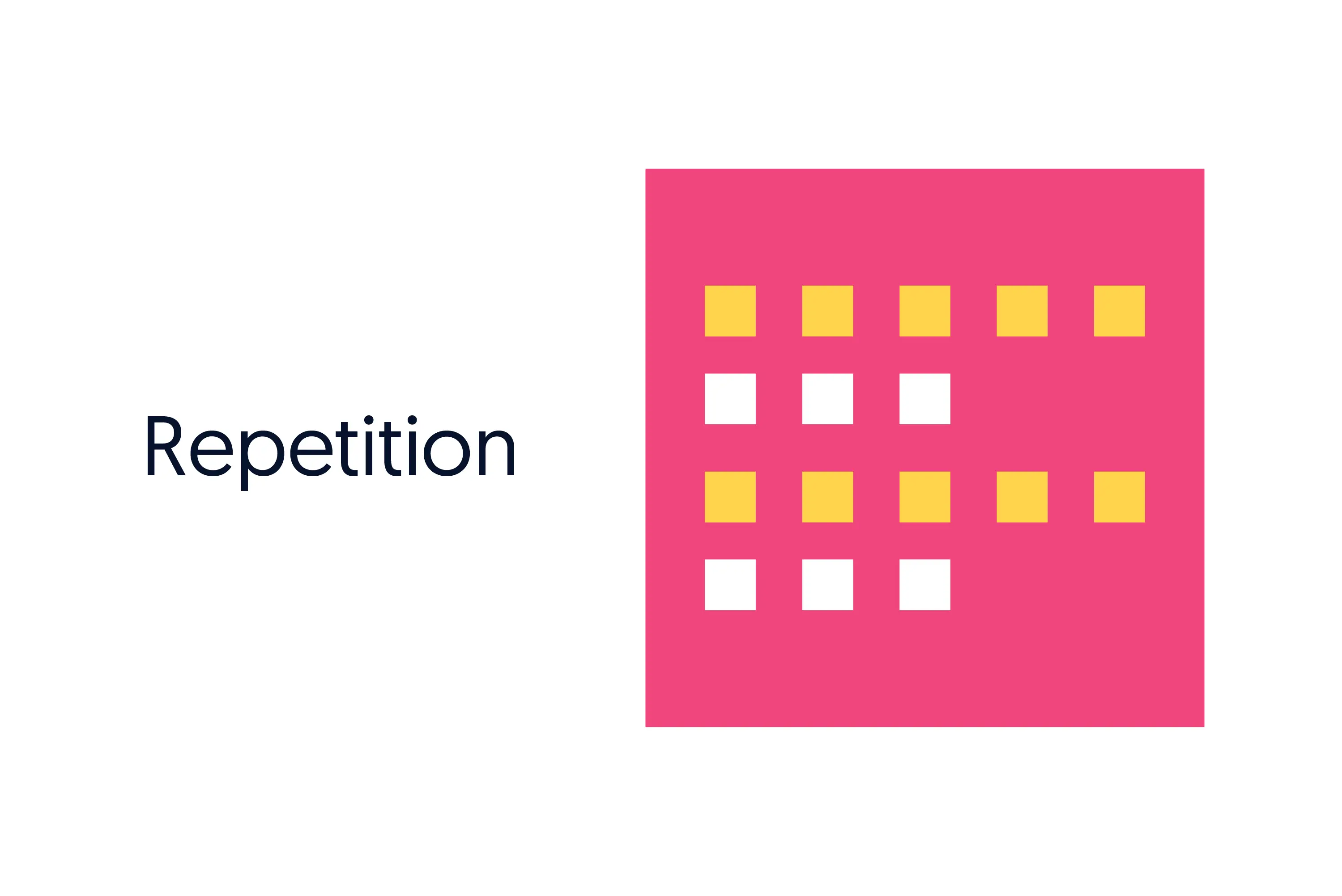
Pattern
Pattern is the regular repetition of design elements in a specific way. It's different from repetition (see below), as repetition doesn't always create a pattern. Patterns always exist as an independent component, although they should fit together with the entire design.
Non-designers should be careful when using patterns as these can often make designs look too busy or jeopardize user-friendliness. However, patterns can add much visual interest and create a unique look and feel if used correctly.
Pattern is definitely more popular in print, rather than digital design. Since it often includes just a couple of colors, it can be a great addition to business cards, flyers, and all sorts of merchandise.

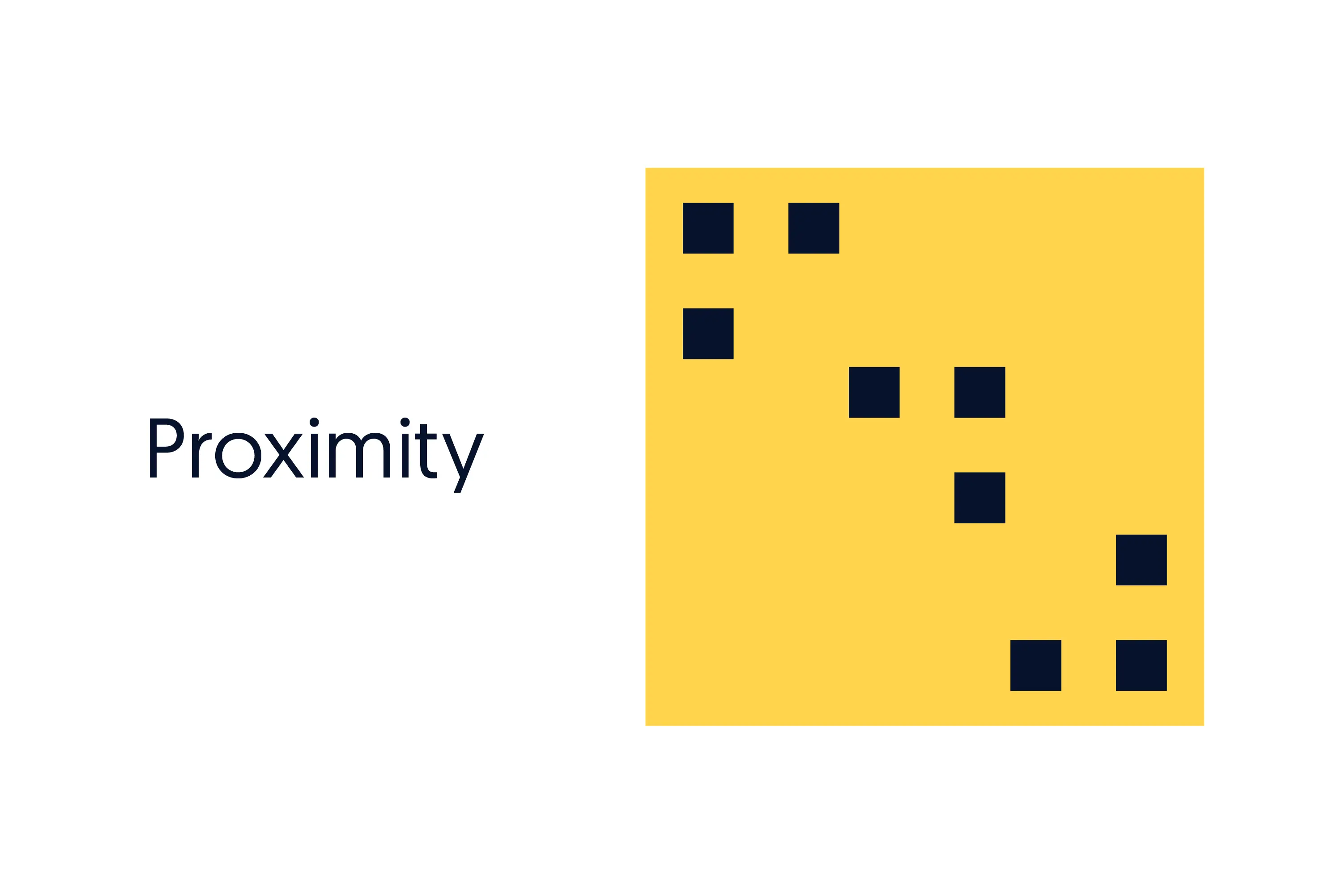
Proximity
Proximity, or visual closeness between two objects, is achieved when the designer aligns elements so that the eye can perceive a connection or distance between them.
Proximity is mainly focused on the relationship between the elements. It can be achieved with different colors and textures, shapes, movement of lines, different scales, etc.
It’s one principle of design that many non-designers overlook. However, changing the proximity between the elements can significantly impact the overall look. It can be especially important with balancing out different elements of a logo design.
Repetition
Repetition is a movement principle in design that means the repeated use of design elements such as colors, shapes, lines, etc. It is significant for branding design since it helps viewers learn and remember the visual language and symbolism.
With the consistent use of colors, logos, symbols, imagery, and messaging, graphic design helps audiences recognize branding images and advertisements. In the long run, this leads to creating a brand image (how audiences perceive a brand) and builds brand recognition and loyalty.
Variety
Variety means adding elements that jump out of the image at you or are visually striking to ensure a design isn't monotonous and boring.
It might seem the complete opposite of balance and repetition, but adding unique and unseen elements in the design will keep the looks of a brand fresh and never boring.
Even corporate brands that have a decades-long history of enforcing the same branding and marketing image add new symbols, colors, and imagery once in a while. Launching a new product could be an excellent opportunity to experiment a bit and add more variety to your brand image (e.g., the black can of Coke Zero).
Emphasis
Emphasis is achieved when adding extra visual weight to a design's most crucial element or message. It can be done by using various techniques: using large elements, larger or bolder fonts to highlight the title, putting the most important message higher or in front of the other elements, adding a hot color in a generally colder design, etc.
So you may be wondering what exactly the difference between emphasis and contrast is?
Simply put, while contrast often creates emphasis, it's not exclusively the case. A great example of emphasis made without stark contrast is underlined text. Or placing something in the center of the design.

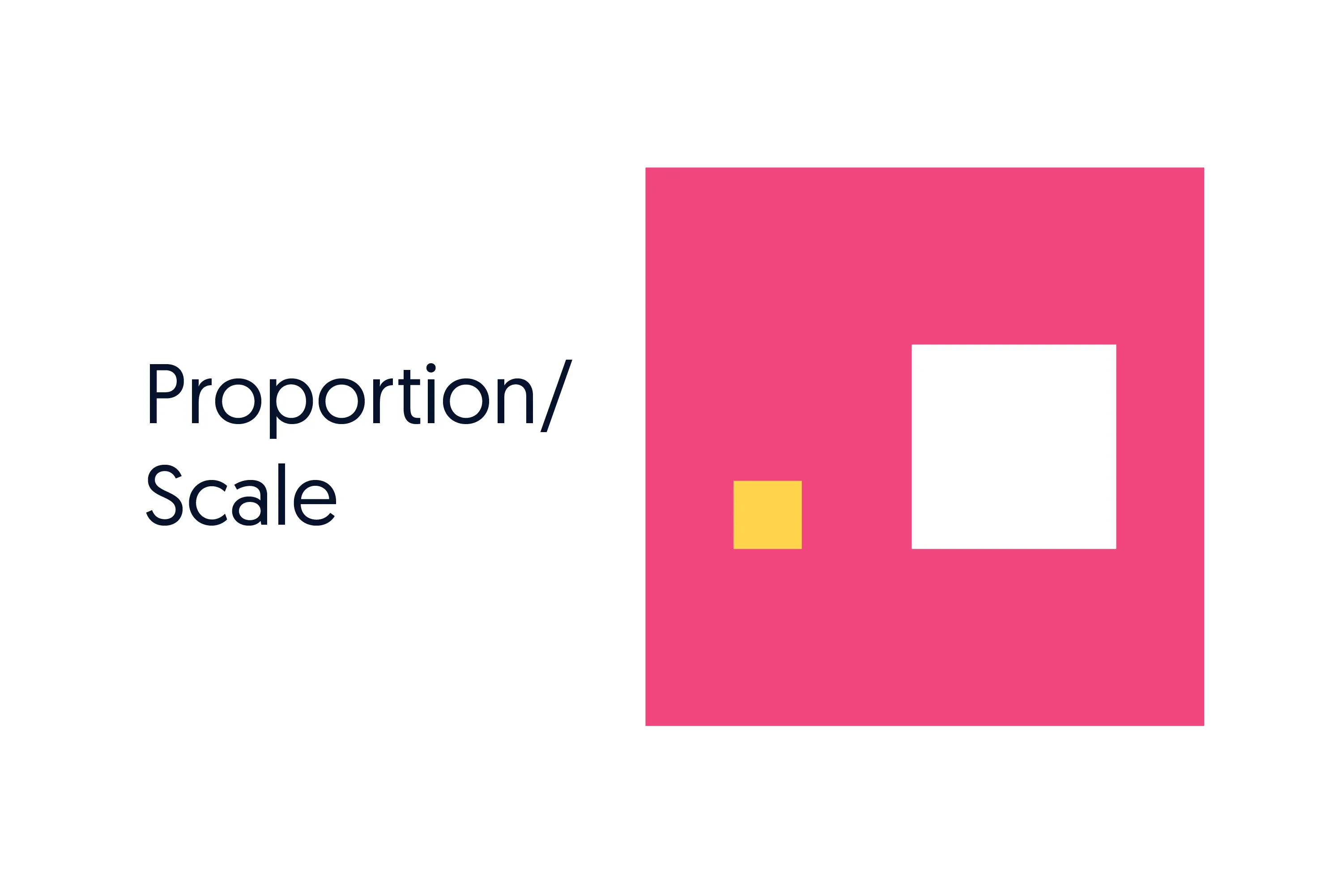
Proportion
The principle of proportion relates to adding visual weight and size of the elements in a design. It helps determine the relationships between the different elements and how they interact. This principle of design is also called scale.
You can use elements of a different size to create a focal point or highlight the importance.
Proportion is especially important in mobile UI/UX design. Scaling everything properly ensures that users have a pleasant mobile experience. And since half of the world's website traffic comes from mobile, you can see why proportion can be such a vital design principle to observe!
Conclusion
Graphic design is often misunderstood as a matter of style preference. When assessing graphic design, it's essential to check whether the most vital design principles have been applied. This allows design clients to provide better feedback and vet out professional designers from the wannabes.
Of course, it takes more than reading a couple of blog articles and doing a course online to use the fundamental principles of design well. Along with the theory, experience plays a vital role in helping designers deliver quality results.
If you want to work with vetted, professional designers without having to break the bank, look no further than ManyPixels!
With over 1.7 million design hours under our belt and thousands of happy clients served, our team can take care of all your design needs!
Take a peak into our rigorous quality assurance process, or book a free demo to learn more.

Having lived and studied in London and Berlin, I'm back in native Serbia, working remotely and writing short stories and plays in my free time. With previous experience in the nonprofit sector, I'm currently writing about the universal language of good graphic design. I make mix CDs and my playlists are almost exclusively 1960s.

Top-quality designers
A complete creative team at your fingertips: graphic and web designers, illustrators, and more.

Lightning-fast turnaround
Get start today and receive your first update on the next business day.

All-inclusive pricing
Unlimited requests and revisions. One flat monthly fee. No surprises.

Flexible & scalable model
No contract. Scale up and down as needed. Pause or cancel at anytime.
Continue reading
.jpg)
.jpg)
.jpg)
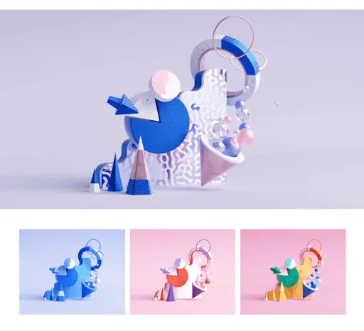
Explore some of our best designs
Get inspired by a curated selection of ManyPixels work. Download the portfolio to see what our team can create.


