
7 Fundamental graphic design elements & how to use them
.jpeg)
TABLE OF CONTENTS


What are the 7 elements of graphic design everyone should know about? Join us as we explain them one by one.
Graphic design is always created for a certain purpose with a specific target audience in mind. So, design work follows much stricter rules than for example visual arts.
Before you start creating designs, you should know what you’re working with. In other words, before you understand how to combine them, you first need to understand what are the graphic design elements?
Graphic design elements are the components of graphic design.
While you may not always use all the elements (e.g., many designs don’t include typography), even the absence of specific features should be an informed decision. So to understand how the elements are used (design principles), you must first grasp what the essential elements in graphic design are.
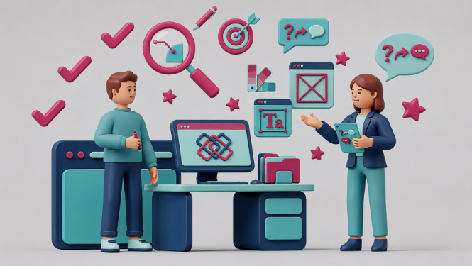
{{GRAPHIC_BANNER="/dev/components"}}
Line
Let’s start with the most basic graphic design element: the line. Lines, whether done with a brushstroke, a pen, or a digital drawing tablet, create a visual connection between the design elements, lead the eye in a particular direction and create a natural focal point.
Lines can be simple and non-invasive, and sometimes the main elements of a design (think of Art Deco geometric patterns).

A striking example of where lines can be significant is the design of CTA buttons. A simple line in the form of a frame can drastically change the design and ensure that the CTA copy is more noticeable.

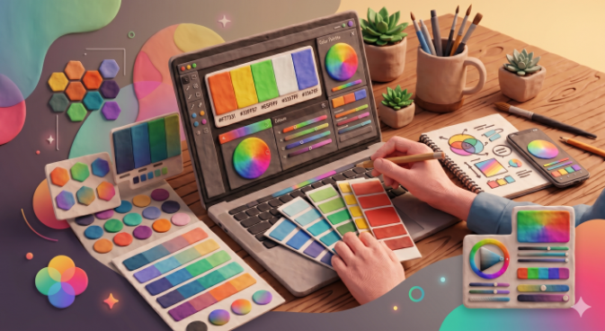
Color
Color is one of the most noticeable components of graphic design. It can be the focal point, the background, used to manipulate depth and proximity, or add dynamic and playfulness.
Color (or the lack thereof) can completely change the way we perceive a design since different colors have different meanings and evoke certain emotions. Color theory and color psychology study the way we see and perceive color.
Color theory is based on the color wheel, which consists of different shades of the colors red, orange, yellow, green, blue and indigo. The color wheel establishes how colors are mixed and combined. For example, colors can be classified as primary or secondary colors, cold or warm, complementary or contrasting colors, etc.
Color psychology studies peoplećs emotional reactions to certain colors. Although this discipline is still developing, there are some common meanings associated with certain colors (e.g. red is the color of danger, passion, and power, while blue stands for calmness, trust, and authority).

A good grasp of color theory can be beneficial in branding design. Here's an illustrative example. The pioneer creative agency Ogilvy & Mather rebranded in 2018 after 70 years!
And the change was both subtle and clever. Along with the change in name (which now bears only the more famous founding partner), the logo's color was also changed to match the new, digital era. A more muted shade of red adds a modern touch while still staying true to the brand's iconic visual identity.

Shape
You might think that this is an obvious entry; however, shape plays a vital role in the visual appeal of graphic design and in relaying a particular message and spirit.
For example, circles, ovals, and lines that are not straight аrе associated with organic, natural movement and objects that one can find in nature. Rectangles and sharp lines are never seen in nature. They make viewers think that something is concise, organized, and created by humans.
Using different types of shapes in various contexts, a graphic designer can convey different ideas to the viewer.

One area in which these visual elements can deliver a tremendous impact is 3D design. The following example shows how combining different forms (fluid and geometric shapes; round and rectangular) creates a unique visual effect. What a great way to elevate data visualization to the next level!

Texture
Although you can't always touch graphic design and don't feel the texture of a product with your fingers, this element still plays a significant role in the final look. Design textures help distinguish an object from the background or add depth to an otherwise two-dimensional design.

Packaging design is a great way to use texutre. You can use this design element to create a sense of different textures without producing packaging from different materials. This simple soap packaging evokes the sense of a wet and soapy surface. Even more impressively, the graphic designer achieved the effect using only black and white.

Typography
Typography is definitely one of the most important elements of graphic design. Different typefaces bring different qualities to the table. Designers need to decide on a font that bodes well with the overall creation, helps it be legible, and works well with the other elements.
Fonts can be sorted into many categories, but the basic ones are serif, sans serif, and script typography.
Generally speaking, sans serif fonts are more traditional, often providing an upscale feel. Sans serif fonts are used most widely in the business world and usually bring more legibility and a modern twist. Scripts can often feel romantic or playful, adding a more humanistic touch to designs.
But these generalizations are a bit like saying: "Italians are louder than Germans." On a very general level, perhaps. But, definitely not always.
So, the choice of fonts in graphic design needs to align with the branding identity, messaging, industry, and purpose of a particular piece of design.

Here's an example to illustrate. Coca-Cola's script typography is instantly recognizable. Still, they decided to pair their iconic wordmark with some basic sans serif typography in this ad.
The ad was created as part of a digital campaign in 2021. So, modern typography works well to draw attention online, where people will only spend a couple of seconds reading.

Space
What are the graphic design elements you need to know? Chances are that you’ve overlooked space.
Negative space or white space in design is the space that isn’t filled with other design elements (e.g. lines, typography, or shapes).

In every design, white space serves a number of important purposes. It can be used to ensure the stability of the design and provide a visual hierarchy. For example, in a landing page you’ll often see different sections clearly spaced out: hero section, features, and a CTA.
White space is an especially element of visual design in the field of UI/UX design. It significantly improves the user experience, and allows vital elements, such as CTA buttons and value propositions to stand out.
Twigs Paper is a good website example to learn from. Organic shapes, dainty fonts, pastel colors, and their beautiful card designs make a visually impactful combo thanks to plenty of space. It’s also a good example of an ecommerce site, and shows how white space can improve your online shopping experience.

Imagery
A combination of all the previous graphic design elements makes up another integral part of the design; images.
This can be in the form of a photo, or an illustration. The type of imagery used will greatly affect the overall graphic design style.
.png)
Imagery is another vital graphic design element you should include in your brand guidelines. This way your designs will always look consistent and help you develop a recognizable brand image.
Chobani is a dairy products brand. In an industry like that, you might not expect the most creative visual identity. And you’d be wrong! Their website and social media are a masterclass on how imagery can help add lots of visual interest and maintain a strong sense of brand identity.


Product shots, illustrations, and tempting recipes all have the same style (playful, pastel, optimistic). So all the design
Closing remarks
We hope this helped explain the most critical elements in graphic design and how they are used in professional graphics.
For more graphic design basics, be sure to check out our articles on the ins and outs of the graphic design process and what makes good design.

Having lived and studied in London and Berlin, I'm back in native Serbia, working remotely and writing short stories and plays in my free time. With previous experience in the nonprofit sector, I'm currently writing about the universal language of good graphic design. I make mix CDs and my playlists are almost exclusively 1960s.

Top-quality designers
A complete creative team at your fingertips: graphic and web designers, illustrators, and more.

Lightning-fast turnaround
Get start today and receive your first update on the next business day.

All-inclusive pricing
Unlimited requests and revisions. One flat monthly fee. No surprises.

Flexible & scalable model
No contract. Scale up and down as needed. Pause or cancel at anytime.
Continue reading

Explore some of our best designs
Get inspired by a curated selection of ManyPixels work. Download the portfolio to see what our team can create.


