Everything You Must Know About Mobile-First Responsive Design

TABLE OF CONTENTS

There’s no way your site can perform if it isn’t optimized for mobile devices. But what is mobile-first design? Is this strategy always a good idea? We’ll answer all your questions!
Over half of the world’s internet traffic comes from mobile devices. Perhaps even more importantly, 60% of all ecommerce sales are made through mobile.
If you want to improve your SEO and your site’s ranking, and increase sales, you need a mobile-friendly website.
But what is mobile-first design, and is it worth your time? Let’s explore.
{{WEB_BANNER="/dev/components"}}
What is mobile-first design?
A while ago, people used to create separate versions of sites for each individual device. This is called adaptive design. Nowadays, we create responsive web design, which means you’d start from the desktop version and adapt for mobile.

So, what is mobile-first responsive design? Simply put, it means creating a website for the smallest screens first, and then adapting it to fit larger devices.
We are going to dive into the advantages of the mobile-first responsive design approach. We’ll also share some tips on how to create mobile-first design.
6 Benefits of Mobile-First Design
It’s clear that the mobile version of your website is equally, if not more important than the desktop one. However if you’re not sure why mobile-first design makes a difference, here are some of its main benefits.
1. Drives more mobile traffic
For some companies mobile traffic is merely a bonus. For others, the most important traffic comes from these devices.
For example, if you want more people to download your mobile app, a mobile-first design can be extremely beneficial. When a site is designed for mobile first, you can launch it more quickly. It can also improve your SEO, as search engines favor mobile-optimized websites.
2. Improved user experience
Are mobile users your primary target market? Then mobile-first web design is the right choice for you. When you think about design for mobile devices from the start, you can choose design elements for the best user experience.
This might mean choosing a more legible font, or creating a visual hierarchy that works well on small screens. Or, you can control how white space is used to include all the necessary information without cluttering the design.
Creating mobile-first responsive design can also improve your website’s accessibility. When you start with the desktop version first, it’s easy to forget how specific font or color choices might affect the user experience on smaller screens, especially for people with sight or reading disabilities.
3. Saves you time and money
Many people choose to develop multiple versions of a website, each designed to render well on a specific screen size. Creating and maintaining multiple websites like this can be time-consuming and expensive.
Maintaining only one version of the mobile design still demands your resources and time. But, ultimately, it can be a profitable and effective solution compared to responsive websites, especially if the majority of your traffic comes from mobile.
4. Increases the website's loading speed
Time is crucial for providing a positive experience to your mobile visitors. They will leave web pages that demand more than a few seconds to load.
Mobile-first designs typically result in lighter web pages and applications. This leads to faster loading times on mobile devices, which is crucial for retaining and engaging mobile users who often have slower internet connections.
5. Reduces bounce rates and increases conversion rates
Conversion rates for desktop users are still significantly higher than for mobile devices (4% as opposed to 1.3%). So, if you think your target audience accesses your site on mobile, a mobile-first approach will help you curb bounce rates and increase conversions.
Just think about how many apps we prefer to use on our phones rather than desktops. You should adopt the same approach to creating a website that people will enjoy using when they’re on their phones. This is especially true for ecommerce sites. A mobile-first responsive design can ensure people can easily browse and purchase your products.
6. Data-driven decision-making
Starting with mobile-first design can help you gather valuable data and feedback from mobile users early in the development process. This information can inform decisions about additional features and improvements.
For example, you’re planning to create a mobile app, mobile-first web design can provide valuable insights on user behavior.
7. Adaptability
As new devices and screen sizes emerge, a mobile-first design philosophy makes it easier to adapt to these changes. It allows for a more future-proof design strategy.
Furthermore, a mobile-first responsive design can be a better choice regarding graceful degradation and progressive advancement.
Graceful degradation means a website or web application is initially designed for modern or advanced web technologies and browsers. If certain features or functionality are not supported in older or less capable browsers, the design "degrades" in a way that the core content and functionality remain accessible to all users. So, a mobile-first design makes a lot of sense, since all of us change and update our phones more regularly than is the case with desktop devices.
Progressive advancement (or enhancement) means the opposite. A website is designed as a basic version. Additional layers of functionality and design are then added progressively for users with more advanced browsers and devices. The mobile-first approach works well here too, since mobile devices have a lot less processing power than computers.
Best practices on how to design responsive mobile-first
Now that you understand why mobile-first design is a good idea, let’s share some helpful tips on how to design websites for mobile phone users.

1. Prioritize content
When you design a mobile website, you should focus on the most important information first. This allows you to prioritize content in a way that’s most user-friendly.
Whether it’s organizing the information on your homepage ,increasing the visibility of CTA buttons, or creating a great search option for your blog, with mobile-first responsive design you’re forced to decide which content really matters.
2. Deliver intuitive navigation
Intuitive navigation plays the most important role in delivering an effortless user experience on mobile devices. You can leverage features like navigation drawers to display secondary elements of the website.
When you adopt mobile-first web design you’ll be inclined to rely more on things like icons and breaking processes into steps, to ensure users stay in control and can easily navigate your site.
3. Avoid disruptive popups
Popups remain one of the controversial topics in digital marketing, as marketers continue to debate on that topic. Although they can be useful, many people find them annoying and decide to leave the website after seeing a popup.
One of the many frustrations people have with pop ups is that they cover the website content. This is already very annoying with desktop versions, but a badly designed mobile popup can be a real deal breaker. Not only do they cover content, they can also be difficult to close.
So, when you create mobile-first design, it’s best to avoid popups as much as you can. If you want to add them, respect these three simple rules:
- Make the close button clearly visible.
- Minimize the number of form fields.
- Use clear language and one simple call to action.
4. Make CTAs consistent and visible
Creating an effective call-to-action button is much more complicated than it looks. And it can be even tricker to make those CTA buttons pop on limited screen sizes. Aside from using the right words, you need to choose design elements and placement of the buttons carefully to ensure your buttons are visible and impactful, but also fit into the rest of the website organically.
5. Performance optimization
The way your website looks is definitely important. But mobile-first responsive design is first and foremost about optimal performance.
There are many small things web developers and designers can do to optimize a site’s performance.
First, you should compress all images to minimize page loading times. You should also apply lazy loading, which basically means that design elements are initialized only when they are needed. This further helps to minimize page load times.
Next, you should also minimize code and markup in your web pages and script files. This basically means that a web developer should remove comments and extra spaces, as well as variable names.
6. Test and again test
Testing is an integral part of the web design process. But with mobile-first design, this can be one of the most vital steps.
Check whether crucial and important parts are working well, and you can deliver user experiences for mobile customers. Analytics will help you determine which elements perform better and in which area you should focus your efforts. Also, during testing, collect feedback from different sources, whether it’s a focus group or other members of your team.
To sum up
Adopting the mobile-first design approach can be a terrific idea for businesses whose primary target market are mobile users. Moreover creating a mobile-first website means it’s easier to adapt in the long run. Finally, it allows you to tap into the huge and ever-evolving base of mobile internet users, and increase your traffic and conversions.
When you design a mobile website, you must choose design elements very carefully. A font that may look perfectly legible on desktop, could turn out to be a mistake with the mobile version. Creating a solid site layout, and optimizing images for web use are further reasons why mobile-first design is best left to the pros.
If you would like some help with creating stunning mobile sites, look no further than ManyPixels unlimited web design services. For as little as $599 you can make as many design requests and revisions as you want.
The extensive scope of services also includes illustrations, motion design, icons, blog graphics, and more. So, you can get all the visuals you need to make your site a success.
Do you want to learn more about it? Book a free 1:1 chat and we’ll be happy to answer your questions.

Having lived and studied in London and Berlin, I'm back in native Serbia, working remotely and writing short stories and plays in my free time. With previous experience in the nonprofit sector, I'm currently writing about the universal language of good graphic design. I make mix CDs and my playlists are almost exclusively 1960s.

Top-quality designers
A complete creative team at your fingertips: graphic and web designers, illustrators, and more.

Lightning-fast turnaround
Get start today and receive your first update on the next business day.

All-inclusive pricing
Unlimited requests and revisions. One flat monthly fee. No surprises.

Flexible & scalable model
No contract. Scale up and down as needed. Pause or cancel at anytime.
Continue reading
.jpg)
.jpg)
.jpg)
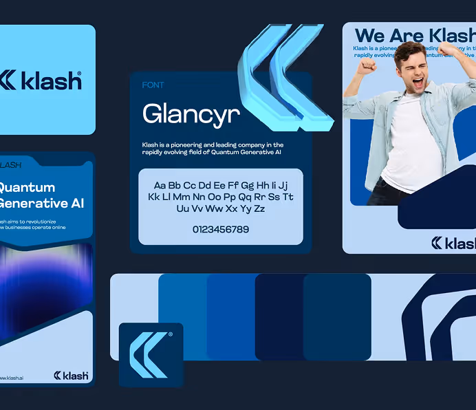
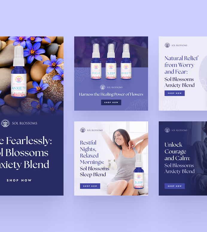
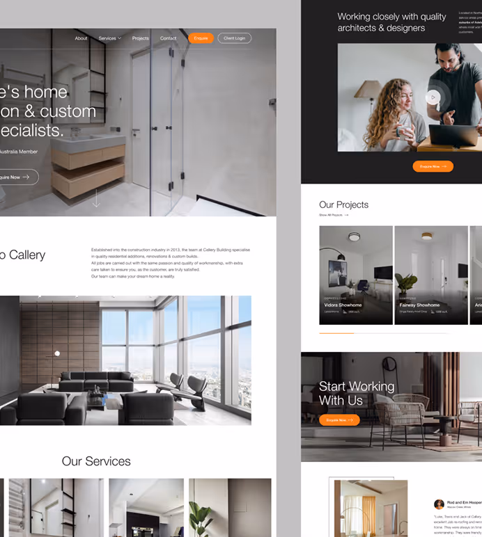
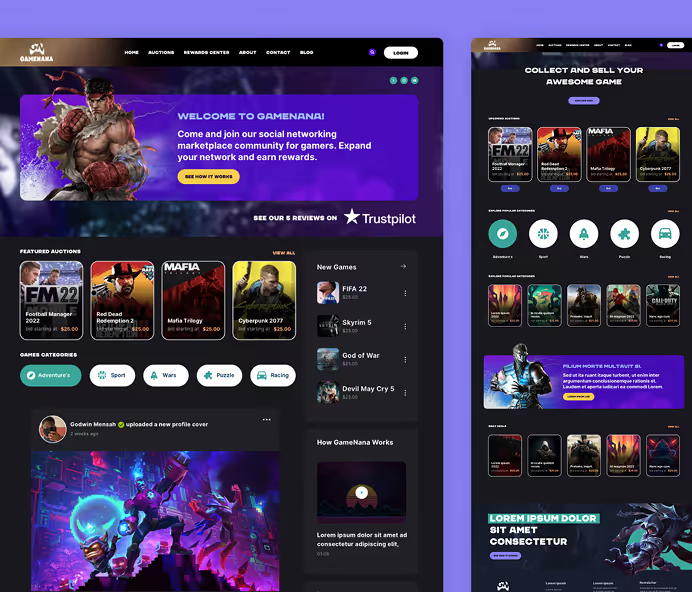
Explore some of our best designs
Get inspired by a curated selection of ManyPixels work. Download the portfolio to see what our team can create.