


15 Free Yearbook Fonts to Write the Sweetest Memories
Need a perfect yearbook font? You’re in the right place.

.svg)


There are no rules to choosing the perfect yearbook font—just make sure it matches the yearbook theme and represents your school spirit. These 15 unique typefaces can help you find a style you like.
School yearbooks are a once-in-a-lifetime opportunity for all font enthusiasts. Yearbook pages often have an eclectic layout: photos, illustrations, large blocks of text paired with short, poignant messages.
This means there’s room for lots of different fonts and lots of fun! Check out these 15 awesome and free fonts for yearbooks to inspire any yearbook team.
{{BRAND_PORTFOLIO="/dev/components"}}
Classy sans serif fonts
Sans serif fonts have clean lines and are usually more legible, which is why they’re often used in a professional context. However, their clean look is quite versatile and can make a great choice for any yearbook design.
Some of the most popular sans serif fonts are Arial, Roboto, Open Sans and Proxima Nova. Any of these will probably make a safe font choice, but here are some modern alternatives to consider.
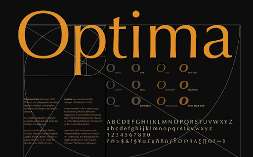
1. Optima
This beautiful font is very elegant and is sure to give your yearbook a sense of tradition and gravitas that teachers and parents will approve of. It resembles the logo font used by the brand Pandora, which holds a similar connection between elegance, luxury and youthfulness.
2. Signika
Signika is a great option for smaller point sizes, as its spaced out letters allow for high readability and clarity. The curved edges give this typeface a gentler look, which can be perfect for filling yearbook pages with sweet, school memories.

3. Bavro
Imagine this modern, futuristic typography on your yearbook cover! It’s sure to win the approval of the entire student body. The downside is that Bavro is only free only in the all-caps version. So if you’re on a budget, you may need to find a complementary font for body copy.

4. Arca Majora
Another all-caps font to give your yearbook cover a sense of drama. Arca Majora is a little less stylized, so it can still be a great choice for some yearbook pages with less text on them, for example, magazine-style pages with lots of pictures and a bold title.

Traditional serifs
The evergreen serif is a font family you probably recognize by fonts like Garamond, Times or Baskerville. The classic typography is something we’re used to seeing in print—and certainly a style that your teachers and headmasters would approve of. This shouldn’t put you off as this font type has a huge number of exciting, modern variations.
Serifs can be beautiful decorative fonts without being overly romantic or frilly.
5. Forum
This free Google font is inspired by classic roman fonts which are often associated with higher education institutions (it’s very similar to the typeface Harvard uses). That’s why it would make a wonderful choice for college and high school yearbooks.

6. Butler
Butler was inspired by the Dala Floda and Bodoni family of fonts. It’s a more modern take on very classic looking fonts, so it’s definitely the right font for your school if you’d like your yearbook design to radiate a sense of tradition and maturity, packaged in a sleek, modern graphic design.

7. Barbaro
Retro style is always a favorite with yearbook design, especially the 1950s and 1960s aesthetic (letterman jackets, cheerleader uniforms, groovy fonts). Barbaro is a great option as it’s got a 1960s flair without being cartoonish.

8. Firefly
Although I’m fairly sure most schools have now switched to whiteboards and markers, chalk fonts are a definitive favorite for any yearbook. Firefly has a unique retro vibe and can compliment any illustrations or doodles you want to include in the final design.

9. Yearbook Solid
As the name suggests, Yearbook Solid font is one of the best options for this purpose. This great free font comes with uppercase letters and numbers - everything you need to design an appealing yearbook cover page!

Melancholic Script Fonts
Script fonts are supposed to mimic human handwriting, so they are definitely going to give any yearbook a more personal look. They’re particularly good for yearbook quotes, as they can make it seem like these were handwritten!
10. Serendipity
Poor readability is an issue with many cursive fonts, but Serendipity is not one of them. This elegant script would make a wonderful choice for subheadings, and even body text.

11. Youth Touch
The name gives it away! Youth Touch is certainly one of the best fonts for yearbooks, ideal for eye-catching headings. If you’re going with a graffiti yearbook theme, it’s a great alternative to graffiti fonts that are often not legible.

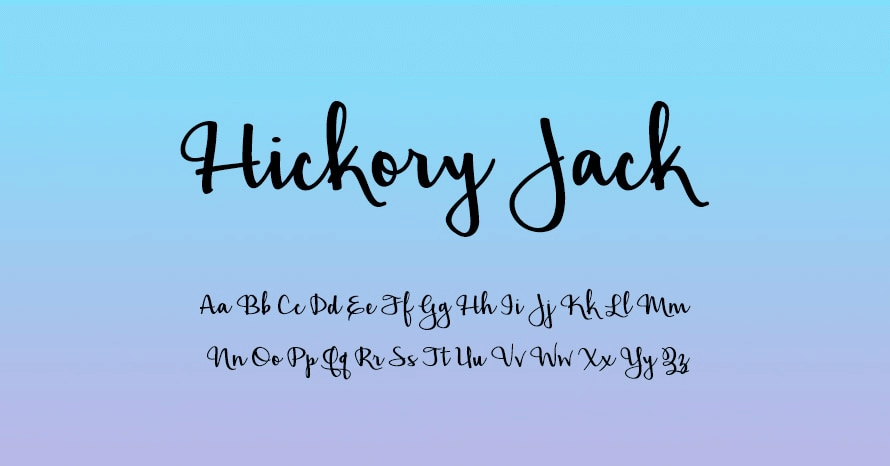
12. Hickory Jack
If you want something striking, but still legible, then Hickory Jack is something to consider.If you want something striking, but still legible, then this cool font is something to consider. It’s unique and, again, resembles human handwriting. It can be a terrific option for sub-heads and used in smaller sizes.
Bold yearbook fonts
Bulky fonts like slab serifs may be an acquired taste, but they’re certainly popular as fonts for yearbooks. They can make a great font choice for futuristic cover designs or statement headings.
13. Higher
This free font hasn’t got the best readability so it’s best to use it sparingly. However, it’s very cool, and would probably make a brilliant twist on your school monogram.

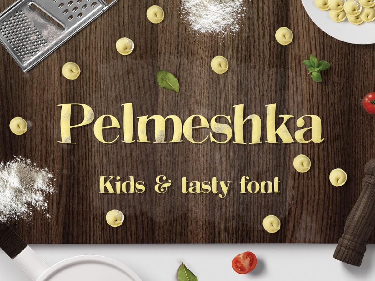
14. Pelmeshka
This kids and cookbook font is inspired by Bodoni, a lovely font that resembles handwriting. Pelmeshka is chunkier and more dramatic and makes a terrific yearbook font for elementary school yearbooks.
15. Promesh
If you’re planning to dedicate a yearbook page to all the jocks, then you can hardly go wrong with this “athletic” font style. However, Promesh is not just great as a gimmick. It’s a crisp, legible all-caps font that will make any yearbook look well-designed.

Bonus tip: mix and match!
Creating your school yearbook should be a fun and creative experience. There are tons of great free yearbook fonts you can find on Google or design websites like Canva.
Remember: don’t be afraid to experiment. You can always use complementary fonts (e.g. different typefaces from the same font family), but it’s also great to try other things.
Pair serifs with sans serifs; bold slab serifs with elegant, script fonts. Or use the same font family and mix letters of different thickness.
The best yearbooks are as colorful, eclectic and diverse as the students so try to use different fonts to reflect that!

Having lived and studied in London and Berlin, I'm back in native Serbia, working remotely and writing short stories and plays in my free time. With previous experience in the nonprofit sector, I'm currently writing about the universal language of good graphic design. I make mix CDs and my playlists are almost exclusively 1960s.
A design solution you will love
Fast & Reliable
Fixed Monthly Rate
Flexible & Scalable
Pro Designers


.jpg)
