
18 Most famous print ads of all time (and why they worked)

TABLE OF CONTENTS


TL;DR
Famous print ads don't win on budget. They win on a single, undiluted idea. This list covers 18 of the most celebrated examples, from Volkswagen's "Think Small" (ranked the top advertising campaign of the 20th century by Ad Age) to the KFC "FCK" crisis ad that turned a supply chain disaster into a brand win. Each entry breaks down why it worked so you can apply the thinking to your own campaigns.
Introduction
Most famous print ads weren't produced by the biggest budgets. They were produced by the most committed briefs.
A print advertisement is any promotional piece placed in a physical format: a magazine spread, a newspaper page, a poster, a billboard, or a transit display. Unlike digital ads, print can't be retargeted, A/B tested, or refreshed overnight. You get one shot in a fixed space, and your audience moves on in seconds.
That constraint is what makes the great ones remarkable. Research shows that print readers spend significantly more time with a publication than digital audiences spend with banner ads. And a print campaign combined with digital advertising can boost overall campaign effectiveness by 400%. Print advertising is still effective — it just demands better creative.
Below are 18 of the most famous print advertisements ever made, spanning magazine ads, newspaper campaigns, and outdoor posters. For each one, we explain what made it work so you can study the thinking, not just admire the result.
What is print advertising?
Print advertising refers to paid promotional content placed in physical media, including newspapers, magazines, billboards, posters, and direct mail pieces. Unlike digital formats, print ads can't be scrolled past, blocked, or closed. A reader who encounters a print ad in a magazine has already chosen to spend time in that space.
The main categories include magazine ads (formatted for specific reader demographics and editorial environments), newspaper ads (fast to market, broad reach), outdoor advertising like billboards and transit posters (high visibility, brief window of attention), and direct mail formats like brochures and catalogs. Each format has different constraints that shape the creative approach.
What makes a famous print ad work?
The most famous print ads share one characteristic: a single, undiluted idea. Not a list of features, not a tagline on a stock photo. One thought, executed without compromise.
Across the 18 examples below, a few patterns repeat consistently.
- Design for clarity (lots of white space, visual hierarchy, etc.)
- Visuals carry emotional weight
- One strong image and headline (or one of the two)
When you're analyzing ads, look past the visual first. Ask: what is the single idea? Then ask whether every element serves that idea or competes with it. Great ads have no wasted parts.
18 famous print advertisements of all time
1. Volkswagen "Think Small" (1959)
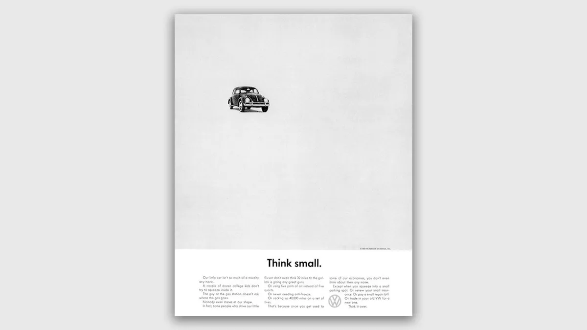
Agency: Doyle Dane Bernbach (DDB)
This is the most studied print ad in the history of advertising. In 1959, DDB placed a small image of the Volkswagen Beetle in the upper corner of a full page of white space, with a two-word headline below: "Think small." The body copy was self-deprecating, honest, and direct. It acknowledged that the car was small, plain, and cheap to run, and positioned all of those things as features, not apologies.
At the time, American car advertising celebrated size, chrome, and aspiration. "Think Small" went the opposite direction entirely. Ad Age ranked it the number-one advertising campaign of the 20th century. It created the template for modern minimalist advertising that copywriters and art directors still reference today.
Why it works: The ad earns attention by refusing to compete for it. The white space is the statement. Restraint signals confidence, and confidence sells.
2. The Economist: "I never read The Economist"
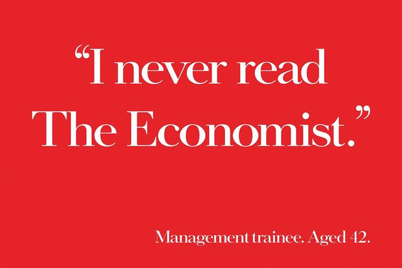
Agency: Abbott Mead Vickers BBDO (campaign ran 1988–2001)
For 14 years, The Economist ran variations of the same magazine ad: white text on a red background, a short copy-only observation, no image, no explanation. This execution reads: "I never read The Economist. Management trainee. Age 42." The implication is immediate. The reader doesn't need it spelled out. The campaign ran without pictures because it didn't need them.
During the campaign's run, The Economist saw a reported 65% increase in circulation and a 95% rise in subscriptions. A single-column magazine ad became one of the most recognized advertising campaigns in British history and still appears in advertising textbooks worldwide.
Why it works: It sells to the reader's self-image, not their inbox. The magazine isn't being promoted. The reader's identity is.
3. Absolut Vodka (1981–2006)

Agency: TBWA
For 25 years, every Absolut print ad used the same approach: the distinctive bottle silhouette, a two-word headline ("Absolut [something]"), and no body copy. More than 1,500 executions were produced across that period. "Absolut Perfection" put a halo above the bottle. "Absolut Chicago" turned the city skyline into the bottle shape. The concept was limitless because the constraint was absolute.
Ad Age ranked the Absolut campaign second on its list of the top 100 advertising campaigns of the 20th century. During the campaign's run, Absolut grew from a niche imported spirit to one of the top-selling vodka brands in the American market, with US sales climbing from fewer than 15,000 cases annually in 1980 to millions by 2000.
Why it works: The consistency is the campaign. One format, executed differently every time, creates both brand recognition and reader anticipation in equal measure.
4. Pepsi

Agency: Buzz in a Box
Pepsi dressed a can in a Coca-Cola Halloween costume with the tagline: "We wish you a scary Halloween." Created by Belgian agency Buzz in a Box, the ad requires no explanation. The visual lands the joke in under a second.
Holiday ads typically play it safe. This one didn't. Using a competitor as the punchline is a risk most brands avoid. Pepsi has made this move multiple times across decades, and it consistently works precisely because the joke is obvious and the confidence behind it is unmistakable.
Why it works: Seasonal context gives brands permission to be funnier than usual. The best holiday ads take that permission fully rather than hedging it.
5. KFC "FCK" (2018)
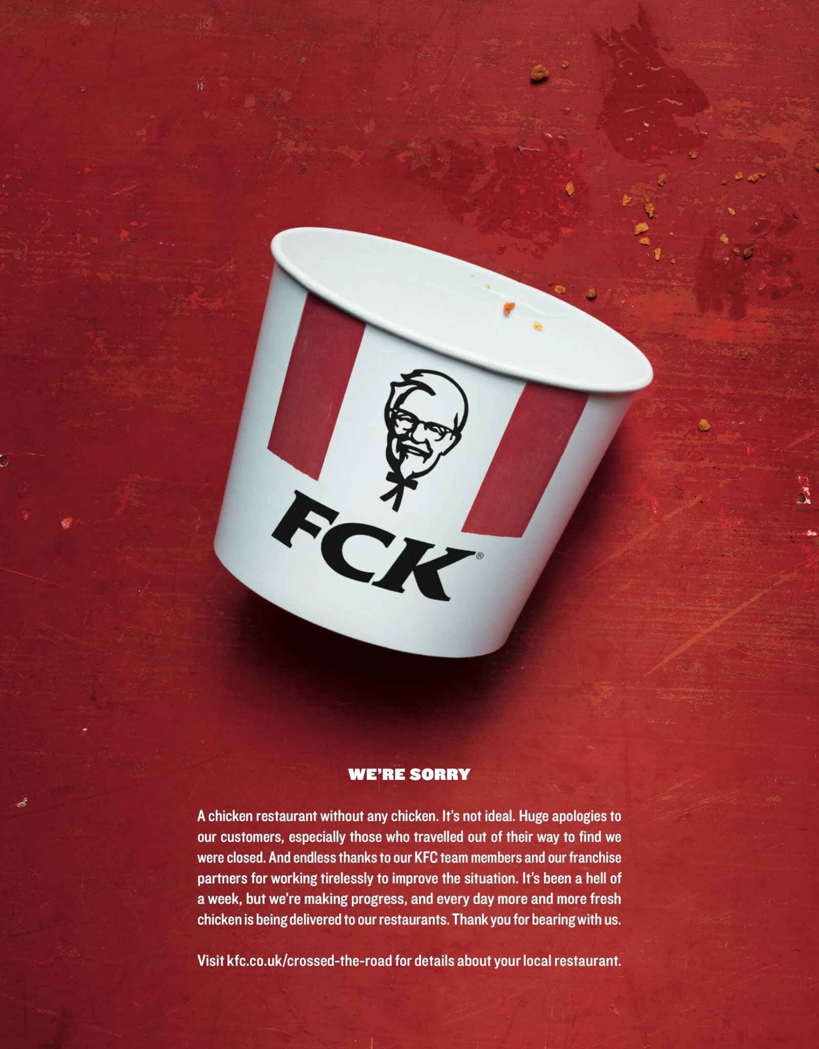
Image via Ads of the World
In 2018, KFC UK ran out of chicken. Hundreds of restaurants closed and customers were furious. The marketing team's response was a full-page newspaper ad: an empty KFC bucket with the brand's initials rearranged to spell "FCK," followed by a plain-language apology. No spin. No corporate hedging.
The campaign generated 8.6 million impressions on Twitter in three days. Few fast food brands turn operational failures into brand wins, but this one did. Brand sentiment increased by 9% in the week following the campaign. It's now regularly cited in marketing courses as a case study in crisis communication.
Why it works: Honesty, deployed fast and with a sense of humor, beats a formal PR statement every time. The joke is the apology.
6. Chupa Chups
A lollipop doesn’t have the best reputation. Too much sugar, bad for your teeth… What do you do if your brand sells them? You make it clear that you’re different.
Chupa Chups is the biggest brand of lollipops, and the creative advertisement below is famous for a reason. The unique visual of ants is unexpected proof that the lollipop is sugar-free. Add in the delicious-looking lollipop, and you have a winning ad on your hands.
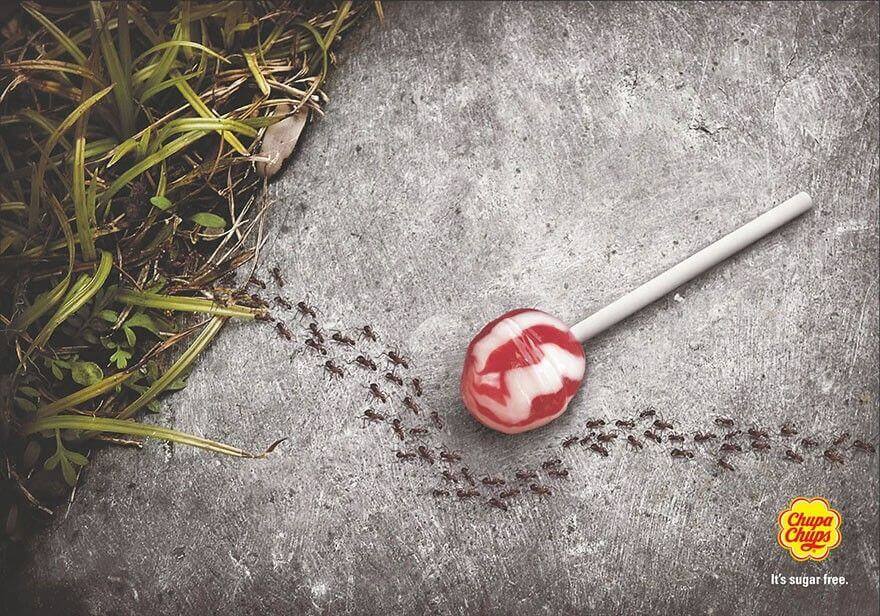
Agency: DDB
A lollipop surrounded by ants, none of them interested. No headline. No body copy. The product proves its own claim by showing you what doesn't happen when you eat it. This is a textbook demonstration ad, and it executes the technique about as cleanly as it can be done.
Rather than leading with guilt about sugar content or defensively listing ingredients, the ad treats the audience as intelligent. The visual makes the case. The joke lands before the logo registers.
Why it works: Demonstration beats description. Let the product prove the claim instead of asserting it.
7. Colgate Dental Floss

Agency: VMLY&R
A close-up of someone smiling with food caught between their teeth. The visual triggers an immediate, universal reaction. Nobody needs to be told why this is a problem. The ad finds the most relatable version of the product's benefit and illustrates it with precision.
There's no headline claiming superior cleaning power, no before-and-after comparison. Just a moment every person over the age of eight has experienced, made visible in a way that makes you want to reach for the floss.
Why it works: Shared, mildly embarrassing moments are more persuasive than product claims. The reader sees themselves, not a pitch.
8. Lego
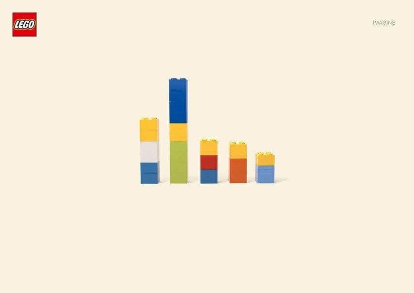
Agency: Jung von Matt
A handful of Lego bricks on a white background. No faces, no copy beyond the logo. Your brain fills in The Simpsons family from color and rough shape alone. The "aha moment" principle in advertising holds that when a reader solves a visual puzzle themselves, they experience a small positive emotion that attaches to the brand. This ad delivers that in about half a second.
The ad is also a product demonstration. Lego's entire promise is that children build what they imagine. Rather than explaining this, the ad makes the reader experience it firsthand.
Why it works: Participation beats observation. When readers complete the picture in their own minds, they've already engaged with the brand.
9. Norwegian Airlines: The Flag of Flags

Agency: M&C Saatchi
The Norwegian flag contains other national flags within its design, depending on how you orient and crop it. M&C Saatchi outlined each hidden flag, added the destination city and the ticket price. The result is a print ad that rewards careful looking, where each hidden flag corresponds to a Norwegian Airlines route.
This is a print-only idea. It couldn't work as a banner ad or a 30-second spot. The physical format is the creative, and the creative uses every square centimeter of available space as efficiently as possible.
Why it works: Print ads don't always have to land at a glance. Sometimes the most memorable ones make you stop and look for a full thirty seconds.
10. WWF Desertification
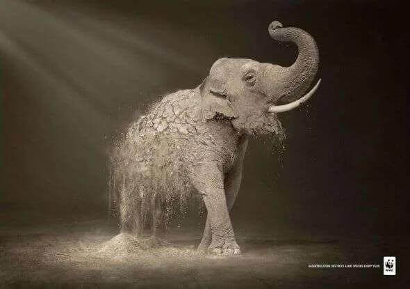
Agency: Contrapunto BBDO
Photographs of endangered animals, manipulated so each one dissolves from the bottom up into desert sand. The cause and the consequence are made inseparable in a single visual. No body copy is needed. This is emotional marketing executed with surgical precision.
WWF understood that their audience didn't need educating about climate change. They needed to feel it. The desertification series delivers that in one image, every time.
Why it works: The most powerful advocacy ads don't argue. They show. Argument invites counterargument. A well-chosen image goes somewhere else entirely.
11. Faber-Castell Pencils
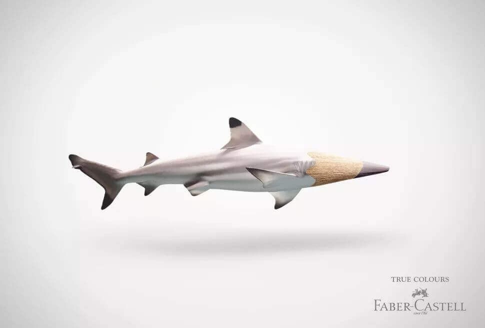
Agency: Serviceplan
Objects sharpened into pencils, each matching the source material's color exactly: a blade of grass becomes a green pencil, a wedge of orange fruit becomes an orange one. The campaign was created in 2011 and still circulates widely online, which is as reliable a test of staying power as print advertising gets.
Good print ads age well because they show something true about the product rather than something trending about the moment. These ads communicate Faber-Castell's color range by using the pencil as both subject and visual device. The product earns the attention rather than borrowing it from something else.
Why it works: When the product itself is the creative device, the brand earns the attention it gets.
12. Marmite: "Love it or hate it, just don't forget it"

Agency: adam&eveDDB
Marmite knows it's a polarizing product. Instead of trying to convert skeptics or reassure loyal buyers, this campaign acknowledged the division directly and made it the platform. The "love it or hate it" positioning has driven Marmite's marketing for decades. This particular execution shows an abandoned jar at the back of a pantry, appealing to the guilt of every person who bought a jar and quietly forgot about it.
Most brands avoid acknowledging that some customers actively dislike their product. Marmite built a marketing identity around it. That honesty is disarming. More importantly, it's memorable in a way that defensive advertising never is.
Why it works: Brands that acknowledge their limitations earn more trust than brands that claim to have none. Own the debate instead of trying to win it.
13. Volkswagen Touareg
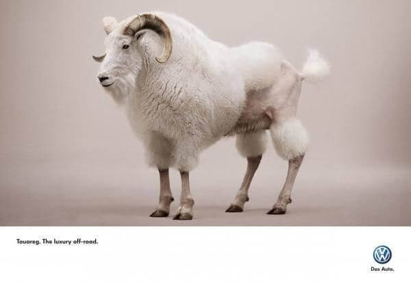
Agency: AlmapBBDO
A mountain goat, capable of climbing any terrain, shaved to look like a groomed city poodle. That's the entire concept. The Volkswagen Touareg was positioned as a car equally at home off-road and on a city street. AlmapBBDO communicated this through one absurd, funny image with no body copy.
Car advertising is one of the hardest categories for fresh creative, and most campaigns show the vehicle in dramatic motion. This one doesn't show the vehicle at all. That's a confident creative call, and the image is genuinely impossible to forget.
Why it works: The best way to show a product's dual nature is to find an analogy that makes the contradiction funny rather than confusing.
14. Whiskas
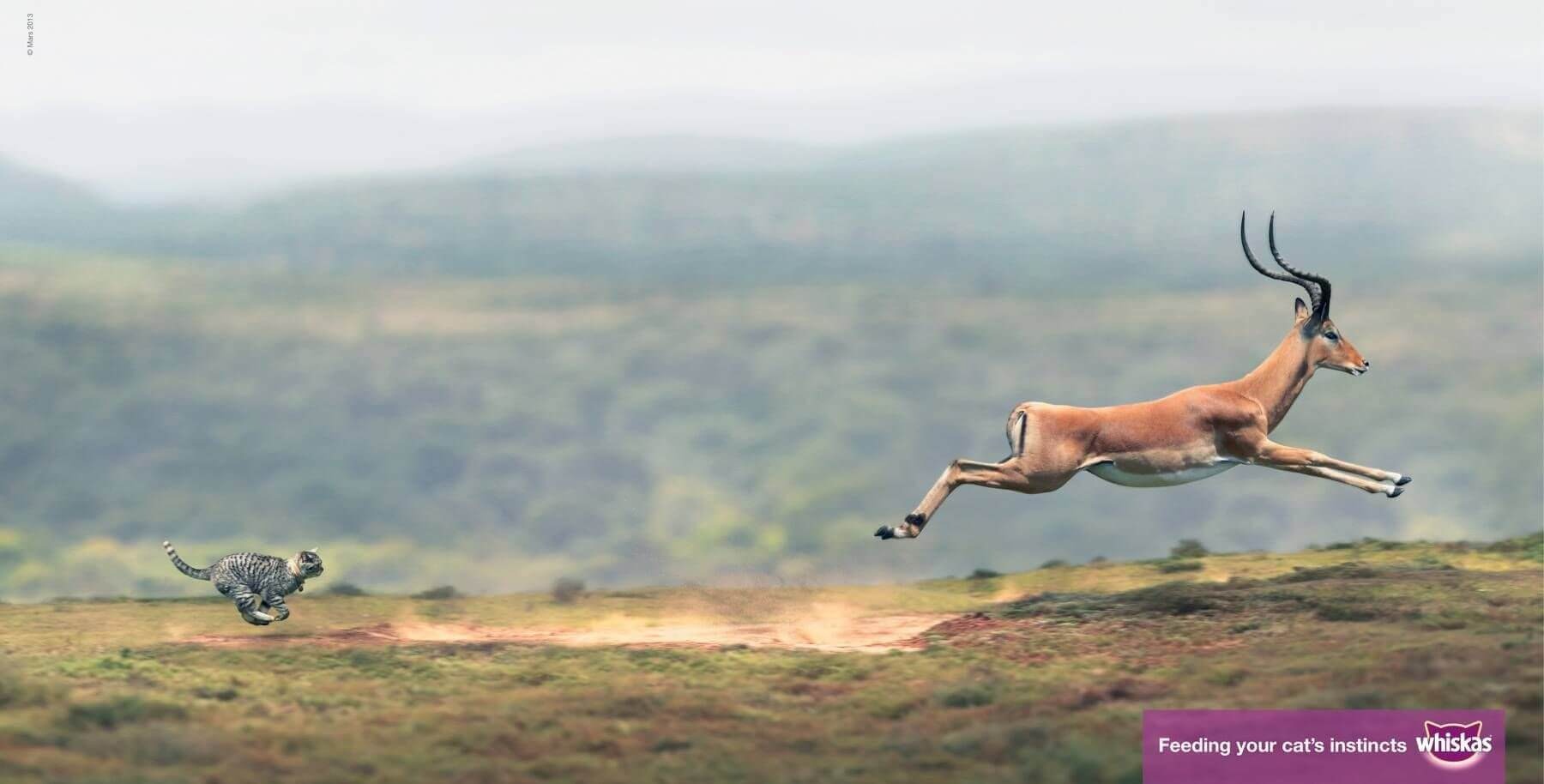
Agency: AMV BBDO
A house cat composited into the body of a wild big cat running across an African plain. The idea: your cat, however domesticated, is still an apex predator at heart. Whiskas cat food is positioned as food that respects that wild nature, not just a convenient bowl of biscuits.
The imagery is arresting enough to stop a reader mid-page-turn, which is the first job of any print ad placed inside a magazine. The concept does the emotional work. The product doesn't need to do anything except appear in the corner.
Why it works: Reframing a mundane product through an unexpected lens gives it new emotional weight. A bowl of cat biscuits becomes an act of respect.
15. Play-Doh
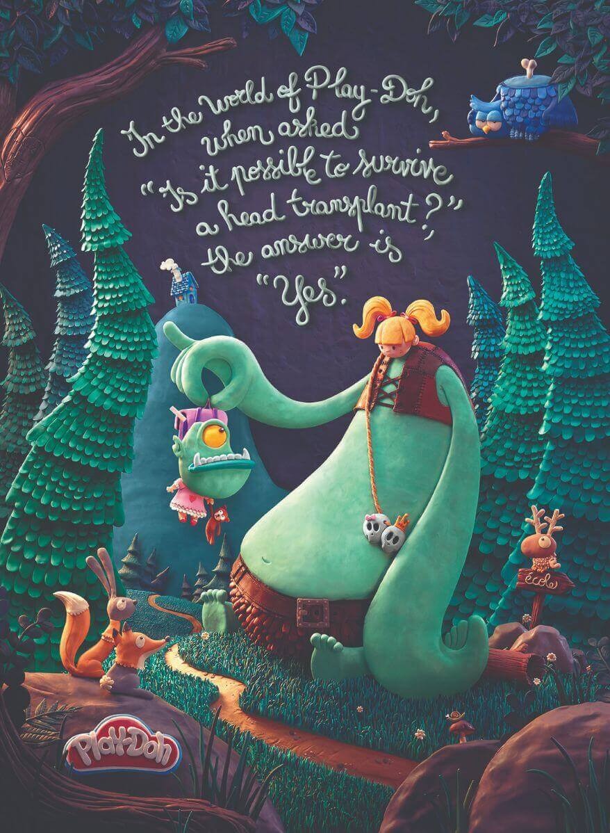
Agency: DDB Paris
Children's advertising often defaults to visual chaos. This Play-Doh campaign went the opposite direction: deliberately maximalist in color and density, but controlled throughout by strong design principles including hierarchy, scale, and rhythm. The visual feels like what Play-Doh actually feels like to play with, which is harder to achieve than it sounds.
Why it works: The visual tone mirrors the brand experience. The reader feels the product before they read a single word.
16. Eurostar

The Queen's Guard is one of London's most internationally recognized symbols, and their large bearskin hats are known globally. Eurostar shaved one to reveal an Eiffel Tower inside. The ad promotes train travel between London and Paris by combining both cities' most iconic images into a single, absurd visual. No headline is required.
Why it works: Cultural shorthand travels. Two globally recognized symbols in one image communicates "London to Paris" faster than any line of copy could.
17. Kielo Travel

Agency: NewMoment
A desk covered in paperwork and manila folders. Drawn across one binder: a turquoise swimming pool with someone floating in it. The visual is a small daydream inside a pile of work. Kielo Travel made that one moment the entire ad.
The insight is simple: people fantasize about holidays most intensely when they're least able to take one. Rather than showing a beautiful destination, this ad acknowledges exactly where its audience is right now.
Why it works: Relatability beats aspiration when the product is about escape. Meet the audience where they are, not where you want them to be.
18. Schusev State Museum of Architecture
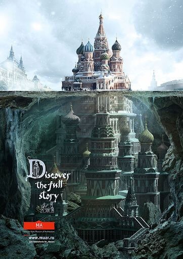
St. Basil's Cathedral, familiar from countless photographs of Moscow, cut away to reveal an intricate and unexpected interior. The campaign is for an architecture museum. The ad communicates the institution's core promise (there is always more to a building than its facade) in a single image, without a sentence of explanatory copy.
Why it works: When an ad demonstrates the product's promise rather than describing it, the demonstration is the pitch. There is nothing left to explain.
What these famous print ads teach us
Looking across these 18 examples, a few principles repeat clearly enough to be worth naming.
One idea, not five. Every ad on this list communicates a single clear point. Not a feature stack, not a list of benefits. One thing the brand needed you to feel or understand, executed without compromise. When you're analyzing print ads that don't work, this is almost always where the problem starts: too many things competing for the same space.
Constraints produce creativity. The best ads on this list treat the format as a tool rather than a limitation. Norwegian Airlines used the physical structure of their national flag. The Economist used nothing but red, white, and nine words. The Eurostar ad used one piece of cultural shorthand from each city it connects. The constraint is where the idea lives.
Confidence is visible. Volkswagen's "Think Small" is mostly white space. Lego's ad is a handful of bricks. Chupa Chups uses no headline at all. Every one of these choices requires trusting the reader to get it without being walked through it. That trust shows. Ads that over-explain signal that the idea wasn't strong enough to stand on its own.
Timelessness comes from truth. The Faber-Castell campaign is from 2011. Volkswagen "Think Small" is from 1959. Both are still referenced because they're built on something true about the product, not something trending about the moment. Ads tied to cultural moments fade. Ads built on human behavior don't.
If you're developing a print campaign, the most useful test is this: can you describe the idea in one sentence? If not, it's not ready. Every ad on this list passes that test. If you need professional print ad design support, ManyPixels works across poster formats, magazine layouts, billboard specs, and direct mail, with first drafts delivered the next business day.
Frequently asked questions
Bottom line
The most famous print advertisements in history were not made by the biggest teams or the largest budgets. They were made by the clearest briefs, the most committed creative decisions, and a consistent willingness to trust the audience with a simple, powerful idea.
Volkswagen trusted readers to find small clever. The Economist trusted readers to feel the implication of nine words. Chupa Chups trusted readers to draw their own conclusion from a group of uninterested ants. That trust is what made each of these ads famous. And it's what makes them worth studying now.
Having lived and studied in London and Berlin, I'm back in native Serbia, working remotely and writing short stories and plays in my free time. With previous experience in the nonprofit sector, I'm currently writing about the universal language of good graphic design. I make mix CDs and my playlists are almost exclusively 1960s.

Top-quality designers
A complete creative team at your fingertips: graphic and web designers, illustrators, and more.

Lightning-fast turnaround
Get start today and receive your first update on the next business day.

All-inclusive pricing
Unlimited requests and revisions. One flat monthly fee. No surprises.

Flexible & scalable model
No contract. Scale up and down as needed. Pause or cancel at anytime.
Continue reading
.jpeg)
.jpeg)
Explore some of our best designs
Get inspired by a curated selection of ManyPixels work. Download the portfolio to see what our team can create.


