
17 Stationery examples that prove corporate can be creative

TABLE OF CONTENTS


Working on custom stationery? Check out these stationery sets that can teach you how to leave a lasting impression with your design.
From a small business to a huge corporation, many companies will come across the need for office stationery with high-quality design. Even though it’s considered a simple collateral asset, stationery design is a touch of finesse that ultimately communicates your brand image with employees, collaborators and customers.
Here are 17 truly creative business stationery examples for just a taste of what you can create for your business.
{{STATIONARY_PORTFOLIO="/dev/components"}}
Embossed
Embossing your company logo and other elements on paper stock, letterheads, business cards, greeting cards, and other personalized stationery, immediately elevates their look. You can either get custom-designed embossed stationery or simply buy a manufactured embosser that will enable you to imprint anything yourself for lower pricing.
1. Covalence Architectes
This architecture firm used a matte peach color paper for its note cards, business cards and envelopes, matched with a plain white paper as letterhead stationery. However, the lavish golden embossing on the stationery makes this look extravagant, serious and respectable, while at the same time creative and unique.


2. Matteo Belgeri
A luxurious indigo-blue with gold embossing makes the stationery of designer Matteo Belgeri a memorable and stylish one. Instead of just pressing in the business logo, Belgeri creates a topographical experience from his business stationery and overall personal branding, which looks as intricate as his designs.


3. Civil
This furniture brand that is inspired by the Scandinavian minimalist style, stays on brand with the stationary design too. Using pastel colors and embossing to add their equally simplistic and elegant logo, Civil created a low-effort, high-quality look.


4. Ji & Chang
This fancy stationery includes embossing of the mirrored monogram of the business, as well as a lettermark in gold. The choice of colors is corporate, yet playful, and makes for a very unusually fresh palette in stationery design.


5. B|D Landscape Architects
A splash of zesty orange color on a simple white base is enough to make a lasting impression with the stationary of B|D Landscape Architects. It is a very contemporary and fresh look, that can be borrowed as inspiration for your own needs.


Simple, but effective
Simplicity isn’t something that is in any way considered to be a bad thing when it comes to graphic design. On the contrary, the simpler a design is without compromising the goal it needs to achieve, the better.
Here are some business stationery designs that are simple, but effective in looking professional, stylish and well-designed.
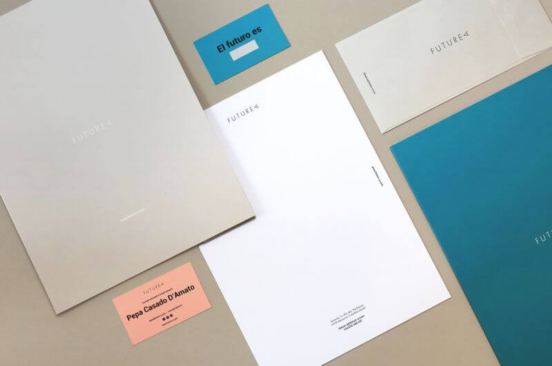
6. Futurea
A simple design with a fresh and youthful color palette adorns the card stock, business letterheads and envelopes of Futurea. The urban and minimalist stationery example goes perfectly with the quirky wordmark for this business.
7. Shifa Hospital
White and green have for a long time been the colors we connect to health and wellbeing, which is why they make a suitable choice for hospital branding. Shifa Hospital applied them to the stationery as well, using the geometric pattern and sans serif typography all across the board.


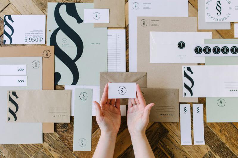
8. Bookstore branding
This Russian bookstore thought of its customers, creating more than just the standard stationery needed for internal use. They produced gift cards, bookmarks, stamp cards, stickers, etc., all in a simple and affordable way.

9. Pitu Studio
A creative studio deserves a creative stationery set. And that’s exactly what Pitu Studio has. From the cool stickers to the customization order sheet and pricing list, everything looks hip, youthful and colorful, as it suits a design studio.


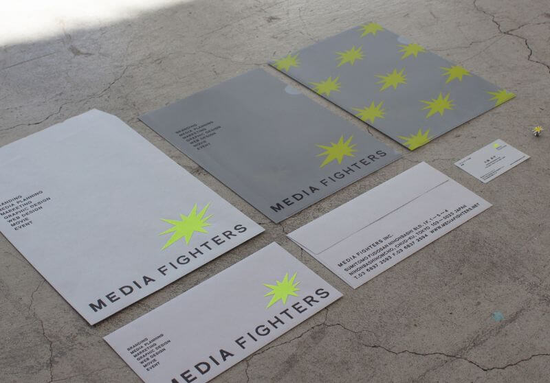
11. Media Fighters
Here is another unusually colorful and pop-arty stationery example, created for an advertising agency. It looks like a Mattise collage and a pop-art rendition at the same time. Simple, colorful and cool.

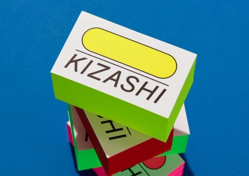
12. Kizashi
No, you haven’t suddenly entered a world where everything looks like the 80s, it’s just the super-nostalgic and colorful look of this stationery. The neon colors and bold shapes make it cool, even though it’s a super simple design.

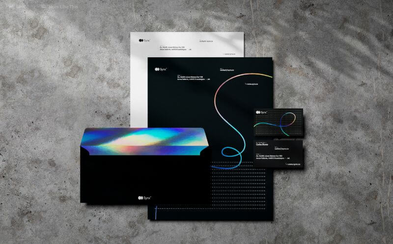
13. Synx
This artificial intelligence company infused translucent materials, as well as reflective foil and a splash of color on the black background. The combination forms a bold and noticeable look, unlike typical stationery. However, it’s safe to presume it comes at a costlier price.


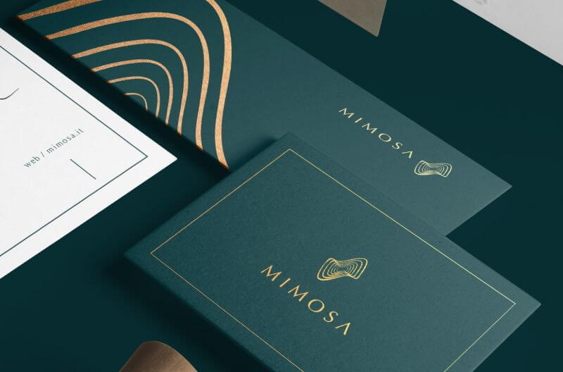
14. Mimosa
With a wider color palette that includes emerald green, pastel pink, white and gold, Mimosa’s stationery set looks playful and braver than the usual moderately colorful designs.


Luxe
If you want to communicate through your stationery design that your business is respectable, long-lasting and reputable, make some fancy stationery. Whether it’s the delicate materials used, the choice of colors, or the already fancy branding your company has, some elements can help you stand out from the rest.
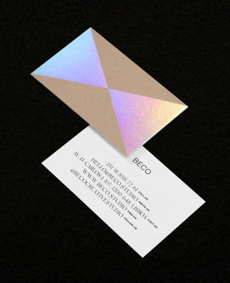
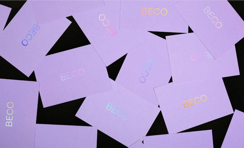
15. Beco Creative Studio
This might be the most delicate and elegant stationery set I have come across. The pearly holo effect combined with the matte white and black background, it is a simple and cute, but luscious design. Of course, the materials used are expensive and possibly harder to work with.


16. Anza Invest Group
Black and gold has always been a power move in terms of design. And luckily it’s also very contemporary and modern to use black as a base instead of white. Anza Invest Group stationery design proves that; and if you like the style be sure to check our selection of cool all-black business cards.


17. Snob Hôtel
Finally, we have a Parisian hotel that used the fanciest and famous style that came out of the golden era of the city of love—Art Deco. The velvety texture, geometric patterns and choice of color make it a luxurious and effective branding asset.


Need custom stationery? We can help!
We hope this list of business stationery examples gives you plenty of food for thought. While there are plenty of handy templates out there, nothing beats a custom touch when it comes to these important office supplies.
With ManyPixels you can get unlimited design requests for as low as $699 a month! One flat monthly fee covers all your design needs: from a business logo and website, to personalized stationery, ads, social media posts and much more!
Get started today and get the first draft of your design back tomorrow. Or book a 1:1 consultation for a chance to ask us any questions!
Journalist turned content writer. Based in North Macedonia, aiming to be a digital nomad. Always loved to write, and found my perfect job writing about graphic design, art and creativity. A self-proclaimed film connoisseur, cook and nerd in disguise.

Top-quality designers
A complete creative team at your fingertips: graphic and web designers, illustrators, and more.

Lightning-fast turnaround
Get start today and receive your first update on the next business day.

All-inclusive pricing
Unlimited requests and revisions. One flat monthly fee. No surprises.

Flexible & scalable model
No contract. Scale up and down as needed. Pause or cancel at anytime.

Continue reading
.jpeg)
.jpeg)
.jpeg)
Explore some of our best designs
Get inspired by a curated selection of ManyPixels work. Download the portfolio to see what our team can create.


