
How to create the best app icons

TABLE OF CONTENTS


An app’s functionality might be the key to its long-term success, but the icon's design is often what gets users’ attention and encourages them to try it out for the first time. Here’s how to design a unique icon for your app!
Developing a useful, innovative app is the hard part. But what’s the use of putting all the work and effort into it if people won’t end up downloading your app?
Most people access apps on mobile devices (and mobile apps have 100-300% higher conversion rates than mobile-optimized websites), and so a huge part of marketing any app is making sure that the app icon is eye-catching and appealing to its user base.
Here are a few simple tips that will help you create an app icon for success!
{{ICONS_PORTFOLIO="/dev/components"}}
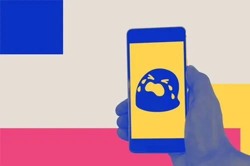
Choose a shape with meaning
People often don’t read lengthy app descriptions when browsing through App Store and Google Play. Instead, it’s often the app icon design that should convey its main functionality with just one glance.
Here’s a famous example. The worlds’ most successful dating app, Tinder, uses the image of a flame for its icon. The symbolic meaning of flames (passion, love, “sparks” between people) is something very well known, so it’s a great choice for an app in this field.

Of course, this comes with one important provision. You should keep your app icon design on-brand and try to use colors that match your brand’s color scheme. You can use different techniques like adding a gradient or contrasting colors to make your icons more noticeable but still nurture your brand image with a fitting design.
Don’t be afraid of being “too obvious.” You can get creative with other design elements such as colors, gradients or by adding a 3D effect. But a universally recognizable symbol is often a good way to help people identify what your app is about quickly and draw the attention of your target audience.
Be unique
You might think that this piece of advice contradicts the previous one: how can you choose a unique shape that’s also a universally recognizable symbol?
Well, the answer is market research. It’s been said that there’s an app for everything these days and it’s probably true. And while it’s ok to use a similar symbol as your competitors, it’s really important to make it your own.
Here’s an interesting case study. WhatsApp and Viber have incredibly similar logos that quickly tell you these are messaging/communication apps. However, their signature colors, green and purple, respectively, make a clear distinction between the two.

Use letters, not words
Wordmarks are a popular logo type and consist of the full company name. When it comes to app icons, this is definitely not a great idea. Due to the very limited space you have on a mobile screen, words are most likely to be completely illegible.
A great solution here is having a graphic designer come up with a brand mark. This is a simpler, “unofficial” version of a brand’s logo. One famous example of this is the N symbol used by Netflix, which also happens to be their mobile app icon.
If your company logo is a wordmark or lettermark, a similar choice for an app icon is a great way to build brand awareness.

Choose vibrant colors
Another somewhat obvious piece of advice is to choose a color that will catch people’s attention. A muted color might look elegant and beautiful, but will be hard to spot on a crowded home screen.

Consider using a border or frame
Here’s a nifty little design trick for all the non-designers out there. If you want to ensure a key element in your icon design is always recognizable and visible no matter what a user’s home screen looks like, you might want to consider using some kind of border or frame in your design.
A well-known example of framing is the outline on Snapchat’s ghost. The yellow background is quite visible and vibrant, but there was a danger that the white shape might not be visible with very bright screen backgrounds. So a simple black outline ensures that the shape is always visible.
It’s also a good way to make a particular design element “pop”, which is the case with the old icon for iTunes Store.

Create several app variations
Some time ago, Android app icons and iOS app icons used to have more obvious differences (see image below), however in more recent years, the two look much more similar (but there are emerging ones like MIUI).

Nevertheless, it’s important to remember that people will see your icons not only through different operating systems, but also on different screens. Creating different variations of an icon doesn’t just allow you to explore different options and find one that best suits your brand, but also it can help you create a successful app icon to suit any screen.
A/B Testing
There’s hardly any success without a bit of trial and error, and this is true for this particular field as well. After you’ve created several versions of your icon, you can test them to see which one performs best. Bear in mind that this might cost you some time and money, but it can mean creating a successful app in the long run, so it’s often worth it.
Android apps can be tested with the Google Play A/B testing feature. You can experiment with different graphics as well as localized text which is super useful. For iOS icons and apps, you might have to consider an alternative method like an ad campaign on social media or display ads to see which graphics and copy attract the most clicks and downloads.
If you're looking for beautiful icons to play around with, we have thousands of designs in our free icons library! Download them in an editable SVG format and customize them according to your needs. You can also grab different styles of the same icon and see what works best.
Use graphics, not photos
When’s the last time you downloaded an app with a photo for an icon? There’s a reason you can’t remember.
Photos don’t scale as well as graphics meaning they don’t look great in all sizes and uses. Secondly, they often have too many details, making the app icon design look busy and confusing.
When it comes to icon design, less is always more since it ensures the appearance is clear and memorable.

If you have some design knowledge and want to create an app icon from scratch, we highly recommend using Adobe Illustrator, as this is one of (if not) the best programs for this type of graphic design.
Make sure you follow the size guidelines
A graphic designer will alleviate the stress for you here, but if you’re still decisive about designing your own app, make sure you follow the rules.
You can find the complete set of guidelines for iOS icons here and for Android here.

Having lived and studied in London and Berlin, I'm back in native Serbia, working remotely and writing short stories and plays in my free time. With previous experience in the nonprofit sector, I'm currently writing about the universal language of good graphic design. I make mix CDs and my playlists are almost exclusively 1960s.

Top-quality designers
A complete creative team at your fingertips: graphic and web designers, illustrators, and more.

Lightning-fast turnaround
Get start today and receive your first update on the next business day.

All-inclusive pricing
Unlimited requests and revisions. One flat monthly fee. No surprises.

Flexible & scalable model
No contract. Scale up and down as needed. Pause or cancel at anytime.
Continue reading

.avif)
Explore some of our best designs
Get inspired by a curated selection of ManyPixels work. Download the portfolio to see what our team can create.


