
Best app icon examples to inspire you
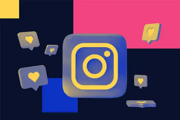
TABLE OF CONTENTS


Need a little design inspiration for creating an awesome app icon? Here are some of the best icon examples and what makes them impactful.
There’s an app for everything these days, meaning that when customers head over to their App Store or Google Play, your app will have a lot of competition to beat.
Functionality and ease of use are by far the most important considerations for the long-term success of any app. However, it’s the design of the app icon that might entice a number of users to try it out.
Here are some of the best app icon designs that can help you design something for your brand.
Symbols and graphics
If you want your app icon design to quickly convey what the app is all about, using a recognizable symbol or image is a good idea.
1. Opto VPN Security
Keys and shields are popular symbols in all sorts of security logos, and they can also make a very good app icon. This modern design uses a simple outline illustration paired with a sleek, gradient background.

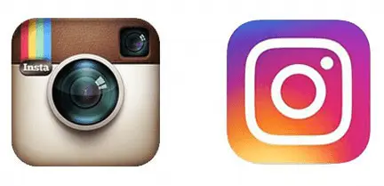
2. Instagram
Who remembers the old days of Instagram (those sepia filters are Instagram content that lives forever in my heart)? Then, you probably recollect the “retro” app icon of a polaroid camera.
Instagram’s new look is definitely one of the best app icon redesigns ever. Although the new icon is a simple outline, it uses subtle drop shadows for a more striking look. Plus the symbol itself is a perfect choice for this social media platform.
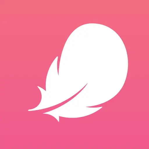
3. Flo
Perhaps the icon image itself doesn’t necessarily convey the app’s main functionality of this period tracking app. Still, it does inspire a particular feeling (lightness, being carefree), which is what you’d want in an app like this.
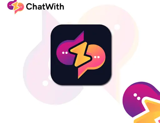
4. ChatWith
Purple and pink color schemes are very popular in the tech industry. Here’s another great app icon concept that makes clever use of color and simple speech bubble shapes.
5. Amazon
Amazon introduced its new app design in 2021. And after a bit of tweaking (the blue strip initially resembled an infamous mustache), the app now has a polished new look. The brown color is pretty unorthodox in app design but perfectly fits the company and the app. And the clever incorporation of a part of Amazon’s logo is seamless. Much better than the dated shopping cart and company name!

Abstract app icons
In the world of SaaS (software-as-a-service) businesses, it can sometimes be difficult to show with very literal symbols what an app is all about. That’s where a more abstract approach, using shapes and lines, can be pretty impressive. Take a look at some of these best app icons in this style.
6. Slack
Even though Slack is technically a professional chat app and could easily be represented by a simple speech bubble, the app icon, and company logo take a totally different approach.
The brilliant idea behind Slack which incidentally made it such a success is that it merges different communication tools and channels in one app. The app icon and logo design reflect that through the use of different colors and fluid shapes combined into one entity.

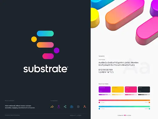
7. Substrate
Substrate is an app that helps you learn organic chemistry in a fun, engaging way. Created with a mobile-first approach, this app is available as an iOS and Android app and designed for learning on the go.
The modern logo reflects that perfectly, but it also references the topic since the lines might represent chemical bonds.
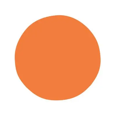
8. Headspace
One of the most basic principles of designing a successful app icon is to keep things simple. Well, this app icon example takes this piece of advice to the next level.
Why does it work, though? For a couple of reasons. First of all, the design is eye-catching precisely because of its simplicity (and the beautiful orange shade is also quite unique). However, the single object also translates the app’s primary function into design. Headspace is a mindfulness and meditation app, and just focusing on this orange dot inspires such a sense with the viewer.
9. Blek
Mascots are probably the most common icon style for game icons. However an abstract icon works just as well, if you know what you’re doing. This game involves using calligraphy that moves and creates artwork. So, this calligraphy-inspired logo icon makes a lot of sense.

Mascots
A mascot app icon is a great way to build a connection with your target audience and give your design “more personality.” Of course, a mascot would ideally be present in your logo as well, which will help you build brand awareness.
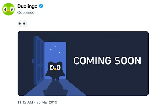
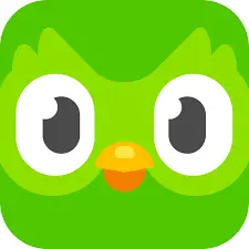
10. Duolingo
The choice of an owl, the "wisest" of animals, is an obvious one for a learning app. However, it's even more interesting to note that the app's functionalities (the incessant push notifications and email reminders) have transformed the mascot's character. And the company quite cleverly embraced this, joining in on the joke that their cute mascot is now a language-teaching sociopath.
11. Dumb Ways to Die
Aside from being one of the most popular mobile games, this is also one of the most unique and best app icon designs.
This game (incidentally one of my favorites) uses game characters as icons, adding fun details. It's also a good example of using different variations, since the iOS and Android icons are different.

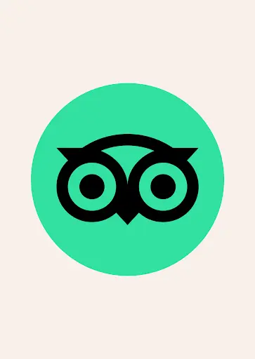
12. Tripadvisor
Another recognizable owl in the world of app design is, of course, Tripadvisor. They used to have a more colorful logo, but moved to a more modern and minimalist design with an outline illustration against a green background in recent years.
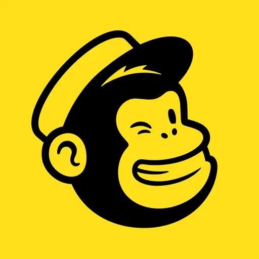
13. Mailchimp
This cute app design uses a bright color that grabs attention. Like Tripadvisor, Mailchimp has stripped down its logo to the basics, and the result is a crisp, modern logo that will probably stay relevant in years to come.
Letters and words
As a rule of thumb, app icons shouldn’t contain full words as these can often be illegible on small home screens. However, if your brand uses a wordmark or lettermark as a logo, you should try to keep app icons close to that by using letters or company name initials.
14. Netflix
Netflix probably has one of the most famous app icons, for a good reason. This type of mark is actually called a brand mark, and represents a simplified version of your logo (e.g. Nike’s brand mark is a standalone “swoosh” sign). You should definitely consider creating one as brand marks are both versatile and one of the most effective ways to build brand awareness.

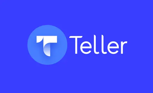
15. Teller
Everyone has a mobile banking app on their phone these days, but unlike other “leisure” apps, the design language of this kind of icon needs to convey trust and credibility and not just attract attention. This fintech app design concept is sleek and modern, and the blue and grey color palette gives off a stern, professional vibe.
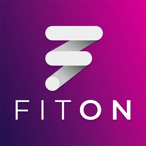
16. Fit On
A skilled designer can find a way to fit a lot even in a very small space, and here's an app icon example to prove it.
This great fitness app icon fits the entire brand name into the icon design, and still looks sleek and tidy. Like we said the purple gradient is a solid color choice.
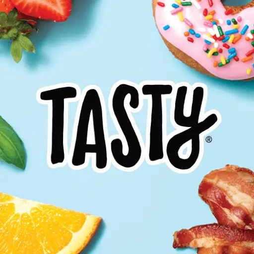
17. Tasty
Remember when I said you should try to keep things as simple and minimalistic as possible? Well, here's an app icon example that breaks those rules and very successfully so.
Buzzfeed's fun food network uses an icon that combines text (an entire word, in fact), a handwritten font rather than a crisp sans serif, colorful background, and additional illustrated design elements in said background. However, it conveys the app's fun, casual nature well, and even with all the details, it doesn't look overcrowded.
Illustrated app design
In closing, here are a few examples of the best app icon designs using different types of illustrations. This is definitely something that you shouldn’t attempt to do if you don’t have any design knowledge. However, an experienced graphic designer or even a place like our free illustration library can definitely offer a great design solution for almost any type of app.
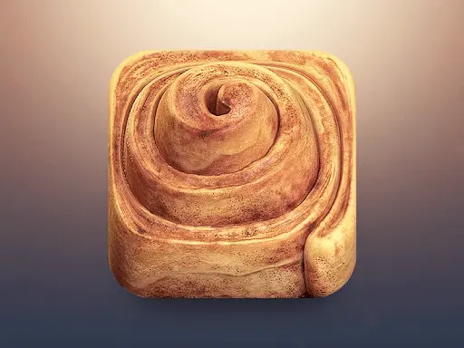
18. Cinnamon Roll App
Using photos in app icon design is usually not a great idea, but a photorealistic illustration high quality PNG file is another story altogether. This style allows you to add more details to your design but still keeping in mind the (space) restrictions you’re dealing with. For example, this idea for an app (presumably) for cinnamon roll recipes is bound to make anyone’s mouth water and would be difficult to overlook!
19. Prune
Although it might look like a mindfulness app, Prune is actually an award-winning mobile game that invites players to cultivate trees and save them from poisonous red orbs. The illustration itself here is not too intricate, but the overall design is beautiful and would likely catch your attention amongst numerous tacky icons that pop up in app search results.
20. Whiteboard
Pencil and watercolor illustrations give any design a more “human” feel, and in this field, it can really make a design stand out. This playful concept for some sort of drawing app combines the two techniques to create a simple and cute icon with a lot of personality.
We hope this list of some of the best icons gives you plenty of food for thought for designing your own! When it comes to icon design, try to stick to the basics and keep details minimal, but don’t forget to infuse the design with your brand identity and add something a little extra (whether it’s a contrast of colors, 3D effect or a mascot) that will help your app stand out from the rest.

Having lived and studied in London and Berlin, I'm back in native Serbia, working remotely and writing short stories and plays in my free time. With previous experience in the nonprofit sector, I'm currently writing about the universal language of good graphic design. I make mix CDs and my playlists are almost exclusively 1960s.

Top-quality designers
A complete creative team at your fingertips: graphic and web designers, illustrators, and more.

Lightning-fast turnaround
Get start today and receive your first update on the next business day.

All-inclusive pricing
Unlimited requests and revisions. One flat monthly fee. No surprises.

Flexible & scalable model
No contract. Scale up and down as needed. Pause or cancel at anytime.
Continue reading

.avif)
Explore some of our best designs
Get inspired by a curated selection of ManyPixels work. Download the portfolio to see what our team can create.


