

Creative Logos and Logo Design Trends from 2020
TABLE OF CONTENTS


If you need a logo update, or to create a distinguishable brand identity and cool logo, check out these 58 great new logos or redesigns to find inspiration and guidance.
So far, 2020 was not a great year for innovation since it’s not the best time for investing in new businesses.
But creative minds never sleep, and there are still unique logos and exciting new trends in design that will fuel your imagination and give you some logo ideas.
Here are some great examples to give you some logo design inspiration we’ve compiled in different categories, together with design tips and explanations why they work.
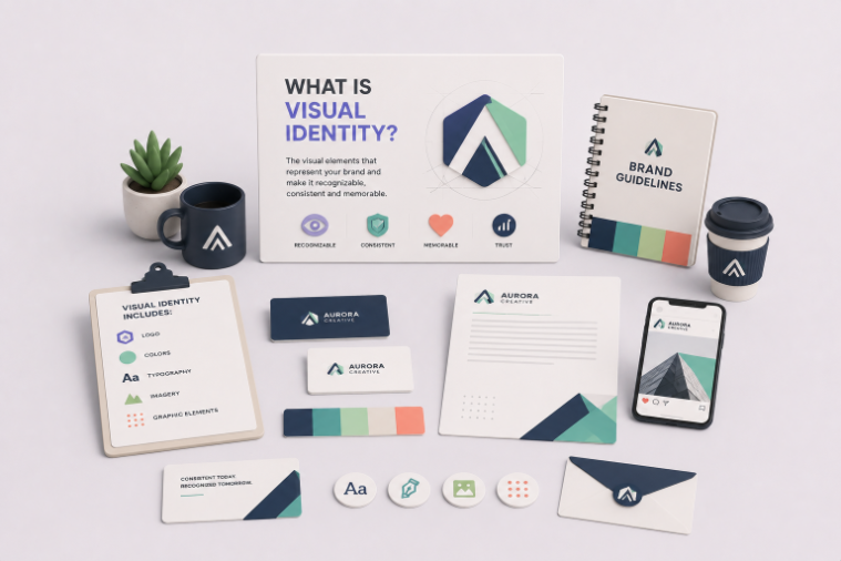
{{BRAND_BANNER="/dev/components"}}
Custom Typeface
Clever wordmarks (the business name as the logo) and unique typefaces aren’t going anywhere, even though they’ve ruled the market for longer than a century (think of Coca Cola if you don’t trust us).
This year is also rich in examples of bold and organic fonts, as well as clean and elegant lettering with a Gothic feel.
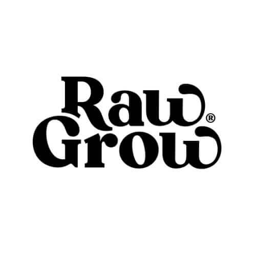
1.Raw Grow
Raw Grow used a strong and bold serif font for this striking logo. A company that produces raw foods definitely needs a logo that makes the customer immediately get the idea that the product is natural and organic, and this wordmark does that successfully.
It is a brave choice to use such big and curved lettering in a time when minimalism is still very popular, but it’s a quirky and noticeable logo. So, a great decision for this brand!
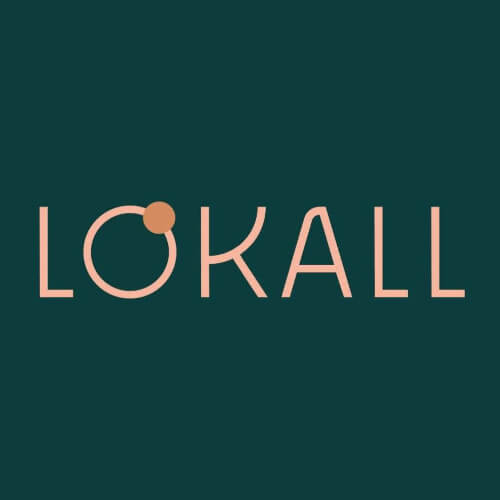
2. Lokall
Quite contrary to the previous example, this local (yup) cafe used a sans serif font with a clean and crisp look.
The dot orbiting around the O signifies the fact that it’s a place that locals gravitate towards and is the meeting place for lovers of good coffee. The cafe has a good brand identity overall and uses a pleasant, pastel color palette that resonates with stereotypically regular cafegoers—millennials.
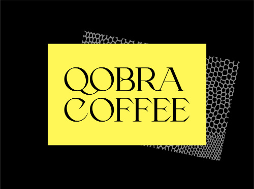
3.Qobra Coffee
This Russian coffee shop for rich and pure coffee blends recently refurbished the packaging and branding.
We might be cheating with this one since it seems that they still use the old logo on their website and social media profiles, but the redesign is absolutely astonishing. It has a mystic and rich look, with the letters endings resembling a snake’s tongue, which makes for a very reactive logo.
It definitely screams exotic and tropical, something that we like to connect to the counties of origin of good coffee blends.
4.Orris Paris
This natural and artisanal skincare line from France definitely has a very high-end feel to its visual identity. It’s easy to imagine this elegant typography both on a placard above the shop’s entrance, on a business card, or engraved in an organic soap.
The fact that is monochromatic and neat resembles the balance between ingredients and the natural production process these soaps are created through.

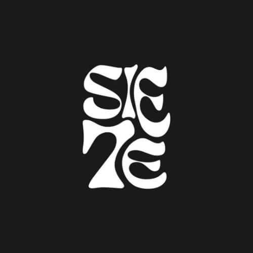
5.Siete
The identity of this new visual and photo studio from Barcelona was conceptualized and created by Laezza.
This clever logo incorporates the number 7 as the T in “Siete”, which is Spanish for seven. Another amazing example of the use of a serif font in a way that doesn’t make it feel unprofessional or over the top.
6. Yaourti
This Mediterranean restaurant that mainly serves yogurt is based in Montreal, Canada, and held by two brothers from Greece who wanted to infuse some of their culture and heritage to their new home.
They opened this cool restaurant and applied their brand story even in the logo. Each letter borrows the shape of a significant ancient Greek object, such as an obelisk, arch, or drinking fountain. And if you’ve seen the Greek alphabet, you’ll know the similarities.

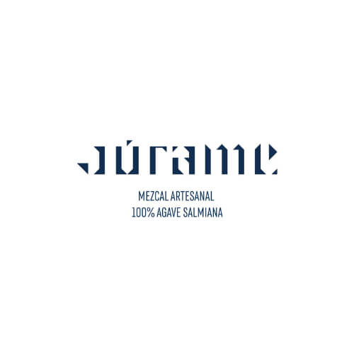
7.Jurame
This classy logo is the perfect blend of craftsmanship and precision that mezcal-making needs. It looks like embroidered letters in a tapestry but still differentiates itself in styling from common spirit brands.
The agency that came up with the branding took common themes borrowed from the Mexican identity but included design elements of the place of origin of mezcal and the community that produces it.
Monograms
Creating a unique logo out of your initials or the first letters of words comprising the brand name is also quite trendy. Or did it ever go out of fashion? Anyway, here are a few that might inspire your own logo.
8.Laudes Foundation
This foundation supports self-sustainable construction and helps fight climate change by supporting brave, innovative efforts that inspire and challenge the industry to harness its power for good.
The two first letters, L and F, create a foundation for the two lines that look like steps. It definitely reflects their mission to move upward and make a positive impact.

9.Craft Design House
This design and crafts studio has a… well, crafty logo. You can see the letters C, D, and H inside the logo, but together they create a brick or a step in the ladder. It’s a new design that looks a lot different than the previous one, but it’s definitely a smarter and more contemporary, great logo!

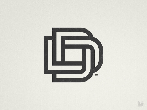
10.Decore Deco
Decore Deco sells woven art blankets, so the interlinked Ds are especially smart when you realize that the process of weaving is actually slipping a piece of thread beneath another one. That is what makes it a very creative logo, that manages to look very modern and minimalistic.
11.Institute for International Studies
This probably makes no sense to someone who doesn’t read in Cyrillic, since this example is of a Russian institute. The original name is “Институт международных исследований”, to give some context to the confused readers at this moment.
The letters И (I) and М (still M) comprise this simple, yet smart logo. You can also see two books leaning on a shelf, which is fitting since it’s an educational institution.
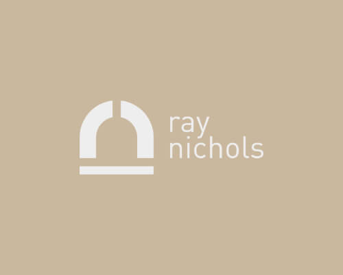
12.Ray Nichols
Kudos to the logo creator Ryan Paonessa, who did a great job with this example. This amazing logomark mad has the initials of the baker for whom it was designed and a masonry baking oven.
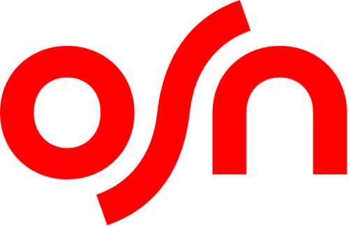
13.OSN
OSN stands for Orbit Showtime Network, a satellite provider from the United Arab Emirates. This is not a new logo, but a slight redesign.
The company managed to give the logo a more dynamic feel, at the same time making it more distinctive than other network providers.
They used a brighter red color this time, and the S is longer and gives it a modern, refreshing look, contrary to the 1970s, chunky font of the previous one.
Retro and Vintage
Nostalgia is a powerful emotion, and old logo styles are making a comeback because of that. Plus, you can’t deny that vintage looks great on any t-shirt, right? It’s a risky business creating a retro business logo—it’ll either look amazing and stand out or seem pretentious and unoriginal. But here’s a few companies that nailed it.
14.68 Lenguas
Yet another artisanal and locally produced mezcal from Mexico with a striking visual identity. This cool logo design uses a font that looks like it’s straight out of a Mayan temple, as well as a mask or totem. The red and black color combination is classy, yet captivating. And it looks even better on a bottle.

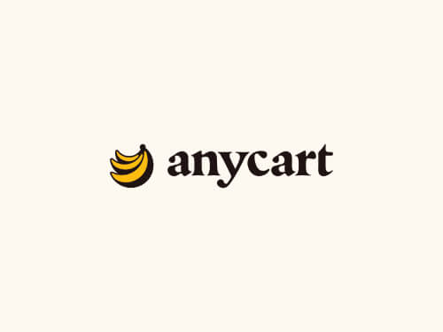
15.Anycart
This food delivery service has a logo that consists of the company name and a stack of bananas. It’s a very simple logo but still looks vintage. It reminds me of the 1960s, The Velvet Underground, and bumper stickers.
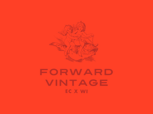
16.Forward Vintage
Okay, this one’s even in the name. The curated clothes decided on a logo that looks like it was taken from a wall in the Vatican Museum. It might be even more ancient than vintage, but it’s a brave and memorable company logo.
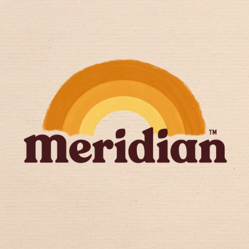
17.Meridian
Another redesign, as fresh as the organic nut and seed butter this shop sells. The muted colors are similar to those of walnut and peanut butter, and even the dots in the Is are small nuts.
The paintbrush rainbow adds to the impression that it’s a family brand, and the bold, rounded serif for the wordmark adds some extra coziness.
This logo has a very modern-retro feel, and it’s a huge step up from the previous logo this company used.
18.United States Olympic and Paralympic Museum
Every Olympics-related logo lately has used cursive fonts, mascots, and a noisier, messier design. But the United States Olympic and Paralympic Museum that will open later this year adopted a logo that combines the stripes from the US flag, the colors of the Olympics, and the diamond-shaped silhouette of the building.

Minimal
The impression simplicity can leave in a good minimal graphic design is amazing. It’s a great proof for the “Less is more” maxima, and we can’t agree more after seeing these amazing logos.
19. Merino Construction
A neon green, M-shaped minimal depiction of a building is the alternative for an already seen, conservative logo for a construction company.
Merino Construction made a brave decision when they chose this logo, but it is a memorable, unique design that you wouldn’t expect to see in a real estate company.

20. Instinto
Instinto Estudio is a Costa Rican architecture studio focused on sustainable design. Their minimalist logo combines the letters I and N in a way that resembles an architectural sketch, which makes it a very relevant and intelligent design.

21. Natalie Turnbull
This Australian art director and stylist describes herself as a person who’s inspired by how form and function are used to communicate an idea, and always strives for a minimal and crisp aesthetic. This is the best logo to convey that message: it is clean, crisp, modern, and very minimalistic.

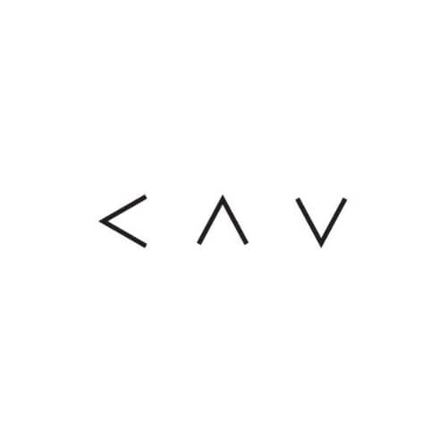
22. KAV
This Israeli fashion studio and clothing store uses a simple arrow pointed in three different directions to form the three letters. Very simple, futuristic, and effective solution.
23. Kartoteka
Now for something really different: Kartoteka from Czechia opted for a neo-modern minimal rendition of post-socialist art. The colors, the flat illustration, and the simplicity make for an impressive logo that feels as if it belongs on an Egyptian sarcophagus.

24. Sonantic
This generator of hyper-realistic artificial voices created an extremely simple wordmark but the letter O resonates with the movement of the cursor on their website. The version of the logo that isn’t animated is still very minimalistic since only one letter is there to remind us that it’s an audio and text-to-speech service.

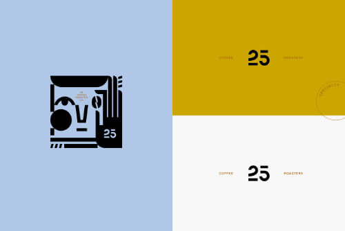
25. 25 Coffee Roasters
Another example of a wonderful logomark: the digits 2 and 5 are the same form, just vertically flipped. This Ukrainian roast coffee shop also has a mascot that they apply in packaging, tote bags, cups, and other merchandise that is also beautifully designed.
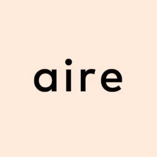
26. Aire
This manufacturer of premium CBD oil decided on a clean, fresh, and relaxing visual that represents well the effects of their product. The lightness of the logo is well paired with the company name and motto: “And breathe”.
Line Work
Simple, cute, and artistic line work also makes a good logo. You’d probably need a graphic designer who can handle some art made by hand and is a good illustrator as well, but the examples below will prove to you that this style of logos is an excellent decision.
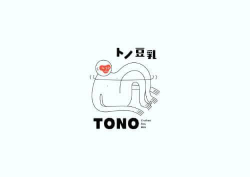
27. Tono Soy Milk
This cute monkey that’s chilling perfectly reflects the easygoing and friendly nature of this brand, which uses a noninvasive method for pressing soybeans to create delicious vegan milk.
You can check out the complete branding to see how good and light it looks on everything it’s applied to.
28.Chetverg
This cute ladle that’s also a fish is the logo of an online fish and seafood market. The font is also handwritten and light, so it’s a perfect match.

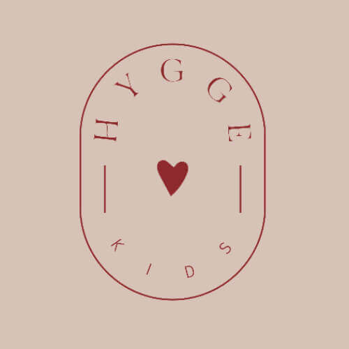
29.Hygge Kids
A kid’s clothes rental has to have a light and cute logo, and Hygge Kids nailed it with this redesign. It’s very simple, uses just a friendly red color, and nails the tone of the company.
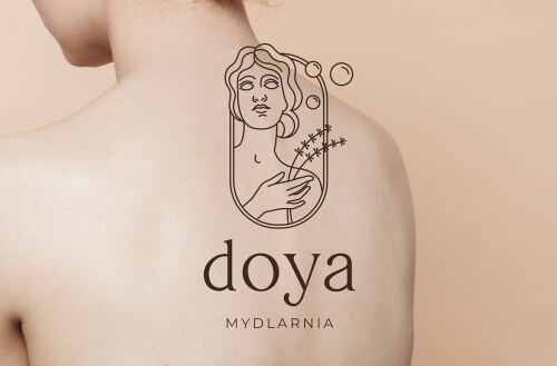
30.Doya Midlarnia
This small family company that produces natural cosmetics without the addition of harmful chemistry assigned Barb Studio to produce this lovely and elegant line logo of a woman, lavender strands, and bubbles.
Burst of Color
Not every brand can have a colorful, immediately noticeable logo. If you’re a professional company offering services or have a more corporate spirit, steer away from an explosion of colors.
On the other hand, if you’re a toy store or a spicy food restaurant, go for it! Here are some brands that decided to ignore the two-color policy and killed it.
31.Zoli Zoli
This food store specializing in Mauritian soul food, as they call it, decided to use all the colors from the flag of Mauritius, as well as a funky font that immediately reminds of coconut trees, long beaches, and the ocean all around.

32.Move United
Disabled Sports USA and Adaptive Sports USA just merged their forces and created Move United. This organization’s mission is to provide leadership and opportunities for individuals with disabilities to develop independence, confidence, and fitness.
With the merger came a new branding, with a custom typeface and a cool branding story. They wrote the word “disability” in different colors, broke it down, and puzzled the pieces together to create these colorful and uplifting letters.

33.Hyber
Another children’s clothes rental that nailed the tone and the character of their logo. As a brand that should appeal to kids and parents, they made a good decision to add color to their logo redesign, and the organic forms and dynamic character of the letters help elevate that message.

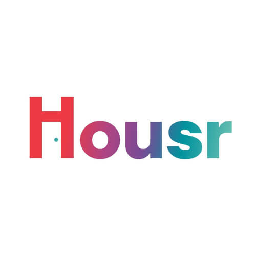
34.Housr
This is another fresh redesign for the better. Housr is an accommodation rental service that mostly targets millennials, students, and remote workers.
The tiny blue dot under the arch of the letter H serves as a doorknob, so the negative space under the letter is a door. And the colorful wordmark definitely relays the message that their accommodations are warm, cozy, and homey.
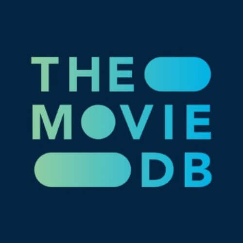
35.The Movie DB
This community-built movie and TV show database might not have used as many colors as the rest of the examples here, but they decided to use the trusted gradient. Their recent redesign looks compact and cool, and the oval-shaped holes between words remind of those found in an old camera film roll.
Circle Logos
Circle logos are regaining their popularity lately. They look good when applied on merchandise or packaging, and the organic form of a circle makes the audience think of trustworthiness, straightforwardness, and nature.
36.Monachus Distillery
Small alcohol distilleries rule this list! Monachus is a small, family-held Croatian distillery that chose the endangered Mediterranean monk seal (Monachus Monachus) to be their logo and namesake.
This beautiful illustration of a seal swimming in a circular form makes a beautiful bottle cap, label stamp, and logo, but at the same time raises awareness for this species of native seals in Croatia. Different colors are used for different flavors of gin too.
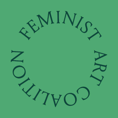
37.Feminist Art Coalition
This might be a very simple circle logo, but it has a straightforwardness to it. Which is exactly why it’s a good logo for a feminist collective.
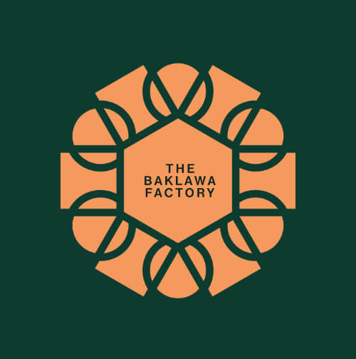
38.The Baklawa Factory
This online shop for oriental pastries that is about to open in the US infused their design with typical ornaments and patterns from Turkish and Persian heritage but gave the logo a modern look by using fresh and pastel colors and a circle shape.
39.Volto Urbano
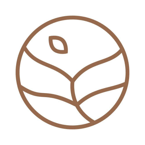
Volto Urbano sells self-sustainable, anti-climate change, and cruelty-free products. And naturally, they have the most organic of all forms as their logo. The lines inside the circle also resemble a fragile, but a growing plant.
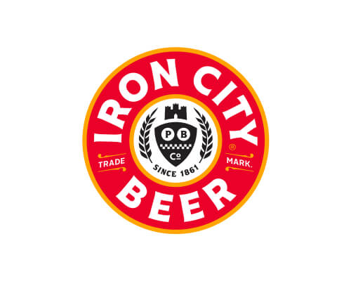
40.Iron City Beer
This logo is quite different from the rest so far, since it’s both a circle, looks vintage and it’s not as contemporary as most of these. But this beer company from Pennsylvania is an old and established brand, so they don’t really need to appeal to the customers with refined and elegant branding.
They got rid of the bold serif font they used thus far and adopted a cleaner one, added a yellow outline in the circles, and made the red color used in the background a lighter shade.
Mascots
When a brand uses a mascot, it is successfully creating a persona out of its story. Think of Tony the Tiger, the Nesquik Bunny, or Colonel Sanders. You might not build a whole story around the mascot you might end up using, but it’s still the face of the brand.
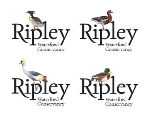
41.Ripley Waterfowl Conservancy
This redesign for Ripley Waterfowl Conservancy uses an illustration of different species of waterfowl: Baer's Pochard, Scaly-sided Merganser, Grey Crowned Crane, and Red-breasted Goose, in order to highlight the diversity of the birds they fight to conserve. The semblance to an old-school postmark gives the impression of an artistic and vintage logo.
42.Tomo Sushi
Tomo is an old sushi restaurant in Amsterdam that recently revamped its branding and made Tomo their avatar. It is reminiscent of a comical anime style, which is another connection to Japanese culture aside from the sushi. And it’s red and white—a color combo often used in the food and beverage industry.

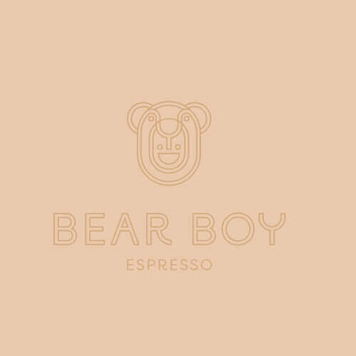
43.Bear Boy
Australia has an established coffee culture, and it makes a lot of sense that so many cafes there have great branding. One of them is Bear Boy, a cozy espresso bar with a lovable mascot.
44.Kelly Loves
This brand for Asian-cuisine-inspired snacks and meals uses an illustration of Kelly Choi, its founder, as the mascot. Kelly started this business in Europe so as she can have a connection to their heritage and culture since she’s a South Korean who spent most of her life abroad.

Metal and Engraved
Metallic and engraved logos are also back in fashion. Although they are mostly used as insignias of institutions or in the real estate business, they can be applied to companies that have a physical product.
Note that if you don’t use packaging and only need the logo for your digital presence, it might not have the same effect, cause you can imitate a metal shine, but it’s more authentic on print or even better, engraved.
45.Alba Cola
This brand uses a huge, metallic unicorn and all capital letters as their logo. It is an unapologetic visual and probably not for everyone’s taste, but it’s definitely striking and well paired with the brand story: it’s a contemporary cola drink inspired by typically Scottish herbs and mythology.

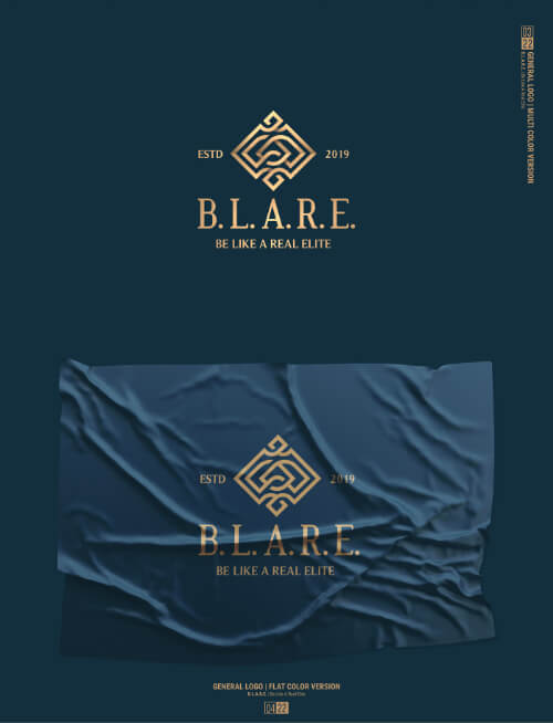
46.B.L.A.R.E
Be Like a Real Elite is a company that provides brasswind accessories and luxury products such as vinyl films, leather goods, acrylic cases, and fashion wear.
The decision to have a golden logo is very suitable since they sell products for instruments made out of metal. The overall branding and packaging definitely sell the point that it’s a luxurious brand.
47.La Floristeria
This flower shop from Honduras uses an elegant and gentle golden rose as its logo. It is a smart choice to stand out from most competitors, with colors of flowers being a common choice.

48. FC Tulsa
The Tulsa Football Club adopted a new logo and crest last year. It features the Scissor-tailed Flycatcher, which is the Oklahoma state bird. Next to it is a vertical “Tulsa” in an Art Deco font which are nods to two eras of Tulsa prominence reflected in the city’s historic architecture and the vertical signage seen across Tulsa.

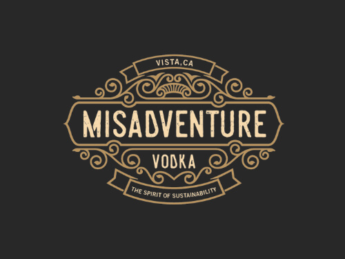
49.Misadventure Vodka
Last alcohol brand, honest. This combination of a metal engraving and Wild West font is a great example of a logo that is really “in your face”. When we think vodka, we usually think of light, Nordic, and cold, so this western and vintage logo is an interesting choice.
Black and White
Before we start a commotion, yes, all logos can be in black or white. But what we’re referring to here is the combination of those colors (or better said, lack of color). If you want a classic a simple logo, making the original version in B&W is always a good step.
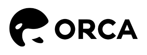
50.Orca Alliance
Orca is a personal finance management toolset. Since the name is exactly like the Orca Whale’s, they used the color combination seen on the animal and a logomark of two orcas swimming in a circle. It’s a variation of yin-yang, which symbolizes balance. A great symbol for a finance management company!
51.The Mental Health Coalition
This organization fights to destigmatize mental health conditions, and they decided to use a logo of a square pebble in a round hole. It reflects the fact that not everyone fits in perfectly, but should be accepted nonetheless.

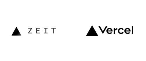
52.Vercel
Another rebranding. Zeit became Vercel, and the company ended up keeping the original identity more or less, they tweaked the logo a bit. The triangle doesn’t have a black and white gradient anymore, and the letters are bolder and cleaner.
Icons
Icons next to wordmarks are an evergreen. If you opt to use one that’s royalty-free or too common, you might end up with an unoriginal design. But if you create an original icon, you get a simple logo that is also very versatile.
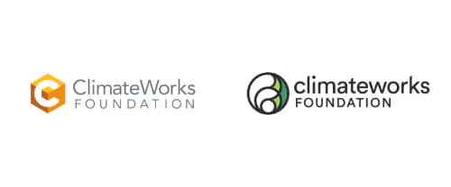
53.Climateworks Foundation
Climateworks got a much-needed rebranding: they ditched the cube logo in favor of a globe one, that has two rich shades of green. The new logo makes much more sense for an Earth-saving organization, right? They also use all lowercase letters for the name now, which makes the identity friendlier and more accessible.
54. Fanhood
This weekly, free email newsletter for basketball enthusiasts has a custom made F-shaped icon with a sporty, dynamic feel and a custom sans serif lettering that has a very retro vibe. The icon is actually a waving banner, which is very suitable for a sports newsletter.

55.Tetrapeak
This new sales and marketing consultancy translated its name into an icon of four peaks. Tetra is Greek for four, so there’s some context if you needed it. The light blue background is a great choice for a consultancy company, as it implies reliability and professionalism.

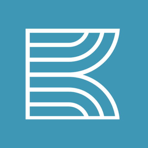
56.Kentucky Performing Arts
This icon is combined with three elements: the letter K as the shape, a theatre curtain, and ray, signifying that the Kentucky Center makes an impact on the audience.
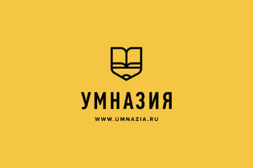
57.Umnazia
These online courses for kids use a great icon, that combines a pen, and an open notebook. It is a smart and simple solution, so kudos to the designer.
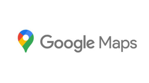
58.Google Maps
The last entry on our list is probably the most famous one. Google Maps stopped using the logo of a map and location and created a location pin icon that is now part of the complete family of Google icon logos.

Journalist turned content writer. Based in North Macedonia, aiming to be a digital nomad. Always loved to write, and found my perfect job writing about graphic design, art and creativity. A self-proclaimed film connoisseur, cook and nerd in disguise.

Top-quality designers
A complete creative team at your fingertips: graphic and web designers, illustrators, and more.

Lightning-fast turnaround
Get start today and receive your first update on the next business day.

All-inclusive pricing
Unlimited requests and revisions. One flat monthly fee. No surprises.

Flexible & scalable model
No contract. Scale up and down as needed. Pause or cancel at anytime.
Continue reading

Explore some of our best designs
Get inspired by a curated selection of ManyPixels work. Download the portfolio to see what our team can create.


