
The 3 rules of mobile app icon design
TABLE OF CONTENTS


You've put a lot of effort, resources, and creativity into developing a mobile app. Now it's time to create an app icon that will draw users' attention and hope for millions of downloads. Mobile app icon design is a craft like any other. Learn how to do it properly.
Icons are the first thing we see on the home screen when we turn on our phone. If we're looking for a particular app on Google Play or the App Store, we type in the application's name or a keyword. However, when the search results appear, we try to recognize the right app by identifying the icons shown.
In cases when we're not sure what app we need for a particular service or experience, icons play a significant role in our decision-making process. The icon triggers our interest before we even check out the app itself. More so, an outstanding icon can assure us that the application behind it is useful and trustworthy, thus ensuring the app's conversion.
Once we decide to download the app, the role of the icon changes. Now it helps us recognize the app on our screen, crowded with numerous other icons.
All of the above brings us to the most important piece of information - the app icon has enormous potential to boost the app's conversion rate in the stores. Whether the icon will realize its potential depends heavily on the graphic development and design of the icon itself.
Although iOS and Android icons look almost identical, there are a lot of differences that prevent us from using the same icon for both operating systems. iOS and Android are available online to ensure app development compliance with each operating system.
To design an outstanding app icon, follow these three rules:
Rule #1: Make it recognizable
The first thing to achieve is the relevance of the icon. You need to remember that users who have never heard of your app will see its icon. What does the icon design say about the app? Does the icon reflect the app's purpose?
Universally accepted symbols illustrate a particular service or experience delivered by specific apps. For instance, when we see an icon depicting an envelope, we immediately associate it with email apps.

If your brand has a logotype that you want to have included in the icon design, try to modify it by including only the first letter of the typography. Long words are hard to read on a small scale and can ruin the icon's look.
Once you find the perfect symbol or illustration (or create a unique one) that represents your app, do a little research on the App Store or Google Play and check out your competitors' app icons. Consider going in a different direction, and develop an app icon that is distinguishable to make sure it can compete with others for the user's attention.
A single symbol on a monochromatic background makes a unique and compelling app icon. Experiment with different colors and compositions, and try to develop unique metaphors.
Using vibrant colors is always an excellent way to make your icon stand out amongst the other apps a user has installed on their mobile phone. However, before choosing the best colors for your app icon, make sure that it looks good on a variety of different backgrounds.
Blue is the most popular color and a favorite of people from all over the world. Therefore, it's safe to say that if you choose this color, you risk blending in with the competition.
Many UI/UX experts use contrasting colors when introducing two different colors into the same design, making the app icon dull and unattractive. Experiment with contrasting colors that create striking color palettes that draw the user's attention.
Rule #2: Make sure the icon is scalable
Your mobile app icon will be shown on the phone's menu, the settings panel, social media, your website. And wherever it appears it will be in different sizes. Whether big or small, an app icon should always look outstanding.
It's best not to use only a 1024 x 1024px grid size but to scale the icon size on various resolutions and sizes. That way, you can review what the icon will look like when shown on a larger or smaller scale.
When designing an app icon, try to make it as simple as possible by removing details until the most basic concept remains. Text, plenty of colors, and shapes can make the app icon too complicated and hard to scan. The simpler the icon, the better it looks on a smaller scale.
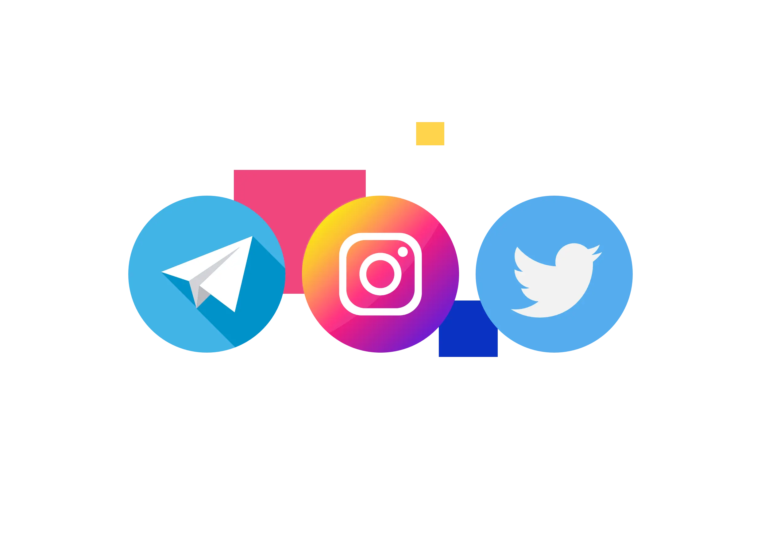
Twitter, Instagram, and Telegram use a single symbol in their app icons, ensuring the design doesn't deteriorate when resolution changes.
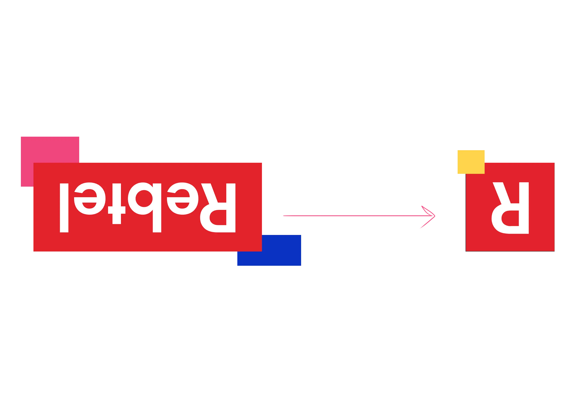
Rebtel's app icon design is a perfect example of how a brand with a distinguished logotype can use a simplified icon design and still make it recognizable.
Rule #3: Keep the consistency
Every app has a brand or a company behind it, and the corporate identity needs to be consistent between the two. Icons are, by definition, a visual representation of the app itself, and consequently, they represent the brand's personality through color and style.
Icon design is an extension of the app UI/UX design, and consistency between the icon and interface will strengthen brand awareness.
When designing an app icon, you must create a consistent user experience. People must feel the connection between the app and its icon. Make sure to align the color palette of the icon and the user interface and use a similar design language.
Another way to enforce a connection between the app and its purpose is to use a symbol that directly illustrates that purpose. Messaging apps often use a telephone handset symbol in their icon, while music players have icons depicting a note.
Conclusion
Close to two million applications in the App Store and 2.8 million in Google Play are competing for attention. Big brands can use their logos to create recognition, while lesser-known applications can show something new and unusual on their icons!
An outstanding app icon design can create a unique user experience. The best way to achieve recognizability is through brand consistency, uniqueness, and relevance.
These simple rules can help you develop an outstanding mobile app icon. However, don’t forget that icon design is a creative process, and sometimes it’s perfectly ok to break one or two rules with out-of-the-box thinking. That’s how innovation happens!
{{ILLUSTRATION_BANNER="/dev/components"}}

An experienced creative talent with a demonstrated history of working in the advertising industry for more than 18 years. A strong creative writing professional with a special focus on creating content for marketing and social advertising projects. I have a Master's degree in Theater Directing. I love hiking, enjoy obscure music and European cinema. I am an avid fan of UFC!

Top-quality designers
A complete creative team at your fingertips: graphic and web designers, illustrators, and more.

Lightning-fast turnaround
Get start today and receive your first update on the next business day.

All-inclusive pricing
Unlimited requests and revisions. One flat monthly fee. No surprises.

Flexible & scalable model
No contract. Scale up and down as needed. Pause or cancel at anytime.

Continue reading

.avif)
Explore some of our best designs
Get inspired by a curated selection of ManyPixels work. Download the portfolio to see what our team can create.


