
Best presentation color palettes for snazzy pitch decks
.jpeg)
TABLE OF CONTENTS


Design always matters, whether we’re talking an annual report, investor pitch deck or a presentation for an event or conference. We’re here to help you find the right presentation color palette no matter the occasion!
Did you know that 91% of presenters say they feel more confident when presenting with a well-designed slide deck. On top of that
Presenter or audience, how your slides look matters. And while choosing the right visuals or fonts is important, a presentation color palette is the thing that ties all of it together. Here are 7 great color combos and why they work!
{{PRESENTATIONS_PORTFOLIO="/dev/components"}}
1. Blue and white: classic and corporate
Blue is definitely one of the most common colors for logos. So, if you happen to follow this trend, a presentation template like the one below could be a great choice. Just make sure that the blue matches the right shade of your logo!

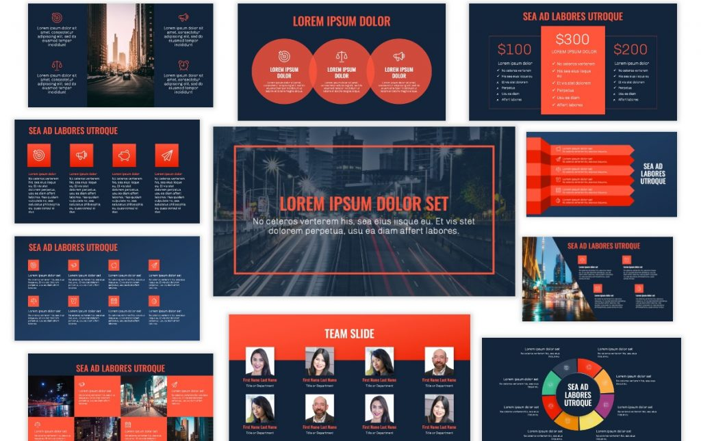
2. Navy and orange: approachable and cool
Navy represents trust and reliability, while orange adds warmth and enthusiasm. This pairing is perfect for startups or companies that want to look both professional and approachable. The dark navy background allows orange highlights to pop, making key elements like charts or keywords stand out. This color palette is used by many cool and innovative companies, such as Mozilla Firefox and FedEx.
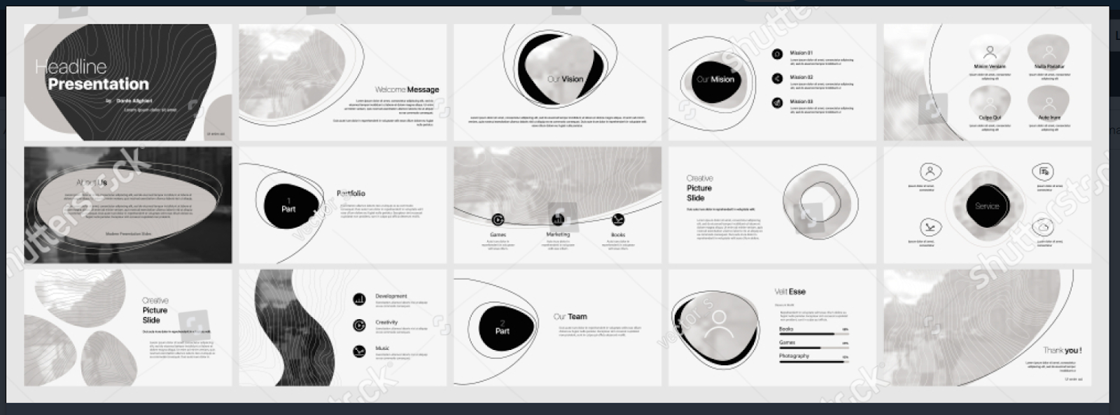
3. Monochrome: simple and versatile
If you’re worried about making the right professional impression, don’t risk it with very elaborate presentation color palettes. Opt for a single-color palette or a classic black and white look if it matches your brand.
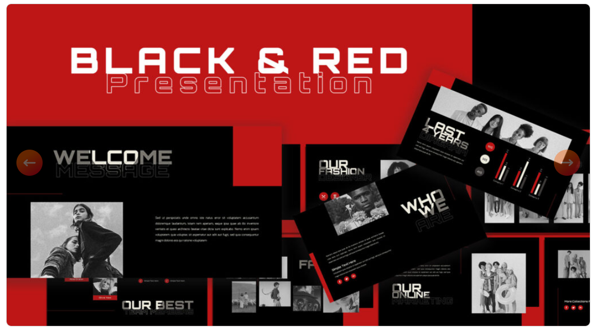
4. Black and red: attention-grabbing
It’s definitely not the best presentation color palette for everyone. However, if you want to exude confidence and something like the Google Slides theme below can be a perfect choice.
5. Teal and beige: breezy and beautiful
For a much classier look, try this great color combo. Beige is a great neutral color to use as an alternative to grey and white. Add an accent color, such as orange for important visuals or information.
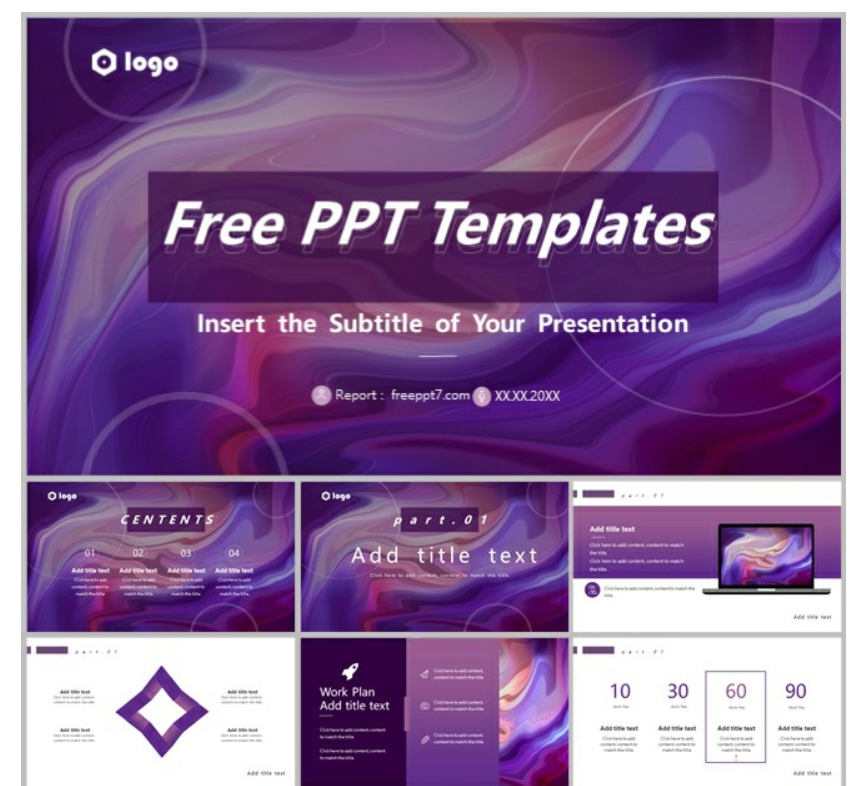
6. Purple and white: techy and sleek
Purple is a very popular brand color in the tech and SaaS industry. Pair it with white for a clean, futuristic look. Purple is also a great color choice if you want to add gradients to your presentation design.
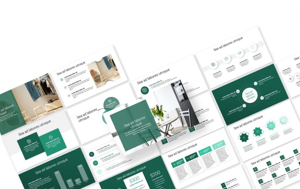
7. Green and grey: sophisticated and professional
Green symbolizes growth, health, and stability, while gray brings neutrality and sophistication. Together, they create a modern and balanced palette often seen in environmental or financial presentations. Green draws the eye without feeling aggressive, while gray prevents the slides from becoming overly vibrant. It’s also a great alternative to the slightly overused blue and white color palette.

8. White and charcoal: elegant and unique
Most non-designers tend to get overboard when creating presentations. Instead, this stunning combination that’s a little bit different than a basic black and white will give youa very classy look, while still letting your presentation content shine.
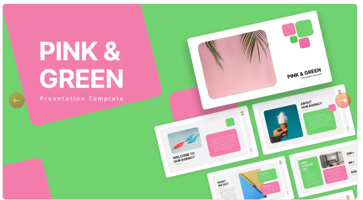
9. Pink and green: youthful and fun
Although it’s definitely not the right choice for everyone, this bold combo of contrasting colors can be a great choice for modern, playful brands. If you opt for a color palette like this, just make sure you opt for simplistic photos and graphics to avoid visual clutter.
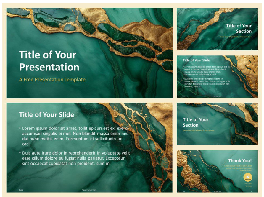
10. Deep teal, copper, and ivory: a sense of luxury
Deep teal offers richness, copper brings vibrancy and uniqueness, and ivory provides a soft, elegant backdrop. This combination is strong for design, branding, or business pitches that want to stand out while maintaining polish.
Why colors matter in presentations
Color is more than an aesthetic choice—it affects how people feel and respond. Studies in psychology and marketing show that colors influence decision-making, attention, and memory retention. For example, research indicates that people are more likely to remember visual material presented in color compared to black and white.
In the context of presentations, colors serve three main functions:
- Attracting attention – A bold accent color can direct the audience’s focus to key points.
- Conveying meaning – Different colors carry cultural and emotional associations (e.g., red for urgency, blue for trust).
- Creating consistency – A well-chosen palette ensures slides look professional and cohesive.
The psychology of colors
Although it’s an area study that still lacks definitive findings, ignoring color theory can result in cluttered, confusing visuals that distract from your message. On the other hand, a thoughtful color strategy makes your presentation memorable.
Colors evoke emotions and associations, though meanings can vary depending on cultural context. Here’s a quick breakdown of common color meanings in Western contexts:
- Red: Energy, urgency, passion, danger. Great for calls to action but overwhelming in large amounts.
- Blue: Trust, professionalism, calm, intelligence. Widely used in corporate and educational settings.
- Green: Growth, health, prosperity, balance. Works well for environmental and financial topics.
- Yellow: Optimism, creativity, warmth. Best as a highlight color, as it can be hard to read in text.
- Orange: Enthusiasm, friendliness, playfulness. Encourages engagement but should be balanced to avoid overstimulation.
- Purple: Luxury, wisdom, creativity. Effective for topics about innovation or branding.
- Black: Sophistication, authority, elegance. Strong for backgrounds and formal presentations.
- White: Simplicity, clarity, openness. Helps declutter and give space to content.
The key is to align your color palette with the tone of your presentation. A financial report may benefit from blue and gray tones, while a startup pitch may shine with bold accents of orange or green.
Choosing a color palette
A good presentation palette usually includes three to five colors:
- Base color – the dominant shade, used in backgrounds or major design elements. It’s usually your main brand color.
- Accent color – draws attention to important content (e.g., graphs, keywords).
- Neutral colors – black, white, or gray to provide balance.
Get no-hassle custom presentations
While many business owners and CEOs create professional slide decks themselves, this is hardly ever a good idea. Creating 15-20 slides takes around 10 to 20 hours - time that could be spent on building your businesses, acquiring customers, and more.
With ManyPixels you can get all the graphics your business needs at a fixed monthly rate. Whether it’s custom slides, illustrations, infographics, marketing materials, even logos and websites - we do it all!
{{PRESENTAION_BANNER="/dev/components"}}
Stop wasting time on DIY design that doesn’t work. Start with monthly rates as low as $699 and get everything you need designed by pros.

Having lived and studied in London and Berlin, I'm back in native Serbia, working remotely and writing short stories and plays in my free time. With previous experience in the nonprofit sector, I'm currently writing about the universal language of good graphic design. I make mix CDs and my playlists are almost exclusively 1960s.

Top-quality designers
A complete creative team at your fingertips: graphic and web designers, illustrators, and more.

Lightning-fast turnaround
Get start today and receive your first update on the next business day.

All-inclusive pricing
Unlimited requests and revisions. One flat monthly fee. No surprises.

Flexible & scalable model
No contract. Scale up and down as needed. Pause or cancel at anytime.
Continue reading

.jpeg)
.jpeg)
Explore some of our best designs
Get inspired by a curated selection of ManyPixels work. Download the portfolio to see what our team can create.


